
Search results for "Extraneous up to dateness" in Home Design Ideas
 Klopf Architecture
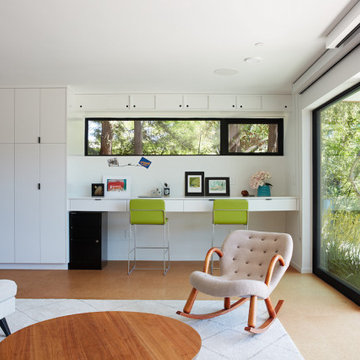
The Roger Lee designed house from 1962 was purchased by the current homeowners in almost original condition, as the previous owners elected to defer most maintenance projects over the years. The clients were able to see beyond the dated materials and finishes, single-paned glass and uninsulated walls and they approached Klopf Architecture to help them expand and update the entire home, one the family could settle into and enjoy for years to come. It was important that the new designs were aligned with Lee's original intent not only because of the client's appreciation for mid-century modern architecture, but also because the house was deemed historical. The Stanford Real Estate Office requires a stringent design review which safeguards the integrity of the community, which Klopf Architecture was happy to oblige going into their updated designs.
As with many original mid-century modern homes, the house was scaled to the 1960s lifestyle where rooms were smaller and openings to views were limited and tightly framed. The original conditions defined the direction the family of four would take in updating the house and making it comfortable for their modern lifestyle. Klopf designed a full gut remodel and major addition to bring the house into the 21st century and provide the living area needed for the client's family. The newly expanded house added just about 1,100 sf to create an airy, comfortable and family friendly house, taking full advantage of the beautiful southwestern views that extend out to the hills beyond. The enclosed garage created an additional 240 sf of covered space for long-term storage.
A cracked swimming pool created an eyesore taking up a majority of the backyard landscape, so it was one of the first elements to go during the transformation. Working with Outer Space Landscape Architects, the family asked for a mix of relaxing outdoor patio spaces that eventually blend into the native landscaping, extending their views outward toward the natural greenery of the trees beyond their property. Filling in the old pool was a smart way to expand the living spaces outward. The orientation of the house was designed to enjoy the views, but the original architecture provided the first homeowners with mere glimpses of the landscape outside.
Klopf was able to broaden those views, continuing and extending on the original architecture to take full advantage of the unobstructed natural views across the rear facade of the house. Small horizontal openings in the primary bedroom and office were replaced with much taller windows that now follow the angled roof line upward, extending across almost all of the facade. We worked with Western Windows, whose designs included an oblique-shaped, operable casement that allowed our design to rise with the slope. A new corner office added to the primary suite, offers a bright and functional work-from-home solution that looks out at the distant views and added natural light from the expanded window configuration that now wraps around the corner.
The existing lower level was designed by Lee as a utilitarian space, serving as a wet pool room with a drain in the center of the floor, bathroom, laundry and storage areas. Without the need for a pool room, Klopf was able to convert the area into a much more comfortable and functional living space with a new family room and guest suite. The new spaces enjoy easy access to a new outdoor patio through floor to ceiling, full-width glass sliders.
Continuing along the rear facade, a previously exposed deck extending from the living room and hallway provided access to the backyard through a single set of stairs leading toward the side of the house which made sense when the pool was in place. The new deck was re-envisioned as an extension of the main living room and now serves as a second outdoor living room. A new slatted pergola above provides the homeowners welcome relief from the hot afternoon sun. A second set of stairs now creates a better connection to the redesigned lower level. Klopf was able to reconfigure the spaces, extending the living room outward toward the views, where the family now claims it as the heart of the home, spending a large majority of their time outdoors.
Back inside, the original wood-burning Malm fireplace was beautifully restored and a gas burner installed to comply with California's strict air standards. It now rests in front of a wall of Heath accent tiles where a dated red brick wall used to stand. A new taller window brings more light and views into the refreshed interior living room. The original glass doors opposite the fireplace were replaced by larger sliders that when fully opened, create a seamless transition to the new outdoor living area so the two spaces feel like one connected space. The original utilitarian kitchen was needlessly tucked into the far back corner and closed-off, out of sight from the living room, so the clients asked Klopf to open it up and expand the kitchen forward so it felt more connected. Today the much larger kitchen is connected to the living area where a short wall with a cutout offers a visual glimpse into the kitchen and a handy pass-through counter for serving guests. A new breakfast nook was also added to create another spot where the family can gather for casual meals. Just outside, a new built-in outdoor grill and prep area extends the kitchen outside and connects to a new outdoor dining spot nestled amongst the trees, taking advantage of the views out back.
Klopf was able to expand the other two bedrooms, add a new laundry room and half-bath and convert the carport to an enclosed garage to add more storage areas which was lost when the pool house was converted to the family and guest room.
To maintain a historical connection to the original designs, the exterior siding was repeated on all exterior walls, a full-height stained glass window at the front entryway restored, and an interior slatted screen element repeated outside at the exterior entry courtyard and over the new outdoor living room to create a shade trellis. The new house stands proudly and shines against it's new landscaping features, while respecting and expanding on the original intent of Roger Lee's designs epitomizing the comforts of indoor-outdoor living in Northern California.
Completion year: 2020
Klopf Architecture project team: John Klopf, Klara Kevane, Noel Andrade
Contractor: ORB Construction, Brendan O'Reilly
Structural engineer: Sezen and Moon
Landscape architect: Outer space
Furnishings and decoration: Urbanism Designs
Photographer: Mariko Reed
 Vetter Architects
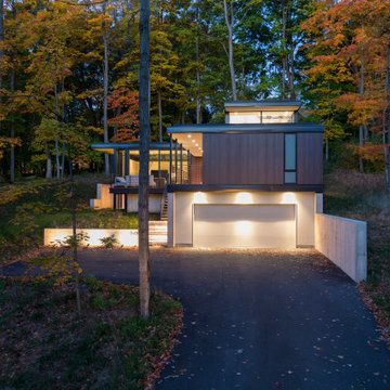
The client’s request was quite common - a typical 2800 sf builder home with 3 bedrooms, 2 baths, living space, and den. However, their desire was for this to be “anything but common.” The result is an innovative update on the production home for the modern era, and serves as a direct counterpoint to the neighborhood and its more conventional suburban housing stock, which focus views to the backyard and seeks to nullify the unique qualities and challenges of topography and the natural environment.
The Terraced House cautiously steps down the site’s steep topography, resulting in a more nuanced approach to site development than cutting and filling that is so common in the builder homes of the area. The compact house opens up in very focused views that capture the natural wooded setting, while masking the sounds and views of the directly adjacent roadway. The main living spaces face this major roadway, effectively flipping the typical orientation of a suburban home, and the main entrance pulls visitors up to the second floor and halfway through the site, providing a sense of procession and privacy absent in the typical suburban home.
Clad in a custom rain screen that reflects the wood of the surrounding landscape - while providing a glimpse into the interior tones that are used. The stepping “wood boxes” rest on a series of concrete walls that organize the site, retain the earth, and - in conjunction with the wood veneer panels - provide a subtle organic texture to the composition.
The interior spaces wrap around an interior knuckle that houses public zones and vertical circulation - allowing more private spaces to exist at the edges of the building. The windows get larger and more frequent as they ascend the building, culminating in the upstairs bedrooms that occupy the site like a tree house - giving views in all directions.
The Terraced House imports urban qualities to the suburban neighborhood and seeks to elevate the typical approach to production home construction, while being more in tune with modern family living patterns.
Overview:
Elm Grove
Size:
2,800 sf,
3 bedrooms, 2 bathrooms
Completion Date:
September 2014
Services:
Architecture, Landscape Architecture
Interior Consultants: Amy Carman Design
 O’Hara Interiors
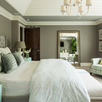
A great way to brighten up a bedroom is with painted nightstands. In this case, we wanted to maintain a calming environment with neutral wall colors and bedding. To add a bit of cheer to the space, we upholstered two lounge chairs and painted both nightstands similar shaded of aqua. Martha O'Hara Interiors, Interior Design | L. Cramer Builders + Remodelers, Builder | Troy Thies, Photography | Shannon Gale, Photo Styling
Please Note: All “related,” “similar,” and “sponsored” products tagged or listed by Houzz are not actual products pictured. They have not been approved by Martha O’Hara Interiors nor any of the professionals credited. For information about our work, please contact design@oharainteriors.com.
Find the right local pro for your project
 Red House Remodeling
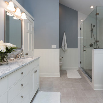
When Urbandale homeowners were ready to revamp their dated, two-room master bath, they turned to the excellent design/build staff at Red House Remodeling for feasibility, planning assistance, design and selection. The space, which was previously two rooms, was opened up and transformed into a relaxing retreat with clean lines, warm greys and lots of refreshing white.
Photos by Jake Boyd Photo
 Cindy Smetana Interiors
Martin King
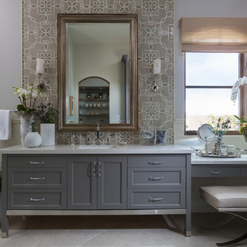
Large transitional master gray tile, white tile and mosaic tile gray floor and ceramic tile alcove shower photo in Orange County with an undermount sink, gray cabinets, gray walls, shaker cabinets, a two-piece toilet, quartz countertops and a hinged shower door
Large transitional master gray tile, white tile and mosaic tile gray floor and ceramic tile alcove shower photo in Orange County with an undermount sink, gray cabinets, gray walls, shaker cabinets, a two-piece toilet, quartz countertops and a hinged shower door
 Kitchen & Bath Concepts
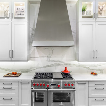
This dark and dated feeling kitchen and bar were completely renovated for this multi-generational global family. By re-configuring the space and incorporating the bar, removing several heavy columns and a wall, it made the kitchen open and accessible to the adjacent rooms and visible from the front door. Everything was lightened and brightened with new cabinetry, counter tops, appliances, flooring, paint, better windows, electrical and lighting. The old range top and down draft were enclosed in a massive brick structure, with no prep space, by removing it and centering the new range on the wall with a custom hood and full height stone back splash, a stunning focal point was created. The position of other key appliances and plumbing were moved or added to create several work stations throughout the large space, such as the refrigeration, full prep sink, coffee bar, baking station, cocktail bar and clean up island. Another special feature of this kitchen was roll out table from the end of the serving island.
Specialty features include:
A roll out table for eating, prep or serving; coffee bar and drink service area with beverage center; full size prep sink adjacent to refrigeration and cooking areas; steam oven and baking station; microwave/warming drawer; dual fuel range with double ovens, 6 burners and a griddle top; two separate islands, one for serving large family meals, one for clean up; specialty spice storage inserts and pull outs; corner turn outs for large items; two double pull outs for trash and recycling; stacked cabinetry with glass display at the top to take advantage of the 14' ceilings.
 Valentini Kids Furniture Brooklyn NY
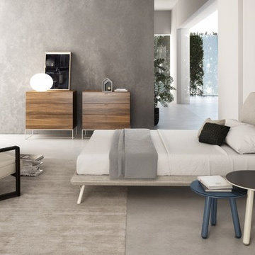
Modern Platform Bed / Bedroom Set Linea by Huppe Up Line
Made in Canada
Linea by Up Huppe is a new modern bedroom set with up-to-date European design and finest made in Canada quality. The Linea Bed is entirely upholstered in Fabric, Leatherette or genuine Leather available in a variety of colors. The Headboard is a bit curved, providing not only a superb look, but also extra comfort. The whole bed is supported by tubular steel legs lacquered in a matt color up to your choice. The Linea Bed as well as the optional casegoods are completely finished from all sides, allowing to place any piece of this bedroom set even in the center of your room. All the pieces within the Linea collection are made of wood veneer and solid Walnut, that can be ordered according to your choice in one of six available wood stain finishes. The interiors of the bedroom case goods are made of Birch that is also finished to protect your even the most delicate clothes. Moreover, the drawers are equipped with soft-closing hardware. Optional Nightstands, Dressers and Chests can be ordered either on short wooden legs or same as bed high steel metal legs.
Features:
Designed by Up Huppe
Bed is upholstered in fabric, eco-leather or leather of different colors
Metal legs available in a variety of matt lacquered colors
Case-goods structure is available in six walnut finishes
Case-goods are finished all around and equipped with self-clothing slow motion slides
Bed only requires a mattress that sits on a wooden platform with slats or panels
The starting price is for the Linea Queen size bed in Light Natural Walnut finish, Black #324 Lacquer and PL #060 Fabric Upholstery.
Dimensions:
Queen Size Bed: W67.5" x D94.8" x H40"
King Size Bed: W85" x D94.8" x H40"
1-Drawer Nightstand: W24" x D19" x H18"
2-Drawer Nightstand (wooden legs): W24" x D19" x H19"
2-Drawer Nightstand (metal base): W24" x D19" x H23.5"
6-Drawer Dresser (wooden legs): W70" x D19" x H24"
6-Drawer Dresser (metal base): W70" x D19" x H31"
3-Drawer Chest (wooden legs): W36" x D19" x H29"
3-Drawer Chest (metal base): W36" x D19" x H36.3"
5-Drawer Chest (wooden legs): W36" x D19" x H45.5"
5-Drawer Chest (metal base): W36" x D19" x H52.5"
Horizontal Mirror: W48" x D1.5" x H23"
Floor Mirror: W25" x D1.5" x H77"

Sponsored
Columbus, OH

Wannemacher Interiors
Customized Award-Winning Interior Design Solutions in Franklin Cnty OH
 Simply Home Decorating
This beautiful North Vancouver home belongs to a nature-loving and health-conscious couple, Emma and Vince (names changed), their two young children, and their dog, Jasper. When they contacted us about renovating and furnishing their kitchen and family room, we walked in and saw a world of potential waiting to be uncovered.
Before: Larkhall Crescent Home:
Like many original North Vancouver homes, the interior was definitely dated. We encountered late ‘80s finishes in powder pink and teal green, old carpet, and a kitchen that wasn’t maximized to suit this family’s modern-day lifestyle. However, the size of the rooms offered us a ton of space with which to get creative.
Knowing our clients’ love of cooking, need for work spaces (Emma and Vince both work remotely), and growing family, we developed a design concept that would increase usable space, optimize storage, and create intimacy in this large area. As for the style, we were inspired by their European roots, inventing a new and modern take on “Belgian Farmhouse” style. Now, the home is truly one-of-a-kind.
After: Warm & Cozy Family Room:
Fresh, bright, and comfortable, this living area has been transformed! We started with the fireplace as a focal point, selecting aged brick tiles for added texture and a crisp wood mantle. The taupe-coloured sectional infuses the room with visual warmth and serves the added purpose of separating the family room from the kitchen.
Emma and Vince were also keen on using non-toxic materials in their home, and we were happy to oblige. To meet their needs, we sourced natural wood elements and sought out Canadian-made products - that adhere to high health standards - whenever possible.
Look closer at the elements of this space, and you will find this stunning, honeycomb-patterned rug in earthy gold, beige, and charcoal tones. It’s plush to the touch and full of visual texture that brings this room’s colour palette together. We sourced these two-tone chairs with caning, petrified wood side table, black sconces, and botanical prints in greyscale from local artist, Heather Johnston.
We topped off the space with this dark wood and rattan console that offers storage facing the kitchen and presents an opportunity to display cherished items. The result is a cozy lounging space brimming with comfort and functionality. It’s perfect for enjoying quality family time, or Emma can simply slide the coffee table away to make room for her morning yoga practice.
Now, let’s turn around and give some attention to the kitchen. Do you remember what the original kitchen looked like? If not, scroll back up, because the transformation is shocking…
Moody & Welcoming Kitchen for Healthy Living:
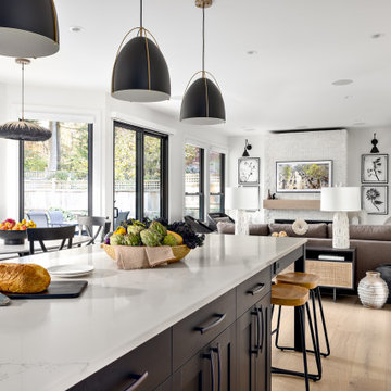
This kitchen looks very different from how it started, right? Though we didn’t touch any walls, the kitchen has almost doubled in usable space! We created a long, extended island with storage, an outlet for small appliances, and seating for comfortable prep, after-school snacking, or mingling among friends.
On the other side of the island, the family has even more storage and an integrated dishwasher within easy reach of the sink, perfect for quick clean-up. From this angle, you can also see the expansive custom Shaker cabinetry in white and the integrated double ovens. These facilitate their cooking experience and gave us the opportunity to add an additional surprise…
A coffee garage station and more hidden storage! Keeping these items located along the perimeter allows them to be accessed by the family or their guests without someone getting under the cook’s feet. These are the little details that make everyday life easier and more enjoyable.
Moving deeper into the kitchen, the seamless induction cooktop topped with a freestanding concealed hood fan commands attention in a soft yet prominent way. The natural wood accent mirrors the fireplace mantle, and the choice of off-black wood-grain cabinets not only continues our black-and-white colour palette but adds a sense of depth and contrast. The corner sink is located to the right and perfectly positioned with a view of their thriving backyard.
To invite more of this family’s character into the space, we mixed metals for interest — matte black, dark pewter, and warm brass — and created open shelves in white oak for their plants and decor. You can also glimpse the tumbled edge of the backsplash tile, which echoes the rustic brick of the fireplace. It adds that farmhouse charm while still feeling timeless and sophisticated.
Last but not least, we designed this dining banquette in the bay window (with integrated bench storage, of course), where the family can share a meal together, the kids can do homework, or Emma and Vince can work and enjoy a change of scenery from their offices. Like the other spaces in the home, it was designed to be beautiful, multi-functional, and long-lasting.
Praise from Our Clients:
It is clear that we love this home, but what did our clients have to say?
“Lori is a visionary and masters execution to the finest detail all at the same time. When she first met us to know more about who we are and how we live, she could right away envision how we could use the space in our kitchen and living room…The results exceeded our expectations.
Lori and her team were also a delight to work with — coordination with all the trades, fast problem-solving, regular updates, professional and friendly attitude of her entire team — made it the dream team. Thank you SHD for making our space so beautiful!”
In turn, we are so grateful for this family’s trust, their open communication, and for being wonderful people with whom to work. (So, thank you!)
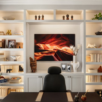
 Spaces Designed, Interior Design Studio, LLC
It is an especially fulfilling Project for an Interior Designer when the outcome exceeds Client expectations, and imagination. This remodeling project required instilling modern sensibilities, openness, styles and textures into a dated house that was past its prime. Strategically, the goal was to tear down where it made sense without doing a complete teardown.
Starting with the soul of the home, the kitchen, we expanded out room by room to create a cohesiveness and flow that invites, supports and provides the warmth and relaxation that only a home can.
In the Kitchen, we started by removing the wooden beams and adding bright recessed lighting. We removed the old limestone accent wall and moved the sink and cooktop from the island on to the countertop – the key goal was to create room for the family to gather around the kitchen. We replaced all appliances with modern Energy Star ones, along with adding a wine rack.
The first order of business for the Living Room was to brighten it up by adding more lighting and replacing an unused section with a glass door to the backyard. Multi-section windows were replaced with large no-split glass overlooking the backyard. Once more, the limestone accent was removed to create a clean, modern look. Replacing the dated wooden staircase with the clean lines of a metal, wire and wooded staircase added interest and freshness. An odd bend in the staircase was removed to clean things up.
The flooring was upgraded throughout the house to reflect the contemporary color scheme.
Each of the smaller bedrooms were similarly upgraded to match the clean and modern décor of the rest of the house.
After such a transformation inside, it was only appropriate that the exterior needed an upgrade as well. All of the legacy limestone accents were replaced by stucco and the color scheme extended from the interior of the house to the gorgeous wrap around balconies, trim, garage doors etc. to complete the inside outside transformation.
 TKS Design Group
Download our free ebook, Creating the Ideal Kitchen. DOWNLOAD NOW
This homeowner’s daughter originally contacted us on behalf of her parents who were reluctant to begin the remodeling process in their home due to the inconvenience and dust. Once we met and they dipped their toes into the process, we were off to the races. The existing bathroom in this beautiful historical 1920’s home, had not been updated since the 70’/80’s as evidenced by the blue carpeting, mirrored walls and dropped ceilings. In addition, there was very little storage, and some health setbacks had made the bathroom difficult to maneuver with its tub shower.
Once we demoed, we discovered everything we expected to find in a home that had not been updated for many years. We got to work bringing all the electrical and plumbing up to code, and it was just as dusty and dirty as the homeowner’s anticipated! Once the space was demoed, we got to work building our new plan. We eliminated the existing tub and created a large walk-in curb-less shower.
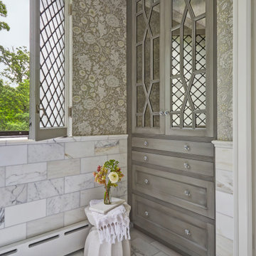
An existing closet was eliminated and in its place, we planned a custom built in with spots for linens, jewelry and general storage. Because of the small space, we had to be very creative with the shower footprint, so we clipped one of the walls for more clearance behind the sink. The bathroom features a beautiful custom mosaic floor tile as well as tiled walls throughout the space. This required lots of coordination between the carpenter and tile setter to make sure that the framing and tile design were all properly aligned. We worked around an existing radiator and a unique original leaded window that was architecturally significant to the façade of the home. We had a lot of extra depth behind the original toilet location, so we built the wall out a bit, moved the toilet forward and then created some extra storage space behind the commode. We settled on mirrored mullioned doors to bounce lots of light around the smaller space.
We also went back and forth on deciding between a single and double vanity, and in the end decided the single vanity allowed for more counter space, more storage below and for the design to breath a bit in the smaller space. I’m so happy with this decision! To build on the luxurious feel of the space, we added a heated towel bar and heated flooring.
One of the concerns the homeowners had was having a comfortable floor to walk on. They realized that carpet was not a very practical solution but liked the comfort it had provided. Heated floors are the perfect solution. The room is decidedly traditional from its intricate mosaic marble floor to the calacutta marble clad walls. Elegant gold chandelier style fixtures, marble countertops and Morris & Co. beaded wallpaper provide an opulent feel to the space.
The gray monochromatic pallet keeps it feeling fresh and up-to-date. The beautiful leaded glass window is an important architectural feature at the front of the house. In the summertime, the homeowners love having the window open for fresh air and ventilation. We love it too!
The curb-less shower features a small fold down bench that can be used if needed and folded up when not. The shower also features a custom niche for storing shampoo and other hair products. The linear drain is built into the tilework and is barely visible. A frameless glass door that swings both in and out completes the luxurious feel.
Designed by: Susan Klimala, CKD, CBD
Photography by: Michael Kaskel
For more information on kitchen and bath design ideas go to: www.kitchenstudio-ge.com
 The Cousins
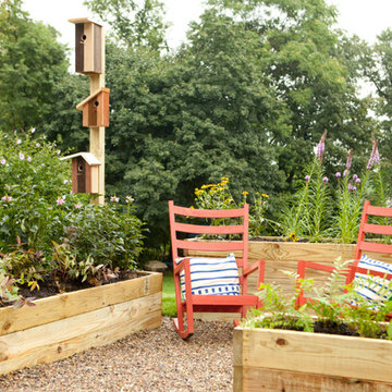
The new backyard is perfect for entertaining large groups, hosting intimate dinners, or relaxing. Birdhouses and plants line the new space and a pergola shades a table for al fresco dining. A pass-through into the basement allows guests to pull a stool right up to the bar.
 Signature Designs Kitchen | Bath | Interiors
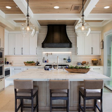
Our client desired a bespoke farmhouse kitchen and sought unique items to create this one of a kind farmhouse kitchen their family. We transformed this kitchen by changing the orientation, removed walls and opened up the exterior with a 3 panel stacking door.
The oversized pendants are the subtle frame work for an artfully made metal hood cover. The statement hood which I discovered on one of my trips inspired the design and added flare and style to this home.
Nothing is as it seems, the white cabinetry looks like shaker until you look closer it is beveled for a sophisticated finish upscale finish.
The backsplash looks like subway until you look closer it is actually 3d concave tile that simply looks like it was formed around a wine bottle.
We added the coffered ceiling and wood flooring to create this warm enhanced featured of the space. The custom cabinetry then was made to match the oak wood on the ceiling. The pedestal legs on the island enhance the characterizes for the cerused oak cabinetry.
Fabulous clients make fabulous projects.
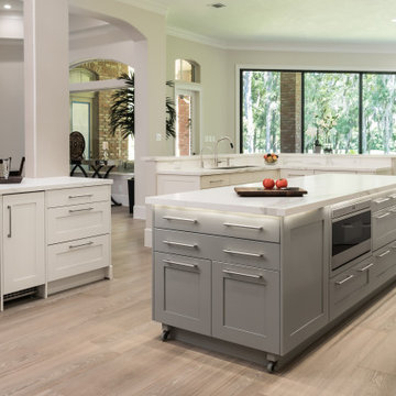 Kitchen & Bath Concepts
This dark and dated feeling kitchen and bar were completely renovated for this multi-generational global family. By re-configuring the space and incorporating the bar, removing several heavy columns and a wall, it made the kitchen open and accessible to the adjacent rooms and visible from the front door. Everything was lightened and brightened with new cabinetry, counter tops, appliances, flooring, paint, better windows, electrical and lighting. The old range top and down draft were enclosed in a massive brick structure, with no prep space, by removing it and centering the new range on the wall with a custom hood and full height stone back splash, a stunning focal point was created. The position of other key appliances and plumbing were moved or added to create several work stations throughout the large space, such as the refrigeration, full prep sink, coffee bar, baking station, cocktail bar and clean up island. Another special feature of this kitchen was roll out table from the end of the serving island.
Specialty features include:
A roll out table for eating, prep or serving; coffee bar and drink service area with beverage center; full size prep sink adjacent to refrigeration and cooking areas; steam oven and baking station; microwave/warming drawer; dual fuel range with double ovens, 6 burners and a griddle top; two separate islands, one for serving large family meals, one for clean up; specialty spice storage inserts and pull outs; corner turn outs for large items; two double pull outs for trash and recycling; stacked cabinetry with glass display at the top to take advantage of the 14' ceilings.

Sponsored
Columbus, OH
Free consultation for landscape design!

Peabody Landscape Group
Columbus' Reliable Landscape Design & Contracting
 Aspen Kitchens Inc.
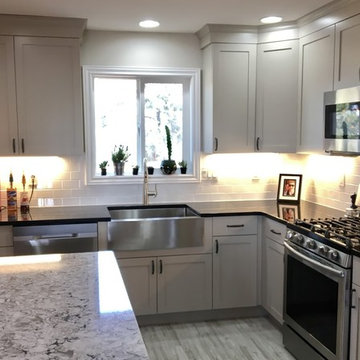
Amazing transformation in a small space. We took the walls down around the main vent chase to open the space to the dining and living room, removed soffits, and brought the kitchen up to date with taupe painted cabinets, a knotty alder island, black granite and Cambria Bellingham counters, a custom Edison bulb chandelier, stainless appliances and the stunning farm sink, and clean classic subway tile.
 Davida's Kitchen & Tiles
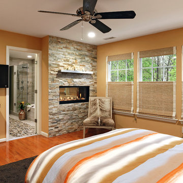
View of the Master Bedroom - The beautiful fireplace in the bathroom is double sided and can be enjoyed in the master bedroom as well. We covered the fireplace wall with a accent stacked stone. Top-down bottom-up woven shades on the windows allow in natural light while still providing privacy.
Photo: Bob Narod
 Reitz Builders
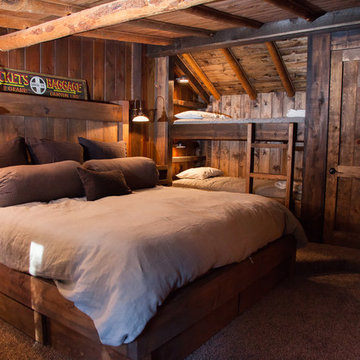
A fully built in bunk room creates space where it's usually a hassle. each set of beds has a set of drawers, and the king bed has 4 fully extendable drawers making it perfect for blanket and linen storage.The Restoration Hardware lighting does a fantastic job of lighting up the bunks and master bed.Photos by:Ryan Williams Photography
 Meadow Mountain Homes
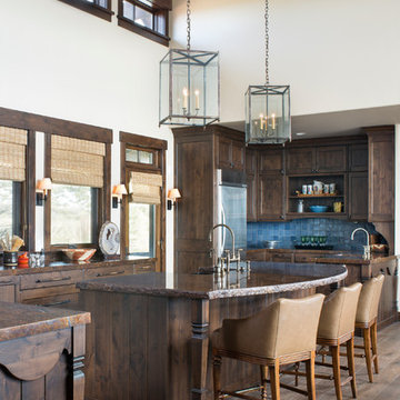
Eat-in kitchen - rustic u-shaped dark wood floor eat-in kitchen idea in Denver with dark wood cabinets, blue backsplash, an island, a farmhouse sink, glass tile backsplash and stainless steel appliances

Sponsored
Sunbury, OH

J.Holderby - Renovations
Franklin County's Leading General Contractors - 2X Best of Houzz!
 Howell Custom Building Group
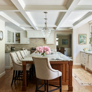
The goal was to update this 1990's colonial's dated kitchen to improve traffic flow, increase natural light, and create a more functional and integrated connection to the outdoor pool and deck, where the family regularly entertains. The original kitchen had narrow work corridors and poor cabinet storage. Along the back of the kitchen, on the poolside, a 22’ wide by 4’ deep bump out replaced a small existing bump out. A coffered ceiling with crown molding was created, adding elegance and giving the sensation of higher ceilings. The new bump out, which has 9’ ceilings and a wall of large windows, floods the kitchen with light and backyard views. The new bump out features large, passthrough sliding windows, overlooking the pool deck, offering easy access to a floating counter for serving. Screens roll up inside mullion pockets, so the windows do not need to be kept open while serving. The bump out created space for a massive kitchen island with leathered granite counter, anchoring the room. It’s large enough for the kids to do their homework, while Mom and Dad prepare meals. The result is a bright, stylish, more functional kitchen that is better connected to the outdoors and to the rest of the home.
 Kimberlee Marie Interiors
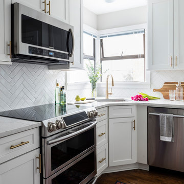
When my clients purchased this charming 1940's home in the Seattle neighborhood of Wedgwood, they were amazed by how intact the original kitchen was. It was like a perfect time capsule. The color palette was avocado green and buttercream yellow. The highlights were an original retro built-in banquette and vintage oven! The challenge we faced (besides the awesome but dated finishes) was the closed floor plan typical in this era of homes and the lack of storage. So, we opened the kitchen to the adjacent dining and living room, bringing it up to speed with modern-day living. In opening it up, we also walled off a doorway that went from the kitchen to the hallway, but it was completely unnecessary and allowed us to gain an entire wall of cabinets that didn't exist previously.
For the finishes, we kept it classic with mostly gray and white but brought in a little flare and interest with the herringbone backsplash and brushed brass finishes because who doesn't love a little gold? Also, we added color with the finishing details like the rug and countertop decor because those things are a great way to add interest and warmth to a space and can be easily changed when it's time for a fresh new look.

17