
Search results for "Extraneous up to dateness" in Home Design Ideas
 Alair Homes Plano
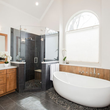
Our clients drastically needed to update this master suite from the original forest green floral wallpaper to something more clean and simple. They wanted to open up the dated cultured marble enclosed tub and shower and remove all soffits and plant ledges above the vanities. They wanted to explore the possibilities of opening up the shower with glass and look at installing a freestanding bathtub and they definitely wanted to keep the double sided fireplace but update the look of it.
First off, we did some minor changes to the bedroom. We replaced the carpet with a beautiful soft multi-color gray low pile carpet and painted the walls a soft white. The fireplace surround was replaced with Carrara 12×12 polished porcelain tile for a more elegant look. Finally, we tore out a corner built in desk and squared off and textured the wall, making it look as though it were never there.
We needed to strip this bathroom down and start from scratch. We demoed the cabinets, counter tops, all plumbing fixtures, ceiling fan, track lighting, tub and tub surround, fireplace surround, shower door, shower walls and ceiling above the shower, all flooring, soffits above vanity areas, saloon doors on the water closet and of course the wallpaper!
We changed the walls around the shower to pony walls with glass on the upper half, opening up the shower. The tile was lined with Premium Antasit 12×24 tile installed vertically in a 50/50 brick pattern. The shower floor and the floor below the tub is Solo River Grey Pebble mosaic tile. A contemporary Jaclo Collection shower system was installed including a contemporary handshower and square shower head. The large freestanding tub is a white Hydro Sytsems “Picasso” with “Steelnox” wall mounted tub filler and hardware from Graff.
All of the cabinets were replaced with Waypoint maple mocha glazed flat front doors and drawers. Quartzmasters Calacatta Grey countertops were installed with 2 Icera “Muse” undermount sinks for a clean modern look. The cabinet hardware the clients chose is ultra modern ”Sutton” from Hardware Resources and the faucet and other hardware is all from the Phylrich “Mix” collection.
Pulling it all together, Premium Antasit 12×14 installed floor tile was installed in a 50/50 brick pattern. The pebble tile that was installed in the shower floor was also installed in an oval shape under the bathtub for a great modern look and to break up the solid gray flooring.
Addison Oak Wood planks were installed vertically behind the bathtub, below the fireplace surround and behind the potty for a modern finished look. The fireplace was surrounded with Carrara 12×12 polished porcelain, as well as the wood planks. Finally, to add the finishing touches, Z-Lite brushed nickel vanity lights were installed above each vanity sink. The clients are so pleased to be able to enjoy and relax in their new contemporary bathroom!
 Sherri Blum | Jack and Jill Interiors, Inc.
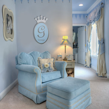
This nursery was a Gender Surprise Nursery and was one of our most memorable designs to date. The client was having her second baby and didn't want to know the baby's gender, yet wanted to have an over-the-top, elegant royal nursery completed to her liking before she had the baby. So we designed two complete nurseries down to every detail...one for a boy and one for a girl. Then when the mom-to-be went for her ultrasound, the doctor sealed up a picture in an envelope and mailed it to our studio. I couldn't wait for the secret to be revealed and was so tickled to be the only person besides the doctor to know the gender of the baby! I opened the envelop and saw an obvious BOY in the image and got right to work ordering up all of the appropriate boy nursery furniture, bedding, wall art, lighting and decor. We had to stage most of the nursery's decor here in our studio and when the furniture was set to arrive, we drove to NJ, the family left the house, and we kicked into gear receiving the nursery furniture and installing the crib bedding, wall art, rug, and accessories down to the tiniest little detail. We completed the decorative mural around the room and when finished, locked the door behind us! We even taped paper over the windows and taped around the outside of the door so no "glow" might show through the door crack at night! The nursery would sit and wait for Mommy and baby to arrive home from the hospital. Such a fun project and so full of excitement and anticipation. When Mom and baby Luke arrived home from the hospital and she saw her nursery for the first time, she contacted me and said "the nursery is breath taking and made me cry!" I love a happy ending...don't you?
Photo by: Linda Birdsall Photo by: Linda Birdsall http://www.portraitartistrybylindamarie.com
 designstiles
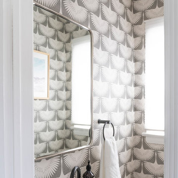
The client wanted to turn her tiny plain powder room into something her guest would enjoy. We updated the sink, faucet, hardware, mirror and lighting freshen up this dated bathroom. The wallpaper actually makes the room feel larger and welcoming!
Photography by: Annie Meisel
Find the right local pro for your project
 Howells Architecture + Design
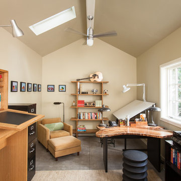
We designed this writer's studio in tandem with an urban backyard and hardscaping renovation. Originally this building was to be a new garage, but the owner liked it so much that halfway through the process, he decided to forgo a garage in favor of an office.
Photo: Anna M Campbell: annamcampbell.com
 San Luis Kitchen Co.
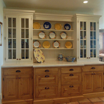
The owners of a charming home in the hills west of Paso Robles recently decided to remodel their not-so-charming kitchen. Referred to San Luis Kitchen by several of their friends, the homeowners visited our showroom and soon decided we were the best people to design a kitchen fitting the style of their home. We were delighted to get to work on the project right away.
When we arrived at the house, we found a small, cramped and out-dated kitchen. The ceiling was low, the cabinets old fashioned and painted a stark dead white, and the best view in the house was neglected in a seldom-used breakfast nook (sequestered behind the kitchen peninsula). This kitchen was also handicapped by white tile counters with dark grout, odd-sized and cluttered cabinets, and small ‘desk’ tacked on to the side of the oven cabinet. Due to a marked lack of counter space & inadequate storage the homeowner had resorted to keeping her small appliances on a little cart parked in the corner and the garbage was just sitting by the wall in full view of everything! On the plus side, the kitchen opened into a nice dining room and had beautiful saltillo tile floors.
Mrs. Homeowner loves to entertain and often hosts dinner parties for her friends. She enjoys visiting with her guests in the kitchen while putting the finishing touches on the evening’s meal. Sadly, her small kitchen really limited her interactions with her guests – she often felt left out of the mix at her own parties! This savvy homeowner dreamed big – a new kitchen that would accommodate multiple workstations, have space for guests to gather but not be in the way, and maybe a prettier transition from the kitchen to the dining (wine service area or hutch?) – while managing the remodel budget by reusing some of her major appliances and keeping (patching as needed) her existing floors.
Responding to the homeowner’s stated wish list and the opportunities presented by the home's setting and existing architecture, the designers at San Luis Kitchen decided to expand the kitchen into the breakfast nook. This change allowed the work area to be reoriented to take advantage of the great view – we replaced the existing window and added another while moving the door to gain space. A second sink and set of refrigerator drawers (housing fresh fruits & veggies) were included for the convenience of this mainly vegetarian cook – her prep station. The clean-up area now boasts a farmhouse style single bowl sink – adding to the ‘cottage’ charm. We located a new gas cook-top between the two workstations for easy access from each. Also tucked in here is a pullout trash/recycle cabinet for convenience and additional drawers for storage.
Running parallel to the work counter we added a long butcher-block island with easy-to-access open shelves for the avid cook and seating for friendly guests placed just right to take in the view. A counter-top garage is used to hide excess small appliances. Glass door cabinets and open shelves are now available to display the owners beautiful dishware. The microwave was placed inconspicuously on the end of the island facing the refrigerator – easy access for guests (and extraneous family members) to help themselves to drinks and snacks while staying out of the cook’s way.
We also moved the pantry storage away from the dining room (putting it on the far wall and closer to the work triangle) and added a furniture-like hutch in its place allowing the more formal dining area to flow seamlessly into the up-beat work area of the kitchen. This space is now also home (opposite wall) to an under counter wine refrigerator, a liquor cabinet and pretty glass door wall cabinet for stemware storage – meeting Mr. Homeowner’s desire for a bar service area.
And then the aesthetic: an old-world style country cottage theme. The homeowners wanted the kitchen to have a warm feel while still loving the look of white cabinetry. San Luis Kitchen melded country-casual knotty pine base cabinets with vintage hand-brushed creamy white wall cabinets to create the desired cottage look. We also added bead board and mullioned glass doors for charm, used an inset doorstyle on the cabinets for authenticity, and mixed stone and wood counters to create an eclectic nuance in the space. All in all, the happy homeowners now boast a charming county cottage kitchen with plenty of space for entertaining their guests while creating gourmet meals to feed them.
Credits:
Custom cabinetry by Wood-Mode Fine Custom Cabinetry
Contracting by Michael Pezzato of Lost Coast Construction
Stone counters by Pyramid M.T.M.
 Oliver Designs
Photo by Christopher Carter
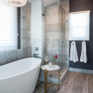
Inspiration for a mid-sized transitional master gray tile and marble tile porcelain tile and gray floor bathroom remodel in Denver with a hinged shower door, black walls, marble countertops and gray countertops
Inspiration for a mid-sized transitional master gray tile and marble tile porcelain tile and gray floor bathroom remodel in Denver with a hinged shower door, black walls, marble countertops and gray countertops
 Robert Frank Interiors
Clark Dugger Photography
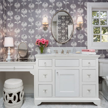
Example of a small classic kids' mosaic tile floor bathroom design in Los Angeles with an undermount sink, beaded inset cabinets, white cabinets, marble countertops and multicolored walls
Example of a small classic kids' mosaic tile floor bathroom design in Los Angeles with an undermount sink, beaded inset cabinets, white cabinets, marble countertops and multicolored walls

Sponsored
Columbus, OH

Structural Remodeling
Franklin County's Heavy Timber Specialists | Best of Houzz 2020!
 KS Designs LLC
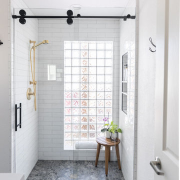
This guest bath has a light and airy feel with an organic element and pop of color. The custom vanity is in a midtown jade aqua-green PPG paint Holy Glen. It provides ample storage while giving contrast to the white and brass elements. A playful use of mixed metal finishes gives the bathroom an up-dated look. The 3 light sconce is gold and black with glass globes that tie the gold cross handle plumbing fixtures and matte black hardware and bathroom accessories together. The quartz countertop has gold veining that adds additional warmth to the space. The acacia wood framed mirror with a natural interior edge gives the bathroom an organic warm feel that carries into the curb-less shower through the use of warn toned river rock. White subway tile in an offset pattern is used on all three walls in the shower and carried over to the vanity backsplash. The shower has a tall niche with quartz shelves providing lots of space for storing shower necessities. The river rock from the shower floor is carried to the back of the niche to add visual interest to the white subway shower wall as well as a black Schluter edge detail. The shower has a frameless glass rolling shower door with matte black hardware to give the this smaller bathroom an open feel and allow the natural light in. There is a gold handheld shower fixture with a cross handle detail that looks amazing against the white subway tile wall. The white Sherwin Williams Snowbound walls are the perfect backdrop to showcase the design elements of the bathroom.
Photography by LifeCreated.
 Design Harmony
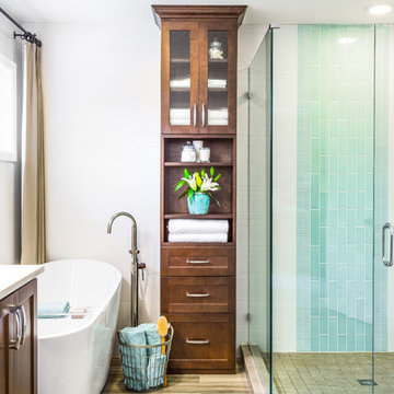
Two different accent tiles make a statement and add a pop of color against the large white wall tiles in the custom shower. Frameless glass creates a custom and modern feel to the space.
This small powder bath lacked interest and was quite dark despite having a window.
We added white horizontal tongue & groove on the lower portion of the room with a warm graphic wallpaper above.
A custom white cabinet with a waterfall grey and white granite counter gave the vanity some personality.
New crown molding, window casings, taller baseboards and white wood blinds made impact to the small room.
We also installed a modern pendant light and a rustic oval mirror which adds character to the space.
BEFORE
Though this bathroom had a good layout, everything was just really outdated. We added tile from floor to ceiling for a spa like feel. We kept the color palette neutral and timeless. The dark cheery cabinet was elegantly finished with crystal knobs and a cararra marble countertop.
AFTER
AFTER
BEFORE
There was an underutilized corner between the vanity and the shower that was basically wasted space.
To give the corner a purpose, we added a make-up vanity in white with a custom made stool.
Oversized subway tiles were added to the shower, along with a rain shower head, for a clean and timeless look. We also added a new frosted glass door to the walk-in closet to let the light in.
BEFORE
These beautiful oval pivot mirrors are not only functional but also showcase the cararra marble on the wall. Unique glass pendants are a dramatic addition to the space as is the ikat wallpaper in the WC. To finish out the vanity space we added a shallow white upper cabinet for additional storage.
BEFORE
AFTER
AFTER
The best part of this remodel? Tearing out the awful, dated carpet! We chose porcelain tile with the look of hardwoods for a more functional and modern space.
Curtains soften the corner while creating privacy and framing the soaking tub.
Photo Credit: Holland Photography - Cory Holland - HollandPhotography.biz
 Vetter Architects
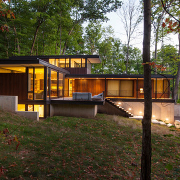
The client’s request was quite common - a typical 2800 sf builder home with 3 bedrooms, 2 baths, living space, and den. However, their desire was for this to be “anything but common.” The result is an innovative update on the production home for the modern era, and serves as a direct counterpoint to the neighborhood and its more conventional suburban housing stock, which focus views to the backyard and seeks to nullify the unique qualities and challenges of topography and the natural environment.
The Terraced House cautiously steps down the site’s steep topography, resulting in a more nuanced approach to site development than cutting and filling that is so common in the builder homes of the area. The compact house opens up in very focused views that capture the natural wooded setting, while masking the sounds and views of the directly adjacent roadway. The main living spaces face this major roadway, effectively flipping the typical orientation of a suburban home, and the main entrance pulls visitors up to the second floor and halfway through the site, providing a sense of procession and privacy absent in the typical suburban home.
Clad in a custom rain screen that reflects the wood of the surrounding landscape - while providing a glimpse into the interior tones that are used. The stepping “wood boxes” rest on a series of concrete walls that organize the site, retain the earth, and - in conjunction with the wood veneer panels - provide a subtle organic texture to the composition.
The interior spaces wrap around an interior knuckle that houses public zones and vertical circulation - allowing more private spaces to exist at the edges of the building. The windows get larger and more frequent as they ascend the building, culminating in the upstairs bedrooms that occupy the site like a tree house - giving views in all directions.
The Terraced House imports urban qualities to the suburban neighborhood and seeks to elevate the typical approach to production home construction, while being more in tune with modern family living patterns.
Overview:
Elm Grove
Size:
2,800 sf,
3 bedrooms, 2 bathrooms
Completion Date:
September 2014
Services:
Architecture, Landscape Architecture
Interior Consultants: Amy Carman Design
 Spazio LA
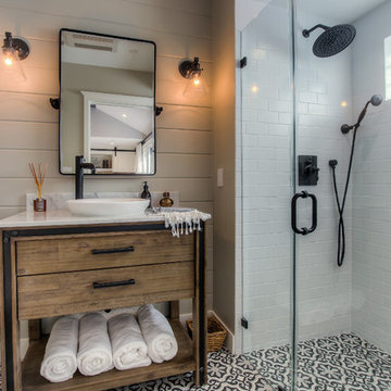
This beautiful bathroom features cement tiles (from Cement Tile Shop) on the floors with an infinity drain a custom frameless shower door and custom lighting. Vanity is Signature Hardware, and mirror is from Pottery Barn.
 Advance Design Studio, Ltd.
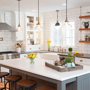
When this suburban family decided to renovate their kitchen, they knew that they wanted a little more space. Advance Design worked together with the homeowner to design a kitchen that would work for a large family who loved to gather regularly and always ended up in the kitchen! So the project began with extending out an exterior wall to accommodate a larger island and more moving-around space between the island and the perimeter cabinetry.
Style was important to the cook, who began collecting accessories and photos of the look she loved for months prior to the project design. She was drawn to the brightness of whites and grays, and the design accentuated this color palette brilliantly with the incorporation of a warm shade of brown woods that originated from a dining room table that was a family favorite. Classic gray and white cabinetry from Dura Supreme hits the mark creating a perfect balance between bright and subdued. Hints of gray appear in the bead board detail peeking just behind glass doors, and in the application of the handsome floating wood shelves between cabinets. White subway tile is made extra interesting with the application of dark gray grout lines causing it to be a subtle but noticeable detail worthy of attention.
Suede quartz Silestone graces the countertops with a soft matte hint of color that contrasts nicely with the presence of white painted cabinetry finished smartly with the brightness of a milky white farm sink. Old melds nicely with new, as antique bronze accents are sprinkled throughout hardware and fixtures, and work together unassumingly with the sleekness of stainless steel appliances.
The grace and timelessness of this sparkling new kitchen maintains the charm and character of a space that has seen generations past. And now this family will enjoy this new space for many more generations to come in the future with the help of the team at Advance Design Studio.
Photographer: Joe Nowak
Dura Supreme Cabinetry
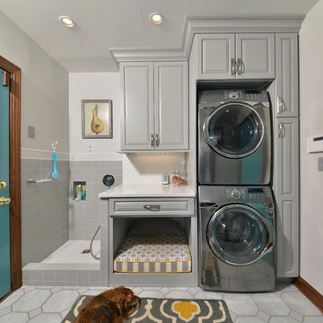
 Artistic Renovations of Ohio LLC
this dog wash is a great place to clean up your pets and give them the spa treatment they deserve. There is even an area to relax for your pet under the counter in the padded cabinet.
Sponsored
Sunbury, OH

J.Holderby - Renovations
Franklin County's Leading General Contractors - 2X Best of Houzz!
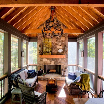
 Atlanta Porch & Patio
Cedar rafters and ceiling in a screened porch with Brazilian hardwoods. Wood burning fieldstone fireplace.
At Atlanta Porch & Patio we are dedicated to building beautiful custom porches, decks, and outdoor living spaces throughout the metro Atlanta area. Our mission is to turn our clients’ ideas, dreams, and visions into personalized, tangible outcomes. Clients of Atlanta Porch & Patio rest easy knowing each step of their project is performed to the highest standards of honesty, integrity, and dependability. Our team of builders and craftsmen are licensed, insured, and always up to date on trends, products, designs, and building codes. We are constantly educating ourselves in order to provide our clients the best services at the best prices.
We deliver the ultimate professional experience with every step of our projects. After setting up a consultation through our website or by calling the office, we will meet with you in your home to discuss all of your ideas and concerns. After our initial meeting and site consultation, we will compile a detailed design plan and quote complete with renderings and a full listing of the materials to be used. Upon your approval, we will then draw up the necessary paperwork and decide on a project start date. From demo to cleanup, we strive to deliver your ultimate relaxation destination on time and on budget.
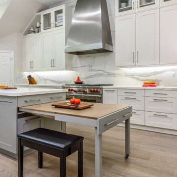
 Kitchen & Bath Concepts
This dark and dated feeling kitchen and bar were completely renovated for this multi-generational global family. By re-configuring the space and incorporating the bar, removing several heavy columns and a wall, it made the kitchen open and accessible to the adjacent rooms and visible from the front door. Everything was lightened and brightened with new cabinetry, counter tops, appliances, flooring, paint, better windows, electrical and lighting. The old range top and down draft were enclosed in a massive brick structure, with no prep space, by removing it and centering the new range on the wall with a custom hood and full height stone back splash, a stunning focal point was created. The position of other key appliances and plumbing were moved or added to create several work stations throughout the large space, such as the refrigeration, full prep sink, coffee bar, baking station, cocktail bar and clean up island. Another special feature of this kitchen was roll out table from the end of the serving island.
Specialty features include:
A roll out table for eating, prep or serving; coffee bar and drink service area with beverage center; full size prep sink adjacent to refrigeration and cooking areas; steam oven and baking station; microwave/warming drawer; dual fuel range with double ovens, 6 burners and a griddle top; two separate islands, one for serving large family meals, one for clean up; specialty spice storage inserts and pull outs; corner turn outs for large items; two double pull outs for trash and recycling; stacked cabinetry with glass display at the top to take advantage of the 14' ceilings.
 TVL Creative Ltd.
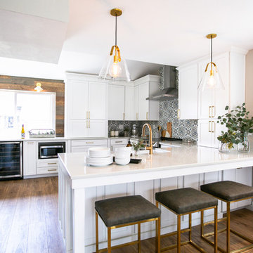
This kitchen took a tired, 80’s builder kitchen and revamped it into a personalized gathering space for our wonderful client. The existing space was split up by the dated configuration of eat-in kitchen table area to one side and cramped workspace on the other. It didn’t just under-serve our client’s needs; it flat out discouraged them from using the space. Our client desired an open kitchen with a central gathering space where family and friends could connect. To open things up, we removed the half wall separating the kitchen from the dining room and the wall that blocked sight lines to the family room and created a narrow hallway to the kitchen. The old oak cabinets weren't maximizing storage and were dated and dark. We used Waypoint Living Spaces cabinets in linen white to brighten up the room. On the east wall, we created a hutch-like stack that features an appliance garage that keeps often used countertop appliance on hand but out of sight. The hutch also acts as a transition from the cooking zone to the coffee and wine area. We eliminated the north window that looked onto the entry walkway and activated this wall as storage with refrigerator enclosure and pantry. We opted to leave the east window as-is and incorporated it into the new kitchen layout by creating a window well for growing plants and herbs. The countertops are Pental Quartz in Carrara. The sleek cabinet hardware is from our friends at Amerock in a gorgeous satin champagne bronze. One of the most striking features in the space is the pattern encaustic tile from Tile Shop. The pop of blue in the backsplash adds personality and contrast to the champagne accents. The reclaimed wood cladding surrounding the large east-facing window introduces a quintessential Colorado vibe, and the natural texture balances the crisp white cabinetry and geometric patterned tile. Minimalist modern lighting fixtures from Mitzi by Hudson Valley Lighting provide task lighting over the sink and at the wine/ coffee station. The visual lightness of the sink pendants maintains the openness and visual connection between the kitchen and dining room. Together the elements make for a sophisticated yet casual vibe-- a comfortable chic kitchen. We love the way this space turned out and are so happy that our clients now have such a bright and welcoming gathering space as the heart of their home!
 TKS Design Group
Download our free ebook, Creating the Ideal Kitchen. DOWNLOAD NOW
Lakefront property in the northwest suburbs of Chicago is hard to come by, so when we were hired by this young family with exactly that, we were immediately inspired by not just the unusually large footprint of this 1950’s colonial revival but also the lovely views of the manmade lake it was sited on. The large 5-bedroom home was solidly stuck in the 1980’s, but we saw tons of potential. We started out by updating the existing staircase with a fresh coat of paint and adding new herringbone slate to the entry hall.
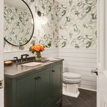
The powder room off the entryway also got a refresh - new flooring, new cabinets and fixtures. We ran the new slate right through into this space for some consistency. A fun wallpaper and shiplap trim add a welcoming feel and set the tone for the home.
Next, we tackled the kitchen. Located away from the rest of the first floor, the kitchen felt a little isolated, so we immediately began planning for how to better connect it to the rest of the first floor. We landed on removing the wall between the kitchen and dining room and designed a modified galley style space with separate cooking and clean up zones. The cooking zone consists of the refrigerator, prep sink and cooktop, along with a nice long run of prep space at the island. The cleanup side of the kitchen consists of the main sink and dishwasher. Both areas are situated so that the user can view the lake during prep work and cleanup!
One of the home’s main puzzles was how to incorporate the mudroom and area in front of the patio doors at the back of the house. We already had a breakfast table area, so the space by the patio doors was a bit of a no man’s land. We decided to separate the kitchen proper from what became the new mudroom with a large set of barn doors. That way you can quickly hide any mudroom messes but have easy access to the light coming in through the patio doors as well as the outdoor grilling station. We also love the impact the barn doors add to the overall space.
The homeowners’ first words to us were “it’s time to ditch the brown,” so we did! We chose a lovely blue pallet that reflects the home’s location on the lake which is also vibrant yet easy on the eye. Countertops are white quartz, and the natural oak floor works well with the other honey accents. The breakfast table was given a refresh with new chairs, chandelier and window treatments that frame the gorgeous views of the lake out the back.
We coordinated the slate mudroom flooring with that used in the home’s main entrance for a consistent feel. The storage area consists of open and closed storage to allow for some clutter control as needed.
Next on our “to do” list was revamping the dated brown bar area in the neighboring dining room. We eliminated the clutter by adding some closed cabinets and did some easy updates to help the space feel more current. One snag we ran into here was the discovery of a beam above the existing open shelving that had to be modified with a smaller structural beam to allow for our new design to work. This was an unexpected surprise, but in the end we think it was well worth it!
We kept the colors here a bit more muted to blend with the homeowner’s existing furnishings. Open shelving and polished nickel hardware add some simple detail to the new entertainment zone which also looks out onto the lake!
Next we tackled the upstairs starting with the homeowner’s son’s bath. The bath originally had both a tub shower and a separate shower, so we decided to swap out the shower for a new laundry area. This freed up some space downstairs in what used to be the mudroom/laundry room and is much more convenient for daily laundry needs.
We continued the blue palette here with navy cabinetry and the navy tile in the shower. Porcelain floor tile and chrome fixtures keep maintenance to a minimum while matte black mirrors and lighting add some depth the design. A low maintenance runner adds some warmth underfoot and ties the whole space together.
We added a pocket door to the bathroom to minimize interference with the door swings. The left door of the laundry closet is on a 180 degree hinge to allow for easy full access to the machines. Next we tackled the master bath which is an en suite arrangement. The original was typical of the 1980’s with the vanity outside of the bathroom, situated near the master closet. And the brown theme continued here with multiple shades of brown.
Our first move was to segment off the bath and the closet from the master bedroom. We created a short hall from the bedroom to the bathroom with his and hers walk-in closets on the left and right as well as a separate toilet closet outside of the main bathroom for privacy and flexibility.
The original bathroom had a giant soaking tub with steps (dangerous!) as well as a small shower that did not work well for our homeowner who is 6’3”. With other bathtubs in the home, they decided to eliminate the tub and create an oversized shower which takes up the space where the old tub was located. The double vanity is on the opposite wall and a bench is located under the window for morning conversations and a place to set a couple of towels.
The pallet in here is light and airy with a mix of blond wood, creamy porcelain and marble tile, and brass accents. A simple roman shade adds some texture and it’s top-down mechanism allows for light and privacy.
This large whole house remodel gave our homeowners not only the ability to maximize the potential of their home but also created a lovely new frame from which to view their fabulous lake views.
Designed by: Susan Klimala, CKD, CBD
Photography by: Michael Kaskel
For more information on kitchen and bath design ideas go to: www.kitchenstudio-ge.com


 AT&S Artistic Tile & Stone
Julie Mifsud Interior Design
www.juliemifsuddesign.com/
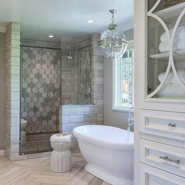
Inspiration for a timeless gray tile freestanding bathtub remodel in San Francisco with recessed-panel cabinets, white cabinets and gray walls
Inspiration for a timeless gray tile freestanding bathtub remodel in San Francisco with recessed-panel cabinets, white cabinets and gray walls

 LifeHouse Construction
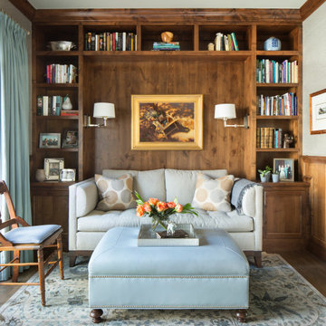
These homeowners purchased this house for their retirement years. To make their retirement even more sweet, we took this confined and dated home and opened it up by raising and widening doorways, replacing carpet with hardwoods, and bringing more light through the whole space. To add detail and visual interest, 2-piece casing and paneling were added in the main hallway. The custom master bathroom includes inset cabinetry and a curved tub panel. All of these changes refreshed the property, creating a clean, contemporary, and welcoming space to fully enjoy retirement.
Photos by Kimberly Gavin Photography
3