
Search results for "Eye level" in Home Design Ideas
 Inside Eye Design
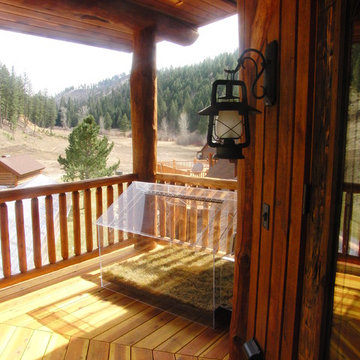
This massive remodel took an existing sad log home and revitalized it into a hybrid of styles. A small "area for doggie relief" was added with a doggie door directly into the master suite to beat the two levels of stairs that would otherwise have to be maneuvered on cold winter nights.
 Evil Eye Studio
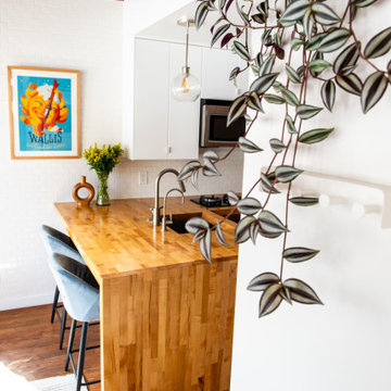
Wood Countertops with wood waterfall. Spiral staircase to upper level.
Eat-in kitchen - scandinavian l-shaped dark wood floor, brown floor and exposed beam eat-in kitchen idea in Salt Lake City with a drop-in sink, flat-panel cabinets, white cabinets, wood countertops, white backsplash, ceramic backsplash, stainless steel appliances, an island and brown countertops
Eat-in kitchen - scandinavian l-shaped dark wood floor, brown floor and exposed beam eat-in kitchen idea in Salt Lake City with a drop-in sink, flat-panel cabinets, white cabinets, wood countertops, white backsplash, ceramic backsplash, stainless steel appliances, an island and brown countertops
 Level One Construction
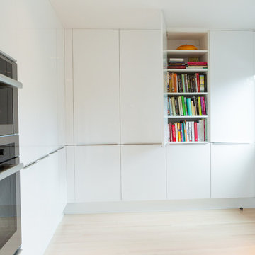
Seamless Elegance is a story bringing together both old and new. A cramped kitchen and a seldom-used den in a 100 year-old house were opened up to create a sprawling 300-sqft paradise. Obsessing over the little details was important to achieving our goal of seamless elegance.
The archway and molding detail between the dining and living room was perfectly mirrored between the dining room and kitchen, right down to the hidden closets. A faux brick wall painted white was added to the back wall of the kitchen to give the illusion that the previous expansion was always there.
The existing 1.5” wide beautiful oak hardwood floor was matched to the rest of the house and continued into the kitchen. The flooring throughout the house was re-done at the same time to solidify the marriage between old and new; the result was a seamless transition into functionality. The character brought into the space by the oak hardwood floor and brick wall off sets the contemporary high gloss white cabinets.
No upper cabinets were used in this design because we wanted to showcase the brick accent wall. The storage lost from zero upper kitchen cabinets was more than made up in floor-to-ceiling pantry. This corner pantry accommodates the bulk of storage for food and dishes in the kitchen. The subtraction of the upper cabinets allows the Tom Dixon pendant lights to be boldly featured over the eating peninsula.
Visual lines were a key aspect in this design helping the eye move throughout the space. The cabinet break lines are at the same height as the counter tops creating one continuous line. The paneled dishwasher blends perfectly with the rest of the kitchen cabinetry. The white quartz countertop flows down into a waterfall edge at the end of the eating peninsula, being the final grounding piece to visual lines.
Although the kitchen is all white, it is offset and given visual interest through texture and the use of different materials. The white allows the beautiful expensive appliances to be showcased along with the newly refinished flooring. The clean crisp kitchen will be the perfect backdrop to show case boldly colored art and accessories.
Find the right local pro for your project
 TVL Creative Ltd.
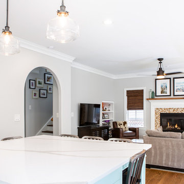
This project has been a labor of love for quite some time! The design ideas started flowing for this space back in 2016, and we are so excited to have recently completed the build-out process after our lengthy planning time frame. These wonderful clients completed a bathroom renovation with us last year, and we absolutely loved the charming, clean-lined farmhouse aesthetic we produced there. Wanting to carry that similar aesthetic into the kitchen, our clients hired us to transform their dated 90's builder-grade kitchen into a stunning showpiece for their home. While no major fixtures or appliances were relocated, nor were there major architectural changes, this space's transformation is a jaw-dropper. We began by removing the existing yellowed oak wood cabinets and replaced them with gorgeous custom cabinets from Tharp Cabinet Company. These cabinets are a very simple shaker style in a bright white paint color. We paired these fresh and bright cabinet with black hardware for a dramatic pop. We utilized the Blackrock pulls from Amerock and adore the playful contrast these pieces provide. On the backsplash, we used a very simple and understated white subway tile for a classic and timeless look that doesn't draw the eye away from the focal island or surrounding features. Over the range, we used a stunning mini-glass mosaic tile from TileBar that shimmers and showcases a variety of colors based on the time of day and light entry. The island is our favorite piece in this kitchen: a custom-built focal point from Tharp, painted in a gorgeous custom blue from Benjamin Moore. The island is topped with a dramatic slab of Arabescato from Pental Surfaces. On the perimeter cabinets, we've utilized the stunning White Fusion quartz, also from Pental. For final touches, we've utilized matte black wall sconces over the windows from Rejuvenation, and have a gorgeous sink faucet from Delta Faucet. Throughout the main level, we refinished the hardwood floors to bring them to a more soft, neutral brown color. New paint is carried throughout the house as well. We adore the bright simplicity of this space, and are so excited that our clients can enjoy this family friendly stunner for years to come!
 Level One Construction
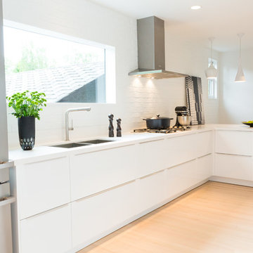
Seamless Elegance is a story bringing together both old and new. A cramped kitchen and a seldom-used den in a 100 year-old house were opened up to create a sprawling 300-sqft paradise. Obsessing over the little details was important to achieving our goal of seamless elegance.
The archway and molding detail between the dining and living room was perfectly mirrored between the dining room and kitchen, right down to the hidden closets. A faux brick wall painted white was added to the back wall of the kitchen to give the illusion that the previous expansion was always there.
The existing 1.5” wide beautiful oak hardwood floor was matched to the rest of the house and continued into the kitchen. The flooring throughout the house was re-done at the same time to solidify the marriage between old and new; the result was a seamless transition into functionality. The character brought into the space by the oak hardwood floor and brick wall off sets the contemporary high gloss white cabinets.
No upper cabinets were used in this design because we wanted to showcase the brick accent wall. The storage lost from zero upper kitchen cabinets was more than made up in floor-to-ceiling pantry. This corner pantry accommodates the bulk of storage for food and dishes in the kitchen. The subtraction of the upper cabinets allows the Tom Dixon pendant lights to be boldly featured over the eating peninsula.
Visual lines were a key aspect in this design helping the eye move throughout the space. The cabinet break lines are at the same height as the counter tops creating one continuous line. The paneled dishwasher blends perfectly with the rest of the kitchen cabinetry. The white quartz countertop flows down into a waterfall edge at the end of the eating peninsula, being the final grounding piece to visual lines.
Although the kitchen is all white, it is offset and given visual interest through texture and the use of different materials. The white allows the beautiful expensive appliances to be showcased along with the newly refinished flooring. The clean crisp kitchen will be the perfect backdrop to show case boldly colored art and accessories.
 Level One Construction
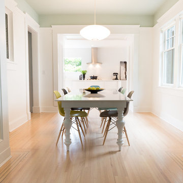
Seamless Elegance is a story bringing together both old and new. A cramped kitchen and a seldom-used den in a 100 year-old house were opened up to create a sprawling 300-sqft paradise. Obsessing over the little details was important to achieving our goal of seamless elegance.
The archway and molding detail between the dining and living room was perfectly mirrored between the dining room and kitchen, right down to the hidden closets. A faux brick wall painted white was added to the back wall of the kitchen to give the illusion that the previous expansion was always there.
The existing 1.5” wide beautiful oak hardwood floor was matched to the rest of the house and continued into the kitchen. The flooring throughout the house was re-done at the same time to solidify the marriage between old and new; the result was a seamless transition into functionality. The character brought into the space by the oak hardwood floor and brick wall off sets the contemporary high gloss white cabinets.
No upper cabinets were used in this design because we wanted to showcase the brick accent wall. The storage lost from zero upper kitchen cabinets was more than made up in floor-to-ceiling pantry. This corner pantry accommodates the bulk of storage for food and dishes in the kitchen. The subtraction of the upper cabinets allows the Tom Dixon pendant lights to be boldly featured over the eating peninsula.
Visual lines were a key aspect in this design helping the eye move throughout the space. The cabinet break lines are at the same height as the counter tops creating one continuous line. The paneled dishwasher blends perfectly with the rest of the kitchen cabinetry. The white quartz countertop flows down into a waterfall edge at the end of the eating peninsula, being the final grounding piece to visual lines.
Although the kitchen is all white, it is offset and given visual interest through texture and the use of different materials. The white allows the beautiful expensive appliances to be showcased along with the newly refinished flooring. The clean crisp kitchen will be the perfect backdrop to show case boldly colored art and accessories.
 Evil Eye Studio
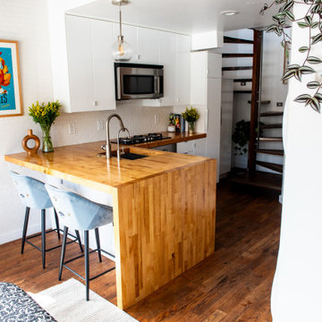
Wood Countertops with wood waterfall. Spiral staircase to upper level.
Danish l-shaped dark wood floor and brown floor eat-in kitchen photo in Salt Lake City with a drop-in sink, flat-panel cabinets, white cabinets, wood countertops, white backsplash, stainless steel appliances, an island and brown countertops
Danish l-shaped dark wood floor and brown floor eat-in kitchen photo in Salt Lake City with a drop-in sink, flat-panel cabinets, white cabinets, wood countertops, white backsplash, stainless steel appliances, an island and brown countertops

Sponsored
Delaware, OH

Buckeye Basements, Inc.
Central Ohio's Basement Finishing ExpertsBest Of Houzz '13-'21
 TVL Creative Ltd.
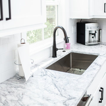
This project has been a labor of love for quite some time! The design ideas started flowing for this space back in 2016, and we are so excited to have recently completed the build-out process after our lengthy planning time frame. These wonderful clients completed a bathroom renovation with us last year, and we absolutely loved the charming, clean-lined farmhouse aesthetic we produced there. Wanting to carry that similar aesthetic into the kitchen, our clients hired us to transform their dated 90's builder-grade kitchen into a stunning showpiece for their home. While no major fixtures or appliances were relocated, nor were there major architectural changes, this space's transformation is a jaw-dropper. We began by removing the existing yellowed oak wood cabinets and replaced them with gorgeous custom cabinets from Tharp Cabinet Company. These cabinets are a very simple shaker style in a bright white paint color. We paired these fresh and bright cabinet with black hardware for a dramatic pop. We utilized the Blackrock pulls from Amerock and adore the playful contrast these pieces provide. On the backsplash, we used a very simple and understated white subway tile for a classic and timeless look that doesn't draw the eye away from the focal island or surrounding features. Over the range, we used a stunning mini-glass mosaic tile from TileBar that shimmers and showcases a variety of colors based on the time of day and light entry. The island is our favorite piece in this kitchen: a custom-built focal point from Tharp, painted in a gorgeous custom blue from Benjamin Moore. The island is topped with a dramatic slab of Arabescato from Pental Surfaces. On the perimeter cabinets, we've utilized the stunning White Fusion quartz, also from Pental. For final touches, we've utilized matte black wall sconces over the windows from Rejuvenation, and have a gorgeous sink faucet from Delta Faucet. Throughout the main level, we refinished the hardwood floors to bring them to a more soft, neutral brown color. New paint is carried throughout the house as well. We adore the bright simplicity of this space, and are so excited that our clients can enjoy this family friendly stunner for years to come!
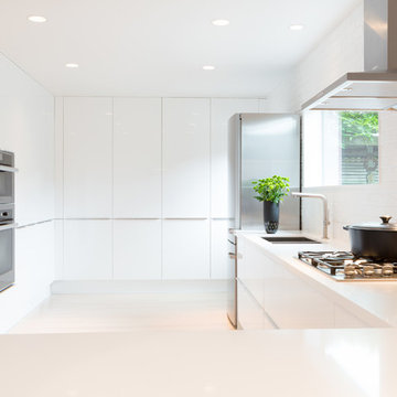 Level One Construction
Seamless Elegance is a story bringing together both old and new. A cramped kitchen and a seldom-used den in a 100 year-old house were opened up to create a sprawling 300-sqft paradise. Obsessing over the little details was important to achieving our goal of seamless elegance.
The archway and molding detail between the dining and living room was perfectly mirrored between the dining room and kitchen, right down to the hidden closets. A faux brick wall painted white was added to the back wall of the kitchen to give the illusion that the previous expansion was always there.
The existing 1.5” wide beautiful oak hardwood floor was matched to the rest of the house and continued into the kitchen. The flooring throughout the house was re-done at the same time to solidify the marriage between old and new; the result was a seamless transition into functionality. The character brought into the space by the oak hardwood floor and brick wall off sets the contemporary high gloss white cabinets.
No upper cabinets were used in this design because we wanted to showcase the brick accent wall. The storage lost from zero upper kitchen cabinets was more than made up in floor-to-ceiling pantry. This corner pantry accommodates the bulk of storage for food and dishes in the kitchen. The subtraction of the upper cabinets allows the Tom Dixon pendant lights to be boldly featured over the eating peninsula.
Visual lines were a key aspect in this design helping the eye move throughout the space. The cabinet break lines are at the same height as the counter tops creating one continuous line. The paneled dishwasher blends perfectly with the rest of the kitchen cabinetry. The white quartz countertop flows down into a waterfall edge at the end of the eating peninsula, being the final grounding piece to visual lines.
Although the kitchen is all white, it is offset and given visual interest through texture and the use of different materials. The white allows the beautiful expensive appliances to be showcased along with the newly refinished flooring. The clean crisp kitchen will be the perfect backdrop to show case boldly colored art and accessories.
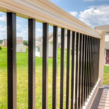
 Stump's Decks and Porches
Black aluminum balusters with vinyl rail is an eye-catching combination that lasts a lifetime.
Deck - mid-sized contemporary deck idea in Philadelphia
Deck - mid-sized contemporary deck idea in Philadelphia
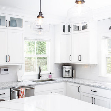 TVL Creative Ltd.
This project has been a labor of love for quite some time! The design ideas started flowing for this space back in 2016, and we are so excited to have recently completed the build-out process after our lengthy planning time frame. These wonderful clients completed a bathroom renovation with us last year, and we absolutely loved the charming, clean-lined farmhouse aesthetic we produced there. Wanting to carry that similar aesthetic into the kitchen, our clients hired us to transform their dated 90's builder-grade kitchen into a stunning showpiece for their home. While no major fixtures or appliances were relocated, nor were there major architectural changes, this space's transformation is a jaw-dropper. We began by removing the existing yellowed oak wood cabinets and replaced them with gorgeous custom cabinets from Tharp Cabinet Company. These cabinets are a very simple shaker style in a bright white paint color. We paired these fresh and bright cabinet with black hardware for a dramatic pop. We utilized the Blackrock pulls from Amerock and adore the playful contrast these pieces provide. On the backsplash, we used a very simple and understated white subway tile for a classic and timeless look that doesn't draw the eye away from the focal island or surrounding features. Over the range, we used a stunning mini-glass mosaic tile from TileBar that shimmers and showcases a variety of colors based on the time of day and light entry. The island is our favorite piece in this kitchen: a custom-built focal point from Tharp, painted in a gorgeous custom blue from Benjamin Moore. The island is topped with a dramatic slab of Arabescato from Pental Surfaces. On the perimeter cabinets, we've utilized the stunning White Fusion quartz, also from Pental. For final touches, we've utilized matte black wall sconces over the windows from Rejuvenation, and have a gorgeous sink faucet from Delta Faucet. Throughout the main level, we refinished the hardwood floors to bring them to a more soft, neutral brown color. New paint is carried throughout the house as well. We adore the bright simplicity of this space, and are so excited that our clients can enjoy this family friendly stunner for years to come!
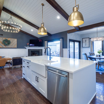
 Nate's Custom Renovations
The modern industrial farmhouse style together in this remodel creates a pleasing and welcoming balance. This project was infused with materials, textures, and color to create a modern industrial feel.
The homeowners wanted an open floor plan. One of the most eye-catching elements is the custom-made rustic wood ceiling beams and the white shiplap, which elevates the entirety of opening this new space.
The homeowners added industrial elements to the space with mixed metals from the lighting, faucet, pot filler, and stainless-steel appliances to farmhouse elements with an apron front sink and rustic barstools. Another aspect of this gorgeous kitchen is the quartz backsplash behind the range with a modern plaster range hood to ceiling accented by a bold encaustic tile on the other backsplash wall. One of the defined focal points for the whole room is the large light fixtures in the kitchen and living area.
This main level remodel project has authentic beauty from floor to ceiling.
 Level Studio
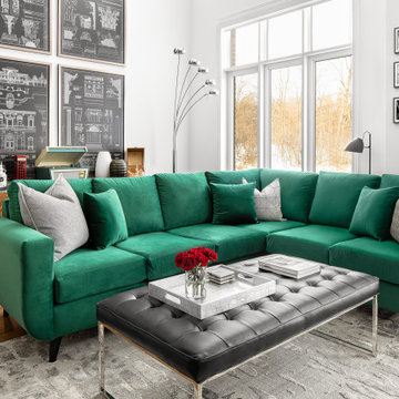
This modern townhome in Vaughan received some mid-century modern flair and some really fun wallpaper.
The large open concept living room was challenging in terms of creating a successful layout and we addressed it by bringing a large sectional closer to the center of the room rather than anchoring it against walls. Plenty of circulation space for a sideboard with a beautiful vinyl player, a collection of tall architectural prints and an eight foot tall floor lamp bring the eye up a double story living space.
Fun wallpaper creates a long feature wall in the living and dining area with a geometric pattern that brings some movement to the room and is also mirrored in the kitchen backsplash and sideboard veneer.
We designed a bedroom with the perfect shade of blue that will age nicely with our client’s young son along with a calming study perfect for getting some work done.

 CB Architecture + Design
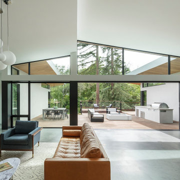
Great room and outdoor living sequence of a new construction single-level home in Orinda, CA. Full-width black-framed sliding glass doors open the great room completely to a large wood deck, dissolving the boundary between indoor and outdoor living at the home's most social moment. The butterfly shed roofline's two angular planes are dramatically visible from this interior angle, with black-framed clerestory windows and cedar soffits framing redwood and mature tree canopy views above the wall line on both sides simultaneously. The outdoor deck hosts three distinct zones visible through the open wall: a dining area with concrete table and metal chairs to the left, a fire pit lounge seating area at center with cable railing and garden views beyond, and a fully equipped outdoor kitchen with stainless steel built-in grill and concrete countertop to the right. Inside, a board-formed concrete partial-height feature wall with walnut credenza and flat screen television at left.
 Spring Creek Design
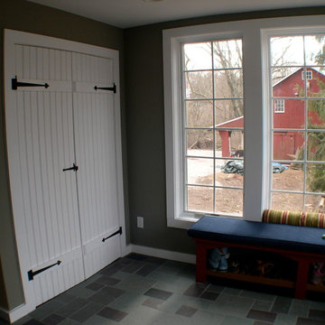
This old farmhouse (ca. late 18th century) has undergone many renovations over the years. Spring Creek Design added its stamp in 2008, with a small mudroom addition and a complete interior renovation.
The addition encompasses a 1st floor mudroom with extensive cabinetry and closetry. Upon entering the space from the driveway, cabinet and countertop space is provided to accommodate incoming grocery bags. Next in line are a series of “lockers” and cubbies - just right for coats, hats and book bags. Further inside is a wrap-around window seat with cedar shoe racks beneath. A stainless steel dog feeding station rounds out the amenities - all built atop a natural Vermont slate floor.
On the lower level, the addition features a full bathroom and a “Dude Pod” - a compact work and play space for the resident code monkey. Outfitted with a stand-up desk and an electronic drum kit, one needs only emerge for Mountain Dew refills and familial visits.
Within the existing space, we added an ensuite bathroom for the third floor bedroom. The second floor bathroom and first floor powder room were also gutted and remodeled.
The master bedroom was extensively remodeled - given a vaulted ceiling and a wall of floor-to-roof built-ins accessed with a rolling ladder.
An extensive, multi-level deck and screen house was added to provide outdoor living space, with secure, dry storage below.
Design Criteria:
- Update house with a high sustainability standard.
- Provide bathroom for daughters’ third floor bedroom.
- Update remaining bathrooms
- Update cramped, low ceilinged master bedroom
- Provide mudroom/entryway solutions.
- Provide a window seating space with good visibility of back and side yards – to keep an eye on the kids at play.
- Replace old deck with a updated deck/screen porch combination.
- Update sitting room with a wood stove and mantle.
Special Features:
- Insulated Concrete Forms used for Dude Pod foundation.
- Soy-based spray foam insulation used in the addition and master bedroom.
- Paperstone countertops in mudroom.
- Zero-VOC paints and finishes used throughout the project.
- All decking and trim for the deck/screen porch is made from 100% recycled HDPE (milk jugs, soda, water bottles)
- High efficiency combination washer/dryer.
 Visbeen Architects
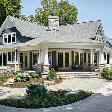
One of the few truly American architectural styles, the Craftsman/Prairie style was developed around the turn of the century by a group of Midwestern architects who drew their inspiration from the surrounding landscape. The spacious yet cozy Thompson draws from features from both Craftsman/Prairie and Farmhouse styles for its all-American appeal. The eye-catching exterior includes a distinctive side entrance and stone accents as well as an abundance of windows for both outdoor views and interior rooms bathed in natural light.
The floor plan is equally creative. The large floor porch entrance leads into a spacious 2,400-square-foot main floor plan, including a living room with an unusual corner fireplace. Designed for both ease and elegance, it also features a sunroom that takes full advantage of the nearby outdoors, an adjacent private study/retreat and an open plan kitchen and dining area with a handy walk-in pantry filled with convenient storage. Not far away is the private master suite with its own large bathroom and closet, a laundry area and a 800-square-foot, three-car garage. At night, relax in the 1,000-square foot lower level family room or exercise space. When the day is done, head upstairs to the 1,300 square foot upper level, where three cozy bedrooms await, each with its own private bath.
Photographer: Ashley Avila Photography
Builder: Bouwkamp Builders
 Drummond House Plans
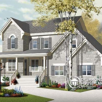
ILLUSTRATION - Country house plans no. 3862-V1 by Drummond House Plans
COASTAL COTTAGE INSPIRATION
Inspired by homes dotting the east coast, this handsome home is destined to be a favorite nation-wide.
A large, covered porch ensures a welcoming entrance. The presence of the garage is concealed by forward-facing windows and gable detail and discreet side doors.
On the main level, we find a spacious living room. The eye is drawn beyond to the dining room with triple garden doors. The kitchen is positioned to easily liaise with either space. Also located on the main level are a half-bath and laundry room.
On the upper level, we find the master retreat complete with spacious master bath and walk-in closet. In addition, we find two secondary bedrooms and a bathroom.
This fine home has room for all!
Drummond House Plans - 2015 Copyrights
Sponsored
Columbus, OH
Free consultation for landscape design!

Peabody Landscape Group
Columbus' Reliable Landscape Design & Contracting
 Fiberon Decking
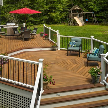
This deck designer created zones for eating and entertaining. An eye-catching octagonal entertaining area is a focal point. The sliding door off the kitchen leads directly to the grill and dining area. Flared staircases at either end of the deck enable easy access to the play area and create a welcoming entry for guests approaching from the driveway. Best of all, the material used is Fiberon composite decking -- smooth and splinter-free, and built to stay that way.
Start your deck project here: https://www.fiberondecking.com/start-your-project

 Visbeen Architects
To the manor born… or at least it will feel like it in this elegant yet easygoing French Country home designed by Visbeen Architects with a busy family who wants the best of the past and the present in mind. Drawn from both French and English traditional architecture, this two-story 5,463-square-foot home is a pleasing and timeless blend of two perennially popular styles.
Driving up the circular driveway, the home’s front façade impresses with its distinctive details, including a covered porch, iron and stone accents, a roofline with multiple peaks, large windows and its central turret capping two bay windows. The back is no less eye-catching, with a series of large central windows on all three floors overlooking the backyard, two private balconies and both a covered second-floor screen porch and an open-air main-level patio perfect for al fresco entertaining.
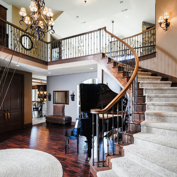
There’s magic on the inside too. The expansive 2,900-square-foot main level revolves around a welcoming two-story foyer with a grand curved staircase that leads into the rest of the luxurious yet not excessive floor plan. Highlights of the public spaces on the left include a spacious two-story light-filled living room with a wall of windows overlooking the backyard and a fireplace, an adjacent dining room perfect for entertaining with its own deck, and a open-plan kitchen with central island, convenient home management area and walk-in pantry. A nearby screened porch is the perfect place for enjoying outdoors meals bug-free. Private rooms are concentrated on the first-floor’s right side, with a secluded master suite that includes spa-like bath with his and her vanities and a large tub as well as a private balcony, large walk-in closet and secluded nearby study/office.
Upstairs, another 1,100 square feet of living space is designed with family living in mind, including two bedrooms, each with private bath and large closet, and a convenient kids study with peaked ceiling overlooking the street. The central circular staircase leads to another 1,800 square-feet in the lower level, with a large family room with kitchen /bar, a guest bedroom suite, a handy exercise area and access to a nearby covered patio.
Photographer: Brad Gillette
75