
Search results for "Fainting" in Home Design Ideas
 Baker Furniture
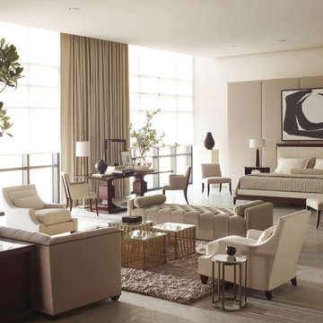
With a tufted seat, nail head trim and a bold silhouette, the Paris chaise is high-style occasional seating. Unusually long, Paris works in lieu of a sofa - whether floating or against a wall, accessible from all angles.
See the Paris: http://bit.ly/1KMCSti
Find it near you: http://bit.ly/11tLAW1
 Jennifer Busler Interiors, LLC
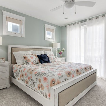
Bedroom - mid-sized transitional guest carpeted and gray floor bedroom idea with gray walls and no fireplace
 Envy Interior Design Studio
Girl's Bedroom
Photo by Virginia Rollison
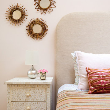
Inspiration for a transitional carpeted bedroom remodel in San Francisco with pink walls
Inspiration for a transitional carpeted bedroom remodel in San Francisco with pink walls
Find the right local pro for your project
 Robyn Scott Interiors, Ltd.
Mid Century Modern, Aspen, Landmark property Renovation
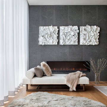
Inspiration for a contemporary home design remodel in Denver
Inspiration for a contemporary home design remodel in Denver


 Signature Innovations LLC
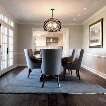
Using white throughout this home makes the dining room’s faint taupe walls pop with understated elegance. The beauty continues in the white and stainless kitchen, grounded on hand scraped flooring. Floor: 7” wide-plank Vintage French Oak | Rustic Character | Victorian Collection hand scraped | light distress | pillowed edge | color Bronze | Satin Hardwax Oil. For more information please email us at: sales@signaturehardwoods.com
 Lean Lens Architects
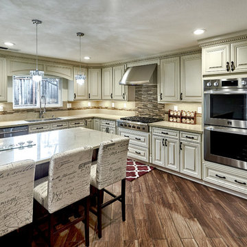
Large appliances stacked on on wall to optimize storage space.
Inspiration for a huge timeless u-shaped dark wood floor and brown floor enclosed kitchen remodel in San Francisco with an undermount sink, raised-panel cabinets, beige cabinets, quartz countertops, beige backsplash, stainless steel appliances, an island and gray countertops
Inspiration for a huge timeless u-shaped dark wood floor and brown floor enclosed kitchen remodel in San Francisco with an undermount sink, raised-panel cabinets, beige cabinets, quartz countertops, beige backsplash, stainless steel appliances, an island and gray countertops

 Latham Pool Products Inc.
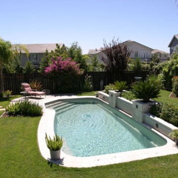
This Viking Fiberglass pool creates a wonderful beach vibe with it's pebble beach color and carmel model choice. You can faintly see the added custom mosaic in the center of the pool if you look closely. This pool was installed by Sandcreek Pools in Brentwood, CA.
 Story Homes
Jacuzzis were popular when this two-story 4-bedroom home was built in 1983. The owner was an architect who helped design this handicapped-accessible home with beautiful backyard views. But it was time for a master bath update. There were already beautiful skylights and big windows, but the shower was cramped and the Jacuzzi with its raised floor just wasn’t working.
The project began with the removal of the Jacuzzi, the raised floor, and all the associated plumbing. Next, the old shower, vanity, and everything else was stripped right down to the studs.
The before-during-after photos show how a deep built-in cabinet was created by “borrowing” some space from the master bedroom. A wide glass pocket door is installed in the adjacent wall.
Without the Jacuzzi this space has become a large, bright, warm place for long baths. Tall ceilings and skylights make this room big and bright. The floor features 12” x 24” stone tile and in-floor heating, with complimentary 2” X 2” tiles for the shower.
The white free-standing tub looks great with polished chrome floor-mounted tub filler and hand shower. With several live plants, this room is often used as a comfortable space for relaxing soaks on cold winter days. (Photos taken on Dec. 22)
On the other side of the room is a large walk-in shower. Additional shower space was gained by removing a built-in cabinet and relocating the plumbing. Glass doors and panels enclose the new shower, and white subway wall tile is the perfect choice.
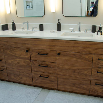
But the bath’s centerpiece could arguably be the beautifully crafted vanity. Solid walnut doors and drawers are constructed so that the grain matches and flows, like a work of art or piece of furniture.
The vanity is finished with a white quartz countertop and two under-mounted sinks with polished chrome fixtures. Two big mirrors with three tall warm-colored lights make this both a functional and beautiful room.
The result is amazing. A great combination of good ideas and thoughtful construction.
 Design Results: Creative Coastal Living
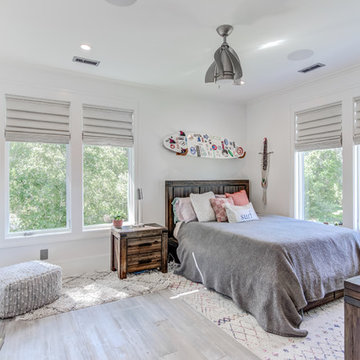
A pared down teenager's room emphasizes her main focus: surfing. A Terna fan by Kichler provides great lighting, sculptural interest, and a gentle breeze. Hunter Douglas shades in a pale neutral, "Sand Castle," provide a faint hint of color against white walls in highly reflective Behr Utlra White. The simplicity of the color scheme plays off engineered wood floors by Provenza in Moonlit Pearl. Furnishings made of acacia hardwood were supplied by Haiku Designs out of Boulder, CO and complete the look for an easy going kid always ready for the next wave!
 Neumann & Rudy Architecture
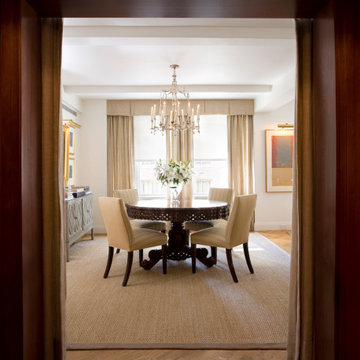
The photograph is composed as a deliberate enfilade study, framing the dining room through a deep, mahogany-cased cased opening that functions as both proscenium and threshold. This heavy portal — with its substantial reveal, plinth-like jambs and crisply mitered head casing — establishes a strong rectilinear armature that compresses the foreground and, by contrast, releases the eye into the luminous volume beyond. The plan reads as a classic pre-war apartment sequence: an axial sightline runs from the gallery floor, across the field of the dining room, and terminates at the window wall, where a curtained bay borrows daylight from the street. The ceiling is articulated by shallow beam drops or applied soffits — a coffer-adjacent treatment that registers the building's structural grid while lending the room a subtle sense of enclosure and datum. Geometry is orchestrated around opposing figures: the orthogonal rigor of casings, valance, beam lines and picture frames set against the centralized circular table, whose radial symmetry anchors the room's midpoint directly beneath the chandelier. Furnishings are held in a loose, non-touching arrangement, with generous circulation clearance at the perimeter, so that the room's volume — rather than its contents — remains the primary subject. Secondary sightlines to the left, toward a mirrored console and gilt-framed panel, and to the right, toward a picture-lit artwork, quietly widen the perceived footprint and imply adjacent rooms beyond the frame.
The material narrative is built on a controlled tonal ascent from dark to light. The foreground is dominated by richly figured, warm-red mahogany millwork and a chevron-laid oak parquet whose bleached, honeyed grain reads with a slight gray wash — a directional pattern that visually propels the viewer toward the interior. Within the dining room, the palette shifts to a low-saturation envelope of chalky off-white plaster walls and putty-toned textiles: floor-length linen or silk-blend drapery panels with a faint slubbed weave, gathered beneath a tailored, flat-front upholstered valance whose crisp horizontal band imparts an atelier precision. Underfoot, a natural sisal or seagrass rug with a linen tape border introduces a coarse, granular tactility that grounds the refined upholstery above; its woven, matte texture is deliberately calibrated against the smoother satin sheen of the dining chairs' subtly striped fabric. The room's tonal fulcrum is the antique carved pedestal table — a near-black, deeply modeled Anglo-Indian or Colonial Revival piece whose pierced apron, scrolled tripod base and paw feet supply the composition's only ornamental exuberance and its darkest value. Accents are chosen for restraint: silvered leaf on the console's fretwork facing, water-gilt on the framed panel, polished nickel or silver on the chandelier and the flower vessel, and the cool white of massed oriental lilies. Undertones remain uniformly warm — greige, ecru, taupe, oatmeal — with cool relief supplied only by the metals and the daylight itself.
Lighting is layered with quiet discipline. Natural light enters as a diffused, north-facing wash through a sheer-veiled window, its intensity softened by roller or Roman shading so that the glazing reads as a luminous plane rather than a view; this creates a gentle contre-jour that silhouettes the chandelier and the table's carved base. The multi-arm chandelier — a silvered, pagoda-crested fixture with slender candle sleeves and faceted drops — serves as sculptural punctuation more than as a working source, its warm 2700K glow registering as ambient sparkle. Accent illumination is deployed with curatorial intent: a picture light grazes the framed work at right, while the recessed downlights and the darkened foreground casings produce a chiaroscuro that heightens the sense of arrival. The cumulative atmosphere is one of hushed formality — composed, aerated, and almost monastic in its refusal of visual noise. Stylistically, the room synthesizes into what might be termed Transitional Classicism, or Warm Neutral Modern Traditional: the bones and millwork are unmistakably pre-war Beaux-Arts-derived, yet the flat-front valances, unadorned wall planes, natural-fiber flooring and simplified parson-back chairs reflect a contemporary editorial sensibility. The single antique table operates as a considered anachronism — a note of patinated gravitas within an otherwise pared-back, texturally driven interior — demonstrating a designer's confidence in restraint punctuated by one authoritative gesture.
 WallsNeedLove
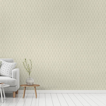
Art deco gray lined arches over a faint green background. Available in both removable peel-and-stick and permanent wallpapers. Printed with child-safe inks.
 Van's Home Center
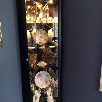
This corner china cabinet made the perfect display for a smaller space. The faint pattern in the glass also copies the pattern on the accent cabinet in the entryway to tie the spaces together. All flooring, tile/stone, furniture, and appliances purchased from and installed by Van's Home Center. Home built by A&D Specs.

 safe ZOnea
If you’re active on GardenWeb sharing plant photos, asking for advice, tracking seasonal progress you already understand how much detail goes into gardening. Soil pH, rainfall, emerging leaves, bloom counts, fertilizer schedules it adds up fast. But all that rich information often remains buried in posts, lists or memory. What if you could visualize that data and turn it into clear quick insights? That’s where a graph maker becomes a game-changer for your gardening workflow.
1. Why garden data belongs on a graph
On GardenWeb, you’ll find forums for everything from perennial care, vegetable gardening, patios, herbs, even cooking and craft projects. While plant lovers share observations and ask questions, many track progress manually in spreadsheets or memory. A graph maker flips that around:
Instead of a list of numbers (e.g., “Soil test: pH 6.4 in May, 6.1 in October”), you get a line graph showing the decline over time.
Instead of guessing which plant bloomed most, you see a bar chart comparing counts across plants.
Instead of manually calculating average rainfall effect, you plot scatter points of bloom count vs. rainfall.
By turning your data into visuals, you’re not just recording—you’re analysing, learning and improving. For GardenWeb users this means smarter decisions: Which fertilizer actually improves bloom count? Which shady spot recovers slower? A graph maker gives clarity.
2. What is a graph maker and how to use one
A graph maker is a web tool or software that lets you input raw data (numbers, dates, categories) and output visual charts like line graphs, bar charts, scatter plots, etc. It might allow you to import a spreadsheet, select chart type, customize colours, label axes, and export the image for your blog, forum post or personal log.
Here’s how you could apply it for gardening:
Log blooms per week for each rose plant.
Using the graph maker, choose line graph to track changes over weeks.
Label your y-axis “Number of Blooms”, x-axis “Week of Year”.
Add colour lines for each plant for easy comparison.
Export as PNG and embed it in a GardenWeb forum post: “See bloom trend for my ‘Peace’ vs ‘Knock Out’ roses”.
This isn’t just pretty-to-look-at: it makes the trend obvious, invites discussion (“Hey, your ‘Knock Out’ line dips after week 28—what changed?”) and helps you refine your routine.
3. Use these specific scenarios on GardenWeb
A. Soil pH and plant health tracking
After multiple tests you have pH values over time and bloom results. Upload both datasets into the graph maker, produce a dual-axis line graph: soil pH on one axis, bloom count on the other. Post your findings in the “Soil, Fertility & Nutrients” forum and get feedback.
B. Seasonal pest or disease appearance
Record number of aphids spotted each month and whether you used treatment. A bar chart via the graph maker can show pre- and post-treatment figures. Then ask the “Insect & Disease Control” forum for advice based on your visual data.
C. Yield comparison between varieties
You grow two zucchini varieties. You keep weekly yield in pounds. Use the graph maker for a side-by-side bar chart. Share in the “Vegetable Gardening” forum: “Which was better this year? See the chart”.
D. Rainfall vs growth rate
You log weekly rainfall and growth (in cm) of your tomato plants. Use scatter plot in graph maker. If a pattern emerges, you’re ready to post: “Is my growth plateau due to drought? Chart shows a clear correlation.”
4. Why this elevates your GardenWeb contributions
When you post with a chart made by a graph maker, you’re doing more than asking or showing off. You’re investigating. You’re analysing. You invite the community to give feedback on data, not just anecdotes. That elevates the discussion. Instead of “My plant died, any ideas?” you post “See this graph of pH drop and bloom count—what might be the limiting factor?” High-quality visuals raise your post’s value and garner more thoughtful responses.
Plus, your posts become useful references for others: someone else can say, “Cool graphic, can you share your data sheet?” You build credibility and help the forum become a learning hub—not just a Q&A board.
5. Tips for using a graph maker effectively in the GardenWeb context
Keep it simple: One chart, one insight. Don’t overcrowd.
Label clearly: Titles, axis labels, units (e.g., cm/week, mg/L, °F).
Use readable colours: Avoid faint tones that vanish on mobile.
Annotate when needed: Add notes like “Fertiliser switched week 12” or “Shade cloth added”.
Provide context in your post: Don’t leave the chart alone—write a few sentences explaining what it shows and what you’re seeking.
Embed carefully: Make sure your image displays properly in GardenWeb; check mobile view.
Share raw data: If possible link to your spreadsheet so others can replicate or comment.
Be open to feedback: The chart invites questions; embrace them.
6. Possible pitfalls and how to avoid them
Bad data = bad chart: If your measurements aren’t consistent, your graph will mislead. Use standardized data collection.
Too much complexity: Multi-axis charts, too many variables—confusing. Stick to one or two variables.
Overlooking mobile viewers: Many GardenWeb users browse via phones. Use large fonts and simple visuals.
Ignoring the narrative: Chart alone won’t answer. Explain what it means and what you need.
Outdated charts: If you update your data annually, keep your visuals current or label them clearly as “2024 data”.
7. Final thoughts
On GardenWeb you’ll find a vibrant community of gardeners, DIYers, cooks and design lovers.Using a graph maker for your posts and progress turns your experience from casual hobby-logging into smart data-driven gardening. You’ll not only learn more—your peers will learn more, too.
So next time you log your plant growth, record your yield, test your soil or track pests—don’t just note it. Plot it. Use a graph maker. Share it in the forum. Let your garden tell the story, and let the community help you write the next chapter.
 Flooret
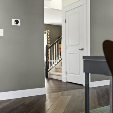
Bold, dramatic, inspiring. With color variation that never grows old, this floor is not for the faint of heart. But for those who follow where Dover leads, there is nothing quite like it.
 Neolithic Materials
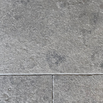
Cielo Limestone is a light, refined stone with soft gray and blue-gray tones. Faint white threads, cloudy patches, small crystals, and shell traces add subtle character, while softened edges keep the look clean and contemporary. Ideal for living spaces, bathroom walls, fireplaces, and counters. For inquiries, contact us at (310) 289-0414 or info@neolithicmaterials.com
 George Group Cabinetry
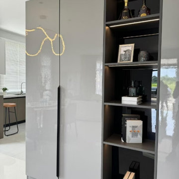
Side perspective showcasing the cabinet’s reflective high-gloss finish, with adjacent kitchen interior faintly mirrored on smooth cabinet surface, verifying premium panel coating workmanship. Central multi-tier LED open shelving neatly arranged with liquor bottles, framed decor and reading books, internal lighting highlights display pieces at night. Tall cabinet structure maximizes vertical wall space, a popular customized feature wall solution for modern semi-detached and terrace houses across Malaysia residential market.
 STACKLAB
GARRISON 1-51
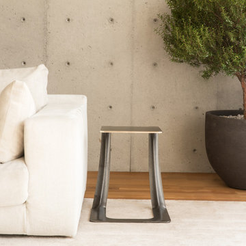
The Garrison is a sculptural iron casting intended for use a stool or side table. It recycles steel salvaged from the 2015 demolition of the namesake Garrison bridge near Toronto’s Fort York. True to STACKLAB’s ethos, however, the Garrison’s shape is not intended to be a formal representation or memorialization of any of the bridge’s attributes.
Instead, the Garrison exemplifies STACKLAB’s mission to emphasize that all material matters. Discarded or waste materials are repurposed in a way that imbues them with new life and meaning.
Its form was derived using digital real-time parametric design and fabrication technology. STACKLAB optimized the product to be as light and strong as possible: the Garrison’s 35-lb. weight can support a load of 900 lbs.
STACKLAB and its partnering firm Rebart procured two tons of bridge rebar, enough to release a limited-edition run of 102 units. STACKLAB designed the Garrison to be sand-cast and engineered the pattern (used to generate sand moulds) so that small manufacturing defects, typical of this process, would only appear at the tip of the piece. Units 1 to 51 have a thermally applied 1/16” solid bronze coating in this location, which ameliorates these defects. This coating turns units that may have been discarded into premium ones, enabling a near-100-percent yield out of the run. The sand-casting process produces faintly perceptible irregularities that enhance the Garrison’s tactility.
Garrison 1-51 is available exclusively at Maison Gerard.
Type
Stool, Side Table
Year
2015
Dimensions
16” W x 14” D x 18” H
Materials
Cast Iron and Bronze
Design
Collaborators
Rebart
Photography: Patrick Thompson
27