
Search results for "Familiarization" in Home Design Ideas
 Fournier Custom Designs Inc.
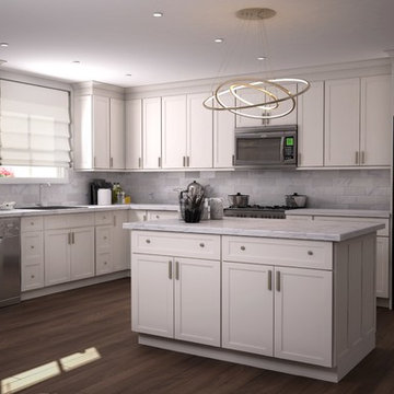
OXFORD LATTE
Like a foaming cup of coffee, Oxford Latte dials the kitchen’s familiarity up to 11. Designed to feel warm and welcoming, the exquisite finish is at equally home in a modern city townhouse and in a cozy country cottage. It makes the ideal finishing touch to any kitchen with a smooth outline and a delightful look that chimes with all interior fixture styles.
 Rosenhaus Design Group, Inc.
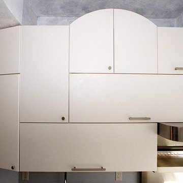
Mark Rosenhaus, CKD. A lot can happen in a room only six feet wide yet ten feet tall. Start with the curved ‘skylight’, notice how the arrangement of cabinets moves towards the focal point outside the glass door.
The diagonal lines of the handles and knobs and proportions of the cabinets create familiar patterns similar to stars in a constellation.
The lift up, swing up, sliding doors provide unencumbered access in this narrow room.
 Anew Remodeling
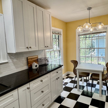
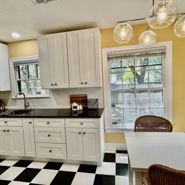
The kitchen carries the theme with bright shaker cabinetry, a white subway backsplash, and bold black countertops. A retro-inspired black-and-white checkerboard floor adds personality, while modern globe pendant lighting ties the space together. The result is a space that feels both familiar and updated with a balance of Traditional charm and Modern simplicity.
Find the right local pro for your project
 The Egg Design Group, LLC
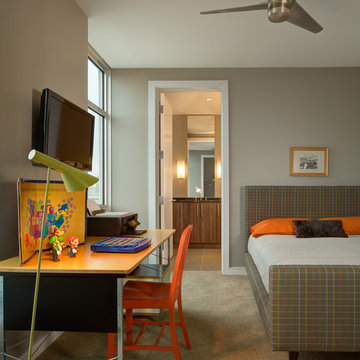
Meanwhile, a room for “him” provides the familiarity and consistency needed for their teenage son. His Autism requires special attention to details. While the room has the look and feel of his room at their other home, it perfectly suits the industrial feel in the views of the Menomonee Valley and Harley-Davidson Museum out his bedroom window. An Eames Desk, Emeco chair made from recycled Coca-Cola bottles, Louis Poulsen floor lamp, and vintage aviation photography complete this special haven.
Tricia Shay Photography
 Drury Design
THE SETUP
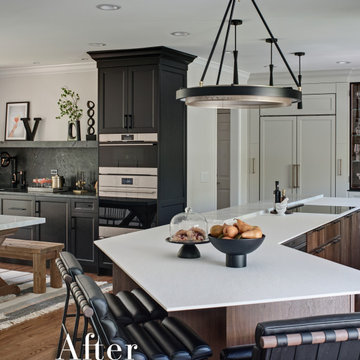
Our journey began with a familiar face — Alicia had previously transformed the client’s mother’s home, establishing a trusted relationship that naturally led to this personal project. The client desired a kitchen that truly reflected her own style while facilitating seamless entertaining.
Design Vision:
The original kitchen, segregated from the dining area by a wall, hindered the flow of interaction and space. Our client envisioned a unified area where she could engage with guests in both the kitchen and dining room simultaneously. Moreover, the space lacked a central island, relying instead on a floorplan anchored by cabinetry in a u-shaped layout.
Design Objectives:
Open up the space for an airy design conducive to entertaining large gatherings
Modernize the kitchen to be both stylish and functional
Integrate the design with the home’s new black-framed windows and doors
Relocate the cooktop to a central position to enhance usability and interaction
Design Challenges:
Removing the wall between the kitchen and dining room would necessitate the rerouting of existing HVAC ductwork that services the upper floor
Limited pantry space in the existing kitchen
The existing u-shaped layout of the kitchen restricted functionality and storage options
Insufficient space for wine storage
The client desired a raised-furniture look for the island, but without showing a new downdraft vent
THE RENEWED SPACE
Design Solutions:
We added a second HVAC unit to the upper floor and rerouted the existing ductwork in that wall
Created tall pantry pullouts on either side of the fridge to maximize dry goods storage
Designed a long island to facilitate cooking stations and dining moments
Created a stylish open display cabinet for wine
Engineered a dual-design island with a footed floating aesthetic on one side, and a full floor reach on the other to conceal the new downdraft ventilation.
Paired with the newly opened adjacent dining room featuring a wet bar, the kitchen has become a stylish and highly functional space for cooking and entertaining. Following a large baby shower hosted by the client (which seamlessly accommodated an 80-person gathering!), it is clear that the new design not only meets but exceeds the needs for hosting and everyday living. This project was a harmonious blend of the client’s vision and Alicia’s innovative design solutions, resulting in a kitchen that truly embodies personalized elegance and functionality.
 Tom Brzoskwinia
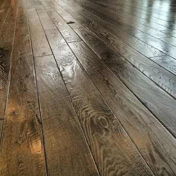
One of the most popular hardwood floor finishing which offers Tom & Peter Flooring is provided by WOCA. If you’ve decided that you want a natural looking wooden floor that is lacquer-free, then the likelihood is that you’ve chosen oil as your way of protecting your wood and making your floor look great at the same time. WOCA for wood flooring comes in various forms and is a great way of making sure that your wood is protected, but at the same time looks natural. A highly popular as well as effective way of treating wood floors, oils effectively penetrate into the wood and in some cases harden into the surface of the floor to stop damage and to maintain the wood in its optimum condition.
WOCA Oil finish hardwood flooring has taken the United States market by in 2014 and shows no signs of slowing down in 2016 and now. Here are some of the most common questions we have regarding this type of finish which we will I’m to answer in today’s my blog:
Is oil finish as durable as traditional factory urethane finishes with aluminum oxide?
When it comes to durability, oil finish flooring tackles the issue with a completely different method. The penetrating oil serves as protection from moisture and wear while allowing the user to feel the wood grains in their bare feet. If compared directly to factory finished aluminum oxide finish, the oil finish flooring will not perform as well to abrasion and impact. However, the beauty of this finish is the fact that it will camouflage any scratches which will inevitably accumulate over time.
Will this finish evaporate over time and will this be harmful for indoor air quality?
Another concern for oil finished floors its effect on indoor air quality. For on-site applications, some varieties suggest several coats which typically require the residents to be out of the home due to mild odors. However, there are factory finished UV-cured or single coat applications which lessen the downtime. Despite the odors produced during the drying process, oil finish floors rank amongst the lowest for VOC (volatile organic compound) emissions. Certain brands even boast true zero VOC. This fact alone makes oil finished floors one of the best options for green building solutions.
“WOCA products are certified by independent laboratories, the German Institute for Biological Building Materials, and are in accordance with DIN–Norm 53–160. WOCA WoodCare Denmark products meet or exceed the most stringent U.S. standards for volatile organic compounds.” –WOCA Oil Finish Manufacture
Does this type of finish require additional maintenance which I am not familiar with?
For weekly cleaning, oiled floors use a special cleaner which contains an oil and soap mixture. After a period of 12-18 months some oil may evaporate causing the wood grains to appear dry. An additional layer of oil can be reapplied to keep the floor looking fresh. Although oil finished floors require more involvement in periodic maintenance in high traffic areas, this maintenance can be done much easier than the equivalent of an onsite sand and refinish.
WOCA Master Color Oil contains pigment, which provides a single-step hardwood floor staining process. Laying down the stain and the finish in one step.
This product comes 14 different colors, from Black to Extra White, and you can mix them freely to create various color palettes that will meet the demands of any job.
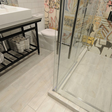
Below are some pictures of the finished job…

 Anew Remodeling
The kitchen carries the theme with bright shaker cabinetry, a white subway backsplash, and bold black countertops. A retro-inspired black-and-white checkerboard floor adds personality, while modern globe pendant lighting ties the space together. The result is a space that feels both familiar and updated with a balance of Traditional charm and Modern simplicity.
 Annie Santulli Designs
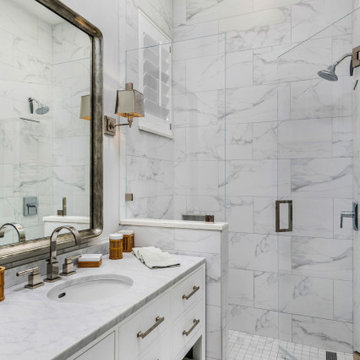
Mixing contemporary style with traditional architectural features, allowed us to put a fresh new face, while keeping the familiar warm comforts. Multiple conversation areas that are cozy and intimate break up the vast open floor plan, allowing the homeowners to enjoy intimate gatherings or host grand events. Matching white conversation couches were used in the living room to section the large space without closing it off. A wet bar was built in the corner of the living room with custom glass cabinetry and leather bar stools. Carrera marble was used throughout to coordinate with the traditional architectural features. And, a mixture of metallics were used to add a touch of modern glam.
 Design Directives, LLC
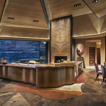
Enormous Great room with book matched, slab onyx fireplace, octagonal shape. Photo Mark Boisclair Architecture: Kilbane ARchitects Contractor: Joel Detar Interior Design: Susie Hersker and Elaine Ryckman Sculpture: Gary Slater
Project designed by Susie Hersker’s Scottsdale interior design firm Design Directives. Design Directives is active in Phoenix, Paradise Valley, Cave Creek, Carefree, Sedona, and beyond.
For more about Design Directives, click here: https://susanherskerasid.com/
To learn more about this project, click here: https://susanherskerasid.com/sedona/
 BBA Architects
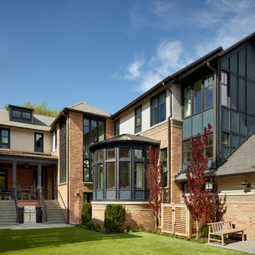
Situated along the perimeter of the property, this unique home creates a continuous street wall, both preserving plenty of open yard space and maintaining privacy from the prominent street corner. A one-story mudroom connects the garage to the house at the rear of the lot which required a local zoning variance. The resulting L-shaped plan and the central location of a glass-enclosed stair allow natural light to enter the home from multiple sides of nearly every room. The Arts & Crafts inspired detailing creates a familiar yet unique facade that is sympathetic to the character and scale of the neighborhood. A chevron pattern is a key design element on the window bays and doors and continues inside throughout the interior of the home.
2022 NAHB Platinum Best in American Living Award
View more of this home through #BBAModernCraftsman on Instagram.
 Anne Decker Architects, LLC
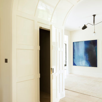
Located in the Langley Fork Historic District in McLean, Virginia, this residence was designed to speak to the formal massing seen in the existing neighborhood fabric of stately traditional homes. The simplicity and clean lines of the stucco and limestone façade blends harmoniously with its surroundings. Traditional forms, interjected with modern twists, create a tension that carries throughout the design, creating a home that feels warm and familiar while clean and distilled at the same time. Photo Credit: Gordon Beall Photography
 Answer The Home
How To Remove Stopper From Pedestal Sink: An Easy Step By Step DIY Guide
By
Jen William
November 13, 2021
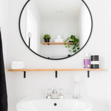
From a statistical viewpoint, we use our sink on an hourly basis. And most of us are familiar with a clogged sink due to a stuck or worn stopper. Do you call a plumber on such occasions? If that’s the case, we can assure you that you can solve it by yourself. And to prep you up, today we shall explain how to remove stopper from pedestal sink deftly in simple steps.
Moreover, minute wastes gradually jam the drain tube. Under this situation, we must unhook the stopper to clear the drain tube. Plus, a pop-up assembly eventually frays when it needs to be changed. So, for your convenience, we have also discussed how to change and reassemble the stopper.
 DH Audio and Home Theater
Dennis Hartwick
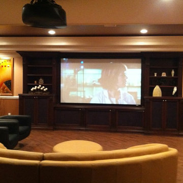
Inspiration for a contemporary home theater remodel in New York
Inspiration for a contemporary home theater remodel in New York
 Anne Decker Architects, LLC
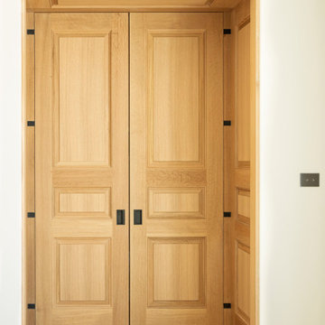
Located in the Langley Fork Historic District in McLean, Virginia, this residence was designed to speak to the formal massing seen in the existing neighborhood fabric of stately traditional homes. The simplicity and clean lines of the stucco and limestone façade blends harmoniously with its surroundings. Traditional forms, interjected with modern twists, create a tension that carries throughout the design, creating a home that feels warm and familiar while clean and distilled at the same time. Photo Credit: Gordon Beall Photography
 7 Day Kitchens
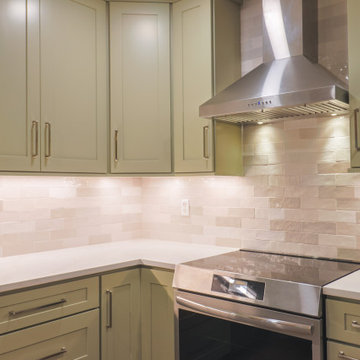
Functionality was a key priority throughout the project. The updated layout improves workflow, while integrated storage solutions maximize usability without adding visual clutter. The result is a space that feels open, efficient, and easy to live in. The overall design balances modern simplicity with subtle warmth through elements like shaker cabinetry and natural flooring, preventing the space from feeling overly stark. This kitchen reflects a clear shift toward a more modern aesthetic while maintaining the comfort and familiarity that define transitional design.
 Bon Brise Design, Inc.
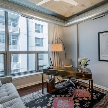
Our client’s office showcases how beautifully the old can be paired with the new. The focal point is the antique brass desk, which belonged to our client’s mother for many years. The rug beneath was her grandmothers. Combined with fresh lighting, seating, and artwork, it’s now a comfortable, familiar space in which our client loves to work.


 HMH Architecture + Interiors
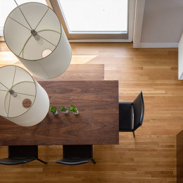
Originally built to house a garage, workshop and wood storage, this simple structure has been gently re-imagined into a unique guesthouse with a rustic accents and modern comforts.
The exterior retains the classic barn appearance, with the addition of carefully placed windows and industrial-looking Corten steel siding. The introduction of a large dormer to the center of the structure was a simple move, but provided multiple functions:
• breaks up the 8’-0” ceiling on the main floor, letting in additional daylight and providing visual relief to the otherwise low ceiling
• creates circulation space with the rustic steel stair and bridge
• utilizes reclaimed wood siding on the ceiling and walls, contrasting with white drywall and clean bright finishes
• visually connects the two upstairs bedrooms with the main floor
The focus of the interior was to preserve and accentuate the barn features as much as possible, and have a warm and cozy, energy efficient guest house. Programming included two bedrooms, two bathrooms, dining area, farmhouse kitchen and pantry, living room and laundry room.
Materials and furnishes were selected to create a clean, comfortable and inviting interior with a rustic edge. The exposed steel beam was left unfinished showing its existing wear and tear, and the new steel stair was left raw to eventually age and match the beam. Durable and economical oak floors were used throughout. Traditional subway tile and penny rounds contrast with the modern, clean lines of the kitchen and bathrooms. A custom sliding barn door adds texture to the kitchen and closes off the pantry and laundry room from the space. Furniture was a mix of new and existing, which makes the spaces both familiar and comfortable.
All in all, there is a timeless look to the end product; a traditional farmstead structure has definitely been giving a great new lease on life.
Andrew Pogue
 User
UserOut with the Old and in with the New
In the first three pictures you will see the old kitchen. Old cabinets, old appliances, old sink, old wallpaper, old floor. You get the picture. It’s old. So, an update is in order.
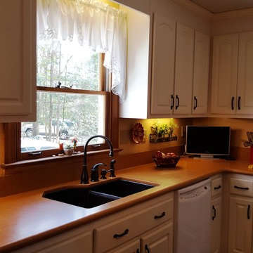
First, the clients chose to have their “still good cabinets” to be refaced. They chose a creamy white and the doors and drawers were replaced. If you aren’t familiar with refacing, the other wood on the cabinet is covered with a thin veneer making the entire cabinet look new.
Countertops – Not wanting granite with its swirls and shiny surface, the clients opted for quartz. At the time of this renovation, quartz was a rather new concept. The quartz pattern is Sonora Gold which is in the textured category of Silestone. They wanted a warm inviting kitchen and the tan/orange undertone fit the bill.
Next, Sink – Of course, as almost everyone who renovates their kitchen, they wanted an undermount sink. They chose a double granite undermount sink with an oil rubbed faucet set to go along with the drawer pulls and black trim in the kitchen.
After that, flooring was installed. This is a vinyl that looks like stone. Not wanting the cold feel of stone and the hardness on the ol’ knees, this was a good choice. The vinyl picked up the colors of the countertops and paint along with a few flecks of black. Good choice!
A custom made island was installed. This has a black base and the quartz countertop. When this was made, the installer said no, an island will not fit in this kitchen. You need the cabinets to open with 3’ clearance. I measured and put down paper in the shape of the island to simulate where the island would be. It fit nicely and as you can see, added not only storage but another surface on which to work.
Appliances were added and the client wanted top of the line so GE Profile with its good reviews and quality, were installed. We went with white to contrast the white cabinets but overall give the kitchen a brighter feel.
The paint chosen is Sienna Sand on top which blended well with the countertops as both have orange undertones and played nicely together. The bottom half of the oak chair rail was painted Pencil Point black to go with the island and faucets and drawer pulls.
The finished look is an unexpected kitchen with warmth and comfort along with plenty of storage and working areas. The clients were very happy with the finished project. Out with the old and in with the new!
90