
Search results for "Familiarization" in Home Design Ideas
 ADINA HALL DESIGN
Adler On The Park Showhouse
Interior Renovation
Chicago, Illinois
Location
Chicago, IL - Lakefront
Category
Show house
Property
Luxury Townhome
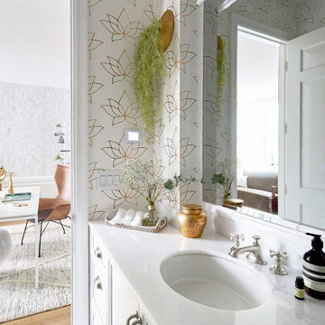
Adina Home Design was invited to reimagine a guest suite in the the Adler on the Park historic home showhouse. Our home office design embodies our core values, providing an ideal canvas to showcase our distinctive design love language, fusing modern aesthetics with Japandi, pastoral, and biophilic influences to create spaces that feel inspiring, familiar and uplifting.
We set out to showcase how a small bedroom can be successfully converted into a home office/guest bedroom. The home office has become a paramount requirement in every home we design, The design blends clean lines, natural materials, and a serene ambiance for a creative workspace. We incorporated sleek furniture, neutral tones, and subtle nods to modern, pastoral and Japanese aesthetics for a harmonious
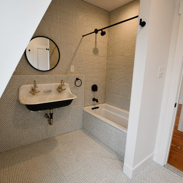
We elevated each space, from the sophisticated walk-in closet with striking black wallcoverings and pristine white shelving, to the tranquil guest bathroom imbued with Japandi Zen influences.
Clean lines, natural materials, and subtle nods to Japanese aesthetics converge, creating harmonious retreats tailored to modern living.
 Woodsmith Construction Inc
Transforming this long-standing home on Bradgate Rd required more than a simple update—it called for a careful balance between renewal, structure, and respect for what was already there.
The existing brick bungalow had strong bones, but the exterior was deteriorating, the carport was underutilized, and key interior spaces no longer supported the homeowners’ needs. Having lived in the home for decades, the goal wasn’t to start over—it was to rework the home into a more functional, comfortable space that could support the years ahead.
The scope included a full exterior masonry refresh, where the front layer of brick was removed and replaced while maintaining the integrity of the original structure. The carport was fully enclosed and integrated into the home as a garage, and a new roof tied everything together with consistent detailing and long-term performance in mind.
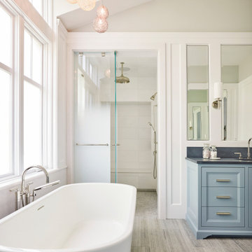
Inside, the layout was carefully reworked to introduce a new primary ensuite and completely renovate the main bathroom. Plumbing, mechanical, and electrical systems were updated throughout, with a focus on accessibility, ease of use, and everyday comfort.
The result is a home that feels both familiar and elevated—where thoughtful construction and refined design come together to support long-term living without compromising character.
 Klopf Architecture
From Mid-Century Classic to the Present
An iconic design updated with comfort, function, and flow for today.
A Remodel That Balances Past and Present
What started as a desire to update a classic Eichler soon became an exploration of how Mid-Century Modern design can successfully evolve for today. The client, a tech professional with a passion for scuba diving and underwater photography, wanted a home that would both honor its original character and feel tailored to his daily life. A lifelong technology enthusiast, he still owns the very first Mac desktop he saved up for as a teenager working at Radio Shack, a detail that underscores his appreciation for design that melds function and form.
Honoring Separation While Expanding Possibility
Unlike many contemporary remodels where walls are opened up to create expansive living spaces, this project took a more restrained approach. The client valued the defined rooms of the original plan and wanted to preserve as much wall space as possible for displaying his large-format underwater photography. The emphasis was not on dramatic spatial reinvention, but on thoughtful refinements. Klopf Architecture shaped a gallery-like backdrop while also expanding the primary suite, modernizing materials and fixtures throughout the home, and improving the functionality and layout of the kitchen. The finished home feels at once timeless and renewed, an Eichler that continues to inspire while fully supporting the lifestyle of its present-day owner.
A major turning point came mid-design. The original project brief had not included an addition, but as the reconfiguration of the primary bedroom and bath unfolded, it became clear that an expansion was the best approach to achieve the client’s vision of a more spacious suite. Fortunately, the adjustment came at a stage when revisions were still manageable and was integrated seamlessly, showing how thoughtful course corrections can strengthen a project rather than hinder it.
Navigating Challenges With Precision
The design development included multiple conceptual rounds, balancing preservation with subtle expansion. During construction, an existing post previously thought to be load-bearing turned out not to be. The structural engineer was able to pivot quickly, and both the post and the cross beam that had been intended to replace it could be omitted, allowing the original rhythm of the Eichler beam bays to be preserved.
Sustainability was not just a checklist item, but a way to align the home with the client’s values of simplicity, efficiency, and long-term functionality. R-38 roof insulation reduced energy usage, solar panels with battery storage provided independence and resilience, and passive comfort strategies eliminated the need forenergy-intensive air conditioning. An electric vehicle charger and an on-demand hot water recirculation system (with call buttons as opposed to having constant circulation) add to the home’s long-term efficiency factors. Together, these moves created a home that is quieter, more comfortable, and better equipped for the future, qualities that supported the client’s pragmatic approach to design and living lightly.
Details That Respect the Eichler DNA
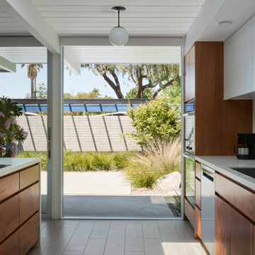
The remodel carries forward the Eichler’s original spirit while introducing new layers of modern livability. Originally, the house was approached along a deep, narrow walk, with the garage on one side and the house on the other, leaving the front door tucked far back within this chasm-like space. By pulling the entry forward, the design reshaped the arrival experience, creating a clearer threshold and a natural drop-off zone for bags, shoes, and keys. This shift also made room for a custom bench at the entry that extends seamlessly through the glass sidelight. The bench and drop-off zone now work together as a single, integrated sequence that supports everyday living while offering a tactile reminder of Eichler’s philosophy of connectedness.
At the client’s request, Klopf reintroduced a classic Eichler gesture by extending the exterior siding into the entry and living room. The detail reinforces a sense of indoor/outdoor continuity while providing a subtle architectural surface that allows the client’s photography to take visual precedence.
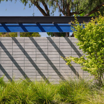
The signature concrete masonry wall at the front was reconstructed using blocks sourced to match the originals, now strengthened with rebar for seismic resilience while maintaining a private outdoor courtyard, visually extending the kitchen outward. A decorative trellis element, a detail borrowed from a neighboring Eichler, restores a familiar mid-century modern architectural motif. At the courtyard entry door, a custom etched glass sidelight with an ocean-themed design featuring kelp and jellyfish serves as a subtle homage to the client’s passion for deep-sea diving.
Landscaping became an integral part of the overall transformation. The homeowner engaged landscape architect Randi Johnsen of Third Nature Studio to shape a series of calm, inviting outdoor rooms that read as a natural extension of the interiors. While technically outside of the core construction scope, the landscape design proved central to achieving a sense of completeness and connectedness across the property. Such whole-property considerations often emerge as design ideas take shape, underscoring the importance of flexibility in planning and budgeting, as well as close collaboration among the design team starting early in the process.
The Value of Evolving Scope
As with many custom residential projects, the scope evolved during the design process. What began as a targeted remodel grew to include a new/expanded primary suite, a rebuilt CMU patio wall for strength and longevity, and a solar panel array and battery storage for energy resilience and carbon-reduction. Each thoughtful decision represented a conscious investment in the home’s performance and character, rather than a cost overrun.
The result was a project delivered on schedule, tailored precisely to the client’s lifestyle, and positioned to add long-term value both functionally and aesthetically. By embracing scope evolution as an opportunity rather than a challenge, and relying on good design paired with transparent communication, this remodel demonstrates how Eichler homes can be adapted for contemporary living without erasing their DNA.
Klopf Architecture project team: John Klopf, AIA, and Klara Kevane, Elise Webb and Nicholas LaNasa.
Contractor: Golden Cove Construction
Landscape Design: Third Nature Studio
Structural Engineer: Daniel Bastiao Design
Photography: ©2025 Mariko Reed
Year Completed: 2024
Location: Sunnyvale, CA
Find the right local pro for your project
 Andrea Canedo Design
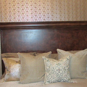
 We focused on selecting suitable colors to bring the mood of relaxation, and on adding the right elements to bring texture, and create ambiance. We selected gold and silver accessories to generate a sense of elegance and sophistication.
We added depth to the headboard wall by using gold wall paper with a wavy pattern design. These curved lines create familiarity and comfort and they also suggest relaxation.
 Advance Design Studio, Ltd.
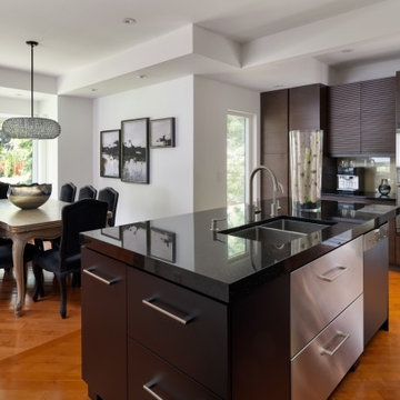
After six years of living in their Huntley IL home, Chris and Meghan were tired of their dark, dingy, outdated kitchen and it was finally time for a long-anticipated change. “The kitchen is the place where we live, it’s where we do everything,” Meghan said. “It was important that it be a space where we wanted to be.” Meghan loves cooking and enjoys including their girls in healthy meal prepping, this led them to want a brighter, more enjoyable kitchen with increased functionality and improved storage.
For Chris especially, the laundry room was an entirely dysfunctional eyesore. “We had a washer and a dryer, but it was all kind-of cobbled together!” Chris said. “There were always laundry piles everywhere, we weren’t really sure what we wanted to do in there, but it was time for us to make a change.” The mess of the space was stressful every time they walked in the door from the garage each day. Kids’ backpacks and shoes piled up haphazardly in the makeshift boot-bench closet left the family feeling disorganized and stressed. They needed space for folding clothes and locker cubbies to help keep the family organized.
Having known Christine and Todd in the Huntley community for years, Chris and Meghan were familiar with their work. “We already trusted them personally and having seen their projects for years we knew they did top notch work. After we reviewed the initial round of designs, we knew that hiring them was definitely the right choice,” Meghan and Chris said. Although Chris had done a lot of work in their home himself, the kitchen and laundry room renovation was such a large undertaking that he didn’t want to steal time away from his family to spend what would surely be many long weekends doing the job himself. “That would not have been a wise choice for us,” Chris laughed.
“Our designer, Michelle was very, very, easy to work with; anything we wanted to see or weren’t sure about, she went above and beyond to make this easy for us. She was easy to get hold of and always quick to respond,” the couple said. Michelle pulled ideas that mirrored the couple’s taste and style and was adept at directing the couple to limited choices that didn’t overwhelm them and kept the process moving. “I have a hard time making decisions. Michelle made the decision-making process so easy. I loved how she listened to what I liked and then presented three great options for me to choose from,” Meghan said.
The main objectives for the kitchen were better storage solutions, they wanted the space to reflect their lifestyle and taste, and they wanted it to last for years with low maintenance. One of the first steps in creating a more functional kitchen was relocating the refrigerator, creating an improved workflow for the busy family.
“We didn’t know that we could even move the refrigerator to a new location where it is now, that was something that we never would have thought of,” Chris said. “The new refrigerator location makes the kitchen feel so much bigger. We didn’t add any space, but our whole kitchen with the new design just seems like it’s so much larger than before!” Meghan said.
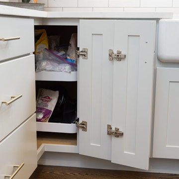
The perimeter mist colored cabinets helped warm and brighten the entire room, while the graphite colored cabinets on the island added contrast. Using this fresh, clean color palette satisfied the couple’s desire for a bright space that was the exact opposite of what they had before. Organization accessories were also added to the cabinets such as a spice drawer tray and roll outs to create hidden convenience.
“I absolutely love the hidden spices – it makes cooking so much more enjoyable!” Chris said. “And all the pull outs, and the double trash bin, who would think you could get so excited about organization!” the couple said in unison.
One thing they hated in their original kitchen was how dark the space felt. Added lighting on the ceiling with the new light fixtures combined with the lighter cabinetry colors throughout solved this problem. “Our new kitchen has this warm, almost cozy feeling that our old kitchen never had, it’s just a space that I love spending my time in now,” Meghan said. The light airy feeling was accentuated with the use of floating white shelves on either side of the decorative range hood. “We have so much cabinetry space, the new design is amazing we actually have more storage space than we will ever need,” Meghan said.
The island was extended to create more work surface and added space for stool seating. “The new island changes how we live. Now the kids can be in the kitchen with us, doing homework, eating breakfast, and the three of us have special dinners there when Chris is working late,” Meghan said.
The Carrara Marmi Quartz countertops were chosen because they are, not only beautiful, but are made from hard-working material that doesn’t require maintenance. The white subway tile backsplash that wraps to the ceiling behind the focal point cooktop range/hood compliments the crisp white countertops perfectly, while brushed brass hardware and light fixtures keep the design fresh and new.
The couple had a few fears at the beginning of the project, as most homeowners do. Their biggest fear was being out of their kitchen and laundry room for an extended time. The crew made it very easy for the family to work in a limited space keeping the washer and dryer hooked up the majority of the time, and also getting appliances working with minimal downtime.
“They above and beyond accommodated us to get us through the process,” Meghan said. “They did a great job making sure we were as comfortable as possible throughout the process,” Chris added.
“Our project manager DJ did a great job. He was very good at updating us on schedule changes, getting guys in as quickly as possible. Everyone that stepped in the house was nice and did great work,” said Chris. They thought Advance’s carpenter was phenomenal and were impressed when he took a conceptual idea from a photograph and worked with designer Michelle to create a one of a kind range/hood that has become the topic of conversation with friends and family who visit the new kitchen. “He was in our house literally every day for several weeks. He was easy to work with and good at what he did,” Meghan and Chris said.
The focal point of the kitchen; a hand-crafted, custom-built ventilation hood was clad with handpicked reclaimed barnwood. Advance Design’s carpenter built the framework and the cladding to create a one-of-a-kind design element that the couple loves.
“I think it was especially fun for him to create something unique from scratch, showcasing his talent in this area,” Meghan said. “I love that my kitchen is not like everyone else’s. I got to pick out the wood on my hood and watch it being built and was able to choose what pieces of wood went where on it. It’s totally unique.”
Red Oak flooring was toothed-in throughout the kitchen and the rest of the first floor anywhere changes were made. Then the whole floor was refinished to tone down the orange undertones in the existing floor stain, ultimately changing the color complexion of the entire first floor. The result is a completely new feeling to the entire home.
Renovating the laundry room was extremely important to Meghan and Chris, but they had trouble visualizing what the possibilities were for the seemingly small space. Michelle produced beautiful 3D illustrations that helped them envision the space in a whole new way.
“I must have told Michelle 100 times that I am a visual person, seeing the designs in 3D made it so easy to make decisions and see what we could really do with our space,” Meghan said.
A dividing wall and doorway were removed between the existing laundry room and hallway formerly containing a coat closet, providing space to design specialized graphite colored cabinetry matching the kitchen island to house custom storage cubbies for each family member. Adding the tall utility cabinetry in the new laundry area helped solve the storage issue, tucking away cleaning supplies, household items, and even the cat got its own cubby.
“I love how everything is now hidden in its own space. I can’t tell you how much I hated coming home and seeing everything sitting around on counters,” Chris said.
Electrical outlets were planned for the inside of utility cabinets, so devices could charge in hidden locations. Stacking the washer and dryer allowed for wider countertop space to provide a folding area and a special space for clothes to hang. “The way I do laundry has been completely transformed! I can actually fold clothes and hang them now right out of the washer and dryer,” Meghan said.
“The end result in the kitchen and the laundry/mud room was an updated light and bright space, with a smarter work flow that better meets the needs of this family,” Michelle said.
“I would totally recommend Advance Design,” Meghan said. “Sometimes I sit and just look at my kitchen and laundry room and think ‘Wow, I can’t believe I get to live here!’ It’s an understatement to say we love our new space.”

 Charles Petersheim, Builder
The Catskill Farms is proud to announce the sale of Barn 29 in Narrowsburg, NY – a pretty pairing of home and land in Sullivan County. This real estate offering featured 2,300 sq ft, 4 bedrooms, 3 baths, with a large open back deck. Familiar details include a wood burning fireplace, interesting and open floor plans, wide plank floors, fun plumbing and lighting fixtures throughout, and a kick your boots off mudroom. Industrial meets country in this beautiful home. Our homes provide genre-busting inspiration and comfort – life is cool in these superb specimens of Catskills real estate.
 Performance Kitchens & Home
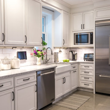
This bright classic traditional white kitchen remodel by Performance Kitchens & Home brings together timeless design and modern function. Crisp white cabinetry, elegant crown molding, and a farmhouse apron-front sink create a warm, familiar feel, while polished quartz surfaces and a sleek stainless-steel appliance package add an updated, contemporary edge.
A subway-tile backsplash with soft gray grout enhances texture and keeps the space feeling fresh and clean. Glass-front display cabinets and an eat-in breakfast area make the room both beautiful and practical for daily living. Carefully planned lighting and improved workflow transform this kitchen into an inviting, efficient centerpiece of the home. Text us at (484) 278-1764 or Call us (215) 482-0700 to get more info about Design, Design-Build and other ways we can help you make your dream a reality!
 BBA Architects
Situated along the perimeter of the property, this unique home creates a continuous street wall, both preserving plenty of open yard space and maintaining privacy from the prominent street corner. A one-story mudroom connects the garage to the house at the rear of the lot which required a local zoning variance. The resulting L-shaped plan and the central location of a glass-enclosed stair allow natural light to enter the home from multiple sides of nearly every room. The Arts & Crafts inspired detailing creates a familiar yet unique facade that is sympathetic to the character and scale of the neighborhood. A chevron pattern is a key design element on the window bays and doors and continues inside throughout the interior of the home.
2022 NAHB Platinum Best in American Living Award
View more of this home through #BBAModernCraftsman on Instagram.
 Klopf Architecture
From Mid-Century Classic to the Present
An iconic design updated with comfort, function, and flow for today.
A Remodel That Balances Past and Present
What started as a desire to update a classic Eichler soon became an exploration of how Mid-Century Modern design can successfully evolve for today. The client, a tech professional with a passion for scuba diving and underwater photography, wanted a home that would both honor its original character and feel tailored to his daily life. A lifelong technology enthusiast, he still owns the very first Mac desktop he saved up for as a teenager working at Radio Shack, a detail that underscores his appreciation for design that melds function and form.
Honoring Separation While Expanding Possibility
Unlike many contemporary remodels where walls are opened up to create expansive living spaces, this project took a more restrained approach. The client valued the defined rooms of the original plan and wanted to preserve as much wall space as possible for displaying his large-format underwater photography. The emphasis was not on dramatic spatial reinvention, but on thoughtful refinements. Klopf Architecture shaped a gallery-like backdrop while also expanding the primary suite, modernizing materials and fixtures throughout the home, and improving the functionality and layout of the kitchen. The finished home feels at once timeless and renewed, an Eichler that continues to inspire while fully supporting the lifestyle of its present-day owner.
A major turning point came mid-design. The original project brief had not included an addition, but as the reconfiguration of the primary bedroom and bath unfolded, it became clear that an expansion was the best approach to achieve the client’s vision of a more spacious suite. Fortunately, the adjustment came at a stage when revisions were still manageable and was integrated seamlessly, showing how thoughtful course corrections can strengthen a project rather than hinder it.
Navigating Challenges With Precision
The design development included multiple conceptual rounds, balancing preservation with subtle expansion. During construction, an existing post previously thought to be load-bearing turned out not to be. The structural engineer was able to pivot quickly, and both the post and the cross beam that had been intended to replace it could be omitted, allowing the original rhythm of the Eichler beam bays to be preserved.
Sustainability was not just a checklist item, but a way to align the home with the client’s values of simplicity, efficiency, and long-term functionality. R-38 roof insulation reduced energy usage, solar panels with battery storage provided independence and resilience, and passive comfort strategies eliminated the need forenergy-intensive air conditioning. An electric vehicle charger and an on-demand hot water recirculation system (with call buttons as opposed to having constant circulation) add to the home’s long-term efficiency factors. Together, these moves created a home that is quieter, more comfortable, and better equipped for the future, qualities that supported the client’s pragmatic approach to design and living lightly.
Details That Respect the Eichler DNA
The remodel carries forward the Eichler’s original spirit while introducing new layers of modern livability. Originally, the house was approached along a deep, narrow walk, with the garage on one side and the house on the other, leaving the front door tucked far back within this chasm-like space. By pulling the entry forward, the design reshaped the arrival experience, creating a clearer threshold and a natural drop-off zone for bags, shoes, and keys. This shift also made room for a custom bench at the entry that extends seamlessly through the glass sidelight. The bench and drop-off zone now work together as a single, integrated sequence that supports everyday living while offering a tactile reminder of Eichler’s philosophy of connectedness.
At the client’s request, Klopf reintroduced a classic Eichler gesture by extending the exterior siding into the entry and living room. The detail reinforces a sense of indoor/outdoor continuity while providing a subtle architectural surface that allows the client’s photography to take visual precedence.
The signature concrete masonry wall at the front was reconstructed using blocks sourced to match the originals, now strengthened with rebar for seismic resilience while maintaining a private outdoor courtyard, visually extending the kitchen outward. A decorative trellis element, a detail borrowed from a neighboring Eichler, restores a familiar mid-century modern architectural motif. At the courtyard entry door, a custom etched glass sidelight with an ocean-themed design featuring kelp and jellyfish serves as a subtle homage to the client’s passion for deep-sea diving.
Landscaping became an integral part of the overall transformation. The homeowner engaged landscape architect Randi Johnsen of Third Nature Studio to shape a series of calm, inviting outdoor rooms that read as a natural extension of the interiors. While technically outside of the core construction scope, the landscape design proved central to achieving a sense of completeness and connectedness across the property. Such whole-property considerations often emerge as design ideas take shape, underscoring the importance of flexibility in planning and budgeting, as well as close collaboration among the design team starting early in the process.
The Value of Evolving Scope
As with many custom residential projects, the scope evolved during the design process. What began as a targeted remodel grew to include a new/expanded primary suite, a rebuilt CMU patio wall for strength and longevity, and a solar panel array and battery storage for energy resilience and carbon-reduction. Each thoughtful decision represented a conscious investment in the home’s performance and character, rather than a cost overrun.
The result was a project delivered on schedule, tailored precisely to the client’s lifestyle, and positioned to add long-term value both functionally and aesthetically. By embracing scope evolution as an opportunity rather than a challenge, and relying on good design paired with transparent communication, this remodel demonstrates how Eichler homes can be adapted for contemporary living without erasing their DNA.
Klopf Architecture project team: John Klopf, AIA, and Klara Kevane, Elise Webb and Nicholas LaNasa.
Contractor: Golden Cove Construction
Landscape Design: Third Nature Studio
Structural Engineer: Daniel Bastiao Design
Photography: ©2025 Mariko Reed
Year Completed: 2024
Location: Sunnyvale, CA
 PI Photography Wall Art & Fine Art
 https://pipafineart.com/products/before-the-first-slice-tomato-photorealism-digital-artwork-loose-art-print.
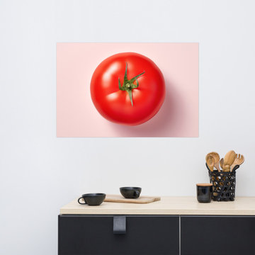
Savor the vibrant simplicity of "Before the First Slice," an artwork that captures the essence of a ripe, red tomato in its purest form. This photorealistic print showcases the tomato's smooth, glistening skin, its vibrant hue contrasting beautifully with the soft pink background. The delicate green stem and subtle imperfections add a touch of natural realism, inviting you to appreciate the simple beauty of this culinary staple. Printed on high-quality photo paper with premium inks, "Before the First Slice" brings a touch of understated elegance and vibrant color to any space.
Hang "Before the First Slice" in your kitchen, pantry, dining room, or restaurant to add a touch of freshness and vibrancy. This artwork is a celebration of the beauty found in everyday objects, a reminder to appreciate the simple pleasures of life and the artistry of nature. The minimalist composition and bold color palette create a striking visual impact, while the familiar subject matter evokes a sense of comfort and nostalgia.
"Before the First Slice" is made in the USA and printed on demand, ensuring a high-quality piece that will be cherished for years to come. Available in a variety of sizes, it makes a perfect gift for art enthusiasts, food lovers, and anyone who appreciates the beauty of minimalist art and the simple elegance of natural forms.
 Berry Design Build
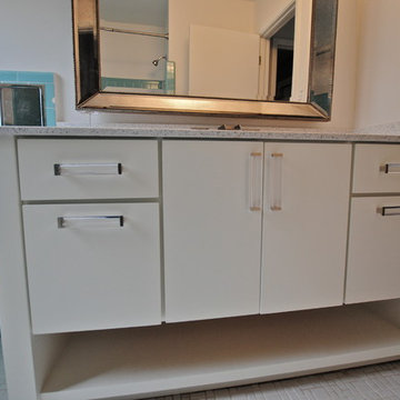
If you are familiar with our work, at Berry Design Build, you know that to us each project is more than just sticks and mortar. Each home, each client, each family we have the privilege to work with becomes part of our team. We believe in the value of excellence, the importance of commitment, and the significance of delivery. This renovation, along with many, is very close to our hearts because it’s one of the few instances where we get to exercise more than just the Design Build division of our company. This particular client had been working with Berry for many years to find that lifetime home. Through many viewings, agent caravans, and lots of offers later she found a house worth calling home. Although not perfectly to her personality (really what home is until you make it yours) she asked our Design Build division to come in and renovate some areas: including the kitchen, hall bathroom, master bathroom, and most other areas of the house; i.e. paint, hardwoods, and lighting. Each project comes with its challenges, but we were able to combine her love of mid-century modern furnishings with the character of the already existing 1962 ranch.
Photos by Nicole Cosentino
 Visbeen Architects
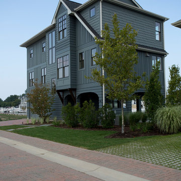
Who needs just one room with a view when you can live with and enjoy breathtaking vistas from three floors in this outstanding and innovative 2,861 square foot design? Narrow waterfront lots are no match for this efficient and easy living floor plan designed by Visbeen Architects, which makes the most of available land and includes the perfect balance of spacious interiors and covered exterior living.
The transitional architectural style combines traditional details with clean, sophisticated lines and references both classic and contemporary waterfront vacation homes across the country, from the coastal south to the New England Oceanside. Both familiar and welcoming in style, the updated exterior features peaks, wood siding and multiple window styles. From the street, the innovative design is full of curb appeal, with the lowest level designed for circulation and outdoor living. Rising from the street level, the home concentrates the majority of living space on the upper two floors, with an efficient floor plan that lives large on all three floors. The lowest level has just 370 well-planned square feet of living space, but features a roomy two-car garage, a foyer and powder room and two patios perfect for both alfresco dining and entertaining, one an exterior covered area and a nearby uncovered open-air alternative.
 Tile Doctor Ltd
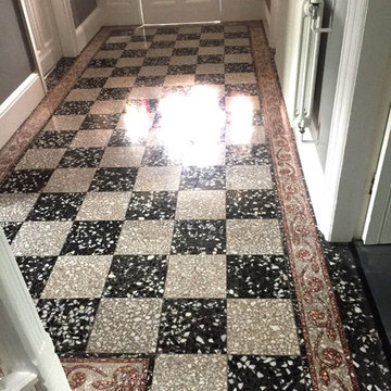
For this job, I paid a visit to the bustling town of Windermere in South Cumbria. My client asked me to refinish a black and white Terrazzo tiled entrance and hallway floor. Terrazzo if you’re not familiar is a very interesting and beautiful stone of Italian origin, which has been used for flooring in houses for centuries.
We had previously quoted to do the work on this floor however the customer has also received a quote from another firm in Glasgow and had chosen to go with them solely because they were more expensive. However, it stands to reason that the most expensive companies are not always the best quality and Tile Doctor prides itself on the amount of customer feedback we display on our websites which we believe is a far better indicator.
On the arranged day no one from the Glasgow firm showed up and after following up with the firm a young man in his early 20s arrived five hours late and began work on the floor. According to the customer he spent three days attempting to complete the job, but ran out of time and asked the client to apply the sealer themselves. The client applied the sealer, but as she had never done it before the floor turned out blotchy in appearance and she was far from happy.
To cut a long story short, my client complained to the Glaswegian company, after all she had paid for a full service and not received it. Unable to get a satisfactory conclusion from them she decided to call in Tile Doctor to put the matter right. I must point out that although I have included before and after photos one this post it’s really difficult to appreciate the extent of the problem without seeing the floor in real life.
To resolve the sealer, and to provide my client with the polished finish she had originally wanted, I burnished the floor using a set of four Tile Doctor Diamond encrusted burnishing pads. Each of the four pads has a different grit: I first applied the coarse pad and worked my way through medium, fine and eventually very fine using a little water to lubricate and rinsing the floor between each pad to remove any residue; after the burnishing process was complete I gave the entire floor a final, thorough wash.
I then used a wet-vac machine to extract the water and get the floor as dry as possible before leaving for the day and allowing it to fully dry completely overnight, it’s very important that the floor is as moisture free as possible before being sealed as it can affect the final result.
The next day I returned to the house and sealed the floor with two coats of Tile Doctor Colour Grow, an impregnating, colour-enhancing sealer that really accentuates the look of the black and white tiles.
Now that the problem has been resolved, my client is very happy with the condition of her Terrazzo tiled entrance and hallway floor.
Heidi Taylor
South Cumbria Tile Doctor
 Lincoln Lighthill Architect
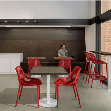
How do you make an impact within a familiar project typology? For our first cafe for Spro Coffee Lab, and their flagship location, we combined a long-held vision of a cafe with a faceted ceiling, their red & white material palette, and the building owner’s desire for an iconic street presence into a unified, minimalist language of angles and facets that extends throughout the cafe.
Overhead, a faceted soffit juts out dramatically over the service bar, the two objects mirroring each other’s footprints and satisfying Health Code requirements for a smooth, cleanable surface overhead. Concealing an egress corridor above that bisects the space, the soffit presents a bold visual gesture through the floor-to-ceiling glass walls of this corner space, beckoning passersby inside.
The service bar points toward the entry, with a minimalist espresso-tap system as the focal point, and angled sections branching off in both directions to create seating and service areas and direct customer flow.
Throughout the space, surfaces customers interact with are clad in chocolate-colored cork, providing a highly textured, tactile contrast to the smooth, white primary materials and complementing the bronze window system, red logos, and customer seating. The unfinished cork is durable and stain-resistant, resilient to the touch, provides acoustic dampening, and is highly sustainable.
The result is a cafe that goes far beyond the project brief, creating a memorable experience and an iconic presence for the brand.
 McKinney York Architects
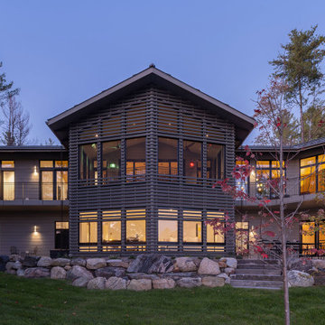
Three generations have shared summers together at this very special place called Merry Hill. Recognizing their shifting needs and looking forward to future generations, the clients wanted to both drastically change their beloved family lake house and yet not change it at all. This new iteration of the cottage is nearly double the size of the original, transforming their summer home into a four-season getaway while evoking the character of the original house in a new and fresh way.
The main cottage, boathouse and sleeping cabin all have broad, shallow-pitched roofs with generous overhangs that derive their form from their mid-century predecessor. Expansive openings, wood interiors, operable clerestories, and local stone double-stacked fireplaces are all familiar to the clients but rendered in different scales. Designed for resiliency and sustainability, the new retreat employs an integrated generator, geothermal heating, solar arrays, and battery storage as well as incorporates passive strategies such as sun orientation, earth sheltering, and cross ventilation to keep the interior at an ideal temperature all year round. The resulting form, detailing, and material selections of this new build allows for the seamless continuity of memory-making for a sentimental family.
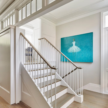 BBA Architects
Situated along the perimeter of the property, this unique home creates a continuous street wall, both preserving plenty of open yard space and maintaining privacy from the prominent street corner. A one-story mudroom connects the garage to the house at the rear of the lot which required a local zoning variance. The resulting L-shaped plan and the central location of a glass-enclosed stair allow natural light to enter the home from multiple sides of nearly every room. The Arts & Crafts inspired detailing creates a familiar yet unique facade that is sympathetic to the character and scale of the neighborhood. A chevron pattern is a key design element on the window bays and doors and continues inside throughout the interior of the home.
2022 NAHB Platinum Best in American Living Award
View more of this home through #BBAModernCraftsman on Instagram.
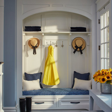
 Sew Beautiful
A collaborative project with an Annapolis architect firm, the design team came to us with two main priorities for this project: first, preserve their majestic waterfront views and second, create comfortable rooms to entertain their family and guests.
Soft, ethereal draperies anchor the picturesque bay window in the master bedroom. Motorized traversing panels in the second floor bedrooms stack off the windows to expose the scenic waterfront, and when closed, darken the rooms for peaceful sleeping. A stage coach valance in a casual stripe pattern, complete with nautical rope ties, provides a fun finish to the well appointed grandchild’s room. Familiar family heirloom furniture pieces were updated and upholstered with welcoming fabrics. Seat cushions and pillows for the rotunda’s custom bench create a cozy place to sit, relax and read a book.
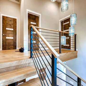
 Rodwin Architecture & Skycastle Construction
This lovely little modern farmhouse is located at the base of the foothills in one of Boulder’s most prized neighborhoods. Tucked onto a challenging narrow lot, this inviting and sustainably designed 2400 sf., 4 bedroom home lives much larger than its compact form. The open floor plan and vaulted ceilings of the Great room, kitchen and dining room lead to a beautiful covered back patio and lush, private back yard. These rooms are flooded with natural light and blend a warm Colorado material palette and heavy timber accents with a modern sensibility. A lyrical open-riser steel and wood stair floats above the baby grand in the center of the home and takes you to three bedrooms on the second floor. The Master has a covered balcony with exposed beamwork & warm Beetle-kill pine soffits, framing their million-dollar view of the Flatirons.
Its simple and familiar style is a modern twist on a classic farmhouse vernacular. The stone, Hardie board siding and standing seam metal roofing create a resilient and low-maintenance shell. The alley-loaded home has a solar-panel covered garage that was custom designed for the family’s active & athletic lifestyle (aka “lots of toys”). The front yard is a local food & water-wise Master-class, with beautiful rain-chains delivering roof run-off straight to the family garden.
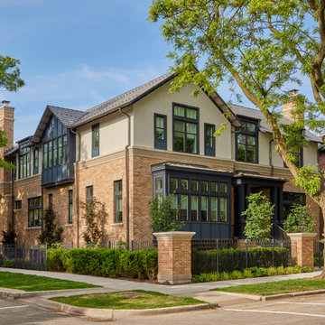 BBA Architects
Situated along the perimeter of the property, this unique home creates a continuous street wall, both preserving plenty of open yard space and maintaining privacy from the prominent street corner. A one-story mudroom connects the garage to the house at the rear of the lot which required a local zoning variance. The resulting L-shaped plan and the central location of a glass-enclosed stair allow natural light to enter the home from multiple sides of nearly every room. The Arts & Crafts inspired detailing creates a familiar yet unique facade that is sympathetic to the character and scale of the neighborhood. A chevron pattern is a key design element on the window bays and doors and continues inside throughout the interior of the home.
2022 NAHB Platinum Best in American Living Award
View more of this home through #BBAModernCraftsman on Instagram.
92