
Search results for "Geometry" in Home Design Ideas
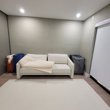
 MC Wallpaper Hanging
Dining Room wallpaper installation – Georgetown, TX – Modern
In this Georgetown dining space, we applied peel-and-stick vinyl with a bold abstract print to energize the room without needing paint. This modern style project focused on contrast: white wainscoting below, sharp black-and-white geometry above. Installed with laser leveling and pattern wraparound at corners for a gallery-like result.
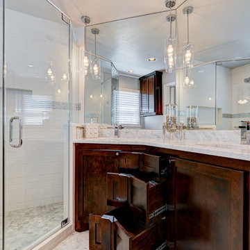
 Design Directions
A uniquely shaped bathroom made for uniquely shaped cabinets. Sure glad our trim carpenters paid attention in geometry class.
Example of a small transitional master gray tile and mosaic tile marble floor corner shower design in Oklahoma City with shaker cabinets, dark wood cabinets, gray walls and marble countertops
Example of a small transitional master gray tile and mosaic tile marble floor corner shower design in Oklahoma City with shaker cabinets, dark wood cabinets, gray walls and marble countertops
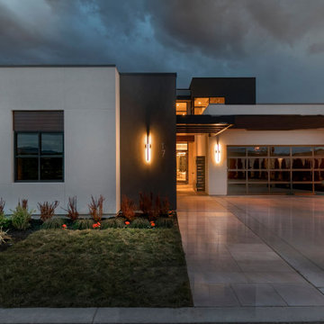
 Urban Design + Build
This beautiful house showcases a modern architectural style with a sophisticated blend of minimalist design and functional elegance. Clean lines and flat roof profiles give the structure a contemporary edge, while the harmonious color palette of neutral tones complements the natural surroundings. The use of large windows and glass garage doors not only provides an abundance of natural light but also fosters a seamless indoor-outdoor connection. Strategic exterior lighting accentuates the building's geometry, creating a warm and inviting ambiance that beckons at twilight. Landscaping is thoughtfully integrated, with well-manicured lawns and vibrant plantings that add a touch of color and life to the serene setting. This home's exterior is a testament to modern luxury living, blending chic design with the beauty of the natural environment.
Find the right local pro for your project
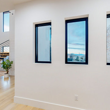
 F9 Productions Inc.
This space celebrates the beauty of simplicity through precise architectural detailing. The trio of narrow, black-framed windows introduces rhythm and balance while framing curated views of the surrounding landscape and stone façade. Adjacent to the floating staircase, the open risers and slender steel railing reinforce the home’s modern aesthetic—creating a striking interplay of light, shadow, and transparency. Warm wood flooring softens the geometry, grounding the minimalist composition in natural texture.
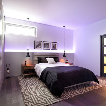
 LUX Design | Interior Design Build
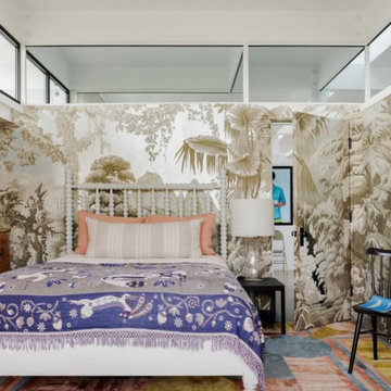
The overall focus of this space is the enhanced lighting. Organic textures and colors have been used by Lux Design to create an oasis and calming environment for the client. The geometry of the furniture pieces and architectural features, have been accented by the designs of the rug, to complete the overall look of this bedroom.
Photo Credit: Lisa Petrole
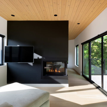
 EW Architecture Inc.
This 1967 home has been transformed. LANTERN HOUSE is located at the edge of the forest, the edge of urbanity, where the glass and metal clad entry and stair volumes glow like lanterns in the night. The sloping, trapezoidal site posed challenges, resulting in a very unique geometry with a courtyard, a bridge, and a new stair tower link old to new. A new porch and foyer create a gradual entry sequence into the existing main house. A new roof form provides vaulted ceilings in an open plan concept. The primary living spaces are connected to private outdoor spaces for entertaining and everyday living, and the main addition contains a private master retreat with secluded access from the stair tower. The connection with nature is ever present throughout the house with intentionally placed glazing framing views to the surrounding trees.
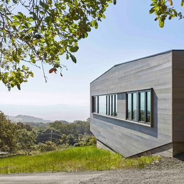
 Schwartz and Architecture
The tightly constrained footprint of the affectionately named “Box on the Rock” is a response to a limited budget and difficult site. Shallow underground hillside waterways run across the site often daylighting in unexpected and unwanted locations. These necessitated relatively expensive pier footings thus motivating an extremely efficient 2,000 sq ft footprint. With no initial resources to develop the wild scrub and rock landscape of the 3-acre property, the home becomes a lone outpost settling the higher ground of the larger natural site --a literal box on a rock.
Given these limitations, the architecture of this outpost needs to provide for all indoor and outdoor functions within its area. With the extremes of the wine country microclimate on the exposed site, this becomes an even more critical requirement for year-round comfort. The central courtyard and the cantilevered deck are strategically carved out of the diagrammatic box to ensure that over the course of the day, temperate options for both sun and shade are always available. In particular, the geometry of the overhang at the front cantilevered deck and the inward angle of its exterior glass walls are carefully calibrated to capture morning sun and winter warming while shielding the internal space from the harshest summer glare. Later in the day the central courtyard comes alive as the sunniest developed outdoor space, yet one that is naturally cooled by capturing the valley cross breezes.
With an economy of means, this simple form morphs to amplify the experience of the dramatic site and create an expansive feeling home that belies its small footprint. Each adjustment to the diagrammatic box negotiates the functional and environmental needs to foster self-contained and site-specific living with a minimal environmental impact.
Photo by Bruce Damonte
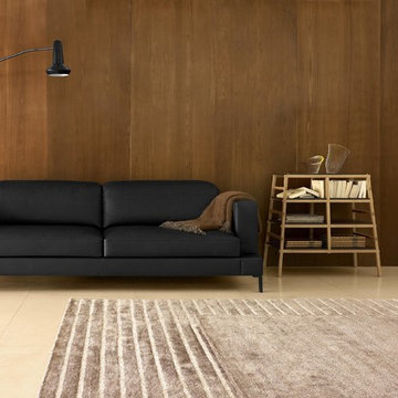
 Soft Square-Modern & Contemporary Furniture Store
LIgne Roset - ACTE 1
by Didier Gomez
Acte 1's aesthetic approach is based on the opposition between the geometry of the tight lines in its structure and its base and the hospitable welcome highlighted by the contrast between the seat cushions and the hinged backs. Its timeless design will appeal to many. As usual, Didier Gomez punctuates his design, inspired by art deco classicism, with an original ''signature'' that gives it its unique personality.
 Century Stair Company
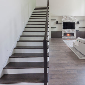
Designed by the homeowners themselves, this striking staircase rises through multiple levels with architectural precision. Dark-toned square balusters and newels create bold contrast against crisp white risers, while horizontal stainless steel rods maintain visual lightness.
The brilliance lies in the interplay of angles, levels, textures, and natural light. Strategic design choices transform the staircase into more than a connector. It carves out cozy sunny nooks and creates focal points throughout the open floor plan, proving that thoughtful geometry can shape how a home feels and functions.
1976-2026 © Century Stair Company
 VORBILD Architecture
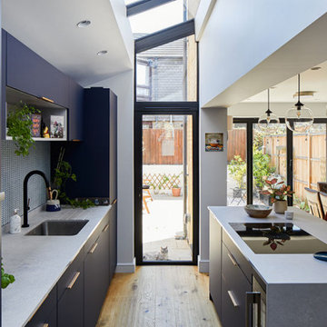
This dynamic galley kitchen extends into an open-plan dining area, seamlessly linking indoor and outdoor living. With its rich navy cabinetry and brushed brass accents, the kitchen maintains a bold yet refined character. Natural light pours in through the dramatic double-height glazing and expansive rooflight, enhancing the sense of vertical space and volume. The white quartz worktops offer clarity and brightness while balancing the darker tones. Pendant lighting continues the visual rhythm above the island and into the dining area, where eclectic plants and curated decor soften the geometry. A subtle indoor-outdoor connection is reinforced by full-height glazing, creating a light-filled space perfect for family life and entertaining.
 Stairbuilders and Manufacturers Association
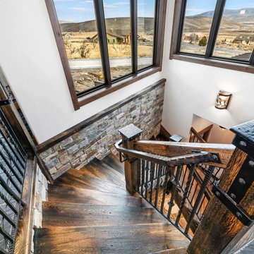
Aesthetic Value: This rustic stairway and balustrade provide a dramatic focal point to the entry area of a mountain home. The burnt treads and metal oiled iron accent the stone wall and water feature under the stair.
Stair Safety: Consistent run at the walk line throughout the dancing winders offers comfortable stride on an asymmetrical stair layout. An additional hammered iron handrail provides continuous graspability despite the oversized guard rail. Lighting under each tread.
Quality: All solid white oak construction of wood components. Hand forged iron newel caps in conjunction with intricate tree bark design elements and custom twisted hammered balusters. Custom finish provided on the wood and iron components.
Technical Challenge: Complex geometry of asymmetrical stair layout, complicated tread notches into the stringer, concealed lighting chases, sand blasted and torched wood prior to application of finish, intense design consultation, and distant jobsite for turnkey project.
 Drewett Works
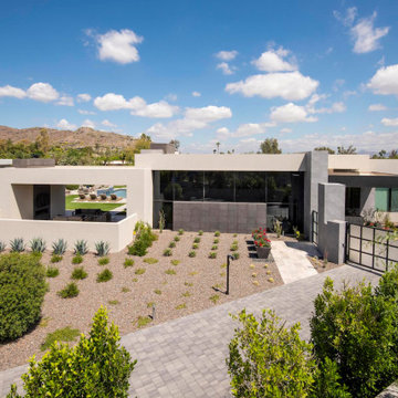
Above and Beyond is the third residence in a four-home collection in Paradise Valley, Arizona. Originally the site of the abandoned Kachina Elementary School, the infill community, appropriately named Kachina Estates, embraces the remarkable views of Camelback Mountain.
Nestled into an acre sized pie shaped cul-de-sac lot, the lot geometry and front facing view orientation created a remarkable privacy challenge and influenced the forward facing facade and massing. An iconic, stone-clad massing wall element rests within an oversized south-facing fenestration, creating separation and privacy while affording views “above and beyond.”
Above and Beyond has Mid-Century DNA married with a larger sense of mass and scale. The pool pavilion bridges from the main residence to a guest casita which visually completes the need for protection and privacy from street and solar exposure.
The pie-shaped lot which tapered to the south created a challenge to harvest south light. This was one of the largest spatial organization influencers for the design. The design undulates to embrace south sun and organically creates remarkable outdoor living spaces.
This modernist home has a palate of granite and limestone wall cladding, plaster, and a painted metal fascia. The wall cladding seamlessly enters and exits the architecture affording interior and exterior continuity.
Kachina Estates was named an Award of Merit winner at the 2019 Gold Nugget Awards in the category of Best Residential Detached Collection of the Year. The annual awards ceremony was held at the Pacific Coast Builders Conference in San Francisco, CA in May 2019.
Project Details: Above and Beyond
Architecture: Drewett Works
Developer/Builder: Bedbrock Developers
Interior Design: Est Est
Land Planner/Civil Engineer: CVL Consultants
Photography: Dino Tonn and Steven Thompson
Awards:
Gold Nugget Award of Merit - Kachina Estates - Residential Detached Collection of the Year
 Oak & Iron Construction Group
This bathroom from Marfa’s Modern captures the spirit of artistic modernism with bold geometry and subtle organic touches. A striking black and white tile pattern defines the shower, lending graphic energy to the otherwise serene space. The brass fixtures and wall-mounted faucet introduce warmth and contrast, while soft natural light enhances the textured plaster walls. Artful details—a striped robe, curated wall art, and a sculptural vase—tie the room’s creative aesthetic together. The result is a bathroom that feels both modern and handcrafted, where every surface tells a story of design intention and desert-inspired artistry.
 mercer INTERIOR
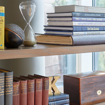
"People tend to be more at ease with right angles and symmetry and many projects do call for that. With this home, I wanted to be mindful of the intent of the building's architect and that meant not trying to make the geometry disappear."- Elizabeth Mercer
Interior Desing by mercer INTERIOR
Photography by Emily Gilbert Photo
 Sustainable Building Design Nepal
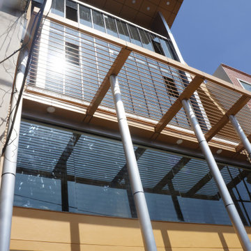
This is a modern building design service for a five storied commercial building with a basement floor, built in Lalitpur, Nepal in 2015. Oriented to South direction, the design incorporates glass facade inclined inward, framed by inclined metallic elements . Use of inclined geometries for volumetric composition at an angle of 15 degrees at varying directions. Striking 17 feet projected roofing canopy has been the center of attraction. The modern building was featured in Spaces Magazine Sep-Oct 2018 issue.
 Studio Terpeluk
The project was a renovation of a 1974 two-story house designed by prominent San Francisco architect Albert Lanier (husband of Ruth Asawa). Each level is framed by exterior courtyards which provide both sheltered intimacy with nature and visual connection to the city beyond. The owners were interested in increasing the volume of the house while maintaining its original DNA as defined by angular geometries, redwood interiors and exterior courtyards.
Our approach was to expand and surgically modify the house in an architecturally non-aggressive manner. Spaces were opened up and flow and views were maximized. Color, texture, light and vegetation were used to harmonize with the vintage redwood tonalities and the owners’ eclecticism.
Dark-knotted douglas fir flooring, fabricated from locally reclaimed pier pilings, was used throughout the house to balance the dark redwood living level with the lighter-hued floors below. The sculptural blackened steel stair anchors the house, weaving together the floors and their diverse spatial character. Hard materials including terrazzo, concrete and mottled gray marble were used to counterbalance the warm softwoods. The house façades and cascading courtyards were reclad in irregular western red cedar planks.
We collaborated with our friend and designer Beatrice Santiccioli to create a color language that expresses a natural interaction with the light and materials in the environment, transitioning from bold to atmospheric as you pass downward through the house. Italian landscape designer Monica Viarengo designed the outdoor areas including the intimate entry courtyard and the terraced back garden with expansive views of the city. Her work shifts from curated to wild as your move through the property.
 Dounia Home
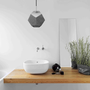
This stunning pendant light combines geometry and intricate Moroccan craftsmanship. Its pattern casts a sense of regal tranquility, directing movement of energy throughout the space.
This ceiling light is made from high quality metals and finished to perfection. It is the perfect accent light for your kitchen, living room and bedroom.
 Entheos
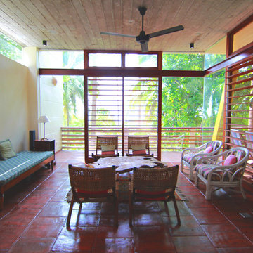
Inspiration for a large tropical enclosed ceramic tile and red floor living room remodel in Other with beige walls


178