
Search results for "Helping couples" in Home Design Ideas
 McAdams Remodeling & Design
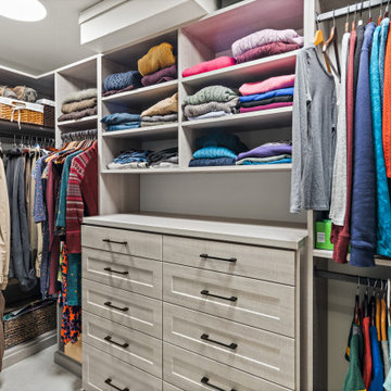
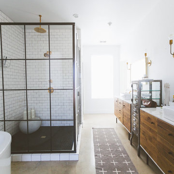
Lee & James wanted to update to their primary bathroom and ensuite closet. It was a small space that had a few pain points. The closet footprint was minimal and didn’t allow for sufficient organization of their wardrobe, a daily struggle for the couple. In addition, their ensuite bathroom had a shower that was petite, and the door from the bedroom was glass paned so it didn’t provide privacy. Also, the room had no bathtub – something they had desired for the ten years they’d lived in the home. The bedroom had an indent that took up much of one wall with a large wardrobe inside. Nice, but it didn’t take the place of a robust closet.
The McAdams team helped the clients create a design that extended the already cantilevered area where the primary bathroom sat to give the room a little more square footage, which allowed us to include all the items the couple desired. The indent and wardrobe in the primary bedroom wall were removed so that the interior of the wall could be incorporated as additional closet space. New sconces were placed on either side of the bed, and a ceiling fan was added overhead for ultimate comfort on warm summer evenings.
The former closet area was repurposed to create the couple’s new and improved (and now much larger) shower. Beautiful Bianco St. Croix tile was installed on the walls and floor of the shower and a frameless glass door highlighting the fabulous Brizo rainshower head and Delta adjustable handheld showerhead all combine to provide the ultimate showering experience. A gorgeous walnut vanity with a Calacutta Gold Honed Marble slab top (that coordinates with the kitchen) replaced the old cabinet. A matte black Pottery Barn Vintage Pill Shaped Mirror was placed above the undermount sink, while a striking LED pendant serves as the main light source. The newly added square footage allows for a Victoria and Albert stand-alone soaking tub with an adjacent towel warmer, all of which almost makes you forget you’re in a home and not a high-end spa. Finally, just past the new Toto toilet with bidet, the couple got their new, large walk-in closet with customized storage solutions for their individual needs. The transformation absolutely helped Lee and James love their home again!


Find the right local pro for your project
 Heather Banks
Photo: Heather Banks © 2015 Houzz
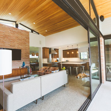
Living room - mid-century modern living room idea in Austin
Living room - mid-century modern living room idea in Austin
 Prentiss Balance Wickline Architects
Photographer: Jay Goodrich
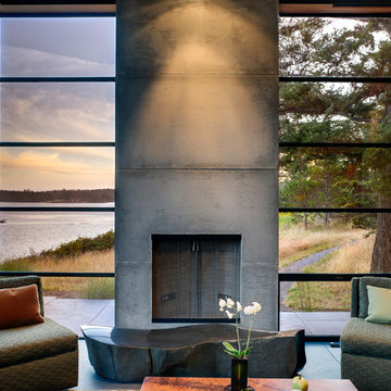
This 2800 sf single-family home was completed in 2009. The clients desired an intimate, yet dynamic family residence that reflected the beauty of the site and the lifestyle of the San Juan Islands. The house was built to be both a place to gather for large dinners with friends and family as well as a cozy home for the couple when they are there alone.
The project is located on a stunning, but cripplingly-restricted site overlooking Griffin Bay on San Juan Island. The most practical area to build was exactly where three beautiful old growth trees had already chosen to live. A prior architect, in a prior design, had proposed chopping them down and building right in the middle of the site. From our perspective, the trees were an important essence of the site and respectfully had to be preserved. As a result we squeezed the programmatic requirements, kept the clients on a square foot restriction and pressed tight against property setbacks.
The delineate concept is a stone wall that sweeps from the parking to the entry, through the house and out the other side, terminating in a hook that nestles the master shower. This is the symbolic and functional shield between the public road and the private living spaces of the home owners. All the primary living spaces and the master suite are on the water side, the remaining rooms are tucked into the hill on the road side of the wall.
Off-setting the solid massing of the stone walls is a pavilion which grabs the views and the light to the south, east and west. Built in a position to be hammered by the winter storms the pavilion, while light and airy in appearance and feeling, is constructed of glass, steel, stout wood timbers and doors with a stone roof and a slate floor. The glass pavilion is anchored by two concrete panel chimneys; the windows are steel framed and the exterior skin is of powder coated steel sheathing.
 Heather Banks
Photo: Heather Banks © 2015 Houzz
Design: Brandi Hines
Inspiration for a modern bathroom remodel in Austin
Inspiration for a modern bathroom remodel in Austin
 Bilotta Kitchen & Home
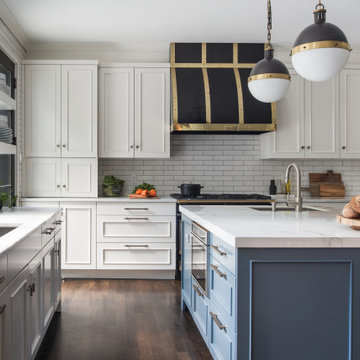
This clean and classic Northern Westchester kitchen features a mix of colors and finishes. The perimeter of the kitchen including the desk area is painted in Benjamin Moore’s Nordic White with satin chrome hardware. The island features Benjamin Moore’s Blue Toile with satin brass hardware. The focal point of the space is the Cornu Fe range and custom hood in satin black with brass and chrome trim. Crisp white subway tile covers the backwall behind the cooking area and all the way up the sink wall to the ceiling. In place of wall cabinets, the client opted for thick white open shelves on either side of the window above the sink to keep the space more open and airier. Countertops are a mix of Neolith’s Estatuario on the island and Ash Grey marble on the perimeter. Hanging above the island are Circa Lighting’s the “Hicks Large Pendants” by designer Thomas O’Brien; above the dining table is Tom Dixon’s “Fat Pendant”.
Just off of the kitchen is a wet bar conveniently located next to the living area, perfect for entertaining guests. They opted for a contemporary look in the space. The cabinetry is Yosemite Bronzato laminate in a high gloss finish coupled with open glass shelves and a mirrored backsplash. The mirror and the abundance of windows makes the room appear larger than it is.
Bilotta Senior Designer: Rita LuisaGarces
Architect: Hirshson Design & Architecture
Photographer: Stefan Radtke



 DANIELLE Interior Design & Decor
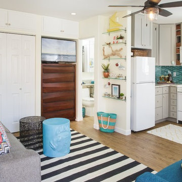
Accenting the teal glass backsplash tile with the vivid black and white rug is just what this small apartment needed. In this small spaces we tried to maximize space and organize effectively. We used minimal dicor and kept the tiny living room to the essentials.
Designed by Interior Designer Danielle Perkins @ DANIELLE Interior Design & Decor.
Photography by Taylor Abeel Photography.
 Megan Hansen
Photo: Megan Hansen © 2017 Houzz
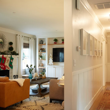
Living room - transitional living room idea in San Francisco
Living room - transitional living room idea in San Francisco
 DISC Interiors
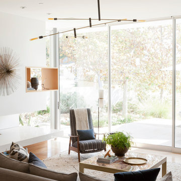
Example of a minimalist medium tone wood floor living room design in Los Angeles with white walls
 TKS Design Group
Download our free ebook, Creating the Ideal Kitchen. DOWNLOAD NOW
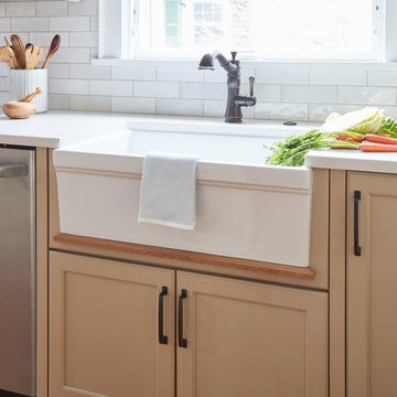
The homeowners came to us looking to update the kitchen in their historic 1897 home. The home had gone through an extensive renovation several years earlier that added a master bedroom suite and updates to the front façade. The kitchen however was not part of that update and a prior 1990’s update had left much to be desired. The client is an avid cook, and it was just not very functional for the family.
The original kitchen was very choppy and included a large eat in area that took up more than its fair share of the space. On the wish list was a place where the family could comfortably congregate, that was easy and to cook in, that feels lived in and in check with the rest of the home’s décor. They also wanted a space that was not cluttered and dark – a happy, light and airy room. A small powder room off the space also needed some attention so we set out to include that in the remodel as well.
See that arch in the neighboring dining room? The homeowner really wanted to make the opening to the dining room an arch to match, so we incorporated that into the design.
Another unfortunate eyesore was the state of the ceiling and soffits. Turns out it was just a series of shortcuts from the prior renovation, and we were surprised and delighted that we were easily able to flatten out almost the entire ceiling with a couple of little reworks.
Other changes we made were to add new windows that were appropriate to the new design, which included moving the sink window over slightly to give the work zone more breathing room. We also adjusted the height of the windows in what was previously the eat-in area that were too low for a countertop to work. We tried to keep an old island in the plan since it was a well-loved vintage find, but the tradeoff for the function of the new island was not worth it in the end. We hope the old found a new home, perhaps as a potting table.
Designed by: Susan Klimala, CKD, CBD
Photography by: Michael Kaskel
For more information on kitchen and bath design ideas go to: www.kitchenstudio-ge.com


Sponsored
Columbus, OH

Hope Restoration & General Contracting
Columbus Design-Build, Kitchen & Bath Remodeling, Historic Renovations
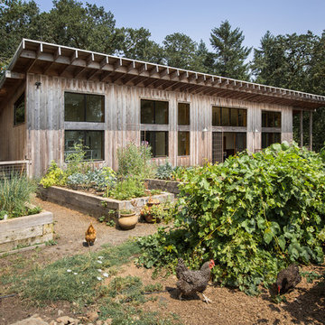
 M.O.Daby Design
modern farmhouse
Dundee, OR
type: custom home + ADU
status: built
credits
design: Matthew O. Daby - m.o.daby design
interior design: Angela Mechaley - m.o.daby design
construction: Cellar Ridge Construction / homeowner
landscape designer: Bryan Bailey - EcoTone / homeowner
photography: Erin Riddle - KLIK Concepts
 Lumar Interiors
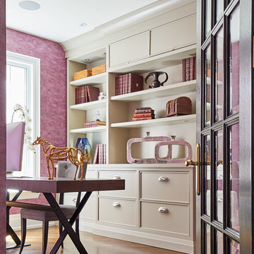
Our goal for this project was to transform this home from family-friendly to an empty nesters sanctuary. We opted for a sophisticated palette throughout the house, featuring blues, greys, taupes, and creams. The punches of colour and classic patterns created a warm environment without sacrificing sophistication.
Home located in Thornhill, Vaughan. Designed by Lumar Interiors who also serve Richmond Hill, Aurora, Nobleton, Newmarket, King City, Markham, Thornhill, York Region, and the Greater Toronto Area.
For more about Lumar Interiors, click here: https://www.lumarinteriors.com/
 Carolina V. Gentry, RID
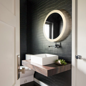
This forever home, perfect for entertaining and designed with a place for everything, is a contemporary residence that exudes warmth, functional style, and lifestyle personalization for a family of five. Our busy lawyer couple, with three close-knit children, had recently purchased a home that was modern on the outside, but dated on the inside. They loved the feel, but knew it needed a major overhaul. Being incredibly busy and having never taken on a renovation of this scale, they knew they needed help to make this space their own. Upon a previous client referral, they called on Pulp to make their dreams a reality. Then ensued a down to the studs renovation, moving walls and some stairs, resulting in dramatic results. Beth and Carolina layered in warmth and style throughout, striking a hard-to-achieve balance of livable and contemporary. The result is a well-lived in and stylish home designed for every member of the family, where memories are made daily.
 River Valley Landscapes
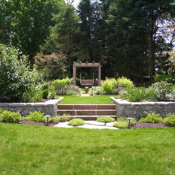
The property is one of the original farm houses located on the main street of a small town. It has been in the family for many years and our client just inherited the property. They were trying to have balance of preserving the old while realizing modern day living has its benefits too. The house had a large addition added using mostly old style materials, but designed with function and modern day luxuries. Our goal was to carry that theme to the outside.
Our first problem we had to address was how to transition between the first floor elevation changes. The lower room was the husband’s office. He stated in the future he may have clients over and it would be nice to have an area to sit outside. The wife’s main concern was to renew the four corner garden. She also felt it was very important to be able to see it from the kitchen area. Finally there was an old wishing well stuck right outside the kitchen. They both felt it would be neat to be able to incorporate this in some how. They wanted a patio area with a built in grill to accommodate there family and friends. They also wanted to keep a large play area for the kids.
We were able to pull this off successfully. We addressed the first issue by having a small lower level flagstone area. This area is large enough for 1 to 2 people to sit comfortably. It also provides a transition from his office to the larger patio area. We installed a simple small gravel sitting area opposite of the main patio. This provides our client a secluded place to relax or do business. Mrs.... told me she is amazed how much her and her husband enjoys this area. It is so peaceful looking at the small creek over a glass of wine.
We built a natural limestone retaining wall to create the patio terrace. The stone was chosen to extend the houses architectural elements into the landscape. Irregular broken flagstone was used to give it a more casual feel. We installed three Serviceberries into the patio terrace to replace some trees that were taken down during the remodeling. She was very concern that they would block the view of the four corner garden. We new they were crucial to nestle in the terrace, so we placed them for a couple days for her to decide. Fortunately she agreed they not only kept the view open, but helped frame the garden.
The four corner garden was designed to be viewed from afar and experienced up close. We wanted the space to have some formal structure while keeping with the casual farm house feel. Another natural limestone retaining wall was created. This leveled the garden terrace and helped associate it with the rest of the property. The four corner garden is nestled into the existing woods edge. This provides three distinct experiences to entering the garden; a more formal from the driveway, an open feel from the lower lawn, and a more natural / casual experience from the wooded area. The Plymouth brown gravel was used for the center of the garden. This helped highlight the stone post that was found during construction. The gravel also brings the sense of sound into the garden space. Lamb’s ear was chosen as a fun way to get kids interest in horticulture.
The balance of using the new to create the old feel is what makes this project a success. The property has already hosted a local historical society event and won an award for its preservation efforts. When Mrs.... can’t find her husband, she knows he is either reading the newspaper by the grill or resting in the hammock along the wood’s path.
Sponsored
Columbus, OH
Hope Restoration & General Contracting
Columbus Design-Build, Kitchen & Bath Remodeling, Historic Renovations
 Ellie Lillstrom Photography
Photo: Ellie Arciaga © 2015 Houzz
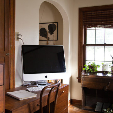
Example of a small eclectic freestanding desk medium tone wood floor study room design in Seattle with white walls
Example of a small eclectic freestanding desk medium tone wood floor study room design in Seattle with white walls
 Rainbow Valley Design & Construction
Steve Smith, ImaginePhotographics
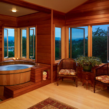
Bathroom - traditional light wood floor bathroom idea in Other with a hot tub
Bathroom - traditional light wood floor bathroom idea in Other with a hot tub

36