
Search results for "Homeowners" in Home Design Ideas
 M Atelier
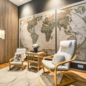
If there is one big mistake that homeowners make when carrying out the decoration tasks of their interior design project, that would be over-accessorising. Indeed, experts in interior design in Singapore agree that there are styles where “more is more,” and there are also those where “less is more.”
While as a homeowner you may choose either of these two style directions, you should first think about the different aspects of interior design and make sure that your style choice fits with these elements. Not doing so may not only result to a poorly executed renovation, but a home that you will find uncomfortable to live in.
So how do you avoid the tendency of over-accessorising? You may want to follow these pieces of advice coming from professionals in interior design in Singapore:
Mistake #1: Using the same fabric on almost all surfaces.
It is common practice among most homeowners to use almost the same fabric on all table surfaces, and sometimes even on sofa covers and drapes. Indeed, this can be cost effective, but it does not contribute to the development of the home’s overall design.
This is because there are fabrics are created to meet specific purposes. For example, lace is often used as table runners, as they give more definition and style to these specific furniture pieces. However, they do not do your windows any favours when used as curtains.
Opaque and heavy fabrics are often intended for curtains and drapes for rooms that require more privacy; in contrast, sheer and fabric materials are more suited for living room windows as they allow natural light and ventilation to move around the house.
Mistake #2: Placing more accents than you actually need.
Another mistake which homeowners are prone to make when decorating their home is placing more accents than needed. There are homes you can see side tables that are overpopulated with picture frames, trinkets, and fancy souvenirs that do not have any connection to each other. Sometimes, you can find numerous throw pillows occupying almost the entire sofa, to the point that all the seats are already occupied.
These are classic examples of “fear of empty spaces,” which is prevalent in most Asian societies, and even in some Western countries. But while it is common practice to occupy empty spaces, you may also want to think about what to do with the space first.
Instead of piling up all your memorabilia in the side tables of your bedroom or living room, why not use a tiered stand so that they can be presented in an organised manner? You may also want to choose a designated area for your trinkets, such as a wall or an unoccupied corner in your room.
Mistake #3: Overdoing the lighting fixtures.
Some homeowners want to imitate the homes of the celebrities they see on TV, and apart from following the same colour schemes and choice of furniture, they also choose to add more lights in their rooms than necessary.
Well, you should understand that the purpose of lighting fixtures is to illuminate the rooms of the house, but this doesn’t mean that you have to brighten up your home all the time. You may want to use lamps that spread the light across the room, rather than several smaller bulbs. The latter only lights up specific parts of the room, and when all these bulbs are lit simultaneously, they only spike up your electric bill.
It would be better to choose lighting fixtures according to your need and the function of the room. Doing so not only illuminates your home properly, but also creates an ambiance that gives you the comfort you are looking for in a dwelling space.
 Michael Nash Design, Build & Homes
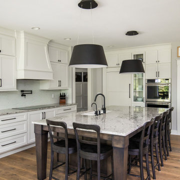
This growing family of six was struggling with a dysfunctional kitchen design. The center island had been installed at an odd angle that limited accessibility and traffic flow. Additionally, storage space was limited by poor cabinet design. Finally, doorways in and out of the kitchen were narrow and poorly located, especially for children dashing in and out.
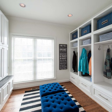
Other design challenges included how to better use a 10’ x 12’ room for children’s jackets and toys and how to add a professional-quality gas range in a neighborhood were natural gas wasn’t available. The new design would address all of these issues.
DESIGN SOLUTIONS
The new kitchen design revolves around a more proportional island. Carefully placed in the center of the new space with seating for four, it includes a prep sink, a second dishwasher and a beverage center.
The distressed ebony-stained island and hutch provides a brilliant contrast between the white color cabinetry. White Carrera marble countertops and backsplash top both island and perimeter cabinets.
Tall, double stacked cabinetry lines two walls to maximize storage space. Across the room there was an unused wall that now contains a 36” tower fridge and freezer, both covered with matching panels, and a tall cabinet that contains a microwave, steam unit and warming drawer.
A propane tank was buried in the back yard to provide gas to a new 60” professional range and cooktop. A custom-made wood mantel hood blends perfectly with the cabinet style.
The old laundry room was reconfigured to have lots of locker space for all kids and added cabinetry for storage. A double entry door separated the new mudroom from the rest of the back hall. In the back hall the back windows were replaced with a set of French door and added decking to create a direct access to deck and backyard.
The end result is an open floor plan, high-end appliances, great traffic flow and pleasing colors. The homeowner calls it the “kitchen of her dreams.”
 Kitchen Design Concepts
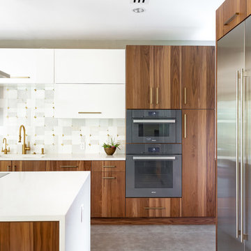
In our world of kitchen design, it’s lovely to see all the varieties of styles come to life. From traditional to modern, and everything in between, we love to design a broad spectrum. Here, we present a two-tone modern kitchen that has used materials in a fresh and eye-catching way. With a mix of finishes, it blends perfectly together to create a space that flows and is the pulsating heart of the home.
With the main cooking island and gorgeous prep wall, the cook has plenty of space to work. The second island is perfect for seating – the three materials interacting seamlessly, we have the main white material covering the cabinets, a short grey table for the kids, and a taller walnut top for adults to sit and stand while sipping some wine! I mean, who wouldn’t want to spend time in this kitchen?!
Cabinetry
With a tuxedo trend look, we used Cabico Elmwood New Haven door style, walnut vertical grain in a natural matte finish. The white cabinets over the sink are the Ventura MDF door in a White Diamond Gloss finish.
Countertops
The white counters on the perimeter and on both islands are from Caesarstone in a Frosty Carrina finish, and the added bar on the second countertop is a custom walnut top (made by the homeowner!) with a shorter seated table made from Caesarstone’s Raw Concrete.
Backsplash
The stone is from Marble Systems from the Mod Glam Collection, Blocks – Glacier honed, in Snow White polished finish, and added Brass.
Fixtures
A Blanco Precis Silgranit Cascade Super Single Bowl Kitchen Sink in White works perfect with the counters. A Waterstone transitional pulldown faucet in New Bronze is complemented by matching water dispenser, soap dispenser, and air switch. The cabinet hardware is from Emtek – their Trinity pulls in brass.
Appliances
The cooktop, oven, steam oven and dishwasher are all from Miele. The dishwashers are paneled with cabinetry material (left/right of the sink) and integrate seamlessly Refrigerator and Freezer columns are from SubZero and we kept the stainless look to break up the walnut some. The microwave is a counter sitting Panasonic with a custom wood trim (made by Cabico) and the vent hood is from Zephyr.
Find the right local pro for your project

 DK Homes
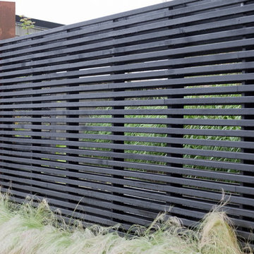
Uniquely situated on a double lot high above the river, this home stands proudly amongst the wooded backdrop. The homeowner's decision for the two-toned siding with dark stained cedar beams fits well with the natural setting. Tour this 2,000 sq ft open plan home with unique spaces above the garage and in the daylight basement.
 Wright-Built
Sarah Miller
Example of a mountain style powder room design in Dallas with a two-piece toilet
Example of a mountain style powder room design in Dallas with a two-piece toilet


 TKS Design Group
Free ebook, CREATING THE IDEAL KITCHEN
Download now → http://bit.ly/idealkitchen
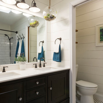
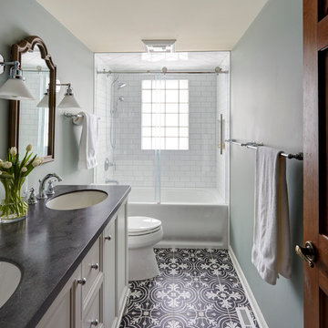
The hall bath for this client started out a little dated with its 1970’s color scheme and general wear and tear, but check out the transformation!
The floor is really the focal point here, it kind of works the same way wallpaper would, but -- it’s on the floor. I love this graphic tile, patterned after Moroccan encaustic, or cement tile, but this one is actually porcelain at a very affordable price point and much easier to install than cement tile.
Once we had homeowner buy-in on the floor choice, the rest of the space came together pretty easily – we are calling it “transitional, Moroccan, industrial.” Key elements are the traditional vanity, Moroccan shaped mirrors and flooring, and plumbing fixtures, coupled with industrial choices -- glass block window, a counter top that looks like cement but that is actually very functional Corian, sliding glass shower door, and simple glass light fixtures.
The final space is bright, functional and stylish. Quite a transformation, don’t you think?
Designed by: Susan Klimala, CKD, CBD
Photography by: Mike Kaskel
For more information on kitchen and bath design ideas go to: www.kitchenstudio-ge.com
 QualCraft Construction Inc
Patricia Bean Expressive Architectural Photography
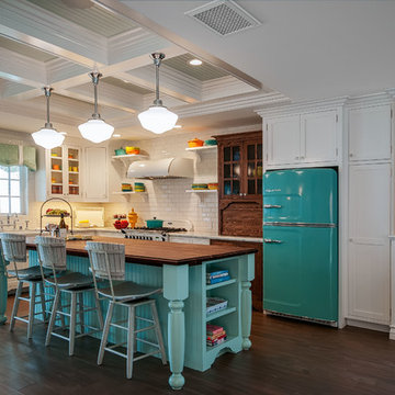
Example of a mid-sized beach style l-shaped kitchen design in San Diego with a farmhouse sink, white backsplash, subway tile backsplash, colored appliances and an island
Example of a mid-sized beach style l-shaped kitchen design in San Diego with a farmhouse sink, white backsplash, subway tile backsplash, colored appliances and an island
 User
UserPhotography: Megan Chaffin
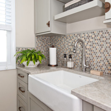
Transitional dark wood floor and brown floor laundry room photo in Chicago with a farmhouse sink, shaker cabinets, gray cabinets, beige walls and beige countertops
Transitional dark wood floor and brown floor laundry room photo in Chicago with a farmhouse sink, shaker cabinets, gray cabinets, beige walls and beige countertops
 goodman charlton
Antoine Bootz
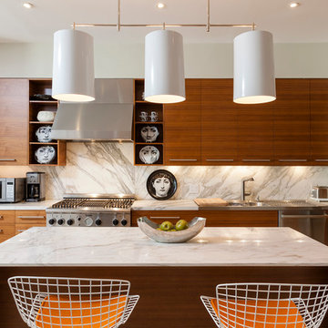
Inspiration for a contemporary kitchen remodel in New York with a double-bowl sink, flat-panel cabinets, medium tone wood cabinets, white backsplash, stainless steel appliances and an island
Inspiration for a contemporary kitchen remodel in New York with a double-bowl sink, flat-panel cabinets, medium tone wood cabinets, white backsplash, stainless steel appliances and an island

 Lila
LilaLandscaping completed by homeowner over 8 years - Include multiple cherry trees, blueberry, grape arbor, Mature dogwood (50 yr old?), Dry garden, cactus
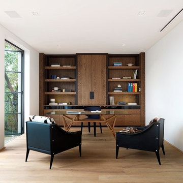
 Decus Interiors
Study room - large contemporary freestanding desk medium tone wood floor study room idea in Sydney with white walls
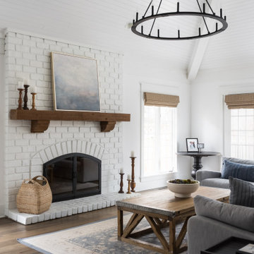
 Plain & Posh
The homeowners wanted to open up their living and kitchen area to create a more open plan. We relocated doors and tore open a wall to make that happen. New cabinetry and floors where installed and the ceiling and fireplace where painted. This home now functions the way it should for this young family!
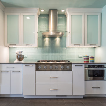
 Dana King Design Build Remodeling
A fun, hip kitchen with a mid-century modern vibe. The homeowners wanted a kitchen to make them happy. We think you can't help but smile!
NEXT Project Studio
Jerry Voloski
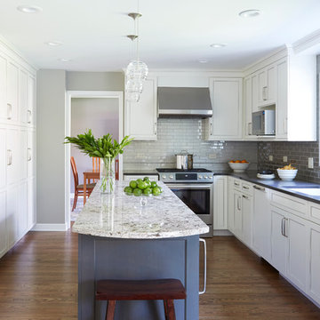 TKS Design Group
Free ebook, Creating the Ideal Kitchen. DOWNLOAD NOW
The homeowners of this mid-century Colonial and family of four were frustrated with the layout of their existing kitchen which was a small, narrow peninsula layout but that was adjoining a large space that they could not figure out how to use. Stealing part of the unused space seemed like an easy solution, except that there was an existing transition in floor height which made that a bit tricky. The solution of bringing the floor height up to meet the height of the existing kitchen allowed us to do just that.
This solution also offered some challenges. The exterior door had to be raised which resulted in some exterior rework, and the floor transition had to happen somewhere to get out to the garage, so we ended up “pushing” it towards what is now a new mudroom and powder room area. This solution allows for a small but functional and hidden mudroom area and more private powder room situation.
Another challenge of the design was the very narrow space. To minimize issues with this, we moved the location of the refrigerator into the newly found space which gave us an L-shaped layout allowing for an island and even some shallow pantry storage. The windows over the kitchen sink were expanded in size and relocated to allow more light into the room. A breakfast table fits perfectly in the area adjacent to the existing French doors and there was even room for a small bar area that helps transition from inside to outside for entertaining. The confusing unused space now makes sense and provides functionality on a daily basis.
To help bring some calm to this busy family, a pallet of soft neutrals was chosen -- gray glass tile with a simple metal accent strip, clear modern pendant lights and a neutral color scheme for cabinetry and countertops.
For more information on kitchen and bath design ideas go to: www.kitchenstudio-ge.com
 AquaTerra Outdoors
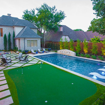
The homeowner of this traditional home requested a traditional pool and spa with a resort-like style and finishes. AquaTerra was able to create this wonderful outdoor environment with all they could have asked for.
While the pool and spa may be simple on the surface, extensive planning went into this environment to incorporate the intricate deck pattern. During site layout and during construction, extreme attention to detail was required to make sure nothing compromised the precise deck layout.
The pool is 42'x19' and includes a custom water feature wall, glass waterline tile and a fully tiled lounge with bubblers. The separate spa is fully glass tiled and is designed to be a water feature with custom spillways when not in use. LED lighting is used in both the pool and spa to create dramatic lighting that can be enjoyed at night.
The pool/spa deck is made of 2'x2' travertine stones, four to a square, creating a 4'x4' grid that is rotated 45 degrees in relation to the pool. In between all of the stones is synthetic turf that ties into the synthetic turf putting green that is adjacent to the deck. Underneath all of this decking and turf is a concrete sub-deck to support and drain the entire system.
Finishes and details that increase the aesthetic appeal for project include:
-All glass tile spa and spa basin
-Travertine deck
-Tiled sun lounge with bubblers
-Custom water feature wall
-LED lighting
-Synthetic turf
This traditional pool and all the intricate details make it a perfect environment for the homeowners to live, relax and play!
Photography: Daniel Driensky
 Bernardo Pozas Residential Design
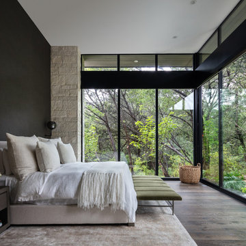
Bedroom - contemporary master dark wood floor and brown floor bedroom idea in Austin with black walls and no fireplace
 Nukitchens
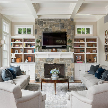
We designed this kitchen using Plain & Fancy custom cabinetry with natural walnut and white pain finishes. The extra large island includes the sink and marble countertops. The matching marble backsplash features hidden spice shelves behind a mobile layer of solid marble. The cabinet style and molding details were selected to feel true to a traditional home in Greenwich, CT. In the adjacent living room, the built-in white cabinetry showcases matching walnut backs to tie in with the kitchen. The pantry encompasses space for a bar and small desk area. The light blue laundry room has a magnetized hanger for hang-drying clothes and a folding station. Downstairs, the bar kitchen is designed in blue Ultracraft cabinetry and creates a space for drinks and entertaining by the pool table. This was a full-house project that touched on all aspects of the ways the homeowners live in the space.
Photos by Kyle Norton
13