
Search results for "Illustrate" in Home Design Ideas



 Stanton Homes
The kitchen emphasizes an open, inviting lifestyle. The apron sink adds a bit of contemporary design to this more traditional home. The prairie style windows off-set the industrial stainless steel with a bit of country flair.
Find the right local pro for your project

 Kitchen Kraft
Inspiration for a huge transitional l-shaped medium tone wood floor open concept kitchen remodel in Columbus with an undermount sink, raised-panel cabinets, white cabinets, granite countertops, beige backsplash, stone tile backsplash, stainless steel appliances and an island

 ArchiCGI 3D Rendering
House Design rendering allows Interior Designers and Architects to bring their beautiful concepts to life. For unlike drawings and concepts, 3D visualizations give a complete picture, enabling the audience to have a glimpse into the life they could lead there.
The elegance of this Classical Interior scenes is a great sample of the highly professional 3dViz.
One could not take eyes off the clean-lined white furniture, lending the space a refined and airy look, marble backdrop and all this delightful storage space. Photoreal 3D house rendering makes colors look every bit as crisp and vivid as they’ll be in real life, so that client can have a complete picture of their effect and make suggestions if necessary.
But what really makes the 3d design stand out are details. Those small things that are never included in drawings, but are vital to the overall atmosphere.
For instance, kitchen decor allows to create a connection with the Client – by making it personal and so much “him”. Thus, cold gleam of elegant glassware, beautiful flowers on the table suggest refined taste, while photos and figurines allow to deduce that the owners are a well-traveled family with versatile interests.
 Advance Design Studio, Ltd.
Our Lakewood clients came to Advance Design dreaming of a home spa with fresh, clean, elegant details. The design process was important, as our clients had found polished nickel sconces that set the tone for the design. Our designer moved the toilet to the other side of the existing layout to open up the space and let more light in. Once the layout was set and the 3D illustrations completed, our clients were sold.
The finished product is better than our clients ever imagined. They achieved a five-star master bath feel in the comfort of their own home. The fresh and clean vibe is evident in the master bath vanity, with Sea Salt Maple Cabinets from Medallion. These bright white cabinets are complemented by the Calacatta Quartz countertop with undermount sinks and stainless-steel Kohler faucets.
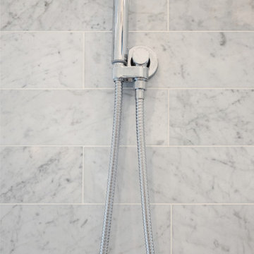
Hexagon Firenze Carrara Honed tile covers the floor, and shower floor adding stunning texture. A large glass shower is lined by 4 x 12” Firenze Carrara Polished tile that matches the flooring. The stainless-steel shower fixtures from Rohl are truly unique. Gold accents in the mirror and pendant light fixture contrast the bright white colors of the tub and walls. It wouldn’t be surprising to see this bathroom in a five-star hotel.

 Décor Aid
With a restrained hand, out interior designer set about bringing a new life in our clients petite apartment while also introducing easy to maintain, durable surfaces and furnishings as they love to entertain and have a lively St. Bernard. And as they had an extensive book collection and a single three-foot wide closet, the key challenge here was to make the best use of the entire space while injecting it with charming whimsy.
After falling in love with our designer’s presentation, our clients went for a complete apartment overhaul and started from scratch. Since the space is small, our designer Anna S. wanted to create an urgent sense of vibrancy without coming off as too heavy handed. So she worked in expressive colors and decorative extras in small doses for subtle impact.
Starting the project by changing several of the unit’s light fixtures for brighter, more minimal styles, Anna surveyed the apartment room to room to devise clever storage solutions that are easy on the eye.
As they have friends over often, Anna created a warm and inviting living room boasting a slightly feminine take on mid-century modern layered with colorful pillows, patterned rugs, and eclectic art that doesn’t take over the apartment.
In the kitchen, she added a strong yet gender neutral burlap wallpaper, floating wooden shelves, and new plumbing fixtures that were more sophisticated than the original, standard ones in place.
However, our favorite part of the apartment is the moody, statement-making foyer. Though it was a long and narrow barely used, neglected space, Anna brought in wallpaper from Tempaper that features a matte black background covered with gold bird and floral illustrations, and added a long row of black glass cabinets and several large gold mirrors for an added sense of glamorous drama and an extra amount of storage space to boot.
 Ferriss - Architectural Renderings
Why do you need 3D visualization of the project?
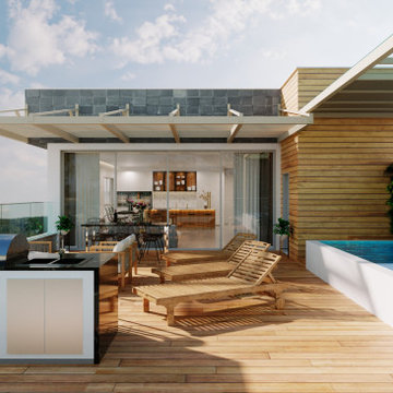
3D visualization is a photorealistic image of the future home, made in special graphic editors. Not every customer has a 3D mindset. And thanks to realistic visualizations, the client can see his house as it really will be.
Visualization helps to capture the volume, taking into account all the stylistic selections, finishing materials, fabrics and decor.
Who else, besides the customer, needs 3D visualization?
Visualization is also important for builders. This helps them understand what the final should look like after the project is completed. High-quality 3D visualization displays texture, color, texture, which greatly facilitates the elaboration of details.
Does this help to eliminate errors?
Yes, it helps.
At the design stage, certain interior items and decor fit into the space of the room. It is very important to take into account the dimensions and enter the parts correctly and ergonomically. Flat drawings, unlike 3D, often do not allow you to feel the true scale of furniture.
Ferriss develops designs of any complexity, contact us and we will help you make all your dreams come true.
https://www.ferriss.co/
Join to our telegram channel - https://lnkd.in/dZam-YY

 Flavin Architects
Albert Frey House II : Designed by Albert Frey : Palm Springs
Photo by Colin Flavin
Modern exterior home idea in Boston
Modern exterior home idea in Boston

 DRC Pools
, the Best in Orange County for Pools, Masonry & Landscaping
Based in Yorba Linda, California, DRC Pools has offered superior landscaping to Orange County residents for more than 13 years. Finding our beginnings in masonry as DR Construction more than 40 years ago, we have grown from a masonry company into a custom pool, spa, masonry, and landscape design company.
DRC Pools has grown into a premiere custom pool, masonry, and landscape design contractor in Orange County. 90% of our work is completed in-house, allowing us to price ourselves competitively and helps us complete our work in a time-efficient manner.
Our mission is to provide quality service and complete customer satisfaction in everything we do, whether it’s high-quality landscaping, masonry, pools, or anything else.
DRC Pools promises to provide a unique design that will correspond to your lifestyle. Our designers work closely with you to ensure the desired result. We guarantee outstanding craftsmanship, personally inspecting every aspect of the job, and paying careful attention to even the smallest detail.
Please view our photo gallery to see how our work illustrates out incomparable standards. See the quality of work DRC Pools provides and what distinguishes us from our competitors.
 ArchiCGI 3D Rendering
House Design rendering allows Interior Designers and Architects to bring their beautiful concepts to life. For unlike drawings and concepts, 3D visualizations give a complete picture, enabling the audience to have a glimpse into the life they could lead there.
The elegance of this Classical Interior scenes is a great sample of the highly professional 3dViz.
One could not take eyes off the clean-lined white furniture, lending the space a refined and airy look, marble backdrop and all this delightful storage space. Photoreal 3D house rendering makes colors look every bit as crisp and vivid as they’ll be in real life, so that client can have a complete picture of their effect and make suggestions if necessary.
But what really makes the 3d design stand out are details. Those small things that are never included in drawings, but are vital to the overall atmosphere.
For instance, kitchen decor allows to create a connection with the Client – by making it personal and so much “him”. Thus, cold gleam of elegant glassware, beautiful flowers on the table suggest refined taste, while photos and figurines allow to deduce that the owners are a well-traveled family with versatile interests.

 contact7524
This stained glass window was created as part of our signature Aspen Stained Glass line. These windows look beautiful in cottage style or contemporary homes and are a great way for outdoor enthusiasts to celebrate their love of nature. The textured appearance of the glass provides the homeowners with a high level of privacy and comfort.

 Peter Q Brown Innovative Design
This North Bozeman remodeling project showcases an outdoor room addition in the form of a covered second story deck.
To see the videos about this project:
Part 1: https://youtu.be/NGjuhX6dUzQ
Part 2: https://youtu.be/CRC-BjNdnzM
This deck addition allows the enjoyment of early morning sun, as well as utilizing the resulting afternoon shade during those hot Bozeman summers.
The owners took advantage of the three dimensional modeling of the building to visualize the changes they had in mind. The ability to see multiple visual perspectives of this outdoor room addition, as well as the entire project was a great advantage. The modeling worked to the contractor’s advantage as well, in that the structural components that needed to come together in the creation of this outdoor room addition were clearly illustrated. This covered outdoor room addition presented design challenges as well as opportunity. The challenge was supporting the roof yet not impacting the views. The solution was using a clear span steel truss. This truss design allows unimpeded views to the neighborhood below and sturdy support for the roof structure above. We took this occasion to incorporate a circular steel ring into the truss, giving it an artistic flair. The outdoor room addition ceiling is quite noticeable from the street. With that in mind, as a visual feature we exposed the roof structure. The oversized ridge and beams are visible from all directions below. In reconfiguring the lower level entry, we duplicated the roof structure and truss design, visually tying the upper and lower levels together. This property sits on a highly visible corner lot. The outdoor room addition, the new front entry, and extensive landscaping give this building the proper curb appeal and is a nice addition to the neighborhood.
 Advance Design Studio, Ltd.
Our Lakewood clients came to Advance Design dreaming of a home spa with fresh, clean, elegant details. The design process was important, as our clients had found polished nickel sconces that set the tone for the design. Our designer moved the toilet to the other side of the existing layout to open up the space and let more light in. Once the layout was set and the 3D illustrations completed, our clients were sold.
The finished product is better than our clients ever imagined. They achieved a five-star master bath feel in the comfort of their own home. The fresh and clean vibe is evident in the master bath vanity, with Sea Salt Maple Cabinets from Medallion. These bright white cabinets are complemented by the Calacatta Quartz countertop with undermount sinks and stainless-steel Kohler faucets.
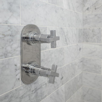
Hexagon Firenze Carrara Honed tile covers the floor, and shower floor adding stunning texture. A large glass shower is lined by 4 x 12” Firenze Carrara Polished tile that matches the flooring. The stainless-steel shower fixtures from Rohl are truly unique. Gold accents in the mirror and pendant light fixture contrast the bright white colors of the tub and walls. It wouldn’t be surprising to see this bathroom in a five-star hotel.
 Advance Design Studio, Ltd.
Our Lakewood clients came to Advance Design dreaming of a home spa with fresh, clean, elegant details. The design process was important, as our clients had found polished nickel sconces that set the tone for the design. Our designer moved the toilet to the other side of the existing layout to open up the space and let more light in. Once the layout was set and the 3D illustrations completed, our clients were sold.
The finished product is better than our clients ever imagined. They achieved a five-star master bath feel in the comfort of their own home. The fresh and clean vibe is evident in the master bath vanity, with Sea Salt Maple Cabinets from Medallion. These bright white cabinets are complemented by the Calacatta Quartz countertop with undermount sinks and stainless-steel Kohler faucets.
Hexagon Firenze Carrara Honed tile covers the floor, and shower floor adding stunning texture. A large glass shower is lined by 4 x 12” Firenze Carrara Polished tile that matches the flooring. The stainless-steel shower fixtures from Rohl are truly unique. Gold accents in the mirror and pendant light fixture contrast the bright white colors of the tub and walls. It wouldn’t be surprising to see this bathroom in a five-star hotel.
 Advance Design Studio, Ltd.
After six years of living in their Huntley IL home, Chris and Meghan were tired of their dark, dingy, outdated kitchen and it was finally time for a long-anticipated change. “The kitchen is the place where we live, it’s where we do everything,” Meghan said. “It was important that it be a space where we wanted to be.” Meghan loves cooking and enjoys including their girls in healthy meal prepping, this led them to want a brighter, more enjoyable kitchen with increased functionality and improved storage.
For Chris especially, the laundry room was an entirely dysfunctional eyesore. “We had a washer and a dryer, but it was all kind-of cobbled together!” Chris said. “There were always laundry piles everywhere, we weren’t really sure what we wanted to do in there, but it was time for us to make a change.” The mess of the space was stressful every time they walked in the door from the garage each day. Kids’ backpacks and shoes piled up haphazardly in the makeshift boot-bench closet left the family feeling disorganized and stressed. They needed space for folding clothes and locker cubbies to help keep the family organized.
Having known Christine and Todd in the Huntley community for years, Chris and Meghan were familiar with their work. “We already trusted them personally and having seen their projects for years we knew they did top notch work. After we reviewed the initial round of designs, we knew that hiring them was definitely the right choice,” Meghan and Chris said. Although Chris had done a lot of work in their home himself, the kitchen and laundry room renovation was such a large undertaking that he didn’t want to steal time away from his family to spend what would surely be many long weekends doing the job himself. “That would not have been a wise choice for us,” Chris laughed.
“Our designer, Michelle was very, very, easy to work with; anything we wanted to see or weren’t sure about, she went above and beyond to make this easy for us. She was easy to get hold of and always quick to respond,” the couple said. Michelle pulled ideas that mirrored the couple’s taste and style and was adept at directing the couple to limited choices that didn’t overwhelm them and kept the process moving. “I have a hard time making decisions. Michelle made the decision-making process so easy. I loved how she listened to what I liked and then presented three great options for me to choose from,” Meghan said.
The main objectives for the kitchen were better storage solutions, they wanted the space to reflect their lifestyle and taste, and they wanted it to last for years with low maintenance. One of the first steps in creating a more functional kitchen was relocating the refrigerator, creating an improved workflow for the busy family.
“We didn’t know that we could even move the refrigerator to a new location where it is now, that was something that we never would have thought of,” Chris said. “The new refrigerator location makes the kitchen feel so much bigger. We didn’t add any space, but our whole kitchen with the new design just seems like it’s so much larger than before!” Meghan said.
The perimeter mist colored cabinets helped warm and brighten the entire room, while the graphite colored cabinets on the island added contrast. Using this fresh, clean color palette satisfied the couple’s desire for a bright space that was the exact opposite of what they had before. Organization accessories were also added to the cabinets such as a spice drawer tray and roll outs to create hidden convenience.
“I absolutely love the hidden spices – it makes cooking so much more enjoyable!” Chris said. “And all the pull outs, and the double trash bin, who would think you could get so excited about organization!” the couple said in unison.
One thing they hated in their original kitchen was how dark the space felt. Added lighting on the ceiling with the new light fixtures combined with the lighter cabinetry colors throughout solved this problem. “Our new kitchen has this warm, almost cozy feeling that our old kitchen never had, it’s just a space that I love spending my time in now,” Meghan said. The light airy feeling was accentuated with the use of floating white shelves on either side of the decorative range hood. “We have so much cabinetry space, the new design is amazing we actually have more storage space than we will ever need,” Meghan said.
The island was extended to create more work surface and added space for stool seating. “The new island changes how we live. Now the kids can be in the kitchen with us, doing homework, eating breakfast, and the three of us have special dinners there when Chris is working late,” Meghan said.
The Carrara Marmi Quartz countertops were chosen because they are, not only beautiful, but are made from hard-working material that doesn’t require maintenance. The white subway tile backsplash that wraps to the ceiling behind the focal point cooktop range/hood compliments the crisp white countertops perfectly, while brushed brass hardware and light fixtures keep the design fresh and new.
The couple had a few fears at the beginning of the project, as most homeowners do. Their biggest fear was being out of their kitchen and laundry room for an extended time. The crew made it very easy for the family to work in a limited space keeping the washer and dryer hooked up the majority of the time, and also getting appliances working with minimal downtime.
“They above and beyond accommodated us to get us through the process,” Meghan said. “They did a great job making sure we were as comfortable as possible throughout the process,” Chris added.
“Our project manager DJ did a great job. He was very good at updating us on schedule changes, getting guys in as quickly as possible. Everyone that stepped in the house was nice and did great work,” said Chris. They thought Advance’s carpenter was phenomenal and were impressed when he took a conceptual idea from a photograph and worked with designer Michelle to create a one of a kind range/hood that has become the topic of conversation with friends and family who visit the new kitchen. “He was in our house literally every day for several weeks. He was easy to work with and good at what he did,” Meghan and Chris said.
The focal point of the kitchen; a hand-crafted, custom-built ventilation hood was clad with handpicked reclaimed barnwood. Advance Design’s carpenter built the framework and the cladding to create a one-of-a-kind design element that the couple loves.
“I think it was especially fun for him to create something unique from scratch, showcasing his talent in this area,” Meghan said. “I love that my kitchen is not like everyone else’s. I got to pick out the wood on my hood and watch it being built and was able to choose what pieces of wood went where on it. It’s totally unique.”
Red Oak flooring was toothed-in throughout the kitchen and the rest of the first floor anywhere changes were made. Then the whole floor was refinished to tone down the orange undertones in the existing floor stain, ultimately changing the color complexion of the entire first floor. The result is a completely new feeling to the entire home.
Renovating the laundry room was extremely important to Meghan and Chris, but they had trouble visualizing what the possibilities were for the seemingly small space. Michelle produced beautiful 3D illustrations that helped them envision the space in a whole new way.
“I must have told Michelle 100 times that I am a visual person, seeing the designs in 3D made it so easy to make decisions and see what we could really do with our space,” Meghan said.
A dividing wall and doorway were removed between the existing laundry room and hallway formerly containing a coat closet, providing space to design specialized graphite colored cabinetry matching the kitchen island to house custom storage cubbies for each family member. Adding the tall utility cabinetry in the new laundry area helped solve the storage issue, tucking away cleaning supplies, household items, and even the cat got its own cubby.
“I love how everything is now hidden in its own space. I can’t tell you how much I hated coming home and seeing everything sitting around on counters,” Chris said.
Electrical outlets were planned for the inside of utility cabinets, so devices could charge in hidden locations. Stacking the washer and dryer allowed for wider countertop space to provide a folding area and a special space for clothes to hang. “The way I do laundry has been completely transformed! I can actually fold clothes and hang them now right out of the washer and dryer,” Meghan said.
“The end result in the kitchen and the laundry/mud room was an updated light and bright space, with a smarter work flow that better meets the needs of this family,” Michelle said.
“I would totally recommend Advance Design,” Meghan said. “Sometimes I sit and just look at my kitchen and laundry room and think ‘Wow, I can’t believe I get to live here!’ It’s an understatement to say we love our new space.”
 Advance Design Studio, Ltd.
Our Lakewood clients came to Advance Design dreaming of a home spa with fresh, clean, elegant details. The design process was important, as our clients had found polished nickel sconces that set the tone for the design. Our designer moved the toilet to the other side of the existing layout to open up the space and let more light in. Once the layout was set and the 3D illustrations completed, our clients were sold.
The finished product is better than our clients ever imagined. They achieved a five-star master bath feel in the comfort of their own home. The fresh and clean vibe is evident in the master bath vanity, with Sea Salt Maple Cabinets from Medallion. These bright white cabinets are complemented by the Calacatta Quartz countertop with undermount sinks and stainless-steel Kohler faucets.
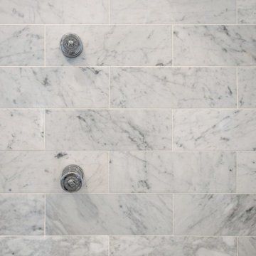
Hexagon Firenze Carrara Honed tile covers the floor, and shower floor adding stunning texture. A large glass shower is lined by 4 x 12” Firenze Carrara Polished tile that matches the flooring. The stainless-steel shower fixtures from Rohl are truly unique. Gold accents in the mirror and pendant light fixture contrast the bright white colors of the tub and walls. It wouldn’t be surprising to see this bathroom in a five-star hotel.

 Gilbert Design Build
This beautiful laundry room designed and built by Gilbert Design Build has it all. The washers and dryer are on pedestals to store detergent and softeners. The rest of the new laundry space was finished to almost be as nice as a typical kitchen with wood cabinets, under cabinet lighting, recessed lights, a large sink. and tile floor.

 gneural llc
Privately commissioned freehand painted geometric in-home mural. Created for a couple in Brighton, CO. One of the owners of the house has been a flight attendant for 19+ years, so we created something that was very personal to her. When she comes home, she has "Landed". She is in her safe place. Consistent place. Steady space. With her beloved husband and pup. Mural Size: approximately 114” L x 154” W. gneural™ is the creative studio of artist and innovative surface designer Debbie Clapper. Drawing nearly every day since the age of 9, Debbie has mastered the art of freehand drawing and painting without the aid of a ruler or straight edge. She has built a lush career around pattern illustration via her passion for abstract optical illusion art. Heavily inspired by M.C. Escher and graffiti, Debbie’s work strives to inspire and ignite imagination in all who interact with it. For 18 years she ran an award-winning graphic design studio, and now she focuses on creating innovative surface design and inspiring creativity. Contact Debbie today to discuss your own, one-of-a-kind, home or business project.
 TKS Design Group
Download our free ebook, Creating the Ideal Kitchen. DOWNLOAD NOW
The homeowners built their traditional Colonial style home 17 years’ ago. It was in great shape but needed some updating. Over the years, their taste had drifted into a more contemporary realm, and they wanted our help to bridge the gap between traditional and modern.
We decided the layout of the kitchen worked well in the space and the cabinets were in good shape, so we opted to do a refresh with the kitchen. The original kitchen had blond maple cabinets and granite countertops. This was also a great opportunity to make some updates to the functionality that they were hoping to accomplish.
After re-finishing all the first floor wood floors with a gray stain, which helped to remove some of the red tones from the red oak, we painted the cabinetry Benjamin Moore “Repose Gray” a very soft light gray. The new countertops are hardworking quartz, and the waterfall countertop to the left of the sink gives a bit of the contemporary flavor.
We reworked the refrigerator wall to create more pantry storage and eliminated the double oven in favor of a single oven and a steam oven. The existing cooktop was replaced with a new range paired with a Venetian plaster hood above. The glossy finish from the hood is echoed in the pendant lights. A touch of gold in the lighting and hardware adds some contrast to the gray and white. A theme we repeated down to the smallest detail illustrated by the Jason Wu faucet by Brizo with its similar touches of white and gold (the arrival of which we eagerly awaited for months due to ripples in the supply chain – but worth it!).
The original breakfast room was pleasant enough with its windows looking into the backyard. Now with its colorful window treatments, new blue chairs and sculptural light fixture, this space flows seamlessly into the kitchen and gives more of a punch to the space.
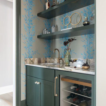
The original butler’s pantry was functional but was also starting to show its age. The new space was inspired by a wallpaper selection that our client had set aside as a possibility for a future project. It worked perfectly with our pallet and gave a fun eclectic vibe to this functional space. We eliminated some upper cabinets in favor of open shelving and painted the cabinetry in a high gloss finish, added a beautiful quartzite countertop and some statement lighting. The new room is anything but cookie cutter.
Next the mudroom. You can see a peek of the mudroom across the way from the butler’s pantry which got a facelift with new paint, tile floor, lighting and hardware. Simple updates but a dramatic change! The first floor powder room got the glam treatment with its own update of wainscoting, wallpaper, console sink, fixtures and artwork. A great little introduction to what’s to come in the rest of the home.
The whole first floor now flows together in a cohesive pallet of green and blue, reflects the homeowner’s desire for a more modern aesthetic, and feels like a thoughtful and intentional evolution. Our clients were wonderful to work with! Their style meshed perfectly with our brand aesthetic which created the opportunity for wonderful things to happen. We know they will enjoy their remodel for many years to come!
Photography by Margaret Rajic Photography
174