
Search results for "Inefficient" in Home Design Ideas
 Kitchen & Bath Masters
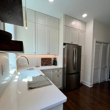
We rolled up our sleeves to transform the kitchen of our client’s charming but aging home in Washington, DC. The original kitchen featured worn-out, dated cabinetry and a layout that was both inefficient and impractical for modern living.
To breathe new life into the space, we replaced the old cabinets with brighter, contemporary cabinetry, instantly opening up the kitchen and making it feel more welcoming. We also reimagined the entire layout to create a design that is not only visually appealing but also highly functional for everyday use.
One of the most impactful changes was removing an old half-closed window and replacing it with a larger, modern window. This single upgrade dramatically increased the amount of natural light in the kitchen, creating a brighter, airier atmosphere and offering beautiful views outside.
To tie the kitchen into the rest of the home, we replaced the outdated vinyl flooring with engineered wood, blending seamlessly with the existing flooring throughout the house and adding warmth and character.
As part of the renovation, we also updated the powder room located within the kitchen space, giving it a fresh, modern look to match the newly remodeled kitchen.
Seeing our client so pleased with the final result made the entire project even more rewarding. We’re proud to have turned an old, dark kitchen into a functional, light-filled, and stylish heart of the home.
 GMI Design Group
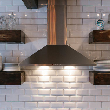
This kitchen was once closed off with two small doors and an odd-shaped peninsula. The cabinetry and tile floor was dated and the arrangement was inefficient.
We moved the wall between the adjoining living room and enlarged the opening, framing it in faux wood beams. Beams were also added to the kitchen. The living area became a large dining room with a custom chandelier and red metal cross back chairs. An 11 foot walnut island can seat 8 and has quartz countertops and a stainless undermount farmhouse apron sink.
Beveled subway tile with grey grout lines the walls and floating rustic shelves flank the modern stainless range hood. Undercabinet lighting and USB outlets give functionality to the desk area. Grey wood and metal swivel bar stools add slim, clean seating.
Rustic wood flooring was added throughout the main level.
 TVL Creative Ltd.
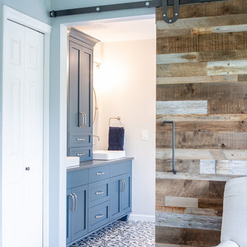
This project is an incredible transformation and the perfect example of successful style mixing! This client, and now a good friend of TVL (as they all become), is a wonderfully eclectic and adventurous one with immense interest in texture play, pops of color, and unique applications. Our scope in this home included a full kitchen renovation, main level powder room renovation, and a master bathroom overhaul. Taking just over a year to complete from the first design phases to final photos, this project was so insanely fun and packs an amazing amount of fun details and lively surprises. The original kitchen was large and fairly functional. However, the cabinetry was dated, the lighting was inefficient and frankly ugly, and the space was lacking personality in general. Our client desired maximized storage and a more personalized aesthetic. The existing cabinets were short and left the nice height of the space under-utilized. We integrated new gray shaker cabinets from Waypoint Living Spaces and ran them to the ceiling to really exaggerate the height of the space and to maximize usable storage as much as possible. The upper cabinets are glass and lit from within, offering display space or functional storage as the client needs. The central feature of this space is the large cobalt blue range from Viking as well as the custom made reclaimed wood range hood floating above. The backsplash along this entire wall is vertical slab of marble look quartz from Pental Surfaces. This matches the expanse of the same countertop that wraps the room. Flanking the range, we installed cobalt blue lantern penny tile from Merola Tile for a playful texture that adds visual interest and class to the entire room. We upgraded the lighting in the ceiling, under the cabinets, and within cabinets--we also installed accent sconces over each window on the sink wall to create cozy and functional illumination. The deep, textured front Whitehaven apron sink is a dramatic nod to the farmhouse aesthetic from KOHLER, and it's paired with the bold and industrial inspired Tournant faucet, also from Kohler. We finalized this space with other gorgeous appliances, a super sexy dining table and chair set from Room & Board, the Paxton dining light from Pottery Barn and a small bar area and pantry on the far end of the space. In the small powder room on the main level, we converted a drab builder-grade space into a super cute, rustic-inspired washroom. We utilized the Bonner vanity from Signature Hardware and paired this with the cute Ashfield faucet from Pfister. The most unique statements in this room include the water-drop light over the vanity from Shades Of Light, the copper-look porcelain floor tile from Pental Surfaces and the gorgeous Cashmere colored Tresham toilet from Kohler. Up in the master bathroom, elegance abounds. Using the same footprint, we upgraded everything in this space to reflect the client's desire for a more bright, patterned and pretty space. Starting at the entry, we installed a custom reclaimed plank barn door with bold large format hardware from Rustica Hardware. In the bathroom, the custom slate blue vanity from Tharp Cabinet Company is an eye catching statement piece. This is paired with gorgeous hardware from Amerock, vessel sinks from Kohler, and Purist faucets also from Kohler. We replaced the old built-in bathtub with a new freestanding soaker from Signature Hardware. The floor tile is a bold, graphic porcelain tile with a classic color scheme. The shower was upgraded with new tile and fixtures throughout: new clear glass, gorgeous distressed subway tile from the Castle line from TileBar, and a sophisticated shower panel from Vigo. We finalized the space with a small crystal chandelier and soft gray paint. This project is a stunning conversion and we are so thrilled that our client can enjoy these personalized spaces for years to come. Special thanks to the amazing Ian Burks of Burks Wurks Construction for bringing this to life!
Find the right local pro for your project
 Clark Contracting & Construction
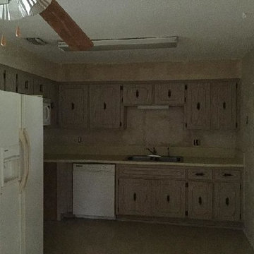
Kitchen - BEFORE, small, cramped, dark, outdated, isolated and inefficient - waiting for a "DREAM-COME-TRUE".
C Green
Example of a mid-sized beach style home design design in Miami
Example of a mid-sized beach style home design design in Miami
 Alli Rader Creative
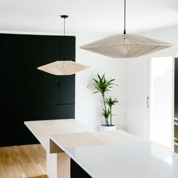
This 1963 brick home was given the opportunity for new life when a creative couple from Brooklyn took a chance and moved their life to Nashville! The kitchen went from a dreary, sad, barely functional room to an inspiring space to gather and entertain. Removing the wall between the living and kitchen opened up the previously choppy, inefficient layout to bring a sense of flow and ease to the home. We designed a custom island/dining table, seamlessly flowing from the terrazzo style quartz countertops into the solid maple table, complimented by the slat wood design on the range hood. We decided to go with a larger scale subway tile in a horizontal stacked pattern to keep the feel light, but also modern and timeless. The built-in matte black wall cabinetry brings a minimal but striking moment to balance the airiness of the other side of the kitchen, while providing ample storage for the pantry as well as a large bar for the cocktail aficionado couple. We incorporated some beautiful handmade pendants from Mexico and hung them at differing heights to accentuate the custom island. Now the space is modern, bright, textured, minimal and elevated. The clients are so pleased, and feel that this house can be a home for them to create and host and be.
 Duncan's Creative Kitchens
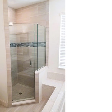
This master bathroom remodel in Lakewood Ranch transformed a cramped and outdated space into a luxurious, spa-like retreat. The original layout was inefficient, so our design focused on reconfiguring the room to maximize both function and flow.
We replaced the enclosed shower and tub with a spacious, glass-enclosed walk-in shower, creating an open and airy feel. New custom cabinetry provides ample storage, while modern fixtures and a neutral color palette contribute to a serene and sophisticated atmosphere. The result is a master bath that feels significantly larger and serves as a true sanctuary for the homeowners.
 Stebnitz Builders, Inc.
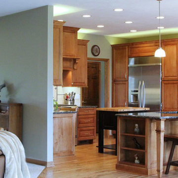
Our client had the perfect lot with plenty of natural privacy and a pleasant view from every direction. What he didn’t have was a home that fit his needs and matched his lifestyle. The home he purchased was a 1980’s house lacking modern amenities and an open flow for movement and sight lines as well as inefficient use of space throughout the house.
After a great room remodel, opening up into a grand kitchen/ dining room, the first-floor offered plenty of natural light and a great view of the expansive back and side yards. The kitchen remodel continued that open feel while adding a number of modern amenities like solid surface tops, and soft close cabinet doors.
Kitchen Remodeling Specs:
Kitchen includes granite kitchen and hutch countertops.
Granite built-in counter and fireplace
surround.
3cm thick polished granite with 1/8″
V eased, 3/8″ radius, 3/8″ top &bottom,
bevel or full bullnose edge profile. 3cm
4″ backsplash with eased polished edges.
All granite treated with “Stain-Proof 15 year sealer. Oak flooring throughout.
 Legacy Builders Group
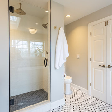
This Wyoming master bath felt confined with an
inefficient layout. Although the existing bathroom
was a good size, an awkwardly placed dividing
wall made it impossible for two people to be in
it at the same time.
Taking down the dividing wall made the room
feel much more open and allowed warm,
natural light to come in. To take advantage of
all that sunshine, an elegant soaking tub was
placed right by the window, along with a unique,
black subway tile and quartz tub ledge. Adding
contrast to the dark tile is a beautiful wood vanity
with ultra-convenient drawer storage. Gold
fi xtures bring warmth and luxury, and add a
perfect fi nishing touch to this spa-like retreat.
 ALL Renovation & Design LLC
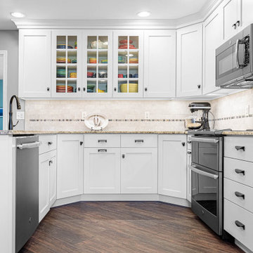
Mrs. Deighan loved to cook, but hated her kitchen.
It was nonfunctional, inefficient, and an eyesore.
The sink was in the corner under low cabinets. The awkwardly placed fridge made it impractical for the entire family to be working together.
And that was a big deal.
She wanted a beautiful place to cook and entertain.
Besides the cramped space, the old, brown plywood cabinets were falling apart.
Because the cabinets were low, under-cabinet lighting was useless.
The kitchen was dark.
The previous owners had updated the flooring, but only by putting uglier tiles over the old vinyl.
And the ceiling had a leak stain.
It was time for a big change.
The Deighan's called Amos from ALL Renovation & Design.
Amos’s many successful remodeling projects done for them over the years had forged a friendship that made him the obvious contractor of choice.
Amos sat down with them and asked them to make a dream kitchen list.
If budget were of no concern, what would the space look like?
Once the Deighan's had their list, Amos helped them to evaluate each investment, taking into consideration the age and value of the home.
Then Amos presented a plan that fit perfectly in the Deighan's budget.
The basic U-shaped kitchen layout stayed the same.
Modern, creamy white custom cabinets replaced the dark plywood cabinets.
The fridge moved to make space for more cabinets.
The biggest challenge was moving the laundry room wall a few feet.
Moving it was necessary to add more space, but, since the wall was load-bearing, moving it required extra attention.
It was worth it.
Extra space allowed the counter to extend and the sink to move.
After the hard work ended, the reason for the transformation became reality.
Now “we can have the whole family in there comfortably and working together,” Mrs. Deighan said.
She loves her kitchen.
Especially the windowed cabinets that show off her fiestaware.
And when you see the beautiful St. Cecilia granite countertops, with Milstone Sari porcelain mosaic tile backsplash, maple flat-panel cabinets with under-cabinet lighting, and all new appliances including a double oven, you will see why she does.
 Drury Design
The Setup
For this primary bathroom project, the homeowners wanted to transform their large, T-shaped bathroom into a functional, multi-purpose sanctuary. The existing layout was inefficient, with a bulky built-in tub, a closed-off shower, and an awkward footprint that limited practical use.
This remodel also presented a unique challenge – the homeowners wanted to use the space for workouts as well. The design needed to maximize the large open area in the middle of the T, providing enough room for yoga and light free-weight exercises while maintaining the bathroom’s aesthetic and functionality.
Design objectives:
Expand and brighten the shower area without major layout changes
Replace the oversized built-in tub with a sleek freestanding alternative
Create a flexible space for workouts while maintaining the bathroom’s design integrity
Address cold flooring with added comfort solutions
Enhance lighting for both beauty and functionality
Incorporate storage for workout equipment and everyday essentials
Integrate natural elements to accommodate the homeowners’ love of plants
The Remodel
Design challenges to be solved:
Shower Expansion – The homeowners want a more open, spa-like shower but don’t want to dramatically alter the footprint.
Workout Integration – Balancing fitness functionality with a serene bathroom design will require creative layout adjustments.
Storage Solutions – With workout gear to stow away, the space needs discrete and versatile storage options.
Lighting – Enhancing both natural and artificial lighting to brighten the large space.
Cold Floors – Positioned above the garage, the bathroom tends to feel colder than the adjacent primary bedroom. A solution is needed to add warmth and comfort during use, without the need to reconfigure the home’s overall heating system.
The Renewed Space
Design solutions:
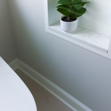
Spa-Like Shower Expansion – Removing a wall and replacing it with glass transformed the shower into an open, airy retreat, allowing natural light to flow freely through the space. A curved black river rock floor and neutral linear wall tiles add warmth and texture, while carefully placed niche lighting enhances the tranquil, luxurious atmosphere.
Workout-Friendly Layout – A custom full-length mirror was strategically placed to accommodate multiple uses, creating a fitness studio-like experience for yoga or light weight training. The mirror’s size and positioning allow for clear visibility during workouts, while also enhancing the room by adding light and a greater sense of depth.
Custom Storage Solutions – A custom cabinet with a wood top was crafted to discreetly store workout equipment, preserving the clean, open feel of the space. Its design not only enhances functionality but also creates a sense of symmetry, bringing visual balance and cohesion to the overall layout.
Enhanced Lighting – Replacing the shower wall with glass, installing a full-length mirror, and incorporating vanity mirrors with built-in lighting dramatically brighten the space. LED strip lighting under the cabinets, along the tub half wall, and in both the side and shower niches adds layered illumination, enhancing both function and ambiance.
Heated Floors – Installing heated flooring provides consistent warmth and comfort year-round, enhancing the space for both workouts and daily routines. A European-style towel warmer brings additional warmth and a touch of luxury, elevating the overall experience.
Final Thoughts:
This transformed bathroom blends luxury with intentional design. By addressing the homeowners’ needs – from workout flexibility to spa-inspired details – the space now serves multiple purposes without compromise. The warm cabinetry, black accents and thoughtful lighting tie the design together, while the curved textures and plant-friendly ledge add a personalized touch. This bathroom is now a bright, welcoming sanctuary for daily routines and mindful moments.
 Mom's Design Build
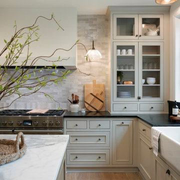
Built in 1992, this lakeside home was ready for a full renovation to match its scenic setting and the demands of modern living. The original layout felt dated and inefficient, so the remodel opened the space by replacing a pantry closet with a sleek pantry cabinet and adding a large window above the sink to flood the kitchen with light and views. An oversized closet became a stylish wet bar and butler’s pantry in rich alder, now a walk-through between the dining and living areas. Warm white oak floors, contrasting cabinetry, honed Borghini marble, and soapstone counters complete the sophisticated yet inviting kitchen design. The bathroom, laundry room, sitting room, front entry, and dining area were also updated in the home remodel. Welcome to Heart of Home.
 Nova Remodeling Inc
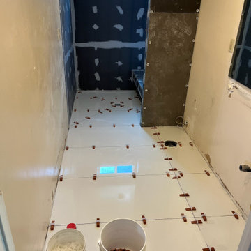
This Bonney Lake bathroom remodel turned an outdated space into a sleek and modern oasis. The project started with a full demolition, stripping away old tiles, worn-out fixtures, and inefficient plumbing. The goal was to create a luxurious, spa-like retreat with contemporary design and high-end finishes.
Once the foundation was prepared, we installed large-format, marble-inspired porcelain tiles, adding a sophisticated and seamless aesthetic. The floor was upgraded with high-gloss, large white tiles, enhancing brightness and creating a polished, modern look. A custom-built vanity with quartz countertops and gold hardware introduced a perfect blend of elegance and functionality.
The shower transformation was a key highlight, featuring a built-in bench, recessed niches, and a frameless glass enclosure for a spacious feel. High-efficiency lighting and modern ventilation were installed to improve both ambiance and air circulation. The fixtures were carefully selected, blending matte black and gold finishes to create a bold and refined contrast.
The final result is a stunning, high-end bathroom that balances beauty with practicality. This Bonney Lake remodel showcases expert craftsmanship, premium materials, and a design that enhances both comfort and home value.
 Four Winds
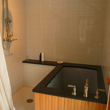
This client has a large, uncomfortable, inefficient tub in this space. They asked to convert it to a shower and a separate bath tub. We had a local boat builder make the custom design for a tub. Sitting upright, like with the Japanese ofuro tubs, the foot space drops below the floor level.
 TVL Creative Ltd.
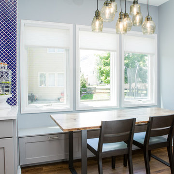
This project is an incredible transformation and the perfect example of successful style mixing! This client, and now a good friend of TVL (as they all become), is a wonderfully eclectic and adventurous one with immense interest in texture play, pops of color, and unique applications. Our scope in this home included a full kitchen renovation, main level powder room renovation, and a master bathroom overhaul. Taking just over a year to complete from the first design phases to final photos, this project was so insanely fun and packs an amazing amount of fun details and lively surprises. The original kitchen was large and fairly functional. However, the cabinetry was dated, the lighting was inefficient and frankly ugly, and the space was lacking personality in general. Our client desired maximized storage and a more personalized aesthetic. The existing cabinets were short and left the nice height of the space under-utilized. We integrated new gray shaker cabinets from Waypoint Living Spaces and ran them to the ceiling to really exaggerate the height of the space and to maximize usable storage as much as possible. The upper cabinets are glass and lit from within, offering display space or functional storage as the client needs. The central feature of this space is the large cobalt blue range from Viking as well as the custom made reclaimed wood range hood floating above. The backsplash along this entire wall is vertical slab of marble look quartz from Pental Surfaces. This matches the expanse of the same countertop that wraps the room. Flanking the range, we installed cobalt blue lantern penny tile from Merola Tile for a playful texture that adds visual interest and class to the entire room. We upgraded the lighting in the ceiling, under the cabinets, and within cabinets--we also installed accent sconces over each window on the sink wall to create cozy and functional illumination. The deep, textured front Whitehaven apron sink is a dramatic nod to the farmhouse aesthetic from KOHLER, and it's paired with the bold and industrial inspired Tournant faucet, also from Kohler. We finalized this space with other gorgeous appliances, a super sexy dining table and chair set from Room & Board, the Paxton dining light from Pottery Barn and a small bar area and pantry on the far end of the space. In the small powder room on the main level, we converted a drab builder-grade space into a super cute, rustic-inspired washroom. We utilized the Bonner vanity from Signature Hardware and paired this with the cute Ashfield faucet from Pfister. The most unique statements in this room include the water-drop light over the vanity from Shades Of Light, the copper-look porcelain floor tile from Pental Surfaces and the gorgeous Cashmere colored Tresham toilet from Kohler. Up in the master bathroom, elegance abounds. Using the same footprint, we upgraded everything in this space to reflect the client's desire for a more bright, patterned and pretty space. Starting at the entry, we installed a custom reclaimed plank barn door with bold large format hardware from Rustica Hardware. In the bathroom, the custom slate blue vanity from Tharp Cabinet Company is an eye catching statement piece. This is paired with gorgeous hardware from Amerock, vessel sinks from Kohler, and Purist faucets also from Kohler. We replaced the old built-in bathtub with a new freestanding soaker from Signature Hardware. The floor tile is a bold, graphic porcelain tile with a classic color scheme. The shower was upgraded with new tile and fixtures throughout: new clear glass, gorgeous distressed subway tile from the Castle line from TileBar, and a sophisticated shower panel from Vigo. We finalized the space with a small crystal chandelier and soft gray paint. This project is a stunning conversion and we are so thrilled that our client can enjoy these personalized spaces for years to come.
 Home Makeover AZ
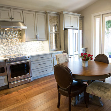
This Kitchen was inefficient before. The island was big and bulky, and created a huge traffic jam before.
By removing a big window where the refrigerator was, and adding a new access to the backyard, this kitchen completely opened up!
Paint color - Woodrow Wilson Putty - Valspar
Floors: Engineered hardwood
Backsplash: Gris Et Blanc Baroque - Dal Tile
Antique Mirror Panes: Mystic Antique Mirror Finish
Sink: Whitehaven Undermount Farmhouse Apron-Front Cast Iron 33 in. Single Basin Kitchen Sink in Thunder Grey
Faucet: Kohler Artifacts single-handle bar sink faucet with 13-1/16" swing spout
 St. Clair Kitchens
A dramatic transformation from a small dark kitchen to bright open concept kitchen and living space. The original kitchen was closed off, by knocking down a wall we were able to create a more open kitchen with an a-symmetrical island with plenty of seating. The most unique feature of this kitchen is the hood that's recessed in a sofit over the island. Cooking in the island can present a ventilation problem. Down draft ranges are inefficient and a hood that hangs from the ceiling can be an eye sore. This solution lets the hood blend in with the ceiling and gets it out of the way.
 felipe_reyna
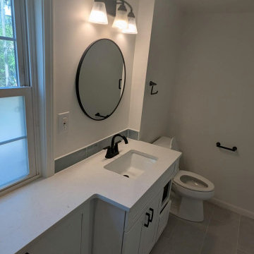
This bathroom remodel focused on improving both layout and functionality.
The original layout had the toilet positioned directly in front of the sink, making the space feel cramped and inefficient. We relocated the toilet to create a better flow and more practical use of space.
Scope of work included:
• Toilet relocation
• Bathtub refinishing
• All new drywall
• New vanity and cabinetry
• New tile throughout
• Plumbing modifications
By redesigning the layout and updating all finishes, the bathroom now feels open, modern, and significantly more functional.
Restoration Remodel specializes in bathroom remodeling and layout redesign in Kansas City.
 The Redefined Home LLC
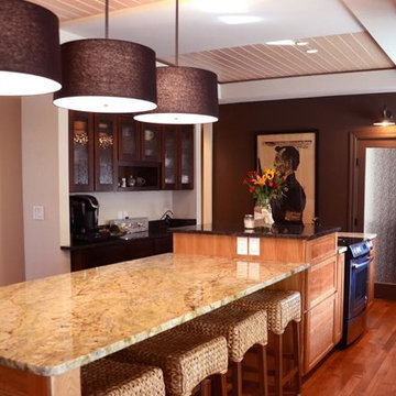
Brought a poorly designed 1980s home into contemporary times for new homeowners with a large family. Converted an awkward cathedral ceiling to a quiet and cozy tray ceiling which adds subtle warmth with it's wood treatment. Redefining rooms and reallocating space throughout the home's footprint turned this home into an efficient, warm, and welcoming home. One example of redefined space is adding a walk-in pantry to the kitchen by moving an inefficient laundry room to another area and connecting a walk-in pantry to the kitchen with the swinging glass door (shown on the dark brown wall).
 Walczak Design And Build
What once felt dark, segmented, and inefficient is now a bright, connected, and highly functional first floor designed for real family living.
Our clients, Terry and Lou, came to us with a home that simply wasn’t keeping up with their growing family. The kitchen was cramped, with tight working lanes and limited light. The laundry room doubled as a powder room—yet functioned poorly as both. Sightlines between spaces were cut off, making it difficult to stay connected to their young children throughout the day. Across the board, the home felt dated and disconnected.
Through thoughtful planning and strategic structural changes, we reimagined the entire first floor to better support how this family truly lives.
We began by redefining the entry experience—creating a true foyer complete with a dedicated drop zone and custom cubby storage. This space now acts as a natural landing point, bringing order and intention to everyday comings and goings.
Adjacent to the new entry, we relocated and redesigned the laundry room. Now positioned exactly where it needs to be, it functions as a hardworking utility space with countertops for folding, a utility sink for immediate stain treatment, and the ability to be closed off—keeping daily life contained when needed.
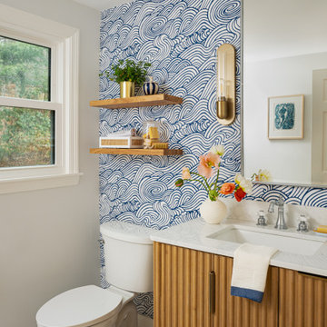
Separating the previous shared function allowed us to carve out a distinct, personality-filled powder room. Wrapped in a bold wave-patterned wallpaper and grounded by a custom reeded oak vanity with warm brass accents, this space delivers a moment of delight and individuality within the home.
The kitchen transformation is where the impact is felt most deeply.
What was once a dark, restrictive layout has been opened into a spacious, highly efficient U-shaped kitchen with generous clearances and an oversized island for gathering. A thoughtful mix of painted cabinetry and rift white oak introduces warmth and balance, while the custom reeded hood becomes a sculptural focal point. Open shelving, integrated pantry storage, and layered lighting ensure the space is as functional as it is beautiful.
Beyond aesthetics, the redesign prioritizes flow—both in movement and in connection. Sightlines between the kitchen, dining, and living areas were intentionally opened, allowing for ease of interaction and visibility throughout the main living spaces.
To unify the home, existing hardwood floors were refinished and extended, creating continuity and a seamless visual experience from one space to the next.
The result is a home that feels lighter, more open, and deeply aligned with how this family lives day to day—designed not just to look beautiful, but to support everything from busy mornings to slow, shared evenings.
 KCBR Design | Remodel
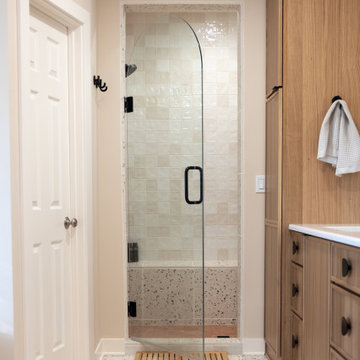
What was once an awkward and inefficient primary bathroom is now a space designed to truly function. The original doorway cut directly into the vanity, and a built in tub consumed valuable square footage, limiting both storage and circulation.
By relocating the entry and reworking the layout, we were able to create a more natural flow. An upgraded shower and a large double oak vanity with thoughtful storage solutions now anchor the space, making daily routines seamless. Heated terrazzo floors add comfort underfoot, while streamlined plumbing fixtures bring a clean, intentional finish to the design.
In the guest bathroom, we moved beyond purely functional and introduced color, pattern, and layered texture to create a space that feels personal and inviting.
Hearing our client share that this remodel has genuinely improved her quality of life is exactly why we do what we do. The result is a cohesive primary and guest bathroom renovation that balances beauty, comfort, and everyday function.
27