
Search results for "Initially start" in Home Design Ideas
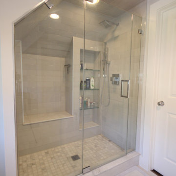
 Plan Architecture
Plan Architecture
So this is one of those interior projects you see on TV where it starts with "I have this small duplex that I want to feel larger." After getting over the initial,HOW ON EARTH ARE WE GOING TO DO THIS?!?, we came up with a really open feeling loft-like flat. We were able to identify the load bearing walls and chimney location early in the process by measuring the entire home from the basement up to the Attic. We made the early decision to expose and clean the brick chimney making it the decorative focal point of the first floor renovation. We also updated the bathroom - check out the before and after photos.
 BlueStar
A San Francisco resident for over 30 years, Boitano purchased his home in the mid 1990’s, after falling in love with its peerless views of Alcatraz and the Golden Gate Bridge. While he did an initial facelift when he first moved in, Boitano is now completing a major renovation of the entire home, with the kitchen being one of the most exciting new spaces.
“The kitchen is the nucleus of the house. So when we started the overall house redesign, we focused our attention on the kitchen first. Everything was centered on entertaining—from small and unplugged, to large and elegant, “said Boitano.
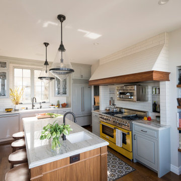
The kitchen design was inspired by the Italian countryside and has the air of an ageless, rustic Tuscan village; it is highlighted by the range hood wall that is covered in handmade lacquered Fireclay wall tiles. “I wanted an open floor plan with the option to close off the space for charity functions and events. I eventually found huge pocket doors to separate the dining room from the kitchen,” said Boitano.
Boitano sought out appliances that would replicate the power and performance of restaurant equipment so he could entertain like a pro at home and, at the same time, fit his personal design aesthetic. His new kitchen is outfitted with BlueStar® appliances, including a range, salamander broiler, ventilation hood and a refrigerator that he custom designed to suit his performance and design needs.
The BlueStar® honey yellow 48” Platinum range offers unsurpassed power and performance featuring industry-leading 25,000 BTU open burners, an innovative interchangeable griddle/charbroiler and a true European Convection PowR Oven™. Boitano loves the powerful cooktop with even, open burners, and, he said, “I really love the industrial lines, the black grates and the contrasting beautiful yellow color. It’s like a piece of art.”
 Kitchen Solvers of Grayslake
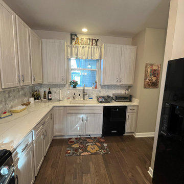
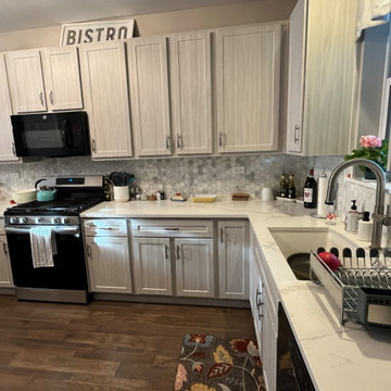
This homeowner had their cabinets painted white a few years ago and they were already starting to see the wear. They were actually glad that they initially painted, because it gave them time to realize refacing was the way they wanted to update their cabinets. They wanted a different look to complement their existing quartz countertop. They selected the Shaker style door in the Swiss Elm Skye wood-grain finish. We also replaced all the drawers with new custom solid wood drawers with soft-close heavy-duty glides. Before, their corner cabinets were restricted due to the double doors only opening at 90 degrees. By replacing the hinges, they can now fully open the doors and access the cabinets. The homeowners are so happy with their refaced kitchen. They say it looks crisp and clean and more their style now.
Find the right local pro for your project
 Cure Design Group
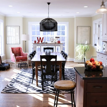
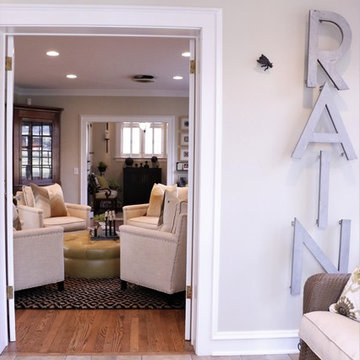
This designer client relationship is one based on friendship. Senior Designer Cori Dyer and client have an indescribable partnership and unmentioned understanding when it comes to decorating this home. A vintage charmer with a modern flair, filled with collectables and uncommon goods that make this space a unique and spectacular.
Cori Dyer:
I first met Sally when our boys became friends at Chaminade in 2007.
Since then, we have stayed close and become great friends.
Several years back she asked for my help giving her ideas on ways to spruce things up a bit and work with her on a major remodel.
A little intimidating as Sally has a beautiful home and is an avid collector of vintage finds.... way before the trend of blending old and new was popular.
She has an eye for unique ways to use vintage pieces and incorporating those into some of the most interesting and compelling displays. What has made this design relationship work is simply one of respect. I know when to give her that push outside of her comfort zone and incorporate her collections with selections that work with what she has, but that offer a new spin on putting it all together.
From that initial "spruce up" has come a makeover in her Living Room and currently one completed in her Family Room.
Although there are signs of my design throughout her home, the detail and selection of the collections and vintage finds are all Sally!!
I truly think that is how Design should be. Blending old and new, and a Designer listening to what makes the client happy.
Client: It was fun to be in style for a year or two, but it’s back to being the quirky lady. I started collecting in my teens and enjoy the hunt for new finds of all types. Cori helped me to enjoy my collections in a new and modern way! As always I had too many things. With her designer eye she taught me to blend the old and the new and to use different materials. The best part was going shopping with one of my best friends, who just happens to be a designer!! She is definitely the ying to my much needed yang.
 Kitchen Solvers of Grayslake
This homeowner had their cabinets painted white a few years ago and they were already starting to see the wear. They were actually glad that they initially painted, because it gave them time to realize refacing was the way they wanted to update their cabinets. They wanted a different look to complement their existing quartz countertop. They selected the Shaker style door in the Swiss Elm Skye wood-grain finish. We also replaced all the drawers with new custom solid wood drawers with soft-close heavy-duty glides. Before, their corner cabinets were restricted due to the double doors only opening at 90 degrees. By replacing the hinges, they can now fully open the doors and access the cabinets. The homeowners are so happy with their refaced kitchen. They say it looks crisp and clean and more their style now.
 Cure Design Group
This designer client relationship is one based on friendship. Senior Designer Cori Dyer and client have an indescribable partnership and unmentioned understanding when it comes to decorating this home. A vintage charmer with a modern flair, filled with collectables and uncommon goods that make this space a unique and spectacular.
Cori Dyer:
I first met Sally when our boys became friends at Chaminade in 2007.
Since then, we have stayed close and become great friends.
Several years back she asked for my help giving her ideas on ways to spruce things up a bit and work with her on a major remodel.
A little intimidating as Sally has a beautiful home and is an avid collector of vintage finds.... way before the trend of blending old and new was popular.
She has an eye for unique ways to use vintage pieces and incorporating those into some of the most interesting and compelling displays. What has made this design relationship work is simply one of respect. I know when to give her that push outside of her comfort zone and incorporate her collections with selections that work with what she has, but that offer a new spin on putting it all together.
From that initial "spruce up" has come a makeover in her Living Room and currently one completed in her Family Room.
Although there are signs of my design throughout her home, the detail and selection of the collections and vintage finds are all Sally!!
I truly think that is how Design should be. Blending old and new, and a Designer listening to what makes the client happy.
Client: It was fun to be in style for a year or two, but it’s back to being the quirky lady. I started collecting in my teens and enjoy the hunt for new finds of all types. Cori helped me to enjoy my collections in a new and modern way! As always I had too many things. With her designer eye she taught me to blend the old and the new and to use different materials. The best part was going shopping with one of my best friends, who just happens to be a designer!! She is definitely the ying to my much needed yang.
 Talon Construction Inc.
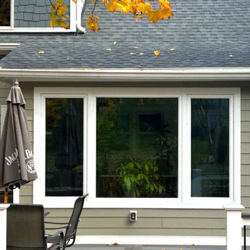
At Talon Construction Inc., we specialize in creating custom home additions that feel like a natural extension of your home. This sunroom addition in Middletown, Maryland showcases our design-build expertise, combining architectural harmony, craftsmanship, and livable design to create a comfortable space filled with natural light.
Exterior View
The exterior of this sunroom blends effortlessly with the existing home. Matching horizontal siding, clean white trim, and a precisely aligned roofline maintain the home’s original charm while adding a fresh, modern touch.
Large, energy-efficient windows invite sunlight into the space, while the glass bay window adds architectural interest and extra dimension. The addition connects directly to the deck, extending the home’s outdoor living area and creating a smooth transition between inside and out.
Interior View
Inside, the sunroom is bright, cozy, and functional. Expansive windows and a transom above the door flood the room with natural light, making it an ideal space for plants, relaxation, or a casual breakfast nook.
The neutral wall tones and heated ceramic tile flooring create warmth and elegance, while custom cabinetry topped with a granite countertop provides practical workspace and storage.
Every element of the design promotes comfort, efficiency, and aesthetic appeal. A reflection of Talon Construction’s design-build process, which focuses on blending form and function seamlessly.
Design-Build Expertise
From initial design concepts to final finishes, our design-build approach ensures that each project meets the homeowner’s needs and architectural goals. This sunroom addition not only enhances the property’s value but also enriches everyday living by bringing the outdoors inside.
Whether you envision a bright plant-filled retreat, a family gathering space, or a peaceful reading room, our team can tailor every detail to your lifestyle.
Contact Talon Construction Inc. today to schedule a consultation and start designing a space that expands your living area — beautifully and seamlessly.
 Tile Doctor Ltd
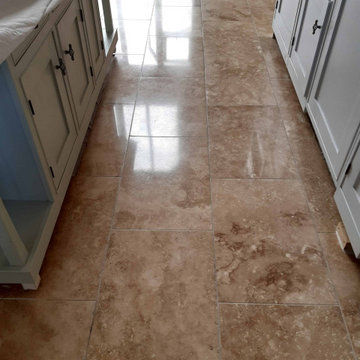
Located in Burgh Castle West of Great Yarmouth, this Travertine stone floor was a classic example of an incomplete installation. By incomplete I mean the tiler had done a fine job of laying and grouting the tiles but had left it at that and not sealed the stone. Natural stone like Travertine is porous and needs a sealer to stop dirt becoming ingrained in its pores, a sealer will also improve its appearance.
Without a sealer this floor now looked very dull, pale, rather damaged with pitting and heavily soiled with ingrained dirt. Pitting in stone like this is a natural feature of Travertine however it can be exacerbated with the use of acid cleaning products. This was a floor in urgent need of a face lift, and I was confident it could be transformed into a very beautiful floor.
I think it is true to say that most tilers will skilfully lay a floor for you but usually don’t have the knowledge, experience or equipment to finish the surface properly and when it comes to sealing many will recommend a product and suggest you take care of it yourself. Naturally if your find yourself in that position don’t insist the tiler does it, better to give us a call and have it done properly.
Our first job was to backfill the larger pits in the stone which as I mentioned are a natural feature of travertine material, but they can trap dirt and so its best if they are plugged with a suitably rigid filler. Also, if left alone the larger holes can quickly become larger as their edges crumble and break up leading to the entire tile becoming unstable. Replacing a tile in a floor like this is possible however its an extremely awkward job to do and it can be difficult to find an exact match for replacement.
Filling was done using a two-part, neutral cream-coloured polyester compound which gels in about fifteen minutes after addition of the catalyst. After this initial period, the excess product is trimmed off level with the surface of the tile before it sets harder than the stone itself in around sixty minutes. The fully cured compound can then be cut and machined as though it were part of the stone structure.
Our second job was to remove deep scratches caused by the unprotected feet of workmen’s ladders. This was done using Tile Doctor 50-grit and 100-grit diamond hand burnishing pads with a little water as a cutting medium. Shallower scratching present across the rest of the floor was removed using a Tile Doctor 200-grit soft milling pad driven by our Klindex 17″ rotary machine.
This abrasive action produces a fine slurry which was then rinsed with water and extracted using our 400psi Ninja machine in preparation for the next stage of the refinishing process. These machines were an expensive investment for our business however they are very robust and effective producing a good result that saves time.
Next task was to restore the polished appearance of the Travertine which was done using the application of a set of Tile Doctor burnishing pads. The process starts by applying a coarse 400-grit diamond pad, again fitted to the Klindex rotary machine. This cleans the tile and improves the matt finish left by the milling pad; again, the slurry was rinse-extracted before moving on to the next pad in the set. Next came the finer diamond polishing stages of 800 grit and 1500 grit, slurry being removed as before between the grades. By this time, all the scratches had been removed and the Travertine floor had visually pleasing even sheen across the whole surface. The last pad in the set is applied dry with a little water sprayed onto the tile so we left the area to dry out thoroughly overnight with the assistance of our large capacity dehumidifier.
Returning the following morning, we found that the floor had dried out perfectly and was ready to be vacuumed and spray burnished with the last pad in the set which is a 3000-grit very fine pad applied using a small amount of water sprayed from a trigger bottle resulting in a deep, rich shine across the floor surface.
Last step in the face lift was to seal the floor with a generous coat of Tile Doctor Ultra-Seal, a premium grade penetrating sealer recommended for use in Kitchens and food preparation areas. Having left the floor to soak up as much of the Tile Doctor Ultra-Seal as it could, the excess product was removed and the whole area allowed to dry completely with the assistance of our industrial air moving fan. Finally, the floor was spray buffed to a deep shine using a white maintenance pad.
The client was extremely pleased with our results and was amazed at the variation of colours within the stone which had never been visible previously.
Nick White
Norfolk Tile Doctor
 Division 9 Inc.
The guest bathroom plays an important role on how your guests will perceive the architecture and style of your home. In this house we totally transformed the outdated bathroom. In collaboration with Roberto Lugo a daring designer from New York, the design process was focused on creating a contemporary space that could be elegant and comfortable.
The initial renovation on this project started with the demolition of entire bathroom including doors, vanity, floor, plumbing and light fixture, toilet, tub, tile switches and outlet. An existing wall between toilet/shower room and vanity room was also removed. The existing door frame was expanded to 27" wide (interior) and the existing floor was inspected to determine a depression on the vanity side.
The existing door frame was converted into a pocket door frame (door opens to the right). To accommodate for standard crown molding the ceiling above the shower was dropped 4".
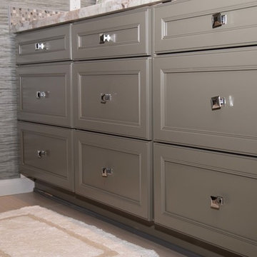
For the vanity, a furniture-like cabinet style with soft close hardware was installed. The grain stain was paired perfectly with a gray marble countertop.
The shower turned out beautifully. A Shower/Bathtub combination with a sliding door was installed. Porcelain tile was installed vertically on the returns walls, glass mosaic for the long walls, glass mosaic was also used along leading edge of tub enclosure. Porcelain tile was used on the floor.
 Inge Architecture
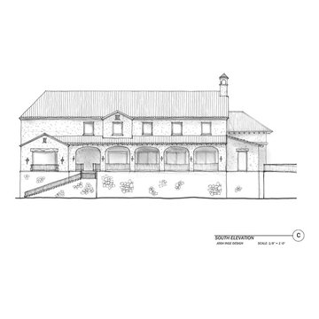
This was the initial proposed back elevation. It changed as the house was further developed and evolved but this was a good place to start visualizing the lake side elevation.
 abarnai
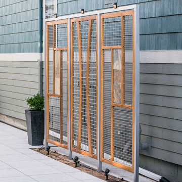
The Courtyard Oasis project encompasses what abarnai does best; remodeling a space with an emphasis on functional installation artwork. Our clients wanted a beautiful and tranquil outdoor space as a seamless extension of their indoor living space. They initially described the outdoor area as a drainage ditch, and to transform it into a Courtyard Oasis required detailed design work and creative collaboration. An open central patio, with custom trellises as a living focal point, was the starting point of the design to connect the indoor and outdoor spaces and allow the courtyard area to be divided into different zones -- for relaxing, entertaining and gardening. The abarnai team loved this project because they go to completely revamp the area and utilize a wide variety of design and building skills, including patio construction, custom trellis artwork, composite decking and stairs, a wood retaining wall, feature lighting systems, planting areas, and a sprinkler system.

 STUDIO GRANIA MURRAY
A second home for a large family. The brief was to completely furnish, accessorise and provide draperies. This was our second project for this client and his family of five daughters. From start to finish the project took ten months to complete. An initial site visit in June followed by a two week installation in March of the following year. Most items were custom made. Everything was chosen with constant family consultation and agreement.
 KSI Kitchen & Bath
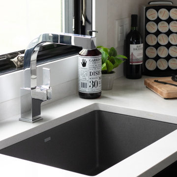
“I am really into black. And I like gray and white too. Pretty much all the neutral colors.”
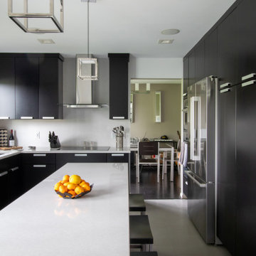
From the start of our initial consultation, we knew this client was looking to transform their home with a distinctive kitchen and bath remodel! Jeff went on to describe how he and his wife Jan wanted a clean, modern look. We got to work to create a design they would love!
 KSI Kitchen & Bath
“I am really into black. And I like gray and white too. Pretty much all the neutral colors.”
From the start of our initial consultation, we knew this client was looking to transform their home with a distinctive kitchen and bath remodel! Jeff went on to describe how he and his wife Jan wanted a clean, modern look. We got to work to create a design they would love!
 Crystal Kitchen + Bath
This kitchen had a fantastic head start from a previous remodel back in 2006, which opened up the space. However, our clients wanted to take it a step further. We added two structural posts to accommodate an expanded header. This change allowed us to create an inviting island that not only provides extra prep space but also offers room for six stools.
The existing maple wood floors were too beautiful to replace, so we laced into them to seamlessly blend the new square footage. The entire floor was elegantly stained grey, creating a cohesive and sophisticated look throughout the space.
The textured melamine wood grain laminate and painted slab doors for the cabinets added a touch of contemporary elegance. The Cambria Queensbury countertops, paired with a full-height backsplash, create a sleek and easy-to-maintain kitchen surface.
A upgraded kitchen is not complete without top-notch appliances. In this project, we installed a 48″ Sub-Zero refrigerator, oven, speed oven, beverage refrigerator, wine cooler, induction cooktop, and a decorative stainless hood. The cast iron farm sink found a new home in the spacious island, flanked by two dishwashers for ultimate convenience.
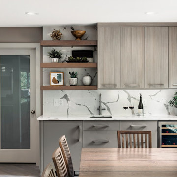
Initially designed as a dry bar, an overseas trip inspired our clients to upgrade to a wet bar. After experiencing the joy of sparkling water in Europe, they decided to bring this feature home. The custom-built Grohe faucet was added to provide non-sparkling and sparkling water options, thanks to a carbonated canister cleverly hidden under the sink.
To add a touch of warmth and continuity, we incorporated floating shelves made of cherry wood, stained to match the new dining room table. This not only ties the spaces together but also adds a unique design element to the wet bar area.
A pocket door leading to the mudroom and back entry, originally added in the 2006 remodel, was kept, and a custom-built dog door made of wood and metal rods was integrated. Now, the dogs can stay in the back entry yet still be part of the family action.
New windows and sliding glass doors were installed to provide breathtaking views of the lush landscape and a stunning blue stone patio with a fireplace, seamlessly connecting the interior to the outdoors.
This project showcases our commitment to marrying functionality, elegance, and innovation. If you have a unique vision for your kitchen, our team at Crystal Kitchen is here to turn it into a reality. Contact us today and let’s create your dream space together!
 Schulte Design Build
Our clients recently purchased a beautiful hillside home in Broadview. What started as a simple kitchen refresh turned into a full-scale renovation to address structural issues and achieve a modern aesthetic.
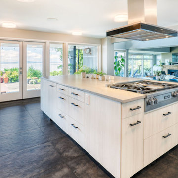
The top priorities for the client’s kitchen were a space for entertaining and to enjoy the sweeping Sound views. The existing late-90s kitchen was outdated and the walls separated the kitchen from the rest of the home. To achieve this, we removed both sides of internal walls and reconfigured plumbing and structural support.
The clients, who are artists and photographers, highly valued aesthetics. Collaborating with their designer, known for using industrial materials in commercial spaces, we aimed to bring these elements into the kitchen. We created a design that maximized the views and integrated industrial and mid-century styles, featuring steel shelving and quartz countertops that resembled concrete.
Instead of using traditional concrete flooring, we opted for concrete tiles. Believe it or not, those tiles are 2x4 feet long! It took two of our team to set each one. Recommended by their designer, large tiles like these are often used in commercial buildings, but the designer knew they were a cost effective (and beautiful) solution for this home.
The renovation also included: A much larger island for cooking and entertaining, custom-made faucets with hot and cold taps, a built-in refrigerator, and a double beverage fridge at the end of the island. We put in two laminated cabinets in two contrasting colors: Wilsonart White Cypress and Wilsonart Black Velvet Traceless. Lastly, we installed hydronic floor heating and AC, ensuring comfort year-round.
The result is a beautifully modern kitchen that is both functional and aesthetically pleasing. This project exceeded the clients' initial expectations, transforming their kitchen into the heart of their home.
 Aardvark Architecture
This proposal is for a new two-story home on the vacant heavily wooded lot with an existing 150-foot-long driveway lined by several beautiful oak trees culminating in a behemoth 43-inch oak tree where the driveway meets the main lot. The far end of the driveway terminates in a grove of three 43/40/43-inch redwoods and at the very center of the vacant lot stands a gargantuan V-twin 59-inch redwood tree paired with a “small” 29-inch redwood tree. The owners want to build a beautiful contemporary-styled home for their family that fully enjoys and embraces the mature trees on their cozy 65-foot by 100-foot lot.
As with all small, constrained lots, this project’s site design started first with meeting the relatively large parking and car maneuvering requirements. Menlo Park’s Department of Transportation typically requires side-facing garages to have 24-feet of backup space. So that they could give the largest feature redwood tree on site an added four feet (50%) of clearance outside of its critical root zone, the owners agreed to install a vehicle turntable at the end of their driveway to eliminate the extra four feet of space needed to back up and turnaround. This allowed them to pull their garage forward an additional four feet towards the front property line on the panhandle side, drastically reducing the rest of the home’s impact on the gargantuan V-Twin paired redwood tree at the center of the lot.
One of the owners has mobility issues, and accordingly, they first sought to design a one-story floor plan that incorporated all their family’s needs including plenty of covered patio and deck space to enjoy our fantastic California weather. But that single-story footprint spread too far into the critical root zones of several of the redwood trees on site, even despite the use of the vehicle turntable. During my interview process with the owners, they made it clear to me that one of their primary concerns is ensuring that the largest trees on site would thrive and become features of their new home after construction is complete. The single-story designs that removed the grove of three huge redwood trees were non-starters, as was the skimpy 5x10 master bath I designed when trying to squeeze the whole house program into an overly compromised single-story design. It was therefore deemed necessary to go with a two-story design despite the owner’s mobility issues. This two-story design has a much more compact ground floor footprint and has no bedrooms downstairs, other than the detached ADU. The owners must give up the floor area and incur the costs to install a residential elevator to access their upstairs master suite.
Our ground floor footprint is smaller due to the two-story design decision, and our foundation is pulled away from the trees thanks to the vehicle turntable. Yet, a tiny portion of the home’s ground floor footprint still encroaches into the critical root zones of the largest 59” redwood tree. Therefore, as outlined in the Arborist Report prepared by Aesculus Arboricultural Consulting, the structural engineers are incorporating an array of drilled piers and shallow-grade beams for the main home’s foundation and deck area nearest the redwood’s critical root zone. This drilled piers and grade beam foundation is a type of “bridging” foundation as outlined in Aesculus’ report to preserve the health of these trees that the property was designed around. The rest of the foundation will be constructed as an insulated slab-on-grade foundation to minimize the number of steps and ramps needed for the owners to enjoy their home and patio areas.
Despite the owner’s desire to keep as many trees as possible on site, and despite the smaller ground floor footprint and the advantage of the vehicle turntable, the need for a 20x20-foot garage and 20x20/25-foot guest parking space on our panhandle lot requires the removal of two heritage trees in the required driveway, a 16” coast redwood, and a 17” coast redwood. An alternate design, such as swapping the garage and guest parking locations north-to-south, still requires the removal of these two trees for vehicle maneuvering but has the added disadvantage of cutting off the home’s sightlines to the behemoth 43” oak tree just outside the currently proposed front patio space and living room. Jim Redman of Elements Landscape is proposing 13 new trees be planted on site to replace the lost value of these two heritage coast redwood trees.
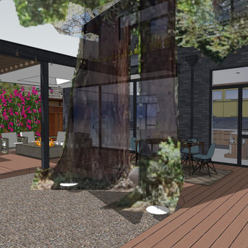
This contemporary architectural design features clean lines, and an abundance of full-height windows and large skylights to best take in the immense trees on site. To blend in with the forest-like setting, the home boasts a mix of rich textures and features a color palette of natural wood tones contrasted with dark blue and black. Once through the new steel gate at the street and down the 150-foot tree-lined driveway, a large covered front patio becomes visible past the neighbor’s detached accessory structure. The covered patio is just across the driveway from the beautiful 43” behemoth coast live oak. The single plane of the covered patio roof is delicately supported by a pair of steel posts in a “V-twin” configuration much like the largest redwood trees that tower over the center of the lot and will still be visible above the new two-story home, even from the front yard. The patio is covered in a dark-colored standing seam roof, with steel C-channel fascias, and tongue-and-groove wood ceiling planks on the underside. Generously sized skylights on the patio roof and inside the living area allow for impressive views of the amazing oak canopy as well as precious natural light.
Supporting the sloped covered patio on the other side is the two-car garage with a secondary bedroom suite stacked above the garage. This two-story volume is to be clad in vertical clear-coated redwood siding, to tie in with the grove of three 43-inch redwood trees just beyond. The garage door, and the bank of windows for Bedroom#2 above feature a steel fascia eyebrow header feature to provide shade and overhang protection, as we are not proposing a large overhang at this “redwood trunk”. The garage and bedroom volume are pulled 16 feet away from the side property line, instead of the minimum required setback of 6’-6”, thus leaving plenty of room for the redwood grove and existing mature pear tree to continue to thrive. This existing mature green screen in this 16-foot-wide side yard is a feature worth soaking in, which is why tall windows with low sill heights are proposed for both the stairs and the upstairs hallway. Though it may be infrequent to approve side-facing 2nd floor windows with sill heights as low as what we’re proposing, we are confident that the mature green screen and the over 16-foot-wide side yard are sufficient to provide for the continued privacy of our neighbor’s rear yard space, especially considering theses windows are in walkway zones.
The covered patio at the front entry is also bound by the 10-foot-tall living room. The great room is clad in a dark blue brick veneer, which wraps around all three sides of the living room. Upon entering the home from the covered patio, you are immediately greeted with one of the most impressive features of the home’s design: a 10-foot-tall by 24-foot-wide set of sliding glass doors. From the entry, this huge opening gives merely an initial glimpse of the massive trunks of the gargantuan V-twin redwoods sitting at the center of the lot. All three sliding glass panels open directly out into the smaller partially covered deck in the rear. This roof overhang element matches the design of the front patio with a steel C-channel fascia and a large skylight. But the rear deck’s roof element is set flat at a ten-foot ceiling height so that the living room’s ceiling seems to float above and out beyond the expanse of full-height sliding doors, thus creating an indoor-outdoor living space that will feel much larger than the home’s actual footprint. This rear covered deck is smaller than the patio in the front and also has a mix of solid and open-slatted roofing to allow for more solar access for the relatively small amount of open sky available.
The downstairs living room is open to the dining and kitchen areas, as well as the stair-and-elevator tower beyond. The stair tower is very open and glassy, and the stairs wind up and around the redwood-clad elevator tower. From certain perspectives in the 16-foot-wide side yard, it will almost seem as if the grove of three redwoods has a fourth tree that the house and the stairs were carefully built around. Other than the 3-foot-wide windows, the exterior walls of the stair tower, downstairs utility spaces, and Bedroom#3 above are finished in cement plaster, painted dark blue and black. The sloped roof over the stair-and-elevator tower continues cleanly over the area of upstairs Bedroom#3. This roof level is set by the side daylight plane and only yields an inside wall height of just under 6 feet in height. The owners are satisfied that the rest of this upstairs room has a nice vaulted ceiling to make up for the one short wall under the daylight plane.
The rest of the ground floor adjacent to the stair tower consists of a small utility wing containing a half-bath, laundry, storage area, and an exterior alcove for the electric heat pump HVAC unit. This short wing also gives more accessible access to the rear yard deck, as well as a backdrop for an outdoor kitchen. The bright white stone backsplash for the outdoor kitchen provides contrast to the otherwise consistent use of cement plaster painted dark blue and black for the two-story wing closest to the detached ADU. Though Bedroom#3 is stacked directly above this small wing, it is relatively short to comply with the side daylight plane of this narrow lot. Still, to further help break up the scale of this wall, another steel fascia eyebrow element is set about 8 feet above the rear deck.
The master suite sits centered above the ten-foot-tall great room. The master bedroom and its balcony, as well as the master bathtub area, have a commanding view of the central redwood trees and their impressive canopy, though the balcony is mostly recessed and should pose no privacy concerns to the neighbor’s rear yards. The master balcony parapet is clad in the same brick veneer continuing up from the living room below. A dark-painted metal rail makes up the rest of the open guardrail height. The entire length of the master balcony is comprised of 9-foot-tall sliding glass doors, but the area above the doors, as well as the area below the master bathroom windows, is accented with more redwood siding. The remainder of the master suite bathroom and walk-in closet is finished in cement plaster painted dark blue. The master bathroom has one side yard-facing window but will be frosted glass for both the owner’s and the neighbor’s privacy.
The 2nd floor is capped under a simple gable roof design with one roof ridge and varying eave and rake overhangs depending on the 2nd-floor layout and solar orientation. Since these roof planes are quite difficult to see in the middle of the heavily wooded panhandle lot, we are proposing a white TPO roofing for these two upper roof planes as a more sustainable choice compared to more dark-colored roofing like the covered patios and detached ADU.
The owners also wish to build a detached 292-square-foot Accessory Dwelling Unit (ADU) as an office and guest suite. For the ADU foundation to be situated outside the central redwood tree’s critical root zone, this relatively tiny structure takes advantage of the narrower 4-foot side and rear setbacks allowed for ADUs smaller than 800 square feet. The small L-shaped detached ADU frames a wonderful quasi-courtyard around the gargantuan V-twin redwoods at the center of the lot. The ADU shares a matching material palette consisting of cement plaster painted blue and black, vertical redwood siding and soffits, and thin brick veneer. The ADU also features large full-height windows. The only difference between the main home and the ADU material palette is that the roofing will be a dark composition shingle roofing since it will be quite visible from the master balcony.
 Reflections Interior Design
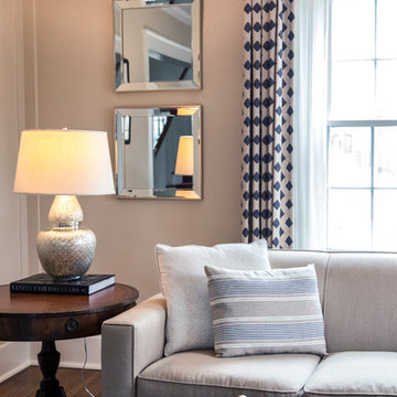
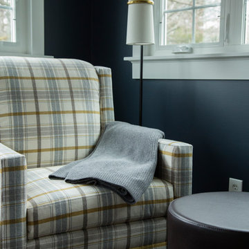
We initially were hired to work with our clients on their upstairs bathrooms. Once we started working together the upstairs bathrooms were put on hold and instead we updated the entire first floor!
We painted or put wallpaper in each space and added new pieces of furniture to blend with existing pieces. Lighting was updated and added throughout. Staying in tune with the original character of the home was an important focus and we paid close attention to that in our selection of light fixtures, furniture and fabrics. We added a hall closet, put wainscoting in the dining room, updated the fireplace tile surround and added details to the living room bookcase. The kitchen got a fresh new look with minimal renovating - we removed some cabinetry, added floating shelves, tiled the wall and designed a custom built-in breakfast nook. We most recently worked on converting an upstairs sun porch to a home office. We opened up the ceilings, added hardwood flooring to match the rest of the house and furnished it with a few of our client's existing pieces and some new. The end result of this project is a beautiful and welcoming space that we feel truly reflects our clients!
 Reflections Interior Design
We initially were hired to work with our clients on their upstairs bathrooms. Once we started working together the upstairs bathrooms were put on hold and instead we updated the entire first floor!
We painted or put wallpaper in each space and added new pieces of furniture to blend with existing pieces. Lighting was updated and added throughout. Staying in tune with the original character of the home was an important focus and we paid close attention to that in our selection of light fixtures, furniture and fabrics. We added a hall closet, put wainscoting in the dining room, updated the fireplace tile surround and added details to the living room bookcase. The kitchen got a fresh new look with minimal renovating - we removed some cabinetry, added floating shelves, tiled the wall and designed a custom built-in breakfast nook. We most recently worked on converting an upstairs sun porch to a home office. We opened up the ceilings, added hardwood flooring to match the rest of the house and furnished it with a few of our client's existing pieces and some new. The end result of this project is a beautiful and welcoming space that we feel truly reflects our clients!
 Advance Design Studio, Ltd.
Jennifer and Dan have lived in their Deer Park Illinois home for 15 years, slowly making minor fixes like painting and decorating; but they had a new plan for their kitchen the entire time. An awkwardly placed garage door, and an island cooktop with a terrible downdraft made a full-scale kitchen remodel an absolute must. Jennifer had many ideas in mind and wanted to work with a company that could provide high-end work, while partnering with a designer that would tailor the kitchen to her ideas.
She was intrigued by the phrase “Common Sense Remodeling” in Advance Design’s feature she discovered while perusing an issue of the community’s Quintessential Barrington Magazine. Doing further research on the company’s website, as she looked through project profiles and read about Advance Design’s “Common Sense Remodeling” philosophy, she promptly scheduled an appointment to see if the people and ideas she read about were truly who they said they were. The more she read, the more she knew that the “Common Sense” approach to remodeling they described was exactly the type of company she was looking for.
The partnership was sealed after an initial consultation with Owner Todd Jurs and Project Designer Michelle Lecinski. They displayed a combination of friendliness, professionalism and respect that was unmatched by any of the other companies Jennifer talked to. She knew that with Advance Design, she would be able to retain the vision that she had in mind with high-quality craftsmanship.
“I reached out to Advance Design because of the ‘Common Sense Remodeling’ tagline,” Jennifer said. “That’s what lingered for me”. “Advance Design was the most respectful- of the house and of my design ideas, and the most professional of the handful of companies that looked at my project”.
Soon after the meeting Jennifer began working with Michelle on the project design. They quickly developed chemistry. Jennifer loved how Michelle researched and located every detail that Jennifer wanted for the kitchen. Between the two of them, every concept and idea was worked through and perfected. “Jennifer had definite ideas about what she wanted the new kitchen to look like, she just didn’t know how to bring it all together. We worked together really well to make her ideas into the practical reality necessary for a well-functioning kitchen, with the look and feel that she had envisioned”, says Michelle.
“Michelle was wonderful in using the CAD system she would show me new drawings every time we changed the layout while working through the design,” Jennifer said. “She was a really wonderful partner in execution, she made sure everything happened quickly and easily.”
The finished design drew out elements of Jennifer’s style and personality. The pair call the look “sophisticated farmhouse” to describe the kitchen renovation to family and friends. The result was a beautifully crafted, authentic-feeling space that satisfied Jennifer’s dreams 15 years in the making. The whole project consisted of a kitchen remodel, mudroom upgrade with powder room, and garage entry relocation. “The projects I personally like the best, are the ones that put the client’s dreams on display,” Project Designer Michelle said. “And this is one of those projects.”
The main focal point of the kitchen is custom zinc and brass ventilation hood with a vintage sheen, which was hand made to order by a small company in Indiana named Vogler Metalworking. “It’s like sculpture, a true work of art”, says Jennifer. Your eye is immediately drawn towards this elegant yet practical hood that eliminated the home’s downdraft problem and added a striking conversation piece at the same time. The carpenters had to use special gloves when transporting and installing it, so they didn’t smudge it with fingerprints. The beautiful hood centers proudly over the stunning black enamel and brass LaCornue Range. “I had a friend who had a LaCornue range and after learning how easy it was to cook perfect meals, I was convinced I wanted to have one”, says Jennifer. This unique, breathtaking combination anchors the entire kitchen and is apparent immediately as you walk into the great room the surrounds the space.
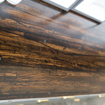
DuraSupreme Crestwood cabinets with a Kendall Panel add function and sophistication. A custom gray paint color paired with a storm blue was developed so that the new kitchen looked like it belonged to the existing space. Unlacquered brass faucets and hardware were important to Jennifer because she wanted the living finishes to age over time. Remarkable brass diamond mesh cabinet door inserts imported from the UK continue to add this one-of-a-kind kitchen renovation; giving it a “you won’t see this everywhere” quality. The use of old railcar flooring for the coffee bar countertop and reclaimed oak for the open shelving gives an authenticity to the space uncommon in kitchens today.
Jennifer and Michelle fell in love with the Limestone Grey Stone while they were investigating unique island countertop ideas. They liked the fact that the limestone as a living finish will age and change over time. Calcutta Miel Quartz countertops made for an excellent pairing around the perimeter, as it’s durable and perfect for cooking preparations. A textured white subway tile backsplash that runs to the ceiling keeps your eye moving towards the open shelving, and to the main focal point of the stunning range hood combination.
“The kitchen functions beautifully, and it’s gorgeous,” beams Jennifer as she gestures with both hands while smiling ear to ear. “The most important thing was I wanted a kitchen that had a wonderful flow, cooked beautiful meals and was a great gathering place for family and friends, and this space does that perfectly! Beauty wise, it turned out exactly how I had envisioned. I felt the function part was the hardest part, and that was nailed”!
Relocating the garage entry to the new mudroom was a huge priority and has finally separated the family’s arriving home functions from their kitchen. Now coats and shoes and bags have their own area for dropping once members arrive home. Matching gray DuraSupreme cabinetry helped create gorgeous, purposeful lockers for the family. A reclaimed vintage sink and custom wall paper were added to the tiny powder room to beautify the once previously only functional space. Advance Design was even able to create a custom space for their dog to sleep while the family is away.
“It was unbelievable that a project of this size was completed in such a short time, and I think that’s because of the large amount of planning and preparation that went into it,” Jennifer marveled, “When we started, we were ready, and everything was prepared”.
When it came to execution, Project Manager Justin Davis and his crew were quick, accessible, and organized. Projects like this kitchen are typically completed in as little as 8-10 weeks. Jennifer’s kitchen however despite the relocation of some challenging HVAC in a soffit and moving of an exterior door was completed remarkably fast in part because the team was working with an existing tile floor that ran throughout the first floor that the client really loved.
“You get to know these people really well because they’re living in your house while you’re living in your house. They were so fast and really good, it didn’t take as long as even planned” reported Jennifer. “I would text Justin and he always responded almost immediately. I got to know all the guys who were working in our house and they were all wonderful people”.
Details in a customized kitchen like this one require skill and care from the people who install it. “All the guys on the job were skilled at what the did. I wanted small details like little feet to look like furniture, that is where their carpentry skill came in to make these all perfect”, said Jennifer. “The tile guys were wonderful. They even let me determine how I wanted the texture with the grout to appear for a salt and pepper look; now that is a very skilled trade person making it custom”.
In Jennifer’s interview, she continued to reference Advance Design’s “Common Sense Remodeling”, so I took a minute to ask her exactly what that phrase meant to her and how it played out in her experience with her project and the Advance Design team. Here is what she said: “I was intrigued about Common Sense Remodeling and in my head that there would be clear costs and prices, great communication between the design team, the execution team and me”, said Jennifer. They did deliver on that, it was so clear about the cost breakdown, what I could expect from everyone who came to my house, and everything that we had ordered. That to me is the Common Sense”!
It’s great to see a client take literally our assertion that a well-planned remodeling project is simply “Common Sense”! She anticipated each step of the way would be clear, concise, and predictable, all the while protecting the outcome due to the careful upfront planning. “Advance Design delivered on their ‘Common Sense Remodeling’ promise,” Jennifer said. “From the design team, to the execution team - everything was straight forward like I imagined. The project turned out exactly how I envisioned, I enjoyed this process and absolutely would recommend Advance Design Studio to anyone.”
22