
Search results for "Initially" in Home Design Ideas


 Ellie Lillstrom Photography
Photo: A Darling Felicity Photography © 2015 Houzz
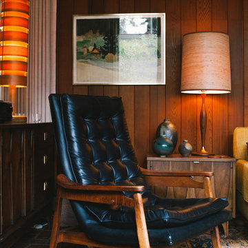
Example of a mid-sized 1960s formal and enclosed brick floor living room design in Seattle with brown walls, a standard fireplace, a brick fireplace and no tv
Example of a mid-sized 1960s formal and enclosed brick floor living room design in Seattle with brown walls, a standard fireplace, a brick fireplace and no tv
Find the right local pro for your project
 Yonkman Construction, Inc.
Northlight Photography, Roger Turk
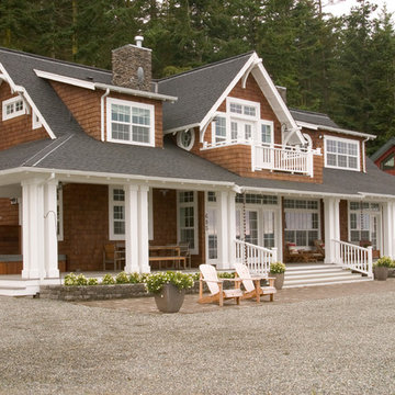
Example of a mid-sized beach style brown two-story wood exterior home design in Seattle
Example of a mid-sized beach style brown two-story wood exterior home design in Seattle
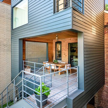

 JAZ Design, Inc.
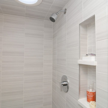
Initially just a bedroom with closet on this 1/2 floor sleeping level, we shortened up the bedroom a bit and added an ensuite that may be compact, but versatile and boasts a naturally lit shower from the sun tunnel above.
 Best Hot Tubs "Hot Tub and Spa Experts"
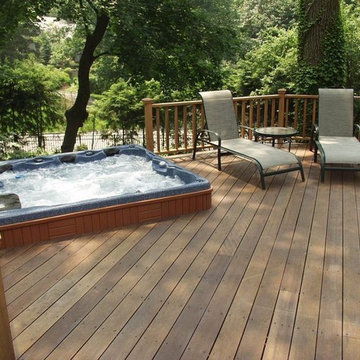
In this case, we designed and built this attractive raised deck, making room for a spa to be set against it. Initially a conceptual design -- be it of wood or stone -- consists of lines on paper or a vision in your head, but ultimately it is a unique balance and culmination of materials utilizing color, texture, scale and shape that is very personal.
www.longislandhottub.com
 Interiors by Maite Granda
Feature in: Luxe Magazine Miami & South Florida Luxury Magazine
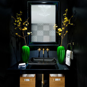
If visitors to Robyn and Allan Webb’s one-bedroom Miami apartment expect the typical all-white Miami aesthetic, they’ll be pleasantly surprised upon stepping inside. There, bold theatrical colors, like a black textured wallcovering and bright teal sofa, mix with funky patterns,
such as a black-and-white striped chair, to create a space that exudes charm. In fact, it’s the wife’s style that initially inspired the design for the home on the 20th floor of a Brickell Key high-rise. “As soon as I saw her with a green leather jacket draped across her shoulders, I knew we would be doing something chic that was nothing like the typical all- white modern Miami aesthetic,” says designer Maite Granda of Robyn’s ensemble the first time they met. The Webbs, who often vacation in Paris, also had a clear vision for their new Miami digs: They wanted it to exude their own modern interpretation of French decor.
“We wanted a home that was luxurious and beautiful,”
says Robyn, noting they were downsizing from a four-story residence in Alexandria, Virginia. “But it also had to be functional.”
To read more visit: https:
https://maitegranda.com/wp-content/uploads/2018/01/LX_MIA18_HOM_MaiteGranda_10.pdf
Rolando Diaz

 Thinkterior LLC
For a family who believes fitness is not only an essential part of life but also a fun opportunity for the whole family to connect, build and achieve greatness together there is nothing better than a custom designed obstacle course right in your back yard.
THEME
The theme of this half mile trail through the woods is evident in the fun, creative and all-inclusive obstacles hidden in the natural flow of the land around this amazing family home. The course was created with adults and children, advanced and beginner athletes, competitive and entertaining events all accounted for. Each of the 13 obstacles was designed to be challenging no matter the size, skill or ability of the athlete lucky enough to run the course.
FOCUS
The focus for this family was to create an outdoor adventure that could be an athletic, social and personal outlet for their entire family while maintaining the natural beauty of the landscape and without altering the sweeping views from the home. The large scale of the challenging obstacles is camouflaged within the landscape using the rolling hills and mature trees as a natural curtain in every season. The beauty of the course does not diminish the functional and demanding nature of the obstacles which are designed to focus on multiple strength, agility, and cardio fitness abilities and intensities.
STORAGE
The start of the trail includes a raised training area offering a dedicated space clear from the ground to place bags, mats and other equipment used during the run. A small all-terrain storage cart was provided for use with 6 yoga mats, 3 medicine balls of various weights, rings, sprinting cones, and a large digital timer to record laps.
GROWTH
The course was designed to provide an athletic and fun challenge for children, teens and adults no matter their experience or athletic prowess. This course offers competitive athletes a challenge and budding athletes an opportunity to experience and ignite their passion for physical activity. Initially the concept for the course was focused on the youngest of the family however as the design grew so did the obstacles and now it is a true family experience that will meet their adapting needs for years. Each obstacle is paired with an instructional sign directing the runners in proper use of the obstacle, adaptations for skill levels and tips on form. These signs are all customized for this course and are printed on metal to ensure they last for many years.
SAFETY
Safety is crucial for all physical activity and an obstacle course of this scale presents unique safety concerns. Children should always be supervised when participating in an adventure on the course however additional care was paid to details on the course to ensure everyone has a great time. All of the course obstacles have been created with pressure treated lumber that will withstand the seasonal poundings. All footer pilings that support obstacles have been placed into the ground between 3 to 4 feet (.9 to 1.2 meters) and each piling has 2 to 3 bags of concrete (totaling over 90 bags used throughout the course) ensuring stability of the structure and safety of the participants. Additionally, all obstacle lumber has been given rounded corners and sanded down offering less splintering and more time for everyone to enjoy the course.
This athletic and charismatic family strives to incorporate a healthy active lifestyle into their daily life and this obstacle course offers their family an opportunity to strengthen themselves and host some memorable and active events at their amazing home.
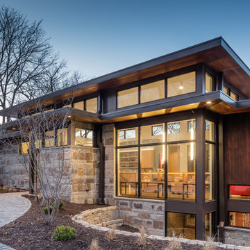
 RDM Architecture
Photo: Bob Greenspan
Large contemporary brown two-story wood flat roof idea in Kansas City
Large contemporary brown two-story wood flat roof idea in Kansas City
 BGI Design
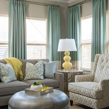
This master bedroom suite was initially wanting for cohesiveness and seating options that would allow our clients to relax from their days of traveling. We began with a color palette that was "spa" like and would allow them to rest, both in the bedroom and sitting room. They loved the neutral hues with splashes of green & accents of yellow throughout. We used an existing bed and dresser but added custom upholstered pieces along with case goods. We painted all of the surfaces, including the trim, a clean color palette, with the exception of the sitting area ceiling & the accent wall behind the bed that showcases a monochromatic wall covering. Not only was designing the bedroom portion a priority, but giving them ample options for sitting or laying to relax was of utmost importance. The sitting area already had an abundance of natural sunlight from the windows, so we added custom stationary drapery panels, mostly neutral furniture pieces, and pops of yellow with the lamp and accessories. The clients are now very happy to use their master suite more efficiently and be able to relax when they come home from long trips!
Michael Hunter Photography

 Emilia Decor
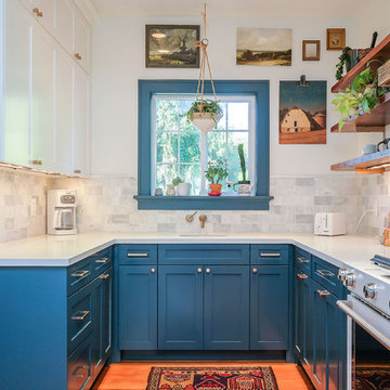
Kitchen - transitional u-shaped light wood floor kitchen idea in Portland with shaker cabinets, blue cabinets, quartzite countertops, porcelain backsplash and a peninsula
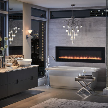
 Brizo Faucet
The twists and flourishes of Old World wrought iron find bold new expression in the Virage Bath Collection by Brizo®. Combining modern sophistication with hints of art deco styling, Virage is a uniquely elegant form that adapts to almost any environment.
The idea for Virage really took root during a trip to Paris and all of the beautiful wrought iron throughout the city. From there it was a matter of making initial sketches a little more Art Deco, a little less Gothic.
 Advance Design Studio, Ltd.
Jennifer and Dan have lived in their Deer Park Illinois home for 15 years, slowly making minor fixes like painting and decorating; but they had a new plan for their kitchen the entire time. An awkwardly placed garage door, and an island cooktop with a terrible downdraft made a full-scale kitchen remodel an absolute must. Jennifer had many ideas in mind and wanted to work with a company that could provide high-end work, while partnering with a designer that would tailor the kitchen to her ideas.
She was intrigued by the phrase “Common Sense Remodeling” in Advance Design’s feature she discovered while perusing an issue of the community’s Quintessential Barrington Magazine. Doing further research on the company’s website, as she looked through project profiles and read about Advance Design’s “Common Sense Remodeling” philosophy, she promptly scheduled an appointment to see if the people and ideas she read about were truly who they said they were. The more she read, the more she knew that the “Common Sense” approach to remodeling they described was exactly the type of company she was looking for.
The partnership was sealed after an initial consultation with Owner Todd Jurs and Project Designer Michelle Lecinski. They displayed a combination of friendliness, professionalism and respect that was unmatched by any of the other companies Jennifer talked to. She knew that with Advance Design, she would be able to retain the vision that she had in mind with high-quality craftsmanship.
“I reached out to Advance Design because of the ‘Common Sense Remodeling’ tagline,” Jennifer said. “That’s what lingered for me”. “Advance Design was the most respectful- of the house and of my design ideas, and the most professional of the handful of companies that looked at my project”.
Soon after the meeting Jennifer began working with Michelle on the project design. They quickly developed chemistry. Jennifer loved how Michelle researched and located every detail that Jennifer wanted for the kitchen. Between the two of them, every concept and idea was worked through and perfected. “Jennifer had definite ideas about what she wanted the new kitchen to look like, she just didn’t know how to bring it all together. We worked together really well to make her ideas into the practical reality necessary for a well-functioning kitchen, with the look and feel that she had envisioned”, says Michelle.
“Michelle was wonderful in using the CAD system she would show me new drawings every time we changed the layout while working through the design,” Jennifer said. “She was a really wonderful partner in execution, she made sure everything happened quickly and easily.”
The finished design drew out elements of Jennifer’s style and personality. The pair call the look “sophisticated farmhouse” to describe the kitchen renovation to family and friends. The result was a beautifully crafted, authentic-feeling space that satisfied Jennifer’s dreams 15 years in the making. The whole project consisted of a kitchen remodel, mudroom upgrade with powder room, and garage entry relocation. “The projects I personally like the best, are the ones that put the client’s dreams on display,” Project Designer Michelle said. “And this is one of those projects.”
The main focal point of the kitchen is custom zinc and brass ventilation hood with a vintage sheen, which was hand made to order by a small company in Indiana named Vogler Metalworking. “It’s like sculpture, a true work of art”, says Jennifer. Your eye is immediately drawn towards this elegant yet practical hood that eliminated the home’s downdraft problem and added a striking conversation piece at the same time. The carpenters had to use special gloves when transporting and installing it, so they didn’t smudge it with fingerprints. The beautiful hood centers proudly over the stunning black enamel and brass LaCornue Range. “I had a friend who had a LaCornue range and after learning how easy it was to cook perfect meals, I was convinced I wanted to have one”, says Jennifer. This unique, breathtaking combination anchors the entire kitchen and is apparent immediately as you walk into the great room the surrounds the space.
DuraSupreme Crestwood cabinets with a Kendall Panel add function and sophistication. A custom gray paint color paired with a storm blue was developed so that the new kitchen looked like it belonged to the existing space. Unlacquered brass faucets and hardware were important to Jennifer because she wanted the living finishes to age over time. Remarkable brass diamond mesh cabinet door inserts imported from the UK continue to add this one-of-a-kind kitchen renovation; giving it a “you won’t see this everywhere” quality. The use of old railcar flooring for the coffee bar countertop and reclaimed oak for the open shelving gives an authenticity to the space uncommon in kitchens today.
Jennifer and Michelle fell in love with the Limestone Grey Stone while they were investigating unique island countertop ideas. They liked the fact that the limestone as a living finish will age and change over time. Calcutta Miel Quartz countertops made for an excellent pairing around the perimeter, as it’s durable and perfect for cooking preparations. A textured white subway tile backsplash that runs to the ceiling keeps your eye moving towards the open shelving, and to the main focal point of the stunning range hood combination.
“The kitchen functions beautifully, and it’s gorgeous,” beams Jennifer as she gestures with both hands while smiling ear to ear. “The most important thing was I wanted a kitchen that had a wonderful flow, cooked beautiful meals and was a great gathering place for family and friends, and this space does that perfectly! Beauty wise, it turned out exactly how I had envisioned. I felt the function part was the hardest part, and that was nailed”!
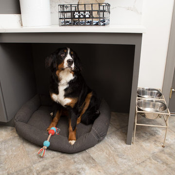
Relocating the garage entry to the new mudroom was a huge priority and has finally separated the family’s arriving home functions from their kitchen. Now coats and shoes and bags have their own area for dropping once members arrive home. Matching gray DuraSupreme cabinetry helped create gorgeous, purposeful lockers for the family. A reclaimed vintage sink and custom wall paper were added to the tiny powder room to beautify the once previously only functional space. Advance Design was even able to create a custom space for their dog to sleep while the family is away.
“It was unbelievable that a project of this size was completed in such a short time, and I think that’s because of the large amount of planning and preparation that went into it,” Jennifer marveled, “When we started, we were ready, and everything was prepared”.
When it came to execution, Project Manager Justin Davis and his crew were quick, accessible, and organized. Projects like this kitchen are typically completed in as little as 8-10 weeks. Jennifer’s kitchen however despite the relocation of some challenging HVAC in a soffit and moving of an exterior door was completed remarkably fast in part because the team was working with an existing tile floor that ran throughout the first floor that the client really loved.
“You get to know these people really well because they’re living in your house while you’re living in your house. They were so fast and really good, it didn’t take as long as even planned” reported Jennifer. “I would text Justin and he always responded almost immediately. I got to know all the guys who were working in our house and they were all wonderful people”.
Details in a customized kitchen like this one require skill and care from the people who install it. “All the guys on the job were skilled at what the did. I wanted small details like little feet to look like furniture, that is where their carpentry skill came in to make these all perfect”, said Jennifer. “The tile guys were wonderful. They even let me determine how I wanted the texture with the grout to appear for a salt and pepper look; now that is a very skilled trade person making it custom”.
In Jennifer’s interview, she continued to reference Advance Design’s “Common Sense Remodeling”, so I took a minute to ask her exactly what that phrase meant to her and how it played out in her experience with her project and the Advance Design team. Here is what she said: “I was intrigued about Common Sense Remodeling and in my head that there would be clear costs and prices, great communication between the design team, the execution team and me”, said Jennifer. They did deliver on that, it was so clear about the cost breakdown, what I could expect from everyone who came to my house, and everything that we had ordered. That to me is the Common Sense”!
It’s great to see a client take literally our assertion that a well-planned remodeling project is simply “Common Sense”! She anticipated each step of the way would be clear, concise, and predictable, all the while protecting the outcome due to the careful upfront planning. “Advance Design delivered on their ‘Common Sense Remodeling’ promise,” Jennifer said. “From the design team, to the execution team - everything was straight forward like I imagined. The project turned out exactly how I envisioned, I enjoyed this process and absolutely would recommend Advance Design Studio to anyone.”

 Brad Cox, Architect, Inc.
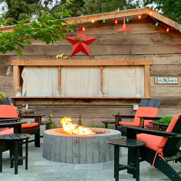
This barn used to be the carriage house for an adjacent property, and was initially in pretty bad shape: no roof, sagging beams, and so much Redwood duff and ivy that the owner didn't realize there was a concrete floor underneath. A framer helped the owner reframe the barn from the inside, using dimensional lumber to keep the integrity of the original studs. (Back in the day, a 2 x 4 actually measured 2" x 4".) The siding seen here was originally on the inside of this same wall. Originally the barn had three "rooms", and when the third room collapsed the wall was replaced with plywood.
 Northside Design Collective
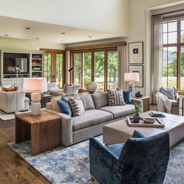
The renovation of this town home included expansion of this sitting room to encompass an existing patio space. The overhang of the roof over this patio made for a dark space initially. In the renovation, sliding glass doors and a stone patio were added to open up the views, increase natural light, and expand the floor space in this area of the home, adjacent to the Living Room and fireplace.
 Interiors by Maite Granda
Feature in: Luxe Magazine Miami & South Florida Luxury Magazine
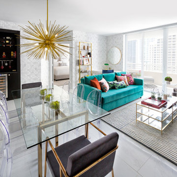
If visitors to Robyn and Allan Webb’s one-bedroom Miami apartment expect the typical all-white Miami aesthetic, they’ll be pleasantly surprised upon stepping inside. There, bold theatrical colors, like a black textured wallcovering and bright teal sofa, mix with funky patterns,
such as a black-and-white striped chair, to create a space that exudes charm. In fact, it’s the wife’s style that initially inspired the design for the home on the 20th floor of a Brickell Key high-rise. “As soon as I saw her with a green leather jacket draped across her shoulders, I knew we would be doing something chic that was nothing like the typical all- white modern Miami aesthetic,” says designer Maite Granda of Robyn’s ensemble the first time they met. The Webbs, who often vacation in Paris, also had a clear vision for their new Miami digs: They wanted it to exude their own modern interpretation of French decor.
“We wanted a home that was luxurious and beautiful,”
says Robyn, noting they were downsizing from a four-story residence in Alexandria, Virginia. “But it also had to be functional.”
To read more visit: https:
https://maitegranda.com/wp-content/uploads/2018/01/LX_MIA18_HOM_MaiteGranda_10.pdf
 CAST architecture
CAST Architecture
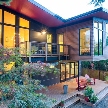
Mid-sized contemporary brown two-story wood exterior home idea in Seattle
Mid-sized contemporary brown two-story wood exterior home idea in Seattle
78