
Search results for "Intentionally non functional" in Home Design Ideas
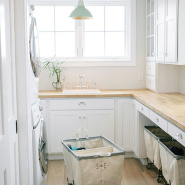
 Steele Canvas
3 BU No 122 Small Truck with 2 inch stem casters
Photo Credit: Amy Gerber/Brown Eyes Plus Blue (www.browneyesplusblue.com)
Inspiration for a timeless u-shaped dedicated laundry room remodel in Boston with a drop-in sink, shaker cabinets, white cabinets, white walls, a stacked washer/dryer and beige countertops
Inspiration for a timeless u-shaped dedicated laundry room remodel in Boston with a drop-in sink, shaker cabinets, white cabinets, white walls, a stacked washer/dryer and beige countertops
 Everything Home
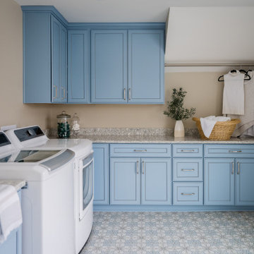
Our studio reconfigured our client’s space to enhance its functionality. We moved a small laundry room upstairs, using part of a large loft area, creating a spacious new room with soft blue cabinets and patterned tiles. We also added a stylish guest bathroom with blue cabinets and antique gold fittings, still allowing for a large lounging area. Downstairs, we used the space from the relocated laundry room to open up the mudroom and add a cheerful dog wash area, conveniently close to the back door.
---
Project completed by Wendy Langston's Everything Home interior design firm, which serves Carmel, Zionsville, Fishers, Westfield, Noblesville, and Indianapolis.
For more about Everything Home, click here: https://everythinghomedesigns.com/
To learn more about this project, click here:
https://everythinghomedesigns.com/portfolio/luxury-function-noblesville/
 New Leaf Custom Homes | Dallas
Shoot 2 Sell
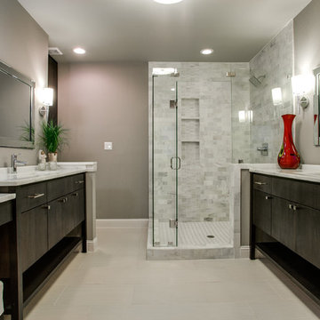
Example of a trendy white tile corner shower design in Dallas with flat-panel cabinets and dark wood cabinets
Example of a trendy white tile corner shower design in Dallas with flat-panel cabinets and dark wood cabinets
Find the right local pro for your project
 ZeroEnergy Design
Lincoln Farmhouse
LEED-H Platinum, Net-Positive Energy
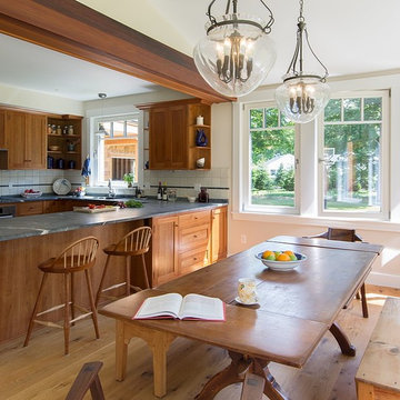
OVERVIEW. This LEED Platinum certified modern farmhouse ties into the cultural landscape of Lincoln, Massachusetts - a town known for its rich history, farming traditions, conservation efforts, and visionary architecture. The goal was to design and build a new single family home on 1.8 acres that respects the neighborhood’s agrarian roots, produces more energy than it consumes, and provides the family with flexible spaces to live-play-work-entertain. The resulting 2,800 SF home is proof that families do not need to compromise on style, space or comfort in a highly energy-efficient and healthy home.
CONNECTION TO NATURE. The attached garage is ubiquitous in new construction in New England’s cold climate. This home’s barn-inspired garage is intentionally detached from the main dwelling. A covered walkway connects the two structures, creating an intentional connection with the outdoors between auto and home.
FUNCTIONAL FLEXIBILITY. With a modest footprint, each space must serve a specific use, but also be flexible for atypical scenarios. The Mudroom serves everyday use for the couple and their children, but is also easy to tidy up to receive guests, eliminating the need for two entries found in most homes. A workspace is conveniently located off the mudroom; it looks out on to the back yard to supervise the children and can be closed off with a sliding door when not in use. The Away Room opens up to the Living Room for everyday use; it can be closed off with its oversized pocket door for secondary use as a guest bedroom with en suite bath.
NET POSITIVE ENERGY. The all-electric home consumes 70% less energy than a code-built house, and with measured energy data produces 48% more energy annually than it consumes, making it a 'net positive' home. Thick walls and roofs lack thermal bridging, windows are high performance, triple-glazed, and a continuous air barrier yields minimal leakage (0.27ACH50) making the home among the tightest in the US. Systems include an air source heat pump, an energy recovery ventilator, and a 13.1kW photovoltaic system to offset consumption and support future electric cars.
ACTUAL PERFORMANCE. -6.3 kBtu/sf/yr Energy Use Intensity (Actual monitored project data reported for the firm’s 2016 AIA 2030 Commitment. Average single family home is 52.0 kBtu/sf/yr.)
o 10,900 kwh total consumption (8.5 kbtu/ft2 EUI)
o 16,200 kwh total production
o 5,300 kwh net surplus, equivalent to 15,000-25,000 electric car miles per year. 48% net positive.
WATER EFFICIENCY. Plumbing fixtures and water closets consume a mere 60% of the federal standard, while high efficiency appliances such as the dishwasher and clothes washer also reduce consumption rates.
FOOD PRODUCTION. After clearing all invasive species, apple, pear, peach and cherry trees were planted. Future plans include blueberry, raspberry and strawberry bushes, along with raised beds for vegetable gardening. The house also offers a below ground root cellar, built outside the home's thermal envelope, to gain the passive benefit of long term energy-free food storage.
RESILIENCY. The home's ability to weather unforeseen challenges is predictable - it will fare well. The super-insulated envelope means during a winter storm with power outage, heat loss will be slow - taking days to drop to 60 degrees even with no heat source. During normal conditions, reduced energy consumption plus energy production means shelter from the burden of utility costs. Surplus production can power electric cars & appliances. The home exceeds snow & wind structural requirements, plus far surpasses standard construction for long term durability planning.
ARCHITECT: ZeroEnergy Design http://zeroenergy.com/lincoln-farmhouse
CONTRACTOR: Thoughtforms http://thoughtforms-corp.com/
PHOTOGRAPHER: Chuck Choi http://www.chuckchoi.com/
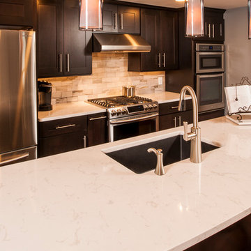
 Artisan Kitchens and Baths
Cabinetry – Kemper Echo Cabinetry
Hardware- Jeffrey Alexander stainless bar pulls
Countertops- Cambria Quartz Torquay
Sinks and Faucets- Blanco Anthracite undermount Silgranite sink. Moen Faucet Nickel
Appliances- Samsung French door refrigerator in stainless, Samsung slide in gas range, Whirlpool wall Oven/ Microwave combination, Bosch 500 series dishwasher, and Broan Elite series pro range hood.
Flooring- prefinished 3/4 oak hardwood.
Backsplash- Natural stone subway tile.
-Inspiration and Design Challenges
The Original kitchen in this 1970’s raised ranch was bright an open yet left the dining room closed off from the home and wasn’t large enough for the island that Joe and his wife would have liked. Joe and Tim from THI Co. had developed a plan relocate the kitchen to one exterior wall and allow for an island that would function for both seating and entertaining. The challenge we faced was the original windows of the kitchen had to completely go. Relying solely on the open floor plan for natural light, Tim opened up the Dining room wall, removed the dividing half wall to the family room and widened doorways to the great room leading from the kitchen and dining room. The removal of the soffits and consistent wood flooring help tie together the adjacent rooms. The plan was for simple clean lines with subtle detail brought out in the trim on the cabinetry and custom 10ft island back panel. Finding a set of appliances was the next task. The kitchen was designed with the intention of being used. The Whirlpool convection wall ovens give the kitchen 3 possible functioning ovens with along with the Samsung 5 burner range. The end result is a simple elegant design that has all the functionality of galley kitchen yet the feel of an open kitchen with twice the square footage.
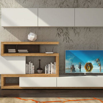
 MIG Furniture Design, Inc.
Modern Italian Wall Unit Velvet Composition 103 by Artigian Mobili. Velvet is a new line of italian wall units and entertainment centers that creates flexible living areas taking into account you individual needs. Smart furniture capable of performing different functions. An abundance of units gives limitless opportunities to realize any project design and adapt to any space. Color is not a problem anymore - each unit can be ordered in ANY RAL COLOR you want! You can select from our pre-designed compositions or build your own according to your sketches and interior project.
Please contact our office regarding customization of this wall unit composition.
MATERIAL/CONSTRUCTION:
18 mm thick wooden particles melamine panels
The lacquered structures and fronts are made of REAL POLISH SCRATCH PROOF LACQUERING, which is non toxic and non allergic products.
The starting price is for the Wall Unit Composition as shown in the main picture in White (smooth) finish / Corten finish / Quercia finish.
Dimensions:
Wall Unit: W118" x D14.5"/19.7" x H76.8"
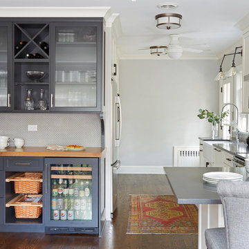
 TKS Design Group
Free ebook, Creating the Ideal Kitchen. DOWNLOAD NOW
Having a space for their teenage kids to hang out after school, study and interact with Mom & Dad was at the top of the list for this remodel. The 1928 home, sits in a lovely Glen Ellyn neighborhood, near downtown and near all the action of the local high school and lake. It’s was a great house with great bones but the kitchen was in need of some TLC. The remodel project had been a long time coming, and since both the homeowners work from home, they had been nervous about disrupting their bustling daily schedules to get the project in motion.
Once we had a plan in place, we dug in and got to work. The first step was to remove a non-load bearing wall between the kitchen and dining room. We then reworked the space a bit, eliminating a redundant passage way to the hall, and reworking a closet to allow for a large galley style kitchen and small bar area open to the dining room. The new kitchen has a small peninsula for the family to have casual meals and for the kids to hang out after school. A window was eliminated to give more space for cabinetry and storage, and another window was made larger to allow for a grander view into the backyard.
We decided upon a layered approach to this space to provide character appropriate to the older home. White painted cabinetry provides a backdrop for interesting touches such as gray herringbone tile, a reeded farmhouse sink and bronze hardware and lighting. The bar has its own unique look featuring gray cabinetry with a patterned cement tile backsplash and walnut top. A bar fridge, glass cabinets and baskets for tucking away homework give this little multi-functional area loads of character. A miniature mudroom area was also added to the dining room so that the new space can be kept neat and tidy.
The stylish result looks both appropriate to the 1928 home and provides loads of functionality for this active family that can now take advantage of every square inch their home.
Designed by: Susan Klimala, CKD, CBD
Photography by: Michael Alan Kaskel
For more information on kitchen and bath design ideas go to: www.kitchenstudio-ge.com


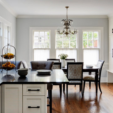 TKS Design Group
Free ebook, Creating the Ideal Kitchen. DOWNLOAD NOW
Having a space for their teenage kids to hang out after school, study and interact with Mom & Dad was at the top of the list for this remodel. The 1928 home, sits in a lovely Glen Ellyn neighborhood, near downtown and near all the action of the local high school and lake. It’s was a great house with great bones but the kitchen was in need of some TLC. The remodel project had been a long time coming, and since both the homeowners work from home, they had been nervous about disrupting their bustling daily schedules to get the project in motion.
Once we had a plan in place, we dug in and got to work. The first step was to remove a non-load bearing wall between the kitchen and dining room. We then reworked the space a bit, eliminating a redundant passage way to the hall, and reworking a closet to allow for a large galley style kitchen and small bar area open to the dining room. The new kitchen has a small peninsula for the family to have casual meals and for the kids to hang out after school. A window was eliminated to give more space for cabinetry and storage, and another window was made larger to allow for a grander view into the backyard.
We decided upon a layered approach to this space to provide character appropriate to the older home. White painted cabinetry provides a backdrop for interesting touches such as gray herringbone tile, a reeded farmhouse sink and bronze hardware and lighting. The bar has its own unique look featuring gray cabinetry with a patterned cement tile backsplash and walnut top. A bar fridge, glass cabinets and baskets for tucking away homework give this little multi-functional area loads of character. A miniature mudroom area was also added to the dining room so that the new space can be kept neat and tidy.
The stylish result looks both appropriate to the 1928 home and provides loads of functionality for this active family that can now take advantage of every square inch their home.
Designed by: Susan Klimala, CKD, CBD
Photography by: Michael Alan Kaskel
For more information on kitchen and bath design ideas go to: www.kitchenstudio-ge.com
 Klopf Architecture
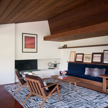
Nestled in the hills of Orinda, California, this 1951 residence is one of only seven extant homes, now known as “The Magnificent Seven”, designed by architect Olof Dahlstrand, a protégé of Frank Lloyd Wright. With its low-slung rooflines, natural materials, and deep integration with the sloping landscape, the home is a pristine example of mid-century modern design inspired by Wright’s organic principles. Over the years, prior homeowners have emphasized preservation, ensuring that the house remained relatively untouched. Each owner has respected the original architecture and stayed true to Dahlstrand’s intent. When a family of five—two college-aged sons and a middle school-aged daughter—acquired the property, they were captivated by its history, legacy of care, and architectural significance. While they appreciated Dahlstrand’s original vision, they also recognized the need to adapt the home for contemporary living while preserving its design integrity.
The remodel was conceived as a thoughtful response to the past—an effort to bring the house into the 21st century without compromising its soul. The primary mandate was to maintain architectural continuity while improving the functionality, comfort, and livability for a modern family. The design team—architects and contractor alike—worked with a shared reverence for the original architecture, allowing that mindset to guide even the most technical or pragmatic decisions.
A key objective was to increase natural light in the kitchen—a departure from Wrightian principles of enclosed, intimate cooking spaces—while maintaining the home’s architectural language. The kitchen was reconfigured to foster a stronger connection to adjacent living spaces while retaining the underlying concept of spatial separation. One of the most transformative architectural changes was the removal of a ridge beam that was originally planned to remain visible through the kitchen. During construction, the team collaborated on a better solution: a wide-flanged steel beam concealed within the roof envelope. This subtle move preserved the clean lines and ceiling continuity, a modern update carried out with utmost respect for the existing framework.
The home’s original powder room, previously accessible only through the kitchen, was relocated for better flow and privacy. A new powder room was carved out of former kitchen cabinetry—a narrow, interior space that could have felt dark and enclosed. To avoid this, the design extended the line of original transom windows into the new powder room and added a skylight above the vanity. The result is a bright and airy space that feels consistent with the rest of the home. Other updates included the installation of new solid-core interior doors with veneers carefully matched to the original mahogany, enhancing the continuity of the interiors. Even smaller decisions, such as placing the door knobs at 42 inches high, mirrored the original proportions. Every choice reflected a shared belief between the architect, contractor, and client: that new work should serve the integrity of the old.
The home’s extensive interior redwood millwork and paneling was meticulously restored. Where new materials were introduced—such as the replacement redwood soffit paneling—the contractor took pains to find finish nails that matched the original, rather than using modern equivalents. This level of craftsmanship and collaboration defined the project. It extended even to the detailing of a blind door to the new powder room, which had to disappear into the existing redwood board-and-batten wall. It was a team effort: the owner found a suitable handle, the architects devised the custom in-swing mechanism, and the contractor executed it so the door aligned precisely with the battens. Throughout, the homeowners were deeply engaged in the design process. One, a meticulous design enthusiast, focused on aesthetic integrity and historic detail. The other brought a practical and function-driven perspective, ensuring that new fixtures and materials would be durable and require minimal maintenance.
While the home’s location posed no major site challenges, sustainability was a key concern. The team upgraded the roof insulation, installed solar panels with battery storage, and added ductless mini-split cooling systems. Lighting was another area where modern technology was woven into a historic framework: new square LED fixtures echo the original custom perimeter soffit lights, maintaining the design language while offering advanced performance.
A planned expansion of a bedroom into suite with a bathroom had to be shelved due to budget constraints and the high cost of below-grade foundation work. Still, the team focused their efforts on making the most of the existing footprint, resolving constraints through design ingenuity rather than adding square footage. This renovation represents a collaborative achievement in preserving and evolving a historically significant home. Every decision was shaped by a shared ethos among clients, architects, and contractor: to maintain the home’s architectural soul while updating it for contemporary life. The result is a timeless modernist residence that continues Olof Dahlstrand’s legacy, remaining grounded in nature, craftsmanship, and human-scale design.
Klopf Architecture Team: John Klopf, AIA, Klara Kevane, Fernanda Bernardes
Interior Architectural Design: Klopf Architecture
Structural Engineer: Daniel Bastiao
Contractor: Don Larwood, Larwood Construction
Photography: Mariko Reed
Year Completed: 2022
 TKS Design Group
Free ebook, Creating the Ideal Kitchen. DOWNLOAD NOW
Having a space for their teenage kids to hang out after school, study and interact with Mom & Dad was at the top of the list for this remodel. The 1928 home, sits in a lovely Glen Ellyn neighborhood, near downtown and near all the action of the local high school and lake. It’s was a great house with great bones but the kitchen was in need of some TLC. The remodel project had been a long time coming, and since both the homeowners work from home, they had been nervous about disrupting their bustling daily schedules to get the project in motion.
Once we had a plan in place, we dug in and got to work. The first step was to remove a non-load bearing wall between the kitchen and dining room. We then reworked the space a bit, eliminating a redundant passage way to the hall, and reworking a closet to allow for a large galley style kitchen and small bar area open to the dining room. The new kitchen has a small peninsula for the family to have casual meals and for the kids to hang out after school. A window was eliminated to give more space for cabinetry and storage, and another window was made larger to allow for a grander view into the backyard.
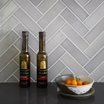
We decided upon a layered approach to this space to provide character appropriate to the older home. White painted cabinetry provides a backdrop for interesting touches such as gray herringbone tile, a reeded farmhouse sink and bronze hardware and lighting. The bar has its own unique look featuring gray cabinetry with a patterned cement tile backsplash and walnut top. A bar fridge, glass cabinets and baskets for tucking away homework give this little multi-functional area loads of character. A miniature mudroom area was also added to the dining room so that the new space can be kept neat and tidy.
The stylish result looks both appropriate to the 1928 home and provides loads of functionality for this active family that can now take advantage of every square inch their home.
Designed by: Susan Klimala, CKD, CBD
Photography by: Michael Alan Kaskel
For more information on kitchen and bath design ideas go to: www.kitchenstudio-ge.com
 Bradford Custom Homes & Remodeling
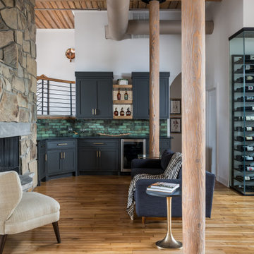
Project Radium Loft is a full home loft renovation in Atlanta, Georgia that transforms a historic industrial space into a refined, modern residence while preserving its original character. This comprehensive remodel balances exposed architecture with elevated finishes, creating a home that feels both authentic and intentionally designed.
Original brick walls, timber columns, exposed ductwork, and wood ceilings were carefully retained to honor the building’s industrial roots. These elements are paired with custom millwork, tailored cabinetry, and layered lighting to soften the space and improve livability. Wide plank hardwood floors run throughout, enhancing continuity and warmth across the open layout.
The heart of the home features a custom kitchen and bar area designed for entertaining, complete with charcoal cabinetry, brass accents, integrated appliances, and a striking glass wine display. Natural stone, textured tile, and warm wood tones add depth while maintaining a clean, modern aesthetic.
Living areas were thoughtfully reconfigured to create defined zones without compromising the openness that defines loft living. Custom built-ins, architectural lighting, and intentional furniture placement bring balance, function, and comfort to the space.
Project Radium Loft showcases Bradford Custom Homes & Remodeling’s expertise in whole home renovations, loft remodels, and adaptive reuse projects. The result is a timeless Atlanta loft that blends history, modern design, and everyday livability.
 Living with Lolo
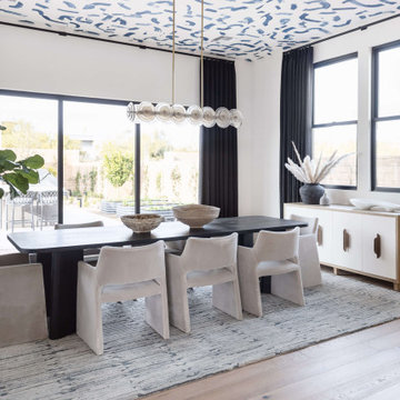
Dining Room in Bronco | Key Feature: A Scottsdale new-build rooted in sculptural modernism, Bronco Revival balances bold black-and-white contrast with organic textures, natural wood elements, and statement lighting. As a groundbreaking “Live Lab” designer residence, it’s a first-of-its-kind space where luxury furnishings are tested in real-world conditions before being introduced into high-profile client homes.
Challenge: Because Bronco Revival was the designer’s personal residence, the project carried a unique level of pressure and intention. The challenge was creating a Scottsdale new-build that felt elevated and editorial while still functioning as a true family home. Every selection had to balance bold sculptural modernism (high contrast, statement lighting, architectural furnishings) with durability, comfort, and day-to-day livability. In addition, the home served as a “Live Lab,” meaning new vendors, materials, and luxury furnishings needed to be tested in real-life conditions before being trusted for future high-profile client projects.
Solution: We approached the project with a highly curated, test-and-refine design strategy, treating each space as both a finished interior and a real-world evaluation environment. Key furnishings, textiles, and materials were selected to support the modern organic vision while also standing up to the demands of everyday family life. We worked through selections intentionally, layering in bold contrast, natural woods, and sculptural statement pieces, while prioritizing performance materials, pet-friendly durability, and timeless foundational elements. By using the home as a lived-in showroom, we were able to validate what truly performs beautifully, refine our vendor relationships, and confidently carry those proven selections into future client designs.
Materials: MadeGoods: Sculptural Davion coffee tables |
Loloi: Custom performance rug collection |
Schumacher: Bespoke drapery fabrication |
Aesthetic Wall Coverings: Pioneering wallpaper application on ceiling beams |
Zac + Fox: Exclusive textile collaboration via Made Resource Group |
Budget ($ Range): $300K |
Timeline (Duration): 4 MONTHS
 Susan Yeley Homes
We honored the building’s history where possible, keeping original bones and character wherever possible, then layered in the clients’ distinct creative identity. On the main floor, we designed spaces that shift seamlessly from workday to reception-ready. Lighting was planned with intention, to preserve the original plaster ceilings and spotlight rotating installations without sacrificing ambient warmth. Custom built-ins maximize functionality while maintaining a distinctly un-officey feel. Upstairs, the artist apartment is a thoughtful retreat: adaptable, light-filled, and comfortable, with just enough quirk to spark inspiration. Even the basement—home to a full photography studio and workroom—balances technical needs with aesthetic ease. Throughout, we used color, texture, and collected pieces to ensure each room feels curated, not staged. Personal, not polished.

Sponsored
Columbus, OH

Structural Remodeling
Franklin County's Heavy Timber Specialists | Best of Houzz 2020!
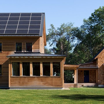 ZeroEnergy Design
Lincoln Farmhouse
LEED-H Platinum, Net-Positive Energy
OVERVIEW. This LEED Platinum certified modern farmhouse ties into the cultural landscape of Lincoln, Massachusetts - a town known for its rich history, farming traditions, conservation efforts, and visionary architecture. The goal was to design and build a new single family home on 1.8 acres that respects the neighborhood’s agrarian roots, produces more energy than it consumes, and provides the family with flexible spaces to live-play-work-entertain. The resulting 2,800 SF home is proof that families do not need to compromise on style, space or comfort in a highly energy-efficient and healthy home.
CONNECTION TO NATURE. The attached garage is ubiquitous in new construction in New England’s cold climate. This home’s barn-inspired garage is intentionally detached from the main dwelling. A covered walkway connects the two structures, creating an intentional connection with the outdoors between auto and home.
FUNCTIONAL FLEXIBILITY. With a modest footprint, each space must serve a specific use, but also be flexible for atypical scenarios. The Mudroom serves everyday use for the couple and their children, but is also easy to tidy up to receive guests, eliminating the need for two entries found in most homes. A workspace is conveniently located off the mudroom; it looks out on to the back yard to supervise the children and can be closed off with a sliding door when not in use. The Away Room opens up to the Living Room for everyday use; it can be closed off with its oversized pocket door for secondary use as a guest bedroom with en suite bath.
NET POSITIVE ENERGY. The all-electric home consumes 70% less energy than a code-built house, and with measured energy data produces 48% more energy annually than it consumes, making it a 'net positive' home. Thick walls and roofs lack thermal bridging, windows are high performance, triple-glazed, and a continuous air barrier yields minimal leakage (0.27ACH50) making the home among the tightest in the US. Systems include an air source heat pump, an energy recovery ventilator, and a 13.1kW photovoltaic system to offset consumption and support future electric cars.
ACTUAL PERFORMANCE. -6.3 kBtu/sf/yr Energy Use Intensity (Actual monitored project data reported for the firm’s 2016 AIA 2030 Commitment. Average single family home is 52.0 kBtu/sf/yr.)
o 10,900 kwh total consumption (8.5 kbtu/ft2 EUI)
o 16,200 kwh total production
o 5,300 kwh net surplus, equivalent to 15,000-25,000 electric car miles per year. 48% net positive.
WATER EFFICIENCY. Plumbing fixtures and water closets consume a mere 60% of the federal standard, while high efficiency appliances such as the dishwasher and clothes washer also reduce consumption rates.
FOOD PRODUCTION. After clearing all invasive species, apple, pear, peach and cherry trees were planted. Future plans include blueberry, raspberry and strawberry bushes, along with raised beds for vegetable gardening. The house also offers a below ground root cellar, built outside the home's thermal envelope, to gain the passive benefit of long term energy-free food storage.
RESILIENCY. The home's ability to weather unforeseen challenges is predictable - it will fare well. The super-insulated envelope means during a winter storm with power outage, heat loss will be slow - taking days to drop to 60 degrees even with no heat source. During normal conditions, reduced energy consumption plus energy production means shelter from the burden of utility costs. Surplus production can power electric cars & appliances. The home exceeds snow & wind structural requirements, plus far surpasses standard construction for long term durability planning.
ARCHITECT: ZeroEnergy Design http://zeroenergy.com/lincoln-farmhouse
CONTRACTOR: Thoughtforms http://thoughtforms-corp.com/
PHOTOGRAPHER: Chuck Choi http://www.chuckchoi.com/
 Valentini Kids Furniture Brooklyn NY
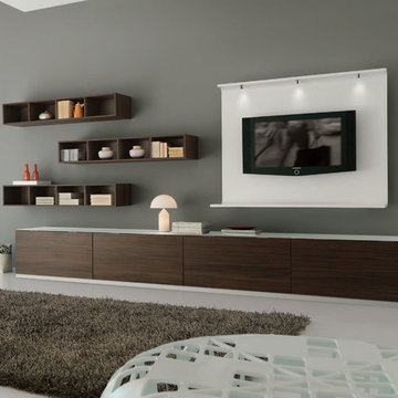
Modern Italian Wall Unit Velvet 903 by Artigian Mobili
Made in Italy
Velvet by ArtigianMobili is an ultra modern collection of wall unit and entertainment centers for your modern home. The Velvet line is modular, providing flexible solutions for your living room, taking into account your specific dimensions and functional requirements. All the units within this wall unit collection are made in Italy according high European quality standards and using the finest materials. The variety of units is presented in different sizes, making possible to customize any composition to fit your particular dimensions and match the design. Color is also flexible within the Velvet Wall Unit Collection. All the units can be ordered wood finished, wood open pore matt lacquered, or lacquered even in your custom RAL COLOR, either gloss or matt! Please select from our "as shown" wall unit compositions or implement your creativity building a unique one!
Base units are covered with extra clear white lacquered glass that can be optionally removed, making the wall unit composition cost less.
Contact our Office regarding customization of this wall unit - we are always ready to help!
MATERIAL/CONSTRUCTION:
Structure is made of 18 mm (0.7") thick wooden particles melamine panels
The lacquered structures and fronts are made of REAL LACQUERING, which is non toxic and non allergic product
Lights (if any) CE marked and comply with the directives 93/68/EEC and 92/31/EEC
The starting price is for the Wall Unit Composition Velvet 903 as shown in the main picture in Dark Oak Finish / Matt White Lacquer.
Dimensions:
Wall Unit: W141.7" x D14.6"/22.3" x H71"
TV Space: W53" x H43"
 Valentini Kids Furniture Brooklyn NY
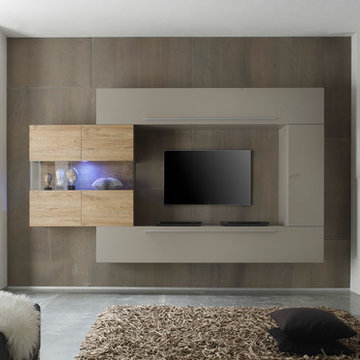
Italian Wall Unit Line 2 by LC Mobili
Made in Italy
Line by LC Mobili is a collection of modern Italian wall units and entertainment centers manufactured with care and sense of style to furnish your modern home. Wall unit from the Line Collection can be a perfect design and functional solution for any contemporary or modern interior: living room, family room and even office. It is a modular line that consists of a selection of individual units: Cube Vitrine, TV Stand, Sideboard, Wall Shelf, Shelving units (three version: A, B, C), and hanging horizontal and vertical cabinets. The individual pieces can be arranged as you want, giving you complete flexibility in designing the entertainment center you need. Being modular, Line Collection allows to build a wall unit both for tight apartments and spacious houses. Feel free to choose from our pre-design wall unit compositions as well as remove or add the units to create your own entertainment center. See addition images of other units from Line Collection and finishes available!
Please contact our office if some customization is needed!
Features:
E1-Class ecological panels, which are made exclusively through a wood recycling process
The lacquered structures and front are made of REAL POLISH SCRATCH PROOF LACQUERING, which is both non toxic and non allergenic
Light (optional): RGB multicolor LED light is supplied with a remote control
The starting price is for the Wall Unit Composition Line 2 as shown in the main picture in Matt Beige and Honey finishes. (Consists of: Two Large Horizontal Unis, Small Vertical Unit and Hanging Cube Vitrine). The Lights are not included in the price.
Dimensions:
Wall Unit: W102" x D14.2" x H75"
 Advance Design Studio, Ltd.
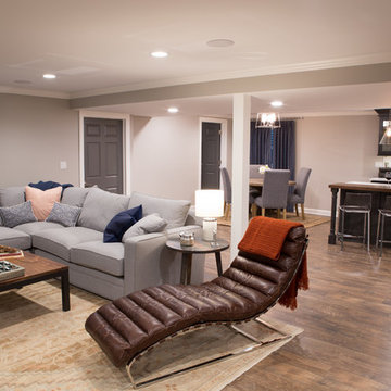
Karen and Chad of Tower Lakes, IL were tired of their unfinished basement functioning as nothing more than a storage area and depressing gym. They wanted to increase the livable square footage of their home with a cohesive finished basement design, while incorporating space for the kids and adults to hang out.
“We wanted to make sure that upon renovating the basement, that we can have a place where we can spend time and watch movies, but also entertain and showcase the wine collection that we have,” Karen said.
After a long search comparing many different remodeling companies, Karen and Chad found Advance Design Studio. They were drawn towards the unique “Common Sense Remodeling” process that simplifies the renovation experience into predictable steps focused on customer satisfaction.
“There are so many other design/build companies, who may not have transparency, or a focused process in mind and I think that is what separated Advance Design Studio from the rest,” Karen said.
Karen loved how designer Claudia Pop was able to take very high-level concepts, “non-negotiable items” and implement them in the initial 3D drawings. Claudia and Project Manager DJ Yurik kept the couple in constant communication through the project. “Claudia was very receptive to the ideas we had, but she was also very good at infusing her own points and thoughts, she was very responsive, and we had an open line of communication,” Karen said.
A very important part of the basement renovation for the couple was the home gym and sauna. The “high-end hotel” look and feel of the openly blended work out area is both highly functional and beautiful to look at. The home sauna gives them a place to relax after a long day of work or a tough workout. “The gym was a very important feature for us,” Karen said. “And I think (Advance Design) did a very great job in not only making the gym a functional area, but also an aesthetic point in our basement”.
An extremely unique wow-factor in this basement is the walk in glass wine cellar that elegantly displays Karen and Chad’s extensive wine collection. Immediate access to the stunning wet bar accompanies the wine cellar to make this basement a popular spot for friends and family.
The custom-built wine bar brings together two natural elements; Calacatta Vicenza Quartz and thick distressed Black Walnut. Sophisticated yet warm Graphite Dura Supreme cabinetry provides contrast to the soft beige walls and the Calacatta Gold backsplash. An undermount sink across from the bar in a matching Calacatta Vicenza Quartz countertop adds functionality and convenience to the bar, while identical distressed walnut floating shelves add an interesting design element and increased storage. Rich true brown Rustic Oak hardwood floors soften and warm the space drawing all the areas together.
Across from the bar is a comfortable living area perfect for the family to sit down at a watch a movie. A full bath completes this finished basement with a spacious walk-in shower, Cocoa Brown Dura Supreme vanity with Calacatta Vicenza Quartz countertop, a crisp white sink and a stainless-steel Voss faucet.
Advance Design’s Common Sense process gives clients the opportunity to walk through the basement renovation process one step at a time, in a completely predictable and controlled environment. “Everything was designed and built exactly how we envisioned it, and we are really enjoying it to it’s full potential,” Karen said.
Constantly striving for customer satisfaction, Advance Design’s success is heavily reliant upon happy clients referring their friends and family. “We definitely will and have recommended Advance Design Studio to friends who are looking to embark on a remodeling project small or large,” Karen exclaimed at the completion of her project.

Sponsored
Columbus, OH
Structural Remodeling
Franklin County's Heavy Timber Specialists | Best of Houzz 2020!
 Klopf Architecture
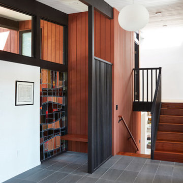
The Roger Lee designed house from 1962 was purchased by the current homeowners in almost original condition, as the previous owners elected to defer most maintenance projects over the years. The clients were able to see beyond the dated materials and finishes, single-paned glass and uninsulated walls and they approached Klopf Architecture to help them expand and update the entire home, one the family could settle into and enjoy for years to come. It was important that the new designs were aligned with Lee's original intent not only because of the client's appreciation for mid-century modern architecture, but also because the house was deemed historical. The Stanford Real Estate Office requires a stringent design review which safeguards the integrity of the community, which Klopf Architecture was happy to oblige going into their updated designs.
As with many original mid-century modern homes, the house was scaled to the 1960s lifestyle where rooms were smaller and openings to views were limited and tightly framed. The original conditions defined the direction the family of four would take in updating the house and making it comfortable for their modern lifestyle. Klopf designed a full gut remodel and major addition to bring the house into the 21st century and provide the living area needed for the client's family. The newly expanded house added just about 1,100 sf to create an airy, comfortable and family friendly house, taking full advantage of the beautiful southwestern views that extend out to the hills beyond. The enclosed garage created an additional 240 sf of covered space for long-term storage.
A cracked swimming pool created an eyesore taking up a majority of the backyard landscape, so it was one of the first elements to go during the transformation. Working with Outer Space Landscape Architects, the family asked for a mix of relaxing outdoor patio spaces that eventually blend into the native landscaping, extending their views outward toward the natural greenery of the trees beyond their property. Filling in the old pool was a smart way to expand the living spaces outward. The orientation of the house was designed to enjoy the views, but the original architecture provided the first homeowners with mere glimpses of the landscape outside.
Klopf was able to broaden those views, continuing and extending on the original architecture to take full advantage of the unobstructed natural views across the rear facade of the house. Small horizontal openings in the primary bedroom and office were replaced with much taller windows that now follow the angled roof line upward, extending across almost all of the facade. We worked with Western Windows, whose designs included an oblique-shaped, operable casement that allowed our design to rise with the slope. A new corner office added to the primary suite, offers a bright and functional work-from-home solution that looks out at the distant views and added natural light from the expanded window configuration that now wraps around the corner.
The existing lower level was designed by Lee as a utilitarian space, serving as a wet pool room with a drain in the center of the floor, bathroom, laundry and storage areas. Without the need for a pool room, Klopf was able to convert the area into a much more comfortable and functional living space with a new family room and guest suite. The new spaces enjoy easy access to a new outdoor patio through floor to ceiling, full-width glass sliders.
Continuing along the rear facade, a previously exposed deck extending from the living room and hallway provided access to the backyard through a single set of stairs leading toward the side of the house which made sense when the pool was in place. The new deck was re-envisioned as an extension of the main living room and now serves as a second outdoor living room. A new slatted pergola above provides the homeowners welcome relief from the hot afternoon sun. A second set of stairs now creates a better connection to the redesigned lower level. Klopf was able to reconfigure the spaces, extending the living room outward toward the views, where the family now claims it as the heart of the home, spending a large majority of their time outdoors.
Back inside, the original wood-burning Malm fireplace was beautifully restored and a gas burner installed to comply with California's strict air standards. It now rests in front of a wall of Heath accent tiles where a dated red brick wall used to stand. A new taller window brings more light and views into the refreshed interior living room. The original glass doors opposite the fireplace were replaced by larger sliders that when fully opened, create a seamless transition to the new outdoor living area so the two spaces feel like one connected space. The original utilitarian kitchen was needlessly tucked into the far back corner and closed-off, out of sight from the living room, so the clients asked Klopf to open it up and expand the kitchen forward so it felt more connected. Today the much larger kitchen is connected to the living area where a short wall with a cutout offers a visual glimpse into the kitchen and a handy pass-through counter for serving guests. A new breakfast nook was also added to create another spot where the family can gather for casual meals. Just outside, a new built-in outdoor grill and prep area extends the kitchen outside and connects to a new outdoor dining spot nestled amongst the trees, taking advantage of the views out back.
Klopf was able to expand the other two bedrooms, add a new laundry room and half-bath and convert the carport to an enclosed garage to add more storage areas which was lost when the pool house was converted to the family and guest room.
To maintain a historical connection to the original designs, the exterior siding was repeated on all exterior walls, a full-height stained glass window at the front entryway restored, and an interior slatted screen element repeated outside at the exterior entry courtyard and over the new outdoor living room to create a shade trellis. The new house stands proudly and shines against it's new landscaping features, while respecting and expanding on the original intent of Roger Lee's designs epitomizing the comforts of indoor-outdoor living in Northern California.
Completion year: 2020
Klopf Architecture project team: John Klopf, Klara Kevane, Noel Andrade
Contractor: ORB Construction, Brendan O'Reilly
Structural engineer: Sezen and Moon
Landscape architect: Outer space
Furnishings and decoration: Urbanism Designs
Photographer: Mariko Reed
 Klopf Architecture
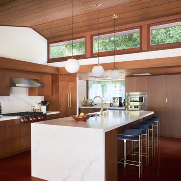
Nestled in the hills of Orinda, California, this 1951 residence is one of only seven extant homes, now known as “The Magnificent Seven”, designed by architect Olof Dahlstrand, a protégé of Frank Lloyd Wright. With its low-slung rooflines, natural materials, and deep integration with the sloping landscape, the home is a pristine example of mid-century modern design inspired by Wright’s organic principles. Over the years, prior homeowners have emphasized preservation, ensuring that the house remained relatively untouched. Each owner has respected the original architecture and stayed true to Dahlstrand’s intent. When a family of five—two college-aged sons and a middle school-aged daughter—acquired the property, they were captivated by its history, legacy of care, and architectural significance. While they appreciated Dahlstrand’s original vision, they also recognized the need to adapt the home for contemporary living while preserving its design integrity.
The remodel was conceived as a thoughtful response to the past—an effort to bring the house into the 21st century without compromising its soul. The primary mandate was to maintain architectural continuity while improving the functionality, comfort, and livability for a modern family. The design team—architects and contractor alike—worked with a shared reverence for the original architecture, allowing that mindset to guide even the most technical or pragmatic decisions.
A key objective was to increase natural light in the kitchen—a departure from Wrightian principles of enclosed, intimate cooking spaces—while maintaining the home’s architectural language. The kitchen was reconfigured to foster a stronger connection to adjacent living spaces while retaining the underlying concept of spatial separation. One of the most transformative architectural changes was the removal of a ridge beam that was originally planned to remain visible through the kitchen. During construction, the team collaborated on a better solution: a wide-flanged steel beam concealed within the roof envelope. This subtle move preserved the clean lines and ceiling continuity, a modern update carried out with utmost respect for the existing framework.
The home’s original powder room, previously accessible only through the kitchen, was relocated for better flow and privacy. A new powder room was carved out of former kitchen cabinetry—a narrow, interior space that could have felt dark and enclosed. To avoid this, the design extended the line of original transom windows into the new powder room and added a skylight above the vanity. The result is a bright and airy space that feels consistent with the rest of the home. Other updates included the installation of new solid-core interior doors with veneers carefully matched to the original mahogany, enhancing the continuity of the interiors. Even smaller decisions, such as placing the door knobs at 42 inches high, mirrored the original proportions. Every choice reflected a shared belief between the architect, contractor, and client: that new work should serve the integrity of the old.
The home’s extensive interior redwood millwork and paneling was meticulously restored. Where new materials were introduced—such as the replacement redwood soffit paneling—the contractor took pains to find finish nails that matched the original, rather than using modern equivalents. This level of craftsmanship and collaboration defined the project. It extended even to the detailing of a blind door to the new powder room, which had to disappear into the existing redwood board-and-batten wall. It was a team effort: the owner found a suitable handle, the architects devised the custom in-swing mechanism, and the contractor executed it so the door aligned precisely with the battens. Throughout, the homeowners were deeply engaged in the design process. One, a meticulous design enthusiast, focused on aesthetic integrity and historic detail. The other brought a practical and function-driven perspective, ensuring that new fixtures and materials would be durable and require minimal maintenance.
While the home’s location posed no major site challenges, sustainability was a key concern. The team upgraded the roof insulation, installed solar panels with battery storage, and added ductless mini-split cooling systems. Lighting was another area where modern technology was woven into a historic framework: new square LED fixtures echo the original custom perimeter soffit lights, maintaining the design language while offering advanced performance.
A planned expansion of a bedroom into suite with a bathroom had to be shelved due to budget constraints and the high cost of below-grade foundation work. Still, the team focused their efforts on making the most of the existing footprint, resolving constraints through design ingenuity rather than adding square footage. This renovation represents a collaborative achievement in preserving and evolving a historically significant home. Every decision was shaped by a shared ethos among clients, architects, and contractor: to maintain the home’s architectural soul while updating it for contemporary life. The result is a timeless modernist residence that continues Olof Dahlstrand’s legacy, remaining grounded in nature, craftsmanship, and human-scale design.
Klopf Architecture Team: John Klopf, AIA, Klara Kevane, Fernanda Bernardes
Interior Architectural Design: Klopf Architecture
Structural Engineer: Daniel Bastiao
Contractor: Don Larwood, Larwood Construction
Photography: Mariko Reed
Year Completed: 2022
 Neumann & Rudy Architecture
## Spatial Composition & Architectural Volume
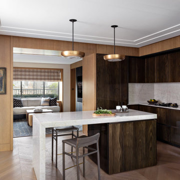
This is a kitchen conceived less as a service zone than as a precisely calibrated architectural volume, resolved through an L-configuration of full-height cabinetry that terminates against a monolithic island set on an intentional diagonal to the orthogonal grid of the herringbone flooring. The island's waterfall treatment — a slab returning to the floor in a single unbroken plane — functions as both a peninsular counter and a piece of quasi-sculptural infrastructure, its overhang generating a shallow banquette-adjacent seating zone without resorting to a conventional breakfast bar. Above, a coffered soffit executed in flush drywall with a continuous cove-lit reveal establishes a datum line that both compresses and defines the working core, while the adjacent tray ceiling reads as a distinct volume, spatially decoupling the kitchen from the living room beyond. That threshold is the composition's most disciplined gesture: a wide cased opening framed in mitered rift-cut oak paneling, its architrave articulated as a shadow-gapped reveal rather than applied trim, drawing a deep enfilade sightline through to the window wall, its Roman shades, and the mid-rise cityscape beyond. Millwork here performs structurally as well as visually — the oak-clad pilasters and the fluted, hand-carved textural panel at right operate as pseudo-columnar elements, organizing the plan into legible bays.
## Materiality, Color & Texture
The palette is constructed on a deliberate dialectic between two wood registers. The envelope employs a pale, quarter-sawn white oak with a honeyed, faintly amber undertone, its figure suppressed and its finish matte, functioning as a luminous neutral ground. Against this, the cabinetry deploys a deeply fumed or ebonized ash — likely a heavily lacquered, open-grain veneer — where the cathedral figuring is exaggerated into near-graphic striation and the high-gloss sheen produces a lacquered, almost Art Deco lustre. This contrast of value (blonde against bitter chocolate) and of sheen (matte against specular) is the project's principal tension. Mediating between them is the stone: a white quartzite or dolomitic marble with soft grey-taupe veining and a distinctly warm, cream-adjacent field, book-matched across the full-height backsplash and repeated on the island slab, its subtly honed surface refusing the glare of a polished finish. Metallic accents are restrained and consistently warm — satin brass on the pendant canopies and stool footrails, blackened bronze on the hardware, glazing frames, and the stools' slender tubular frames. Textiles introduce a low-frequency counterpoint: nubby bouclé upholstery on the sectional, a striated woven sheer at left, ikat-patterned cushions, and a tonal blue-grey geometric rug that supplies the only chromatic departure from the room's ochre-to-espresso spectrum.
## Lighting, Atmosphere & Style Profile
The lighting scheme is layered with unusual rigor. Daylight is admitted obliquely, filtered through the plaid-toned Roman shades of the adjacent living room, so the kitchen receives it secondhand — soft, directional, and already warmed. Artificial light works in three tiers: the recessed cove uplighting that grazes the soffit and dissolves the ceiling's edges; concealed under-cabinet illumination that renders the stone backsplash as a glowing plane; and the pair of spun-brass disc pendants suspended on slender blackened stems, whose downward-facing diffusers deliver a controlled pool of task light while their polished undersides register as small suns in the composition. The absence of visible downlight clutter is notable and disciplined. The resulting atmosphere is enveloping and low-glare — cosseting rather than clinical — with a distinctly residential, almost salon-like decorum reinforced by the framed genre painting hung casually on the oak paneling, a curatorial gesture that domesticates the kitchen decisively. Stylistically, the project reads as **Warm Modernist Luxe**, drawing on the vocabulary of high-craft European cabinetry and mid-century Milanese interiors: the grain-forward veneers, brass discs, and slender bronze seating carry a whisper of 1970s Italian sophistication, while the flush detailing, shadow-gap reveals, and rigorous suppression of ornament situate it firmly in contemporary practice. It is tailored rather than austere — a demonstration that minimalist discipline and material sensuality need not be adversaries.
13