
Search results for "Kick start" in Home Design Ideas
 McCabe By Design LLC
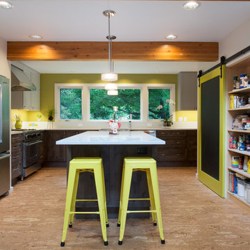
This farmhouse kitchen was designed for an active family that loves to entertain and likes to keep an eye on their menagerie of barnyard animals throughout the day. The pantry, behind the barn door, was carved out of a former cabinet space while the refrigerator was relocated to the former tiny pantry, after the two side fireplace was replaced with a once sided fireplace that now faces the family room. With the burning hazard eliminated, the island could be extended for much desired storage, prep space as well as a place for friends and family to perch while meal preparation is underway.
 Walls too Windows, Interior Design
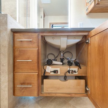
 Compact master bath remodel, with hair accessories plug ins, Swiss Alps Photography
Inspiration for a small timeless master beige tile and travertine tile travertine floor and multicolored floor walk-in shower remodel in Portland with raised-panel cabinets, medium tone wood cabinets, a wall-mount toilet, beige walls, an undermount sink, quartz countertops and a hinged shower door
Inspiration for a small timeless master beige tile and travertine tile travertine floor and multicolored floor walk-in shower remodel in Portland with raised-panel cabinets, medium tone wood cabinets, a wall-mount toilet, beige walls, an undermount sink, quartz countertops and a hinged shower door
 Marquis Fine Cabinetry
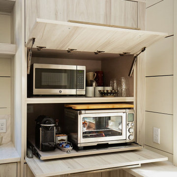
Project Number: M1197
Design/Manufacturer/Installer: Marquis Fine Cabinetry
Collection: Milano
Finish: Rockefeller
Features: Tandem Metal Drawer Box (Standard), Adjustable Legs/Soft Close (Standard), Stainless Steel Toe-Kick
Cabinet/Drawer Extra Options: Touch Latch, Custom Appliance Panels, Floating Shelves, Tip-Ups
Find the right local pro for your project
 Clearcut & Co
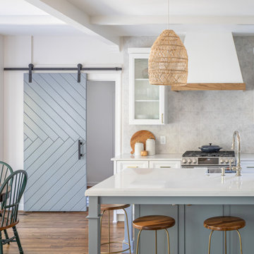
A traditional kitchen with touches of the farmhouse and Mediterranean styles. We used cool, light tones adding pops of color and warmth with natural wood.
 TKS Design Group
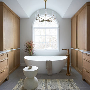
Several years ago, Jill and Brian remodeled their kitchen with TKS Design Group and recently decided it was time to look at a primary bath remodel.
Jill and Brian wanted a completely fresh start. We tweaked the layout slightly by reducing the size of the enormous tub deck and expanding the vanities and storage into the old tub deck zone as well as pushing a bit into the awkward carpeted dressing area. By doing so, we were able to substantially expand the existing footprint of the shower. We also relocated the French doors so that the bath would take advantage of the light brought in by the skylight in that area. A large arched window was replaced with a similar but cleaner lined version, and we removed the large bulkhead and columns to open the space. A simple freestanding tub now punctuates the area under the window and makes for a pleasing focal point. Subtle but significant changes.
We chose a neutral gray tile for the floor to ground the space, and then white oak cabinetry and gold finishes bring warmth to the pallet. The large shower features a mix of white and gray tile where an electronic valve system offers a bit of modern technology and customization to bring some luxury to the everyday. The bathroom remodel also features plenty of storage that keeps the everyday necessities tucked away. The result feels modern, airy and restful!
 Klopf Architecture
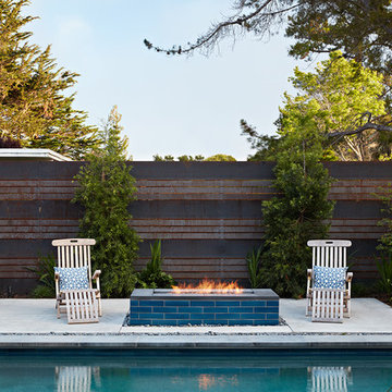
Klopf Architecture, Arterra Landscape Architects and Henry Calvert of Calvert Ventures Designed and built a new warm, modern, Eichler-inspired, open, indoor-outdoor home on a deeper-than-usual San Mateo Highlands property where an original Eichler house had burned to the ground.
The owners wanted multi-generational living and larger spaces than the original home offered, but all parties agreed that the house should respect the neighborhood and blend in stylistically with the other Eichlers. At first the Klopf team considered re-using what little was left of the original home and expanding on it. But after discussions with the owner and builder, all parties agreed that the last few remaining elements of the house were not practical to re-use, so Klopf Architecture designed a new home that pushes the Eichler approach in new directions.
One disadvantage of Eichler production homes is that the house designs were not optimized for each specific lot. A new custom home offered the team a chance to start over. In this case, a longer house that opens up sideways to the south fit the lot better than the original square-ish house that used to open to the rear (west). Accordingly, the Klopf team designed an L-shaped “bar” house with a large glass wall with large sliding glass doors that faces sideways instead of to the rear like a typical Eichler. This glass wall opens to a pool and landscaped yard designed by Arterra Landscape Architects.
Driving by the house, one might assume at first glance it is an Eichler because of the horizontality, the overhanging flat roof eaves, the dark gray vertical siding, and orange solid panel front door, but the house is designed for the 21st Century and is not meant to be a “Likeler.” You won't see any posts and beams in this home. Instead, the ceiling decking is a western red cedar that covers over all the beams. Like Eichlers, this cedar runs continuously from inside to out, enhancing the indoor / outdoor feeling of the house, but unlike Eichlers it conceals a cavity for lighting, wiring, and insulation. Ceilings are higher, rooms are larger and more open, the master bathroom is light-filled and more generous, with a separate tub and shower and a separate toilet compartment, and there is plenty of storage. The garage even easily fits two of today's vehicles with room to spare.
A massive 49-foot by 12-foot wall of glass and the continuity of materials from inside to outside enhance the inside-outside living concept, so the owners and their guests can flow freely from house to pool deck to BBQ to pool and back.
During construction in the rough framing stage, Klopf thought the front of the house appeared too tall even though the house had looked right in the design renderings (probably because the house is uphill from the street). So Klopf Architecture paid the framer to change the roofline from how we had designed it to be lower along the front, allowing the home to blend in better with the neighborhood. One project goal was for people driving up the street to pass the home without immediately noticing there is an "imposter" on this lot, and making that change was essential to achieve that goal.
This 2,606 square foot, 3 bedroom, 3 bathroom Eichler-inspired new house is located in San Mateo in the heart of the Silicon Valley.
Klopf Architecture Project Team: John Klopf, AIA, Klara Kevane
Landscape Architect: Arterra Landscape Architects
Contractor: Henry Calvert of Calvert Ventures
Photography ©2016 Mariko Reed
Location: San Mateo, CA
Year completed: 2016
 Ann Lowengart Interiors
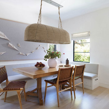
The three-level Mediterranean revival home started as a 1930s summer cottage that expanded downward and upward over time. We used a clean, crisp white wall plaster with bronze hardware throughout the interiors to give the house continuity. A neutral color palette and minimalist furnishings create a sense of calm restraint. Subtle and nuanced textures and variations in tints add visual interest. The stair risers from the living room to the primary suite are hand-painted terra cotta tile in gray and off-white. We used the same tile resource in the kitchen for the island's toe kick.
 Ann Lowengart Interiors
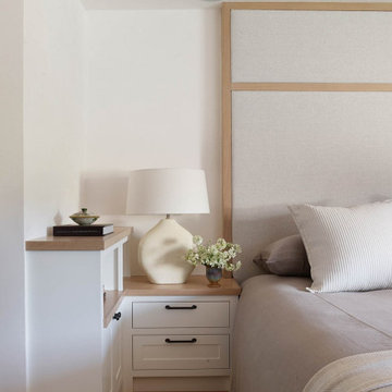
The three-level Mediterranean revival home started as a 1930s summer cottage that expanded downward and upward over time. We used a clean, crisp white wall plaster with bronze hardware throughout the interiors to give the house continuity. A neutral color palette and minimalist furnishings create a sense of calm restraint. Subtle and nuanced textures and variations in tints add visual interest. The stair risers from the living room to the primary suite are hand-painted terra cotta tile in gray and off-white. We used the same tile resource in the kitchen for the island's toe kick.
 Ann Lowengart Interiors
The three-level Mediterranean revival home started as a 1930s summer cottage that expanded downward and upward over time. We used a clean, crisp white wall plaster with bronze hardware throughout the interiors to give the house continuity. A neutral color palette and minimalist furnishings create a sense of calm restraint. Subtle and nuanced textures and variations in tints add visual interest. The stair risers from the living room to the primary suite are hand-painted terra cotta tile in gray and off-white. We used the same tile resource in the kitchen for the island's toe kick.
 Ann Lowengart Interiors
The three-level Mediterranean revival home started as a 1930s summer cottage that expanded downward and upward over time. We used a clean, crisp white wall plaster with bronze hardware throughout the interiors to give the house continuity. A neutral color palette and minimalist furnishings create a sense of calm restraint. Subtle and nuanced textures and variations in tints add visual interest. The stair risers from the living room to the primary suite are hand-painted terra cotta tile in gray and off-white. We used the same tile resource in the kitchen for the island's toe kick.
 Ann Lowengart Interiors
The three-level Mediterranean revival home started as a 1930s summer cottage that expanded downward and upward over time. We used a clean, crisp white wall plaster with bronze hardware throughout the interiors to give the house continuity. A neutral color palette and minimalist furnishings create a sense of calm restraint. Subtle and nuanced textures and variations in tints add visual interest. The stair risers from the living room to the primary suite are hand-painted terra cotta tile in gray and off-white. We used the same tile resource in the kitchen for the island's toe kick.
 Ann Lowengart Interiors
The three-level Mediterranean revival home started as a 1930s summer cottage that expanded downward and upward over time. We used a clean, crisp white wall plaster with bronze hardware throughout the interiors to give the house continuity. A neutral color palette and minimalist furnishings create a sense of calm restraint. Subtle and nuanced textures and variations in tints add visual interest. The stair risers from the living room to the primary suite are hand-painted terra cotta tile in gray and off-white. We used the same tile resource in the kitchen for the island's toe kick.
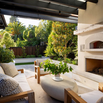 Ann Lowengart Interiors
The three-level Mediterranean revival home started as a 1930s summer cottage that expanded downward and upward over time. We used a clean, crisp white wall plaster with bronze hardware throughout the interiors to give the house continuity. A neutral color palette and minimalist furnishings create a sense of calm restraint. Subtle and nuanced textures and variations in tints add visual interest. The stair risers from the living room to the primary suite are hand-painted terra cotta tile in gray and off-white. We used the same tile resource in the kitchen for the island's toe kick.
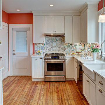
 Tracey Stephens Design, LLC
Wing Wong, Memories TTL
Inspiration for a mid-sized eclectic medium tone wood floor enclosed kitchen remodel in New York with a farmhouse sink, shaker cabinets, white cabinets, quartz countertops, multicolored backsplash, stainless steel appliances and no island
Inspiration for a mid-sized eclectic medium tone wood floor enclosed kitchen remodel in New York with a farmhouse sink, shaker cabinets, white cabinets, quartz countertops, multicolored backsplash, stainless steel appliances and no island
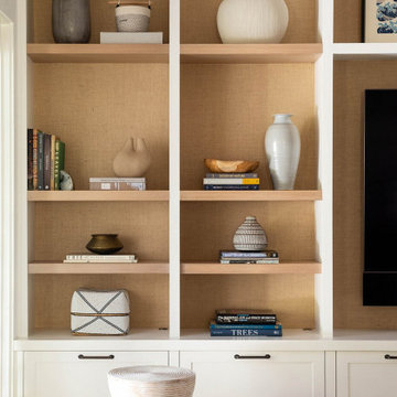 Ann Lowengart Interiors
The three-level Mediterranean revival home started as a 1930s summer cottage that expanded downward and upward over time. We used a clean, crisp white wall plaster with bronze hardware throughout the interiors to give the house continuity. A neutral color palette and minimalist furnishings create a sense of calm restraint. Subtle and nuanced textures and variations in tints add visual interest. The stair risers from the living room to the primary suite are hand-painted terra cotta tile in gray and off-white. We used the same tile resource in the kitchen for the island's toe kick.
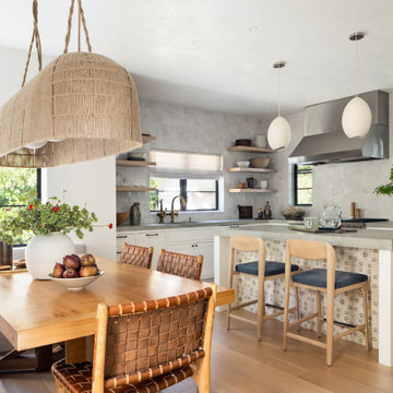 Ann Lowengart Interiors
The three-level Mediterranean revival home started as a 1930s summer cottage that expanded downward and upward over time. We used a clean, crisp white wall plaster with bronze hardware throughout the interiors to give the house continuity. A neutral color palette and minimalist furnishings create a sense of calm restraint. Subtle and nuanced textures and variations in tints add visual interest. The stair risers from the living room to the primary suite are hand-painted terra cotta tile in gray and off-white. We used the same tile resource in the kitchen for the island's toe kick.
 Robert Thomas Homes
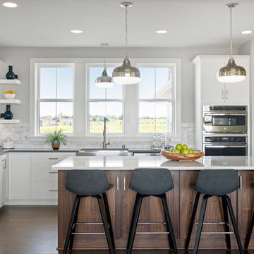
Inspiration for a huge transitional l-shaped medium tone wood floor open concept kitchen remodel in Minneapolis with a farmhouse sink, shaker cabinets, white cabinets, granite countertops, gray backsplash, subway tile backsplash, stainless steel appliances, an island and white countertops
 transFORM Home
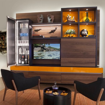
This custom living room unit and media center was designed to provide all that a Manhattan family needs for entertaining lots of guests or to just kick back, relax and watch some TV. The wall unit also shows off some of our favorite new material finishes with a combination of wood veneer, matte glass, and high gloss.
Color played a big role in the design of this entertainment center. It contrasts a radiant high gloss orange with a warm Smoked Walnut wood grain for a balanced and modern look. The orange high gloss adds an artistic accent to the unit, while keeping the design free from chaotic lines and color schemes. Our no-handle design is made possible by a brushed aluminum J-channel that provides a clean look and makes the drawers easy to access. Flat style doors and drawer fronts also contribute to the smooth and modern European look of the media center.
Our space saving entertainment system also delivers an abundant amount of floor to ceiling storage, both open and in drawers. There is ample room to store and display books, sculptures and home decor. Bottom cabinets are a suitable place to conceal and store media equipment. 1.5 inch thick floating shelves above the television and the box shelves alongside, featured in Midnight Ash, provide definition to the design and balance the high intensity orange elements. Top shelves provide space to arrange fragile keepsakes while bottom shelves can be used to display your favorite reads.
Opposite the open shelving is a matte black glass fronted cabinet to house your favorite drinks and glassware for quick entertaining. The black satin glass is defined by an aluminum door frame. Clear glass shelves are found within the glass door cabinet and provide a useful place for storing dry bar essentials like rocks glasses and your preferred liquor selection. The cabinet includes vertical profile LED strip lights on both side panels that illuminate when the door is opened. The lighting shines through the shelves and sparkles off the glassware, silver ice bucket and colorful drinks you might keep there.
The unit contains a sliding door that alternately hides a flat screen television and reveals a shelf. This feature paired with our wire management system helps keep your wall unit and your living area looking neat and tidy.
The hidden hardware adds a unique function to this design without drawing the eye. Short arm flap stays and drop-down flap hinges allow for the soft, almost automatic opening of the long panel faces that conceal the drawers behind. The drawers are easy to access and provide the storage of multiple drawers without cluttering the look of the media center.
This design is completed with integrated LED lighting. Behind the floating backing panel, adjustable LED lighting enhances the spacious look of the unit and provide mood lights for the living room. The shelves are equipped with recessed LED lights that make the orange high gloss color pop and showcase your displayed possessions. The floating shelves are equipped with horizontal profile LED strip lights to give the whole unit a warm glow. Our lighting systems offer features such as touch switches and dimmers, which add light, comfort and convenience to your living space.
Tell us what you want in your living room media center.
 Studio Dearborn
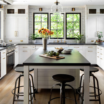
INTERNATIONAL AWARD WINNER. 2018 NKBA Design Competition Best Overall Kitchen. 2018 TIDA International USA Kitchen of the Year. 2018 Best Traditional Kitchen - Westchester Home Magazine design awards.
The designer's own kitchen was gutted and renovated in 2017, with a focus on classic materials and thoughtful storage. The 1920s craftsman home has been in the family since 1940, and every effort was made to keep finishes and details true to the original construction. For sources, please see the website at www.studiodearborn.com. Photography, Adam Kane Macchia and Timothy Lenz
 Roost Interior Design
Matt Rose Photography
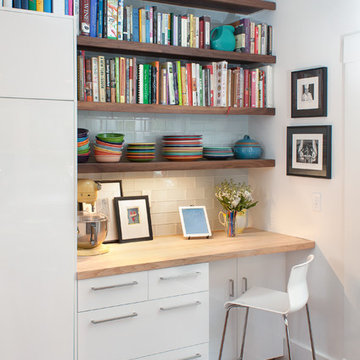
Trendy built-in desk dark wood floor home office photo in Other with white walls
Trendy built-in desk dark wood floor home office photo in Other with white walls
2