
Search results for "Kitchen sitting area ideas" in Home Design Ideas
 JMT Fine Living
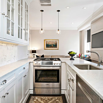
Pre war kitchen completely gutted. Small space efficiently designed to maximize kitchen counter and storage space while including sitting area and work space. Counter stools and wine fridge hidden at far end of island
 Haven Design and Construction
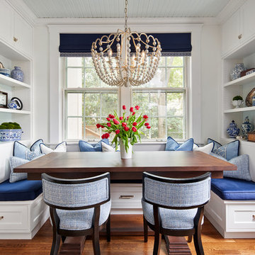
This 1902 San Antonio home was beautiful both inside and out, except for the kitchen, which was dark and dated. The original kitchen layout consisted of a breakfast room and a small kitchen separated by a wall. There was also a very small screened in porch off of the kitchen. The homeowners dreamed of a light and bright new kitchen and that would accommodate a 48" gas range, built in refrigerator, an island and a walk in pantry. At first, it seemed almost impossible, but with a little imagination, we were able to give them every item on their wish list. We took down the wall separating the breakfast and kitchen areas, recessed the new Subzero refrigerator under the stairs, and turned the tiny screened porch into a walk in pantry with a gorgeous blue and white tile floor. The french doors in the breakfast area were replaced with a single transom door to mirror the door to the pantry. The new transoms make quite a statement on either side of the 48" Wolf range set against a marble tile wall. A lovely banquette area was created where the old breakfast table once was and is now graced by a lovely beaded chandelier. Pillows in shades of blue and white and a custom walnut table complete the cozy nook. The soapstone island with a walnut butcher block seating area adds warmth and character to the space. The navy barstools with chrome nailhead trim echo the design of the transoms and repeat the navy and chrome detailing on the custom range hood. A 42" Shaws farmhouse sink completes the kitchen work triangle. Off of the kitchen, the small hallway to the dining room got a facelift, as well. We added a decorative china cabinet and mirrored doors to the homeowner's storage closet to provide light and character to the passageway. After the project was completed, the homeowners told us that "this kitchen was the one that our historic house was always meant to have." There is no greater reward for what we do than that.
 Dalia Kitchen Design
Boston Home Magazine
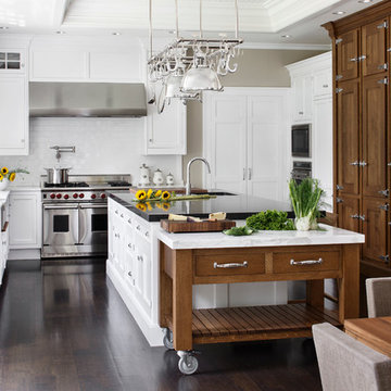
Inspiration for a large timeless u-shaped dark wood floor eat-in kitchen remodel in Boston with a farmhouse sink, shaker cabinets, white cabinets, marble countertops, white backsplash, subway tile backsplash and stainless steel appliances
Inspiration for a large timeless u-shaped dark wood floor eat-in kitchen remodel in Boston with a farmhouse sink, shaker cabinets, white cabinets, marble countertops, white backsplash, subway tile backsplash and stainless steel appliances
Find the right local pro for your project
 Metropolis Drafting and Construction Inc
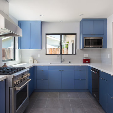
A small enclosed kitchen is very common in many homes such as the home that we remodeled here.
Opening a wall to allow natural light to penetrate the space is a must. When budget is important the solution can be as you see in this project - the wall was opened and removed but a structural post remained and it was incorporated in the design.
The blue modern flat paneled cabinets was a perfect choice to contras the very familiar gray scale color scheme but it’s still compliments it since blue is in the correct cold color spectrum.
Notice the great black windows and the fantastic awning window facing the pool. The awning window is great to be able to serve the exterior sitting area near the pool.
Opening the wall also allowed us to compliment the kitchen with a nice bar/island sitting area without having an actual island in the space.
The best part of this kitchen is the large built-in pantry wall with a tall wine fridge and a lovely coffee area that we built in the sitting area made the kitchen expend into the breakfast nook and doubled the area that is now considered to be the kitchen.
 JRP Design & Remodel
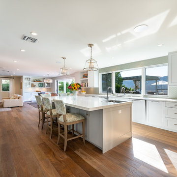
For three years this Westlake Village couple lived in a house that didn't quite fit their needs. With frequent houseguests staying for weeks at a time, the family needed more space, particularly in the cramped kitchen. So began their search for a new home. Though the couple viewed several residences, they realized nothing compared to the space and location of the house they already owned. The family knew JRP by reputation from friends who were JRP clients. After consulting with our team, the couple agreed a whole-home renovation was the way to the dream home they had been searching for. Inspired by top architectural magazines, the couple had a clear vision of how their home should look and feel: a clean, open, modern space with a mix of details that played to the family's lively spirit.
The highlight of this new, open floorplan home is the gorgeous kitchen perfect for hosting. The unified palette is soft and beautiful. Clean, bright surfaces underpin strong visual elements such as polished quartz countertops, brushed oak floors, and glass tiles set in a herringbone pattern. A center-island breakfast bar now sits opposite a giant picture window and a show-stopping view of the Santa Monica mountains. Upstairs, the redesigned master bath is what dreams are made of. The double vanity and freestanding tub were rearranged to maximize space while the wood tile floors and stunning rock backsplash add an elemental feel. Now completely transformed, every detail of this transitional home creates the perfect atmosphere for relaxing and entertaining.
Cabinets (Manufacturer, Door Style, Material, Color/Stain or Finish)
- Dewils, Shaker Frameless, Maple, Just White
- Dewils, Shaker Frameless, Maple, Fashion Grey
- Dewils, Shaker Frameless, Maple, North Sea
Countertops (Material Type - Manufacturer, Collection, Color)
- Quartz – Vadara, Toledo, Calacatta Dorado
Light Fixture (Type - Manufacturer, Collection, Color)
- Dining Chandelier – Existing
- Breakfast Area Pendant – 1213 Madison Collection, Polished Nickel/Royal Cut Crystal
- Dining Wall Mount Sconce – Heart Sconce, Aged Iron with Natural Percale
- Kitchen Island Pendant – Darlana, Polished Chrome
- Master Bath Ceiling – Bling Flushmount
- Master Bath Vanity – Robert Abbey Fine Lighting Double Shade Bath, Polished Nickel over Steel
- Exterior – Primo Lanterns, The Yorkshire Electric Lantern, Custom Graphite Finish
Plumbing Fixture (Type - Manufacturer, Color)
- Freestanding Tub – Existing
- Tubfiller – Existing
- Master Bath Faucets – Existing
- Kitchen Faucets – Hansgrohe, Chrome
Sink (Type – Manufacturer, Material)
- Undermount Single Bowl Kitchen– Kohler, Stainless Steel
- Undermount Single Prep – Elkay, Stainless Steel
- Undermount Bar Sink – Kohler, Stainless Steel
- Ladena Undermount Lavatory – Kohler, Ceramic
Hardware (Type – Manufacturer, Color)
- Deadbolt – Emtek, Satin Nickel
- Dummy - Emtek, Satin Nickel
- Passage & Privacy - Emtek, Stainless Steel
Color of wall:
- Kitchen, Breakfast Area, Family Room – Dunn Edwards Edgecomb Grey
- Master Bath – Dunn Edwards Foggy Day
- Living and Dining – Dunn Edwards Winter Morning
Tile (Location: Material Type – Manufacturer, Collection/Style, Color)
- KITCHEN BACKSPLASH: Glass - Ann Sacks, Jute, Ecru/Gloss
- MASTER BATH FLOORS, TUB ACCENT WALL, & HALL BATH FLOORS: Porcelain – Bedrosians, Tahoe, Frost/Glazed
- ACCENT WALL BEHIND TUB: Mosaic – Daltile, Flat River Pebble, Creamy Sand
- FIREPLACE FLOOR: Porcelain Tile - Agora Surfaces, Almeria, Lava/Matte
Stone/Masonry (Location: Material Type – Manufacturer, Collection/Style, Color)
- FIREPLACE: Stone Veneer – Eldorado, European Ledge, Zinc/Dry Stacked
Wood Floor (Type – Manufacturer, Collection/Style, Color/Wash)
- Siberian Oak – Provenza, Heirloom, Light Wire Brushed
Windows/Exterior Doors (Type - Manufacturer)
- 2 Wide Casement – Jeld-Wen
- 3 Wide Casement – Jeld-Wen
- Awning – Jeld-Wen
- Single Casement – Jeld-Wen
- Stationary – Jeld-Wen
Photographer: Andrew Abouna
 Gardner/Fox Associates, Inc
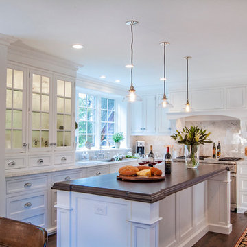
The original breakfast room was removed and the corner corner squared off a the site of the new sink. The removal of the wall dividing the kitchen and dining areas allowed the kitchen to expand and accommodate the open concept floor plan. The result is an amazingly comfortable & beautiful space in which to cook & entertain.
 River Valley Landscapes
The property is one of the original farm houses located on the main street of a small town. It has been in the family for many years and our client just inherited the property. They were trying to have balance of preserving the old while realizing modern day living has its benefits too. The house had a large addition added using mostly old style materials, but designed with function and modern day luxuries. Our goal was to carry that theme to the outside.
Our first problem we had to address was how to transition between the first floor elevation changes. The lower room was the husband’s office. He stated in the future he may have clients over and it would be nice to have an area to sit outside. The wife’s main concern was to renew the four corner garden. She also felt it was very important to be able to see it from the kitchen area. Finally there was an old wishing well stuck right outside the kitchen. They both felt it would be neat to be able to incorporate this in some how. They wanted a patio area with a built in grill to accommodate there family and friends. They also wanted to keep a large play area for the kids.
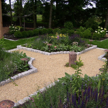
We were able to pull this off successfully. We addressed the first issue by having a small lower level flagstone area. This area is large enough for 1 to 2 people to sit comfortably. It also provides a transition from his office to the larger patio area. We installed a simple small gravel sitting area opposite of the main patio. This provides our client a secluded place to relax or do business. Mrs.... told me she is amazed how much her and her husband enjoys this area. It is so peaceful looking at the small creek over a glass of wine.
We built a natural limestone retaining wall to create the patio terrace. The stone was chosen to extend the houses architectural elements into the landscape. Irregular broken flagstone was used to give it a more casual feel. We installed three Serviceberries into the patio terrace to replace some trees that were taken down during the remodeling. She was very concern that they would block the view of the four corner garden. We new they were crucial to nestle in the terrace, so we placed them for a couple days for her to decide. Fortunately she agreed they not only kept the view open, but helped frame the garden.
The four corner garden was designed to be viewed from afar and experienced up close. We wanted the space to have some formal structure while keeping with the casual farm house feel. Another natural limestone retaining wall was created. This leveled the garden terrace and helped associate it with the rest of the property. The four corner garden is nestled into the existing woods edge. This provides three distinct experiences to entering the garden; a more formal from the driveway, an open feel from the lower lawn, and a more natural / casual experience from the wooded area. The Plymouth brown gravel was used for the center of the garden. This helped highlight the stone post that was found during construction. The gravel also brings the sense of sound into the garden space. Lamb’s ear was chosen as a fun way to get kids interest in horticulture.
The balance of using the new to create the old feel is what makes this project a success. The property has already hosted a local historical society event and won an award for its preservation efforts. When Mrs.... can’t find her husband, she knows he is either reading the newspaper by the grill or resting in the hammock along the wood’s path.

Sponsored
Delaware, OH

Buckeye Basements, Inc.
Central Ohio's Basement Finishing ExpertsBest Of Houzz '13-'21
 Glickman Design Build
Photo Credit: © John Cole Photography
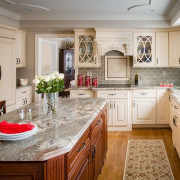
Inspiration for a timeless u-shaped medium tone wood floor kitchen remodel in DC Metro with an island, an undermount sink, raised-panel cabinets, beige cabinets, gray backsplash, subway tile backsplash and paneled appliances
Inspiration for a timeless u-shaped medium tone wood floor kitchen remodel in DC Metro with an island, an undermount sink, raised-panel cabinets, beige cabinets, gray backsplash, subway tile backsplash and paneled appliances
 Advance Design Studio, Ltd.
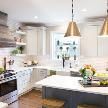
After six years of living in their Huntley IL home, Chris and Meghan were tired of their dark, dingy, outdated kitchen and it was finally time for a long-anticipated change. “The kitchen is the place where we live, it’s where we do everything,” Meghan said. “It was important that it be a space where we wanted to be.” Meghan loves cooking and enjoys including their girls in healthy meal prepping, this led them to want a brighter, more enjoyable kitchen with increased functionality and improved storage.
For Chris especially, the laundry room was an entirely dysfunctional eyesore. “We had a washer and a dryer, but it was all kind-of cobbled together!” Chris said. “There were always laundry piles everywhere, we weren’t really sure what we wanted to do in there, but it was time for us to make a change.” The mess of the space was stressful every time they walked in the door from the garage each day. Kids’ backpacks and shoes piled up haphazardly in the makeshift boot-bench closet left the family feeling disorganized and stressed. They needed space for folding clothes and locker cubbies to help keep the family organized.
Having known Christine and Todd in the Huntley community for years, Chris and Meghan were familiar with their work. “We already trusted them personally and having seen their projects for years we knew they did top notch work. After we reviewed the initial round of designs, we knew that hiring them was definitely the right choice,” Meghan and Chris said. Although Chris had done a lot of work in their home himself, the kitchen and laundry room renovation was such a large undertaking that he didn’t want to steal time away from his family to spend what would surely be many long weekends doing the job himself. “That would not have been a wise choice for us,” Chris laughed.
“Our designer, Michelle was very, very, easy to work with; anything we wanted to see or weren’t sure about, she went above and beyond to make this easy for us. She was easy to get hold of and always quick to respond,” the couple said. Michelle pulled ideas that mirrored the couple’s taste and style and was adept at directing the couple to limited choices that didn’t overwhelm them and kept the process moving. “I have a hard time making decisions. Michelle made the decision-making process so easy. I loved how she listened to what I liked and then presented three great options for me to choose from,” Meghan said.
The main objectives for the kitchen were better storage solutions, they wanted the space to reflect their lifestyle and taste, and they wanted it to last for years with low maintenance. One of the first steps in creating a more functional kitchen was relocating the refrigerator, creating an improved workflow for the busy family.
“We didn’t know that we could even move the refrigerator to a new location where it is now, that was something that we never would have thought of,” Chris said. “The new refrigerator location makes the kitchen feel so much bigger. We didn’t add any space, but our whole kitchen with the new design just seems like it’s so much larger than before!” Meghan said.
The perimeter mist colored cabinets helped warm and brighten the entire room, while the graphite colored cabinets on the island added contrast. Using this fresh, clean color palette satisfied the couple’s desire for a bright space that was the exact opposite of what they had before. Organization accessories were also added to the cabinets such as a spice drawer tray and roll outs to create hidden convenience.
“I absolutely love the hidden spices – it makes cooking so much more enjoyable!” Chris said. “And all the pull outs, and the double trash bin, who would think you could get so excited about organization!” the couple said in unison.
One thing they hated in their original kitchen was how dark the space felt. Added lighting on the ceiling with the new light fixtures combined with the lighter cabinetry colors throughout solved this problem. “Our new kitchen has this warm, almost cozy feeling that our old kitchen never had, it’s just a space that I love spending my time in now,” Meghan said. The light airy feeling was accentuated with the use of floating white shelves on either side of the decorative range hood. “We have so much cabinetry space, the new design is amazing we actually have more storage space than we will ever need,” Meghan said.
The island was extended to create more work surface and added space for stool seating. “The new island changes how we live. Now the kids can be in the kitchen with us, doing homework, eating breakfast, and the three of us have special dinners there when Chris is working late,” Meghan said.
The Carrara Marmi Quartz countertops were chosen because they are, not only beautiful, but are made from hard-working material that doesn’t require maintenance. The white subway tile backsplash that wraps to the ceiling behind the focal point cooktop range/hood compliments the crisp white countertops perfectly, while brushed brass hardware and light fixtures keep the design fresh and new.
The couple had a few fears at the beginning of the project, as most homeowners do. Their biggest fear was being out of their kitchen and laundry room for an extended time. The crew made it very easy for the family to work in a limited space keeping the washer and dryer hooked up the majority of the time, and also getting appliances working with minimal downtime.
“They above and beyond accommodated us to get us through the process,” Meghan said. “They did a great job making sure we were as comfortable as possible throughout the process,” Chris added.
“Our project manager DJ did a great job. He was very good at updating us on schedule changes, getting guys in as quickly as possible. Everyone that stepped in the house was nice and did great work,” said Chris. They thought Advance’s carpenter was phenomenal and were impressed when he took a conceptual idea from a photograph and worked with designer Michelle to create a one of a kind range/hood that has become the topic of conversation with friends and family who visit the new kitchen. “He was in our house literally every day for several weeks. He was easy to work with and good at what he did,” Meghan and Chris said.
The focal point of the kitchen; a hand-crafted, custom-built ventilation hood was clad with handpicked reclaimed barnwood. Advance Design’s carpenter built the framework and the cladding to create a one-of-a-kind design element that the couple loves.
“I think it was especially fun for him to create something unique from scratch, showcasing his talent in this area,” Meghan said. “I love that my kitchen is not like everyone else’s. I got to pick out the wood on my hood and watch it being built and was able to choose what pieces of wood went where on it. It’s totally unique.”
Red Oak flooring was toothed-in throughout the kitchen and the rest of the first floor anywhere changes were made. Then the whole floor was refinished to tone down the orange undertones in the existing floor stain, ultimately changing the color complexion of the entire first floor. The result is a completely new feeling to the entire home.
Renovating the laundry room was extremely important to Meghan and Chris, but they had trouble visualizing what the possibilities were for the seemingly small space. Michelle produced beautiful 3D illustrations that helped them envision the space in a whole new way.
“I must have told Michelle 100 times that I am a visual person, seeing the designs in 3D made it so easy to make decisions and see what we could really do with our space,” Meghan said.
A dividing wall and doorway were removed between the existing laundry room and hallway formerly containing a coat closet, providing space to design specialized graphite colored cabinetry matching the kitchen island to house custom storage cubbies for each family member. Adding the tall utility cabinetry in the new laundry area helped solve the storage issue, tucking away cleaning supplies, household items, and even the cat got its own cubby.
“I love how everything is now hidden in its own space. I can’t tell you how much I hated coming home and seeing everything sitting around on counters,” Chris said.
Electrical outlets were planned for the inside of utility cabinets, so devices could charge in hidden locations. Stacking the washer and dryer allowed for wider countertop space to provide a folding area and a special space for clothes to hang. “The way I do laundry has been completely transformed! I can actually fold clothes and hang them now right out of the washer and dryer,” Meghan said.
“The end result in the kitchen and the laundry/mud room was an updated light and bright space, with a smarter work flow that better meets the needs of this family,” Michelle said.
“I would totally recommend Advance Design,” Meghan said. “Sometimes I sit and just look at my kitchen and laundry room and think ‘Wow, I can’t believe I get to live here!’ It’s an understatement to say we love our new space.”
 Nantucket Looms
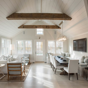
Dining & sitting area off the kitchen. White and bright with a combination of a beachy and contemporary feel.
Beach style living room photo in Boston with white walls
Beach style living room photo in Boston with white walls
 Metropolis Drafting and Construction Inc
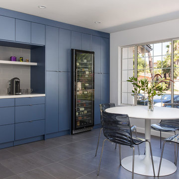
A small enclosed kitchen is very common in many homes such as the home that we remodeled here.
Opening a wall to allow natural light to penetrate the space is a must. When budget is important the solution can be as you see in this project - the wall was opened and removed but a structural post remained and it was incorporated in the design.
The blue modern flat paneled cabinets was a perfect choice to contras the very familiar gray scale color scheme but it’s still compliments it since blue is in the correct cold color spectrum.
Notice the great black windows and the fantastic awning window facing the pool. The awning window is great to be able to serve the exterior sitting area near the pool.
Opening the wall also allowed us to compliment the kitchen with a nice bar/island sitting area without having an actual island in the space.
The best part of this kitchen is the large built-in pantry wall with a tall wine fridge and a lovely coffee area that we built in the sitting area made the kitchen expend into the breakfast nook and doubled the area that is now considered to be the kitchen.
 Drury Design
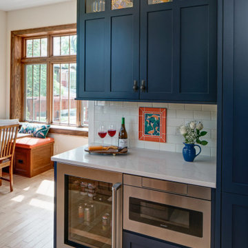
The 100-year old home’s kitchen was old and just didn’t function well. A peninsula in the middle of the main part of the kitchen blocked the path from the back door. This forced the homeowners to mostly use an odd, U-shaped corner of the kitchen.
Design objectives:
-Add an island
-Wow-factor design
-Incorporate arts and crafts with a touch of Mid-century modern style
-Allow for a better work triangle when cooking
-Create a seamless path coming into the home from the backdoor
-Make all the countertops in the space 36” high (the old kitchen had different base cabinet heights)
Design challenges to be solved:
-Island design
-Where to place the sink and dishwasher
-The family’s main entrance into the home is a back door located within the kitchen space. Samantha needed to find a way to make an unobstructed path through the kitchen to the outside
-A large eating area connected to the kitchen felt slightly misplaced – Samantha wanted to bring the kitchen and materials more into this area
-The client does not like appliance garages/cabinets to the counter. The more countertop space, the better!
Design solutions:
-Adding the right island made all the difference! Now the family has a couple of seats within the kitchen space. -Multiple walkways facilitate traffic flow.
-Multiple pantry cabinets (both shallow and deep) are placed throughout the space. A couple of pantry cabinets were even added to the back door wall and wrap around into the breakfast nook to give the kitchen a feel of extending into the adjoining eating area.
-Upper wall cabinets with clear glass offer extra lighting and the opportunity for the client to display her beautiful vases and plates. They add and an airy feel to the space.
-The kitchen had two large existing windows that were ideal for a sink placement. The window closest to the back door made the most sense due to the fact that the other window was in the corner. Now that the sink had a place, we needed to worry about the dishwasher. Samantha didn’t want the dishwasher to be in the way of people coming in the back door – it’s now in the island right across from the sink.
-The homeowners love Motawi Tile. Some fantastic pieces are placed within the backsplash throughout the kitchen. -Larger tiles with borders make for nice accent pieces over the rangetop and by the bar/beverage area.
-The adjacent area for eating is a gorgeous nook with massive windows. We added a built-in furniture-style banquette with additional lower storage cabinets in the same finish. It’s a great way to connect and blend the two areas into what now feels like one big space!
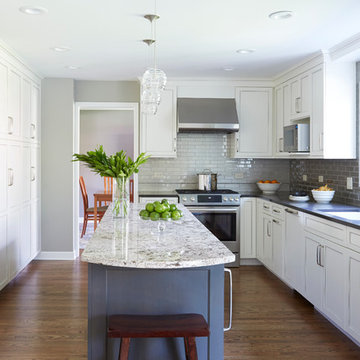
 TKS Design Group
Free ebook, Creating the Ideal Kitchen. DOWNLOAD NOW
The homeowners of this mid-century Colonial and family of four were frustrated with the layout of their existing kitchen which was a small, narrow peninsula layout but that was adjoining a large space that they could not figure out how to use. Stealing part of the unused space seemed like an easy solution, except that there was an existing transition in floor height which made that a bit tricky. The solution of bringing the floor height up to meet the height of the existing kitchen allowed us to do just that.
This solution also offered some challenges. The exterior door had to be raised which resulted in some exterior rework, and the floor transition had to happen somewhere to get out to the garage, so we ended up “pushing” it towards what is now a new mudroom and powder room area. This solution allows for a small but functional and hidden mudroom area and more private powder room situation.
Another challenge of the design was the very narrow space. To minimize issues with this, we moved the location of the refrigerator into the newly found space which gave us an L-shaped layout allowing for an island and even some shallow pantry storage. The windows over the kitchen sink were expanded in size and relocated to allow more light into the room. A breakfast table fits perfectly in the area adjacent to the existing French doors and there was even room for a small bar area that helps transition from inside to outside for entertaining. The confusing unused space now makes sense and provides functionality on a daily basis.
To help bring some calm to this busy family, a pallet of soft neutrals was chosen -- gray glass tile with a simple metal accent strip, clear modern pendant lights and a neutral color scheme for cabinetry and countertops.
For more information on kitchen and bath design ideas go to: www.kitchenstudio-ge.com

Sponsored
Columbus, OH

Hope Restoration & General Contracting
Columbus Design-Build, Kitchen & Bath Remodeling, Historic Renovations
 Ispiri Design-Build
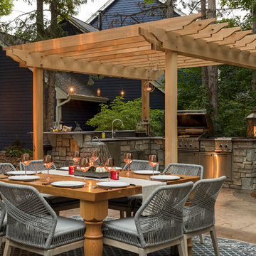
Existing mature pine trees canopy this outdoor living space. The homeowners had envisioned a space to relax with their large family and entertain by cooking and dining, cocktails or just a quiet time alone around the firepit. The large outdoor kitchen island and bar has more than ample storage space, cooking and prep areas, and dimmable pendant task lighting. The island, the dining area and the casual firepit lounge are all within conversation areas of each other. The overhead pergola creates just enough of a canopy to define the main focal point; the natural stone and Dekton finished outdoor island.
 TKS Design Group
Free ebook, Creating the Ideal Kitchen. DOWNLOAD NOW
Our clients had been in their home since the early 1980’s and decided it was time for some updates. We took on the kitchen, two bathrooms and a powder room.
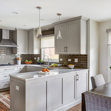
The layout in the kitchen was functional for them, so we kept that pretty much as is. Our client wanted a contemporary-leaning transitional look — nice clean lines with a gray and white palette. Light gray cabinets with a slightly darker gray subway tile keep the northern exposure light and airy. They also purchased some new furniture for their breakfast room and adjoining family room, so the whole space looks completely styled and new. The light fixtures are staggered and give a nice rhythm to the otherwise serene feel.
The homeowners were not 100% sold on the flooring choice for little powder room off the kitchen when I first showed it, but now they think it is one of the most interesting features of the design. I always try to “push” my clients a little bit because that’s when things can get really fun and this is what you are paying for after all, ideas that you may not come up with on your own.
We also worked on the two upstairs bathrooms. We started first on the hall bath which was basically just in need of a face lift. The floor is porcelain tile made to look like carrera marble. The vanity is white Shaker doors fitted with a white quartz top. We re-glazed the cast iron tub.
The master bath was a tub to shower conversion. We used a wood look porcelain plank on the main floor along with a Kohler Tailored vanity. The custom shower has a barn door shower door, and vinyl wallpaper in the sink area gives a rich textured look to the space. Overall, it’s a pretty sophisticated look for its smaller fooprint.
Designed by: Susan Klimala, CKD, CBD
Photography by: Michael Alan Kaskel
For more information on kitchen and bath design ideas go to: www.kitchenstudio-ge.com
 Visbeen Architects
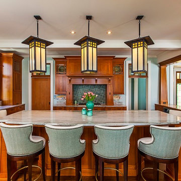
Inspired by the surrounding landscape, the Craftsman/Prairie style is one of the few truly American architectural styles. It was developed around the turn of the century by a group of Midwestern architects and continues to be among the most comfortable of all American-designed architecture more than a century later, one of the main reasons it continues to attract architects and homeowners today. Oxbridge builds on that solid reputation, drawing from Craftsman/Prairie and classic Farmhouse styles. Its handsome Shingle-clad exterior includes interesting pitched rooflines, alternating rows of cedar shake siding, stone accents in the foundation and chimney and distinctive decorative brackets. Repeating triple windows add interest to the exterior while keeping interior spaces open and bright. Inside, the floor plan is equally impressive. Columns on the porch and a custom entry door with sidelights and decorative glass leads into a spacious 2,900-square-foot main floor, including a 19 by 24-foot living room with a period-inspired built-ins and a natural fireplace. While inspired by the past, the home lives for the present, with open rooms and plenty of storage throughout. Also included is a 27-foot-wide family-style kitchen with a large island and eat-in dining and a nearby dining room with a beadboard ceiling that leads out onto a relaxing 240-square-foot screen porch that takes full advantage of the nearby outdoors and a private 16 by 20-foot master suite with a sloped ceiling and relaxing personal sitting area. The first floor also includes a large walk-in closet, a home management area and pantry to help you stay organized and a first-floor laundry area. Upstairs, another 1,500 square feet awaits, with a built-ins and a window seat at the top of the stairs that nod to the home’s historic inspiration. Opt for three family bedrooms or use one of the three as a yoga room; the upper level also includes attic access, which offers another 500 square feet, perfect for crafts or a playroom. More space awaits in the lower level, where another 1,500 square feet (and an additional 1,000) include a recreation/family room with nine-foot ceilings, a wine cellar and home office.
Photographer: Jeff Garland
 Tunde Decor, LLC
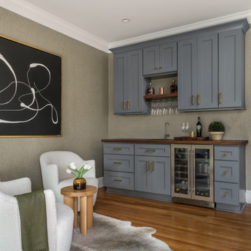
We opened up the wall between the kitchen and a guest bedroom. This new bar/sitting area used to be the bedroom.
We used textured wallpaper, and walnut countertop, floating shelf to warm up the space.
Sponsored
Fredericksburg, OH

High Point Cabinets
Columbus' Experienced Custom Cabinet Builder | 4x Best of Houzz Winner
 TKS Design Group
Download our free ebook, Creating the Ideal Kitchen. DOWNLOAD NOW
This client was referred to us from a past client. They are a busy 2-career household with young children and enjoy entertaining friends and family in their home. They have a beautiful open concept home but unfortunately the kitchen was not fitting for the rest of the home. They were not quite sure what to do with the space. We talked about trying to refresh it or do more of a minor remodel, but in the end they decided a full gut would get them to where they wanted to be.
One problem was there was no place for guests to hang out other than the large and awkward banquette area. The brick wall and tiled hood area were feeling a bit dated and tired. The space was just not functional for their lifestyle. There was no prep space near the cooktop and no landing area for items coming out of the ovens or refrigerator, plus a big dead zone in the center of the room.
Banquettes, like the one they previously had in the space, are great for small spaces, but when they get really large like this one, it makes getting in and out of the seating area awkward and uncomfortable. Plus, there was room for a large table, so we eliminated the awkward built in.
We started by removing the faux brick wall between the kitchen and back entry. We relocated the entry to the garage over a couple feet in order to get every last inch out of the new kitchen. We also made the decision to close up the primary window that faced the pretty ho hum brick wall of the neighbor’s house. There was plenty of light coming in from the seating area, so we just didn’t feel the window was adding much to the room.
Construction went smoothy. There was a bit of rework with electrical, flooring and HVAC, but in the end, we think it was well worth it.
The clients really wanted a sleek contemporary look, and we originally had planned for a full height slab backsplash, but due to it’s size, it was a budget buster. Instead, we got creative and settled on large format porcelain tiles that have a similar feel but were a fraction of the cost. We made sure the wall was plumb and level so that the fit and finish would mimic that of slab material.
The final space was quite a change. A large prep sink sits directly across from the new pro-style range with plenty additional prep space on the large island. The refrigerator and ovens now have miles of landing space, and a nice tight work triangle makes cooking a breeze.
Since we wanted a more contemporary feel, not many wall cabinets were included. Instead, we outfitted some of the drawers for dish storage with a peg system. Two large pantries flanking the refrigerator hold baking supplies and small appliances. Large drawers by the cooktop hold pots and pans, and an appliance garage tucked away to the left of the range hides away miscellaneous items. The large island also houses a microwave drawer and tons of storage, most of which is drawers offering maximum convenience.
The island now seats 5-6 people comfortably along with the new table in the seating area which can seat up to 8. Entertaining will be a breeze in this space. With such a clean backdrop, we knew we would need some drama with the lighting, so we chose two sets of staggered pendants, which we adjusted for the right visual balance above the island.
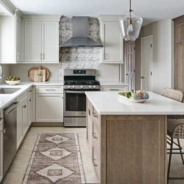
We also included a small coffee station to the right of the main kitchen, which helps keep the coffee clutter out of the kitchen proper. Two tones of complimentary gray are featured in this kitchen. The perimeter is a light gray that reads almost white. The island is a gray stain that adds some depth and interest with the visible wood texture. The countertops are clean white quartz, and the hardware, barstools and light fixtures add warm brass tones. I see lots of cooking and entertaining with family and friends in the near future in this bright and airy new space.
Designed by: Susan Klimala, CKD, CBD
Photography by: Michael Kaskel
For more information on kitchen and bath design ideas go to: www.kitchenstudio-ge.com
 Drury Design
THE SETUP
Client Background: Our clients, a couple who have transitioned into the empty nest phase, have cherished their home for over three decades without undergoing any significant renovations. With a newfound desire to adapt their living space to better suit their current lifestyle, they’ve embarked on a journey to reimagine their kitchen — the heart of their home. Their aspiration is to cultivate a serene, neutral-toned sanctuary on the first floor that seamlessly merges with their family room, ensuring a harmonious and inviting environment.
Design Inspiration: The renovation is inspired by the couple’s penchant for soft, calming neutrals, using their cherished family room and the kitchen’s existing tile flooring as the cornerstone for the color scheme. This approach aims to foster a sense of warmth and tranquility throughout.
Design Objectives:
Harmonize the kitchen with the family room by adopting a soothing, neutral color scheme, ensuring a seamless flow across the first floor.
Enhance kitchen functionality with thoughtfully designed cabinetry, providing a designated place for every item and maximizing storage efficiency.
Cultivate an inviting and comfortable atmosphere that reflects the homeowners’ desire for a calm and relaxing space.
Design Challenges:
The homeowners wish to retain the existing kitchen tile flooring and integrate it into a refreshed, modern design.
Accommodating a dining area spacious enough for family visits without compromising the kitchen’s open feel or functional layout.
Despite liking the current placement of plumbing and appliances, the homeowners aspire for a more open floor plan to facilitate better movement and interaction.
The need to amplify natural light in the kitchen, especially around the sink area, where existing lighting is insufficient.
Preserving the half-wall between the kitchen and family room, a feature the homeowners want to keep, while ensuring it complements the new design.
THE RENEWED SPACE
Design Solutions:
By choosing a neutral color palette that complements the existing tile, the design unifies the kitchen with the adjacent spaces. The tile’s grout was cleaned and restored, enhancing the floor’s appearance and integrating it seamlessly with the new kitchen aesthetic.
The inclusion of a larger island with seating for two, alongside maintaining a substantial dining table, was achieved by optimizing the spatial layout. This allowed for a sociable yet functional kitchen, accommodating large family gatherings without feeling crowded.
Minor adjustments to the kitchen’s layout maintained the preferred locations for plumbing and appliances while introducing an ‘open’ design concept. Strategic modifications, such as angling the pantry wall, improved the flow and accessibility within the space.
Replacing the garden window with a broader, standard window significantly increased natural light, transforming the sink area into a bright, welcoming space with enhanced views of the outdoors.
The decision to keep the half-wall was ingeniously leveraged to define the dining area while maintaining an open connection to the family room. This feature not only serves as a visual separator but also ties the two spaces together through the shared color scheme and design elements.
The homeowners are thrilled with their newly remodeled kitchen, which has become a hub of warmth and hospitality. Hosting a wedding shower and a birthday party, they have shared their renewed space with friends and family, who have been equally enamored. This remodel has not only met their functional and aesthetic desires but has also enriched their home with a fresh sense of serenity and joy.
The upstairs part of the home is shaping up nicely. Here’s their newly remodeled primary bathroom.
 John David Rulon
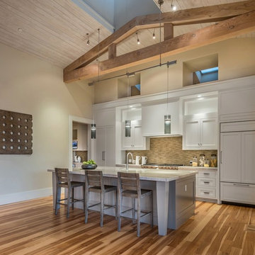
My client for this project was a builder/ developer. He had purchased a flat two acre parcel with vineyards that was within easy walking distance of downtown St. Helena. He planned to “build for sale” a three bedroom home with a separate one bedroom guest house, a pool and a pool house. He wanted a modern type farmhouse design that opened up to the site and to the views of the hills beyond and to keep as much of the vineyards as possible. The house was designed with a central Great Room consisting of a kitchen area, a dining area, and a living area all under one roof with a central linear cupola to bring natural light into the middle of the room. One approaches the entrance to the home through a small garden with water features on both sides of a path that leads to a covered entry porch and the front door. The entry hall runs the length of the Great Room and serves as both a link to the bedroom wings, the garage, the laundry room and a small study. The entry hall also serves as an art gallery for the future owner. An interstitial space between the entry hall and the Great Room contains a pantry, a wine room, an entry closet, an electrical room and a powder room. A large deep porch on the pool/garden side of the house extends most of the length of the Great Room with a small breakfast Room at one end that opens both to the kitchen and to this porch. The Great Room and porch open up to a swimming pool that is on on axis with the front door.
The main house has two wings. One wing contains the master bedroom suite with a walk in closet and a bathroom with soaking tub in a bay window and separate toilet room and shower. The other wing at the opposite end of the househas two children’s bedrooms each with their own bathroom a small play room serving both bedrooms. A rear hallway serves the children’s wing, a Laundry Room and a Study, the garage and a stair to an Au Pair unit above the garage.
A separate small one bedroom guest house has a small living room, a kitchen, a toilet room to serve the pool and a small covered porch. The bedroom is ensuite with a full bath. This guest house faces the side of the pool and serves to provide privacy and block views ofthe neighbors to the east. A Pool house at the far end of the pool on the main axis of the house has a covered sitting area with a pizza oven, a bar area and a small bathroom. Vineyards were saved on all sides of the house to help provide a private enclave within the vines.
The exterior of the house has simple gable roofs over the major rooms of the house with sloping ceilings and large wooden trusses in the Great Room and plaster sloping ceilings in the bedrooms. The exterior siding through out is painted board and batten siding similar to farmhouses of other older homes in the area.
Clyde Construction: General Contractor
Photographed by: Paul Rollins
2