
Search results for "Knee deep" in Home Design Ideas
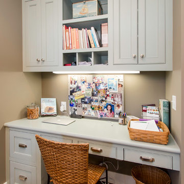
 Architectural Designs
Exclusive House Plan 73345HS is a 3 bedroom 3.5 bath beauty with the master on main and a 4 season sun room that will be a favorite hangout.
The front porch is 12' deep making it a great spot for use as outdoor living space which adds to the 3,300+ sq. ft. inside.
Ready when you are. Where do YOU want to build?
Plans: http://bit.ly/73345hs
Photo Credit: Garrison Groustra
 Manomin Resawn Timbers
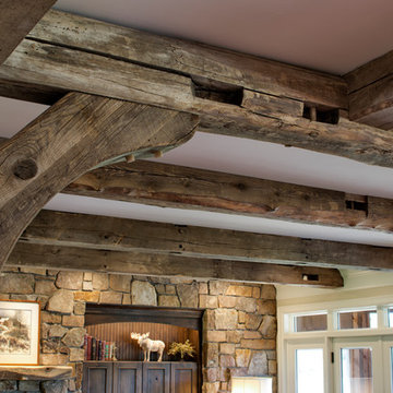
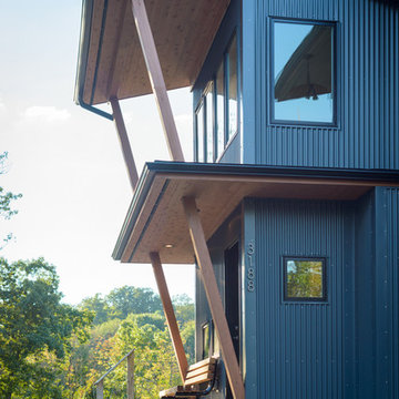
This close up detail of a reclaimed wood curved knee brace connecting a vertical post to a ceiling beam shows exactly what sets Manomin craftsmanship apart. The silvered gray brown tones, deep checking, original knots, and heavily weathered surface texture on these old growth hardwoods tell a century of history in every surface. Mortise pockets visible on the horizontal beam show authentic timber frame joinery that no modern material can replicate.
For architects, designers, and builders specifying reclaimed timber frame systems, this detail shot shows the grain quality, surface character, and joinery craftsmanship available from Manomin. For homeowners, this is what a statement reclaimed wood moment looks like up close. At Manomin Resawn Timbers, every piece goes through a detailed process of denailing, kiln drying, and precision milling so that antique character is preserved while performing beautifully in a modern home.
Whether you are a homebuilder, a home remodeling contractor, or a homeowner looking for custom reclaimed wood timber framing with curved and shaped profiles, Manomin Resawn Timbers has been helping people discover the antique charm of reclaimed wood since 2002. We serve homebuilders, contractors, and designers across the country. Visit our showroom in Hugo, MN or reach out to us with a call or a message to get started.
 Marilyn Hill Interiors
Showcase Photography
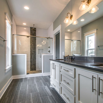
Example of a mid-sized arts and crafts master ceramic tile, gray tile and white tile porcelain tile doorless shower design in Nashville with an undermount sink, shaker cabinets, white cabinets, quartzite countertops, a two-piece toilet and gray walls
Example of a mid-sized arts and crafts master ceramic tile, gray tile and white tile porcelain tile doorless shower design in Nashville with an undermount sink, shaker cabinets, white cabinets, quartzite countertops, a two-piece toilet and gray walls
Find the right local pro for your project
 RAJ Kitchen and Bath, LLC
**Check out the video of this transformation on our website**
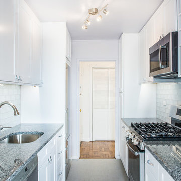
This small kitchen was way too small for this 2 bedrooms, 2 bathrooms apartment. Not only was it a very small kitchen, but the physical location of it made it very difficult to make it any bigger. There wasn't much that could have been done without incurring astronomical cost, which would get little or no return on the investment. The client wanted a kitchen that can be optimized in its current location to add a ton of value for resale.
This was difficult to do, because there was no moving of any mechanical around in the kitchen and even if we wanted to, the management of the building would not allow. For those of you who live in condos, co-ops or apartment building, you know how difficult it is to rework these foot prints. When we showed up, we saw the problems, but we also saw a huge opportunity where we can achieve those goals in the small space. This was accomplished by making some key changes and to incorporate some new things that was not possible when this kitchen was built years ago.
The crucial part of the design that would drive the entire new layout, was selecting the only appliance; that was the Refrigerator. Once we nailed down that refrigerator, we then proceeded to design the kitchen around it. We moved it to the other side of the wall where the sink was so that we can tap into the water line from the sink plumbing. It was crucial that it stays exactly 24" deep, not an inch more because we had to keep the entry as open as possible. Also, it was going to be directly in front of another big storage unit - The pantry. It is not ideal in most cases, but we needed the rest of the space to ramp up the design and open feel towards the side where all of the activities would take place, which happend to be the dining room and the view.
Once all that was figured out, we re-positioned the sink, dishwasher and the range and proceeded to wrap the cabinets around the columns to integrate them into the space. Thirty- six inches cabinets height was used so that they can be installed higher towards the ceiling height to give more room rather than the standard 18" required height between the counter tops. This was done to make the room feel a lot bigger than it really was. Not to mention, we also didn't want the faucet to be buried under the cabinets so that was also a necessary design detail for the space.
We then lowered both knee walls so that the counter top can sit on top of them, by removing that stop point that would have otherwise defined the kitchen area. This allowed us to pick up that extra footprint into the room for added prep space and enabled us to create the illusion of a kitchen that is looking longer than it really is. Every inch mattered when designing this kitchen and we made a conscious decision to use every one of that inch.
White cabinets were selected to do just what white cabinets are design to do; make a small or dark room appear bigger, brighter and more open. In this kitchen, this was amplified the more because of the kitchen location. It was perfect! We knew we did justice to the space because while we were there taking some photos, a few potential buyers walked in and went straight for the kitchen! They said its design just to fit the apartment.
Pantry roll out shelving, Double recycle bin, fancy handles, LED lighting, Quartz counter top, beautiful backslash tiles and grey linen floors finished off the kitchen which looked over a beautiful view of the George Washington Bridge from the top of this lovely 4th floor apartment.
Credit to Masterpiece Tile and Marble (Annmarie on the selection of Tiles and countertop and Val on the Construction to complete this project).
Davor Kokic Photography
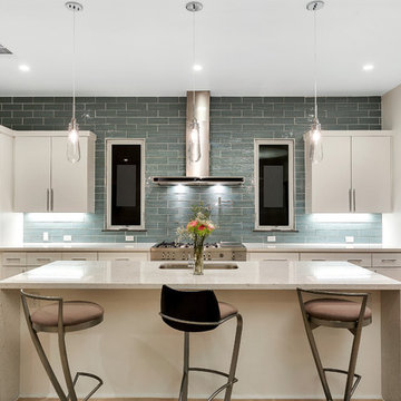
 Michael Andrew Barber Architects
Example of a trendy kitchen design in Austin with an undermount sink, flat-panel cabinets, white cabinets, gray backsplash, subway tile backsplash, stainless steel appliances and an island
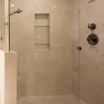
 dB Atlanta | Direct Build of Atlanta
Heather Fritz
Example of a mid-sized minimalist master beige tile and porcelain tile porcelain tile doorless shower design in Atlanta with an undermount sink, shaker cabinets, white cabinets, quartz countertops, a two-piece toilet and beige walls
Example of a mid-sized minimalist master beige tile and porcelain tile porcelain tile doorless shower design in Atlanta with an undermount sink, shaker cabinets, white cabinets, quartz countertops, a two-piece toilet and beige walls
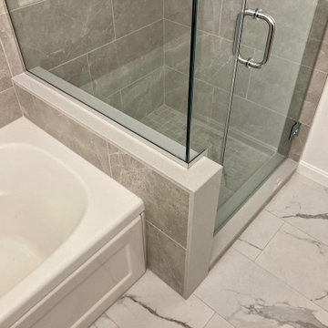
 Ready 2 Remodel
Master Bathroom with a space saving Corner Shower. Includes a Custom Hinged Shower Door with Glass that wraps around the knee wall. A Quartz shower curb that matches, 2 Quartz corner shelves that serve as a shower caddy. . Porcelain Grey Wall tile with a custom matching Shower Pan

Sponsored
Columbus, OH

Hope Restoration & General Contracting
Columbus Design-Build, Kitchen & Bath Remodeling, Historic Renovations


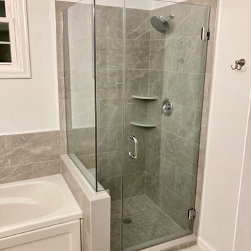 Ready 2 Remodel
Master Bathroom with a space saving Corner Shower. Includes a Custom Hinged Shower Door with Glass that wraps around the knee wall. A Quartz shower curb that matches, 2 Quartz corner shelves that serve as a shower caddy. . Porcelain Grey Wall tile with a custom matching Shower Pan
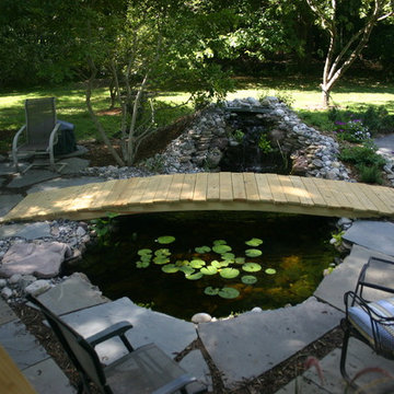
 KneeDeep Ponds, Inc.
KneeDeep Ponds, Inc. was called in to see what we could do with the space that was available. As you will see we were able to pick up space that the owner did not see and in the end gave them the pond they wanted and more patio not to mention a new flagstone walk to the deck.
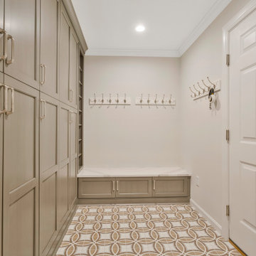
 Reico Kitchen & Bath
Katherine Dashiell of Reico Kitchen and Bath in Annapolis, MD collaborated with Lauer Construction on this multi-room project to create a transitional style inspired kitchen, bathroom and mudroom remodel featuring Merillat Masterpiece cabinetry.
The kitchen perimeter cabinets are the Rockwell full overlay door style in a Moonshine finish, paired with kitchen island cabinets in the Mineral Grey finish. The kitchen also includes Jefferey Alexander Marlo Knobs and Sullivan Pulls in Polished Chrome.
The mudroom cabinets are the Rockwell full overlay door style in a Mineral Grey finish. The flooring is Pacific Caramel 8x8 tile.
The bathroom cabinets are the Rockwell full overlay door style in a Mineral Grey finish with a Nickel Linen Glaze. The bathroom also includes Picadilly Gloss Perla 4x12 tile with Thassos Bar Liner and Deep Ocean Stone Mosaic for the shower wall and Stateworks Lugnez 12x24 and 2x2 for the shower floor.
Throughout these spaces, the countertops, knee wall toppers, shower curb and bench are Cambria Brittanicca quartz.
Photos courtesy of BTW Images.
 Bay Area Kitchens
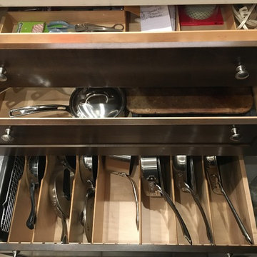
Drawers provide the best storage for most kitchen items, while keeping you off of your knees.
Example of a transitional kitchen design in Houston
Example of a transitional kitchen design in Houston
Sponsored
Columbus, OH
Hope Restoration & General Contracting
Columbus Design-Build, Kitchen & Bath Remodeling, Historic Renovations
 Ready 2 Remodel
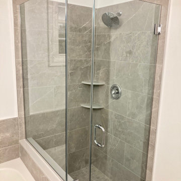
Master Bathroom with a space saving Corner Shower. Includes a Custom Hinged Shower Door with Glass that wraps around the knee wall. A Quartz shower curb that matches, 2 Quartz corner shelves that serve as a shower caddy. . Porcelain Grey Wall tile with a custom matching Shower Pan
 Sai Remodeling LLC
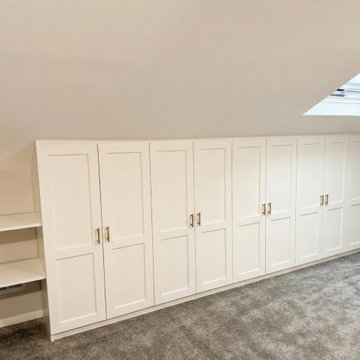
The completed attic playroom transformation. We utilized the hard-to-reach knee wall space to create deep storage for toys and games. The result is a high-end, built-in aesthetic that resolves the homeowner's original DIY challenges.
 Jarrett Design
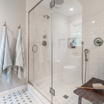
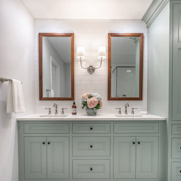
This bathroom needed help as it was tired, dated and cramped! The vanity area was open to the master bedroom and sandwiched between a closet and existing bathroom wall. Behind the bathroom wall, was a second sink, a small walk-in shower and the commode. A poorly placed linen closet ate into the area and there was a soffit over the shower adding to the cramped feeling. The ceiling was cluttered with old-school heating lamps, flush-mount fixtures and ventilation grills. The “movie star” lighting meant to add some glamour only made the bathroom feel dated and sad. Our clients wanted to bring this bathroom to life.
We built a wall and added a door between the bedroom and bathroom to ensure more privacy and define the space. In addition, we removed the wall separating the actual bathroom and vanity area to make the master bathroom larger. The linen closet was also taken out so the shower could be expanded significantly. Our homeowner had recently suffered a knee injury so they were looking for future solutions that would work for them as they continued to age. We made the shower large enough to include a bench and installed a handheld sprayer located near the seat. Shower walls were reinforced so that when the day came that a grab bar was needed, they would be ready.
We added a tall cabinet that featured two, deep rollouts and interior shelving to keep linens and bathroom supplies organized. Beneath the sinks, we included rollout drawers so items would not get lost in those dark areas under the plumbing. Everything that had been cluttering the ceiling was removed including the shower soffit and heat lamp. With those gone, we added evenly-spaced, recessed ceiling lights to help brighten the space making it safer and more practical.
We chose a custom blue-green paint for the cabinets which was understated enough to provide a sense of serenity while still offering a splash of color to help liven up the room. Walnut-framed mirrors added a touch of warmth and the patterned floor tile made the whole room fun! An old bathroom came alive!
 Jarrett Design
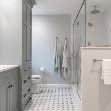
This bathroom needed help as it was tired, dated and cramped! The vanity area was open to the master bedroom and sandwiched between a closet and existing bathroom wall. Behind the bathroom wall, was a second sink, a small walk-in shower and the commode. A poorly placed linen closet ate into the area and there was a soffit over the shower adding to the cramped feeling. The ceiling was cluttered with old-school heating lamps, flush-mount fixtures and ventilation grills. The “movie star” lighting meant to add some glamour only made the bathroom feel dated and sad. Our clients wanted to bring this bathroom to life.
We built a wall and added a door between the bedroom and bathroom to ensure more privacy and define the space. In addition, we removed the wall separating the actual bathroom and vanity area to make the master bathroom larger. The linen closet was also taken out so the shower could be expanded significantly. Our homeowner had recently suffered a knee injury so they were looking for future solutions that would work for them as they continued to age. We made the shower large enough to include a bench and installed a handheld sprayer located near the seat. Shower walls were reinforced so that when the day came that a grab bar was needed, they would be ready.
We added a tall cabinet that featured two, deep rollouts and interior shelving to keep linens and bathroom supplies organized. Beneath the sinks, we included rollout drawers so items would not get lost in those dark areas under the plumbing. Everything that had been cluttering the ceiling was removed including the shower soffit and heat lamp. With those gone, we added evenly-spaced, recessed ceiling lights to help brighten the space making it safer and more practical.
We chose a custom blue-green paint for the cabinets which was understated enough to provide a sense of serenity while still offering a splash of color to help liven up the room. Walnut-framed mirrors added a touch of warmth and the patterned floor tile made the whole room fun! An old bathroom came alive!
Sponsored
Columbus, OH

Wannemacher Interiors
Customized Award-Winning Interior Design Solutions in Franklin Cnty OH
 Jarrett Design
This bathroom needed help as it was tired, dated and cramped! The vanity area was open to the master bedroom and sandwiched between a closet and existing bathroom wall. Behind the bathroom wall, was a second sink, a small walk-in shower and the commode. A poorly placed linen closet ate into the area and there was a soffit over the shower adding to the cramped feeling. The ceiling was cluttered with old-school heating lamps, flush-mount fixtures and ventilation grills. The “movie star” lighting meant to add some glamour only made the bathroom feel dated and sad. Our clients wanted to bring this bathroom to life.
We built a wall and added a door between the bedroom and bathroom to ensure more privacy and define the space. In addition, we removed the wall separating the actual bathroom and vanity area to make the master bathroom larger. The linen closet was also taken out so the shower could be expanded significantly. Our homeowner had recently suffered a knee injury so they were looking for future solutions that would work for them as they continued to age. We made the shower large enough to include a bench and installed a handheld sprayer located near the seat. Shower walls were reinforced so that when the day came that a grab bar was needed, they would be ready.
We added a tall cabinet that featured two, deep rollouts and interior shelving to keep linens and bathroom supplies organized. Beneath the sinks, we included rollout drawers so items would not get lost in those dark areas under the plumbing. Everything that had been cluttering the ceiling was removed including the shower soffit and heat lamp. With those gone, we added evenly-spaced, recessed ceiling lights to help brighten the space making it safer and more practical.
We chose a custom blue-green paint for the cabinets which was understated enough to provide a sense of serenity while still offering a splash of color to help liven up the room. Walnut-framed mirrors added a touch of warmth and the patterned floor tile made the whole room fun! An old bathroom came alive!
 RAJ Kitchen and Bath, LLC
**Check out the video of this transformation on our website**
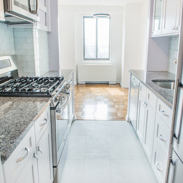
This small kitchen was way too small for this 2 bedrooms, 2 bathrooms apartment. Not only was it a very small kitchen, but the physical location of it made it very difficult to make it any bigger. There wasn't much that could have been done without incurring astronomical cost, which would get little or no return on the investment. The client wanted a kitchen that can be optimized in its current location to add a ton of value for resale.
This was difficult to do, because there was no moving of any mechanical around in the kitchen and even if we wanted to, the management of the building would not allow. For those of you who live in condos, co-ops or apartment building, you know how difficult it is to rework these foot prints. When we showed up, we saw the problems, but we also saw a huge opportunity where we can achieve those goals in the small space. This was accomplished by making some key changes and to incorporate some new things that was not possible when this kitchen was built years ago.
The crucial part of the design that would drive the entire new layout, was selecting the only appliance; that was the Refrigerator. Once we nailed down that refrigerator, we then proceeded to design the kitchen around it. We moved it to the other side of the wall where the sink was so that we can tap into the water line from the sink plumbing. It was crucial that it stays exactly 24" deep, not an inch more because we had to keep the entry as open as possible. Also, it was going to be directly in front of another big storage unit - The pantry. It is not ideal in most cases, but we needed the rest of the space to ramp up the design and open feel towards the side where all of the activities would take place, which happend to be the dining room and the view.
Once all that was figured out, we re-positioned the sink, dishwasher and the range and proceeded to wrap the cabinets around the columns to integrate them into the space. Thirty- six inches cabinets height was used so that they can be installed higher towards the ceiling height to give more room rather than the standard 18" required height between the counter tops. This was done to make the room feel a lot bigger than it really was. Not to mention, we also didn't want the faucet to be buried under the cabinets so that was also a necessary design detail for the space.
We then lowered both knee walls so that the counter top can sit on top of them, by removing that stop point that would have otherwise defined the kitchen area. This allowed us to pick up that extra footprint into the room for added prep space and enabled us to create the illusion of a kitchen that is looking longer than it really is. Every inch mattered when designing this kitchen and we made a conscious decision to use every one of that inch.
White cabinets were selected to do just what white cabinets are design to do; make a small or dark room appear bigger, brighter and more open. In this kitchen, this was amplified the more because of the kitchen location. It was perfect! We knew we did justice to the space because while we were there taking some photos, a few potential buyers walked in and went straight for the kitchen! They said its design just to fit the apartment.
Pantry roll out shelving, Double recycle bin, fancy handles, LED lighting, Quartz counter top, beautiful backslash tiles and grey linen floors finished off the kitchen which looked over a beautiful view of the George Washington Bridge from the top of this lovely 4th floor apartment.
Credit to Masterpiece Tile and Marble (Annmarie on the selection of Tiles and countertop and Val on the Construction to complete this project).
Davor Kokic Photography
 J.P. Hoffman Design Build
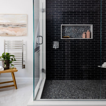
By relocating the narrow linen closet to the sitting room outside the bathroom, we expanded the shower and embraced the blue inspiration our client desired, using deep blue 2×8 glass shower wall tiles and a glass mosaic penny round tile on the shower floor and in the shower niche. On the opposite side of the spacious area, a knee wall was added to offer separation between the toilet and vanity. Framing the vanity is a stunning statement wallpaper, adding a vibrant pop of pattern.
Beyond aesthetics, this remodel expertly balances luxury and functionality, harmonizing contemporary fixtures and ambient lighting. This luxurious Primary Bathroom remodel redefines comfort and sophistication within a serene space, marking a remarkable journey from the mundane to the magnificent.
5