
Search results for "Lacking" in Home Design Ideas
 Sosna Inc
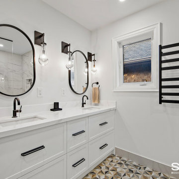
Our clients approached us to renovate their home, as it was lacking function for their family’s changing needs. They were facing issues with insufficient storage, and underutilised areas.
The entry was cramped, which was especially noticeable when several people were coming in, or when carrying in groceries. The Shared Bathroom was too small, and lacked enough room for their teenage children to store their individual belongings. Additionally, since both clients work from home, a dedicated office space was essential.
On the Main Floor, we relocated the closet at the entry, making the entrance more spacious, and the Powder Room was given an update and new fixtures.
The wall between the Kitchen and Dining Room was removed, which opened up the Main Floor. Half of the space this created was used to create a much larger Kitchen with ample gathering space for our client’s large family. The new custom Kitchen boasts plenty of dark cabinetry with wood accents, and is complimented by a beautiful quartz countertop and matching black fixtures.
The other half of the newly created space was transformed into a quiet, functional home office. In the new office, a wall of built-in cabinetry offers useful storage for both work and hobby items, creating the perfect space for both work and crafting.
On the Second Floor, we expanded the Shared Bathroom by using space from the Guest Bedroom closet and the Second Floor Office. We replaced the bathtub shower combo with a spacious grand shower and added a large vanity and makeup area, giving each teenager their own dedicated personal storage space.
In the Master Ensuite, we altered the entryway location, allowing for a redesigned layout that includes a large vanity and double sink, enhancing both functionality and storage.
Our clients expressed their happiness with the renovation process with Sosna, specifically how clean the construction area was kept, and how respectful the Sosna team was of their home and neighbours. They were pleased that all deadlines were met, and the project was completed on time, and looked even better than they had dreamed.
Sosna Inc
416-888-7366 ext 1
email: contact@sosna.ca
website: sosna.ca
 TKS Design Group
Download our free ebook, Creating the Ideal Kitchen. DOWNLOAD NOW
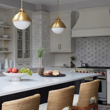
For many, extra time at home during COVID left them wanting more from their homes. Whether you realized the shortcomings of your space or simply wanted to combat boredom, a well-designed and functional home was no longer a want, it became a need. Tina found herself wanting more from her Old Irving Park home and reached out to The Kitchen Studio about adding function to her kitchen to make the most of the available real estate.
At the end of the day, there is nothing better than returning home to a bright and happy space you love. And this kitchen wasn’t that for Tina. Dark and dated, with a palette from the past and features that didn’t make the most of the available square footage, this remodel required vision and a fresh approach to the space. Lead designer, Stephanie Cole’s main design goal was better flow, while adding greater functionality with organized storage, accessible open shelving, and an overall sense of cohesion with the adjoining family room.
The original kitchen featured a large pizza oven, which was rarely used, yet its footprint limited storage space. The nearby pantry had become a catch-all, lacking the organization needed in the home. The initial plan was to keep the pizza oven, but eventually Tina realized she preferred the design possibilities that came from removing this cumbersome feature, with the goal of adding function throughout the upgraded and elevated space. Eliminating the pantry added square footage and length to the kitchen for greater function and more storage. This redesigned space reflects how she lives and uses her home, as well as her love for entertaining.
The kitchen features a classic, clean, and timeless palette. White cabinetry, with brass and bronze finishes, contrasts with rich wood flooring, and lets the large, deep blue island in Woodland’s custom color Harbor – a neutral, yet statement color – draw your eye.
The kitchen was the main priority. In addition to updating and elevating this space, Tina wanted to maximize what her home had to offer. From moving the location of the patio door and eliminating a window to removing an existing closet in the mudroom and the cluttered pantry, the kitchen footprint grew. Once the floorplan was set, it was time to bring cohesion to her home, creating connection between the kitchen and surrounding spaces.
The color palette carries into the mudroom, where we added beautiful new cabinetry, practical bench seating, and accessible hooks, perfect for guests and everyday living. The nearby bar continues the aesthetic, with stunning Carrara marble subway tile, hints of brass and bronze, and a design that further captures the vibe of the kitchen.
Every home has its unique design challenges. But with a fresh perspective and a bit of creativity, there is always a way to give the client exactly what they want [and need]. In this particular kitchen, the existing soffits and high slanted ceilings added a layer of complexity to the lighting layout and upper perimeter cabinets.
While a space needs to look good, it also needs to function well. This meant making the most of the height of the room and accounting for the varied ceiling features, while also giving Tina everything she wanted and more. Pendants and task lighting paired with an abundance of natural light amplify the bright aesthetic. The cabinetry layout and design compliments the soffits with subtle profile details that bring everything together. The tile selections add visual interest, drawing the eye to the focal area above the range. Glass-doored cabinets further customize the space and give the illusion of even more height within the room.
While her family may be grown and out of the house, Tina was focused on adding function without sacrificing a stunning aesthetic and dreamy finishes that make the kitchen the gathering place of any home. It was time to love her kitchen again, and if you’re wondering what she loves most, it’s the niche with glass door cabinetry and open shelving for display paired with the marble mosaic backsplash over the range and complimenting hood. Each of these features is a stunning point of interest within the kitchen – both brag-worthy additions to a perimeter layout that previously felt limited and lacking.
Whether your remodel is the result of special needs in your home or simply the excitement of focusing your energy on creating a fun new aesthetic, we are here for it. We love a good challenge because there is always a way to make a space better – adding function and beauty simultaneously.
 TVL Creative Ltd.
This project was such an incredible design opportunity, and instilled inspiration and excitement at every turn! Our amazing clients came to us with the challenge of converting their beloved family home into a welcoming haven for all members of the family. At the time that we met our clients, they were struggling with the difficult personal decision of the fate of the home. Their father/father-in-law had passed away and their mother/mother-in-law had recently been admitted into a nursing facility and was fighting Alzheimer’s. Resistant to loss of the home now that both parents were out of it, our clients purchased the home to keep in in the family. Despite their permanent home currently being in New Jersey, these clients dedicated themselves to keeping and revitalizing the house. We were moved by the story and became immediately passionate about bringing this dream to life.
The home was built by the parents of our clients and was only ever owned by them, making this a truly special space to the family. Our goal was to revitalize the home and to bring new energy into every room without losing the special characteristics that were original to the home when it was built. In this way, we were able to develop a house that maintains its own unique personality while offering a space of welcoming neutrality for all members of the family to enjoy over time.
The renovation touched every part of the home: the exterior, foyer, kitchen, living room, sun room, garage, six bedrooms, three bathrooms, the laundry room, and everything in between. The focus was to develop a style that carried consistently from space to space, but allowed for unique expression in the small details in every room.
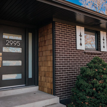
Starting at the entry, we renovated the front door and entry point to offer more presence and to bring more of the mid-century vibe to the home’s exterior. We integrated a new modern front door, cedar shingle accents, new exterior paint, and gorgeous contemporary house numbers that really allow the home to stand out. Just inside the entry, we renovated the foyer to create a playful entry point worthy of attention. Cement look tile adorns the foyer floor, and we’ve added new lighting and upgraded the entry coat storage.
Upon entering the home, one will immediately be captivated by the stunning kitchen just off the entry. We transformed this space in just about every way. While the footprint of the home ultimately remained almost identical, the aesthetics were completely turned on their head. We re-worked the kitchen to maximize storage and to create an informal dining area that is great for casual hosting or morning coffee.
We removed the entry to the garage that was once in the informal dining, and created a peninsula in its place that offers a unique division between the kitchen/informal dining and the formal dining and living areas. The simple light warm light gray cabinetry offers a bit of traditional elegance, along with the marble backsplash and quartz countertops. We extended the original wood flooring into the kitchen and stained all floors to match for a warmth that truly resonates through all spaces. We upgraded appliances, added lighting everywhere, and finished the space with some gorgeous mid century furniture pieces.
In the formal dining and living room, we really focused on maintaining the original marble fireplace as a focal point. We cleaned the marble, repaired the mortar, and refinished the original fireplace screen to give a new sleek look in black. We then integrated a new gas insert for modern heating and painted the upper portion in a rich navy blue; an accent that is carried through the home consistently as a nod to our client’s love of the color.
The former entry into the old covered porch is now an elegant glass door leading to a stunning finished sunroom. This room was completely upgraded as well. We wrapped the entire space in cozy white shiplap to keep a casual feel with brightness. We tiled the floor with large format concrete look tile, and painted the old brick fireplace a bright white. We installed a new gas burning unit, and integrated transitional style lighting to bring warmth and elegance into the space. The new black-frame windows are adorned with decorative shades that feature hand-sketched bird prints, and we’ve created a dedicated garden-ware “nook” for our client who loves to work in the yard. The far end of this space is completed with two oversized chaise loungers and overhead lights…the most perfect little reading nook!
Just off the dining room, we created an entirely new space to the home: a mudroom. The clients lacked this space and desperately needed a landing spot upon entering the home from the garage. We uniquely planned existing space in the garage to utilize for this purpose, and were able to create a small but functional entry point without losing the ability to park cars in the garage. This new space features cement-look tile, gorgeous deep brown cabinetry, and plenty of storage for all the small items one might need to store while moving in and out of the home.
The remainder of the upstairs level includes massive renovations to the guest hall bathroom and guest bedroom, upstairs master bed/bath suite, and a third bedroom that we converted into a home office for the client.
Some of the largest transformations were made in the basement, where unfinished space and lack of light were converted into gloriously lit, cozy, finished spaces. Our first task was to convert the massive basement living room into the new master bedroom for our clients. We removed existing built-ins, created an entirely new walk-in closet, painted the old brick fireplace, installed a new gas unit, added carpet, introduced new lighting, replaced windows, and upgraded every part of the aesthetic appearance. One of the most incredible features of this space is the custom double sliding barn door made by a Denver artisan. This space is truly a retreat for our clients!
We also completely transformed the laundry room, back storage room, basement master bathroom, and two bedrooms.
This home’s massive scope and ever-evolving challenges were thrilling and exciting to work with, and the result is absolutely amazing. At the end of the day, this home offers a look and feel that the clients love. Above all, though, the clients feel the spirit of their family home and have a welcoming environment for all members of the family to enjoy for years to come.
Find the right local pro for your project
 Well Arranged Home
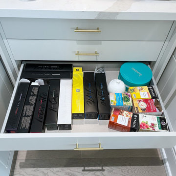
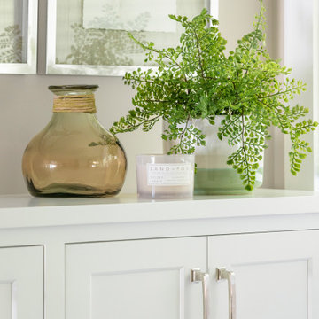
This coffee station lacked organization, with tea and coffee pods crammed into a single drawer. Without any dividers, finding the right item was a hassle, and the lack of visual appeal diminished the overall aesthetic of the space.
 Olamar Interiors
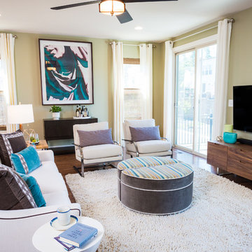
The clients are a younger couple with no pets or children. They asked me to help them with the Great Room in their brand new townhouse. The space is open concept with 9-foot ceilings. When the clients moved in they had very little furniture and the walls were white and bare. The husband had his eye on a very large original work of art that he wanted to purchase and incorporate into the design. They love to cook and entertain. They asked for a tranquil, neutral space with some color accents, comfortable and flexible seating, a wall-mounted TV with some storage for media equipment, and a bar. The room has several large windows and two sets of sliding glass doors so there is a lot of natural light, which the clients didn’t want to block, but also a lack of privacy. The couple also requested lighting over the kitchen island and some counter stools.
I was challenged by the lack of architectural detail in the room and a tight budget. I decided to choose furniture and accessories with classic modern lines so they would last for a long time. To offset all of the straight lines and neutral colors of the main furniture pieces, and to add visual interest, I introduced organic elements, texture and movement. I did this with wallpaper on the fireplace wall and on the kitchen island (in the case of the island, I railroaded the paper for some interest), a textured rug, some greenery, rough wood on the pedestals next to the fireplace, window shades in natural woven wood, and accessories (particularly two ceramic vases) in interesting shapes. I used the husband’s art piece as the starting point for the color scheme and overall design. I added balance and harmony by adding a large art piece and large pedestals across the room from the large art piece and carrying the teal color across the room in the sofa cushion and ottoman fabrics, art above the mantel and a vase in the niche next to the fireplace. I chose large green glass pendant lights for the kitchen to add color and to match the scale of the room.
One major challenge was that the clients wanted ottomans so they could put their feet up while watching TV. I couldn’t accommodate ottomans and a coffee table, so I opted just to have one large ottoman and added casters so it could be moved closer to the sofa; however, the husband is very tall and the wife is very petite so they wanted separate ottomans to accommodate their different leg lengths. My solution was to design an ottoman that provides maximum flexibility: the two pieces can be joined and a tray added to make it a coffee table, or pulled apart and used either as party seating or individual ottomans for the homeowners. They were thrilled with the solution.
Photographer:
Jon W. Miller
 Amy Pearson Design
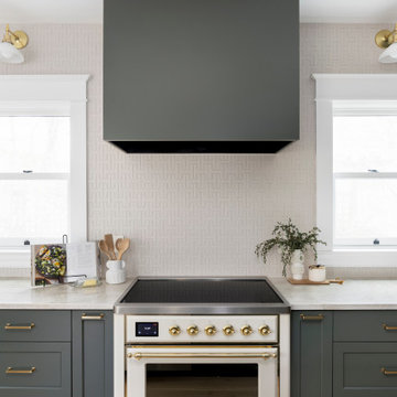
A classic Portland foursquare, lovingly owned by an active and lively family of four, had undergone some unfortunate previous renovations that were in desperate need of updating. A cramped kitchen layout, lacking countertop work space, non-functional appliance locations (the range was floating on it’s own!), cramped kitchen nook not large enough for eat-in space and therefor left underutilized, and a general lack of storage all needed to be addressed.
To increase functional space, we enclosed a small back porch and re-built the adjacent nook, folding in the square footage to create an expansive kitchen footprint. We relocated the back door and added a back deck while creating space for a mud bench for littles to tuck away their gear! The enlarged kitchen now boasts a extensive natural light thanks to the addition of several windows.
An easy work flow was created within the new kitchen layout featuring an in-island sink with range and hood flanked by matching windows. Custom cabinet accessories make storage a breeze and provide a space for all the necessities to be right at the homeowner’s fingertips. The eat-in kitchen space allows not only for lingering family chats, but homework and craft projects to be done while dinner simmers on the stove. This kitchen truly is the heart of this home!
All of the updates were completed with the home’s original foursquare architecture in mind. with a focus on classic architectural molding styles, traditional window details, and clean-lined classic fixtures. Youthfulness and modernity are infused into the space with the contemporary handmade tile backsplash, rich and timeless green cabinets, and artistic wallpaper with a whimsical floral print and subtle European nod. The custom range in cream and brass is a stunning showstopper and a testament that even the most functional of elements in a kitchen can still be beautiful! Which one is the star of the show? How do we pick just one?!
 Designel
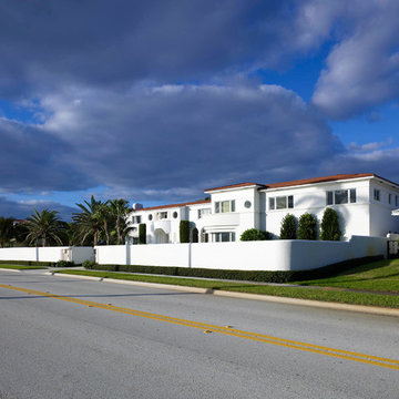
The existing two story residence was built in 1937 and has a footprint of approximately 2,850 sq. ft. While much of the plan at both levels remained in its original “formal” layout with spacious rooms, the home did not meet the current day needs for this modern family. The lack of an “informal” family-room, no space to accommodate overnight guests, only a small powder room tucked under the main stair at the ground floor, and barely enough room for one car in the garage, not to mention the lack of storage space were the problems to solve.
After investigating numerous options the decision was made to introduce a new two story addition with maid’s quarters, a new laundry room, and a three car garage with plenty of additional storage space at the first floor, and a two bedroom guest suite with a kitchenette and living quarters at the second floor. Together with a small addition, this move delivered over 600 sq. ft in the main structure for a new family room with game tables and a full bathroom for guests which also serves as a cabana for the pool area.
The design of the additions, including the introduction of new fenestration to capitalize on daylight and views was sensitive to the original architecture and unanimously approved by the Historic Preservation Board of West Palm Beach.
 Bianca Fathauer
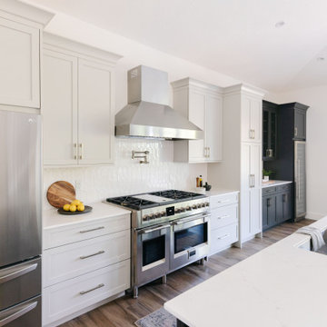
We were more than thrilled when our Wisper Bay clients came to us looking to continue the remodel process in the downstairs area of their Palm City home. We had just finished their upstairs master bathroom and were officially in love with the design as well as our working relationship with this lovely couple. To have them trust us to now take on an even larger project, double the size of the first, was such a huge nod of confidence and we could not have been happier to oblige.
The downstairs had great space but lacked the personality and warmth the clients wanted. It felt dark, lacking natural light and did not reflect their taste or match the look of what we had just completed upstairs. The goal was to continue the flow that was created upstairs and making the entire home feel uniform and continuous.
We added a 12’ set of French doors, new waterproof vinyl flooring, removed the many walls enclosing the existing kitchen, and reconfigured the space to make more sense. We went with a two tone look featuring all new Dura Supreme cabinets, replaced all the appliances to include a Fulgor Milano gas range making the kitchen a true chefs dream. We also added a huge island with quartz countertops, making entertaining and cleaning a breeze.
 Che Bella Interiors Design + Remodeling
Bathroom remodel by Che Bella Interiors, serving the Minneapolis & St. Paul area - Our client had recently purchased a coveted lakefront home on the spectacular shoreline of Crystal Lake. While the location and breathtaking views were picture-perfect, the interior was ripe for a transformation and provided an inspiring canvas for a remodel.
The scope of this 2020 project included the master bathroom and bedroom, which featured dated finishes, cramped spaces, and a lack of privacy. A wish list included removing the oversized tub, more bathroom storage, a modern color palette, texture, and enhancing privacy to transform their master retreat into the space of their dreams.
Through creative space planning and artful design, we created a swoon-worthy master retreat featuring a soothing, inviting, romantic vibe – a perfect pairing with the home’s lakefront setting. Within the bathroom, the challenge was to make the space as functional as possible, something it previously lacked. We extended the shower walls to add more privacy and leveraged a newly discovered wall cavity to create a bench seat. Added storage was found by creating built-in linen cabinets and hidden medicine cabinets in the vanity mirrors. Meanwhile, a selection of hexagon-shaped porcelain floor tile and a blue accent tile in the shower make a timeless and subtle statement, reflecting the tranquility of the suite as a whole. A beautiful mix of form and function, along with classic, high-end touches that make this gem sparkle.
Visit www.chebellainteriors.com to learn about the entire scope of this project and see more examples of our work.
 Almesedoors
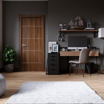
THE DOOR NAME ORIGIN - "ALLUMINIO ELIVIA VERTICAL WOOD GRAIN 4HS"
Of all the interior door models in the Elivia collection, this one is perhaps the most unapologetically elegant. Why? Hmm … That which is self-evident can be the most difficult to explain. Is it because it is built using the latest breakthroughs in interior door making technology? Look at the finish: the process of applying it utilizes something called “stretching” by professionals, which is to say that instead of simply slapping the finish on top of the interior door’s surface, our company fuses (for lack of a better word) the materials (on molecular level, no less), the result being that the finished product is more warp-resistant, scratch-resistant, and fade-proof than any interior door put together in the past. This is especially important in climates known for their high humidity levels. Yes, but this has more to do with engineering than aesthetics, right? Okay, so, is this interior door super-elegant because ... Show more!
FINISH: WALNUT
When it comes to interior door finishes, walnut may not be king per se, since “different folk have different views,” as the poet said, and it behooves a proper collection of finishes to be thoroughly democratic; but, but … you could view walnut as an important majority leader descended from royalty – like, say, Louis Napoleon back when he was still an elected official and not, as he eventually came to style himself, Napoleon III.
Strictly speaking, a walnut is the seed of a drupaceous nut, and not a true nut in the botanical sense. It is native to Persia (walnut oil is a staple in Iranian cuisine to this day) and North America, even though approximately one half of the world’s production today is done in China.
That said, one of its more historically curious uses would be the production of ink and dyes. Those are made, or used to be made, at least, from the husk surrounding the nut. The ink could be used to produce drawings – or darken paper to make it look older. It has (as it turned out by the by) excellent archival properties. It was used liberally by many capable and honest artists in the past.
A keen observer of the human condition, a Florentine named Leonardo da Vinci never left his house (which featured some pretty interesting interior doors, but that’s a story for another day) … never left it without a vial – and a sketch book.
As he took leisurely strolls around the streets and piazzas, he observed folks – socializing, arguing, fighting, striking bargains, and gossiping. Let us mention in passing – and this is merely an opinion, mind you – that his sketches seem to be a great deal livelier than his portraits, which for the most part adhere to the epoch’s somewhat mawkish standards and the algebraic, rather than harmonious, approach to depicting humans. The perpetual beguiling mystery of Mona Lisa’s smile is undoubtedly magnificent, but it is the Tuscan polymath’s quick yet amazingly insightful drawings that give us an idea – oftentimes a very comprehensive one – of what everyday life was truly like in Florence in the Sixteenth Century. An old man gloating at someone’s misfortune, two passionate merchants arguing over the price of some highly important delivery, a young woman lamenting the lack of decent men whom a reasonable person could view as husband material, and on and on – it’s all there in Leonardo’s sketches characterized by masterful lines and elegant shading despite the obvious – and necessary – impetuosity of each sketch. So precious and brilliant are those casual masterpieces that, had the scientifically inclined fellow eliminated the need for outdoor sketching by inventing photography, it would have been an historian’s immeasurable gain, certainly, but also an art lover’s great loss.
The idea behind our Walnut Finish is to invoke in the interior door owner a feeling of timeless historicity. Some things change, but others are forever. Stability is an important quality in an interior door, is it not?
Rembrandt van Rijn, who also used walnut ink extensively, was a studio artist, with only a few outdoor paintings in his legacy. Truth be told, he was a better draftsman than Leonardo, at least as far as technique goes (don’t let this get around). Well. He lived a century later and had the benefit of all the development art had undergone since the great Italian master. Just like these interior doors – your interior doors – are a huge improvement on anything that was available only twenty years ago, never mind a hundred years ago.
The “oscillation” of Rembrandt’s line, the delightful shift from the descriptive to the aesthetic stroke, makes his production in that category quite unique. Upon reaching artistic maturity, the stubborn Dutch master began to shun the unbroken contour line, which caused a lot of trouble for his drawings a century later, when dealers and collectors who wished to “update” his sketches to fit the current fashion had the audacity to “complete” Rembrandt’s pen-and-inks. Fortunately, some of the sketches escaped this sorry fate and have been preserved in their original glorious state to this day. Rembrandt’s mastery is yet another thing this interior door finish might remind you of each time you look at your doors.
 Drury Design
THE SETUP
When we first encountered this basement for a family with three boys, we saw a space with untapped potential. Though previously remodeled, it lacked a cohesive design strategy. The expansive area housed various entertainment pieces (a shuffleboard table, air hockey, foosball, etc.) scattered haphazardly throughout the space.
While the basement included a workout room and a rudimentary kitchen area, it lacked a dedicated game room or proper bar. Excessive storage closets along the back wall consumed valuable real estate that could be repurposed for more engaging uses.
In essence, the basement was spacious but disjointed—functional for family use but falling short as an entertainment hub. It didn’t align with the sophistication of the rest of the home. Our clients envisioned a transformation: a fresh, organized space that would not only serve their family’s needs but also shine as an inviting arena for entertaining friends and hosting gatherings – especially sports-focused gatherings!
Design Objectives:
Reimagine the basement layout, creating distinct zones for varied activities.
Expand the workout area to accommodate new equipment, including a Smith machine.
Implement a multi-screen setup inspired by high-end sports bars, allowing guests to follow multiple games while socializing.
Enhance existing features while developing new areas:
Optimize a workout space for all equipment needs
Establish a dedicated children’s space with guest room capabilities
Create an integrated bar and entertainment area
Retain and incorporate the existing projector setup
Design Challenges:
Navigate layout constraints in the new workout room due to fixed utility areas.
Carve out a distinct space for kids within the open plan.
Revitalize an underutilized section of the basement.
Elevate the existing big screen area with purposeful design elements.
Develop a full-fledged bar area while maintaining kitchen functions applicable for hangout snacking.
Work around immovable structural elements (soffits, load-bearing support columns)
THE RENEWED SPACE
Design Solutions:
Install a stylish barn door for the utility area of the new workout space, improving aesthetics and accessibility.
Repurpose the former workout room into a dedicated game room for kids, utilizing couches with pull-out beds so the area can double as overflow guest accommodations.
Transform the unused area into a vibrant pub-style area for card and table games.
Enhance the big screen area with elegant wainscoting and ambient theatre-style lighting.
Design a multi-functional wet bar area featuring varied seating, prep areas, and a microwave.
Base the bar sink area width off the soffit above it.
In the big screen area, use the soffit to inform the width of a wainscoting section.
For the immovable support columns, dress one up to match the wainscoting of the nearby big screen wall. Hide the other one in a new wall.
Final Thoughts:
The reimagined basement has exceeded our clients’ expectations, evolving into the ultimate entertainment hub. With seven strategically placed screens, it’s perfect for gatherings focused on major sporting events and casual gatherings, as well. The space strikes a balance between adult sophistication and family-friendly functionality, featuring distinct zones for various activities.
The new design not only maximizes functionality for modern, multi-screen entertainment but also elevates the aesthetic appeal. It integrates flawlessly with the rest of the home’s transitional style while allowing each basement section to maintain its unique character. The result is a versatile space that caters to both intimate family time and large-scale entertaining.
 TVL Creative Ltd.
This project was such an incredible design opportunity, and instilled inspiration and excitement at every turn! Our amazing clients came to us with the challenge of converting their beloved family home into a welcoming haven for all members of the family. At the time that we met our clients, they were struggling with the difficult personal decision of the fate of the home. Their father/father-in-law had passed away and their mother/mother-in-law had recently been admitted into a nursing facility and was fighting Alzheimer’s. Resistant to loss of the home now that both parents were out of it, our clients purchased the home to keep in in the family. Despite their permanent home currently being in New Jersey, these clients dedicated themselves to keeping and revitalizing the house. We were moved by the story and became immediately passionate about bringing this dream to life.
The home was built by the parents of our clients and was only ever owned by them, making this a truly special space to the family. Our goal was to revitalize the home and to bring new energy into every room without losing the special characteristics that were original to the home when it was built. In this way, we were able to develop a house that maintains its own unique personality while offering a space of welcoming neutrality for all members of the family to enjoy over time.
The renovation touched every part of the home: the exterior, foyer, kitchen, living room, sun room, garage, six bedrooms, three bathrooms, the laundry room, and everything in between. The focus was to develop a style that carried consistently from space to space, but allowed for unique expression in the small details in every room.
Starting at the entry, we renovated the front door and entry point to offer more presence and to bring more of the mid-century vibe to the home’s exterior. We integrated a new modern front door, cedar shingle accents, new exterior paint, and gorgeous contemporary house numbers that really allow the home to stand out. Just inside the entry, we renovated the foyer to create a playful entry point worthy of attention. Cement look tile adorns the foyer floor, and we’ve added new lighting and upgraded the entry coat storage.
Upon entering the home, one will immediately be captivated by the stunning kitchen just off the entry. We transformed this space in just about every way. While the footprint of the home ultimately remained almost identical, the aesthetics were completely turned on their head. We re-worked the kitchen to maximize storage and to create an informal dining area that is great for casual hosting or morning coffee.
We removed the entry to the garage that was once in the informal dining, and created a peninsula in its place that offers a unique division between the kitchen/informal dining and the formal dining and living areas. The simple light warm light gray cabinetry offers a bit of traditional elegance, along with the marble backsplash and quartz countertops. We extended the original wood flooring into the kitchen and stained all floors to match for a warmth that truly resonates through all spaces. We upgraded appliances, added lighting everywhere, and finished the space with some gorgeous mid century furniture pieces.
In the formal dining and living room, we really focused on maintaining the original marble fireplace as a focal point. We cleaned the marble, repaired the mortar, and refinished the original fireplace screen to give a new sleek look in black. We then integrated a new gas insert for modern heating and painted the upper portion in a rich navy blue; an accent that is carried through the home consistently as a nod to our client’s love of the color.
The former entry into the old covered porch is now an elegant glass door leading to a stunning finished sunroom. This room was completely upgraded as well. We wrapped the entire space in cozy white shiplap to keep a casual feel with brightness. We tiled the floor with large format concrete look tile, and painted the old brick fireplace a bright white. We installed a new gas burning unit, and integrated transitional style lighting to bring warmth and elegance into the space. The new black-frame windows are adorned with decorative shades that feature hand-sketched bird prints, and we’ve created a dedicated garden-ware “nook” for our client who loves to work in the yard. The far end of this space is completed with two oversized chaise loungers and overhead lights…the most perfect little reading nook!
Just off the dining room, we created an entirely new space to the home: a mudroom. The clients lacked this space and desperately needed a landing spot upon entering the home from the garage. We uniquely planned existing space in the garage to utilize for this purpose, and were able to create a small but functional entry point without losing the ability to park cars in the garage. This new space features cement-look tile, gorgeous deep brown cabinetry, and plenty of storage for all the small items one might need to store while moving in and out of the home.
The remainder of the upstairs level includes massive renovations to the guest hall bathroom and guest bedroom, upstairs master bed/bath suite, and a third bedroom that we converted into a home office for the client.
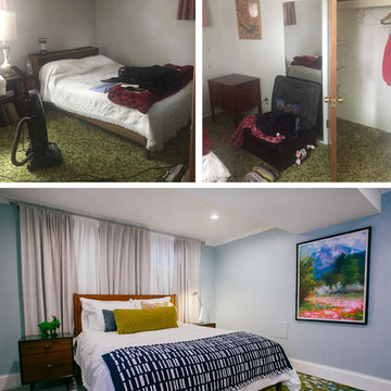
Some of the largest transformations were made in the basement, where unfinished space and lack of light were converted into gloriously lit, cozy, finished spaces. Our first task was to convert the massive basement living room into the new master bedroom for our clients. We removed existing built-ins, created an entirely new walk-in closet, painted the old brick fireplace, installed a new gas unit, added carpet, introduced new lighting, replaced windows, and upgraded every part of the aesthetic appearance. One of the most incredible features of this space is the custom double sliding barn door made by a Denver artisan. This space is truly a retreat for our clients!
We also completely transformed the laundry room, back storage room, basement master bathroom, and two bedrooms.
This home’s massive scope and ever-evolving challenges were thrilling and exciting to work with, and the result is absolutely amazing. At the end of the day, this home offers a look and feel that the clients love. Above all, though, the clients feel the spirit of their family home and have a welcoming environment for all members of the family to enjoy for years to come.
 Castle Building & Remodeling
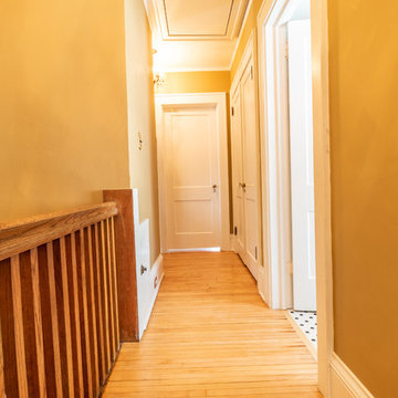
This family and had been living in their 1917 Tangletown neighborhood, Minneapolis home for over two years and it wasn’t meeting their needs.
The lack of AC in the bathroom was an issue, the bathtub leaked frequently, and their lack of a shower made it difficult for them to use the space well. After researching Design/Build firms, they came to Castle on the recommendations from others.
Wanting a clean “canvas” to work with, Castle removed all the flooring, plaster walls, tiles, plumbing and electrical fixtures. We replaced the existing window with a beautiful Marvin Integrity window with privacy glass to match the rest of the home.
A bath fan was added as well as a much smaller radiator. Castle installed a new cast iron bathtub, tub filler, hand shower, new custom vanity from the Woodshop of Avon with Cambria Weybourne countertop and a recessed medicine cabinet. Wall sconces from Creative lighting add personality to the space.
The entire space feels charming with all new traditional black and white hexagon floor tile, tiled shower niche, white subway tile bath tub surround, tile wainscoting and custom shelves above the toilet.
Just outside the bathroom, Castle also installed an attic access ladder in their hallway, that is not only functional, but aesthetically pleasing.
Come see this project on the 2018 Castle Educational Home Tour, September 29 – 30, 2018.
 Mythic Homes
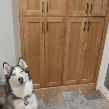
Kitchen Renovation: layout modification and aesthetic upgrades.
Cabinets: Rustic Cherry Natural
Counter tops: Golden Supreme Granite
Back splash: Rittenhouse square bisquit
Appliances: Samsung Black Stainless
This was a traditional ranch style home with a small kitchen that lacked counter top space and had a cramped dining room that blocked access to the garage and back patio. The renovation focused on creating better flow, opening up the walkways, increasing storage and was upgraded to our aesthetic taste.
The island incorporates dining seating for up to 5 while also providing storage for the Microwave, Trash/Recycling and Storage for dog food/board games. We designed a custom hood surround to fit within our limited ceiling height. This simple design added character and visual interest to a simple space plan. Full height pantry storage was added on the end of the kitchen by the patio doors, leaving just enough room before the garage door for the dog food bowls.
Electrical was upgraded for the whole space, going from 2 outlets in the kitchen to 7 has increased the usability of the space. A USB outlet was added to the end of the island so that people can charge their phones. Prior to the renovation there was a lack of lighting, we added can lights and an island pendant to increase visibility for prep.
 TVL Creative Ltd.
This project was such an incredible design opportunity, and instilled inspiration and excitement at every turn! Our amazing clients came to us with the challenge of converting their beloved family home into a welcoming haven for all members of the family. At the time that we met our clients, they were struggling with the difficult personal decision of the fate of the home. Their father/father-in-law had passed away and their mother/mother-in-law had recently been admitted into a nursing facility and was fighting Alzheimer’s. Resistant to loss of the home now that both parents were out of it, our clients purchased the home to keep in in the family. Despite their permanent home currently being in New Jersey, these clients dedicated themselves to keeping and revitalizing the house. We were moved by the story and became immediately passionate about bringing this dream to life.
The home was built by the parents of our clients and was only ever owned by them, making this a truly special space to the family. Our goal was to revitalize the home and to bring new energy into every room without losing the special characteristics that were original to the home when it was built. In this way, we were able to develop a house that maintains its own unique personality while offering a space of welcoming neutrality for all members of the family to enjoy over time.
The renovation touched every part of the home: the exterior, foyer, kitchen, living room, sun room, garage, six bedrooms, three bathrooms, the laundry room, and everything in between. The focus was to develop a style that carried consistently from space to space, but allowed for unique expression in the small details in every room.
Starting at the entry, we renovated the front door and entry point to offer more presence and to bring more of the mid-century vibe to the home’s exterior. We integrated a new modern front door, cedar shingle accents, new exterior paint, and gorgeous contemporary house numbers that really allow the home to stand out. Just inside the entry, we renovated the foyer to create a playful entry point worthy of attention. Cement look tile adorns the foyer floor, and we’ve added new lighting and upgraded the entry coat storage.
Upon entering the home, one will immediately be captivated by the stunning kitchen just off the entry. We transformed this space in just about every way. While the footprint of the home ultimately remained almost identical, the aesthetics were completely turned on their head. We re-worked the kitchen to maximize storage and to create an informal dining area that is great for casual hosting or morning coffee.
We removed the entry to the garage that was once in the informal dining, and created a peninsula in its place that offers a unique division between the kitchen/informal dining and the formal dining and living areas. The simple light warm light gray cabinetry offers a bit of traditional elegance, along with the marble backsplash and quartz countertops. We extended the original wood flooring into the kitchen and stained all floors to match for a warmth that truly resonates through all spaces. We upgraded appliances, added lighting everywhere, and finished the space with some gorgeous mid century furniture pieces.
In the formal dining and living room, we really focused on maintaining the original marble fireplace as a focal point. We cleaned the marble, repaired the mortar, and refinished the original fireplace screen to give a new sleek look in black. We then integrated a new gas insert for modern heating and painted the upper portion in a rich navy blue; an accent that is carried through the home consistently as a nod to our client’s love of the color.
The former entry into the old covered porch is now an elegant glass door leading to a stunning finished sunroom. This room was completely upgraded as well. We wrapped the entire space in cozy white shiplap to keep a casual feel with brightness. We tiled the floor with large format concrete look tile, and painted the old brick fireplace a bright white. We installed a new gas burning unit, and integrated transitional style lighting to bring warmth and elegance into the space. The new black-frame windows are adorned with decorative shades that feature hand-sketched bird prints, and we’ve created a dedicated garden-ware “nook” for our client who loves to work in the yard. The far end of this space is completed with two oversized chaise loungers and overhead lights…the most perfect little reading nook!
Just off the dining room, we created an entirely new space to the home: a mudroom. The clients lacked this space and desperately needed a landing spot upon entering the home from the garage. We uniquely planned existing space in the garage to utilize for this purpose, and were able to create a small but functional entry point without losing the ability to park cars in the garage. This new space features cement-look tile, gorgeous deep brown cabinetry, and plenty of storage for all the small items one might need to store while moving in and out of the home.
The remainder of the upstairs level includes massive renovations to the guest hall bathroom and guest bedroom, upstairs master bed/bath suite, and a third bedroom that we converted into a home office for the client.
Some of the largest transformations were made in the basement, where unfinished space and lack of light were converted into gloriously lit, cozy, finished spaces. Our first task was to convert the massive basement living room into the new master bedroom for our clients. We removed existing built-ins, created an entirely new walk-in closet, painted the old brick fireplace, installed a new gas unit, added carpet, introduced new lighting, replaced windows, and upgraded every part of the aesthetic appearance. One of the most incredible features of this space is the custom double sliding barn door made by a Denver artisan. This space is truly a retreat for our clients!
We also completely transformed the laundry room, back storage room, basement master bathroom, and two bedrooms.
This home’s massive scope and ever-evolving challenges were thrilling and exciting to work with, and the result is absolutely amazing. At the end of the day, this home offers a look and feel that the clients love. Above all, though, the clients feel the spirit of their family home and have a welcoming environment for all members of the family to enjoy for years to come.
 Amy Pearson Design
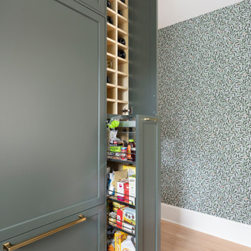
A classic Portland foursquare, lovingly owned by an active and lively family of four, had undergone some unfortunate previous renovations that were in desperate need of updating. A cramped kitchen layout, lacking countertop work space, non-functional appliance locations (the range was floating on it’s own!), cramped kitchen nook not large enough for eat-in space and therefor left underutilized, and a general lack of storage all needed to be addressed.
To increase functional space, we enclosed a small back porch and re-built the adjacent nook, folding in the square footage to create an expansive kitchen footprint. We relocated the back door and added a back deck while creating space for a mud bench for littles to tuck away their gear! The enlarged kitchen now boasts a extensive natural light thanks to the addition of several windows.
An easy work flow was created within the new kitchen layout featuring an in-island sink with range and hood flanked by matching windows. Custom cabinet accessories make storage a breeze and provide a space for all the necessities to be right at the homeowner’s fingertips. The eat-in kitchen space allows not only for lingering family chats, but homework and craft projects to be done while dinner simmers on the stove. This kitchen truly is the heart of this home!
All of the updates were completed with the home’s original foursquare architecture in mind. with a focus on classic architectural molding styles, traditional window details, and clean-lined classic fixtures. Youthfulness and modernity are infused into the space with the contemporary handmade tile backsplash, rich and timeless green cabinets, and artistic wallpaper with a whimsical floral print and subtle European nod. The custom range in cream and brass is a stunning showstopper and a testament that even the most functional of elements in a kitchen can still be beautiful! Which one is the star of the show? How do we pick just one?!
 TVL Creative Ltd.
This project was such an incredible design opportunity, and instilled inspiration and excitement at every turn! Our amazing clients came to us with the challenge of converting their beloved family home into a welcoming haven for all members of the family. At the time that we met our clients, they were struggling with the difficult personal decision of the fate of the home. Their father/father-in-law had passed away and their mother/mother-in-law had recently been admitted into a nursing facility and was fighting Alzheimer’s. Resistant to loss of the home now that both parents were out of it, our clients purchased the home to keep in in the family. Despite their permanent home currently being in New Jersey, these clients dedicated themselves to keeping and revitalizing the house. We were moved by the story and became immediately passionate about bringing this dream to life.
The home was built by the parents of our clients and was only ever owned by them, making this a truly special space to the family. Our goal was to revitalize the home and to bring new energy into every room without losing the special characteristics that were original to the home when it was built. In this way, we were able to develop a house that maintains its own unique personality while offering a space of welcoming neutrality for all members of the family to enjoy over time.
The renovation touched every part of the home: the exterior, foyer, kitchen, living room, sun room, garage, six bedrooms, three bathrooms, the laundry room, and everything in between. The focus was to develop a style that carried consistently from space to space, but allowed for unique expression in the small details in every room.
Starting at the entry, we renovated the front door and entry point to offer more presence and to bring more of the mid-century vibe to the home’s exterior. We integrated a new modern front door, cedar shingle accents, new exterior paint, and gorgeous contemporary house numbers that really allow the home to stand out. Just inside the entry, we renovated the foyer to create a playful entry point worthy of attention. Cement look tile adorns the foyer floor, and we’ve added new lighting and upgraded the entry coat storage.
Upon entering the home, one will immediately be captivated by the stunning kitchen just off the entry. We transformed this space in just about every way. While the footprint of the home ultimately remained almost identical, the aesthetics were completely turned on their head. We re-worked the kitchen to maximize storage and to create an informal dining area that is great for casual hosting or morning coffee.
We removed the entry to the garage that was once in the informal dining, and created a peninsula in its place that offers a unique division between the kitchen/informal dining and the formal dining and living areas. The simple light warm light gray cabinetry offers a bit of traditional elegance, along with the marble backsplash and quartz countertops. We extended the original wood flooring into the kitchen and stained all floors to match for a warmth that truly resonates through all spaces. We upgraded appliances, added lighting everywhere, and finished the space with some gorgeous mid century furniture pieces.
In the formal dining and living room, we really focused on maintaining the original marble fireplace as a focal point. We cleaned the marble, repaired the mortar, and refinished the original fireplace screen to give a new sleek look in black. We then integrated a new gas insert for modern heating and painted the upper portion in a rich navy blue; an accent that is carried through the home consistently as a nod to our client’s love of the color.
The former entry into the old covered porch is now an elegant glass door leading to a stunning finished sunroom. This room was completely upgraded as well. We wrapped the entire space in cozy white shiplap to keep a casual feel with brightness. We tiled the floor with large format concrete look tile, and painted the old brick fireplace a bright white. We installed a new gas burning unit, and integrated transitional style lighting to bring warmth and elegance into the space. The new black-frame windows are adorned with decorative shades that feature hand-sketched bird prints, and we’ve created a dedicated garden-ware “nook” for our client who loves to work in the yard. The far end of this space is completed with two oversized chaise loungers and overhead lights…the most perfect little reading nook!
Just off the dining room, we created an entirely new space to the home: a mudroom. The clients lacked this space and desperately needed a landing spot upon entering the home from the garage. We uniquely planned existing space in the garage to utilize for this purpose, and were able to create a small but functional entry point without losing the ability to park cars in the garage. This new space features cement-look tile, gorgeous deep brown cabinetry, and plenty of storage for all the small items one might need to store while moving in and out of the home.
The remainder of the upstairs level includes massive renovations to the guest hall bathroom and guest bedroom, upstairs master bed/bath suite, and a third bedroom that we converted into a home office for the client.
Some of the largest transformations were made in the basement, where unfinished space and lack of light were converted into gloriously lit, cozy, finished spaces. Our first task was to convert the massive basement living room into the new master bedroom for our clients. We removed existing built-ins, created an entirely new walk-in closet, painted the old brick fireplace, installed a new gas unit, added carpet, introduced new lighting, replaced windows, and upgraded every part of the aesthetic appearance. One of the most incredible features of this space is the custom double sliding barn door made by a Denver artisan. This space is truly a retreat for our clients!
We also completely transformed the laundry room, back storage room, basement master bathroom, and two bedrooms.
This home’s massive scope and ever-evolving challenges were thrilling and exciting to work with, and the result is absolutely amazing. At the end of the day, this home offers a look and feel that the clients love. Above all, though, the clients feel the spirit of their family home and have a welcoming environment for all members of the family to enjoy for years to come.
 Hillcrest Construction
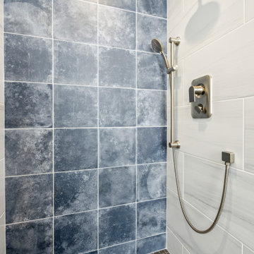
Hillcrest Construction designed and executed a complete facelift for these West Chester clients’ master bathroom. The sink/toilet/shower layout stayed relatively unchanged due to the limitations of the small space, but major changes were slated for the overall functionality and aesthetic appeal.
The bathroom was gutted completely, the wiring was updated, and minor plumbing alterations were completed for code compliance.
Bathroom waterproofing was installed utilizing the state-of-the-industry Schluter substrate products, and the feature wall of the shower is tiled with a striking blue 12x12 tile set in a stacked pattern, which is a departure of color and layout from the staggered gray-tome wall tile and floor tile.
The original bathroom lacked storage, and what little storage it had lacked practicality.
The original 1’ wide by 4’ deep “reach-in closet” was abandoned and replaced with a custom cabinetry unit that featured six 30” drawers to hold a world of personal bathroom items which could pulled out for easy access. The upper cubbie was shallower at 13” and was sized right to hold a few spare towels without the towels being lost to an unreachable area. The custom furniture-style vanity, also built and finished at the Hillcrest custom shop facilitated a clutter-free countertop with its two deep drawers, one with a u-shaped cut out for the sink plumbing. Considering the relatively small size of the bathroom, and the vanity’s proximity to the toilet, the drawer design allows for greater access to the storage area as compared to a vanity door design that would only be accessed from the front. The custom niche in the shower serves and a consolidated home for soap, shampoo bottles, and all other shower accessories.
Moen fixtures at the sink and in the shower and a Toto toilet complete the contemporary feel. The controls at the shower allow the user to easily switch between the fixed rain head, the hand shower, or both. And for a finishing touch, the client chose between a number for shower grate color and design options to complete their tailor-made sanctuary.
 Hillcrest Construction
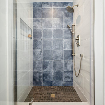
Hillcrest Construction designed and executed a complete facelift for these West Chester clients’ master bathroom. The sink/toilet/shower layout stayed relatively unchanged due to the limitations of the small space, but major changes were slated for the overall functionality and aesthetic appeal.
The bathroom was gutted completely, the wiring was updated, and minor plumbing alterations were completed for code compliance.
Bathroom waterproofing was installed utilizing the state-of-the-industry Schluter substrate products, and the feature wall of the shower is tiled with a striking blue 12x12 tile set in a stacked pattern, which is a departure of color and layout from the staggered gray-tome wall tile and floor tile.
The original bathroom lacked storage, and what little storage it had lacked practicality.
The original 1’ wide by 4’ deep “reach-in closet” was abandoned and replaced with a custom cabinetry unit that featured six 30” drawers to hold a world of personal bathroom items which could pulled out for easy access. The upper cubbie was shallower at 13” and was sized right to hold a few spare towels without the towels being lost to an unreachable area. The custom furniture-style vanity, also built and finished at the Hillcrest custom shop facilitated a clutter-free countertop with its two deep drawers, one with a u-shaped cut out for the sink plumbing. Considering the relatively small size of the bathroom, and the vanity’s proximity to the toilet, the drawer design allows for greater access to the storage area as compared to a vanity door design that would only be accessed from the front. The custom niche in the shower serves and a consolidated home for soap, shampoo bottles, and all other shower accessories.
Moen fixtures at the sink and in the shower and a Toto toilet complete the contemporary feel. The controls at the shower allow the user to easily switch between the fixed rain head, the hand shower, or both. And for a finishing touch, the client chose between a number for shower grate color and design options to complete their tailor-made sanctuary.
 Steel Roots Home Decor
Show Spaces Photography
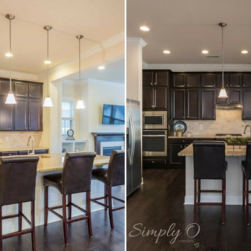
The before kitchen lacked warmth; making it appear bland and uninviting.
55