
Search results for "Leather drawer pulls" in Home Design Ideas

 Nadler Cabinet Services Inc.
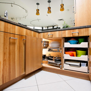
The interior of the cabinets in this kitchen were not working well for the homeowner. They wanted to keep their kitchen design and improve the functionality with convenient storage options. We added 2 garbage drawers that worked around the sink plumbing, double tiered corner cabinet pull out system and roll out drawers in other cabinets.
 Full Bloom Cottage
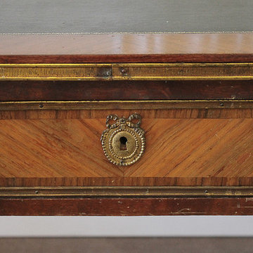
19th century wood inlay Louis XVI style leather top desk This desk has beautiful chevron style wood inlays, and bronze mounted ormolu ribbons on the corners. Decorative bronze caps at the top of the legs, and feet, as well as down the flutes of each leg. There are 3 working drawers in this desk. The center has a large pull out drawers, and the sides have a pull out drawer. There is a working locking key for these side drawers. The black leather top is in good condition, with a small mark as shown in a photo. The legs are solid and sturdy ready for everyday use. Measures: 57.25" W x 29.75" D x 30" H Leg clearance: 23.25".
Find the right local pro for your project
 Sawhill Kitchens
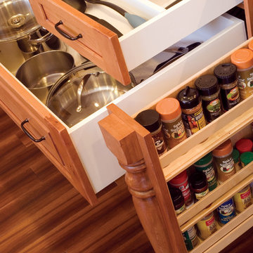
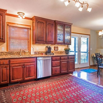
Kitchen with Universal Design features by Sawhill Custom Kitchens & Design in Minneapolis. VIsit www.sawhillkitchens.com to see more examples of our work.
 ZeroEnergy Design
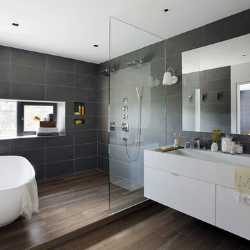
The reconfiguration of the master bathroom opened up the space by pairing a platform shower with a freestanding tub. The open shower, wall-hung vanity, and wall-hung water closet create continuous flooring and an expansive feeling. The result is a welcoming space with a calming aesthetic.
 Arbor Mills
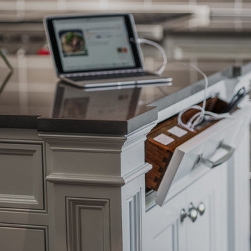
Tilt out drawer recharging station in island cabinet, custom made by Arbor Mills cabinetry
Kitchen - transitional kitchen idea in Chicago
Kitchen - transitional kitchen idea in Chicago
 Crystal Kitchen + Bath
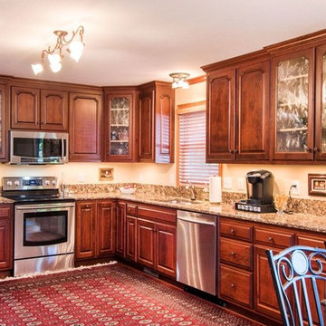
Tying multiple floors together using 6”x36” dark grey wood-looking tile, laid on a staggered patterned worked well with the tile and concrete floors next to it.
Two-toned cabinetry of wired brushed hickory with a grey stain wash, combined with maple wood in a dark slate finish is a current trend.
Counter tops: combination of splashy granite and white Caesarstone grounded the display. A custom-designed table of ash wood, with heavy distressing and grey washed stain added warmth.
Show custom features:
Arched glass door cabinets with crown moulding to match.
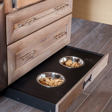
Unique Features: drawer in drawer for pot lids, pull out drawer in toe kick for dog dishes, toe space step stool, swing up mixer shelf, pull out spice storage.
Built in Banquette seating with table and docking station for family meals and working.
Custom open shelves and wine rack with detailed legs anchor the three sides of the island.
Backsplash rail with spice rack, knife and utensil holder add more storage space.
A floating soffit matches the shape of island and helps lower the showroom ceiling height to what would be found in a normal home. It includes: pendant lights for the snack bar, chandelier for the table and recess for task lights over the sink.
The large triangular shaped island has eleven foot legs. It fills the unusual space and creates three separate areas: a work space, snack bar/room divider and table area.

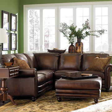
 Bassett Furniture
Available in leather only.
Hamilton combines classic styling with a hand rubbed leather that gives this collection an old world flair. Full front panels arms and shaped front rail are nailed in Antique Brass and the boxed backs and seats are seamed in a picture frame style. The turned legs are in a Heirloom finish. The leather shown only is hand rubbed, customized items will not feature hand rubbed leather.
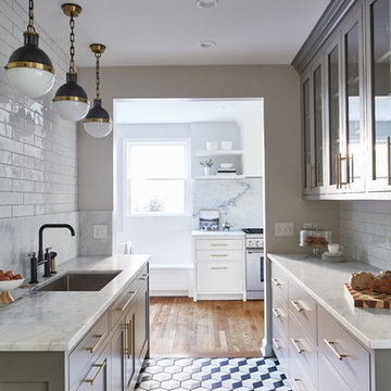
 R. B. Schwarz, Inc.
New butler’s pantry we created after removing the stove and the closet in the old kitchen.
// This room makes a big design statement, from the hex tile, Alba Vera marble counters, custom cabinets and pendant light fixtures.
// The pendant lights are from Circa Lighting, and match the brass of the drawer and door pulls.
// The 3x12 subway tile runs from countertop to the ceiling.
// One side of the butler’s pantry features a dish pantry with custom glass-front cabinets and drawer storage.
// The other side features the main sink, dishwasher and custom cabinets. This butler’s pantry keeps dirty dishes out of sight from the guests and entertaining area.
// Designer refers to it as the jewel of the kitchen

 Twelve Stones Designs, LLC
The owners of this kitchen had spent the money to upgrade the finishes in their kitchen upon building the home 12 years ago, but after living in the space for several years they realized how nonfunctional the layout really was. The (then) two preschool aged children had grown into busy, hungry teenagers with many friends who also liked to hang out at the house. So the family needed a more functional kitchen with better traffic flow, space for daily activities revolving around the kitchen at different times of day, and a kitchen that could accommodate cooking for and serving large groups. Furthermore, the dark, traditional finishes no longer reflected the homeowners’ style. They requested a brighter, more relaxed, coastal style that reflected their love of the seaside cities they like to visit.
Originally, the kitchen was U-shaped with a narrow island in the middle. The island created narrow aisles that bottle-necked at the dishwasher, refrigerator, and cooktop areas. There was a pass-through from the foyer into the kitchen, but the owners never liked that the pass-through was also located so close to the powder room. The awkward proximity was unappealing and made guests feel uncomfortable.
The kitchen’s storage was made up of lots of narrow cabinets, apothecary drawers, clipped corner units, and very few drawers. It lacked useful storage for the larger items the family used on a daily basis. And the kitchen’s only pantry was small closet that had only builder-grade, narrow shelving with no illumination to be able to see the contents inside.
Overall, the kitchen’s lighting plan was poorly executed. Only six recessed cans illuminated the entire kitchen and nook areas. The under cabinet lighting was not evenly distributed either. In fact, the builder had mis-placed the under cabinet lighting around the decorative pilasters which made for choppy, dark cubbies. Further, the builder didn’t include any lighting over the sink or the bar area, which meant whoever was doing the dishes was always in their own shadow. That, coupled with the steep overhang of the game room above made the bar area feel like a dim, cavernous space that wasn’t inviting or task oriented. The kitchen looked out into the main living space, but the raised bar and a narrow wall (which held the only large cabinet in the kitchen) created more of a barrier than a relationship to the living room or breakfast nook. In fact, one couldn’t even see the breakfast nook from the cooktop or sink areas due to its orientation. The raised bar top was too narrow to comfortably sit to either dine at or chat from due to the lack of knee space. The the homeowners confided that the kitchen felt more like a dark, dirty prison than place where the family, or their guests, wanted to gather and commune.
The clients' needs and desires were:
➢ to create a kitchen that would be a space the family loved to be in; to relate to the adjacent spaces all around, and to have better flow for entertaining large groups
➢ to remove the walls between the breakfast nook and living area and to be able to utilize the natural light from the windows in both those areas
➢ to incorporate a functional chopping block for prepping fresh food for home cooked meals, an island with a large sink and drain board, 2 pull out trash cans, and seating for at least the 2 teens to eat or do homework
➢ to design a kitchen and breakfast nook with an airy, coastal, relaxed vibe that blended with the rest of the house's coastal theme
➢ to integrate a layered lighting plan which would include ample general illumination, specific task lighting, decorative lighting, and lots of illuminated storage
➢ to design a kitchen with not only more storage for all the husband’s kitchen gadgets and collection of oils and spices, but smart storage, including a coffee/breakfast bar and a place to store and conceal the toaster oven and microwave
➢ to find a way to utilize the large open space between the kitchen, pantry area, and breakfast nook
Twelve Stones Designs achieved the owner's goals by:
➢ removing the walls between the kitchen and living room to allow the natural light to filter in from the adjacent rooms and to create a connection between the kitchen, nook, and living spaces for a sense of unity and communion
➢ removing the existing pantry and designing 3 large pantry style cabinets with LED tape lights and rollout drawers to house lots of kitchen appliances, gadgets, and tons of groceries. We also took the cabinets all the way up to the 9’ ceiling for additional storage for seasonal items and bulk storage.
➢ designing 2 islands - 1 with a gorgeous black walnut chopping block that houses a drawer for chopping and carving knives and a custom double pull out trash unit for point of use utilization - and 1 that houses the dishwasher, a large Blanco Gourmet sink with integrated drain board, woven baskets for fresh root vegetables and kitchen towels, plenty of drawer storage for kitchen items, and bar seating for up to 4 diners.
➢ closing off the space between the kitchen and the powder room to create a beautiful new private alcove for the powder room as well as adding some decorative storage. This also gave us space to include more tall storage near the new range for precision placement of the husband’s extensive oil and spice collection as well as a location for a combo-steam oven the wife wanted for baking and cooking healthy meals.
The project is enhanced functionally by:
➢ incorporated USB and standard receptacles for the kids’ laptops and phone charging in the large island
➢ designing the small island to include additional open shelving for items used on a daily basis such as a variety of bowls, plates, and colanders. This set up also works well for the husband who prefers to “plate” his dinners in restaurant-style fashion before presenting them to the table.
➢ the integration of specific storage units, such as double stacked cutlery drawers, a custom spice pull-out, a Kuerig coffee and tea pod drawer, and custom double stacked utensil drawers
➢ moving the refrigerator to the old oven location - this eliminated the bottle neck as well as created a better relationship to the eating table. It also utilizes the floor space between the pantry, nook, and kitchen
➢ creating a banquet style breakfast nook - this banquette seating not only doubles the amount of seating for large gatherings but it better utilizes the odd space between the kitchen and the previous nook area. It also helps to create a distinct pathway from the mudroom room through the pantry area, kitchen, nook, and living room.
➢ the coffee/breakfast bar area which includes the perfect location for the concealed microwave and toaster oven, convenient storage for the coffee pods and tea accoutrements. Roll-out drawers below also house the smoothie maker, hot water kettle, and a plethora of smoothie-making ingredients such as protein powders, smoothie additives, etc. Furthermore, the drawers below the Keurig house measuring utensil, cutlery, baking supplies and tupperware storage.
➢ incorporating lots of wide drawers and pullouts to accommodate large cookware.
➢ utilizing as much vertical space as possible by building storage to the ceiling which accommodates the family’s abundant amount of serving platters, baking sheets, bakeware, casserole dishes, and additional cutting boards.
The project is enhanced aesthetically by:
➢ new 5-piece Versailles pattern porcelain tile that now seamlessly joins the entire down stairs area together creating a bright, cohesiveness feeling instead of choppy separated spaces - it also adds a coastal feeling
➢ designing a cabinet to conceal the microwave and toaster oven
➢ the coastal influenced light fixtures over the nook table and island
➢ the sandy colors of the Langdon Cambria countertops. The swirling pattern and sparkling quartz pieces remind the homeowner of black-and-tan sandy beaches
➢ the striped banquet seating whose creamy white background and blue-green stripes were the inspiration for the cabinet and wall colors.
➢ All the interior doors were painted black to coordinate with the blacks and grays in the backsplash tile and countertop. This also adds a hint of tailored formality to an otherwise casual space.
➢ the use of WAC's Oculux small aperture LED units for the overhead lighting complimented with Diode LED strips for task lighting under the cabinets and inside the pantry and glass wall cabinets. All of the lighting applications are on separate dimmer switches.
Innovative uses of materials or construction methods by Realty Restoration LLC:
➢ Each 1-1/2” x 3” block of reclaimed end-grain black walnut that makes up the center island chopping block was hand milled and built in the shop. It was designed to look substantial and proportional to the surrounding elements, executed by creating the 4 inch tall top with a solid wood chamfered edge band.
➢ The metal doors on either side of the vent hood were also custom designed for this project and built in the Realty Restoration LLC shop. They are made 1x2, 11-gauge mild steel with ribbed glass. Weighing 60 lbs a piece, heavy duty cabinet hinges were added to support the weight of the door and keep them from sagging.
➢ Under-cabinet receptacles were added along the range wall in order to have a clean, uninterrupted backsplash.
Design obstacles to overcome:
➢ Because we were removing the demising walls between the kitchen and living room, we had to find a way to plumb and vent the new island. We did this by tunneling through the slab (the slab had post tension cables which prevented us from just trenching) to run a new wet vent through a nearby structural wall. We pulled the existing hot and cold lines between upper floor joists and ran them down the structural wall as well and up through a conduit in the tunnel.
➢ Since we were converting from wall overs to a gas range it allowed us to utilize the 220 feed for the wall ovens to provide a new sub panel for all the new kitchen circuits
➢ Due to framing deficiencies inherited from the original build there was a 1-1/2” differential in the floor-to-ceiling height over a 20 foot span; by utilizing the process of cutting and furring coupled with the crown moulding details on the cabinet elevations we were able to mask the problem and provide seamless transitions between the cabinet components.
Evidence of superior craftsmanship:
➢ uniquely designed, one-of-a-kind metal “X” end panels on the large island. The end panels were custom made in the Realty Restoration LLC shop and fitted to the exact dimensions of the island. The welding seams are completely indistinguishable - the posts look like they are cut from a single sheet of metal
➢ square metal posts on the small island were also custom made and designed to compliment and carry through the metal element s throughout the kitchen
➢ the beautiful, oversized end panels on the pantry cabinets which give the breakfast nook a tailored look
➢ integrating a large format 5 piece Versailles tile pattern to seamlessly flow from the existing spaces into the new kitchen space
➢ By constructing a custom cabinet that jogged around a corner we could not remodel (housing the entry way coat closet) we were able to camouflage the adjacent wall offset within the upper and lower cabinets. By designing around the existing jog in the structural walls we accomplished a few things: we were able to find the space to house, and hide, the microwave and toaster oven yet still have a clean cohesive appearance from the kitchen side. Additionally, the owners were able to keep their much needed coat closet and we didn’t have to increase the budget with unnecessary structural work.
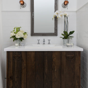
 FOUR POINT DESIGN BUILD INC
DESIGN BUILD REMODEL | Vintage Bathroom Transformation | FOUR POINT DESIGN BUILD INC
This vintage inspired master bath remodel project is a FOUR POINT FAVORITE. A complete design-build gut and re-do, this charming space complete with swap meet finds, new custom pieces, reclaimed wood, and extraordinary fixtures is one of our most successful design solution projects.
THANK YOU HOUZZ and Becky Harris for FEATURING this very special PROJECT!!! See it here at http://www.houzz.com/ideabooks/23834088/list/old-hollywood-style-for-a-newly-redone-los-angeles-bath
Photography by Riley Jamison
AS SEEN IN
Houzz
Martha Stewart
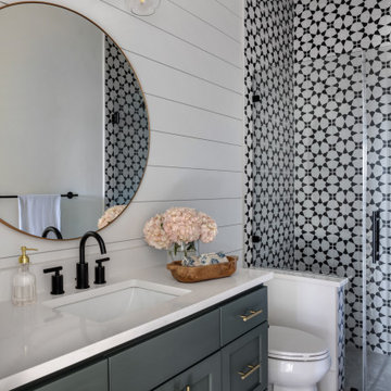
 Danze & Davis Architects, Inc.
Example of a mid-sized minimalist kids' black and white tile and cement tile ceramic tile, gray floor, single-sink and shiplap wall bathroom design in Austin with shaker cabinets, green cabinets, white walls, an undermount sink, quartzite countertops, a hinged shower door, white countertops and a freestanding vanity
 Sicora Design/Build
Farm Kid Studios
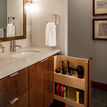
Bathroom - mid-sized contemporary master porcelain tile and beige tile porcelain tile bathroom idea in Minneapolis with flat-panel cabinets, medium tone wood cabinets, quartz countertops, an undermount sink and gray walls
Bathroom - mid-sized contemporary master porcelain tile and beige tile porcelain tile bathroom idea in Minneapolis with flat-panel cabinets, medium tone wood cabinets, quartz countertops, an undermount sink and gray walls


 Reico Kitchen & Bath
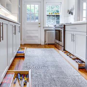
Designed by Marc Jean-Michel of Reico Kitchen & Bath in Bethesda, MD in collaboration with Wisdom Construction, this Washington, DC kitchen remodel features Merillat Masterpiece kitchen cabinets in the Ganon door style in a Dove White finish with Calacatta Laza engineered quartz countertops from Q by MSI.
The kitchen features unique storage in a smaller galley kitchen space by utilizing the toe kick area of the cabinets to create pull out drawer storage. Those drawers are touch-sensitive...a little toe push and out (and in) they go!
Photos courtesy of BTW Images LLC.
 Nadler Cabinet Services Inc.
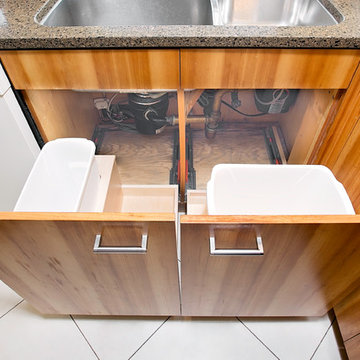
The interior of the cabinets in this kitchen were not working well for the homeowner. They wanted to keep their kitchen design and improve the functionality with convenient storage options. We added 2 garbage drawers that worked around the sink plumbing, double tiered corner cabinet pull out system and roll out drawers in other cabinets.
 Kitchen Design Concepts
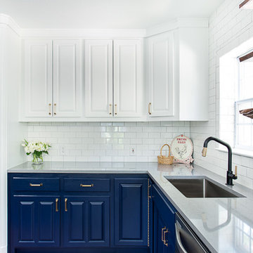
We introduce to you one of our newer services we are providing here at Kitchen Design Concepts: spaces that just need a little reviving! As of recent, we are taking on projects that are in need of minimal updating, as in, spaces that don’t need a full-on remodel. Yes, you heard right! If your space has good bones, you like the layout of your kitchen, and you just need a few cosmetic changes, then today’s feature is for you! Recently, we updated a space where we did just this! The kitchen was in need of a little love, some fresh paint, and new finishes. And if we’re being honest here, the result looks almost as if the kitchen had a full-on remodel! To learn more about this space and how we did our magic, continue reading below:
The Before and After
First, see what an impact new finishes can make! The “before” image shows a kitchen with outdated finishes such as the tile countertops, backsplash, and cabinetry finish. The “after” image, is a kitchen that looks almost as if its brand new, the image speaks for itself!
Cabinetry
With the wooden cabinetry in this kitchen already having great bones, all we needed to do was our refinishing process that involved removing door and drawer fronts, sanding, priming, and painting. The main color of the cabinetry is white (Sherwin Williams Pure White 7005) and as an accent, we applied a deep navy blue that really pops in this space (Sherwin Willaims Naval 6244). As a special design element, we incorporated a natural wooden band across the hood which is subtle but adds an element of surprise.
Countertops
The original countertops in this space were a 12×12 tile with cracks and discolored grout from all the wear and tear. To replace the countertops, we installed a clean and crisp quartz that is not only durable but easy to maintain (no grout here!). The 3cm countertops are a Cambria quartz in a grey-tone color (Carrick).
Backsplash
Keeping things simple, yet classic, we installed a 3×6 subway tile from Interceramic. The crisp white pairs well with all the other finishes of the space and really brighten the space up! To spice things up, we paired the white tile with a contrasting grout color (Cape Grey) that matches the countertop. This is a simple method to add interest to your white backsplash!
Fixtures and Fittings
For the fixtures and fittings of the kitchen, we wanted pieces that made a statement. That’s why we selected this industrial style faucet from Brizo! The faucet is a Brizo LITZE™ PULL-DOWN FAUCET WITH ARC SPOUT AND INDUSTRIAL HANDLE (63044LF-BLGL). The matte black paired with the luxe gold elements really make a statement! To match the gold elements of the faucet, we installed cabinetry hardware from Topknobs in the same gold finish. The hardware is a Channing pull TK743HB. Lastly, the large single bowl sink (who doesn’t want a large sink?!) is a great functional touch to the kitchen. The sink is a Blanco Precision 16″ R10 super single with 16″ Drainer in stainless steel (516216).
 Mina Brinkey
Photo: Mina Brinkey © 2013 Houzz
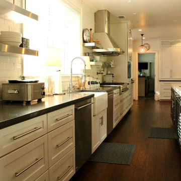
Inspiration for a transitional kitchen remodel in Tampa with a farmhouse sink, white backsplash, subway tile backsplash and stainless steel appliances
Inspiration for a transitional kitchen remodel in Tampa with a farmhouse sink, white backsplash, subway tile backsplash and stainless steel appliances
 Sage Market + Design
Freebird Photography
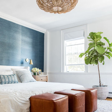
Bedroom - coastal master medium tone wood floor and brown floor bedroom idea in Boston with white walls
Bedroom - coastal master medium tone wood floor and brown floor bedroom idea in Boston with white walls
 Studio Dearborn
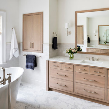
Vanity, mirror frame and wall cabinets: Studio Dearborn. Faucet and hardware: Waterworks. Subway tile: Waterworks Cottage in Shale. Drawer pulls: Emtek. Marble: Calcatta gold. Window shades: horizonshades.com. Photography, Adam Kane Macchia.
 transFORM Home
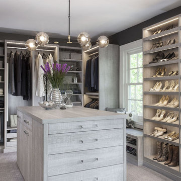
When you first walk into this dressing room, it’s the lighting that jumps out at you first. Each shelf is illuminated to show the brilliant colors and texture of the clothing. Light even pours through the big windows and draws your eye across the rooftops of Brooklyn to see the NYC skyline. It creates a feeling of brightness and positivity that energizes and enlivens. It’s a dressing room where you can look and feel your best as you begin your day.
Featured in a modern Italian Melamine and tastefully accented with complementing Matte Nickel hardware and Clear Acrylic handle pulls, this Chic Brooklyn Dressing Room proves to be not only stylish, but functional too.
This custom closet combines both high and low hanging sections, which afford you enough room to organize items based on size. This type of mechanism offers more depth than a standard hanging system.
The open shelving offers a substantial amount of depth, so you have plenty of space to personalize your room with mementos, collectibles and home decor. Adjustable shelves also give you the freedom to store items of all sizes from large shoe and boot boxes to smaller collectibles and scarves.
A functional key to closet design is being able to visualize and conveniently access items. There’s also something very appealing about having your items neatly displayed - especially when it comes to shoes. Our wide shoe shelves were purposely installed on a slant for easy access, allowing you to identify and grab your favorite footwear quickly and easily.
A spacious center island provides a place to relax while spreading out accessories and visualizing more possibilities. This center island was designed with extra drawer storage that includes a velvet lined jewelry drawer. Double jewelry drawers can add a sleek and useful dimension to any dressing room. An organized system will prevent tarnishing and with a designated spot for every piece, your jewelry stays organized and in perfect condition.
The space is maximized with smart storage features like an Elite Belt Rack and hook as well as Elite Valet Rods and a pull-out mirror. The unit also includes a Deluxe Pant Rack in a Matte Nickel finish. Thanks to the full-extension ball-bearing slides, everything is in complete view. This means you no longer have to waste time desperately hunting for something you know is hiding somewhere in your closet.
Lighting played a huge role in the design of this dressing room. In order to make the contents of the closet fully visible, we integrated a combination of energy efficient lighting options, including LED strip lights and touch dimmers as well as under-mounted shelf lights and sensor activated drawer lights. Efficient lighting options will put your wardrobe in full view early in the mornings and in the evenings when dressing rooms are used most.
Dressing rooms act as a personal sanctuary for mixing and matching the perfect ensemble. Your closet should cater to your personal needs, whether it’s top shelving or extra boot and hat storage. A well designed space can make dressing much easier - even on rushed mornings.
22