
Search results for "Level playing" in Home Design Ideas
 Forward Design Build Remodel
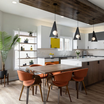
Our clients were ready to take their 20+ year old home and give the design a refresh, and make their space a lot more functional for their needs. The areas in their first floor they wanted to improve were the kitchen, mudroom and pantry, dining room, living room, stairway and powder room. They wanted their space to match their fun mid-century modern style.
Our design team and our clients dreamed up a plan that not only solves all of the functional issues they were dealing with, it’s also a stunning and unique space. We removed the wall in between the kitchen and dining room. We created a center island that extends and lowers to include an eat-in area. The cabinetry plan in the kitchen changed to suit their needs. We re-did the flooring throughout the first floor and installed a new fireplace. The existing laundry room got moved to the basement, making way for a mudroom and pantry space. We installed a new railing on the staircase and an art niche in the living room. The powder room got a refresh with statement wallpaper and vanity.
 David Heide Design Studio
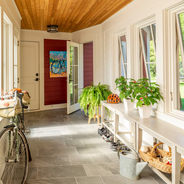
In coming to Minnesota from Iceland, the owners of Home 4 found themselves more than 3,000 miles away from home, hoping to build something new – literally and figuratively – that would feel like home for their family of five. They purchased a scenic piece of land in Rochester and identified a general idea of the spaces they would need, but they struggled with how to define a sense of character that would incorporate their culture and identity into the design. The architect-led design team was tasked with creating a house that would help establish the homeowners’ roots in a new country while still recalling familiar comforts of their heritage.
The result is a warm family home that combines elements of Nordic design with a touch of American farmhouse aesthetic. Gracious proportions, custom woodworking, and cheerful details create a welcoming atmosphere, while modern conveniences like a large mudroom and second-floor laundry help day-to-day life feel easy.
Around each corner, a new detail greets the eye, from the Lundie-inspired column at the staircase, to the double-heart detail inscribed in the woodwork, to the custom table designed for the breakfast nook. Each element is lovely individually, but experiencing the holistic effect as the details intentionally pair and play together helps to craft a house that feels like home.
Most important, the homeowners’ history, heritage, and hopes are melded together into a home that represents their family. Each unique element and carefully considered material combine to form a house that feels as if it could have belonged to this family for generations, even though it is brand new.
 Ann Lowengart Interiors
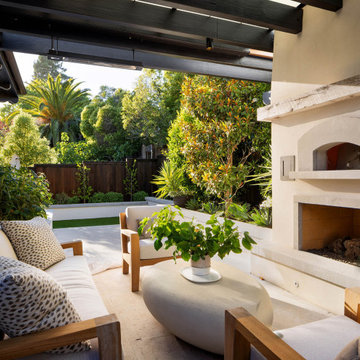
The three-level Mediterranean revival home started as a 1930s summer cottage that expanded downward and upward over time. We used a clean, crisp white wall plaster with bronze hardware throughout the interiors to give the house continuity. A neutral color palette and minimalist furnishings create a sense of calm restraint. Subtle and nuanced textures and variations in tints add visual interest. The stair risers from the living room to the primary suite are hand-painted terra cotta tile in gray and off-white. We used the same tile resource in the kitchen for the island's toe kick.
Find the right local pro for your project
 InnovationLand
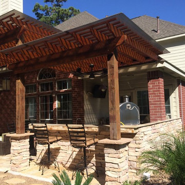
A two-level pergola, circular firepit area and outdoor kitchen with a charcoal-gas combo grill star in this Houston patio addition designed for entertaining large crowds in style.
"The client was an attorney with a passion for cooking and entertaining," says the project's principal designer, Lisha Maxey of LGH Designs. "Her main objective with this space was to create a large area for 10 to 20 guests, including seating and the prep and cooking of meals."
Located in the backyard of the client's home in Spring, TX, this beautiful outdoor living and entertaining space includes a 28-by-12-foot patio with Fantastico silver travertine tile flooring, arranged in a Versailles pattern. The walkway is Oklahoma wister flagstone.
Providing filtered shade for the patio is a two-level pergola of treated pine stained honey gold. The larger, higher tier is about 18 by 10 feet; the smaller, lower tier is about 10 feet square.
"We covered the entire pergola with Lexan - a high-quality, clear acrylic sheet that provides protection from the sun, heat and rain," says Outdoor Homescapes of Houston owner Wayne Franks.
Beneath the lower tier of the pergola sits an L-shaped, 12-by-9-foot outdoor kitchen island faced with Carmel Country ledgestone. The island houses a Fire Magic® combination charcoal-gas grill and lowered power burner, a Pacific Living countertop pizza oven and a stainless steel RCS trash drawer and sink. The countertops and raised bar are Fantastico silver travertine (18-square-inch tiles) and the backsplash is real quartz.
"The most unique design item of this kitchen area is the hexagon/circular table we added to the end of the long bar," says Lisha. This enabled the client to add seating for her dining guests."
Under the higher, larger tier of the pergola is a seating area, made up of a coffee table and espresso-colored rattan sofa and club chairs with spring-green-and-white cushions.
"Lighting also plays an important role in this space, since the client often entertains in the evening," says Wayne. Enter the chandelier over the patio seating arrangement and - over the outdoor kitchen - pendant lamps and an industrial-modern ceiling fan with a light fixture in the center. "It's important to layer your lighting for ambiance, security and safety - from an all-over ambient light that fills the space to under-the-counter task lighting for food prep and cooking to path and retaining wall lighting."
Off the patio is a transition area of crushed granite and floating flagstone pavers, leading to a circular firepit area of stamped concrete.
At the center of this circle is the standalone firepit, framed at the back by a curved stone bench. The walls of the bench and column bases for the pergola, by the way, are the same ledgestone as the kitchen island. The top slab on the bench is a hearth piece of manmade stone.
"I think the finish materials blend with the home really well," says Wayne. "We met her objectives of being able to entertain with 10 to 12 to 20 people at one time and being able to cook with charcoal and gas separately in one unit. And of course, the project was on time, on budget."
"It is truly a paradise," says the client in her Houzz review of the project. "They listened to my vision and incorporated their expertise to create an outdoor living space just perfect for me and my family!"
 Refugia Design/Build
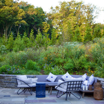
This backyard patio garden was transformed with the client’s goal of minimizing lawn and creating intimate gathering space. Layered perennial beds are filled with a rich diversity of texture, form and color, enveloping the patio with stunning 3-dimensional views. Take a wander into the planting and you’ll find a meandering exploratory pathway that immerses you in nature’s sounds, movement and smells, up close. This grassy channel also provides the kids fun access from one playing area to the next, hidden from the grown-ups, free to roam and explore.
 River Valley Landscapes
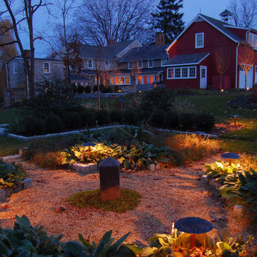
The property is one of the original farm houses located on the main street of a small town. It has been in the family for many years and our client just inherited the property. They were trying to have balance of preserving the old while realizing modern day living has its benefits too. The house had a large addition added using mostly old style materials, but designed with function and modern day luxuries. Our goal was to carry that theme to the outside.
Our first problem we had to address was how to transition between the first floor elevation changes. The lower room was the husband’s office. He stated in the future he may have clients over and it would be nice to have an area to sit outside. The wife’s main concern was to renew the four corner garden. She also felt it was very important to be able to see it from the kitchen area. Finally there was an old wishing well stuck right outside the kitchen. They both felt it would be neat to be able to incorporate this in some how. They wanted a patio area with a built in grill to accommodate there family and friends. They also wanted to keep a large play area for the kids.
We were able to pull this off successfully. We addressed the first issue by having a small lower level flagstone area. This area is large enough for 1 to 2 people to sit comfortably. It also provides a transition from his office to the larger patio area. We installed a simple small gravel sitting area opposite of the main patio. This provides our client a secluded place to relax or do business. Mrs.... told me she is amazed how much her and her husband enjoys this area. It is so peaceful looking at the small creek over a glass of wine.
We built a natural limestone retaining wall to create the patio terrace. The stone was chosen to extend the houses architectural elements into the landscape. Irregular broken flagstone was used to give it a more casual feel. We installed three Serviceberries into the patio terrace to replace some trees that were taken down during the remodeling. She was very concern that they would block the view of the four corner garden. We new they were crucial to nestle in the terrace, so we placed them for a couple days for her to decide. Fortunately she agreed they not only kept the view open, but helped frame the garden.
The four corner garden was designed to be viewed from afar and experienced up close. We wanted the space to have some formal structure while keeping with the casual farm house feel. Another natural limestone retaining wall was created. This leveled the garden terrace and helped associate it with the rest of the property. The four corner garden is nestled into the existing woods edge. This provides three distinct experiences to entering the garden; a more formal from the driveway, an open feel from the lower lawn, and a more natural / casual experience from the wooded area. The Plymouth brown gravel was used for the center of the garden. This helped highlight the stone post that was found during construction. The gravel also brings the sense of sound into the garden space. Lamb’s ear was chosen as a fun way to get kids interest in horticulture.
The balance of using the new to create the old feel is what makes this project a success. The property has already hosted a local historical society event and won an award for its preservation efforts. When Mrs.... can’t find her husband, she knows he is either reading the newspaper by the grill or resting in the hammock along the wood’s path.
 Banker Wire
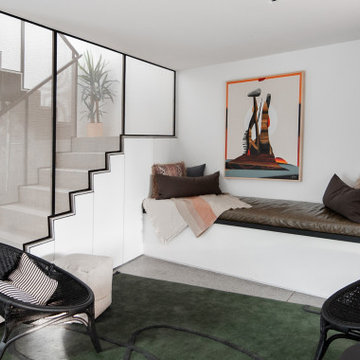
When envisioning the Hygeia Lot 3 single family residential home in Encinitas, California, Lindsay and Rory Brown of The Brown Studio sought to weave unique architectural details throughout the minimalist design scheme. To add depth to the overall look and feel of the space, and to complement the home’s existing ‘hard’ angles, the team selected Banker Wire’s IPZ-25 woven wire mesh. Specified in a stainless steel and brass finish, the wire mesh was utilized to create the interior stairway railing, which functions as the focal point of the lower lounge room area.
Adding an elegant touchpoint to the space, the wire mesh reiterates the angular look and feel while providing much-needed depth through the stainless steel and brass finish. Similarly, for the project-at-large, the design team favored a seamless indoor/outdoor design scheme, with the Banker Wire mesh application helping to achieve this; the exterior of the home features Gabion rock walls, created using an enclosing wire structure to secure the rocks into a wall formation. By adding the wire mesh interior stairway railing, the design team was able to create an indoor/outdoor connection through highlighting these unique wire touchpoints.
“The Hygeia Lot 3 house is full of unique angles and architectural details—it’s two levels of playful design and carefully crafted architectural details,” says Loryn Cook, Designer, The Brown Studio. “We wanted to use materials that reflect this line of thinking, and Banker Wire’s architectural mesh provided the stability and breathability we were after.”
The simple, lightweight material of the IPZ-25 wire mesh pattern—which has a 54% open area—utilizes a mixture of stainless steel to achieve balanced sturdiness; when mixed with the copper-based alloy of brass, a beautiful contrast occurs, while the team’s custom system holds the wire in place. Through utilizing different wire diameters for the warp and shute—achieving balanced stiffness in both directions—the intercrimp surface gives the material a high degree of reflective energy. As a result, the mesh pattern imitates an array of colors that changes as the viewer moves throughout the space.
“For this project, we wanted a material that was permeable enough to see through, but detailed enough to catch the eye,” adds Cook. “IPZ-25 provides a myriad of different textures and colors, depending on the perspective from which it is viewed from—we love it specifically for this effect.”
In regards to the fabrication process, Robert Richter, Owner of Flur Metals, notes that although it was initially a challenge, this project is proof that the outcome is well worth it.
“We typically utilize more rigid mesh types for this kind of application, but because of how unique IPZ-25 is, The Brown Studio came to us asking if we could make it work,” says Richter. “We did not shy away from the challenge; this project was exciting, as we were able to utilize such a delicate, beautiful mesh, but a non-traditional way. Once one side was ‘tac’d in,’ we pulled it tight, and ‘tac’d’ the other side to the frame. Then, the border was welded to another frame that sandwiched the mesh in place,” adds Richter. “This application is proof that it can be done! It’s still one of my favorite projects we have ever worked on.”

Sponsored
Delaware, OH

Buckeye Basements, Inc.
Central Ohio's Basement Finishing ExpertsBest Of Houzz '13-'21
 Mike Schaap Builders
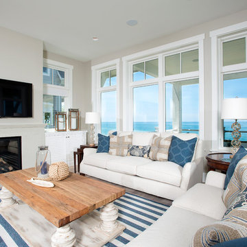
Captivated by South Haven’s natural charm and waterfront beauty, this storybook, waterfront abode is exceptionally true to its lakefront character.
Featuring over 3,600 square feet with five bedroom and three-and-a-half baths, the careful design of this open and charming layout paired with grand views from nearly every room, capture all the warmth and playfulness of lakefront living.
• A beach friendly fiber cement siding in a cheerful shade of blue blends seamlessly with the water backdrop, while contrasting white trim and darker blue window clad lend definition to the exterior.
• An impressive kitchen with stunning Ann Sachs tile backsplash, quartz countertops, richly stained bistro table and Viking Appliances overlook the generous, but clearly defined, living and dining rooms.
• Extensive built-ins with extra storage and workspace, such as a distinctive dining serving piece featuring quartz stone and a lake reflecting mirror, maximize space and make entertaining a breeze.
• Playful design elements like Thibaut wallpaper, braided hemp cabinet insets and white-washed European white oak floors complement the home’s coastal flair with nautical décor and warm hues.
• Fine finishes and rich trim details including wainscot, various painted ceilings, louvered doors on cabinetry, and fireplace surround with kitchen coordinating quartz stone, show off the intricate design gestures.
• Skillfully designed upstairs presents a restful master retreat with private balcony, two guest bedrooms, convenient laundry featuring sleek retractable doors and space maximizing built in bunk beds with ultra-clever steps that provide storage.
• The lower level’s extra guest quarters, additional laundry, full beach bath with top-to-bottom tiled shower, diligent kitchenette, beach-friendly stained concrete floors, outdoor shower that keeps sand at bay, and direct access to the sugary sands of Lake Michigan.
Photography by Chuck Heiney
 Eden Design
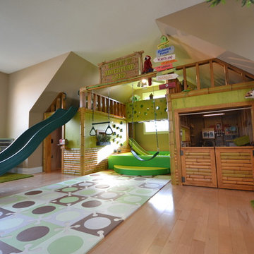
A great view of the custom built playhouse. This structure features all the elements of an outdoor play structure, including two slides, monkey bars, mini rock climbing wall, a swing and a "trapeze bar" / ring combo.
The left "cabin" has a set of cedar stairs that allow access to the upper deck and bridge to the upper deck of the right "cabin"
The left cabin features a light switch which turns all the 12V DC lighting in each cabin on or off. It also has a cedar staircase to the upper level, a PVC "sound pipe" that allows two people to talk into it, a magnetic board for play magnets, access to the ball pit slide, and a cool "button box" that is programmed with different animal noises depending on which button is pressed.
The right cabin is a combination kitchen / grocery store and puppet show area and contains all the related toys and details expected in such an area.
The bamboo siding edges and corners are sourced from Texture Plus, who specialize in faux siding materials.
 KBC Developments
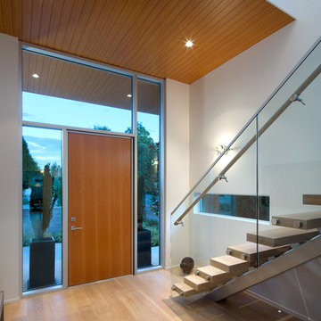
Placed within an idyllic beach community, this modern family home is filled with both playful and functional spaces. Natural light reflects throughout and oversized openings allow for movement to the outdoor spaces. Custom millwork completes the kitchen with concealed appliances, and creates a space well suited for entertaining. Accents of concrete add strength and architectural context to the spaces. Livable finishes of white oak and quartz are simple and hardworking. High ceilings in the bedroom level allowed for creativity in children’s spaces, and the addition of colour brings in that sense of playfulness. Art pieces reflect the owner’s time spent abroad, and exude their love of life – which is fitting in a place where the only boundaries to roam are the ocean and railways.
KBC Developments
Photography by Ema Peter
www.emapeter.com
 Lincoln Lighthill Architect
Lincoln Lighthill Architect employed several discrete updates that collectively transform this existing row house.
At the heart of the home, a section of floor was removed at the top level to open up the existing stair and allow light from a new skylight to penetrate deep into the home. The stair itself received a new maple guardrail and planter, with a Fiddle-leaf fig tree growing up through the opening towards the skylight.
On the top living level, an awkwardly located entrance to a full bathroom directly off the main stair was moved around the corner and out of the way by removing a little used tub from the bathroom, as well as an outdated heater in the back corner. This created a more discrete entrance to the existing, now half-bath, and opened up a space for a wall of pantry cabinets with built-in refrigerator, and an office nook at the rear of the house with a huge new awning window to let in light and air.
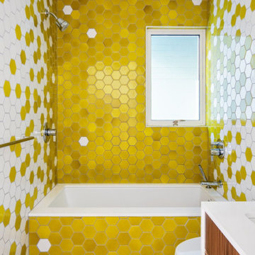
Downstairs, the two existing bathrooms were reconfigured and recreated as dedicated master and kids baths. The kids bath uses yellow and white hexagonal Heath tile to create a pixelated celebration of color. The master bath, hidden behind a flush wall of walnut cabinetry, utilizes another Heath tile color to create a calming retreat.
Throughout the home, walnut thin-ply cabinetry creates a strong contrast to the existing maple flooring, while the exposed blond edges of the material tie the two together. Rounded edges on integral pulls and door edges create pinstripe detailing that adds richness and a sense of playfulness to the design.
This project was featured by Houzz: https://tinyurl.com/stn2hcze
 Ashby Collective
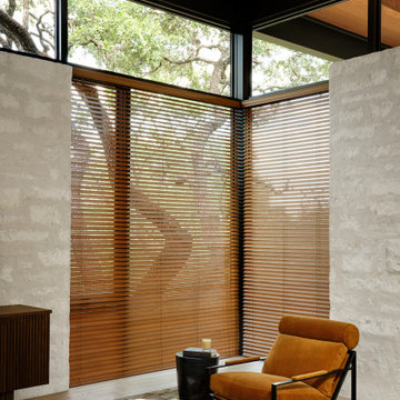
Large minimalist open concept light wood floor, beige floor and exposed beam living room photo in Austin with white walls
 Richard Best Architect, Inc.
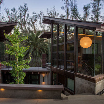
Hillside Modernism In Context.
The owners of this modern hillside home sought to have a home in a nice Los Angeles neighborhood wherein they could raise their burgeoning family. The owners purchased a 1948 2000sf, single story, 2 bedroom English Cottage styled home (believed to have been originally owned by Yul Brynner) on a ½ acre hillside site in the exclusive Brentwood area of Los Angeles. The property slopes downward away from the street and overlooks a mini eucalyptus arroyo. The owners love their new location but are now faced-with having to raise their new and growing family on a hillside with extremely limited yard spaces for children to play and in a location where nature is very close – deer as well as coyotes wander the arroyo.
In 2000 the owners commissioned architect Richard Best to add 2500sf to the cottage and transform it into a home more fitting to their growing family’s needs. Subsequently, in 2014/15, the owners again commissioned Richard to create a 2-story master suite addition. Living in or visiting the completed project - the original 1948 home remodeled + the 2000 addition + the 2014/15 addition, one goes through an unexpected and delightful experience as the spaces of the home “unfold” to reveal intimacy and environmental immersion.
It was important to Richard and to the owners that their remodels and additions be appropriately designed to fit into the neighborhood and have the feel, scale, and soul of the original cottage. With this in-mind, Richard has interpreted the design intentions of the original cottage - “modernizing” the architectural vocabulary and creating open-plan, 2-story additions which promote site “engagement” at various floor levels and openness to the outdoors in a manner clearly inspired by the original cottage, yet modern.
At the front door of the original (still remains as it was) 1948 structure, one is presented with a quaint a low-slung entry which establishes a very comfortable sense of scale. Inside, the remodeled spaces of the original cottage exude comfort and a cozy sensibility evoked by the reuse of the original home’s exposed timber framing structure, open-plan circulation, and an inventive two-sided steel fireplace which acts as a room divider between the living room and a home office. Accordion wood doors connect these rooms to a newly formed outdoor rear patio. At this point one also gets ones first hint that something very interesting is happening just beyond – a glimpse of the 2000 & 2014/15 additions.
Moving from the original 1948 structure into the 2-story 2000 addition, one is greeted by a modern and open linear floor plan arrangement – a kitchen, casual dining and family room extend perpendicularly from the 1948 structure into the rear yard and down the hillside. The open framed cathedral ceiling and wood roof trusses establish a lofty feeling and a rhythm discretely separating the open rooms one from the other. Extensive use of windows and French doors connect the indoors to the outdoors and provide abundant natural lighting. This new appendage ends with a symmetrical family room which has no corners – it is a geometry composed of two overlapped squares - one rotated 45 degrees atop the other to create double opportunities for bay windows. The design not only connects the home to the desired exterior flat yards spaces, but it also takes full advantage of the sloping terrain by adding a floor below the original level so as to maintain a scale appropriate to the neighborhood. The exterior materials were chosen taking “hints” from the original 1948 structure – natural redwood siding, reused brick veneer and wood doors/windows all serving to aesthetically connect the addition back-to the spirit of the original structure.
By 2014/15 the owners’ family has fully blossomed - the children are now teenagers and there is a need for additional space. However, the owners are very content with their remodeled cottage and Richard’s 2000 addition – unsure how to add to a home which they feel is quite perfect as it is … wanting whatever changes are to be made to be sympathetic to it. They are also concerned about potential additions blocking-out their views of the eucalyptus arroyo. The owners approached Richard with trepidation – we love our perfect house but we need it to be a bit bigger and we don’t want to block-out the arroyo views or create a hemmed-in feeling – how can we add but still see the arroyo.
In response Richard created a private yet connected 2-story master suite, which by its positioning, dynamic geometries and extensive glazing create the fourth side of the former rear patio, making it into exterior courtyard with views around and through the new addition into the arroyo. A dynamic angularity in the new master addition (inspired by the 2000 addition) simultaneously reduces the apparent size/presence of the master suite addition on the edge of the eucalyptus arroyo while creating framed views into the arroyo from the newly formed courtyard. The new master suite - a master bathroom, master closet and a master sleeping loft each having exterior decks and/or patios, is connected back to the 2000 addition via a glazed hallway which provides a sense of connectedness and privacy. A modern rustic aesthetic of exposed board-formed concrete, natural finished Corten steel exterior cladding, frameless metal windows, and clear finished Douglas Fir planks serve to “extend” the soul of the original cottage into the master suite.
The project is a highly sustainable design as well. Energy use is reduced by employing a high efficiency heat pump heating and cooling system, dual paned/gasketed metal window/door systems, natural lighting through a Kalwall skylight and generous exterior glazing with extensive eaves for shading, rigid roof insulation, and earthen backing – the lower floor is up-against the hillside which tends to even-out the day/night temperature differential.
Credits:
Architecture & Interior Design: Richard Best Architect Inc.
Structural Engineering: Dan Echeto & David Choi Associates
Interior Decor: Noelle Schoop
Landscape: Connie Heitzman
Photos: Carmel McFayden and Adriano Sarmento / James Porschen


 TVL Creative Ltd.
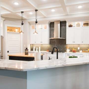
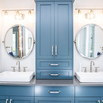
This project is an incredible transformation and the perfect example of successful style mixing! This client, and now a good friend of TVL (as they all become), is a wonderfully eclectic and adventurous one with immense interest in texture play, pops of color, and unique applications. Our scope in this home included a full kitchen renovation, main level powder room renovation, and a master bathroom overhaul. Taking just over a year to complete from the first design phases to final photos, this project was so insanely fun and packs an amazing amount of fun details and lively surprises. The original kitchen was large and fairly functional. However, the cabinetry was dated, the lighting was inefficient and frankly ugly, and the space was lacking personality in general. Our client desired maximized storage and a more personalized aesthetic. The existing cabinets were short and left the nice height of the space under-utilized. We integrated new gray shaker cabinets from Waypoint Living Spaces and ran them to the ceiling to really exaggerate the height of the space and to maximize usable storage as much as possible. The upper cabinets are glass and lit from within, offering display space or functional storage as the client needs. The central feature of this space is the large cobalt blue range from Viking as well as the custom made reclaimed wood range hood floating above. The backsplash along this entire wall is vertical slab of marble look quartz from Pental Surfaces. This matches the expanse of the same countertop that wraps the room. Flanking the range, we installed cobalt blue lantern penny tile from Merola Tile for a playful texture that adds visual interest and class to the entire room. We upgraded the lighting in the ceiling, under the cabinets, and within cabinets--we also installed accent sconces over each window on the sink wall to create cozy and functional illumination. The deep, textured front Whitehaven apron sink is a dramatic nod to the farmhouse aesthetic from KOHLER, and it's paired with the bold and industrial inspired Tournant faucet, also from Kohler. We finalized this space with other gorgeous appliances, a super sexy dining table and chair set from Room & Board, the Paxton dining light from Pottery Barn and a small bar area and pantry on the far end of the space. In the small powder room on the main level, we converted a drab builder-grade space into a super cute, rustic-inspired washroom. We utilized the Bonner vanity from Signature Hardware and paired this with the cute Ashfield faucet from Pfister. The most unique statements in this room include the water-drop light over the vanity from Shades Of Light, the copper-look porcelain floor tile from Pental Surfaces and the gorgeous Cashmere colored Tresham toilet from Kohler. Up in the master bathroom, elegance abounds. Using the same footprint, we upgraded everything in this space to reflect the client's desire for a more bright, patterned and pretty space. Starting at the entry, we installed a custom reclaimed plank barn door with bold large format hardware from Rustica Hardware. In the bathroom, the custom slate blue vanity from Tharp Cabinet Company is an eye catching statement piece. This is paired with gorgeous hardware from Amerock, vessel sinks from Kohler, and Purist faucets also from Kohler. We replaced the old built-in bathtub with a new freestanding soaker from Signature Hardware. The floor tile is a bold, graphic porcelain tile with a classic color scheme. The shower was upgraded with new tile and fixtures throughout: new clear glass, gorgeous distressed subway tile from the Castle line from TileBar, and a sophisticated shower panel from Vigo. We finalized the space with a small crystal chandelier and soft gray paint. This project is a stunning conversion and we are so thrilled that our client can enjoy these personalized spaces for years to come. Special thanks to the amazing Ian Burks of Burks Wurks Construction for bringing this to life!
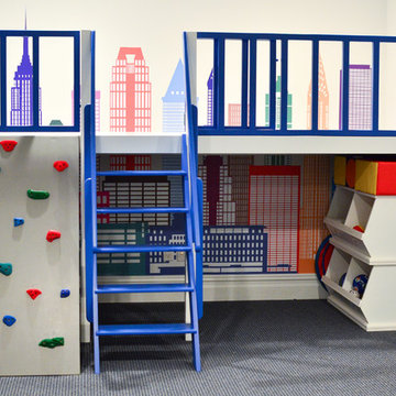
 Learn'ique: Design-to-Learn
Kate Hart
Mid-sized trendy gender-neutral carpeted kids' room photo in New York with white walls
Mid-sized trendy gender-neutral carpeted kids' room photo in New York with white walls
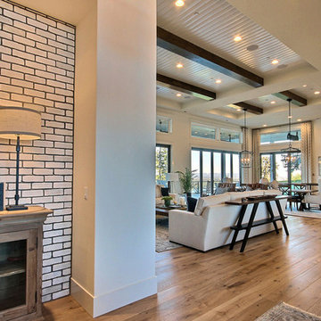
 Cascade West Development
Inspired by the majesty of the Northern Lights and this family's everlasting love for Disney, this home plays host to enlighteningly open vistas and playful activity. Like its namesake, the beloved Sleeping Beauty, this home embodies family, fantasy and adventure in their truest form. Visions are seldom what they seem, but this home did begin 'Once Upon a Dream'. Welcome, to The Aurora.
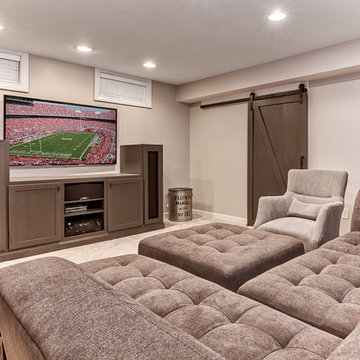
Sponsored
Columbus, OH

Hope Restoration & General Contracting
Columbus Design-Build, Kitchen & Bath Remodeling, Historic Renovations
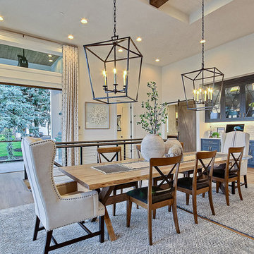 Cascade West Development
Inspired by the majesty of the Northern Lights and this family's everlasting love for Disney, this home plays host to enlighteningly open vistas and playful activity. Like its namesake, the beloved Sleeping Beauty, this home embodies family, fantasy and adventure in their truest form. Visions are seldom what they seem, but this home did begin 'Once Upon a Dream'. Welcome, to The Aurora.
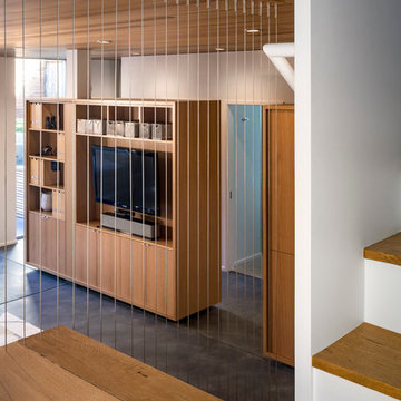
 building Lab, inc.
View from the stair landing down to the family/entertainment space.
Photos by Scott Hargis.
Family room library - mid-sized modern open concept concrete floor family room library idea in San Francisco with white walls, no fireplace and a wall-mounted tv
Family room library - mid-sized modern open concept concrete floor family room library idea in San Francisco with white walls, no fireplace and a wall-mounted tv
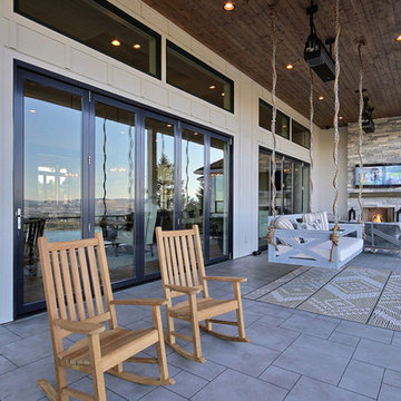 Cascade West Development
Inspired by the majesty of the Northern Lights and this family's everlasting love for Disney, this home plays host to enlighteningly open vistas and playful activity. Like its namesake, the beloved Sleeping Beauty, this home embodies family, fantasy and adventure in their truest form. Visions are seldom what they seem, but this home did begin 'Once Upon a Dream'. Welcome, to The Aurora.
71