
Search results for "Lightening" in Home Design Ideas
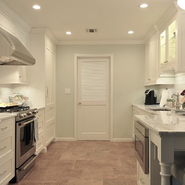
 Timeless Designs LLC
Open concept kitchen - mid-sized traditional galley ceramic tile and beige floor open concept kitchen idea in New York with a double-bowl sink, recessed-panel cabinets, white cabinets, marble countertops, white backsplash, subway tile backsplash, stainless steel appliances and a peninsula
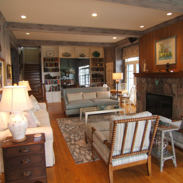
 Meyers Interiors
AFTER, lightening up those bookcases really helped to lighten the entire area!
Inspiration for a large timeless enclosed medium tone wood floor living room remodel in Other with a standard fireplace, a stone fireplace and no tv
Inspiration for a large timeless enclosed medium tone wood floor living room remodel in Other with a standard fireplace, a stone fireplace and no tv

 Laura Design Company
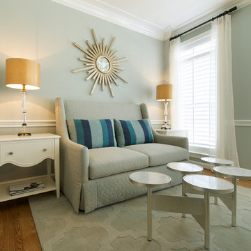
This client had existing dark furniture that they wanted to keep, but lighten up. A mix of layered neutral textiles and eclectic tables creates an airy feel. The resulting room is traditional with a coastal influence.
Photos by Laura Irion.
Find the right local pro for your project
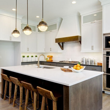

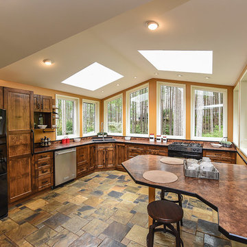
 Armellas Style In Design
The staging, in this room, was completed to pull a bit of red into the room and to lighten up the space as much as possible. We used cream, light grey, and taupe to lighten the space.
 Clare Sells Homes, Inc.
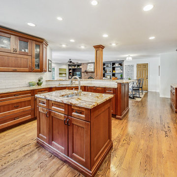
The backsplash had been a dark colored mini mosaic and my clients hated it the whole time they lived here! We removed them and replaced with a white subway tile with an organic shape, lightened up the paint plus added a fresh coat of ceiling paint to truly lighten and expand the space.
 Barrington Homes, LLC.
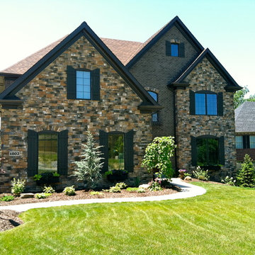
As Seen in Dutch Quality Stone - National Distribution Catalog and on DutchQualityStone.com
Inspiration for a mid-sized timeless two-story stone exterior home remodel in Other
Inspiration for a mid-sized timeless two-story stone exterior home remodel in Other

Sponsored
Sunbury, OH

J.Holderby - Renovations
Franklin County's Leading General Contractors - 2X Best of Houzz!
 Olamar Interiors
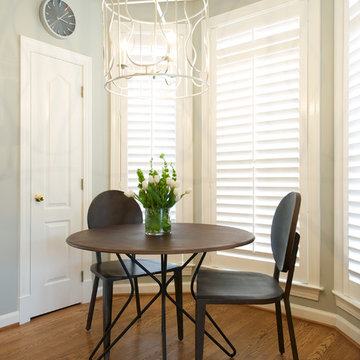
This condo in Sterling, VA belongs to a couple about to enter into retirement. They own this home in Sterling, along with a weekend home in West Virginia, a vacation home on Emerald Isle in North Carolina and a vacation home in St. John. They want to use this home as their "home-base" during their retirement, when they need to be in the metro area for business or to see family. The condo is small and they felt it was too "choppy," it didn't have good flow and the rooms were too separated and confined. They wondered if it could have more of an open concept feel but were doubtful due to the size and layout of the home. The furnishings they owned from their previous home were very traditional and heavy. They wanted a much lighter, more open and more contemporary feel to this home. They wanted it to feel clean, light, airy and much bigger then it is.
The first thing we tackled was an unsightly, and very heavy stone veneered fireplace wall that separated the family room from the office space. It made both rooms look heavy and dark. We took down the stone and opened up parts of the wall so that the two spaces would flow into each other.
We added a view thru fireplace and gave the fireplace wall a faux marble finish to lighten it and make it much more contemporary. Glass shelves bounce light and keep the wall feeling light and streamlined. Custom built ins add hidden storage and make great use of space in these small rooms.
Our strategy was to open as much as possible and to lighten the space through the use of color, fabric and glass. New furnishings in lighter colors and soft textures help keep the feeling light and modernize the space. Sheer linen draperies soften the hard lines and add to the light, airy feel. Tinius Photography

 Alair Homes Plano
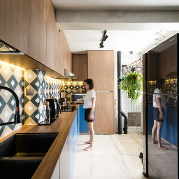
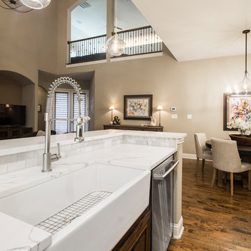
Our clients house was built in 2012, so it was not that outdated, it was just dark. The clients wanted to lighten the kitchen and create something that was their own, using more unique products. The master bath needed to be updated and they wanted the upstairs game room to be more functional for their family.
The original kitchen was very dark and all brown. The cabinets were stained dark brown, the countertops were a dark brown and black granite, with a beige backsplash. We kept the dark cabinets but lightened everything else. A new translucent frosted glass pantry door was installed to soften the feel of the kitchen. The main architecture in the kitchen stayed the same but the clients wanted to change the coffee bar into a wine bar, so we removed the upper cabinet door above a small cabinet and installed two X-style wine storage shelves instead. An undermount farm sink was installed with a 23” tall main faucet for more functionality. We replaced the chandelier over the island with a beautiful Arhaus Poppy large antique brass chandelier. Two new pendants were installed over the sink from West Elm with a much more modern feel than before, not to mention much brighter. The once dark backsplash was now a bright ocean honed marble mosaic 2”x4” a top the QM Calacatta Miel quartz countertops. We installed undercabinet lighting and added over-cabinet LED tape strip lighting to add even more light into the kitchen.
We basically gutted the Master bathroom and started from scratch. We demoed the shower walls, ceiling over tub/shower, demoed the countertops, plumbing fixtures, shutters over the tub and the wall tile and flooring. We reframed the vaulted ceiling over the shower and added an access panel in the water closet for a digital shower valve. A raised platform was added under the tub/shower for a shower slope to existing drain. The shower floor was Carrara Herringbone tile, accented with Bianco Venatino Honed marble and Metro White glossy ceramic 4”x16” tile on the walls. We then added a bench and a Kohler 8” rain showerhead to finish off the shower. The walk-in shower was sectioned off with a frameless clear anti-spot treated glass. The tub was not important to the clients, although they wanted to keep one for resale value. A Japanese soaker tub was installed, which the kids love! To finish off the master bath, the walls were painted with SW Agreeable Gray and the existing cabinets were painted SW Mega Greige for an updated look. Four Pottery Barn Mercer wall sconces were added between the new beautiful Distressed Silver leaf mirrors instead of the three existing over-mirror vanity bars that were originally there. QM Calacatta Miel countertops were installed which definitely brightened up the room!
Originally, the upstairs game room had nothing but a built-in bar in one corner. The clients wanted this to be more of a media room but still wanted to have a kitchenette upstairs. We had to remove the original plumbing and electrical and move it to where the new cabinets were. We installed 16’ of cabinets between the windows on one wall. Plank and Mill reclaimed barn wood plank veneers were used on the accent wall in between the cabinets as a backing for the wall mounted TV above the QM Calacatta Miel countertops. A kitchenette was installed to one end, housing a sink and a beverage fridge, so the clients can still have the best of both worlds. LED tape lighting was added above the cabinets for additional lighting. The clients love their updated rooms and feel that house really works for their family now.
Design/Remodel by Hatfield Builders & Remodelers | Photography by Versatile Imaging

 J Design Group - Interior Designers Miami - Modern
AVENTURA MAGAZINE selected our client’s luxury 5000 Sf ocean front apartment in Miami Beach, to publish it in their issue and they Said:
Story by Linda Marx, Photography by Daniel Newcomb
Light & Bright
New York snowbirds redesigned their Miami Beach apartment to take advantage of the tropical lifestyle.
WHEN INTERIOR DESIGNER JENNIFER CORREDOR was asked to recreate a four-bedroom, six-bath condominium at The Bath Club in Miami Beach, she seized the opportunity to open the rooms and better utilize the vast ocean views.
In five months last year, the designer transformed a dark and closed 5,000-square-foot unit located on a high floor into a series of sweeping waterfront spaces and updated the well located apartment into a light and airy retreat for a sports-loving family of five.
“They come down from New York every other weekend and wanted to make their waterfront home a series of grand open spaces,” says Corrredor, of the J. Design Group in Coral Gables, a firm specializing in modern and contemporary interiors. “Since many of the rooms face the ocean, it made sense to open and lighten up the home, taking advantage of the awesome views of the sea and the bay.”
The designer used 40 x 40 all white tile throughout the apartment as a clean base. This way, her sophisticated use of color would stand out and bring the outdoors in.
The close-knit family members—two parents and three boys in college—like to do things together. But there were situations to overcome in the process of modernizing and opening the space. When Corredor was briefed on their desires, nothing seemed too daunting. The confident designer was ready to delve in. For example, she fixed an area at the front door
that was curved. “The wood was concave so I straightened it out,” she explains of a request from the clients. “It was an obstacle that I overcame as part of what I do in a redesign. I don’t consider it a difficult challenge. Improving what I see is part of the process.”
She also tackled the kitchen with gusto by demolishing a wall. The kitchen had formerly been enclosed, which was a waste of space and poor use of available waterfront ambience. To create a grand space linking the kitchen to the living room and dining room area, something had to go. Once the wall was yesterday’s news, she relocated the refrigerator and freezer (two separate appliances) to the other side of the room. This change was a natural functionality in the new open space. “By tearing out the wall, the family has a better view of the kitchen from the living and dining rooms,” says Corredor, who also made it easier to walk in and out of one area and into the other. “The views of the larger public space and the surrounding water are breathtaking.
Opening it up changed everything.”
They clients can now see the kitchen from the living and dining areas, and at the same time, dwell in an airy and open space instead of feeling stuck in a dark enclosed series of rooms. In fact, the high-top bar stools that Corredor selected for the kitchen can be twirled around to use for watching TV in the living room.
In keeping with the theme of moving seamlessly from one room to the other, Corredor designed a subtle wall of glass in the living room along with lots of comfortable seating. This way, all family members feel at ease while relaxing, talking, or watching sporting events on the large flat screen television. “For this room, I wanted more open space, light and a supreme airy feeling,” she says. “With the glass design making a statement, it quickly became the star of the show.”…….
….. To add texture and depth, Corredor custom created wood doors here, and in other areas of the home. They provide a nice contrast to the open Florida tropical feel. “I added character to the openness by using exotic cherry wood,” she says. “I repeated this throughout the home and it works well.”
Known for capturing the client’s vision while adding her own innovative twists, Corredor lightened the family room, giving it a contemporary and modern edge with colorful art and matching throw pillows on the sofas. She added a large beige leather ottoman as the center coffee table in the room. This round piece was punctuated with a bold-toned flowering plant atop. It effortlessly matches the pillows and colors of the contemporary canvas.
Miami,
Miami Interior Designers,
Miami Interior Designer,
Interior Designers Miami,
Interior Designer Miami,
Modern Interior Designers,
Modern Interior Designer,
Modern interior decorators,
Modern interior decorator,
Contemporary Interior Designers,
Contemporary Interior Designer,
Interior design decorators,
Interior design decorator,
Interior Decoration and Design,
Black Interior Designers,
Black Interior Designer,
Interior designer,
Interior designers,
Interior design decorators,
Interior design decorator,
Home interior designers,
Home interior designer,
Interior design companies,
Interior decorators,
Interior decorator,
Decorators,
Decorator,
Miami Decorators,
Miami Decorator,
Decorators Miami,
Decorator Miami,
Interior Design Firm,
Interior Design Firms,
Interior Designer Firm,
Interior Designer Firms,
Interior design,
Interior designs,
Home decorators,
Interior decorating Miami,
Best Interior Designers,
Interior design decorator,
 Olamar Interiors
This condo in Sterling, VA belongs to a couple about to enter into retirement. They own this home in Sterling, along with a weekend home in West Virginia, a vacation home on Emerald Isle in North Carolina and a vacation home in St. John. They want to use this home as their "home-base" during their retirement, when they need to be in the metro area for business or to see family. The condo is small and they felt it was too "choppy," it didn't have good flow and the rooms were too separated and confined. They wondered if it could have more of an open concept feel but were doubtful due to the size and layout of the home. The furnishings they owned from their previous home were very traditional and heavy. They wanted a much lighter, more open and more contemporary feel to this home. They wanted it to feel clean, light, airy and much bigger then it is.
The first thing we tackled was an unsightly, and very heavy stone veneered fireplace wall that separated the family room from the office space. It made both rooms look heavy and dark. We took down the stone and opened up parts of the wall so that the two spaces would flow into each other.
We added a view thru fireplace and gave the fireplace wall a faux marble finish to lighten it and make it much more contemporary. Glass shelves bounce light and keep the wall feeling light and streamlined. Custom built ins add hidden storage and make great use of space in these small rooms.
Our strategy was to open as much as possible and to lighten the space through the use of color, fabric and glass. New furnishings in lighter colors and soft textures help keep the feeling light and modernize the space. Sheer linen draperies soften the hard lines and add to the light, airy feel. Tinius Photography
 Olamar Interiors
This condo in Sterling, VA belongs to a couple about to enter into retirement. They own this home in Sterling, along with a weekend home in West Virginia, a vacation home on Emerald Isle in North Carolina and a vacation home in St. John. They want to use this home as their "home-base" during their retirement, when they need to be in the metro area for business or to see family. The condo is small and they felt it was too "choppy," it didn't have good flow and the rooms were too separated and confined. They wondered if it could have more of an open concept feel but were doubtful due to the size and layout of the home. The furnishings they owned from their previous home were very traditional and heavy. They wanted a much lighter, more open and more contemporary feel to this home. They wanted it to feel clean, light, airy and much bigger then it is.
The first thing we tackled was an unsightly, and very heavy stone veneered fireplace wall that separated the family room from the office space. It made both rooms look heavy and dark. We took down the stone and opened up parts of the wall so that the two spaces would flow into each other.
We added a view thru fireplace and gave the fireplace wall a faux marble finish to lighten it and make it much more contemporary. Glass shelves bounce light and keep the wall feeling light and streamlined. Custom built ins add hidden storage and make great use of space in these small rooms.
Our strategy was to open as much as possible and to lighten the space through the use of color, fabric and glass. New furnishings in lighter colors and soft textures help keep the feeling light and modernize the space. Sheer linen draperies soften the hard lines and add to the light, airy feel. Tinius Photography
Sponsored
Sunbury, OH
J.Holderby - Renovations
Franklin County's Leading General Contractors - 2X Best of Houzz!
 Kliethermes Homes & Remodeling
Sally Turner
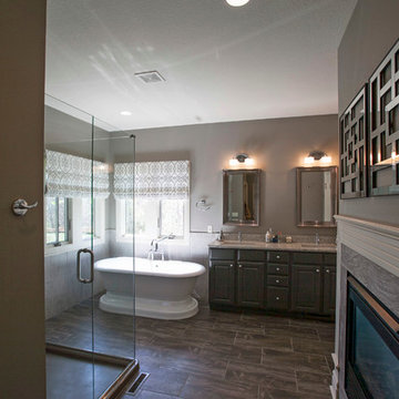
Inspiration for a timeless master gray tile and porcelain tile porcelain tile bathroom remodel in Other with an integrated sink, raised-panel cabinets, gray cabinets, solid surface countertops, a two-piece toilet and gray walls
Inspiration for a timeless master gray tile and porcelain tile porcelain tile bathroom remodel in Other with an integrated sink, raised-panel cabinets, gray cabinets, solid surface countertops, a two-piece toilet and gray walls
 Alair Homes Plano
Our clients house was built in 2012, so it was not that outdated, it was just dark. The clients wanted to lighten the kitchen and create something that was their own, using more unique products. The master bath needed to be updated and they wanted the upstairs game room to be more functional for their family.
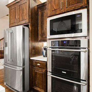
The original kitchen was very dark and all brown. The cabinets were stained dark brown, the countertops were a dark brown and black granite, with a beige backsplash. We kept the dark cabinets but lightened everything else. A new translucent frosted glass pantry door was installed to soften the feel of the kitchen. The main architecture in the kitchen stayed the same but the clients wanted to change the coffee bar into a wine bar, so we removed the upper cabinet door above a small cabinet and installed two X-style wine storage shelves instead. An undermount farm sink was installed with a 23” tall main faucet for more functionality. We replaced the chandelier over the island with a beautiful Arhaus Poppy large antique brass chandelier. Two new pendants were installed over the sink from West Elm with a much more modern feel than before, not to mention much brighter. The once dark backsplash was now a bright ocean honed marble mosaic 2”x4” a top the QM Calacatta Miel quartz countertops. We installed undercabinet lighting and added over-cabinet LED tape strip lighting to add even more light into the kitchen.
We basically gutted the Master bathroom and started from scratch. We demoed the shower walls, ceiling over tub/shower, demoed the countertops, plumbing fixtures, shutters over the tub and the wall tile and flooring. We reframed the vaulted ceiling over the shower and added an access panel in the water closet for a digital shower valve. A raised platform was added under the tub/shower for a shower slope to existing drain. The shower floor was Carrara Herringbone tile, accented with Bianco Venatino Honed marble and Metro White glossy ceramic 4”x16” tile on the walls. We then added a bench and a Kohler 8” rain showerhead to finish off the shower. The walk-in shower was sectioned off with a frameless clear anti-spot treated glass. The tub was not important to the clients, although they wanted to keep one for resale value. A Japanese soaker tub was installed, which the kids love! To finish off the master bath, the walls were painted with SW Agreeable Gray and the existing cabinets were painted SW Mega Greige for an updated look. Four Pottery Barn Mercer wall sconces were added between the new beautiful Distressed Silver leaf mirrors instead of the three existing over-mirror vanity bars that were originally there. QM Calacatta Miel countertops were installed which definitely brightened up the room!
Originally, the upstairs game room had nothing but a built-in bar in one corner. The clients wanted this to be more of a media room but still wanted to have a kitchenette upstairs. We had to remove the original plumbing and electrical and move it to where the new cabinets were. We installed 16’ of cabinets between the windows on one wall. Plank and Mill reclaimed barn wood plank veneers were used on the accent wall in between the cabinets as a backing for the wall mounted TV above the QM Calacatta Miel countertops. A kitchenette was installed to one end, housing a sink and a beverage fridge, so the clients can still have the best of both worlds. LED tape lighting was added above the cabinets for additional lighting. The clients love their updated rooms and feel that house really works for their family now.
Design/Remodel by Hatfield Builders & Remodelers | Photography by Versatile Imaging

 PPG PROLUXE Wood Finishes
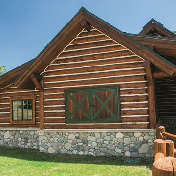
The rich wood tone and sheen of this log home were achieved with PPG® PROLUXE™ Cetol® Log & Siding wood finish in Teak, applied by Rudy Mendiola of The Log Doctor. The contrast of the chinking (the special sealant used between the logs) is used as a stylistic element of this home. Metal trim on barn-style window shutters adds additional character.
 Alair Homes Plano
Our clients house was built in 2012, so it was not that outdated, it was just dark. The clients wanted to lighten the kitchen and create something that was their own, using more unique products. The master bath needed to be updated and they wanted the upstairs game room to be more functional for their family.
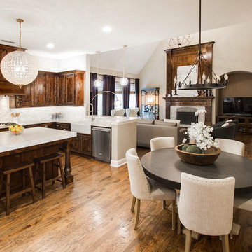
The original kitchen was very dark and all brown. The cabinets were stained dark brown, the countertops were a dark brown and black granite, with a beige backsplash. We kept the dark cabinets but lightened everything else. A new translucent frosted glass pantry door was installed to soften the feel of the kitchen. The main architecture in the kitchen stayed the same but the clients wanted to change the coffee bar into a wine bar, so we removed the upper cabinet door above a small cabinet and installed two X-style wine storage shelves instead. An undermount farm sink was installed with a 23” tall main faucet for more functionality. We replaced the chandelier over the island with a beautiful Arhaus Poppy large antique brass chandelier. Two new pendants were installed over the sink from West Elm with a much more modern feel than before, not to mention much brighter. The once dark backsplash was now a bright ocean honed marble mosaic 2”x4” a top the QM Calacatta Miel quartz countertops. We installed undercabinet lighting and added over-cabinet LED tape strip lighting to add even more light into the kitchen.
We basically gutted the Master bathroom and started from scratch. We demoed the shower walls, ceiling over tub/shower, demoed the countertops, plumbing fixtures, shutters over the tub and the wall tile and flooring. We reframed the vaulted ceiling over the shower and added an access panel in the water closet for a digital shower valve. A raised platform was added under the tub/shower for a shower slope to existing drain. The shower floor was Carrara Herringbone tile, accented with Bianco Venatino Honed marble and Metro White glossy ceramic 4”x16” tile on the walls. We then added a bench and a Kohler 8” rain showerhead to finish off the shower. The walk-in shower was sectioned off with a frameless clear anti-spot treated glass. The tub was not important to the clients, although they wanted to keep one for resale value. A Japanese soaker tub was installed, which the kids love! To finish off the master bath, the walls were painted with SW Agreeable Gray and the existing cabinets were painted SW Mega Greige for an updated look. Four Pottery Barn Mercer wall sconces were added between the new beautiful Distressed Silver leaf mirrors instead of the three existing over-mirror vanity bars that were originally there. QM Calacatta Miel countertops were installed which definitely brightened up the room!
Originally, the upstairs game room had nothing but a built-in bar in one corner. The clients wanted this to be more of a media room but still wanted to have a kitchenette upstairs. We had to remove the original plumbing and electrical and move it to where the new cabinets were. We installed 16’ of cabinets between the windows on one wall. Plank and Mill reclaimed barn wood plank veneers were used on the accent wall in between the cabinets as a backing for the wall mounted TV above the QM Calacatta Miel countertops. A kitchenette was installed to one end, housing a sink and a beverage fridge, so the clients can still have the best of both worlds. LED tape lighting was added above the cabinets for additional lighting. The clients love their updated rooms and feel that house really works for their family now.
Design/Remodel by Hatfield Builders & Remodelers | Photography by Versatile Imaging
 Olamar Interiors
This condo in Sterling, VA belongs to a couple about to enter into retirement. They own this home in Sterling, along with a weekend home in West Virginia, a vacation home on Emerald Isle in North Carolina and a vacation home in St. John. They want to use this home as their "home-base" during their retirement, when they need to be in the metro area for business or to see family. The condo is small and they felt it was too "choppy," it didn't have good flow and the rooms were too separated and confined. They wondered if it could have more of an open concept feel but were doubtful due to the size and layout of the home. The furnishings they owned from their previous home were very traditional and heavy. They wanted a much lighter, more open and more contemporary feel to this home. They wanted it to feel clean, light, airy and much bigger then it is.
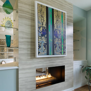
The first thing we tackled was an unsightly, and very heavy stone veneered fireplace wall that separated the family room from the office space. It made both rooms look heavy and dark. We took down the stone and opened up parts of the wall so that the two spaces would flow into each other.
We added a view thru fireplace and gave the fireplace wall a faux marble finish to lighten it and make it much more contemporary. Glass shelves bounce light and keep the wall feeling light and streamlined. Custom built ins add hidden storage and make great use of space in these small rooms.
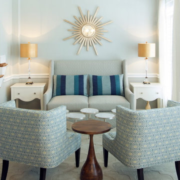
Our strategy was to open as much as possible and to lighten the space through the use of color, fabric and glass. New furnishings in lighter colors and soft textures help keep the feeling light and modernize the space. Sheer linen draperies soften the hard lines and add to the light, airy feel. Tinius Photography
 Olamar Interiors
This condo in Sterling, VA belongs to a couple about to enter into retirement. They own this home in Sterling, along with a weekend home in West Virginia, a vacation home on Emerald Isle in North Carolina and a vacation home in St. John. They want to use this home as their "home-base" during their retirement, when they need to be in the metro area for business or to see family. The condo is small and they felt it was too "choppy," it didn't have good flow and the rooms were too separated and confined. They wondered if it could have more of an open concept feel but were doubtful due to the size and layout of the home. The furnishings they owned from their previous home were very traditional and heavy. They wanted a much lighter, more open and more contemporary feel to this home. They wanted it to feel clean, light, airy and much bigger then it is.
The first thing we tackled was an unsightly, and very heavy stone veneered fireplace wall that separated the family room from the office space. It made both rooms look heavy and dark. We took down the stone and opened up parts of the wall so that the two spaces would flow into each other.
We added a view thru fireplace and gave the fireplace wall a faux marble finish to lighten it and make it much more contemporary. Glass shelves bounce light and keep the wall feeling light and streamlined. Custom built ins add hidden storage and make great use of space in these small rooms.
Our strategy was to open as much as possible and to lighten the space through the use of color, fabric and glass. New furnishings in lighter colors and soft textures help keep the feeling light and modernize the space. Sheer linen draperies soften the hard lines and add to the light, airy feel. Tinius Photography
46