
Search results for "Like minded people" in Home Design Ideas
 Klopf Architecture
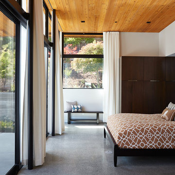
Klopf Architecture, Arterra Landscape Architects and Henry Calvert of Calvert Ventures Designed and built a new warm, modern, Eichler-inspired, open, indoor-outdoor home on a deeper-than-usual San Mateo Highlands property where an original Eichler house had burned to the ground.
The owners wanted multi-generational living and larger spaces than the original home offered, but all parties agreed that the house should respect the neighborhood and blend in stylistically with the other Eichlers. At first the Klopf team considered re-using what little was left of the original home and expanding on it. But after discussions with the owner and builder, all parties agreed that the last few remaining elements of the house were not practical to re-use, so Klopf Architecture designed a new home that pushes the Eichler approach in new directions.
One disadvantage of Eichler production homes is that the house designs were not optimized for each specific lot. A new custom home offered the team a chance to start over. In this case, a longer house that opens up sideways to the south fit the lot better than the original square-ish house that used to open to the rear (west). Accordingly, the Klopf team designed an L-shaped “bar” house with a large glass wall with large sliding glass doors that faces sideways instead of to the rear like a typical Eichler. This glass wall opens to a pool and landscaped yard designed by Arterra Landscape Architects.
Driving by the house, one might assume at first glance it is an Eichler because of the horizontality, the overhanging flat roof eaves, the dark gray vertical siding, and orange solid panel front door, but the house is designed for the 21st Century and is not meant to be a “Likeler.” You won't see any posts and beams in this home. Instead, the ceiling decking is a western red cedar that covers over all the beams. Like Eichlers, this cedar runs continuously from inside to out, enhancing the indoor / outdoor feeling of the house, but unlike Eichlers it conceals a cavity for lighting, wiring, and insulation. Ceilings are higher, rooms are larger and more open, the master bathroom is light-filled and more generous, with a separate tub and shower and a separate toilet compartment, and there is plenty of storage. The garage even easily fits two of today's vehicles with room to spare.
A massive 49-foot by 12-foot wall of glass and the continuity of materials from inside to outside enhance the inside-outside living concept, so the owners and their guests can flow freely from house to pool deck to BBQ to pool and back.
During construction in the rough framing stage, Klopf thought the front of the house appeared too tall even though the house had looked right in the design renderings (probably because the house is uphill from the street). So Klopf Architecture paid the framer to change the roofline from how we had designed it to be lower along the front, allowing the home to blend in better with the neighborhood. One project goal was for people driving up the street to pass the home without immediately noticing there is an "imposter" on this lot, and making that change was essential to achieve that goal.
This 2,606 square foot, 3 bedroom, 3 bathroom Eichler-inspired new house is located in San Mateo in the heart of the Silicon Valley.
Klopf Architecture Project Team: John Klopf, AIA, Klara Kevane
Landscape Architect: Arterra Landscape Architects
Contractor: Henry Calvert of Calvert Ventures
Photography ©2016 Mariko Reed
Location: San Mateo, CA
Year completed: 2016
 Airoom Architects-Builders-Remodelers
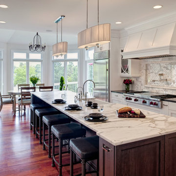
Airoom remodeled this kitchen with Old Hollywood glamour in mind, but included contemporary touches like appliances from Subzero and Wolf. Large windows provide natural light and a stunning lakefront view. Sparkling crystal cabinets flank a backsplash in laser-cut Calcutta Gold marble – also featured in the polished countertops. A barreled ceiling crowns the butler’s pantry, and the warmth of these durable Brazilian cherry floors balance the gleaming monochrome look throughout the kitchen area.
 Milgard Windows & Doors
The Kiguchi family moved into their Austin, Texas home in 1994. Built in the 1980’s as part of a neighborhood development, they happily raised their family here but longed for something more contemporary. Once they became empty nesters, they decided it was time for a major remodel. After spending many years visiting Austin AIA Home Tours that highlight contemporary residential architecture, they had a lot of ideas and in 2013 were ready to interview architects and get their renovation underway.
The project turned into a major remodel due to an unstable foundation. Architects Ben Arbib and Ed Hughey, of Arbib Hughey Design were hired to solve the structural issue and look for inspiration in the bones of the house, which sat on top of a hillside and was surrounded by great views.
Unfortunately, with the old floor plan, the beautiful views were hidden by small windows that were poorly placed. In order to bring more natural light into the house the window sizes and configurations had to be addressed, all while keeping in mind the homeowners desire for a modern look and feel.
To achieve a more contemporary and sophisticated front of house, a new entry was designed that included removing a two-story bay window and porch. The entrance of the home also became more integrated with the landscape creating a template for new foliage to be planted. Older exterior materials were updated to incorporate a more muted palette of colors with a metal roof, dark grey siding in the back and white stucco in the front. Deep eaves were added over many of the new large windows for clean lines and sun protection.
“Inside it was about opening up the floor plan, expanding the views throughout the house, and updating the material palette to get a modern look that was also warm and inviting,” said Ben from Arbib Hughey Design. “Prior to the remodel, the house had the typical separation of rooms. We removed the walls between them and changed all of the windows to Milgard Thermally Improved Aluminum to connect the inside with the outside. No matter where you are you get nice views and natural light.”
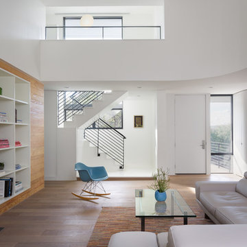
The architects wanted to create some drama, which they accomplished with the window placement and opening up the interior floor plan to an open concept approach. Cabinetry was used to help delineate intimate spaces. To add warmth to an all-white living room, white-washed oak wood floors were installed and pine planks were used around the fireplace. The large windows served as artwork bringing the color of nature into the space.
An octagon shaped, elevated dining room, (named “the turret”), had a big impact on the design of the house. They architects rounded the corners and added larger window openings overlooking a new sunken garden. The great room was also softened by rounding out the corners and that circular theme continued throughout the house, being picked up in skylight wells and kitchen cabinetry. A staircase leading to a catwalk was added and the result was a two-story window wall that flooded the home with natural light.
When asked why Milgard® Thermally Improved Aluminum windows were selected, the architectural team listed many reasons:
1) Aesthetics: “We liked the slim profiles and narrow sightlines. The window frames never get in the way of the view and that was important to us. They also have a very contemporary look that went well with our design.”
2) Options: “We liked that we could get large sliding doors that matched the windows, giving us a very cohesive look and feel throughout the project.”
3) Cost Effective: “Milgard windows are affordable. You get a good product at a good price.”
4) Custom Sizes: “Milgard windows are customizable, which allowed us to get the right window for each location.”
Ready to take on your own traditional to modern home remodeling project? Arbib Hughey Design advises, “Work with a good architect. That means picking a team that is creative, communicative, listens well and is responsive. We think it’s important for an architect to listen to their clients and give them something they want, not something the architect thinks they should have. At the same time you want an architect who is willing and able to think outside the box and offer up design options that you may not have considered. Design is about a lot of back and forth, trying out ideas, getting feedback and trying again.”
The home was completely transformed into a unique, contemporary house perfectly integrated with its site. Internally the home has a natural flow for the occupants and externally it is integrated with the surroundings taking advantage of great natural light. As a side note, it was highly praised as part of the Austin AIA homes tour.
Find the right local pro for your project
 Green Bay Remodeling Inc.
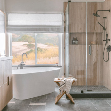
Our spa-like Pleasanton bathroom remodel. Contemporary, bold yet calm bathroom. Full bathroom remodeling with a wood accent wall and gray tiles to complete the modern look of the space. Freestanding tub with a stainless steel tub filler, modern light fixture, wooden custom vanity, black quartz & gray veins countertop, round wood mirrors, double free-standing shower with the wooden finished wall.
 FineLine Kitchens, Inc.
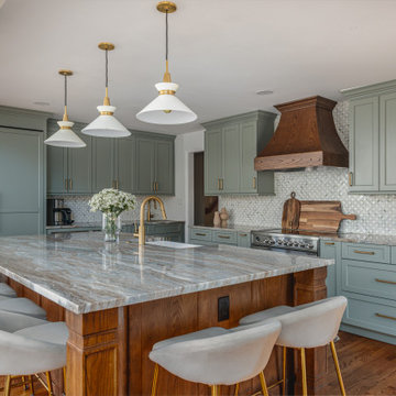
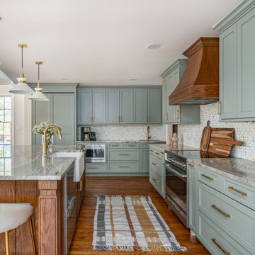
Hi everyone, I'm Sarah and Ogun we are here with fine line kitchens. So we are a couple working together. I do the interior design and remodeling of the space material selection meeting with the clients. And I handled operations outside, you know meaning all the construction work that is taking place the inside. The houses that we work in. I handle all the aspects of the construction, so today's project is very special. We're in Vienna and the client had a very big family. It's a family of seven that lives here. So we had a few aspects that we needed to keep in mind while designing this one. Having everybody be able to sit on the island. So we wanted plenty of seating all the way around. We didn't want anybody standing or anything like that. So what we did is we maximize the space. The center island is the biggest part of the kitchen. We use a natural stone to kind of give it a beautiful texture versus quartz. It's kind of standard white or kind of fabricated, so I wanted something very natural. We did this because I took my inspiration from the outside, so the inspiration if you look at the view right in front of me is there are so many greens there's a lot of brass accents and I wanted to bring this. Into this kitchen while designing it for my clients. She is very warm very. She wanted a very homey, comfy kind of look for the kitchen. So that's what we did today. As you can see, the cabinets are sage green, very light, so I still think it's a neutral, but it's a lighter color that again brings the outside in and we combine that with the oak right behind me so it's a slightly warm oak. It's not very dark. It's not very light. It's a medium brown and the same color went on the island. To kind of tie these two in and the backsplash, my favorite part is where you can see a little bit of design. It is, in my opinion still classic, but includes a pattern so the outside part is as we said in the beginning, is handled by my husband. I'd like him to speak a little bit about that. Thanks, Sarah, I want to talk to you guys a little bit about the construction part of this project. Originally this kitchen was located mostly in this area. They had their stove there sing. It was more of a peninsula layout in Sarah's and the customer vision they wanted. They wanted to get rid of the peninsula and they want to be able to have a huge island that can at least sit seven people because they're familiar with seven. So we wanted to make sure that we can achieve this design and bring it to life so that they can be happy with this layout. Some of the challenges we had, the house, the home being, you know, old home. There were a lot of you know the older electrical and plumbing that had to be replaced. We had to relocate the stove from here to this area. Over here we had put a nice foot fan that we had to relocate all the ductwork and the plumbing. Was being on the peninsula area. We had to relocate it to the center islands. So we achieved all this and kind of like bring it to bring in this kitchen up to date it looks beautiful. That's true, so yes, the old layout did not function for my clients because everything was kind of gathered on one side of the kitchen. So there was like a peninsula right there. So the end of this island kind of continued straight. And that was just the L shape. Kind of where everything was and there used to be another big table here, so they were using only kind of half of the space. So like I said at the beginning, our vision was to kind of feed everybody at the island, create some symmetry. 'cause I love that. So as you can see behind me, this is kind of the focal point symmetrical. Everything is kind of even we wanted to also panel the fridge here so it mimics the pantry and another size. So when you're looking at it, it is bringing again that symmetry back again. I hope you enjoyed this kitchen and this video and I'll see you soon. So how do you think this project turned out? It's nice. I like the color. I think it turned out nice. It's kind of like a little bit different color than what we always do. So I realize. Are you giving me a little bit of credit here that I did something different? Are you proud? I'm so proud of you. Other than that I like it. That they have kind of like a two sink. So if this was our kitchen, if we ever like you can have your own. I can have mine if we ever get into a fight then this can be like my own kitchen. Why are we gonna bring in a fight right now? So I'm cooking anyway. You're grilling most of the time, So what are you even talking about? My kitchen? That's my kitchen. You can just take the small sink. That's fine. It's always good to have your own space right there, so anyways. Thank you guys for watching. We hope to see you soon and if you have any questions please click the link below. It'll lead you to our website, house, YouTube and all of the social media is so nice to have you guys. We'll see you soon. Thanks bye bye-bye.
 AquaTerra Outdoors
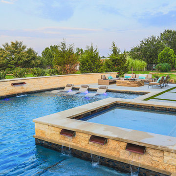
This late 70's ranch style home was recently renovated with a clean, modern twist on the ranch style architecture of the existing residence. We were hired to create the entire outdoor environemnt including the new pool and spa. Similar to the renovated home, this aquatic environment was designed to take a traditional pool and gives it a clean, modern twist. The site proved to be perfect for a long, sweeping curved water feature that can be seen from all of the outdoor gathering spaces as well as many rooms inside the residence. This design draws people outside and allows them to explore all of the features of the pool and outdoor spaces. Features of this resort like outdoor environment include play pool with two lounge areas with LED lit bubblers, Pebble Tec Pebble Sheen Luminous series pool finish, Lightstreams glass tile, spa with six custom copper Bobe water spillway scuppers, water feature wall with three custom copper Bobe water scuppers, Fully automated with Pentair Equipment, LED lighting throughout the pool and spa, gathering space with automated fire pit, lounge deck area, synthetic turf between step pads and deck and a fully loaded Gourmet outdoor kitchen to meet all the entertaining needs.
This outdoor environment cohesively brings the clean & modern finishes of the renovated home seamlessly to the outdoors to a pool and spa for play, exercise and relaxation.
Photography: Daniel Driensky
 Robert Thomas Homes
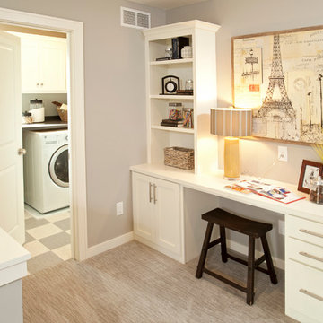
This home is built by Robert Thomas Homes located in Minnesota. Our showcase models are professionally staged. Please contact Ambiance at Home for information on furniture - 952.440.6757


 designstiles
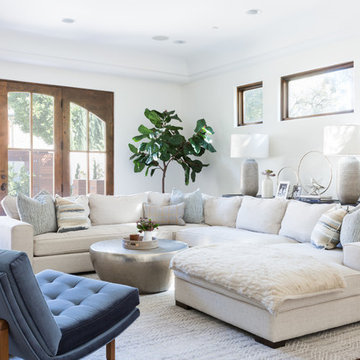
 “People tend to want to place their sofas right against the wall,” Lovett says. “I always try to float the sofa a bit and give the sofa some breathing room. Here, we didn’t have floor outlets or any eye-level lighting. Incorporating table lamps allows for mood lighting and ambiance. We placed a console behind the sofa to bring in large-scale lamps, which also helped fill in the negative space between the sofa and the bottom of the windows.”
Photography: Amy Bartlam
 Eldorado Stone
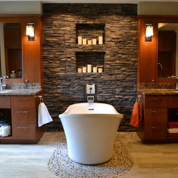
The goal of this master suite remodel was to design a luxurious yet simple environment that was not only beautiful but also comfortable, and designer Lori Wiles brought the transformation to life.
The remodel was a transformation of the unused storage area in the bottom level of the clients’ home. Wiles' creative problem solving did more than just hide basement remodel problems like low ductwork and poorly located pipes. Instead, these obstacles served as a source of inspiration for some of the most interesting aspects of her design, such as the angular wood-paneled headboard wall with built-in nightstands.
Following a stone, fire, water, and wood theme, the materials used in this master suite strongly relate to nature. Water flows to the tub from the stone accent wall in the bathroom, and an opposing stone wall in the bedroom creates a dramatic backdrop for a seating area. Both walls contain candle-filled niches and Cherry wood is employed throughout, creating warmth and continuity.
To further achieve the natural look and feel of the bathroom, Wiles incorporated a variety of stones. The shower and immediate area around the freestanding tub feature pebble accent flooring that complement the surrounding large, rectangular tile floors. Eldorado Stone’s Black River Stacked Stone was chosen because it offered different textures and dimensions of the black, rugged, stacked stone, resulting in an organic environment that provides relief from the flat surfaces.
By using quality materials such as Eldorado Stone, designer Lori Wiles was able to create a zen-like space that exceeded her client’s expectations.
Eldorado Stone Profile Featured: Black River Stacked Stone installed with a Dry-Stack grout technique
Designer: Lori Wiles Design
Website: www.loriwilesdesign.com
Phone: (319) 310-6214
Contact Lori Wiles Design
Houzz: www.houzz.com/pro/loriwiles/lori-wiles-design
Facebook: www.facebook.com/pages/Lori-Wiles-Design
Pinterest: www.pinterest.com/loriwilesdesign/
Photography: Lori Wiles Design
Mason: Iowa Stone Supply
Website: www.iowastonesupply.com
Phone: (319) 533-4299
Contact Iowa Stone Supply
Eastern Iowa Showroom (Monday-Friday 7:30-4:00 or by appointment)
1530 Stamy Road
Hiawatha, IA 52233
Central Iowa Showroom (by appointment)
2913 99th Street
Urbandale, IA 50322
Facebook: www.facebook.com/pages/Iowa-Stone-Supply
 Plain & Posh
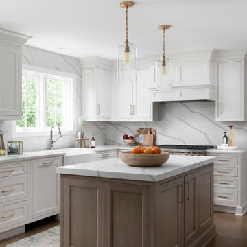
Thse clients came to me for a kitchen refresh. Keeping the existing floor plan but updating as much as possible. After explaining my thoughts, they chose to go with a much larger project. The wall to the garage wash pushed bach 12" to allow for the island to happen. This almost couldn't happen as there is a support post in the garage we had to keep. I designed the last pantry area as on 10" deep, allowing us to conceal that behind the cabinets. Then, we opend up the wall to the dining room to make the rooms one large space. The wall to the family room was also openend up, leaving the half wall to allow for the kitchen eating area. They wanted to incorporate a bar area, without it feeling like a "bar" The fabulous tall custom unit houses their wine collection and then half of the dining room buffet area holds glassware and other bar items. I helped the clients with all of the design choices.We all wanted to keep the space classic, war, functional and with mixed materials. I chose to use the same countertop material for the backsplash, to keep the space feeling as large as possible.
 Peter Salerno Inc
Peter Rymwid
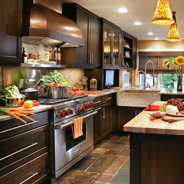
Mid-sized transitional slate floor eat-in kitchen photo in New York with a farmhouse sink, shaker cabinets, dark wood cabinets and granite countertops
Mid-sized transitional slate floor eat-in kitchen photo in New York with a farmhouse sink, shaker cabinets, dark wood cabinets and granite countertops

 FineLine Kitchens, Inc.
Hi everyone, I'm Sarah and Ogun we are here with fine line kitchens. So we are a couple working together. I do the interior design and remodeling of the space material selection meeting with the clients. And I handled operations outside, you know meaning all the construction work that is taking place the inside. The houses that we work in. I handle all the aspects of the construction, so today's project is very special. We're in Vienna and the client had a very big family. It's a family of seven that lives here. So we had a few aspects that we needed to keep in mind while designing this one. Having everybody be able to sit on the island. So we wanted plenty of seating all the way around. We didn't want anybody standing or anything like that. So what we did is we maximize the space. The center island is the biggest part of the kitchen. We use a natural stone to kind of give it a beautiful texture versus quartz. It's kind of standard white or kind of fabricated, so I wanted something very natural. We did this because I took my inspiration from the outside, so the inspiration if you look at the view right in front of me is there are so many greens there's a lot of brass accents and I wanted to bring this. Into this kitchen while designing it for my clients. She is very warm very. She wanted a very homey, comfy kind of look for the kitchen. So that's what we did today. As you can see, the cabinets are sage green, very light, so I still think it's a neutral, but it's a lighter color that again brings the outside in and we combine that with the oak right behind me so it's a slightly warm oak. It's not very dark. It's not very light. It's a medium brown and the same color went on the island. To kind of tie these two in and the backsplash, my favorite part is where you can see a little bit of design. It is, in my opinion still classic, but includes a pattern so the outside part is as we said in the beginning, is handled by my husband. I'd like him to speak a little bit about that. Thanks, Sarah, I want to talk to you guys a little bit about the construction part of this project. Originally this kitchen was located mostly in this area. They had their stove there sing. It was more of a peninsula layout in Sarah's and the customer vision they wanted. They wanted to get rid of the peninsula and they want to be able to have a huge island that can at least sit seven people because they're familiar with seven. So we wanted to make sure that we can achieve this design and bring it to life so that they can be happy with this layout. Some of the challenges we had, the house, the home being, you know, old home. There were a lot of you know the older electrical and plumbing that had to be replaced. We had to relocate the stove from here to this area. Over here we had put a nice foot fan that we had to relocate all the ductwork and the plumbing. Was being on the peninsula area. We had to relocate it to the center islands. So we achieved all this and kind of like bring it to bring in this kitchen up to date it looks beautiful. That's true, so yes, the old layout did not function for my clients because everything was kind of gathered on one side of the kitchen. So there was like a peninsula right there. So the end of this island kind of continued straight. And that was just the L shape. Kind of where everything was and there used to be another big table here, so they were using only kind of half of the space. So like I said at the beginning, our vision was to kind of feed everybody at the island, create some symmetry. 'cause I love that. So as you can see behind me, this is kind of the focal point symmetrical. Everything is kind of even we wanted to also panel the fridge here so it mimics the pantry and another size. So when you're looking at it, it is bringing again that symmetry back again. I hope you enjoyed this kitchen and this video and I'll see you soon. So how do you think this project turned out? It's nice. I like the color. I think it turned out nice. It's kind of like a little bit different color than what we always do. So I realize. Are you giving me a little bit of credit here that I did something different? Are you proud? I'm so proud of you. Other than that I like it. That they have kind of like a two sink. So if this was our kitchen, if we ever like you can have your own. I can have mine if we ever get into a fight then this can be like my own kitchen. Why are we gonna bring in a fight right now? So I'm cooking anyway. You're grilling most of the time, So what are you even talking about? My kitchen? That's my kitchen. You can just take the small sink. That's fine. It's always good to have your own space right there, so anyways. Thank you guys for watching. We hope to see you soon and if you have any questions please click the link below. It'll lead you to our website, house, YouTube and all of the social media is so nice to have you guys. We'll see you soon. Thanks bye bye-bye.

 Kimberlee Marie Interiors
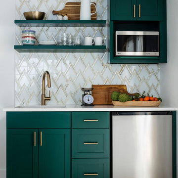
This one is near and dear to my heart. Not only is it in my own backyard, it is also the first remodel project I've gotten to do for myself! This space was previously a detached two car garage in our backyard. Seeing it transform from such a utilitarian, dingy garage to a bright and cheery little retreat was so much fun and so rewarding! This space was slated to be an AirBNB from the start and I knew I wanted to design it for the adventure seeker, the savvy traveler, and those who appreciate all the little design details . My goal was to make a warm and inviting space that our guests would look forward to coming back to after a full day of exploring the city or gorgeous mountains and trails that define the Pacific Northwest. I also wanted to make a few bold choices, like the hunter green kitchen cabinets or patterned tile, because while a lot of people might be too timid to make those choice for their own home, who doesn't love trying it on for a few days?At the end of the day I am so happy with how it all turned out!

 TKS Design Group
Download our free ebook, Creating the Ideal Kitchen. DOWNLOAD NOW
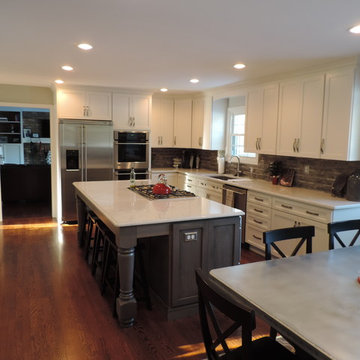
This client was referred to us from a past client. They are a busy 2-career household with young children and enjoy entertaining friends and family in their home. They have a beautiful open concept home but unfortunately the kitchen was not fitting for the rest of the home. They were not quite sure what to do with the space. We talked about trying to refresh it or do more of a minor remodel, but in the end they decided a full gut would get them to where they wanted to be.
One problem was there was no place for guests to hang out other than the large and awkward banquette area. The brick wall and tiled hood area were feeling a bit dated and tired. The space was just not functional for their lifestyle. There was no prep space near the cooktop and no landing area for items coming out of the ovens or refrigerator, plus a big dead zone in the center of the room.
Banquettes, like the one they previously had in the space, are great for small spaces, but when they get really large like this one, it makes getting in and out of the seating area awkward and uncomfortable. Plus, there was room for a large table, so we eliminated the awkward built in.
We started by removing the faux brick wall between the kitchen and back entry. We relocated the entry to the garage over a couple feet in order to get every last inch out of the new kitchen. We also made the decision to close up the primary window that faced the pretty ho hum brick wall of the neighbor’s house. There was plenty of light coming in from the seating area, so we just didn’t feel the window was adding much to the room.
Construction went smoothy. There was a bit of rework with electrical, flooring and HVAC, but in the end, we think it was well worth it.
The clients really wanted a sleek contemporary look, and we originally had planned for a full height slab backsplash, but due to it’s size, it was a budget buster. Instead, we got creative and settled on large format porcelain tiles that have a similar feel but were a fraction of the cost. We made sure the wall was plumb and level so that the fit and finish would mimic that of slab material.
The final space was quite a change. A large prep sink sits directly across from the new pro-style range with plenty additional prep space on the large island. The refrigerator and ovens now have miles of landing space, and a nice tight work triangle makes cooking a breeze.
Since we wanted a more contemporary feel, not many wall cabinets were included. Instead, we outfitted some of the drawers for dish storage with a peg system. Two large pantries flanking the refrigerator hold baking supplies and small appliances. Large drawers by the cooktop hold pots and pans, and an appliance garage tucked away to the left of the range hides away miscellaneous items. The large island also houses a microwave drawer and tons of storage, most of which is drawers offering maximum convenience.
The island now seats 5-6 people comfortably along with the new table in the seating area which can seat up to 8. Entertaining will be a breeze in this space. With such a clean backdrop, we knew we would need some drama with the lighting, so we chose two sets of staggered pendants, which we adjusted for the right visual balance above the island.
We also included a small coffee station to the right of the main kitchen, which helps keep the coffee clutter out of the kitchen proper. Two tones of complimentary gray are featured in this kitchen. The perimeter is a light gray that reads almost white. The island is a gray stain that adds some depth and interest with the visible wood texture. The countertops are clean white quartz, and the hardware, barstools and light fixtures add warm brass tones. I see lots of cooking and entertaining with family and friends in the near future in this bright and airy new space.
Designed by: Susan Klimala, CKD, CBD
Photography by: Michael Kaskel
For more information on kitchen and bath design ideas go to: www.kitchenstudio-ge.com
 STAK Architecture
Nestled in a historic residential neighborhood this 1950s Baptist Church was outgrown by its congregation. The building was left unused for 12 years until it was adapted for reuse as a single family home. The home, for a young family of four, was designed with the healthy building principles in mind. The completed house is net zero ready, meaning that all of the systems necessary to convert this house to a net zero home are in place, all that is needed are solar panels. Though the original building was in very rough shape, the design team worked hard to retain as much of the original form as possible. The addition distinguishes itself from the original through materiality and structural articulation. The new form hovers on cantilevers, creating a light touch with the ground plane, in contrast to the heavy form of the original masonry structure. Even though the new building has a modern aesthetic it had to conform to some of the historic neighborhood ordinances of the city. The completed product is loved by the neighborhood, with many people taking their evening walks to pass by their new favorite house.
 Kristyn Harvey Interiors
Client wanted a spacious kitchen with separate work zones so she could cook while her husband helped clean up. Kitchen island was designed to grow with the family and features seating for up to 5 people and a homework station, complete with outlets in the drawers, at the end of the island.
Bar was intentionally designed as a more masculine version of the kitchen. The left side houses drinkware while the right side is a coffee and tea nook. Porcelain countertop runs the entirety of the bar to provide an anxiety-free coffee making experience (for us slightly OCD people out there!). Custom built parquet dining table with easy to maintain black chairs for the couples 2 young kids.

Sponsored
Columbus, OH
Free consultation for landscape design!

Peabody Landscape Group
Franklin County's Reliable Landscape Design & Contracting
 Home Advertising
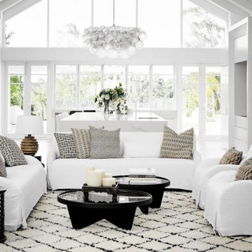
A Hampton style sofa has become a necessity in home decor as people become more familiar with the Hampton interior style. Hampton style sofas are a good choice for timeless design if you are replacing or buying a new one. When you are uncertain of what you want, buying a sofa can seem challenging. If you're trying to select La maison hampton furniture for one of your home's most important rooms, you have a lot to take into account. It maust suit your taste and function.
Couches require thought and consideration. It is important that you choose a style and a color that goes well with your living area, along with a durable material that meets your needs. The front door must also be able to accommodate the rug. So, don't forget to familiarize yourself with the different sizes, fillings, and textures before creating your budget. You don't have to spend a lot of money on a new sofa, but while there are some places where you can save money, there are others where you should invest.
First, Let's Talk about the Vibe of sofa style
First and foremost, you should consider the style of your sofa. Choose a sofa whose style fits the current theme of your home. It may seem very obvious, but many people simply buy whatever suits their fancy, and unfortunately, the style of the room is a lot of the time different from what suits their fancy.
If the rug or the art above the sofa don't go together, it might not work in the room. It's imperative to get the look right before adding the rest of these elements. Make sure you consider how you wish the room to feel when you're in it. If you're looking for something more colorful, or you have a particular style in mind, such as mid-century (then googling 'Hampton style sofas' will prove valuable). A sofa that looks great but is super-comfy might end up looking completely out of place if you skip this step.
Next, We will Discuss Functionality of sofas
It is important to consider what you will be doing with the sofa. Although I am convinced that the answer is "to sit on", we need to dig deeper. Can you, for instance, sit down for drinks in this formal sitting room when company comes over? Do you watch television in this room every day? There is a rumpus room upstairs for the kids to interact with their friends and eat and drink on it? There might be Hampton style sofas in the guest room.
For your convenience, I have compiled a full list of Hampton style sofas here. Depending on the situation, each sofa style needs to be different. Typically, formal couches tend to be less comfortable. They're usually more rigid and upright. Couches for watching TV should be cushier; they should be comfortable. We know that many teens are not concerned about Hampton style sofas maintenance, so kids zones need sofas that are able to withstand more wear and tear. This is something high schools should teach.
This story shows you the importance of not skipping this important ‘how will it be used? At this point, you should have an idea of how you'll use the Hampton style sofas. Consider, for instance, a sofa with a bold color and a formal feel for your living room. If you want a couch with a relaxed feel, choose a neutral shade with a cushy feel.
Dimensions of an ideal hamptons style sofa
Before you buy a Hampton style sofa, you must measure the size of your current living room. You will probably not fit it if you don't do this. A large one will either overwhelm the room and leave no room for a coffee table, or a small one will look dwarfed in comparison. When a pandemic strikes, scale is everything.
You should be able to fit the sofa into the room comfortably without it feeling too large or small. Measure the width of your La maison hampton furniture style sofas first with a tape measure. Consider if you'd like side tables beside your sofa. In that case, you would need to measure the width of either side of your sofa and add around 50cm to either side (most decent side tables have a width of about 50cm).
In addition to measuring Hampton style sofas depth, you should also measure the width. There are some sofas that can be as deep as a metre (from the front of the sofa cushion to its back). Since your sofa will need an allowance of 50cm from the edge of the coffee table to the front of the sofa, and a minimum of 50cm on the other side of the coffee table, you might want to measure your current coffee table to ensure it matches.
Another Important Factor is Height
In an open-plan living room, this element is particularly important if your sofa crosses the space. When you have a sectional sofa, for example, one of the ends will likely cut across the room, so the back should be low so your eye can still pass over the back.
One of the top 10 living room design mistakes I make is to place tall-backed Hampton style sofas across the room, a mistake that really cramps the style of the whole space. It happens way too often.
Although the height won't be a major issue if the sofa is backed up against a wall, it is still worth considering the size of the art you want to hang above it. If you want neck support whilst watching TV, a low-back sofa might not be for you. My neck tends to become less and less flexible as I get older. It's a sad fact, but true nonetheless. If you find yourself in the same situation, you should consider high-back Hampton style sofas.
Sofa Cushions: How Low are They?
Many people don't think about this dimension when purchasing a sofa online, especially if they're doing so for the first time. If you're road-testing the sofa in-store, you'll know if it's too low for you right away, but an online purchase is something else. Low-profile sofas have a seat height of 40 cm or less. The sofa's 60cm seat height will make it much more difficult to get up and out of it. The importance of this factor increases as we age or if we have mobility problems.
The seat you're sitting in should allow you to stand up comfortably, without feeling like you need assistance. Additionally, the height of your coffee table should not be higher than the seat cushions on the sofa, because the table should never be higher than the seat cushions on the sofa. They should never be higher than each other. Make sure you take notes!
What Else is There in the Room?
A good idea when choosing a sofa is to consider what other elements will be in the room. For a well-designed, elegantly-resolved living room, you'll need a sofa, rug, coffee table, side table/s, lamp, TV unit, and wall art. The room will not feel right if you buy a massive sectional sofa that takes up the entire room and leaves no space for a coffee table or side tables.
You should measure out your sofa, keeping in mind that the other pieces La maison hampton furniture and decor will also need to fit into the space. All pieces of furniture need to have enough space to breathe. It's best not to have all the furniture crammed into the point where sitting down means hitting your legs or feet against pieces. You probably now understand that choosing a couch is more about the couch itself than with how to choose it. So think of the big picture whenever you choose something.
Two Two-Seaters, or a Sectional Sofa?
People often have to wrestle with the question of whether they should buy two sofas or one sectional when figuring out how to choose a sofa. Sectionals are usually preferable to two separate two-seater sofas. However, the corner piece is rarely occupied anyway. Often, the corner piece of a sectional is so tiny that it is impossible for a person to sit there comfortably. Therefore, think about whether you actually need this over getting two x two-seater sofas and arranging them into an L-shape.
If you don't have a large living room, you might prefer 2 x two-seater sofas instead. Sectional sofas are best for larger rooms. With the visual break of all that fabric dominating the corner, it will do the room a world of good. Furthermore, you can use the space between your sofas to put a side table so you can place drinks, or a table lamp, there.
You may want to consider getting 1 x two-seater sofa and an armchair instead, if you have a really small living room. Even though you want to seat as many people as possible, you should let the room determine how many people the sofa can accommodate.
A Guide to Picking the Right Material
The material of the sofa is obviously very important when it comes to picking out the right one. The best advice I can offer is to consider who will use the sofa and how that will impact maintenance.
Leather sofas are easier to clean than fabric ones when kids or pets are present. Leather has the disadvantage of retaining heat in the winter and being cold in the summer. Cushions work well with leather sofas, but velvet ones work better with leather sofas. Leather will show up claw marks more easily on some pets (like my cats).
It is true that fabric sofas are softer and cozier, but they can also be more difficult to clean. Having a slipcover sofa is a godsend if you have pets or toddlers, but they're not too easy to maintain.
You should consider how much patience you have to keep the sofa clean and who uses it. That will make it easier to decide what material to use. I work with a sofa supplier who has bomb-proof fabric that is so easy to clean that you can literally serve dinner right onto the cushions without making an utter mess.
 Mary Cook
Taylor Photo
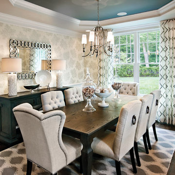
Inspiration for a transitional dark wood floor and brown floor dining room remodel in Chicago with beige walls
Inspiration for a transitional dark wood floor and brown floor dining room remodel in Chicago with beige walls
 Revision LLC
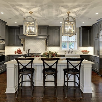
Large transitional u-shaped dark wood floor and brown floor kitchen photo in Minneapolis with gray cabinets, white backsplash, stainless steel appliances, an island, raised-panel cabinets, a farmhouse sink, solid surface countertops, white countertops and ceramic backsplash
1