
Search results for "Litre difference" in Home Design Ideas
 Robin's Nest Interiors
Updated Spec Home: Basement Living Area
I promised you there would be a Season 2 of our series Updated Spec Home and here it is – Basement Family Room. My mom and sister found themselves spending more and more time in this room because it was a great open space to watch television and hang out with my sister’s two border collies.
Color Scheme
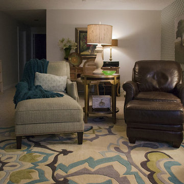
We pulled our color scheme from a floral fabric that they saw on a chair at my store, and we used it to reupholster their existing wood accent chairs. We used pops of turquoise and green throughout the space including the long back wall which was perfect to make a feature with this vibrant wallpaper in a geometric design.
Defining the Space
The room was so large that we needed to define different areas. The large rug in the oversized pattern was perfect for the seating area.
Lighting
Since there is only one small window bringing natural light into the space, we painted the remaining walls a light warm gray (Sherwin Williams’ City Loft SW7631) and added several table lamps and a floor lamp for task lighting.
Reusing Existing Furniture
Fortunately the space was large enough so my sister could keep her fabulous worn leather chair and ottoman and my mom could have an upholstered chair and ottoman in a subtle blue and green tweed.
The large hallway leading to the storage area was the perfect place for these small bookcases which house family photos in various silver frames. The bookcases have a special place in our hearts – they belonged to my grandparents. We accessorized with a long painted box which was the perfect scale for the bookcases and a grouping of vibrant botanical prints.
In lieu of a conventional media cabinet, my mom and sister found this one with a built-in fireplace. It brings a lot of warmth into the space – literally!
Painted Furniture
We had Kelly Sisler of Kelly Faux Creations paint their existing glass front cabinet this awesome apple green. Accessories include turquoise floral vases, a metallic circular vase, and a beautiful floral print.
Reading Nook
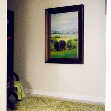
We positioned this original oil painting in the landing so it would be visible from the seating area. The landing was the perfect spot to display my sister’s collection of art glass. I love the small reading nook created with this rattan wooden accent chair and lantern floor lamp. We were able to make good use of the ledge in the stairwell by leaning these vibrant watercolors.
The dogs even have their own space. Meet my two “nephews” – Dill and Atticus (the one with his back to us pouting). We used this colorful oversized canvas to define their space and break up the long wall.
As you know, one good thing leads to another. Be sure to tune in next week for a surprise addition to this Updated Spec Home. In the meantime, check out this Basement Family Room designed by Robin’s Nest Interiors. Enjoy!
 User
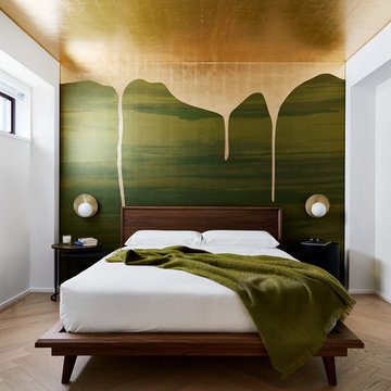
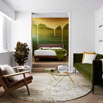
UserA custom handmade wall covering recalls historical canopy beds transforming the bed now to the scale of the space. Vancouver's Stanley Park provides the tonal inspiration set underneath a luminous gold sky.
Photo by:
David Mitchell

 TKS Design Group
Free ebook, Creating the Ideal Kitchen. DOWNLOAD NOW
One of my favorite things to work on is older homes with a bit of history because I find it an interesting challenge to marry the historical architectural features of a home with modern design elements that work well for my client’s current lifestyle.
This home was particularly fun because it was the second kitchen we had done for this family and was quite a departure from the style of the first kitchen.
The before shot of the kitchen shows a view from the family room. See the dropped ceiling? We were curious, was this just part of the design or was the dropped ceiling there to hide mechanicals? Well we soon found out that it was mostly decorative (yay!), and with the exception of a little bit of work to some plumbing from an upstairs bathroom and rerouting of the ventilation system within the original floor joists, we were in the clear, phew! The shot of the completed kitchen from roughly the same vantage point shows how much taller the ceilings are. It makes a huge difference in the feel of the space. Dark and gloomy turned fresh and light!
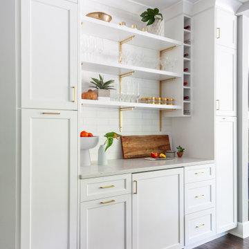
Another serious consideration was what do we do with the skinny transom window above the refrigerator. After much back and forth, we decided to eliminate it and do some open shelving instead. This ended up being one of the nicest areas in the room. I am calling it the “fun zone” because it houses all the barware, wine cubbies and a bar fridge — the perfect little buffet spot for entertaining. It is flanked on either side by pull out pantries that I’m sure will get a ton of use. Since the neighboring room has literally three walls of almost full height windows, the kitchen gets plenty of light.
The gold shelving brackets, large pendant fixtures over the island and the tile mural behind the range all pay subtle homage to the home’s prairie style architecture and bring a bit of sparkle to the room.
Even though the room is quite large, the work triangle is very tight with the large Subzero fridge, sink and range all nearby for easy maneuvering during meal prep. There is seating for four at the island, and work aisles are generous.
Designed by: Susan Klimala, CKD, CBD
Photography by: LOMA Studios
For more information on kitchen and bath design ideas go to: www.kitchenstudio-ge.com
Find the right local pro for your project
 TKS Design Group
Free ebook, Creating the Ideal Kitchen. DOWNLOAD NOW
One of my favorite things to work on is older homes with a bit of history because I find it an interesting challenge to marry the historical architectural features of a home with modern design elements that work well for my client’s current lifestyle.
This home was particularly fun because it was the second kitchen we had done for this family and was quite a departure from the style of the first kitchen.
The before shot of the kitchen shows a view from the family room. See the dropped ceiling? We were curious, was this just part of the design or was the dropped ceiling there to hide mechanicals? Well we soon found out that it was mostly decorative (yay!), and with the exception of a little bit of work to some plumbing from an upstairs bathroom and rerouting of the ventilation system within the original floor joists, we were in the clear, phew! The shot of the completed kitchen from roughly the same vantage point shows how much taller the ceilings are. It makes a huge difference in the feel of the space. Dark and gloomy turned fresh and light!
Another serious consideration was what do we do with the skinny transom window above the refrigerator. After much back and forth, we decided to eliminate it and do some open shelving instead. This ended up being one of the nicest areas in the room. I am calling it the “fun zone” because it houses all the barware, wine cubbies and a bar fridge — the perfect little buffet spot for entertaining. It is flanked on either side by pull out pantries that I’m sure will get a ton of use. Since the neighboring room has literally three walls of almost full height windows, the kitchen gets plenty of light.
The gold shelving brackets, large pendant fixtures over the island and the tile mural behind the range all pay subtle homage to the home’s prairie style architecture and bring a bit of sparkle to the room.
Even though the room is quite large, the work triangle is very tight with the large Subzero fridge, sink and range all nearby for easy maneuvering during meal prep. There is seating for four at the island, and work aisles are generous.
Designed by: Susan Klimala, CKD, CBD
Photography by: LOMA Studios
For more information on kitchen and bath design ideas go to: www.kitchenstudio-ge.com
 Robin's Nest Interiors
Updated Spec Home: Basement Living Area
I promised you there would be a Season 2 of our series Updated Spec Home and here it is – Basement Family Room. My mom and sister found themselves spending more and more time in this room because it was a great open space to watch television and hang out with my sister’s two border collies.
Color Scheme
We pulled our color scheme from a floral fabric that they saw on a chair at my store, and we used it to reupholster their existing wood accent chairs. We used pops of turquoise and green throughout the space including the long back wall which was perfect to make a feature with this vibrant wallpaper in a geometric design.
Defining the Space
The room was so large that we needed to define different areas. The large rug in the oversized pattern was perfect for the seating area.
Lighting
Since there is only one small window bringing natural light into the space, we painted the remaining walls a light warm gray (Sherwin Williams’ City Loft SW7631) and added several table lamps and a floor lamp for task lighting.
Reusing Existing Furniture
Fortunately the space was large enough so my sister could keep her fabulous worn leather chair and ottoman and my mom could have an upholstered chair and ottoman in a subtle blue and green tweed.
The large hallway leading to the storage area was the perfect place for these small bookcases which house family photos in various silver frames. The bookcases have a special place in our hearts – they belonged to my grandparents. We accessorized with a long painted box which was the perfect scale for the bookcases and a grouping of vibrant botanical prints.
In lieu of a conventional media cabinet, my mom and sister found this one with a built-in fireplace. It brings a lot of warmth into the space – literally!
Painted Furniture
We had Kelly Sisler of Kelly Faux Creations paint their existing glass front cabinet this awesome apple green. Accessories include turquoise floral vases, a metallic circular vase, and a beautiful floral print.
Reading Nook
We positioned this original oil painting in the landing so it would be visible from the seating area. The landing was the perfect spot to display my sister’s collection of art glass. I love the small reading nook created with this rattan wooden accent chair and lantern floor lamp. We were able to make good use of the ledge in the stairwell by leaning these vibrant watercolors.
The dogs even have their own space. Meet my two “nephews” – Dill and Atticus (the one with his back to us pouting). We used this colorful oversized canvas to define their space and break up the long wall.
As you know, one good thing leads to another. Be sure to tune in next week for a surprise addition to this Updated Spec Home. In the meantime, check out this Basement Family Room designed by Robin’s Nest Interiors. Enjoy!
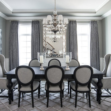
 Kristin Petro Interiors, Inc.
Designer: Sheri Gibson; Photographer: kellyallison photography
Rug, table and chairs from Restoration Hardware.
Elegant dark wood floor dining room photo in Chicago with gray walls and no fireplace
Elegant dark wood floor dining room photo in Chicago with gray walls and no fireplace
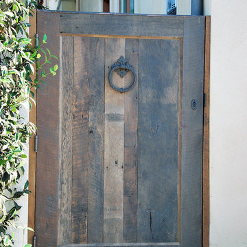
 Dynamic Garage Door
This is one of several custom made gates for a Tuscan Villa style home in Newport Beach, CA. Dynamic Garage Door worked closely with the proud homeowners to achieve a rustic style gate that transmitted the essence of Tuscany's rugged riviera homes. The gates features world-class European hardware including mortise style locks with roller catches and decorative iron pulls that feel authentic to the touch because they were made much in the same way tradition has dictated for centuries.
The goal was to achieve an architectural gate design that would harmonize, not compete, with the home's earthy elements including the rock walls and neutrally toned color scheme. We chose oak as our reclaimed barn wood species for its brown tones that differ from your typical pine species which give you a silver appearance. Oak give off a warmer, brown coloration that is closer to the tonalities found in Tuscan homes.
Nothing gives is more impressive than reclaimed bar wood gates because of the unique lumber characteristics that were given by mother nature over decades and centuries, nothing that can be achieved over night. Dynamic Garage Door craftsmen are highly skilled in preserving these lumber surfaces and keeping them intact. We developed designs and techniques that keep each piece authentic and true to its charming age. Just like wine, reclaimed wood will get better and better over the ageless decades and centuries to come. There is literally no maintenance on our reclaimed wood gates because each passing year is a new layer of gorgeous character that will pass the test of time over and over again!
As an added bonus and value to our already high-end gate designs, we craft each one of our gates on galvanized steel frames which will ensure our gorgeous gates will not only look fabulous but last a lifetime!
Contact us today for prices and perhaps design ideas you might not thought of yet or with your own ideas that others have declined to build for you.
Consultation Center: (855) 343-3667

 TKS Design Group
Free ebook, Creating the Ideal Kitchen. DOWNLOAD NOW
One of my favorite things to work on is older homes with a bit of history because I find it an interesting challenge to marry the historical architectural features of a home with modern design elements that work well for my client’s current lifestyle.
This home was particularly fun because it was the second kitchen we had done for this family and was quite a departure from the style of the first kitchen.
The before shot of the kitchen shows a view from the family room. See the dropped ceiling? We were curious, was this just part of the design or was the dropped ceiling there to hide mechanicals? Well we soon found out that it was mostly decorative (yay!), and with the exception of a little bit of work to some plumbing from an upstairs bathroom and rerouting of the ventilation system within the original floor joists, we were in the clear, phew! The shot of the completed kitchen from roughly the same vantage point shows how much taller the ceilings are. It makes a huge difference in the feel of the space. Dark and gloomy turned fresh and light!
Another serious consideration was what do we do with the skinny transom window above the refrigerator. After much back and forth, we decided to eliminate it and do some open shelving instead. This ended up being one of the nicest areas in the room. I am calling it the “fun zone” because it houses all the barware, wine cubbies and a bar fridge — the perfect little buffet spot for entertaining. It is flanked on either side by pull out pantries that I’m sure will get a ton of use. Since the neighboring room has literally three walls of almost full height windows, the kitchen gets plenty of light.
The gold shelving brackets, large pendant fixtures over the island and the tile mural behind the range all pay subtle homage to the home’s prairie style architecture and bring a bit of sparkle to the room.
Even though the room is quite large, the work triangle is very tight with the large Subzero fridge, sink and range all nearby for easy maneuvering during meal prep. There is seating for four at the island, and work aisles are generous.
Designed by: Susan Klimala, CKD, CBD
Photography by: LOMA Studios
For more information on kitchen and bath design ideas go to: www.kitchenstudio-ge.com



 Alturas Homes
Interior Design by Lauren Smyth
Photography and Staging by Andi Marshall
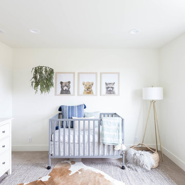
Example of a farmhouse gender-neutral carpeted and gray floor nursery design in Boise with white walls
Example of a farmhouse gender-neutral carpeted and gray floor nursery design in Boise with white walls
 User
UserLiving Room with Bedroom as focal point.
Photo by:
David Mitchell
Small trendy formal and enclosed light wood floor and brown floor living room photo in New York with white walls and no fireplace
Small trendy formal and enclosed light wood floor and brown floor living room photo in New York with white walls and no fireplace
Sponsored
Sunbury, OH

J.Holderby - Renovations
Franklin County's Leading General Contractors - 2X Best of Houzz!
 Capital Area Remodeling, LLC
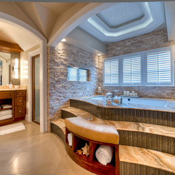
COTY award winner. (Contractor of the Year) A solid slab of Onyx was used for the tub deck. There is a waterfall on the left side of the tub and a gas fireplace on the other. Stacked stone veneer is on the tub surround walls. Fiber optics were installed on the ceiling so the homeowners could look at the night sky. Cherry wood cabinets were used for both his and her vanities. The floor has large Travertine tile installed on the diagonal. The floors are also heated.
Capital Area Construction
 Hermitage Kitchen Gallery LLC
Designed by Victoria Highfill, Photography by MelissaMMills.com
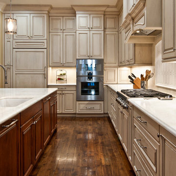
Example of a large classic l-shaped medium tone wood floor and brown floor enclosed kitchen design in Nashville with an undermount sink, raised-panel cabinets, beige cabinets, marble countertops, beige backsplash, ceramic backsplash, paneled appliances, an island and white countertops
Example of a large classic l-shaped medium tone wood floor and brown floor enclosed kitchen design in Nashville with an undermount sink, raised-panel cabinets, beige cabinets, marble countertops, beige backsplash, ceramic backsplash, paneled appliances, an island and white countertops
 Drew Gray Photography
Drew Steven Photography
http://www.drewsteven.com
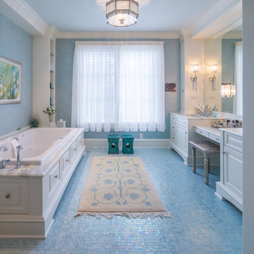
Inspiration for a timeless mosaic tile floor and blue floor drop-in bathtub remodel in Minneapolis with an undermount sink, raised-panel cabinets, white cabinets and blue walls
Inspiration for a timeless mosaic tile floor and blue floor drop-in bathtub remodel in Minneapolis with an undermount sink, raised-panel cabinets, white cabinets and blue walls
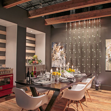
 J. Myers & Associates - Interior Design Portland
Fresh flowers can change the whole space, and create a completely different atmosphere. By bringing in fresh, outdoor elements to an urban space, you are able to freshen it up - this time literally!
Photos by - Beach Dream Photography
 Randy Jeffcoat Builders, Inc.
John McManus
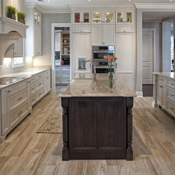
Inspiration for a large timeless l-shaped porcelain tile eat-in kitchen remodel in Atlanta with an undermount sink, recessed-panel cabinets, white cabinets, granite countertops, white backsplash, subway tile backsplash, stainless steel appliances and two islands
Inspiration for a large timeless l-shaped porcelain tile eat-in kitchen remodel in Atlanta with an undermount sink, recessed-panel cabinets, white cabinets, granite countertops, white backsplash, subway tile backsplash, stainless steel appliances and two islands
 Save home
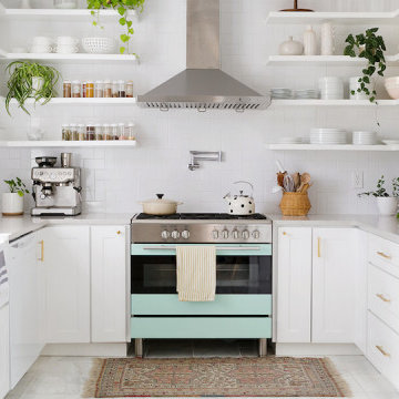
A clean, white, and fresh look never cease to accentuate your kitchen’s interior.
Whether you have a small kitchen or a large one, it is highly unlikely to make a wrong decision with the white color. A white kitchen is a timeless addition to your entire décor, which always radiates more light, a bright look, and an aesthetically soothing aura.
However, although the color white has the power to uplift the look of your kitchen, it is not enough to just paint the walls white. You need to strike a chord between various textures and colors along with kitchen elements, like shaker kitchen cabinets, countertop, etc.
In the following section, we have compiled a list of modern kitchen cabinets ideas. Read on see some of the best white kitchen cabinet styles for your kitchen.
Top 10 Modern White Kitchen Ideas
There’s no doubt in the fact that a white kitchen and RTA cabinets can form the perfect base for your kitchen’s interior. You can add some plants, a pinch of gold, and or a simple black countertop for a different yet appealing look. Below we have discussed some of these ideas. Read on:
1. Airy and Light
The simplest way to design your modern white kitchen is to use a white and timber combination. This can include white cabinets, timber doors, and white wall tiles. Or you can choose timber RTA cabinets paired with white tiles, flooring, and countertop.
2. Sophisticated
Another way is to sophisticatedly turn around your white choices. Here’s an example:
Use white cabinets, steel fittings, and accessories paired with textured white tiles and marble countertop. The flooring can also be white, similar to the countertop. This would give a nice, clean, and refreshing look to your modern white kitchen
.
3. Stone Look
The stone look is always best paired with white cabinets. So, if you utilize shaker kitchen cabinets, which are white, and pair it with everything white stone-like look, then your kitchen would look mesmerizing. This means using marble countertop, marble flooring, and stone-looking back tiles.
4. Monochrome
Black and white appeals to a lot of homeowners. It is the best combination that is unlikely to go wrong. In fact, it helps you move ahead of the ordinary kitchen interior.
You can set your monochrome modern white kitchen in two ways:
Firstly, you have white cabinets paired with black countertop and black fittings. Too much black would reduce lighting and make your kitchen look smaller. So, add white flooring and white back tiles.
Secondly, you can keep the lower RTA cabinets black, and rest everything white, such as textured back tiles, white knobs, etc. You can also pair it with timber upper cabinets.
5. Grey Shade
Similar to monochrome, grey is also amazing. It looks much more sophisticated than monochrome, but a little less bold. So, you can keep your modern white kitchen in these two shades. For example, grey cabinets and white countertop, tiles, and flooring. Here, glossy back tiles can accentuate the look.
6. Brass Touch
Brass touch can literally light up any dull space. If you just add a brass lamp to your living room or kitchen, it can drastically enhance the look. You can use brass in the form of brass windows and lamps. You can also add copper stools and upper cabinets for the same effect.
7. White Countertop
One thing that can make your modern white kitchen look extremely beautiful is the attention to detail. This includes adding a white countertop that really improves the look. A lot of people add a white countertop but making it complement your cabinets can improve the interior a lot.
For example, marble countertop, wooden flooring, white cabinets, and copper knobs.
8. Wood Shelves
The color of wood and timber automatically adds a sense of warmth to your kitchen. So, you can also use either upper or lower timber cabinets. If you are using timber or wood for the upper cabinet and RTA cabinets for the lower cabinets, then you can keep upper cabinets as open shelves. This can also be a bar wood shelf.
9. White Tiles
Basic, old-school white tiles are also great. Earlier, we had small white tiles that used to go with everything. These tiles still complement your kitchen. Use white RTA cabinets, black countertop, and white tiles for a perfect contrast.
10. Light and Bright
Another amazing way to install shaker kitchen cabinets in a modern white kitchen is to keep everything white but add colorful chairs to your dining table. This will add life to your kitchen.
Conclusion
If you are redesigning your kitchen or re-structuring it, modern white kitchen themes are the best option. Simply take inspiration from the above examples and choose a versatile approach for remodeling your kitchen. There’s no shortage of options that you can choose from, such as monochrome, black cabinets, etc. Just remember to check the kitchen size, your budget, and lighting in your kitchen to ensure that you are moving in the right direction.
Whether you have a small kitchen or a large one, it is highly unlikely to make a wrong decision with the white color. A white kitchen is a timeless addition to your entire décor, which always radiates more light, a bright look, and an aesthetically soothing aura.
However, although the color white has the power to uplift the look of your kitchen, it is not enough to just paint the walls white. You need to strike a chord between various textures and colors along with kitchen elements, like shaker kitchen cabinets, countertop, etc.
In the following section, we have compiled a list of modern kitchen cabinets ideas. Read on see some of the best white kitchen cabinet styles for your kitchen.
Top 10 Modern White Kitchen Ideas
There’s no doubt in the fact that a white kitchen and RTA cabinets can form the perfect base for your kitchen’s interior. You can add some plants, a pinch of gold, and or a simple black countertop for a different yet appealing look. Below we have discussed some of these ideas. Read on:
1. Airy and Light
The simplest way to design your modern white kitchen is to use a white and timber combination. This can include white cabinets, timber doors, and white wall tiles. Or you can choose timber RTA cabinets paired with white tiles, flooring, and countertop.
2. Sophisticated
Another way is to sophisticatedly turn around your white choices. Here’s an example:
Use white cabinets, steel fittings, and accessories paired with textured white tiles and marble countertop. The flooring can also be white, similar to the countertop. This would give a nice, clean, and refreshing look to your modern white kitchen
.
3. Stone Look
The stone look is always best paired with white cabinets. So, if you utilize shaker kitchen cabinets, which are white, and pair it with everything white stone-like look, then your kitchen would look mesmerizing. This means using marble countertop, marble flooring, and stone-looking back tiles.
4. Monochrome
Black and white appeals to a lot of homeowners. It is the best combination that is unlikely to go wrong. In fact, it helps you move ahead of the ordinary kitchen interior.
You can set your monochrome modern white kitchen in two ways:
Firstly, you have white cabinets paired with black countertop and black fittings. Too much black would reduce lighting and make your kitchen look smaller. So, add white flooring and white back tiles.
Secondly, you can keep the lower RTA cabinets black, and rest everything white, such as textured back tiles, white knobs, etc. You can also pair it with timber upper cabinets.
5. Grey Shade
Similar to monochrome, grey is also amazing. It looks much more sophisticated than monochrome, but a little less bold. So, you can keep your modern white kitchen in these two shades. For example, grey cabinets and white countertop, tiles, and flooring. Here, glossy back tiles can accentuate the look.
6. Brass Touch
Brass touch can literally light up any dull space. If you just add a brass lamp to your living room or kitchen, it can drastically enhance the look. You can use brass in the form of brass windows and lamps. You can also add copper stools and upper cabinets for the same effect.
7. White Countertop
One thing that can make your modern white kitchen look extremely beautiful is the attention to detail. This includes adding a white countertop that really improves the look. A lot of people add a white countertop but making it complement your cabinets can improve the interior a lot.
For example, marble countertop, wooden flooring, white cabinets, and copper knobs.
8. Wood Shelves
The color of wood and timber automatically adds a sense of warmth to your kitchen. So, you can also use either upper or lower timber cabinets. If you are using timber or wood for the upper cabinet and RTA cabinets for the lower cabinets, then you can keep upper cabinets as open shelves. This can also be a bar wood shelf.
9. White Tiles
Basic, old-school white tiles are also great. Earlier, we had small white tiles that used to go with everything. These tiles still complement your kitchen. Use white RTA cabinets, black countertop, and white tiles for a perfect contrast.
10. Light and Bright
Another amazing way to install shaker kitchen cabinets in a modern white kitchen is to keep everything white but add colorful chairs to your dining table. This will add life to your kitchen.
Conclusion
If you are redesigning your kitchen or re-structuring it, modern white kitchen themes are the best option. Simply take inspiration from the above examples and choose a versatile approach for remodeling your kitchen. There’s no shortage of options that you can choose from, such as monochrome, black cabinets, etc. Just remember to check the kitchen size, your budget, and lighting in your kitchen to ensure that you are moving in the right direction.
 Susan Yeley Homes
You need only look at the before picture of the SYI Studio space to understand the background of this project and need for a new work space.
Susan lives with her husband, three kids and dog in a 1960 split-level in Bloomington, which they've updated over the years and didn't want to leave, thanks to a great location and even greater neighbors. As the SYI team grew so did the three Yeley kids, and it became clear that not only did the team need more space but so did the family.
1.5 bathrooms + 3 bedrooms + 5 people = exponentially increasing discontent.
By 2016, it was time to pull the trigger. Everyone needed more room, and an offsite studio wouldn't work: Susan is not just Creative Director and Owner of SYI but Full Time Activities and Meal Coordinator at Chez Yeley.
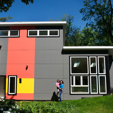
The design, conceptualized entirely by the SYI team and executed by JL Benton Contracting, reclaimed the existing 4th bedroom from SYI space, added an ensuite bath and walk-in closet, and created a studio space with its own exterior entrance and full bath—making it perfect for a mother-in-law or Airbnb suite down the road.
The project added over a thousand square feet to the house—and should add many more years for the family to live and work in a home they love.
Contractor: JL Benton Contracting
Cabinetry: Richcraft Wood Products
Photographer: Gina Rogers
3