
Search results for "Master issues" in Home Design Ideas

 Drewett Works
With adjacent neighbors within a fairly dense section of Paradise Valley, Arizona, C.P. Drewett sought to provide a tranquil retreat for a new-to-the-Valley surgeon and his family who were seeking the modernism they loved though had never lived in. With a goal of consuming all possible site lines and views while maintaining autonomy, a portion of the house — including the entry, office, and master bedroom wing — is subterranean. This subterranean nature of the home provides interior grandeur for guests but offers a welcoming and humble approach, fully satisfying the clients requests.
While the lot has an east-west orientation, the home was designed to capture mainly north and south light which is more desirable and soothing. The architecture’s interior loftiness is created with overlapping, undulating planes of plaster, glass, and steel. The woven nature of horizontal planes throughout the living spaces provides an uplifting sense, inviting a symphony of light to enter the space. The more voluminous public spaces are comprised of stone-clad massing elements which convert into a desert pavilion embracing the outdoor spaces. Every room opens to exterior spaces providing a dramatic embrace of home to natural environment.
Grand Award winner for Best Interior Design of a Custom Home
The material palette began with a rich, tonal, large-format Quartzite stone cladding. The stone’s tones gaveforth the rest of the material palette including a champagne-colored metal fascia, a tonal stucco system, and ceilings clad with hemlock, a tight-grained but softer wood that was tonally perfect with the rest of the materials. The interior case goods and wood-wrapped openings further contribute to the tonal harmony of architecture and materials.
Grand Award Winner for Best Indoor Outdoor Lifestyle for a Home This award-winning project was recognized at the 2020 Gold Nugget Awards with two Grand Awards, one for Best Indoor/Outdoor Lifestyle for a Home, and another for Best Interior Design of a One of a Kind or Custom Home.
At the 2020 Design Excellence Awards and Gala presented by ASID AZ North, Ownby Design received five awards for Tonal Harmony. The project was recognized for 1st place – Bathroom; 3rd place – Furniture; 1st place – Kitchen; 1st place – Outdoor Living; and 2nd place – Residence over 6,000 square ft. Congratulations to Claire Ownby, Kalysha Manzo, and the entire Ownby Design team.
Tonal Harmony was also featured on the cover of the July/August 2020 issue of Luxe Interiors + Design and received a 14-page editorial feature entitled “A Place in the Sun” within the magazine.

 Sweet Smiling Landscape Design
When I came to this property not only was the landscape a scrappy mess the property also had some very real grading and drainage issues that were jeopardizing the safety of this house. As recent transplants from New Jerseys to Southern California these clients were in awe of all the plants they were seeing in their neighborhood. Living on the water at the Ventura harbor they wanted to be able to take full advantage or the outdoor lifestyle and cool ocean breeze. Being environmentally conscious citizens, these clients were very concerned that their garden was designed with sustainability as a leading factor. As they said in our initial consultation, “Would want or garden be part of the solution not part of the problem.”
This property is the last house on the bottom of a gently sloping street. All the water from the neighbor’s houses drain onto this property. When I came into this project the back yard sloped into the house. When it would rain the water would pool up against the house causing water damage. To address the drainage we employed several tactics. Firstly, we had to invert the slope in the back yard so that water would not pool against the house. We created a very minor slope going away from the house so that water drains away but so the patio area feels flat.
The back of the back yard had an existing retaining wall made out of shabby looking slump stone. In front of that retaining wall we created a beautiful natural stone retaining wall. This retain wall severs many purposes. One it works as a place to put some of the soil removed from the grading giving this project a smaller carbon foot print (moving soil of a site burns a lot of fossil fuel). The retaining wall also helps obscure the shabby existing retaining wall and allows for planting space above the footing from the existing retaining wall. The soil behind the ne retaining wall is slightly lower than the top of the wall so that when the run on water on from the neighbor’s property flows it is slowed down and absorbed before it has a chance to get near the house. Finally, the wall is at a height designed to serve as overflow seating as these clients intend to have occasional large parties and gatherings.
Other efforts made to help keep the house safe and dry are that we used permeable paving. With the hardscape being comprised of flag stone with gravel in-between water has a chance to soak into the ground so it does not flow into spots where it will pool up.
The final element to help keep the house dry is the addition of infiltration swales. Infiltration swales are depressions in the landscape that capture rain water. The down spouts on the sides of the houses are connected to pipe that goes under the ground and conveys the water to the swales. In this project it helps move rain water away from the house. In general, these Infiltration swales are a powerful element in creating sustainable landscapes. These swales capture pollutants that accumulate on the roof and in the landscape. Biology in the soil in the swales can break down these pollutants. When run of watered is not captured by soil on a property the dirty water flows into water ways and then the ocean were the biology that breaks down the pollutants is not as prolific. This is particularly important in this project as it drains directly into the harbor. The water that is absorbed in to the swales can replenish aquafers as well as increasing the water available to the plants planted in that area recusing the amount of water that is needed from irrigation.
When it came to the planting we went with a California friendly tropical theme. Using lots of succulents and plants with colorful foliage we created vibrant lush landscape that will have year around color. We planted densely (the images in the picture were taken only a month after installation). Taller drought tolerant plants to help regulate the temperature and loss of water from the plants below them. The dense plantings will help keep the garden, the house and even the neighborhood cooler on hot days, will provide spaces for birds to enjoy and will create an illusion of depth in a somewhat narrow space.
Today this garden is a space these homeowners can fully enjoy while having the peace of mind that their house is protected from flooding and they are helping the environment.

 Rudloff Custom Builders
This dramatically stunning second floor landing is filled with architectural detailing.
Beautiful dark hardwood hand rail works in unison with the dark hard wood wide-plank flooring.
Wainscoting with elegant top rail wraps around this beautiful space.
Beneath the large picture window is a window seat that spans that wall and has plenty of custom built-in storage.
The large picture window with true divided lights is topped off by a half round window with curved mullions giving a nod to the curved elements of the first floor.
Half round transoms adorn the tops of doorways and corridor entrances. Quatrefoil motif antiqued mirrors flank both sides of the large picture window.
This home was featured in Philadelphia Magazine August 2014 issue to showcase its beauty and excellence.
Photo by Alicia's Art, LLC
RUDLOFF Custom Builders, is a residential construction company that connects with clients early in the design phase to ensure every detail of your project is captured just as you imagined. RUDLOFF Custom Builders will create the project of your dreams that is executed by on-site project managers and skilled craftsman, while creating lifetime client relationships that are build on trust and integrity.
We are a full service, certified remodeling company that covers all of the Philadelphia suburban area including West Chester, Gladwynne, Malvern, Wayne, Haverford and more.
As a 6 time Best of Houzz winner, we look forward to working with you on your next project.
Find the right local pro for your project

 Mottram Architecture
Timber frame homes offer unique challenges during a remodel. What often makes them beautiful and attractive to most homeowners, also makes them challenging for space requirements.
Context: The lovely couple that owned this home were struggling with some interesting floor plan challenges that just didn't work for their family. The loved the beautiful timbers and woodwork of their home, but the dramatically sloping ceilings on the second floor, particularly in the bathroom, just didn't work for this 1 1/2 bath home. Needing to use the skylight to approach the toilet was a less then ideal scenario. Although the bathroom footprint was more then adequate, the sloped ceiling only made half of the space useable. Check out the Before/After post on our blog to see the photos of the house pre-renovation. As much as they loved all the wood features in their home, another challenge they had was light. The wood ceiling made everything inside the house darker, even with a fantastic array of south facing windows, there were spaces in the home that felt dark and small. When they contacted us they wanted to know how could they make their brighter and more inviting, were there solutions to the 2nd floor sloped ceiling issues, and if they were going to do all of this work, how could they make their home more comfortable and efficient. A nagging water leak in the upstairs bathroom spurred them into action and here is how we solved their dilemma.
Conclusion: First, we added a little dormer to the rear of the house so we could get full headroom in nearly all of the upstairs bathroom! Then we decided to extend that dormer one more timber bay over to create a walk in closet with natural light and plenty of space. Since we were contemplating energy efficiency, we resolved a nagging issue that is present in a lot of timber frame construction, air tightness. Commonly found in timber frame construction, fiberglass insulation is installed in the rafter bays and board ceilings are installed over top. Unfortunately, board ceilings are anything but air tight, and fiberglass insulation needs to be in an airtight cavity for maximum effectiveness. So we were able to solve two issues at the same time for this homeowner. We removed the board ceiling and fiberglass insulation, we dense packed the rafter bays with cellulose insulation, and installed sheetrock in place of the boards. The boards were salvaged for re-use by the homeowner, and the space and light quality was dramatically improved. Some may think that losing the board ceiling took something away from the space, but what you'll see in the pictures is that it highly accentuates the heavy timbers and really makes them stand out in a beautiful way. Now with this added airtightness, better insulation, and brighter space, the homeowner hardly runs their wood stove, and it's so quiet in the space, an added bonus from changing the insulation. It became necessary to also add a sheetrock ceiling to the living room to hide the plumbing from the new bathroom layout above. Changing this ceiling gave the homeowner some real quality lighting that was lacking in the living room before. The brighter ceiling and new lighting layout completely transforms the living room into a space you want to hang out, even though the layout didn't change at all. When the homeowner saw the finished spaces she said "I can't believe this is my house, I want to live in this house"
Energy Efficiency: I touched a little on the efficiency above, but like all projects done with Mottram Architecture, we always want to leave you with a little extra. Timber frame construction with board ceilings and fiberglass insulation are notoriously leaky! If you want to know what we think about fiberglass insulation, check our our blog post on Why Fiberglass Insulation Sucks. By installing cellulose insulation and covering it with sheetrock we were able to greatly reduce the heat flowing out of this home. It not only improves cashflow it improves the comfort level in the space. Who wants to sit in their living room and feel a draft? Let us remind you, we are not saying cellulose insulation is an air barrier, we use the sheetrock to help with that, but it does significantly reduce the air flow over fiberglass insulation. And when we reduce the airflow, we reduce the heat flow. And when we reduce the heat flow, we reduce the need to re-heat that drafty air from outside. When it comes to energy efficiency the first and best place to start is air infiltration. We greatly reduced the air infiltration with the new insulation, but we also added a hat and warm boots. What I mean by that is, we improved the insulation in the roof, and we installed insulation in the basement. Maybe it's a silly analogy, but when you think about keeping warm, we always start with the hat and boots! With sustainability in mind, the next project will be to add a deck to the front of this house with rain catchment barrels from the metal roof. They are planning to plant a garden in the spring and the rain catchment system will help to irrigate the new garden.
Builder: East Shore Builders
Photographer: Michael Eric Berube
Michael Eric Berube, Maine Virtual Home Tours

 Brizo Faucet
Drawing inspiration from the timeless beauty of lighthouses, the Baliza Bath Collection by Brizo® features a unique architecture and simple, elegant lines. The result is a stunningly fresh perspective on a warm, traditional feel.
Baliza is all about “new traditional”—that is, taking traditional architecture and tweaking it, redefining it. In this case, that meant embracing a more petite form, especially at a time when ”traditional” seemed to be synonymous with “bulky.”

 Edgewater Design Group
The family purchased the 1950s ranch on Mullet Lake because their daughter dreamed of being married on its shores. The home would be used for the wedding venue and then as a wedding gift to the young couple. We were originally hired in August 2014 to help with a simple renovation of the home that was to be completed well in advance of the August 2015 wedding date. However, thorough investigation revealed significant issues with the original foundation, floor framing and other critical elements of the home’s structure that made that impossible. Based on this information, the family decided to tear down and build again. So now we were tasked with designing a new home that would embody their daughter’s vision of a storybook home – a vision inspired by another one of our projects that she had toured. To capture this aesthetic, traditional cottage materials such as stone and cedar shakes are accentuated by more materials such as reclaimed barn wood siding and corrugated CORTEN steel accent roofs. Inside, interior finishes include hand-hewn timber accents that frame openings and highlight features like the entrance reading nook. Natural materials shine against white walls and simply furnished rooms. While the house has nods to vintage style throughout, the open-plan kitchen and living area allows for both contemporary living and entertaining. We were able to capture their daughter’s vision and the home was completed on time for her big day.
- Jacqueline Southby Photography

 Archetype Design Studio, LLC
Craig Thompson Photography
The client was looking for a contemporary but comfortable space as a gathering place for themselves, their family and friends in the city. They wanted color, which was right up my alley. The specific color requests were orange, aqua and purple. We used the orange and aqua in the main living space adding a rich chocolate to the mix to provide a bold color palette. One theme that was consistent in the design was the use of circles, ellipses, and flowing curves. This was evidenced in the fabrics, furniture, wall sconces, bar design, artwork, TV area wall covering, and artwork. Often times contemporary design is very angular, straight lined and rigid. This was not the desired look for this client.
They desired an open layout in the main living space to accentuate the breathtaking view. With these units there are always structural issues to be worked through. There is a structural column in an inopportune place in the main Living area. To make sense of this, it was incorporated into a bar that goes right up to the full height window. When sitting at the bar, it almost feels like you are floating in mid air, looking down on the hustle and bustle of the city. The bar is faced with dimensional glass tile with quartz countertops. An elliptical shaped floating bulkhead is intersected by the bold orange column. The bulkhead was finished in the dark chocolate with a silver deco molding around the face like a bracelet, architectural jewelry as I like to refer to it as. The bar creates an interesting architectural focal point, but also provides function for entertaining.
We did a softer version of the aqua, combined with gray and cream for the color palette in the Master suite. I was able to give the client her request for purple which we did in the Guest Bedroom (not photographed) as the accent wall behind the bed and combined it with gold to complete the scheme.


 Simons Design Studio
Interior Designer: Simons Design Studio
Builder: Magleby Construction
Photography: Allison Niccum
Example of a farmhouse master carpeted and beige floor bedroom design in Salt Lake City with beige walls and no fireplace
Example of a farmhouse master carpeted and beige floor bedroom design in Salt Lake City with beige walls and no fireplace
 TKS Design Group
Download our free ebook, Creating the Ideal Kitchen. DOWNLOAD NOW
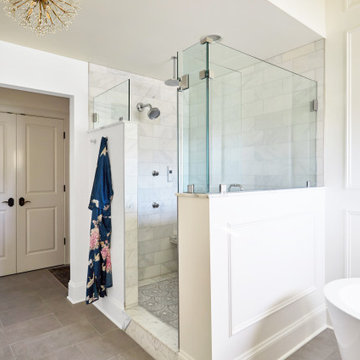
A tired primary bathroom, with varying ceiling heights and a beige-on-beige color scheme, was screaming for love. Squaring the room and adding natural materials erased the memory of the lack luster space and converted it to a bright and welcoming spa oasis. The home was a new build in 2005 and it looked like all the builder’s material choices remained. The client was clear on their design direction but were challenged by the differing ceiling heights and were looking to hire a design-build firm that could resolve that issue.
This local Glen Ellyn couple found us on Instagram (@kitchenstudioge, follow us ?). They loved our designs and felt like we fit their style. They requested a full primary bath renovation to include a large shower, soaking tub, double vanity with storage options, and heated floors. The wife also really wanted a separate make-up vanity. The biggest challenge presented to us was to architecturally marry the various ceiling heights and deliver a streamlined design.
The existing layout worked well for the couple, so we kept everything in place, except we enlarged the shower and replaced the built-in tub with a lovely free-standing model. We also added a sitting make-up vanity. We were able to eliminate the awkward ceiling lines by extending all the walls to the highest level. Then, to accommodate the sprinklers and HVAC, lowered the ceiling height over the entrance and shower area which then opens to the 2-story vanity and tub area. Very dramatic!
This high-end home deserved high-end fixtures. The homeowners also quickly realized they loved the look of natural marble and wanted to use as much of it as possible in their new bath. They chose a marble slab from the stone yard for the countertops and back splash, and we found complimentary marble tile for the shower. The homeowners also liked the idea of mixing metals in their new posh bathroom and loved the look of black, gold, and chrome.
Although our clients were very clear on their style, they were having a difficult time pulling it all together and envisioning the final product. As interior designers it is our job to translate and elevate our clients’ ideas into a deliverable design. We presented the homeowners with mood boards and 3D renderings of our modern, clean, white marble design. Since the color scheme was relatively neutral, at the homeowner’s request, we decided to add of interest with the patterns and shapes in the room.
We were first inspired by the shower floor tile with its circular/linear motif. We designed the cabinetry, floor and wall tiles, mirrors, cabinet pulls, and wainscoting to have a square or rectangular shape, and then to create interest we added perfectly placed circles to contrast with the rectangular shapes. The globe shaped chandelier against the square wall trim is a delightful yet subtle juxtaposition.
The clients were overjoyed with our interpretation of their vision and impressed with the level of detail we brought to the project. It’s one thing to know how you want a space to look, but it takes a special set of skills to create the design and see it thorough to implementation. Could hiring The Kitchen Studio be the first step to making your home dreams come to life?

 Michael Nash Design, Build & Homes
2010 NARI CAPITAL COTY MERIT AWARD WINNER
Baby boomers residing in this single-family colonial in Mclean, Virginia, wanted to make big changes indoors and out. First, they were tired of their back yard and old wooden deck. The neighboring lot sloped steeply downward, creating significant run-off that prevented any semblance of a lawn or landscaping from taking hold. Worse, it prevented the couple from letting their grandchildren or dog out to play.
To address the issue, Michael Nash Design, Build & Homes excavated their entire yard so it was level. Then they designed and built a 5’ x 40’ retaining wall covered with ledger stone to separate the lots, installing an underground drainage system to keep runoff away from a new flagstone patio and surrounding plants and shrubs.
Above the stone patio is a large no-maintenance deck reached via a wide stairway with matching railing. A 12’ x 18’ screened in porch sits to one side featuring cedar beaded ceiling panels and French doors that lead into the home’s dining room.
Highlighting the interior renovations is a new gourmet kitchen with a custom-made wood cabinets and exotic granite countertops. The room’s focal point is a large island with a two-tier countertop and bar seating. Professional-grade stainless steel appliances include a gas cooktop, double-wall ovens, built-in microwave and dishwasher and large refrigerator. Other features include a porcelain tile floor, tile backsplash and a tray ceiling.
A new master bathroom features floor-to-ceiling cabinets, a dark marble countertop and his and hers sinks. Contrasting light-colored marble floor and wall tile leads to a glass-enclosed shower. An adjoining walk-in closet completes the design.

 Chi Renovation & Design
Our Chicago design-build team used timeless design elements like black-and-white with touches of wood in this bathroom renovation.
---
Project designed by Skokie renovation firm, Chi Renovations & Design - general contractors, kitchen and bath remodelers, and design & build company. They serve the Chicago area, and it's surrounding suburbs, with an emphasis on the North Side and North Shore. You'll find their work from the Loop through Lincoln Park, Skokie, Evanston, Wilmette, and all the way up to Lake Forest.
For more about Chi Renovation & Design, click here: https://www.chirenovation.com/

 Tiffany Brooks, HGTV Host & Interior Designer
Inquire About Our Design Services
When we first started talking in the spring of 2015, I was impressed. She was witty, realistic, and understood that as much as she loves my shows on HGTV, design does not does not happen in 43 minutes! She told me about her space, and how she felt that her bedroom seemed “blah” to her. She had no retreat. Molly desperately longed for a place that she could spend time in, read in, play in and above all, relax in.
What we did:
Many people are terrified of hiring a designer. Rightfully so, they are investing a pretty penny in their homes. They want to make sure that everything, down to the last floral arrangement, is to their liking, because they will have to live it (and pay for it). Unfortunately, a client can unintentionally stifle a designer’s creativity through micro-management. This can produce lackluster results and ultimately cause more time (and money) to be spent on a project than is really necessary.
With Molly, that was never an issue. Before she even showed me the room in question, she said that I could have full creative license to do what I needed to do to her bedroom. SAY WHAAH!?
With Molly giving me complete creative freedom, I planned everything out and got down to business. The result: Bite-your-bottom-lip sexy. I don’t get jealous of too many of my clients’ spaces, but this one still takes my breath away every time I look at the pics!
The craziest part was that by adding more furniture, it actually made the space feel larger.
Molly and her husband Patrick loved the finished space, and promised me I will be back to finish the rest of the house!
Here’s the highlights of the rest of the project:
I came up with a space plan with three options.
Next, we reviewed mood boards and fabric schemes that would work for both Molly and her hubby Patrick.
We started with the bed. My goal was to add edge to its otherwise traditional style.
We decided to spice things up by painting the trim work in the room black.
We built in layers of lighting with dimmers. In a bedroom everything should be on dimmers, right? Right.
We designed and customized bedding, chairs and window treatments.
Together with Molly, we selected the most perfect wallpaper. This geometric “grasscloth” adds so much depth and dimension that was just missing before.
What I love:
That light fixture. I mean it is really, really amazing in person.
The porcupine mirror. This thing came packaged like it was the hope diamond, and everyone was terrified to handle it. But it really became a highlight of the room.

 TVL Creative Ltd.
This project included a massive renovation to nearly all spaces in the home: the entry, living room, family room, dining room, kitchen, staircase, and master bathroom. Each space underwent a massive transformation in order to create the elegant & traditional aesthetic that our clients love. On the main level of the home, the original space layout was extremely compartmentalized and dark. Our clients wanted to open up and brighten the space as much as possible. In addition to this, a major goal was to increase function and to create a welcoming environment for guests and the clients alike. We started by opening up the space plan significantly. This allows for flowing space between the kitchen, front living room, and rear family room. Light is better carried through these spaces, and further emphasized with airy colors, light cabinetry, and a better lighting plan overall. We removed the old decorative ceiling beams and reworked closets and hallways to create a more open and functional main level. The kitchen offers a large amount of counter space and storage opportunity, but also welcomes guests at a sizable island and secondary peninsula. Beyond the kitchen, we designed a work nook where display storage and functional workspace are both present. We reworked both fireplaces in the home to create warm nooks for gathering: both fireplaces feature large format stone and are flanked with display shelving. The master bathroom upstairs was completely reworked as well. We eliminated the oversized drop-in tub and in-wall fireplace, and took away the steam shower that had been causing water and mildew issues for years. We relocated the toilet and developed a gorgeous vanity area in the space where the old bathtub and fireplace used to be. We then created a massive shower room in lieu of a tub/shower combination. The bathroom is adorned with warm tones and natural textures: marble subway tile runs up the entire wall behind the vanity, wood-look porcelain covers the floor and back wall of the shower, and simple artisan subway tiles in a creamy vanilla tone cover the shower walls. These spaces completely transformed the look and feel of the house, and we are so happy our amazing clients get to enjoy this home with their family for years to come!

 Michael Nash Design, Build & Homes
2010 NARI CAPITAL COTY MERIT AWARD WINNER
Baby boomers residing in this single-family colonial in Mclean, Virginia, wanted to make big changes indoors and out. First, they were tired of their back yard and old wooden deck. The neighboring lot sloped steeply downward, creating significant run-off that prevented any semblance of a lawn or landscaping from taking hold. Worse, it prevented the couple from letting their grandchildren or dog out to play.
To address the issue, Michael Nash Design, Build & Homes excavated their entire yard so it was level. Then they designed and built a 5’ x 40’ retaining wall covered with ledger stone to separate the lots, installing an underground drainage system to keep runoff away from a new flagstone patio and surrounding plants and shrubs.
Above the stone patio is a large no-maintenance deck reached via a wide stairway with matching railing. A 12’ x 18’ screened in porch sits to one side featuring cedar beaded ceiling panels and French doors that lead into the home’s dining room.
Highlighting the interior renovations is a new gourmet kitchen with a custom-made wood cabinets and exotic granite countertops. The room’s focal point is a large island with a two-tier countertop and bar seating. Professional-grade stainless steel appliances include a gas cooktop, double-wall ovens, built-in microwave and dishwasher and large refrigerator. Other features include a porcelain tile floor, tile backsplash and a tray ceiling.
A new master bathroom features floor-to-ceiling cabinets, a dark marble countertop and his and hers sinks. Contrasting light-colored marble floor and wall tile leads to a glass-enclosed shower. An adjoining walk-in closet completes the design.
 Archetype Design Studio, LLC
Craig Thompson Photography
The client was looking for a contemporary but comfortable space as a gathering place for themselves, their family and friends in the city. They wanted color, which was right up my alley. The specific color requests were orange, aqua and purple. We used the orange and aqua in the main living space adding a rich chocolate to the mix to provide a bold color palette. One theme that was consistent in the design was the use of circles, ellipses, and flowing curves. This was evidenced in the fabrics, furniture, wall sconces, bar design, artwork, TV area wall covering, and artwork. Often times contemporary design is very angular, straight lined and rigid. This was not the desired look for this client.
They desired an open layout in the main living space to accentuate the breathtaking view. With these units there are always structural issues to be worked through. There is a structural column in an inopportune place in the main Living area. To make sense of this, it was incorporated into a bar that goes right up to the full height window. When sitting at the bar, it almost feels like you are floating in mid air, looking down on the hustle and bustle of the city. The bar is faced with dimensional glass tile with quartz countertops. An elliptical shaped floating bulkhead is intersected by the bold orange column. The bulkhead was finished in the dark chocolate with a silver deco molding around the face like a bracelet, architectural jewelry as I like to refer to it as. The bar creates an interesting architectural focal point, but also provides function for entertaining.
We did a softer version of the aqua, combined with gray and cream for the color palette in the Master suite. I was able to give the client her request for purple which we did in the Guest Bedroom (not photographed) as the accent wall behind the bed and combined it with gold to complete the scheme.
 Natural Stone Institute
Gallegos was contacted by a client about a project where stone was not just to be an accent material, but the main visual and perceived structural element to create a timeless architectural composition. To further the endeavor: all veneers and dimension stone must be locally sourced and sustainably quarried. The design called for a moss rock veneer with cut stone trim. Sourcing the sandstone moss rock was simple because there were several local quarries to use. The problem
was with the trim pieces.
Gallegos selected Colorado Buff sandstone for the trim since the buff body was a good contrast to the moss rock and it is a stone that can be cut to size. One main concern with any sedimentary stone is hitting what is known as a “dry” layer in the ledge. This is an area in the stone between sedimentary layers that has not solidified or cemented. It is still granular and can lead to future stone failure as water penetrates these layers and creates freeze/thaw issues. To avoid this, they used
an epoxy injected into the dry layers to help solidify the material and prevent any future failures.
The client also wanted sustainable materials for their countertops and bathrooms. Many of the interior stones were either reclaimed materials or were sourced from Colorado quarries – Calacatta Lincoln was used extensively.
Gallegos sourced tiles from reclamation projects in Europe and Asia for use in the master bath and front entry areas. For many of the countertops, the owner’s interior designer spent hours looking through remnants and applied several throughout the residence.
Willow Court is a spectacular and dramatic nod to stone masonry, something the owner, architect, and builder can be proud of and, for the most part, was built with the environment in mind.
 KitchenLab Interiors
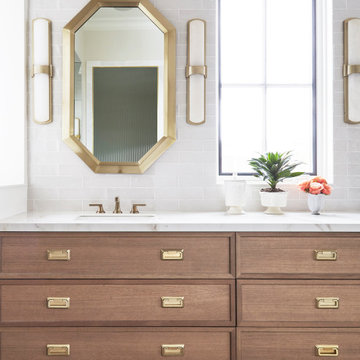
’ first, entirely new construction project in collaboration with GTH architects who designed the residence. KLI was responsible for all interior finishes, fixtures, furnishings, and design including the stairs, casework, interior doors, moldings and millwork. KLI also worked with the client on selecting the roof, exterior stucco and paint colors, stone, windows, and doors. The homeowners had purchased the existing home on a lakefront lot of the Valley Lo community in Glenview, thinking that it would be a gut renovation, but when they discovered a host of issues including mold, they decided to tear it down and start from scratch. The minute you look out the living room windows, you feel as though you're on a lakeside vacation in Wisconsin or Michigan. We wanted to help the homeowners achieve this feeling throughout the house - merging the causal vibe of a vacation home with the elegance desired for a primary residence. This project is unique and personal in many ways - Rebekah and the homeowner, Lorie, had grown up together in a small suburb of Columbus, Ohio. Lorie had been Rebekah's babysitter and was like an older sister growing up. They were both heavily influenced by the style of the late 70's and early 80's boho/hippy meets disco and 80's glam, and both credit their moms for an early interest in anything related to art, design, and style. One of the biggest challenges of doing a new construction project is that it takes so much longer to plan and execute and by the time tile and lighting is installed, you might be bored by the selections of feel like you've seen them everywhere already. “I really tried to pull myself, our team and the client away from the echo-chamber of Pinterest and Instagram. We fell in love with counter stools 3 years ago that I couldn't bring myself to pull the trigger on, thank god, because then they started showing up literally everywhere", Rebekah recalls. Lots of one of a kind vintage rugs and furnishings make the home feel less brand-spanking new. The best projects come from a team slightly outside their comfort zone. One of the funniest things Lorie says to Rebekah, "I gave you everything you wanted", which is pretty hilarious coming from a client to a designer.
Sponsored
Columbus, OH

Wannemacher Interiors
Customized Award-Winning Interior Design Solutions in Franklin Cnty OH

 Transitions Designs
2013 ASID Platinum Award Winner for Best Bath Design! This Master Bath creates a soothing, spa like environment including a deep soaking tub and multi-function water features in the shower. Natural stone and glass tile complement the dark cabinets. This clean, contemporary style is enhanced by a quartz countertop, chrome faucets, dual undermount sinks and floating mirrors. Photo: J. Brent Reeves
 TKS Design Group
Download our free ebook, Creating the Ideal Kitchen. DOWNLOAD NOW
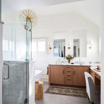
A tired primary bathroom, with varying ceiling heights and a beige-on-beige color scheme, was screaming for love. Squaring the room and adding natural materials erased the memory of the lack luster space and converted it to a bright and welcoming spa oasis. The home was a new build in 2005 and it looked like all the builder’s material choices remained. The client was clear on their design direction but were challenged by the differing ceiling heights and were looking to hire a design-build firm that could resolve that issue.
This local Glen Ellyn couple found us on Instagram (@kitchenstudioge, follow us ?). They loved our designs and felt like we fit their style. They requested a full primary bath renovation to include a large shower, soaking tub, double vanity with storage options, and heated floors. The wife also really wanted a separate make-up vanity. The biggest challenge presented to us was to architecturally marry the various ceiling heights and deliver a streamlined design.
The existing layout worked well for the couple, so we kept everything in place, except we enlarged the shower and replaced the built-in tub with a lovely free-standing model. We also added a sitting make-up vanity. We were able to eliminate the awkward ceiling lines by extending all the walls to the highest level. Then, to accommodate the sprinklers and HVAC, lowered the ceiling height over the entrance and shower area which then opens to the 2-story vanity and tub area. Very dramatic!
This high-end home deserved high-end fixtures. The homeowners also quickly realized they loved the look of natural marble and wanted to use as much of it as possible in their new bath. They chose a marble slab from the stone yard for the countertops and back splash, and we found complimentary marble tile for the shower. The homeowners also liked the idea of mixing metals in their new posh bathroom and loved the look of black, gold, and chrome.
Although our clients were very clear on their style, they were having a difficult time pulling it all together and envisioning the final product. As interior designers it is our job to translate and elevate our clients’ ideas into a deliverable design. We presented the homeowners with mood boards and 3D renderings of our modern, clean, white marble design. Since the color scheme was relatively neutral, at the homeowner’s request, we decided to add of interest with the patterns and shapes in the room.
We were first inspired by the shower floor tile with its circular/linear motif. We designed the cabinetry, floor and wall tiles, mirrors, cabinet pulls, and wainscoting to have a square or rectangular shape, and then to create interest we added perfectly placed circles to contrast with the rectangular shapes. The globe shaped chandelier against the square wall trim is a delightful yet subtle juxtaposition.
The clients were overjoyed with our interpretation of their vision and impressed with the level of detail we brought to the project. It’s one thing to know how you want a space to look, but it takes a special set of skills to create the design and see it thorough to implementation. Could hiring The Kitchen Studio be the first step to making your home dreams come to life?
 Archetype Design Studio, LLC
Craig Thompson Photography
The client was looking for a contemporary but comfortable space as a gathering place for themselves, their family and friends in the city. They wanted color, which was right up my alley. The specific color requests were orange, aqua and purple. We used the orange and aqua in the main living space adding a rich chocolate to the mix to provide a bold color palette. One theme that was consistent in the design was the use of circles, ellipses, and flowing curves. This was evidenced in the fabrics, furniture, wall sconces, bar design, artwork, TV area wall covering, and artwork. Often times contemporary design is very angular, straight lined and rigid. This was not the desired look for this client.
They desired an open layout in the main living space to accentuate the breathtaking view. With these units there are always structural issues to be worked through. There is a structural column in an inopportune place in the main Living area. To make sense of this, it was incorporated into a bar that goes right up to the full height window. When sitting at the bar, it almost feels like you are floating in mid air, looking down on the hustle and bustle of the city. The bar is faced with dimensional glass tile with quartz countertops. An elliptical shaped floating bulkhead is intersected by the bold orange column. The bulkhead was finished in the dark chocolate with a silver deco molding around the face like a bracelet, architectural jewelry as I like to refer to it as. The bar creates an interesting architectural focal point, but also provides function for entertaining.
We did a softer version of the aqua, combined with gray and cream for the color palette in the Master suite. I was able to give the client her request for purple which we did in the Guest Bedroom (not photographed) as the accent wall behind the bed and combined it with gold to complete the scheme.
81