
Search results for "Master reduce" in Home Design Ideas
 Fusion Interiors
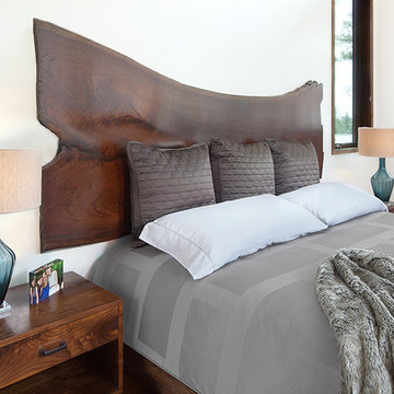
The master bedroom furniture was a custom design concept that was created. The headboard is mounted on to the wall and it was made from a slab of solid walnut. The nightstands and platform bed frame were created from another piece of solid walnut. The headboard is not just a headboard, but a piece of art.
IlluminArts Photography
 Katie Hutchison Studio
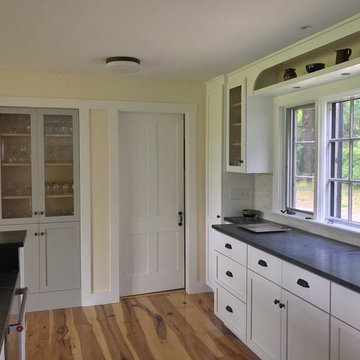
The new owners of this house in Harvard, Massachusetts loved its location and authentic Shaker characteristics, but weren’t fans of its curious layout. A dated first-floor full bathroom could only be accessed by going up a few steps to a landing, opening the bathroom door and then going down the same number of steps to enter the room. The dark kitchen faced the driveway to the north, rather than the bucolic backyard fields to the south. The dining space felt more like an enlarged hall and could only comfortably seat four. Upstairs, a den/office had a woefully low ceiling; the master bedroom had limited storage, and a sad full bathroom featured a cramped shower.
KHS proposed a number of changes to create an updated home where the owners could enjoy cooking, entertaining, and being connected to the outdoors from the first-floor living spaces, while also experiencing more inviting and more functional private spaces upstairs.
On the first floor, the primary change was to capture space that had been part of an upper-level screen porch and convert it to interior space. To make the interior expansion seamless, we raised the floor of the area that had been the upper-level porch, so it aligns with the main living level, and made sure there would be no soffits in the planes of the walls we removed. We also raised the floor of the remaining lower-level porch to reduce the number of steps required to circulate from it to the newly expanded interior. New patio door systems now fill the arched openings that used to be infilled with screen. The exterior interventions (which also included some new casement windows in the dining area) were designed to be subtle, while affording significant improvements on the interior. Additionally, the first-floor bathroom was reconfigured, shifting one of its walls to widen the dining space, and moving the entrance to the bathroom from the stair landing to the kitchen instead.
These changes (which involved significant structural interventions) resulted in a much more open space to accommodate a new kitchen with a view of the lush backyard and a new dining space defined by a new built-in banquette that comfortably seats six, and -- with the addition of a table extension -- up to eight people.
Upstairs in the den/office, replacing the low, board ceiling with a raised, plaster, tray ceiling that springs from above the original board-finish walls – newly painted a light color -- created a much more inviting, bright, and expansive space. Re-configuring the master bath to accommodate a larger shower and adding built-in storage cabinets in the master bedroom improved comfort and function. A new whole-house color palette rounds out the improvements.
Photos by Katie Hutchison
 Katie Hutchison Studio
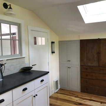
The new owners of this house in Harvard, Massachusetts loved its location and authentic Shaker characteristics, but weren’t fans of its curious layout. A dated first-floor full bathroom could only be accessed by going up a few steps to a landing, opening the bathroom door and then going down the same number of steps to enter the room. The dark kitchen faced the driveway to the north, rather than the bucolic backyard fields to the south. The dining space felt more like an enlarged hall and could only comfortably seat four. Upstairs, a den/office had a woefully low ceiling; the master bedroom had limited storage, and a sad full bathroom featured a cramped shower.
KHS proposed a number of changes to create an updated home where the owners could enjoy cooking, entertaining, and being connected to the outdoors from the first-floor living spaces, while also experiencing more inviting and more functional private spaces upstairs.
On the first floor, the primary change was to capture space that had been part of an upper-level screen porch and convert it to interior space. To make the interior expansion seamless, we raised the floor of the area that had been the upper-level porch, so it aligns with the main living level, and made sure there would be no soffits in the planes of the walls we removed. We also raised the floor of the remaining lower-level porch to reduce the number of steps required to circulate from it to the newly expanded interior. New patio door systems now fill the arched openings that used to be infilled with screen. The exterior interventions (which also included some new casement windows in the dining area) were designed to be subtle, while affording significant improvements on the interior. Additionally, the first-floor bathroom was reconfigured, shifting one of its walls to widen the dining space, and moving the entrance to the bathroom from the stair landing to the kitchen instead.
These changes (which involved significant structural interventions) resulted in a much more open space to accommodate a new kitchen with a view of the lush backyard and a new dining space defined by a new built-in banquette that comfortably seats six, and -- with the addition of a table extension -- up to eight people.
Upstairs in the den/office, replacing the low, board ceiling with a raised, plaster, tray ceiling that springs from above the original board-finish walls – newly painted a light color -- created a much more inviting, bright, and expansive space. Re-configuring the master bath to accommodate a larger shower and adding built-in storage cabinets in the master bedroom improved comfort and function. A new whole-house color palette rounds out the improvements.
Photos by Katie Hutchison
Find the right local pro for your project
 Katie Hutchison Studio
The new owners of this house in Harvard, Massachusetts loved its location and authentic Shaker characteristics, but weren’t fans of its curious layout. A dated first-floor full bathroom could only be accessed by going up a few steps to a landing, opening the bathroom door and then going down the same number of steps to enter the room. The dark kitchen faced the driveway to the north, rather than the bucolic backyard fields to the south. The dining space felt more like an enlarged hall and could only comfortably seat four. Upstairs, a den/office had a woefully low ceiling; the master bedroom had limited storage, and a sad full bathroom featured a cramped shower.
KHS proposed a number of changes to create an updated home where the owners could enjoy cooking, entertaining, and being connected to the outdoors from the first-floor living spaces, while also experiencing more inviting and more functional private spaces upstairs.
On the first floor, the primary change was to capture space that had been part of an upper-level screen porch and convert it to interior space. To make the interior expansion seamless, we raised the floor of the area that had been the upper-level porch, so it aligns with the main living level, and made sure there would be no soffits in the planes of the walls we removed. We also raised the floor of the remaining lower-level porch to reduce the number of steps required to circulate from it to the newly expanded interior. New patio door systems now fill the arched openings that used to be infilled with screen. The exterior interventions (which also included some new casement windows in the dining area) were designed to be subtle, while affording significant improvements on the interior. Additionally, the first-floor bathroom was reconfigured, shifting one of its walls to widen the dining space, and moving the entrance to the bathroom from the stair landing to the kitchen instead.
These changes (which involved significant structural interventions) resulted in a much more open space to accommodate a new kitchen with a view of the lush backyard and a new dining space defined by a new built-in banquette that comfortably seats six, and -- with the addition of a table extension -- up to eight people.
Upstairs in the den/office, replacing the low, board ceiling with a raised, plaster, tray ceiling that springs from above the original board-finish walls – newly painted a light color -- created a much more inviting, bright, and expansive space. Re-configuring the master bath to accommodate a larger shower and adding built-in storage cabinets in the master bedroom improved comfort and function. A new whole-house color palette rounds out the improvements.
Photos by Katie Hutchison
 TVL Creative Ltd.
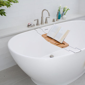
Our clients’ recently purchase home is set in a picturesque location in Golden, Colorado. With idyllic square footage for raising a family, it was almost just what they wanted. However, the 90’s interior furnishings and dated layout didn’t feel like home. So, they reached out to TVL Creative to help them get the place move-in ready and feeling more 'them.' The scope of work included an overhaul of the master bathroom, full-home paint scheme, lighting updates, and new staircase railings. The most profound transformation within our scope was the master bathroom renovation. This luxurious space, built by TVL’s own Team Angel, is a calming retreat with gorgeous detailing throughout. Every part of this bathroom was gutted and we worked to establish a new concept and functional layout that would better serve our clients. As part of the transformative design, a calming symmetry was created by marrying the new vanity design with the existing architecture of the room. A feature tile accentuates the symmetrical composition of vanity and vaulted ceiling: large beveled mirrors and linear sconces bring the eye upward. Custom built-ins flanking the master bathroom sinks were designed to provide ample organized storage for linens and toiletries. A make-up vanity accented by a full height mirror and coordinating pendant rounds out the custom built-ins. Opposite the vanity wall is the commode room, bathtub, and a large shower. In the bathtub nook, the sculptural form of the Elise tub by MTI Baths compliments the arc of the picture window above. The Kohler Archer tub filler adds transitional and classy styling to the area. A quartz-topped bench running the length of the back wall provides a perfect spot for a glass of wine near the bath, while doubling as a gorgeous and functional seat in the shower. The bench was also utilized to move the bathtub off of the exterior wall and reduce the amount of awkward-to-clean floor space. In the shower, the upgrades feel limitless. We relocated the valve controls to the entry half wall for easy on/off access. We also created functionals shower niches that are tucked out of view for handy storage without aesthetic compromise. The shower features a lovely three-dimensional diamond accent tile and is wrapped in frameless glass for added light entry. In general, the space is outfitted with other stunning features including Kohler Archer fixtures throughout, Feiss decorative lighting, Amerock hardware on all built-ins, and cabinetry from Waypoint Living Spaces. From bachelor pad to first family home, it's been a pleasure to work with our client over the years! We will especially cherish our time working with them this time around to make their new house feel more like home.
 User
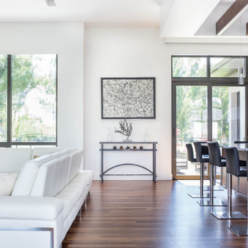
UserThe open space plan on the main level of the Prairie Style home is deceiving of the actual separation of spaces. This home packs a punch with a private hot tub, craft room, library, and even a theater. The interior of the home features the same attention to place, as the natural world is evident in the use of granite, basalt, walnut, poplar, and natural river rock throughout. Floor to ceiling windows in strategic locations eliminates the sense of compression on the interior, while the overall window design promotes natural daylighting and cross-ventilation in nearly every space of the home.
Glo’s A5 Series in double pane was selected for the high performance values and clean, minimal frame profiles. High performance spacers, double pane glass, multiple air seals, and a larger continuous thermal break combine to reduce convection and eliminate condensation, ultimately providing energy efficiency and thermal performance unheard of in traditional aluminum windows. The A5 Series provides smooth operation and long-lasting durability without sacrificing style for this Prairie Style home.
 Katie Hutchison Studio
The new owners of this house in Harvard, Massachusetts loved its location and authentic Shaker characteristics, but weren’t fans of its curious layout. A dated first-floor full bathroom could only be accessed by going up a few steps to a landing, opening the bathroom door and then going down the same number of steps to enter the room. The dark kitchen faced the driveway to the north, rather than the bucolic backyard fields to the south. The dining space felt more like an enlarged hall and could only comfortably seat four. Upstairs, a den/office had a woefully low ceiling; the master bedroom had limited storage, and a sad full bathroom featured a cramped shower.
KHS proposed a number of changes to create an updated home where the owners could enjoy cooking, entertaining, and being connected to the outdoors from the first-floor living spaces, while also experiencing more inviting and more functional private spaces upstairs.
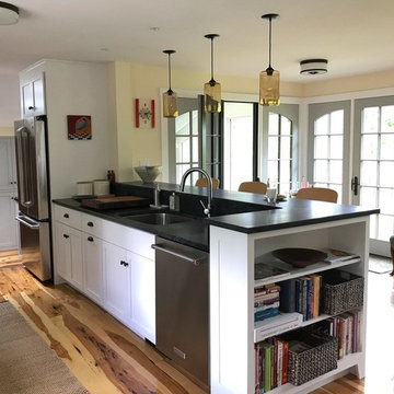
On the first floor, the primary change was to capture space that had been part of an upper-level screen porch and convert it to interior space. To make the interior expansion seamless, we raised the floor of the area that had been the upper-level porch, so it aligns with the main living level, and made sure there would be no soffits in the planes of the walls we removed. We also raised the floor of the remaining lower-level porch to reduce the number of steps required to circulate from it to the newly expanded interior. New patio door systems now fill the arched openings that used to be infilled with screen. The exterior interventions (which also included some new casement windows in the dining area) were designed to be subtle, while affording significant improvements on the interior. Additionally, the first-floor bathroom was reconfigured, shifting one of its walls to widen the dining space, and moving the entrance to the bathroom from the stair landing to the kitchen instead.
These changes (which involved significant structural interventions) resulted in a much more open space to accommodate a new kitchen with a view of the lush backyard and a new dining space defined by a new built-in banquette that comfortably seats six, and -- with the addition of a table extension -- up to eight people.
Upstairs in the den/office, replacing the low, board ceiling with a raised, plaster, tray ceiling that springs from above the original board-finish walls – newly painted a light color -- created a much more inviting, bright, and expansive space. Re-configuring the master bath to accommodate a larger shower and adding built-in storage cabinets in the master bedroom improved comfort and function. A new whole-house color palette rounds out the improvements.
Photos by Katie Hutchison

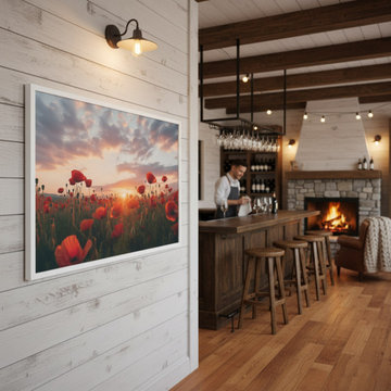
 PI Photography Wall Art & Fine Art
Transform Your Space with "A Field of Memories": High-Impact Photorealistic Poppy Art
[Explore the Artwork Now]
https://pipafineart.com/pages/arts-and-flowers-a-field-of-memories-photorealistic-digital-artwork
Elevate your design vision (or your favorite room) with the breathtaking drama and serene beauty of "Arts and Flowers: A Field of Memories." This extraordinary photorealistic digital artwork offers more than just a beautiful image; it’s an immersive emotional experience, perfect for interior designers creating tranquil sanctuaries and homeowners seeking a captivating, mood-defining focal point.
Visual Analysis & Emotional Impact:
Step into a vast field where vibrant, deep-red poppies sway gently under the glow of a spectacular sunset. The artistry lies in the meticulous detail—the delicate texture of each petal and the realistic depiction of light. The primary color palette features rich, intense reds (often symbolizing passion and remembrance) beautifully offset by the warm, dynamic sky, which transitions seamlessly through hues of orange, pink, purple, and gold. This composition masterfully uses light and shadow to create a sense of depth that is almost photographic, yet carries a soft, dreamlike quality. The low horizon line emphasizes the grandeur of the sky, drawing the viewer's eye across the expansive landscape and instantly instilling a sense of peace and openness.
Design Versatility for Professionals and Homeowners:
For the discerning Interior Designer, this piece is an excellent solution for injecting both color and emotional depth into transitional or contemporary spaces. Its rich, warm tones are a natural complement to dark wood finishes, gold accents, or neutral linen textures, allowing it to serve as a grounding element.
Living Room: A dramatic conversational piece positioned above a sofa or fireplace.
Dining Room: Enhances the atmosphere of joy and celebration for gatherings.
Bedrooms/Master Suites: For Homeowners, the soothing colors and tranquil scene promote restful sleep and rejuvenation, creating a true sanctuary.
Home Office/Studio: Provides a powerful connection to nature, reducing stress and boosting creativity.
The artwork's photorealistic style, combined with its calming mood, makes it incredibly versatile for virtually any room that requires a touch of warmth and grandeur. This is not just decoration; it's an investment in the mood and feeling of a space.
Ready to transform a room? View more in-situ examples, explore available sizing, and bring the captivating beauty of "A Field of Memories" into your next project or home today.
[Explore the Artwork Now]
https://pipafineart.com/pages/arts-and-flowers-a-field-of-memories-photorealistic-digital-artwork
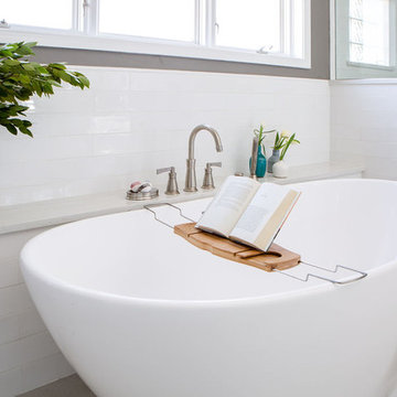 TVL Creative Ltd.
Our clients’ recently purchase home is set in a picturesque location in Golden, Colorado. With idyllic square footage for raising a family, it was almost just what they wanted. However, the 90’s interior furnishings and dated layout didn’t feel like home. So, they reached out to TVL Creative to help them get the place move-in ready and feeling more 'them.' The scope of work included an overhaul of the master bathroom, full-home paint scheme, lighting updates, and new staircase railings. The most profound transformation within our scope was the master bathroom renovation. This luxurious space, built by TVL’s own Team Angel, is a calming retreat with gorgeous detailing throughout. Every part of this bathroom was gutted and we worked to establish a new concept and functional layout that would better serve our clients. As part of the transformative design, a calming symmetry was created by marrying the new vanity design with the existing architecture of the room. A feature tile accentuates the symmetrical composition of vanity and vaulted ceiling: large beveled mirrors and linear sconces bring the eye upward. Custom built-ins flanking the master bathroom sinks were designed to provide ample organized storage for linens and toiletries. A make-up vanity accented by a full height mirror and coordinating pendant rounds out the custom built-ins. Opposite the vanity wall is the commode room, bathtub, and a large shower. In the bathtub nook, the sculptural form of the Elise tub by MTI Baths compliments the arc of the picture window above. The Kohler Archer tub filler adds transitional and classy styling to the area. A quartz-topped bench running the length of the back wall provides a perfect spot for a glass of wine near the bath, while doubling as a gorgeous and functional seat in the shower. The bench was also utilized to move the bathtub off of the exterior wall and reduce the amount of awkward-to-clean floor space. In the shower, the upgrades feel limitless. We relocated the valve controls to the entry half wall for easy on/off access. We also created functionals shower niches that are tucked out of view for handy storage without aesthetic compromise. The shower features a lovely three-dimensional diamond accent tile and is wrapped in frameless glass for added light entry. In general, the space is outfitted with other stunning features including Kohler Archer fixtures throughout, Feiss decorative lighting, Amerock hardware on all built-ins, and cabinetry from Waypoint Living Spaces. From bachelor pad to first family home, it's been a pleasure to work with our client over the years! We will especially cherish our time working with them this time around to make their new house feel more like home.
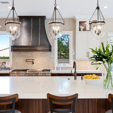
 JRP Design & Remodel
The main goal to reawaken the beauty of this outdated kitchen was to create more storage and make it a more functional space. This husband and wife love to host their large extended family of kids and grandkids. The JRP design team tweaked the floor plan by reducing the size of an unnecessarily large powder bath. Since storage was key this allowed us to turn a small pantry closet into a larger walk-in pantry.
Keeping with the Mediterranean style of the house but adding a contemporary flair, the design features two-tone cabinets. Walnut island and base cabinets mixed with off white full height and uppers create a warm, welcoming environment. With the removal of the dated soffit, the cabinets were extended to the ceiling. This allowed for a second row of upper cabinets featuring a walnut interior and lighting for display. Choosing the right countertop and backsplash such as this marble-like quartz and arabesque tile is key to tying this whole look together.
The new pantry layout features crisp off-white open shelving with a contrasting walnut base cabinet. The combined open shelving and specialty drawers offer greater storage while at the same time being visually appealing.
The hood with its dark metal finish accented with antique brass is the focal point. It anchors the room above a new 60” Wolf range providing ample space to cook large family meals. The massive island features storage on all sides and seating on two for easy conversation making this kitchen the true hub of the home.
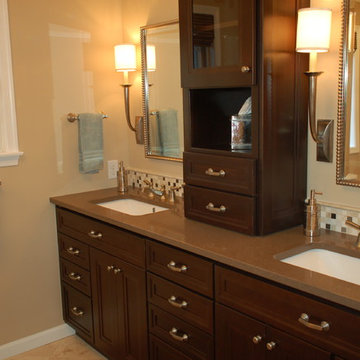
 Chester County Kitchen & Bath
Three projects at once?! Why not? These were some brave customers! We started by gutting the kitchen and the master bathroom at the same time. By the time the master was in working order, we tackled the hall bathroom. A succinct and perfectly timed series of projects.
John Noland expertly designed this roomy kitchen to create better flow for cooking and entertaining. He used Fieldstone Bainbridge cabinets in Butterscotch. The new speed oven and wall oven were moved conveniently to the other side of the bar, giving more room for the refrigerator, and a large induction cooktop. The kitchen now had the practicality it was missing. Other features include the natural stone tile floor in a pin wheel design, the large island for seating and storage and all topped by peacock green granite. The homeowners provided a reception at the completion of the project which was much appreciated by all of the contractors working on the job!
 Katie Hutchison Studio
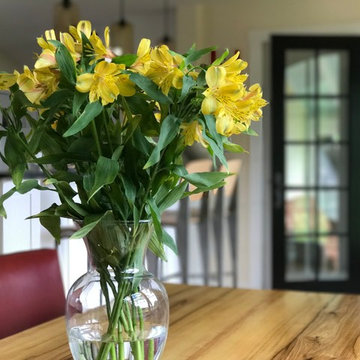
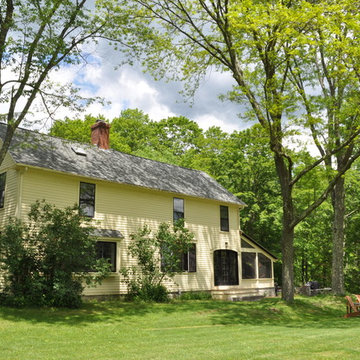
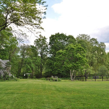
The new owners of this house in Harvard, Massachusetts loved its location and authentic Shaker characteristics, but weren’t fans of its curious layout. A dated first-floor full bathroom could only be accessed by going up a few steps to a landing, opening the bathroom door and then going down the same number of steps to enter the room. The dark kitchen faced the driveway to the north, rather than the bucolic backyard fields to the south. The dining space felt more like an enlarged hall and could only comfortably seat four. Upstairs, a den/office had a woefully low ceiling; the master bedroom had limited storage, and a sad full bathroom featured a cramped shower.
KHS proposed a number of changes to create an updated home where the owners could enjoy cooking, entertaining, and being connected to the outdoors from the first-floor living spaces, while also experiencing more inviting and more functional private spaces upstairs.
On the first floor, the primary change was to capture space that had been part of an upper-level screen porch and convert it to interior space. To make the interior expansion seamless, we raised the floor of the area that had been the upper-level porch, so it aligns with the main living level, and made sure there would be no soffits in the planes of the walls we removed. We also raised the floor of the remaining lower-level porch to reduce the number of steps required to circulate from it to the newly expanded interior. New patio door systems now fill the arched openings that used to be infilled with screen. The exterior interventions (which also included some new casement windows in the dining area) were designed to be subtle, while affording significant improvements on the interior. Additionally, the first-floor bathroom was reconfigured, shifting one of its walls to widen the dining space, and moving the entrance to the bathroom from the stair landing to the kitchen instead.
These changes (which involved significant structural interventions) resulted in a much more open space to accommodate a new kitchen with a view of the lush backyard and a new dining space defined by a new built-in banquette that comfortably seats six, and -- with the addition of a table extension -- up to eight people.
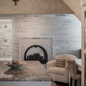
Upstairs in the den/office, replacing the low, board ceiling with a raised, plaster, tray ceiling that springs from above the original board-finish walls – newly painted a light color -- created a much more inviting, bright, and expansive space. Re-configuring the master bath to accommodate a larger shower and adding built-in storage cabinets in the master bedroom improved comfort and function. A new whole-house color palette rounds out the improvements.
Photos by Katie Hutchison
 Katie Hutchison Studio
The new owners of this house in Harvard, Massachusetts loved its location and authentic Shaker characteristics, but weren’t fans of its curious layout. A dated first-floor full bathroom could only be accessed by going up a few steps to a landing, opening the bathroom door and then going down the same number of steps to enter the room. The dark kitchen faced the driveway to the north, rather than the bucolic backyard fields to the south. The dining space felt more like an enlarged hall and could only comfortably seat four. Upstairs, a den/office had a woefully low ceiling; the master bedroom had limited storage, and a sad full bathroom featured a cramped shower.
KHS proposed a number of changes to create an updated home where the owners could enjoy cooking, entertaining, and being connected to the outdoors from the first-floor living spaces, while also experiencing more inviting and more functional private spaces upstairs.
On the first floor, the primary change was to capture space that had been part of an upper-level screen porch and convert it to interior space. To make the interior expansion seamless, we raised the floor of the area that had been the upper-level porch, so it aligns with the main living level, and made sure there would be no soffits in the planes of the walls we removed. We also raised the floor of the remaining lower-level porch to reduce the number of steps required to circulate from it to the newly expanded interior. New patio door systems now fill the arched openings that used to be infilled with screen. The exterior interventions (which also included some new casement windows in the dining area) were designed to be subtle, while affording significant improvements on the interior. Additionally, the first-floor bathroom was reconfigured, shifting one of its walls to widen the dining space, and moving the entrance to the bathroom from the stair landing to the kitchen instead.
These changes (which involved significant structural interventions) resulted in a much more open space to accommodate a new kitchen with a view of the lush backyard and a new dining space defined by a new built-in banquette that comfortably seats six, and -- with the addition of a table extension -- up to eight people.
Upstairs in the den/office, replacing the low, board ceiling with a raised, plaster, tray ceiling that springs from above the original board-finish walls – newly painted a light color -- created a much more inviting, bright, and expansive space. Re-configuring the master bath to accommodate a larger shower and adding built-in storage cabinets in the master bedroom improved comfort and function. A new whole-house color palette rounds out the improvements.
Photos by Katie Hutchison
Sponsored
Delaware, OH

Buckeye Basements, Inc.
Central Ohio's Basement Finishing ExpertsBest Of Houzz '13-'21
 Katie Hutchison Studio
The new owners of this house in Harvard, Massachusetts loved its location and authentic Shaker characteristics, but weren’t fans of its curious layout. A dated first-floor full bathroom could only be accessed by going up a few steps to a landing, opening the bathroom door and then going down the same number of steps to enter the room. The dark kitchen faced the driveway to the north, rather than the bucolic backyard fields to the south. The dining space felt more like an enlarged hall and could only comfortably seat four. Upstairs, a den/office had a woefully low ceiling; the master bedroom had limited storage, and a sad full bathroom featured a cramped shower.
KHS proposed a number of changes to create an updated home where the owners could enjoy cooking, entertaining, and being connected to the outdoors from the first-floor living spaces, while also experiencing more inviting and more functional private spaces upstairs.
On the first floor, the primary change was to capture space that had been part of an upper-level screen porch and convert it to interior space. To make the interior expansion seamless, we raised the floor of the area that had been the upper-level porch, so it aligns with the main living level, and made sure there would be no soffits in the planes of the walls we removed. We also raised the floor of the remaining lower-level porch to reduce the number of steps required to circulate from it to the newly expanded interior. New patio door systems now fill the arched openings that used to be infilled with screen. The exterior interventions (which also included some new casement windows in the dining area) were designed to be subtle, while affording significant improvements on the interior. Additionally, the first-floor bathroom was reconfigured, shifting one of its walls to widen the dining space, and moving the entrance to the bathroom from the stair landing to the kitchen instead.
These changes (which involved significant structural interventions) resulted in a much more open space to accommodate a new kitchen with a view of the lush backyard and a new dining space defined by a new built-in banquette that comfortably seats six, and -- with the addition of a table extension -- up to eight people.
Upstairs in the den/office, replacing the low, board ceiling with a raised, plaster, tray ceiling that springs from above the original board-finish walls – newly painted a light color -- created a much more inviting, bright, and expansive space. Re-configuring the master bath to accommodate a larger shower and adding built-in storage cabinets in the master bedroom improved comfort and function. A new whole-house color palette rounds out the improvements.
Photos by Katie Hutchison
 Katie Hutchison Studio
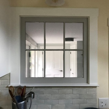
The new owners of this house in Harvard, Massachusetts loved its location and authentic Shaker characteristics, but weren’t fans of its curious layout. A dated first-floor full bathroom could only be accessed by going up a few steps to a landing, opening the bathroom door and then going down the same number of steps to enter the room. The dark kitchen faced the driveway to the north, rather than the bucolic backyard fields to the south. The dining space felt more like an enlarged hall and could only comfortably seat four. Upstairs, a den/office had a woefully low ceiling; the master bedroom had limited storage, and a sad full bathroom featured a cramped shower.
KHS proposed a number of changes to create an updated home where the owners could enjoy cooking, entertaining, and being connected to the outdoors from the first-floor living spaces, while also experiencing more inviting and more functional private spaces upstairs.
On the first floor, the primary change was to capture space that had been part of an upper-level screen porch and convert it to interior space. To make the interior expansion seamless, we raised the floor of the area that had been the upper-level porch, so it aligns with the main living level, and made sure there would be no soffits in the planes of the walls we removed. We also raised the floor of the remaining lower-level porch to reduce the number of steps required to circulate from it to the newly expanded interior. New patio door systems now fill the arched openings that used to be infilled with screen. The exterior interventions (which also included some new casement windows in the dining area) were designed to be subtle, while affording significant improvements on the interior. Additionally, the first-floor bathroom was reconfigured, shifting one of its walls to widen the dining space, and moving the entrance to the bathroom from the stair landing to the kitchen instead.
These changes (which involved significant structural interventions) resulted in a much more open space to accommodate a new kitchen with a view of the lush backyard and a new dining space defined by a new built-in banquette that comfortably seats six, and -- with the addition of a table extension -- up to eight people.
Upstairs in the den/office, replacing the low, board ceiling with a raised, plaster, tray ceiling that springs from above the original board-finish walls – newly painted a light color -- created a much more inviting, bright, and expansive space. Re-configuring the master bath to accommodate a larger shower and adding built-in storage cabinets in the master bedroom improved comfort and function. A new whole-house color palette rounds out the improvements.
Photos by Katie Hutchison
 Dream Kitchens
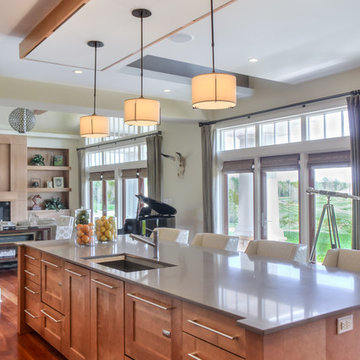
Imagine a lazy morning in this casually elegant kitchen, sipping your freshly brewed coffee as natural light pours through floor to ceiling windows. Then imagine being in this kitchen sipping your morning coffee and gazing out at the beautiful rolling landscape of one of New England’s prestigious golf clubs. Imagine . . .
The owner of this beautiful contemporary kitchen with its idyllic setting imagined ! And her kitchen designer captured her imagination and brought this inspired space to life in both style and function.
Columns of stainless steel are balanced by columns with the warmth of birch wood with just a hint of stain. On an adjacent wall one more wood column rises from floor to ceiling. A strong horizontal line of cabinetry seemingly intersects the vertical columns. While contemporary in design, the cabinetry in this kitchen found its beginnings with the Shakers and the designers of the Craftsman period. Increasing the size of the framing on the doors, accenting the cabinet shapes with square-edged trim and blocks of wood at varying depths, thinly slicing and randomly sizing the natural stone on the accent wall, and choosing oversized stainless steel handles definitively bring this kitchen forward in time. Recycled glass countertops in a soft, quiet color continue to help this kitchen live so harmoniously with its surroundings.
As the day unfolds and the lazy morning turns into ambitious meal preparation, it is clear that this kitchen is a chef’s delight. The stainless steel columns incorporate double ovens, a microwave and a steam oven. Two wood columns house a refrigerator and a freezer. The separate wood column reveals pantry storage, and a TV is hidden behind a lift-up door.
On the island with its clean, rectangular shape two dishwashers flank the sink. Imagine ! how much more pleasant the task of clean-up is when you overlook the family living space and vista beyond.
In the cook center, a complement of drawers provides excellent storage for pots and pans, utensils, spices and herbs around the 5-burner cooktop. A powerful vent with a rear exhaust maintains the horizontal design of the space. And the freshly-brewed coffee in the morning ? It comes from a built-in coffee maker that’s just around the corner from the refrigerator. Along with a wine refrigerator, it creates a beverage and serving center between the kitchen and the dining room.
The homeowner envisioned a kitchen that is as beautiful as its surroundings. Her kitchen designer wanted her kitchen to be as functional as it is beautiful. Both agree that this kitchen lives up to their expectations!
 TVL Creative Ltd.
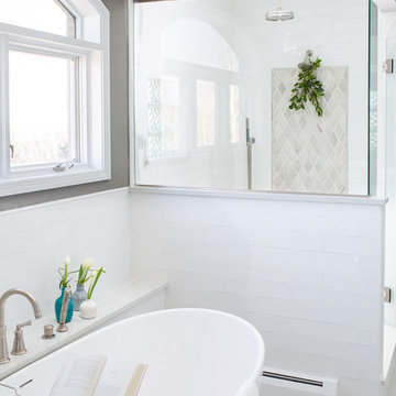
Our clients’ recently purchase home is set in a picturesque location in Golden, Colorado. With idyllic square footage for raising a family, it was almost just what they wanted. However, the 90’s interior furnishings and dated layout didn’t feel like home. So, they reached out to TVL Creative to help them get the place move-in ready and feeling more 'them.' The scope of work included an overhaul of the master bathroom, full-home paint scheme, lighting updates, and new staircase railings. The most profound transformation within our scope was the master bathroom renovation. This luxurious space, built by TVL’s own Team Angel, is a calming retreat with gorgeous detailing throughout. Every part of this bathroom was gutted and we worked to establish a new concept and functional layout that would better serve our clients. As part of the transformative design, a calming symmetry was created by marrying the new vanity design with the existing architecture of the room. A feature tile accentuates the symmetrical composition of vanity and vaulted ceiling: large beveled mirrors and linear sconces bring the eye upward. Custom built-ins flanking the master bathroom sinks were designed to provide ample organized storage for linens and toiletries. A make-up vanity accented by a full height mirror and coordinating pendant rounds out the custom built-ins. Opposite the vanity wall is the commode room, bathtub, and a large shower. In the bathtub nook, the sculptural form of the Elise tub by MTI Baths compliments the arc of the picture window above. The Kohler Archer tub filler adds transitional and classy styling to the area. A quartz-topped bench running the length of the back wall provides a perfect spot for a glass of wine near the bath, while doubling as a gorgeous and functional seat in the shower. The bench was also utilized to move the bathtub off of the exterior wall and reduce the amount of awkward-to-clean floor space. In the shower, the upgrades feel limitless. We relocated the valve controls to the entry half wall for easy on/off access. We also created functionals shower niches that are tucked out of view for handy storage without aesthetic compromise. The shower features a lovely three-dimensional diamond accent tile and is wrapped in frameless glass for added light entry. In general, the space is outfitted with other stunning features including Kohler Archer fixtures throughout, Feiss decorative lighting, Amerock hardware on all built-ins, and cabinetry from Waypoint Living Spaces. From bachelor pad to first family home, it's been a pleasure to work with our client over the years! We will especially cherish our time working with them this time around to make their new house feel more like home.
Sponsored
Sunbury, OH

J.Holderby - Renovations
Franklin County's Leading General Contractors - 2X Best of Houzz!
 TVL Creative Ltd.
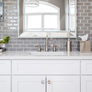
Our clients’ recently purchase home is set in a picturesque location in Golden, Colorado. With idyllic square footage for raising a family, it was almost just what they wanted. However, the 90’s interior furnishings and dated layout didn’t feel like home. So, they reached out to TVL Creative to help them get the place move-in ready and feeling more 'them.' The scope of work included an overhaul of the master bathroom, full-home paint scheme, lighting updates, and new staircase railings. The most profound transformation within our scope was the master bathroom renovation. This luxurious space, built by TVL’s own Team Angel, is a calming retreat with gorgeous detailing throughout. Every part of this bathroom was gutted and we worked to establish a new concept and functional layout that would better serve our clients. As part of the transformative design, a calming symmetry was created by marrying the new vanity design with the existing architecture of the room. A feature tile accentuates the symmetrical composition of vanity and vaulted ceiling: large beveled mirrors and linear sconces bring the eye upward. Custom built-ins flanking the master bathroom sinks were designed to provide ample organized storage for linens and toiletries. A make-up vanity accented by a full height mirror and coordinating pendant rounds out the custom built-ins. Opposite the vanity wall is the commode room, bathtub, and a large shower. In the bathtub nook, the sculptural form of the Elise tub by MTI Baths compliments the arc of the picture window above. The Kohler Archer tub filler adds transitional and classy styling to the area. A quartz-topped bench running the length of the back wall provides a perfect spot for a glass of wine near the bath, while doubling as a gorgeous and functional seat in the shower. The bench was also utilized to move the bathtub off of the exterior wall and reduce the amount of awkward-to-clean floor space. In the shower, the upgrades feel limitless. We relocated the valve controls to the entry half wall for easy on/off access. We also created functionals shower niches that are tucked out of view for handy storage without aesthetic compromise. The shower features a lovely three-dimensional diamond accent tile and is wrapped in frameless glass for added light entry. In general, the space is outfitted with other stunning features including Kohler Archer fixtures throughout, Feiss decorative lighting, Amerock hardware on all built-ins, and cabinetry from Waypoint Living Spaces. From bachelor pad to first family home, it's been a pleasure to work with our client over the years! We will especially cherish our time working with them this time around to make their new house feel more like home.
 ZeroEnergy Design
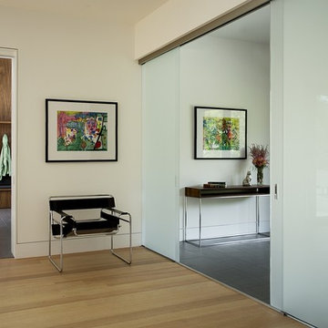
ZeroEnergy Design (ZED) created this modern home for a progressive family in the desirable community of Lexington.
Thoughtful Land Connection. The residence is carefully sited on the infill lot so as to create privacy from the road and neighbors, while cultivating a side yard that captures the southern sun. The terraced grade rises to meet the house, allowing for it to maintain a structured connection with the ground while also sitting above the high water table. The elevated outdoor living space maintains a strong connection with the indoor living space, while the stepped edge ties it back to the true ground plane. Siting and outdoor connections were completed by ZED in collaboration with landscape designer Soren Deniord Design Studio.
Exterior Finishes and Solar. The exterior finish materials include a palette of shiplapped wood siding, through-colored fiber cement panels and stucco. A rooftop parapet hides the solar panels above, while a gutter and site drainage system directs rainwater into an irrigation cistern and dry wells that recharge the groundwater.
Cooking, Dining, Living. Inside, the kitchen, fabricated by Henrybuilt, is located between the indoor and outdoor dining areas. The expansive south-facing sliding door opens to seamlessly connect the spaces, using a retractable awning to provide shade during the summer while still admitting the warming winter sun. The indoor living space continues from the dining areas across to the sunken living area, with a view that returns again to the outside through the corner wall of glass.
Accessible Guest Suite. The design of the first level guest suite provides for both aging in place and guests who regularly visit for extended stays. The patio off the north side of the house affords guests their own private outdoor space, and privacy from the neighbor. Similarly, the second level master suite opens to an outdoor private roof deck.
Light and Access. The wide open interior stair with a glass panel rail leads from the top level down to the well insulated basement. The design of the basement, used as an away/play space, addresses the need for both natural light and easy access. In addition to the open stairwell, light is admitted to the north side of the area with a high performance, Passive House (PHI) certified skylight, covering a six by sixteen foot area. On the south side, a unique roof hatch set flush with the deck opens to reveal a glass door at the base of the stairwell which provides additional light and access from the deck above down to the play space.
Energy. Energy consumption is reduced by the high performance building envelope, high efficiency mechanical systems, and then offset with renewable energy. All windows and doors are made of high performance triple paned glass with thermally broken aluminum frames. The exterior wall assembly employs dense pack cellulose in the stud cavity, a continuous air barrier, and four inches exterior rigid foam insulation. The 10kW rooftop solar electric system provides clean energy production. The final air leakage testing yielded 0.6 ACH 50 - an extremely air tight house, a testament to the well-designed details, progress testing and quality construction. When compared to a new house built to code requirements, this home consumes only 19% of the energy.
Architecture & Energy Consulting: ZeroEnergy Design
Landscape Design: Soren Deniord Design
Paintings: Bernd Haussmann Studio
Photos: Eric Roth Photography
 TVL Creative Ltd.
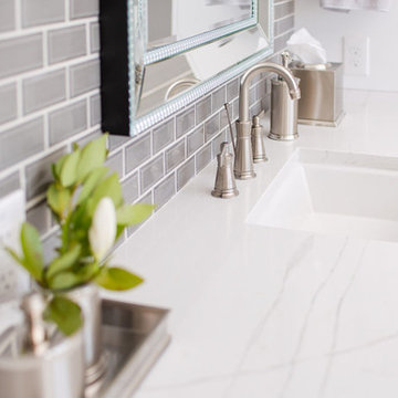
Our clients’ recently purchase home is set in a picturesque location in Golden, Colorado. With idyllic square footage for raising a family, it was almost just what they wanted. However, the 90’s interior furnishings and dated layout didn’t feel like home. So, they reached out to TVL Creative to help them get the place move-in ready and feeling more 'them.' The scope of work included an overhaul of the master bathroom, full-home paint scheme, lighting updates, and new staircase railings. The most profound transformation within our scope was the master bathroom renovation. This luxurious space, built by TVL’s own Team Angel, is a calming retreat with gorgeous detailing throughout. Every part of this bathroom was gutted and we worked to establish a new concept and functional layout that would better serve our clients. As part of the transformative design, a calming symmetry was created by marrying the new vanity design with the existing architecture of the room. A feature tile accentuates the symmetrical composition of vanity and vaulted ceiling: large beveled mirrors and linear sconces bring the eye upward. Custom built-ins flanking the master bathroom sinks were designed to provide ample organized storage for linens and toiletries. A make-up vanity accented by a full height mirror and coordinating pendant rounds out the custom built-ins. Opposite the vanity wall is the commode room, bathtub, and a large shower. In the bathtub nook, the sculptural form of the Elise tub by MTI Baths compliments the arc of the picture window above. The Kohler Archer tub filler adds transitional and classy styling to the area. A quartz-topped bench running the length of the back wall provides a perfect spot for a glass of wine near the bath, while doubling as a gorgeous and functional seat in the shower. The bench was also utilized to move the bathtub off of the exterior wall and reduce the amount of awkward-to-clean floor space. In the shower, the upgrades feel limitless. We relocated the valve controls to the entry half wall for easy on/off access. We also created functionals shower niches that are tucked out of view for handy storage without aesthetic compromise. The shower features a lovely three-dimensional diamond accent tile and is wrapped in frameless glass for added light entry. In general, the space is outfitted with other stunning features including Kohler Archer fixtures throughout, Feiss decorative lighting, Amerock hardware on all built-ins, and cabinetry from Waypoint Living Spaces. From bachelor pad to first family home, it's been a pleasure to work with our client over the years! We will especially cherish our time working with them this time around to make their new house feel more like home.
73