
Search results for "Master starting" in Home Design Ideas
 StoneUnlimited Kitchen and Bath Remodeling
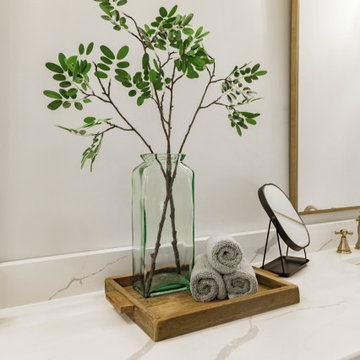
This aesthetically pleasing master bathroom is the perfect place for our clients to start and end each day. Fully customized shower fixtures and a deep soaking tub will provide the perfect solutions to destress and unwind. Our client's love for plants translates beautifully into this space with a sage green double vanity that brings life and serenity into their master bath retreat. Opting to utilize softer patterned tile throughout the space, makes it more visually expansive while gold accessories, natural wood elements, and strategically placed rugs throughout the room, make it warm and inviting.
Committing to a color scheme in a space can be overwhelming at times when considering the number of options that are available. This master bath is a perfect example of how to incorporate color into a room tastefully, while still having a cohesive design.
Items used in this space include:
Waypoint Living Spaces Cabinetry in Sage Green
Calacatta Italia Manufactured Quartz Vanity Tops
Elegant Stone Onice Bianco Tile
Natural Marble Herringbone Tile
Delta Cassidy Collection Fixtures
Want to see more samples of our work or before and after photographs of this project?
Visit the Stoneunlimited Kitchen and Bath website:
www.stoneunlimited.net
Stoneunlimited Kitchen and Bath is a full scope, full service, turnkey business. We do it all so that you don’t have to. You get to do the fun part of approving the design, picking your materials and making selections with our guidance and we take care of everything else. We provide you with 3D and 4D conceptual designs so that you can see your project come to life. Materials such as tile, fixtures, sinks, shower enclosures, flooring, cabinetry and countertops are ordered through us, inspected by us and installed by us. We are also a fabricator, so we fabricate all the countertops. We assign and manage the schedule and the workers that will be in your home taking care of the installation. We provide painting, electrical, plumbing as well as cabinetry services for your project from start to finish. So, when I say we do it, we truly do it all!
 Simply Home Decorating
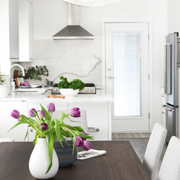
This 1990's home, located in North Vancouver's Lynn Valley neighbourhood, had high ceilings and a great open plan layout but the decor was straight out of the 90's complete with sponge painted walls in dark earth tones. The owners, a young professional couple, enlisted our help to take it from dated and dreary to modern and bright. We started by removing details like chair rails and crown mouldings, that did not suit the modern architectural lines of the home. We replaced the heavily worn wood floors with a new high end, light coloured, wood-look laminate that will withstand the wear and tear from their two energetic golden retrievers. Since the main living space is completely open plan it was important that we work with simple consistent finishes for a clean modern look. The all white kitchen features flat doors with minimal hardware and a solid surface marble-look countertop and backsplash. We modernized all of the lighting and updated the bathrooms and master bedroom as well. The only departure from our clean modern scheme is found in the dressing room where the client was looking for a more dressed up feminine feel but we kept a thread of grey consistent even in this more vivid colour scheme. This transformation, featuring the clients' gorgeous original artwork and new custom designed furnishings is admittedly one of our favourite projects to date!
 Tiffany Brooks, HGTV Host & Interior Designer
Inquire About Our Design Services
When we first started talking in the spring of 2015, I was impressed. She was witty, realistic, and understood that as much as she loves my shows on HGTV, design does not does not happen in 43 minutes! She told me about her space, and how she felt that her bedroom seemed “blah” to her. She had no retreat. Molly desperately longed for a place that she could spend time in, read in, play in and above all, relax in.
What we did:
Many people are terrified of hiring a designer. Rightfully so, they are investing a pretty penny in their homes. They want to make sure that everything, down to the last floral arrangement, is to their liking, because they will have to live it (and pay for it). Unfortunately, a client can unintentionally stifle a designer’s creativity through micro-management. This can produce lackluster results and ultimately cause more time (and money) to be spent on a project than is really necessary.
With Molly, that was never an issue. Before she even showed me the room in question, she said that I could have full creative license to do what I needed to do to her bedroom. SAY WHAAH!?
With Molly giving me complete creative freedom, I planned everything out and got down to business. The result: Bite-your-bottom-lip sexy. I don’t get jealous of too many of my clients’ spaces, but this one still takes my breath away every time I look at the pics!
The craziest part was that by adding more furniture, it actually made the space feel larger.
Molly and her husband Patrick loved the finished space, and promised me I will be back to finish the rest of the house!
Here’s the highlights of the rest of the project:
I came up with a space plan with three options.
Next, we reviewed mood boards and fabric schemes that would work for both Molly and her hubby Patrick.
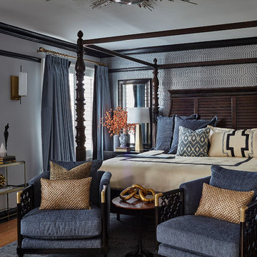
We started with the bed. My goal was to add edge to its otherwise traditional style.
We decided to spice things up by painting the trim work in the room black.
We built in layers of lighting with dimmers. In a bedroom everything should be on dimmers, right? Right.
We designed and customized bedding, chairs and window treatments.
Together with Molly, we selected the most perfect wallpaper. This geometric “grasscloth” adds so much depth and dimension that was just missing before.
What I love:
That light fixture. I mean it is really, really amazing in person.
The porcupine mirror. This thing came packaged like it was the hope diamond, and everyone was terrified to handle it. But it really became a highlight of the room.
Find the right local pro for your project
 TVL Creative Ltd.
[Our Clients]
We were so excited to help these new homeowners re-envision their split-level diamond in the rough. There was so much potential in those walls, and we couldn’t wait to delve in and start transforming spaces. Our primary goal was to re-imagine the main level of the home and create an open flow between the space. So, we started by converting the existing single car garage into their living room (complete with a new fireplace) and opening up the kitchen to the rest of the level.
[Kitchen]
The original kitchen had been on the small side and cut-off from the rest of the home, but after we removed the coat closet, this kitchen opened up beautifully. Our plan was to create an open and light filled kitchen with a design that translated well to the other spaces in this home, and a layout that offered plenty of space for multiple cooks. We utilized clean white cabinets around the perimeter of the kitchen and popped the island with a spunky shade of blue. To add a real element of fun, we jazzed it up with the colorful escher tile at the backsplash and brought in accents of brass in the hardware and light fixtures to tie it all together. Through out this home we brought in warm wood accents and the kitchen was no exception, with its custom floating shelves and graceful waterfall butcher block counter at the island.
[Dining Room]
The dining room had once been the home’s living room, but we had other plans in mind. With its dramatic vaulted ceiling and new custom steel railing, this room was just screaming for a dramatic light fixture and a large table to welcome one-and-all.
[Living Room]
We converted the original garage into a lovely little living room with a cozy fireplace. There is plenty of new storage in this space (that ties in with the kitchen finishes), but the real gem is the reading nook with two of the most comfortable armchairs you’ve ever sat in.
[Master Suite]
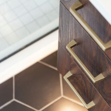
This home didn’t originally have a master suite, so we decided to convert one of the bedrooms and create a charming suite that you’d never want to leave. The master bathroom aesthetic quickly became all about the textures. With a sultry black hex on the floor and a dimensional geometric tile on the walls we set the stage for a calm space. The warm walnut vanity and touches of brass cozy up the space and relate with the feel of the rest of the home. We continued the warm wood touches into the master bedroom, but went for a rich accent wall that elevated the sophistication level and sets this space apart.
[Hall Bathroom]
The floor tile in this bathroom still makes our hearts skip a beat. We designed the rest of the space to be a clean and bright white, and really let the lovely blue of the floor tile pop. The walnut vanity cabinet (complete with hairpin legs) adds a lovely level of warmth to this bathroom, and the black and brass accents add the sophisticated touch we were looking for.
[Office]
We loved the original built-ins in this space, and knew they needed to always be a part of this house, but these 60-year-old beauties definitely needed a little help. We cleaned up the cabinets and brass hardware, switched out the formica counter for a new quartz top, and painted wall a cheery accent color to liven it up a bit. And voila! We have an office that is the envy of the neighborhood.
 The Good Home - Interiors & Design
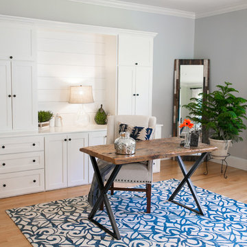
The duo purpose custom built-ins with shiplap detail provide storage for clothing, blankets, and bedding in the drawers and upper cabinets, while office supplies are housed in the center cabinets. Desk built by TIm Hill Fine Woodworking
Photo by Maine Photo Co - Liz Donnelly
 TaylorPro Design and Remodeling, Inc.
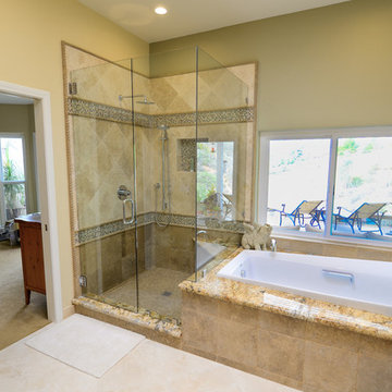
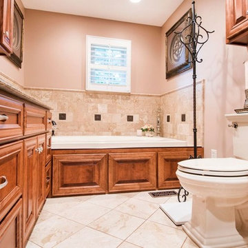
"When we bought our house in Poway 11 years ago, we were so happy with our huge master bath and Jacuzzi tub. It was such a huge step-up from our prior home. But just like the rest of the house, the master bath was already almost 20 years old and getting out dated and in need of remodeling. We broke up our remodeling projects into every couple of years, doing what we could ourselves and hiring out for the rest. The master bath was the last project and much too big for us to do on our own. We got 3 quotes from 3 contractors listed on Angie’s list which all had good reviews. One was a major re modeler and the other two were smaller contractors. We ended up going with TaylorPro because he was right in the middle and had great reviews.
Kerry was very responsive getting us a timely estimate and had great suggestions for what we were looking for. From the start to finish it turned out to be a wonderful experience! To our delight, they were able to get started ahead of what we were told. Everything went almost as scheduled and we were informed constantly on where we were in the project. Kerry was very responsive to all our concerns or requests and we were never left wondering what the next step would be. His crew was wonderful, so polite and hard working. They were very professional, on time, considerate and knew exactly what they were doing.
There were certain things we were really looking for in the remodel. First off, the bathroom was pretty large with a high ceiling. In the winter months, it was always really cold and hard to heat. To solve that we had TaylorPro install heated flooring beneath the travertine tiles. We also needed a custom vanity that would conceal hair appliances, most of our personal toiletries and have enough storage for everything else. The cabinetry was custom designed to exactly what we were looking for. Lastly, we wanted a classic, timeless look using tumbled travertine. After consulting with his designer we were able to select all the tile, accent tile and a beautiful frameless glass shower enclosure.
The finished project was beyond our highest expectations and we won’t hesitate to use Kerry and his crew for any future jobs or recommend him to family and friends."
~ Mark and Amy B, Clients
Frameless shower door, glass tile with rope border, dark and light travertine tiles on walls, travertine on floor, heated floor by NuHeat, tub and sinks by Kohler, shower/tub/vanity fixtures Hansgrohe, toilet Toto, custom cabinets by Thead Custom Cabinetry.
Photo by Kerry W. Taylor
 Abda Custom Window Fashions
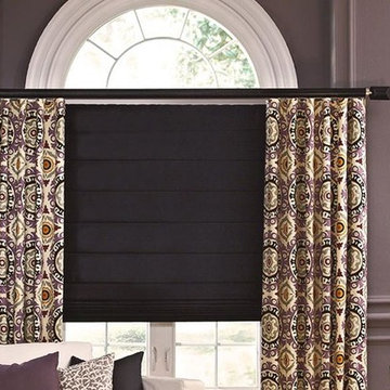
We like this design because it is updating a traditional home into more of a "contemporary" look. There's a fine line when trying to accomplish this. You want the updated look to not compete with the traditional architecture of the home. For example the wood molding, chair rail and curvature of the window.
This space works with the updated design by painting the walls a solid, modern color of deep plum. You want to paint the wood detail of the chair rail and molding the same color of the wall so it's not too busy and just adds that visual interest in the background. Second, using a fabric pattern that is modern paired with the clean lines of the sofa, rod and lamp shade makes this space the ultimate updated look.
**UPDATE** We also work with clients all over the country! Our virtual designers have experience as local and long distance design consultants. Our designers offer professional fabric and design recommendations, free estimates and have a great ability to communicate via email or phone to help conceptualize the project and see it through to the final stages. Fabric samples are mailed directly to you and we also provide easy installation guides.
For clients out of the Indiana area, we now have a professionally trained interior designer! Our "virtual designer" can help you with your project and ship your custom items directly to you at a fraction of the cost without compromising on quality! Let our design specialists help you today!
We're very excited to announce that we were featured on HOUZZ! Click the link below to check out the article!
http://www.houzz.com/ideabooks/30722151/list/design-workshop-shutters-all-grown-up
Abda Window fashions of Indianapolis has custom curtains, drapes, valances, cornices, pillows and hardware in a variety of fabrics and finishes. Curtains and drapes are great alone or paired with a hard window treatment for the ultimate fashion statement. All of our curtains, drapes, valances, cornices and pillows are custom-made from our own workroom. We also make custom bedding and upholstery. We have a huge selection of fabrics that will match any style.
Our custom, affordable draperies, curtains and sheers are now available to anyone in the US. We make them in our own workroom and ship them anywhere in the US! Talk with our professional design specialists and let them help you transform your home! It’s simple and easy. This is a great solution for persons who live out of state or are too busy for a traditional home consultation. With our great reviews, solid company and company values- you know that you’re home is in great hands!
We also have ready-made curtains and bedding available too! And don’t forget our custom hardware! You can also check out our houzz.com store for great window fashion products, including our exclusive bendable rods!
To see our new line, contact Talitha at 317-273-8343 or email: talitha@abdawindowfashions.com or check out our houzz.com store!
For our local customers we offer, FREE In-home consultation or showroom appointment to meet your lifestyle and design needs. At Abda, we have the perfect blend of high-end and affordable solutions for every style and budget. Affordable doesn’t mean cheap! We pride ourselves on quality products with excellent service. We’re so confident of our products that we give our customers more than the manufacturers guarantee!
We give our customers an additional 2 year warranty on top of the manufacturers guarantee!
At Abda, you will find knowledgeable staff that will turn your visions into a reality. Stop in our showroom or schedule a Free In-home consultation today! We know you will be happy with the results but don’t take our word for it, check out what some of our customers say about us on Houzz and Angie’s List!
http://www.angieslist.com/companylist/us/in/indianapolis/abda-inc-custom-window-fashions-reviews-60394.htm?cid=ssabadge
Why Choose Us?
We have been in business since November 1998 and started in the window covering business by cleaning & repairing blinds. This gave us a unique perspective from most window covering dealers. We have always considered how well products hold up and which manufacturers stand behind their products the best. We let our clients know the benefits of more expensive products and give honest feedback. We take pride in showing alternative products to fit all budgets.
Our great testimonials on Angie’s List, Houzz.com and referrals have helped our company grow without the need for “conventional” advertising. Abda means ‘servant’. At Abda, we approach every customer with a servant’s attitude. This philosophy has helped our customers feel confident in their purchases and well-taken care of. Our number one focus is customer service and we believe in putting the customer’s needs first. We offer our clients an additional 2 year warranty on top of the manufacturer’s warranty and want each and every client to be completely happy with their purchase. We’ve been awarded the prestigious 2013 Angie’s List Super Service Award, an honor bestowed annually on approximately 5 percent of all the businesses rated on the nation’s leading provider of consumer reviews. We’ve grown over the years and have added more team members to our company and we’re very excited at the direction our company is going.
Check out our website for more information: www.abdawindowfashions.com
Below is a list of styles and types of curtains and draperies that we can help you with. No worries if you do not find what you’re looking for below! Since we have our own workroom, the sky is the limit. There’s no project too small or large! Our design specialists are great at helping you with window treatment ideas. Stop in our showroom or call today for a FREE in-home consultation. If you’re out of state, no problem! We’re now making our custom treatments and shipping them to you!
Call today (317-273-8343) for more information or email:
talitha@abdawindowfashions.com
Some of the styles and types:
Modern curtains & draperies,
Contemporary curtains & draperies,
Traditional curtains & draperies,
Transitional curtains & draperies,
Beach Style curtains & draperies,
Asian Style curtains & draperies,
Eclectic curtains & draperies,
Midcentury curtains & draperies,
Mediterranean curtains & draperies,
Farmhouse Style curtains & draperies
Kitchen curtains,
Living room curtains,
Dining room curtains,
Master Bedroom curtains,
Nursery curtains,
Children’s room curtains,
Guest bedroom curtains,
Areas that we serve for installation for curtains & draperies are listed below. (But we ship to anywhere in the US!) If you don’t see your city on the list, just give us a call and we will see what we can do.
Indianapolis curtains and draperies & surrounding areas,
Carmel curtains and draperies & surrounding areas,
Zionsville curtains and draperies & surrounding areas
Westfield curtains and draperies & surrounding areas,
Avon curtains and draperies & surrounding areas,
Greenwood curtains and draperies & surrounding areas,

Sponsored
Sunbury, OH

J.Holderby - Renovations
Franklin County's Leading General Contractors - 2X Best of Houzz!
 Spaces Designed, Interior Design Studio, LLC
“We could never have envisioned what could be” – Steiner Ranch Homeowner and Client
It is an especially fulfilling Project for an Interior Designer when the outcome exceeds Client expectations, and imagination. This remodeling project required instilling modern sensibilities, openness, styles and textures into a dated house that was past its prime. Strategically, the goal was to tear down where it made sense without doing a complete teardown.
Starting with the soul of the home, the kitchen, we expanded out room by room to create a cohesiveness and flow that invites, supports and provides the warmth and relaxation that only a home can.
In the Kitchen, we started by removing the wooden beams and adding bright recessed lighting. We removed the old limestone accent wall and moved the sink and cooktop from the island on to the countertop – the key goal was to create room for the family to gather around the kitchen. We replaced all appliances with modern Energy Star ones, along with adding a wine rack.
The first order of business for the Living Room was to brighten it up by adding more lighting and replacing an unused section with a glass door to the backyard. Multi-section windows were replaced with large no-split glass overlooking the backyard. Once more, the limestone accent was removed to create a clean, modern look. Replacing the dated wooden staircase with the clean lines of a metal, wire and wooded staircase added interest and freshness. An odd bend in the staircase was removed to clean things up.
The Master Bedroom went from what looked like a motel room with green carpet and cheap blinds to an oasis of luxury and charm. A section of the wraparound doors were closed off to increase privacy, accentuate the best view from the bedroom and to add usable space. Artwork, rug, contemporary bed and other accent pieces brought together the seamless look across the home.
The Master Bathroom remodel started by replacing the standard windows with a single glass pane that enhanced the view of the outdoors. The dated shower was replaced by a walk-in shower and soaking tub to create the ultimate at-home spa experience. Lighted LED mirrors frame His & Hers sinks and bathe them in a soft light.
The flooring was upgraded throughout the house to reflect the contemporary color scheme.
Each of the smaller bedrooms were similarly upgraded to match the clean and modern décor of the rest of the house.
After such a transformation inside, it was only appropriate that the exterior needed an upgrade as well. All of the legacy limestone accents were replaced by stucco and the color scheme extended from the interior of the house to the gorgeous wrap around balconies, trim, garage doors etc. to complete the inside outside transformation.
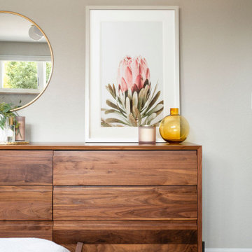 TVL Creative Ltd.
[Our Clients]
We were so excited to help these new homeowners re-envision their split-level diamond in the rough. There was so much potential in those walls, and we couldn’t wait to delve in and start transforming spaces. Our primary goal was to re-imagine the main level of the home and create an open flow between the space. So, we started by converting the existing single car garage into their living room (complete with a new fireplace) and opening up the kitchen to the rest of the level.
[Kitchen]
The original kitchen had been on the small side and cut-off from the rest of the home, but after we removed the coat closet, this kitchen opened up beautifully. Our plan was to create an open and light filled kitchen with a design that translated well to the other spaces in this home, and a layout that offered plenty of space for multiple cooks. We utilized clean white cabinets around the perimeter of the kitchen and popped the island with a spunky shade of blue. To add a real element of fun, we jazzed it up with the colorful escher tile at the backsplash and brought in accents of brass in the hardware and light fixtures to tie it all together. Through out this home we brought in warm wood accents and the kitchen was no exception, with its custom floating shelves and graceful waterfall butcher block counter at the island.
[Dining Room]
The dining room had once been the home’s living room, but we had other plans in mind. With its dramatic vaulted ceiling and new custom steel railing, this room was just screaming for a dramatic light fixture and a large table to welcome one-and-all.
[Living Room]
We converted the original garage into a lovely little living room with a cozy fireplace. There is plenty of new storage in this space (that ties in with the kitchen finishes), but the real gem is the reading nook with two of the most comfortable armchairs you’ve ever sat in.
[Master Suite]
This home didn’t originally have a master suite, so we decided to convert one of the bedrooms and create a charming suite that you’d never want to leave. The master bathroom aesthetic quickly became all about the textures. With a sultry black hex on the floor and a dimensional geometric tile on the walls we set the stage for a calm space. The warm walnut vanity and touches of brass cozy up the space and relate with the feel of the rest of the home. We continued the warm wood touches into the master bedroom, but went for a rich accent wall that elevated the sophistication level and sets this space apart.
[Hall Bathroom]
The floor tile in this bathroom still makes our hearts skip a beat. We designed the rest of the space to be a clean and bright white, and really let the lovely blue of the floor tile pop. The walnut vanity cabinet (complete with hairpin legs) adds a lovely level of warmth to this bathroom, and the black and brass accents add the sophisticated touch we were looking for.
[Office]
We loved the original built-ins in this space, and knew they needed to always be a part of this house, but these 60-year-old beauties definitely needed a little help. We cleaned up the cabinets and brass hardware, switched out the formica counter for a new quartz top, and painted wall a cheery accent color to liven it up a bit. And voila! We have an office that is the envy of the neighborhood.
 Woodmaster Kitchens
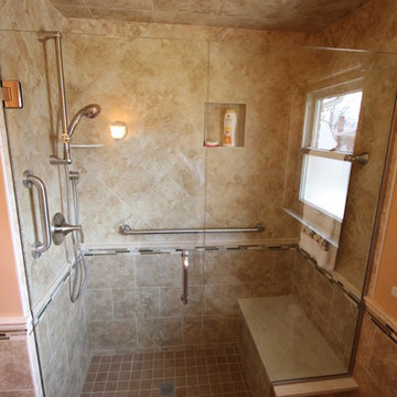
This bathroom design features a warm color scheme and a large, accessible shower with a built in seat and grab bars. The integrated storage niche in the tile wall and corner shelf ensure that you always have a place to keep your shower toiletries to hand. A Medallion vanity and Robern medicine cabinet keep the bathroom clutter free with plenty of integrated storage space.
 Kandrac & Kole Interior Designs, Inc.
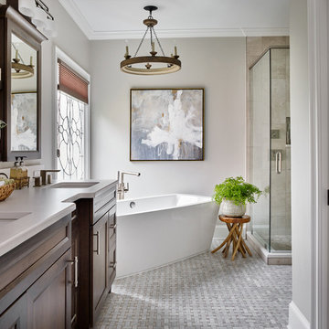
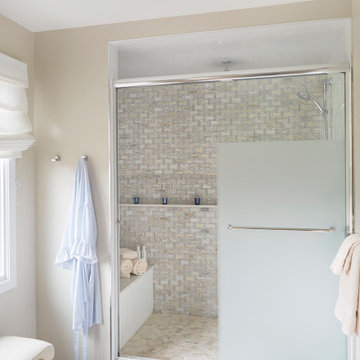
An update to a dated 80s bath using high quality custom cabinetry, silestone quartz countertop, accent tile and Kohler fixtures. Cabinets by Dura Supreme, Silestone Quartz countertops, basketweave tile purchased through Prosource Marietta, Design By Kandrac & Kole, renovation by Highland Design Gallery and photo credit Emily Followill
 TKS Design Group
Download our free ebook, Creating the Ideal Kitchen. DOWNLOAD NOW
Lakefront property in the northwest suburbs of Chicago is hard to come by, so when we were hired by this young family with exactly that, we were immediately inspired by not just the unusually large footprint of this 1950’s colonial revival but also the lovely views of the manmade lake it was sited on. The large 5-bedroom home was solidly stuck in the 1980’s, but we saw tons of potential. We started out by updating the existing staircase with a fresh coat of paint and adding new herringbone slate to the entry hall.
The powder room off the entryway also got a refresh - new flooring, new cabinets and fixtures. We ran the new slate right through into this space for some consistency. A fun wallpaper and shiplap trim add a welcoming feel and set the tone for the home.
Next, we tackled the kitchen. Located away from the rest of the first floor, the kitchen felt a little isolated, so we immediately began planning for how to better connect it to the rest of the first floor. We landed on removing the wall between the kitchen and dining room and designed a modified galley style space with separate cooking and clean up zones. The cooking zone consists of the refrigerator, prep sink and cooktop, along with a nice long run of prep space at the island. The cleanup side of the kitchen consists of the main sink and dishwasher. Both areas are situated so that the user can view the lake during prep work and cleanup!
One of the home’s main puzzles was how to incorporate the mudroom and area in front of the patio doors at the back of the house. We already had a breakfast table area, so the space by the patio doors was a bit of a no man’s land. We decided to separate the kitchen proper from what became the new mudroom with a large set of barn doors. That way you can quickly hide any mudroom messes but have easy access to the light coming in through the patio doors as well as the outdoor grilling station. We also love the impact the barn doors add to the overall space.
The homeowners’ first words to us were “it’s time to ditch the brown,” so we did! We chose a lovely blue pallet that reflects the home’s location on the lake which is also vibrant yet easy on the eye. Countertops are white quartz, and the natural oak floor works well with the other honey accents. The breakfast table was given a refresh with new chairs, chandelier and window treatments that frame the gorgeous views of the lake out the back.
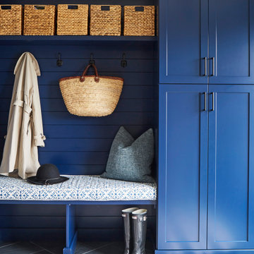
We coordinated the slate mudroom flooring with that used in the home’s main entrance for a consistent feel. The storage area consists of open and closed storage to allow for some clutter control as needed.
Next on our “to do” list was revamping the dated brown bar area in the neighboring dining room. We eliminated the clutter by adding some closed cabinets and did some easy updates to help the space feel more current. One snag we ran into here was the discovery of a beam above the existing open shelving that had to be modified with a smaller structural beam to allow for our new design to work. This was an unexpected surprise, but in the end we think it was well worth it!
We kept the colors here a bit more muted to blend with the homeowner’s existing furnishings. Open shelving and polished nickel hardware add some simple detail to the new entertainment zone which also looks out onto the lake!
Next we tackled the upstairs starting with the homeowner’s son’s bath. The bath originally had both a tub shower and a separate shower, so we decided to swap out the shower for a new laundry area. This freed up some space downstairs in what used to be the mudroom/laundry room and is much more convenient for daily laundry needs.
We continued the blue palette here with navy cabinetry and the navy tile in the shower. Porcelain floor tile and chrome fixtures keep maintenance to a minimum while matte black mirrors and lighting add some depth the design. A low maintenance runner adds some warmth underfoot and ties the whole space together.
We added a pocket door to the bathroom to minimize interference with the door swings. The left door of the laundry closet is on a 180 degree hinge to allow for easy full access to the machines. Next we tackled the master bath which is an en suite arrangement. The original was typical of the 1980’s with the vanity outside of the bathroom, situated near the master closet. And the brown theme continued here with multiple shades of brown.
Our first move was to segment off the bath and the closet from the master bedroom. We created a short hall from the bedroom to the bathroom with his and hers walk-in closets on the left and right as well as a separate toilet closet outside of the main bathroom for privacy and flexibility.
The original bathroom had a giant soaking tub with steps (dangerous!) as well as a small shower that did not work well for our homeowner who is 6’3”. With other bathtubs in the home, they decided to eliminate the tub and create an oversized shower which takes up the space where the old tub was located. The double vanity is on the opposite wall and a bench is located under the window for morning conversations and a place to set a couple of towels.
The pallet in here is light and airy with a mix of blond wood, creamy porcelain and marble tile, and brass accents. A simple roman shade adds some texture and it’s top-down mechanism allows for light and privacy.
This large whole house remodel gave our homeowners not only the ability to maximize the potential of their home but also created a lovely new frame from which to view their fabulous lake views.
Designed by: Susan Klimala, CKD, CBD
Photography by: Michael Kaskel
For more information on kitchen and bath design ideas go to: www.kitchenstudio-ge.com
 Landis Architects | Builders
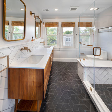
Our clients wanted a master bath connected to their bedroom. We transformed the adjacent sunroom into an elegant and warm master bath that reflects their passion for midcentury design. The design started with the walnut double vanity the clients selected in the mid-century style. We built on that style with classic black and white tile. We built that ledge behind the vanity so we could run plumbing and insulate around the pipes as it is an exterior wall. We could have built out that full wall but chose a knee wall so the client would have a ledge for additional storage. The wall-mounted faucets are set in the knee wall. The large shower has a niche and a bench seat. Our designer selected a simple white quartz surface throughout for the vanity counter, ledge, shower seat and niche shelves. Note how the herringbone pattern in the niche matches the surrounding tile.

 TKS Design Group
Download our free ebook, Creating the Ideal Kitchen. DOWNLOAD NOW
Lakefront property in the northwest suburbs of Chicago is hard to come by, so when we were hired by this young family with exactly that, we were immediately inspired by not just the unusually large footprint of this 1950’s colonial revival but also the lovely views of the manmade lake it was sited on. The large 5-bedroom home was solidly stuck in the 1980’s, but we saw tons of potential. We started out by updating the existing staircase with a fresh coat of paint and adding new herringbone slate to the entry hall.
The powder room off the entryway also got a refresh - new flooring, new cabinets and fixtures. We ran the new slate right through into this space for some consistency. A fun wallpaper and shiplap trim add a welcoming feel and set the tone for the home.
Next, we tackled the kitchen. Located away from the rest of the first floor, the kitchen felt a little isolated, so we immediately began planning for how to better connect it to the rest of the first floor. We landed on removing the wall between the kitchen and dining room and designed a modified galley style space with separate cooking and clean up zones. The cooking zone consists of the refrigerator, prep sink and cooktop, along with a nice long run of prep space at the island. The cleanup side of the kitchen consists of the main sink and dishwasher. Both areas are situated so that the user can view the lake during prep work and cleanup!
One of the home’s main puzzles was how to incorporate the mudroom and area in front of the patio doors at the back of the house. We already had a breakfast table area, so the space by the patio doors was a bit of a no man’s land. We decided to separate the kitchen proper from what became the new mudroom with a large set of barn doors. That way you can quickly hide any mudroom messes but have easy access to the light coming in through the patio doors as well as the outdoor grilling station. We also love the impact the barn doors add to the overall space.
The homeowners’ first words to us were “it’s time to ditch the brown,” so we did! We chose a lovely blue pallet that reflects the home’s location on the lake which is also vibrant yet easy on the eye. Countertops are white quartz, and the natural oak floor works well with the other honey accents. The breakfast table was given a refresh with new chairs, chandelier and window treatments that frame the gorgeous views of the lake out the back.
We coordinated the slate mudroom flooring with that used in the home’s main entrance for a consistent feel. The storage area consists of open and closed storage to allow for some clutter control as needed.
Next on our “to do” list was revamping the dated brown bar area in the neighboring dining room. We eliminated the clutter by adding some closed cabinets and did some easy updates to help the space feel more current. One snag we ran into here was the discovery of a beam above the existing open shelving that had to be modified with a smaller structural beam to allow for our new design to work. This was an unexpected surprise, but in the end we think it was well worth it!
We kept the colors here a bit more muted to blend with the homeowner’s existing furnishings. Open shelving and polished nickel hardware add some simple detail to the new entertainment zone which also looks out onto the lake!
Next we tackled the upstairs starting with the homeowner’s son’s bath. The bath originally had both a tub shower and a separate shower, so we decided to swap out the shower for a new laundry area. This freed up some space downstairs in what used to be the mudroom/laundry room and is much more convenient for daily laundry needs.
We continued the blue palette here with navy cabinetry and the navy tile in the shower. Porcelain floor tile and chrome fixtures keep maintenance to a minimum while matte black mirrors and lighting add some depth the design. A low maintenance runner adds some warmth underfoot and ties the whole space together.
We added a pocket door to the bathroom to minimize interference with the door swings. The left door of the laundry closet is on a 180 degree hinge to allow for easy full access to the machines. Next we tackled the master bath which is an en suite arrangement. The original was typical of the 1980’s with the vanity outside of the bathroom, situated near the master closet. And the brown theme continued here with multiple shades of brown.
Our first move was to segment off the bath and the closet from the master bedroom. We created a short hall from the bedroom to the bathroom with his and hers walk-in closets on the left and right as well as a separate toilet closet outside of the main bathroom for privacy and flexibility.
The original bathroom had a giant soaking tub with steps (dangerous!) as well as a small shower that did not work well for our homeowner who is 6’3”. With other bathtubs in the home, they decided to eliminate the tub and create an oversized shower which takes up the space where the old tub was located. The double vanity is on the opposite wall and a bench is located under the window for morning conversations and a place to set a couple of towels.
The pallet in here is light and airy with a mix of blond wood, creamy porcelain and marble tile, and brass accents. A simple roman shade adds some texture and it’s top-down mechanism allows for light and privacy.
This large whole house remodel gave our homeowners not only the ability to maximize the potential of their home but also created a lovely new frame from which to view their fabulous lake views.
Designed by: Susan Klimala, CKD, CBD
Photography by: Michael Kaskel
For more information on kitchen and bath design ideas go to: www.kitchenstudio-ge.com
 Christopher Maya Associates Inc.
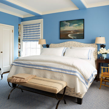
Maya's inspiration was the water. The family spends summers by the ocean, and the husband sails. Christopher started with those simple Roman shades, which have a purplish-blue stripe. He thought that blue would be great for the walls, and it really was. The space was tight — there was no room for nightstands on both sides of the bed. So instead he gave the wife a small desk. She can shut the door and write. She really liked the simplicity of this room.
 AB Design Elements, LLC
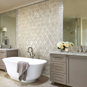
Transitional gray tile and glass tile beige floor freestanding bathtub photo in Phoenix with shaker cabinets, gray cabinets, gray walls, an undermount sink and gray countertops
 Sweetlake Interior Design LLC
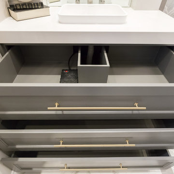
Master bathroom design & build in Houston Texas. This master bathroom was custom designed specifically for our client. She wanted a luxurious bathroom with lots of detail, down to the last finish. Our original design had satin brass sink and shower fixtures. The client loved the satin brass plumbing fixtures, but was a bit apprehensive going with the satin brass plumbing fixtures. Feeling it would lock her down for a long commitment. So we worked a design out that allowed us to mix metal finishes. This way our client could have the satin brass look without the commitment of the plumbing fixtures. We started mixing metals by presenting a chandelier made by Curry & Company, the "Zenda Orb Chandelier" that has a mix of silver and gold. From there we added the satin brass, large round bar pulls, by "Lewis Dolin" and the satin brass door knobs from Emtek. We also suspended a gold mirror in the window of the makeup station. We used a waterjet marble from Tilebar, called "Abernethy Marble." The cobalt blue interior doors leading into the Master Bath set the gold fixtures just right.
Sponsored
Delaware, OH

Buckeye Basements, Inc.
Central Ohio's Basement Finishing ExpertsBest Of Houzz '13-'21
 Advance Design Studio, Ltd.
Scott and Janet of Elgin have had four design to build renovations with Advance Design over the last decade. We got the chance to sit down and talk with Janet about her experience working with Advance Design on so many different areas of her home. Starting with her kitchen in 2009, Janet proclaimed, “The reason we kept coming back is because our first [renovation] went so extremely well, exceeding all of my expectations.”
Since their kitchen renovation with Advance Design ten years ago, Scott and Janet have also worked with Advance to remodel their master bedroom, their power room, a wet bar, and most recently their master bath. Having renovated practically every major room in the house with the team, we asked Janet what made her experience with Advance Design so special. “We went with Advance Design because we trusted them so much more, their experience, and everything that they brought. We were confident they were giving us what we wanted for the money we were spending.”
For their most recent renovation, Scott and Janet clearly knew what to expect going into their master bath renovation. They were familiar with Advance’s step by step design process that epitomizes the “Common Sense Remodeling” philosophy applied in every project Advance creates. After once again experiencing the careful budgeting analysis, the pointed design meetings, and the clear documentation that leads up the a thoroughly managed installation, Janet’s simple summary of their experience is this; “The word I would use to describe the process is – collaboration!”
Working closely with Advance Design kitchen designer Michelle Lecinski, together they were able to develop a new master bath design that not only worked with their investment goal, but also made sense for their lifestyle. “Oh Michelle, my designer! I connected with her immediately. She spent time getting to know us, our lifestyle, even the setting of our house.” The threesome had a great experience designing and producing yet another successful project together.
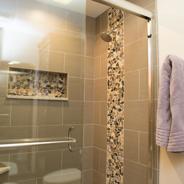
When it came to their new project plans, Scott and Janet were interested in creating a relaxing “spa-like” experience in their master bath. One of the many ideas Michelle introduced during the design process was installing a Kohler Alteo series showerhead for a rain-like shower experience. This designer showerhead, mixed with the warm ambiance of the lighting and pebble accent running throughout the shower make for what Janet calls a “luxury spa essence”. From the oversized glass sliding door to the recessed niche for accessories, each special detail was considered and implemented intentionally so as to create the maximumly optimized use of the compact space. Not only was this transformation one of beauty and luxury, but special attention was given to every way possible to provide additional storage to maximize the functionality of the bath area as a whole.
Once design was complete and the bath construction project began in their home, making sure everything happened efficiently and on schedule became new priority number one. “Having a project manager made an enormous difference,” Janet said, “It was so worth it to hire professionals that knew exactly what they were doing. Even after all of these years, I wouldn’t change a thing.”
“It was a pleasure working together with Janet and Scott to create this beautiful space that will enhance their lives for many years,” says Michelle. “It is so much fun to get to do this job every day, I love that I can have this sort of impact on their lives by doing something for them [Janet & Scott] that comes so naturally to me!”
After reviewing the long-term relationship with clients like Scott and Janet, owner Todd Jurs had this to say, “Clients returning and asking us to transform that next area of their home really warms my heart. It reaffirms that every decision to please clients no matter what is always the right choice, and that our honesty and integrity along with the immense collective talent of this team is recognized and appreciated by those who continue to return to us year after year.” He continued to say, “I always say how blessed we truly are to be able to do what we do, and experiences like this one put a smile on my face every time.”
 Hughes Kitchens & Bath
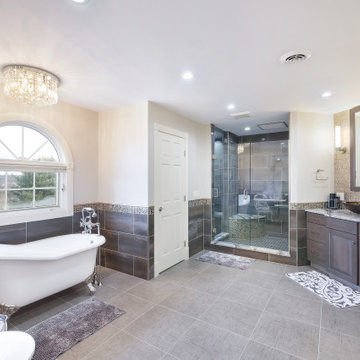
When I originally met with the client in their home they told me that they wanted this to be an absolutely beautiful bathroom. As we designed the space I knew we needed a starting point to build from and I showed them Cambria Galloway Quartz Counter-top. I knew from talking to them that this could work really well for the space. They fell in love with it. We carried the sample with us through the entire design process. The whole bathroom color pallet came from the counter. We added the Galloway in the shower and in the steam room to keep the same feel and color palette. The homeowner was blown away and totally is in love with the entire bathroom.
 TVL Creative Ltd.
[Our Clients]
We were so excited to help these new homeowners re-envision their split-level diamond in the rough. There was so much potential in those walls, and we couldn’t wait to delve in and start transforming spaces. Our primary goal was to re-imagine the main level of the home and create an open flow between the space. So, we started by converting the existing single car garage into their living room (complete with a new fireplace) and opening up the kitchen to the rest of the level.
[Kitchen]
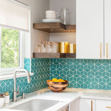
The original kitchen had been on the small side and cut-off from the rest of the home, but after we removed the coat closet, this kitchen opened up beautifully. Our plan was to create an open and light filled kitchen with a design that translated well to the other spaces in this home, and a layout that offered plenty of space for multiple cooks. We utilized clean white cabinets around the perimeter of the kitchen and popped the island with a spunky shade of blue. To add a real element of fun, we jazzed it up with the colorful escher tile at the backsplash and brought in accents of brass in the hardware and light fixtures to tie it all together. Through out this home we brought in warm wood accents and the kitchen was no exception, with its custom floating shelves and graceful waterfall butcher block counter at the island.
[Dining Room]
The dining room had once been the home’s living room, but we had other plans in mind. With its dramatic vaulted ceiling and new custom steel railing, this room was just screaming for a dramatic light fixture and a large table to welcome one-and-all.
[Living Room]
We converted the original garage into a lovely little living room with a cozy fireplace. There is plenty of new storage in this space (that ties in with the kitchen finishes), but the real gem is the reading nook with two of the most comfortable armchairs you’ve ever sat in.
[Master Suite]
This home didn’t originally have a master suite, so we decided to convert one of the bedrooms and create a charming suite that you’d never want to leave. The master bathroom aesthetic quickly became all about the textures. With a sultry black hex on the floor and a dimensional geometric tile on the walls we set the stage for a calm space. The warm walnut vanity and touches of brass cozy up the space and relate with the feel of the rest of the home. We continued the warm wood touches into the master bedroom, but went for a rich accent wall that elevated the sophistication level and sets this space apart.
[Hall Bathroom]
The floor tile in this bathroom still makes our hearts skip a beat. We designed the rest of the space to be a clean and bright white, and really let the lovely blue of the floor tile pop. The walnut vanity cabinet (complete with hairpin legs) adds a lovely level of warmth to this bathroom, and the black and brass accents add the sophisticated touch we were looking for.
[Office]
We loved the original built-ins in this space, and knew they needed to always be a part of this house, but these 60-year-old beauties definitely needed a little help. We cleaned up the cabinets and brass hardware, switched out the formica counter for a new quartz top, and painted wall a cheery accent color to liven it up a bit. And voila! We have an office that is the envy of the neighborhood.
32