
Search results for "Master starting" in Home Design Ideas
 TKS Design Group
Download our free ebook, Creating the Ideal Kitchen. DOWNLOAD NOW
Lakefront property in the northwest suburbs of Chicago is hard to come by, so when we were hired by this young family with exactly that, we were immediately inspired by not just the unusually large footprint of this 1950’s colonial revival but also the lovely views of the manmade lake it was sited on. The large 5-bedroom home was solidly stuck in the 1980’s, but we saw tons of potential. We started out by updating the existing staircase with a fresh coat of paint and adding new herringbone slate to the entry hall.
The powder room off the entryway also got a refresh - new flooring, new cabinets and fixtures. We ran the new slate right through into this space for some consistency. A fun wallpaper and shiplap trim add a welcoming feel and set the tone for the home.
Next, we tackled the kitchen. Located away from the rest of the first floor, the kitchen felt a little isolated, so we immediately began planning for how to better connect it to the rest of the first floor. We landed on removing the wall between the kitchen and dining room and designed a modified galley style space with separate cooking and clean up zones. The cooking zone consists of the refrigerator, prep sink and cooktop, along with a nice long run of prep space at the island. The cleanup side of the kitchen consists of the main sink and dishwasher. Both areas are situated so that the user can view the lake during prep work and cleanup!
One of the home’s main puzzles was how to incorporate the mudroom and area in front of the patio doors at the back of the house. We already had a breakfast table area, so the space by the patio doors was a bit of a no man’s land. We decided to separate the kitchen proper from what became the new mudroom with a large set of barn doors. That way you can quickly hide any mudroom messes but have easy access to the light coming in through the patio doors as well as the outdoor grilling station. We also love the impact the barn doors add to the overall space.
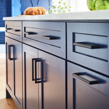
The homeowners’ first words to us were “it’s time to ditch the brown,” so we did! We chose a lovely blue pallet that reflects the home’s location on the lake which is also vibrant yet easy on the eye. Countertops are white quartz, and the natural oak floor works well with the other honey accents. The breakfast table was given a refresh with new chairs, chandelier and window treatments that frame the gorgeous views of the lake out the back.
We coordinated the slate mudroom flooring with that used in the home’s main entrance for a consistent feel. The storage area consists of open and closed storage to allow for some clutter control as needed.
Next on our “to do” list was revamping the dated brown bar area in the neighboring dining room. We eliminated the clutter by adding some closed cabinets and did some easy updates to help the space feel more current. One snag we ran into here was the discovery of a beam above the existing open shelving that had to be modified with a smaller structural beam to allow for our new design to work. This was an unexpected surprise, but in the end we think it was well worth it!
We kept the colors here a bit more muted to blend with the homeowner’s existing furnishings. Open shelving and polished nickel hardware add some simple detail to the new entertainment zone which also looks out onto the lake!
Next we tackled the upstairs starting with the homeowner’s son’s bath. The bath originally had both a tub shower and a separate shower, so we decided to swap out the shower for a new laundry area. This freed up some space downstairs in what used to be the mudroom/laundry room and is much more convenient for daily laundry needs.
We continued the blue palette here with navy cabinetry and the navy tile in the shower. Porcelain floor tile and chrome fixtures keep maintenance to a minimum while matte black mirrors and lighting add some depth the design. A low maintenance runner adds some warmth underfoot and ties the whole space together.
We added a pocket door to the bathroom to minimize interference with the door swings. The left door of the laundry closet is on a 180 degree hinge to allow for easy full access to the machines. Next we tackled the master bath which is an en suite arrangement. The original was typical of the 1980’s with the vanity outside of the bathroom, situated near the master closet. And the brown theme continued here with multiple shades of brown.
Our first move was to segment off the bath and the closet from the master bedroom. We created a short hall from the bedroom to the bathroom with his and hers walk-in closets on the left and right as well as a separate toilet closet outside of the main bathroom for privacy and flexibility.
The original bathroom had a giant soaking tub with steps (dangerous!) as well as a small shower that did not work well for our homeowner who is 6’3”. With other bathtubs in the home, they decided to eliminate the tub and create an oversized shower which takes up the space where the old tub was located. The double vanity is on the opposite wall and a bench is located under the window for morning conversations and a place to set a couple of towels.
The pallet in here is light and airy with a mix of blond wood, creamy porcelain and marble tile, and brass accents. A simple roman shade adds some texture and it’s top-down mechanism allows for light and privacy.
This large whole house remodel gave our homeowners not only the ability to maximize the potential of their home but also created a lovely new frame from which to view their fabulous lake views.
Designed by: Susan Klimala, CKD, CBD
Photography by: Michael Kaskel
For more information on kitchen and bath design ideas go to: www.kitchenstudio-ge.com
 Pearl Remodeling
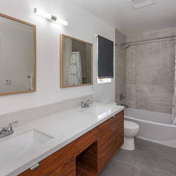
This house was only 1,100 SF with 2 bedrooms and one bath. In this project we added 600SF making it 4+3 and remodeled the entire house. The house now has amazing polished concrete floors, modern kitchen with a huge island and many contemporary features all throughout.
 Sean Litchfield Photography
Sean Litchfield
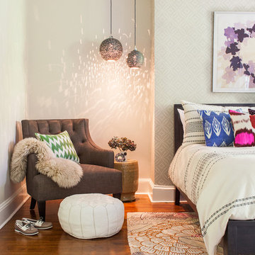
Example of a trendy bedroom design in New York with gray walls
Example of a trendy bedroom design in New York with gray walls
Find the right local pro for your project
 Amsted Design-Build
Previously renovated with a two-story addition in the 80’s, the home’s square footage had been increased, but the current homeowners struggled to integrate the old with the new.
An oversized fireplace and awkward jogged walls added to the challenges on the main floor, along with dated finishes. While on the second floor, a poorly configured layout was not functional for this expanding family.
From the front entrance, we can see the fireplace was removed between the living room and dining rooms, creating greater sight lines and allowing for more traditional archways between rooms.
At the back of the home, we created a new mudroom area, and updated the kitchen with custom two-tone millwork, countertops and finishes. These main floor changes work together to create a home more reflective of the homeowners’ tastes.
On the second floor, the master suite was relocated and now features a beautiful custom ensuite, walk-in closet and convenient adjacency to the new laundry room.
Gordon King Photography
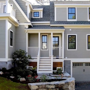
 david phillips
renovation and addition / builder - EODC, LLC.
Mid-sized elegant gray three-story wood house exterior photo in Boston with a shingle roof
Mid-sized elegant gray three-story wood house exterior photo in Boston with a shingle roof
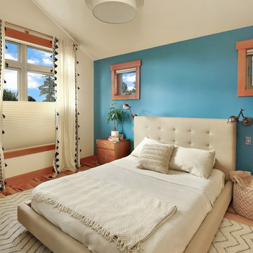
 Bellingham Bay Builders
The owners of this home came to us with a plan to build a new high-performance home that physically and aesthetically fit on an infill lot in an old well-established neighborhood in Bellingham. The Craftsman exterior detailing, Scandinavian exterior color palette, and timber details help it blend into the older neighborhood. At the same time the clean modern interior allowed their artistic details and displayed artwork take center stage.
We started working with the owners and the design team in the later stages of design, sharing our expertise with high-performance building strategies, custom timber details, and construction cost planning. Our team then seamlessly rolled into the construction phase of the project, working with the owners and Michelle, the interior designer until the home was complete.
The owners can hardly believe the way it all came together to create a bright, comfortable, and friendly space that highlights their applied details and favorite pieces of art.
Photography by Radley Muller Photography
Design by Deborah Todd Building Design Services
Interior Design by Spiral Studios
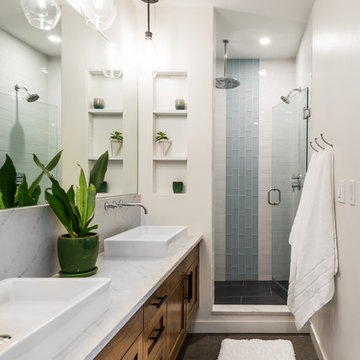
 Board & Vellum
Photos by Andrew Giammarco Photography.
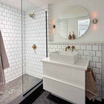
Alcove shower - mid-sized contemporary 3/4 white tile and ceramic tile concrete floor and gray floor alcove shower idea in Seattle with shaker cabinets, white walls, a vessel sink, quartz countertops, a hinged shower door, white countertops and dark wood cabinets
Alcove shower - mid-sized contemporary 3/4 white tile and ceramic tile concrete floor and gray floor alcove shower idea in Seattle with shaker cabinets, white walls, a vessel sink, quartz countertops, a hinged shower door, white countertops and dark wood cabinets


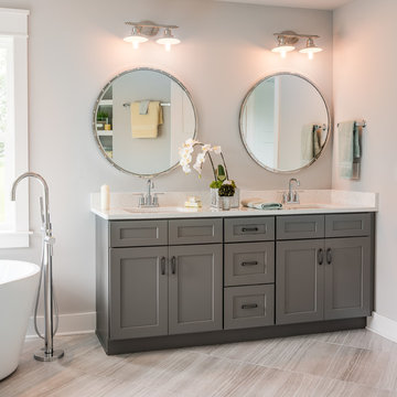
 Custom Home Group
Jason Sandy www.AngleEyePhotography.com
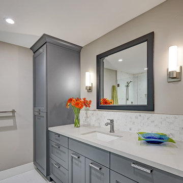
Example of a farmhouse 3/4 gray floor freestanding bathtub design in Philadelphia with shaker cabinets, gray cabinets, gray walls and an undermount sink
Example of a farmhouse 3/4 gray floor freestanding bathtub design in Philadelphia with shaker cabinets, gray cabinets, gray walls and an undermount sink
 Nar Design Group
This home remodel is a celebration of curves and light. Starting from humble beginnings as a basic builder ranch style house, the design challenge was maximizing natural light throughout and providing the unique contemporary style the client’s craved.
The Entry offers a spectacular first impression and sets the tone with a large skylight and an illuminated curved wall covered in a wavy pattern Porcelanosa tile.
The chic entertaining kitchen was designed to celebrate a public lifestyle and plenty of entertaining. Celebrating height with a robust amount of interior architectural details, this dynamic kitchen still gives one that cozy feeling of home sweet home. The large “L” shaped island accommodates 7 for seating. Large pendants over the kitchen table and sink provide additional task lighting and whimsy. The Dekton “puzzle” countertop connection was designed to aid the transition between the two color countertops and is one of the homeowner’s favorite details. The built-in bistro table provides additional seating and flows easily into the Living Room.
A curved wall in the Living Room showcases a contemporary linear fireplace and tv which is tucked away in a niche. Placing the fireplace and furniture arrangement at an angle allowed for more natural walkway areas that communicated with the exterior doors and the kitchen working areas.
The dining room’s open plan is perfect for small groups and expands easily for larger events. Raising the ceiling created visual interest and bringing the pop of teal from the Kitchen cabinets ties the space together. A built-in buffet provides ample storage and display.
The Sitting Room (also called the Piano room for its previous life as such) is adjacent to the Kitchen and allows for easy conversation between chef and guests. It captures the homeowner’s chic sense of style and joie de vivre.
 TVL Creative Ltd.
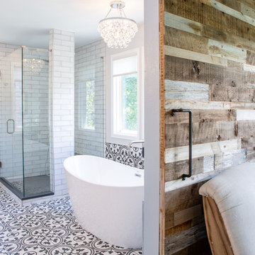
This project is an incredible transformation and the perfect example of successful style mixing! This client, and now a good friend of TVL (as they all become), is a wonderfully eclectic and adventurous one with immense interest in texture play, pops of color, and unique applications. Our scope in this home included a full kitchen renovation, main level powder room renovation, and a master bathroom overhaul. Taking just over a year to complete from the first design phases to final photos, this project was so insanely fun and packs an amazing amount of fun details and lively surprises. The original kitchen was large and fairly functional. However, the cabinetry was dated, the lighting was inefficient and frankly ugly, and the space was lacking personality in general. Our client desired maximized storage and a more personalized aesthetic. The existing cabinets were short and left the nice height of the space under-utilized. We integrated new gray shaker cabinets from Waypoint Living Spaces and ran them to the ceiling to really exaggerate the height of the space and to maximize usable storage as much as possible. The upper cabinets are glass and lit from within, offering display space or functional storage as the client needs. The central feature of this space is the large cobalt blue range from Viking as well as the custom made reclaimed wood range hood floating above. The backsplash along this entire wall is vertical slab of marble look quartz from Pental Surfaces. This matches the expanse of the same countertop that wraps the room. Flanking the range, we installed cobalt blue lantern penny tile from Merola Tile for a playful texture that adds visual interest and class to the entire room. We upgraded the lighting in the ceiling, under the cabinets, and within cabinets--we also installed accent sconces over each window on the sink wall to create cozy and functional illumination. The deep, textured front Whitehaven apron sink is a dramatic nod to the farmhouse aesthetic from KOHLER, and it's paired with the bold and industrial inspired Tournant faucet, also from Kohler. We finalized this space with other gorgeous appliances, a super sexy dining table and chair set from Room & Board, the Paxton dining light from Pottery Barn and a small bar area and pantry on the far end of the space. In the small powder room on the main level, we converted a drab builder-grade space into a super cute, rustic-inspired washroom. We utilized the Bonner vanity from Signature Hardware and paired this with the cute Ashfield faucet from Pfister. The most unique statements in this room include the water-drop light over the vanity from Shades Of Light, the copper-look porcelain floor tile from Pental Surfaces and the gorgeous Cashmere colored Tresham toilet from Kohler. Up in the master bathroom, elegance abounds. Using the same footprint, we upgraded everything in this space to reflect the client's desire for a more bright, patterned and pretty space. Starting at the entry, we installed a custom reclaimed plank barn door with bold large format hardware from Rustica Hardware. In the bathroom, the custom slate blue vanity from Tharp Cabinet Company is an eye catching statement piece. This is paired with gorgeous hardware from Amerock, vessel sinks from Kohler, and Purist faucets also from Kohler. We replaced the old built-in bathtub with a new freestanding soaker from Signature Hardware. The floor tile is a bold, graphic porcelain tile with a classic color scheme. The shower was upgraded with new tile and fixtures throughout: new clear glass, gorgeous distressed subway tile from the Castle line from TileBar, and a sophisticated shower panel from Vigo. We finalized the space with a small crystal chandelier and soft gray paint. This project is a stunning conversion and we are so thrilled that our client can enjoy these personalized spaces for years to come. Special thanks to the amazing Ian Burks of Burks Wurks Construction for bringing this to life!
 OMNIA Group Architects
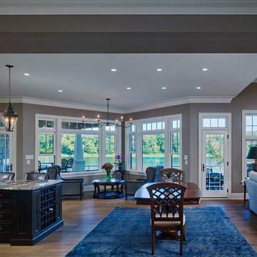
Perched above the beautiful Delaware River in the historic village of New Hope, Bucks County, Pennsylvania sits this magnificent custom home designed by OMNIA Group Architects. According to Partner, Brian Mann,"This riverside property required a nuanced approach so that it could at once be both a part of this eclectic village streetscape and take advantage of the spectacular waterfront setting." Further complicating the study, the lot was narrow, it resides in the floodplain and the program required the Master Suite to be on the main level. To meet these demands, OMNIA dispensed with conventional historicist styles and created an open plan blended with traditional forms punctuated by vast rows of glass windows and doors to bring in the panoramic views of Lambertville, the bridge, the wooded opposite bank and the river. Mann adds, "Because I too live along the river, I have a special respect for its ever changing beauty - and I appreciate that riverfront structures have a responsibility to enhance the views from those on the water." Hence the riverside facade is as beautiful as the street facade. A sweeping front porch integrates the entry with the vibrant pedestrian streetscape. Low garden walls enclose a beautifully landscaped courtyard defining private space without turning its back on the street. Once inside, the natural setting explodes into view across the back of each of the main living spaces. For a home with so few walls, spaces feel surprisingly intimate and well defined. The foyer is elegant and features a free flowing curved stair that rises in a turret like enclosure dotted with windows that follow the ascending stairs like a sculpture. "Using changes in ceiling height, finish materials and lighting, we were able to define spaces without boxing spaces in" says Mann adding, "the dynamic horizontality of the river is echoed along the axis of the living space; the natural movement from kitchen to dining to living rooms following the current of the river." Service elements are concentrated along the front to create a visual and noise barrier from the street and buttress a calm hall that leads to the Master Suite. The master bedroom shares the views of the river, while the bath and closet program are set up for pure luxuriating. The second floor features a common loft area with a large balcony overlooking the water. Two children's suites flank the loft - each with their own exquisitely crafted baths and closets. Continuing the balance between street and river, an open air bell-tower sits above the entry porch to bring life and light to the street. Outdoor living was part of the program from the start. A covered porch with outdoor kitchen and dining and lounge area and a fireplace brings 3-season living to the river. And a lovely curved patio lounge surrounded by grand landscaping by LDG finishes the experience. OMNIA was able to bring their design talents to the finish materials too including cabinetry, lighting, fixtures, colors and furniture.


Sponsored
Sunbury, OH

J.Holderby - Renovations
Franklin County's Leading General Contractors - 2X Best of Houzz!
 Classic Homeworks
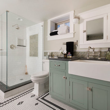
The basement batthroom is bright and open. There is plenty of room for the laundry facilities and additional cabinetry.
Corner shower - large traditional corner shower idea in Denver with beige walls, a vessel sink, shaker cabinets and green cabinets
Corner shower - large traditional corner shower idea in Denver with beige walls, a vessel sink, shaker cabinets and green cabinets
 LMOH Home
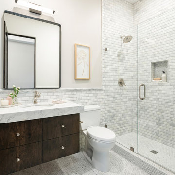
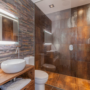
A merge of modern lines with classic shapes and materials creates a refreshingly timeless appeal for these secondary bath remodels. All three baths showcasing different design elements with a continuity of warm woods, natural stone, and scaled lighting making them perfect for guest retreats.
 50 Degrees North Architects
Overview
Whole house refurbishment, double storey wrap around extension and large loft conversion.
The Brief
Create a WOW factor space, add glamour and fun and give the house a street side and garden side, both different.
Our Solution
This project was exciting from the start, the client wanted to entertain in a WOW factor space, have a panoramic view of the garden (which was to be landscaped), add bedrooms and a great master suite.
We had some key elements to introduce such as an aquarium separating two rooms; double height spaces and a gloss kitchen, all of which manifest themselves in the completed scheme.
Architecture is a process taking a schedule of areas, some key desires and needs, mixing the functionality and creating space.
New spaces transform a house making it more valuable, giving it kerb appeal and making it feel like a different building. All of which happened at Ailsa Road.
 F5 Design/Architecture Inc.
Darlene Hall
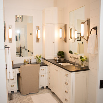
Farmhouse bathroom photo in Columbus with an undermount sink and soapstone countertops
Farmhouse bathroom photo in Columbus with an undermount sink and soapstone countertops
Sponsored
Sunbury, OH
J.Holderby - Renovations
Franklin County's Leading General Contractors - 2X Best of Houzz!
 Austin Patterson Disston Architects
Tria Giovan
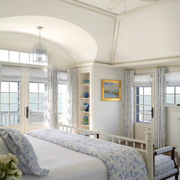
Bedroom - coastal bedroom idea in New York with white walls
Bedroom - coastal bedroom idea in New York with white walls

 Klopf Architecture
Klopf Architecture, Arterra Landscape Architects and Henry Calvert of Calvert Ventures Designed and built a new warm, modern, Eichler-inspired, open, indoor-outdoor home on a deeper-than-usual San Mateo Highlands property where an original Eichler house had burned to the ground.
The owners wanted multi-generational living and larger spaces than the original home offered, but all parties agreed that the house should respect the neighborhood and blend in stylistically with the other Eichlers. At first the Klopf team considered re-using what little was left of the original home and expanding on it. But after discussions with the owner and builder, all parties agreed that the last few remaining elements of the house were not practical to re-use, so Klopf Architecture designed a new home that pushes the Eichler approach in new directions.
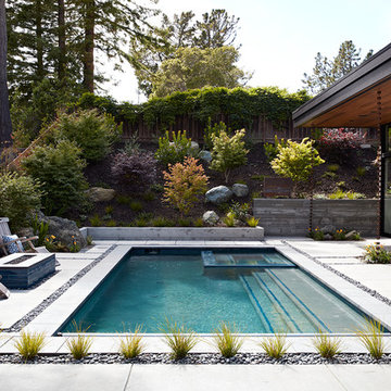
One disadvantage of Eichler production homes is that the house designs were not optimized for each specific lot. A new custom home offered the team a chance to start over. In this case, a longer house that opens up sideways to the south fit the lot better than the original square-ish house that used to open to the rear (west). Accordingly, the Klopf team designed an L-shaped “bar” house with a large glass wall with large sliding glass doors that faces sideways instead of to the rear like a typical Eichler. This glass wall opens to a pool and landscaped yard designed by Arterra Landscape Architects.
Driving by the house, one might assume at first glance it is an Eichler because of the horizontality, the overhanging flat roof eaves, the dark gray vertical siding, and orange solid panel front door, but the house is designed for the 21st Century and is not meant to be a “Likeler.” You won't see any posts and beams in this home. Instead, the ceiling decking is a western red cedar that covers over all the beams. Like Eichlers, this cedar runs continuously from inside to out, enhancing the indoor / outdoor feeling of the house, but unlike Eichlers it conceals a cavity for lighting, wiring, and insulation. Ceilings are higher, rooms are larger and more open, the master bathroom is light-filled and more generous, with a separate tub and shower and a separate toilet compartment, and there is plenty of storage. The garage even easily fits two of today's vehicles with room to spare.
A massive 49-foot by 12-foot wall of glass and the continuity of materials from inside to outside enhance the inside-outside living concept, so the owners and their guests can flow freely from house to pool deck to BBQ to pool and back.
During construction in the rough framing stage, Klopf thought the front of the house appeared too tall even though the house had looked right in the design renderings (probably because the house is uphill from the street). So Klopf Architecture paid the framer to change the roofline from how we had designed it to be lower along the front, allowing the home to blend in better with the neighborhood. One project goal was for people driving up the street to pass the home without immediately noticing there is an "imposter" on this lot, and making that change was essential to achieve that goal.
This 2,606 square foot, 3 bedroom, 3 bathroom Eichler-inspired new house is located in San Mateo in the heart of the Silicon Valley.
Klopf Architecture Project Team: John Klopf, AIA, Klara Kevane
Landscape Architect: Arterra Landscape Architects
Contractor: Henry Calvert of Calvert Ventures
Photography ©2016 Mariko Reed
Location: San Mateo, CA
Year completed: 2016
80