
Search results for "Meet changing" in Home Design Ideas

 San Luis Kitchen Co.
The owners of a charming home in the hills west of Paso Robles recently decided to remodel their not-so-charming kitchen. Referred to San Luis Kitchen by several of their friends, the homeowners visited our showroom and soon decided we were the best people to design a kitchen fitting the style of their home. We were delighted to get to work on the project right away.
When we arrived at the house, we found a small, cramped and out-dated kitchen. The ceiling was low, the cabinets old fashioned and painted a stark dead white, and the best view in the house was neglected in a seldom-used breakfast nook (sequestered behind the kitchen peninsula). This kitchen was also handicapped by white tile counters with dark grout, odd-sized and cluttered cabinets, and small ‘desk’ tacked on to the side of the oven cabinet. Due to a marked lack of counter space & inadequate storage the homeowner had resorted to keeping her small appliances on a little cart parked in the corner and the garbage was just sitting by the wall in full view of everything! On the plus side, the kitchen opened into a nice dining room and had beautiful saltillo tile floors.
Mrs. Homeowner loves to entertain and often hosts dinner parties for her friends. She enjoys visiting with her guests in the kitchen while putting the finishing touches on the evening’s meal. Sadly, her small kitchen really limited her interactions with her guests – she often felt left out of the mix at her own parties! This savvy homeowner dreamed big – a new kitchen that would accommodate multiple workstations, have space for guests to gather but not be in the way, and maybe a prettier transition from the kitchen to the dining (wine service area or hutch?) – while managing the remodel budget by reusing some of her major appliances and keeping (patching as needed) her existing floors.
Responding to the homeowner’s stated wish list and the opportunities presented by the home's setting and existing architecture, the designers at San Luis Kitchen decided to expand the kitchen into the breakfast nook. This change allowed the work area to be reoriented to take advantage of the great view – we replaced the existing window and added another while moving the door to gain space. A second sink and set of refrigerator drawers (housing fresh fruits & veggies) were included for the convenience of this mainly vegetarian cook – her prep station. The clean-up area now boasts a farmhouse style single bowl sink – adding to the ‘cottage’ charm. We located a new gas cook-top between the two workstations for easy access from each. Also tucked in here is a pullout trash/recycle cabinet for convenience and additional drawers for storage.
Running parallel to the work counter we added a long butcher-block island with easy-to-access open shelves for the avid cook and seating for friendly guests placed just right to take in the view. A counter-top garage is used to hide excess small appliances. Glass door cabinets and open shelves are now available to display the owners beautiful dishware. The microwave was placed inconspicuously on the end of the island facing the refrigerator – easy access for guests (and extraneous family members) to help themselves to drinks and snacks while staying out of the cook’s way.
We also moved the pantry storage away from the dining room (putting it on the far wall and closer to the work triangle) and added a furniture-like hutch in its place allowing the more formal dining area to flow seamlessly into the up-beat work area of the kitchen. This space is now also home (opposite wall) to an under counter wine refrigerator, a liquor cabinet and pretty glass door wall cabinet for stemware storage – meeting Mr. Homeowner’s desire for a bar service area.
And then the aesthetic: an old-world style country cottage theme. The homeowners wanted the kitchen to have a warm feel while still loving the look of white cabinetry. San Luis Kitchen melded country-casual knotty pine base cabinets with vintage hand-brushed creamy white wall cabinets to create the desired cottage look. We also added bead board and mullioned glass doors for charm, used an inset doorstyle on the cabinets for authenticity, and mixed stone and wood counters to create an eclectic nuance in the space. All in all, the happy homeowners now boast a charming county cottage kitchen with plenty of space for entertaining their guests while creating gourmet meals to feed them.


Find the right local pro for your project
 Advance Design Studio, Ltd.
Curtis and Peggy had been thinking of a kitchen remodel for quite some time, but they knew their house would have a unique set of challenges. Their older Victorian house was built in 1891. The kitchen cabinetry was original, and they wanted to keep the authenticity of their period home while adding modern comforts that would improve their quality of life.
A friend recommended Advance Design Studio for their exceptional experience and quality of work. After meeting with designer Michelle Lecinski at Advance Design, they were confident they could partner with Advance to accomplish the unique kitchen renovation they’d been talking about for years. “We wanted to do the kitchen for a long, long time,” Curtis said. “(We asked ourselves) what are we actually going to do? How are we going to do this? And who are we going to find to do exactly what we want?”
The goal for the project was to keep the home renovation and new kitchen feeling authentic to the time in which it was built. They desperately wanted the modern comforts that come with a larger refrigerator and the dishwasher that they never had! The old home was also a bit drafty so adding a fireplace, wall insulation and new windows became a priority. They very much wanted to create a comfortable hearth room adjacent to the kitchen, complete with old world brick.
The original cabinetry had to go to make way for beautiful new kitchen cabinetry that appears as if it was a hundred years old, but with all the benefits of cutting-edge storage, self-closing drawers, and a brand-new look. “We just wanted to keep it old looking, but with some modern updates,” Peggy said.
Dura Supreme Highland Cabinets with a Heritage Old World Painted Finish replaced the original 1891 cabinets. The hand-applied careful rubbed-off detailing makes these exquisite cabinets look as if they came from a far-gone era. Despite the small size of the kitchen, Peggy, Curtis and Michelle utilized every inch with custom cabinet sizes to increase storage capacity. The custom cabinets allowed for the addition of a 24” Fisher Paykel dishwasher with a concealing Dura Supreme door panel. Michelle was also able to work into the new design a larger 30” Fisher Paykel French refrigerator. “We made every ¼ inch count in this small space,” designer Michelle said. “Having the ability to custom size the cabinetry was the only way to achieve this.”
“The kitchen essentially was designed around the Heartland Vintage range and oven,” says Michelle. A classic appliance that combines nostalgic beauty and craftsmanship for modern cooking, with nickel plated trim and elegantly shaped handles and legs; the not to miss range is a striking focal point of the entire room and an engaging conversation piece.
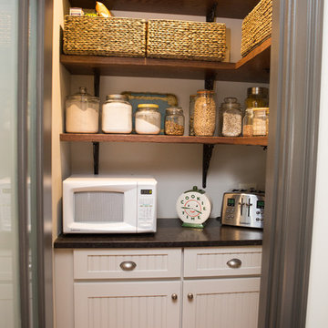
Granite countertops in Kodiak Satin with subtle veining kept with the old-world style. The delicate porcelain La Vie Crackle Sonoma tile kitchen backsplash compliments the home’s style perfectly. A handcrafted passthrough designed to show off Peggy’s fine china was custom built by project carpenters Justin Davis and Jeff Dallain to physically and visually open the space. Additional storage was created in the custom panty room with Latte Edinburg cabinets, hand-made weathered wood shelving with authentic black iron brackets, and an intricate tin copper ceiling.
Peggy and Curtis loved the idea of adding a Vermont stove to make the hearth-room not only functional, but a truly beckoning place to be. A stunning Bordeaux red Vermont Castings Stove with crisp black ventilation was chosen and combined with the authentic reclaimed Chicago brick wall. Advance’s talented carpenters custom-built elegant weathered shelves to house family memorabilia, installed carefully chosen barn sconces, and made the hearth room an inviting place to relax with a cup of coffee and a good book.
“Peggy and Curtis’ project was so much fun to work on. Creating a space that looks and feels like it always belonged in this beautiful old Victorian home is a designer’s dream. To see the delight in their faces when they saw the design details coming together truly made it worth the time and effort that went into making the very compact kitchen space work”, said Michelle. “The result is an amazing custom kitchen, packed with functionality in every inch, nook and cranny!” exclaims Michelle.
The renovation didn’t end with the kitchen. New Pella windows were added to help lessen the drafts. The removal of the original windows and trim necessitated the re-creation of hand-made corbels and trim details no longer available today. The talented carpenter team came to the rescue, crafting new pieces and masterfully finishing them as if they were always there. New custom gutters were formed and installed with a front entry rework necessary to accommodate the changes.
The whole house functions better, but it still feels like the original 1891 home. “From start to finish it’s just a much better space than we used to have,” Peggy said. “Jeff and Justin were amazing.” Curtis added; “We were lucky to find Advance Design, because they really came through for us. I loved that they had everything in house, anything you needed to have done, they could do it”.
 Dana King Design Build Remodeling
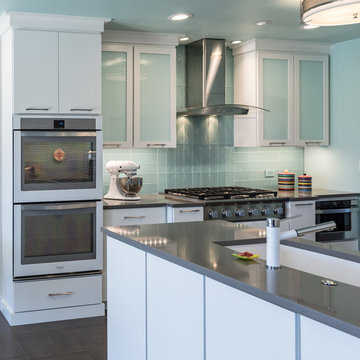
A fun, hip kitchen with a mid-century modern vibe. The homeowners wanted a kitchen to make them happy. We think you can't help but smile!
NEXT Project Studio
Jerry Voloski
 ZeroEnergy Design
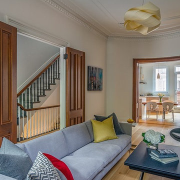
This renovated brick rowhome in Boston’s South End offers a modern aesthetic within a historic structure, creative use of space, exceptional thermal comfort, a reduced carbon footprint, and a passive stream of income.
DESIGN PRIORITIES. The goals for the project were clear - design the primary unit to accommodate the family’s modern lifestyle, rework the layout to create a desirable rental unit, improve thermal comfort and introduce a modern aesthetic. We designed the street-level entry as a shared entrance for both the primary and rental unit. The family uses it as their everyday entrance - we planned for bike storage and an open mudroom with bench and shoe storage to facilitate the change from shoes to slippers or bare feet as they enter their home. On the main level, we expanded the kitchen into the dining room to create an eat-in space with generous counter space and storage, as well as a comfortable connection to the living space. The second floor serves as master suite for the couple - a bedroom with a walk-in-closet and ensuite bathroom, and an adjacent study, with refinished original pumpkin pine floors. The upper floor, aside from a guest bedroom, is the child's domain with interconnected spaces for sleeping, work and play. In the play space, which can be separated from the work space with new translucent sliding doors, we incorporated recreational features inspired by adventurous and competitive television shows, at their son’s request.
MODERN MEETS TRADITIONAL. We left the historic front facade of the building largely unchanged - the security bars were removed from the windows and the single pane windows were replaced with higher performing historic replicas. We designed the interior and rear facade with a vision of warm modernism, weaving in the notable period features. Each element was either restored or reinterpreted to blend with the modern aesthetic. The detailed ceiling in the living space, for example, has a new matte monochromatic finish, and the wood stairs are covered in a dark grey floor paint, whereas the mahogany doors were simply refinished. New wide plank wood flooring with a neutral finish, floor-to-ceiling casework, and bold splashes of color in wall paint and tile, and oversized high-performance windows (on the rear facade) round out the modern aesthetic.
RENTAL INCOME. The existing rowhome was zoned for a 2-family dwelling but included an undesirable, single-floor studio apartment at the garden level with low ceiling heights and questionable emergency egress. In order to increase the quality and quantity of space in the rental unit, we reimagined it as a two-floor, 1 or 2 bedroom, 2 bathroom apartment with a modern aesthetic, increased ceiling height on the lowest level and provided an in-unit washer/dryer. The apartment was listed with Jackie O'Connor Real Estate and rented immediately, providing the owners with a source of passive income.
ENCLOSURE WITH BENEFITS. The homeowners sought a minimal carbon footprint, enabled by their urban location and lifestyle decisions, paired with the benefits of a high-performance home. The extent of the renovation allowed us to implement a deep energy retrofit (DER) to address air tightness, insulation, and high-performance windows. The historic front facade is insulated from the interior, while the rear facade is insulated on the exterior. Together with these building enclosure improvements, we designed an HVAC system comprised of continuous fresh air ventilation, and an efficient, all-electric heating and cooling system to decouple the house from natural gas. This strategy provides optimal thermal comfort and indoor air quality, improved acoustic isolation from street noise and neighbors, as well as a further reduced carbon footprint. We also took measures to prepare the roof for future solar panels, for when the South End neighborhood’s aging electrical infrastructure is upgraded to allow them.
URBAN LIVING. The desirable neighborhood location allows the both the homeowners and tenant to walk, bike, and use public transportation to access the city, while each charging their respective plug-in electric cars behind the building to travel greater distances.
OVERALL. The understated rowhouse is now ready for another century of urban living, offering the owners comfort and convenience as they live life as an expression of their values.
Eric Roth Photo
 Room & Board
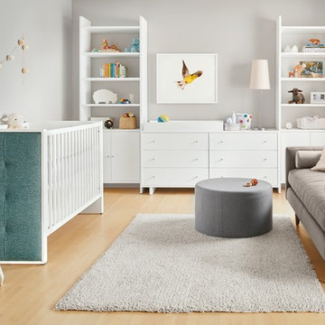
Add softness, warmth and a cozy feeling to your baby's nursery with our Greta crib. Handcrafted by a family-owned company in upstate New York, Greta is constructed from solid maple and durable, low-emission MDF. The crib's end panels are wrapped in fabric and tufted for extra detail and a soft look and feel. Greta features a non-toxic finish that's free of lead, phthalates and formaldehyde and is GREENGUARD-certified. And with the option to convert to a toddler bed, Greta easily grows with your baby.
We're proud to bring you exclusive cribs designed to keep your baby safe. We ensure each crib meets or exceeds all U.S. government safety standards, as well as CPSC requirements and ASTM standards.
Sponsored
Sunbury, OH

J.Holderby - Renovations
Franklin County's Leading General Contractors - 2X Best of Houzz!
 Cape Associates, Inc.
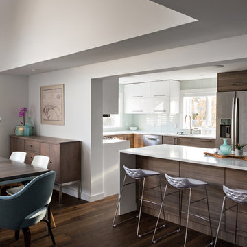
The overarching design intent for this 1,455-square-foot West Vine Street condominium was to make the spaces contemporary and functional. The renovation began with an unexpected structural deficiency in the form of a post located in the middle of the living room that was causing a three-inch dip in the floor. It was removed and replaced with steel columns running down through the walls and into a footing pad with a three-foot depth.
The main living spaces underwent significant changes; the kitchen was reconfigured to open up a formerly cramped space, and the removal of a wall made room for a cascading island with Cesarstone countertops—a crowning feature. Additionally, an electrical panel was relocated to be able to wrap the refrigerator with a wood veneer frame. Notable materials include eight-inch-wide ‘Esplanade’ French oak plank floors chosen to complement the reclaimed wood-wrapped ceiling beams, which feature a combination of LED downlighting and uplighting. A sleek gas fireplace with horizontal slate surround and paneled wall backing replaced an old wood-burning stove—furthering the design program.
Pacheco-Robb Architects dismantled an existing spiral stair and replaced it with a cable-rail system—a nautical nod—which is noteworthy for the way it meets code; by running a contiguous oak banister for the entire length of the stair, they were able to avoid having to add a second railing, which would shrink the already narrow stairwell.
Upstairs, a tight bedroom with gabled ceilings was addressed by adding a solar-operated skylight with built-in shade, plus minimalistic furnishings. Structural changes in the master bedroom included eliminating a closest to widen the room, and reconfiguring a bathroom to fit a small walk-in closet in lieu of a long, thin hallway.
The formerly unfinished rooftop deck is now accessed via a six-foot door that opens more than 90 degrees. Azek decking was laid over the rubber roof, and two-inch stanchions were located around the rail’s outer edge. By opening the floor plan and streamlining the aesthetic, the place now breathes.

 Melissa Hill Home Design
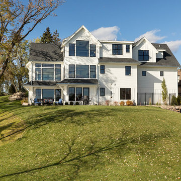
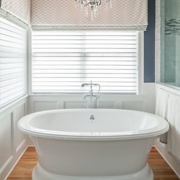
When our clients moved into their already built home they decided to live in it for a while before making any changes. Once they were settled they decided to hire us as their interior designers to renovate and redesign various spaces of their home. As they selected the spaces to be renovated they expressed a strong need for storage and customization. They allowed us to design every detail as well as oversee the entire construction process directing our team of skilled craftsmen. The home is a traditional home so it was important for us to retain some of the traditional elements while incorporating our clients style preferences.
Custom designed by Hartley and Hill Design.
All materials and furnishings in this space are available through Hartley and Hill Design. www.hartleyandhilldesign.com
888-639-0639
Neil Landino Photography
 WeDoClosets, Inc.
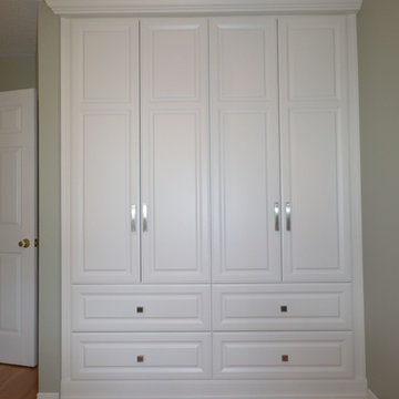
Removing the old rod and shelf closet and doors made a perfect space for this custom fitted built-in wardrobe. Trimmed with moldings including crown molding, the appearance change to the room was remarkable!
 Western Window Systems
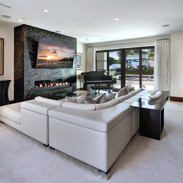
When a soft contemporary style meets artistic-minded homeowners, the result is this exquisite dwelling in Corona del Mar from Brandon Architects and Patterson Custom Homes. Complete with curated paintings and an art studio, the 4,300-square-foot residence utilizes Western Window Systems’ Series 600 Multi-Slide doors and windows to blur the boundaries between indoor and outdoor spaces. In one instance, the retractable doors open to an outdoor courtyard. In another, they lead to a spa and views of the setting sun. Photos by Jeri Koegel.
Sponsored
Fredericksburg, OH

High Point Cabinets
Columbus' Experienced Custom Cabinet Builder | 4x Best of Houzz Winner
 Jami Abbadessa
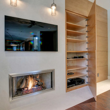
This couple was ready for some major changes in their home on north Euclid in Upland, CA. After completing their nursery last year, they asked for help designing their family room. Everything had to go! The brick fireplace, the TV niche next to the fireplace, the wet bar…none of it portrayed my client’s taste or style in any way. They requested a space that was modern, not fussy, clean and contemporary. I achieved this look by transforming the fireplace wall with limestone and paneled walls with hidden storage behind where the TV niche used to be. Other features that helped in this transformation are updated recessed and accent lighting, fixtures, window coverings, sleek, contemporary furnishings, art and accessories. The existing carpet was replaced with dark wood flooring that seamlessly meets the new limestone fireplace hearth that runs the distance of the entire focal wall.
A roadblock popped up when we found out the SMALLEST WALL in the house that was part of the existing wet bar turned out to be where the main plumbing and electrical were housed. Instead of spending the exorbitant amount of money that it would’ve cost to remove this wall, I instead turned the unused wet bar into a functional feature with oodles of storage on one side and a wall niche on the opposite to display art.
Now this space is a functional and comfortable room in their house where they can relax and spend time with family.
 ZeroEnergy Design
This renovated brick rowhome in Boston’s South End offers a modern aesthetic within a historic structure, creative use of space, exceptional thermal comfort, a reduced carbon footprint, and a passive stream of income.
DESIGN PRIORITIES. The goals for the project were clear - design the primary unit to accommodate the family’s modern lifestyle, rework the layout to create a desirable rental unit, improve thermal comfort and introduce a modern aesthetic. We designed the street-level entry as a shared entrance for both the primary and rental unit. The family uses it as their everyday entrance - we planned for bike storage and an open mudroom with bench and shoe storage to facilitate the change from shoes to slippers or bare feet as they enter their home. On the main level, we expanded the kitchen into the dining room to create an eat-in space with generous counter space and storage, as well as a comfortable connection to the living space. The second floor serves as master suite for the couple - a bedroom with a walk-in-closet and ensuite bathroom, and an adjacent study, with refinished original pumpkin pine floors. The upper floor, aside from a guest bedroom, is the child's domain with interconnected spaces for sleeping, work and play. In the play space, which can be separated from the work space with new translucent sliding doors, we incorporated recreational features inspired by adventurous and competitive television shows, at their son’s request.
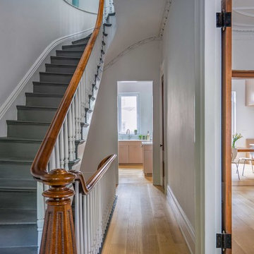
MODERN MEETS TRADITIONAL. We left the historic front facade of the building largely unchanged - the security bars were removed from the windows and the single pane windows were replaced with higher performing historic replicas. We designed the interior and rear facade with a vision of warm modernism, weaving in the notable period features. Each element was either restored or reinterpreted to blend with the modern aesthetic. The detailed ceiling in the living space, for example, has a new matte monochromatic finish, and the wood stairs are covered in a dark grey floor paint, whereas the mahogany doors were simply refinished. New wide plank wood flooring with a neutral finish, floor-to-ceiling casework, and bold splashes of color in wall paint and tile, and oversized high-performance windows (on the rear facade) round out the modern aesthetic.
RENTAL INCOME. The existing rowhome was zoned for a 2-family dwelling but included an undesirable, single-floor studio apartment at the garden level with low ceiling heights and questionable emergency egress. In order to increase the quality and quantity of space in the rental unit, we reimagined it as a two-floor, 1 or 2 bedroom, 2 bathroom apartment with a modern aesthetic, increased ceiling height on the lowest level and provided an in-unit washer/dryer. The apartment was listed with Jackie O'Connor Real Estate and rented immediately, providing the owners with a source of passive income.
ENCLOSURE WITH BENEFITS. The homeowners sought a minimal carbon footprint, enabled by their urban location and lifestyle decisions, paired with the benefits of a high-performance home. The extent of the renovation allowed us to implement a deep energy retrofit (DER) to address air tightness, insulation, and high-performance windows. The historic front facade is insulated from the interior, while the rear facade is insulated on the exterior. Together with these building enclosure improvements, we designed an HVAC system comprised of continuous fresh air ventilation, and an efficient, all-electric heating and cooling system to decouple the house from natural gas. This strategy provides optimal thermal comfort and indoor air quality, improved acoustic isolation from street noise and neighbors, as well as a further reduced carbon footprint. We also took measures to prepare the roof for future solar panels, for when the South End neighborhood’s aging electrical infrastructure is upgraded to allow them.
URBAN LIVING. The desirable neighborhood location allows the both the homeowners and tenant to walk, bike, and use public transportation to access the city, while each charging their respective plug-in electric cars behind the building to travel greater distances.
OVERALL. The understated rowhouse is now ready for another century of urban living, offering the owners comfort and convenience as they live life as an expression of their values.
Eric Roth Photo
 TKS Design Group
Download our free ebook, Creating the Ideal Kitchen. DOWNLOAD NOW
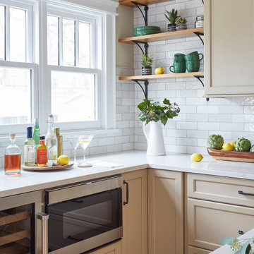
The homeowners came to us looking to update the kitchen in their historic 1897 home. The home had gone through an extensive renovation several years earlier that added a master bedroom suite and updates to the front façade. The kitchen however was not part of that update and a prior 1990’s update had left much to be desired. The client is an avid cook, and it was just not very functional for the family.
The original kitchen was very choppy and included a large eat in area that took up more than its fair share of the space. On the wish list was a place where the family could comfortably congregate, that was easy and to cook in, that feels lived in and in check with the rest of the home’s décor. They also wanted a space that was not cluttered and dark – a happy, light and airy room. A small powder room off the space also needed some attention so we set out to include that in the remodel as well.
See that arch in the neighboring dining room? The homeowner really wanted to make the opening to the dining room an arch to match, so we incorporated that into the design.
Another unfortunate eyesore was the state of the ceiling and soffits. Turns out it was just a series of shortcuts from the prior renovation, and we were surprised and delighted that we were easily able to flatten out almost the entire ceiling with a couple of little reworks.
Other changes we made were to add new windows that were appropriate to the new design, which included moving the sink window over slightly to give the work zone more breathing room. We also adjusted the height of the windows in what was previously the eat-in area that were too low for a countertop to work. We tried to keep an old island in the plan since it was a well-loved vintage find, but the tradeoff for the function of the new island was not worth it in the end. We hope the old found a new home, perhaps as a potting table.
Designed by: Susan Klimala, CKD, CBD
Photography by: Michael Kaskel
For more information on kitchen and bath design ideas go to: www.kitchenstudio-ge.com
 Klopf Architecture
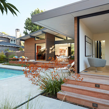
Klopf Architecture and Outer space Landscape Architects designed a new warm, modern, open, indoor-outdoor home in Los Altos, California. Inspired by mid-century modern homes but looking for something completely new and custom, the owners, a couple with two children, bought an older ranch style home with the intention of replacing it.
Created on a grid, the house is designed to be at rest with differentiated spaces for activities; living, playing, cooking, dining and a piano space. The low-sloping gable roof over the great room brings a grand feeling to the space. The clerestory windows at the high sloping roof make the grand space light and airy.
Upon entering the house, an open atrium entry in the middle of the house provides light and nature to the great room. The Heath tile wall at the back of the atrium blocks direct view of the rear yard from the entry door for privacy.
The bedrooms, bathrooms, play room and the sitting room are under flat wing-like roofs that balance on either side of the low sloping gable roof of the main space. Large sliding glass panels and pocketing glass doors foster openness to the front and back yards. In the front there is a fenced-in play space connected to the play room, creating an indoor-outdoor play space that could change in use over the years. The play room can also be closed off from the great room with a large pocketing door. In the rear, everything opens up to a deck overlooking a pool where the family can come together outdoors.
Wood siding travels from exterior to interior, accentuating the indoor-outdoor nature of the house. Where the exterior siding doesn’t come inside, a palette of white oak floors, white walls, walnut cabinetry, and dark window frames ties all the spaces together to create a uniform feeling and flow throughout the house. The custom cabinetry matches the minimal joinery of the rest of the house, a trim-less, minimal appearance. Wood siding was mitered in the corners, including where siding meets the interior drywall. Wall materials were held up off the floor with a minimal reveal. This tight detailing gives a sense of cleanliness to the house.
The garage door of the house is completely flush and of the same material as the garage wall, de-emphasizing the garage door and making the street presentation of the house kinder to the neighborhood.
The house is akin to a custom, modern-day Eichler home in many ways. Inspired by mid-century modern homes with today’s materials, approaches, standards, and technologies. The goals were to create an indoor-outdoor home that was energy-efficient, light and flexible for young children to grow. This 3,000 square foot, 3 bedroom, 2.5 bathroom new house is located in Los Altos in the heart of the Silicon Valley.
Klopf Architecture Project Team: John Klopf, AIA, and Chuang-Ming Liu
Landscape Architect: Outer space Landscape Architects
Structural Engineer: ZFA Structural Engineers
Staging: Da Lusso Design
Photography ©2018 Mariko Reed
Location: Los Altos, CA
Year completed: 2017
Sponsored
Sunbury, OH
J.Holderby - Renovations
Franklin County's Leading General Contractors - 2X Best of Houzz!
 Centered Interiors
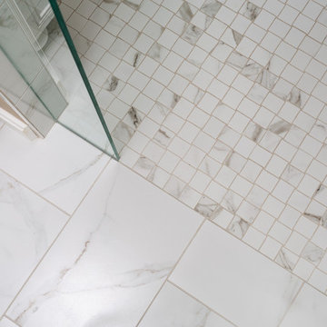
Inspiration for a small transitional master white tile and porcelain tile porcelain tile, white floor and double-sink bathroom remodel in Louisville with recessed-panel cabinets, white cabinets, a two-piece toilet, beige walls, an undermount sink, granite countertops and a built-in vanity
 Dream Finders Homes
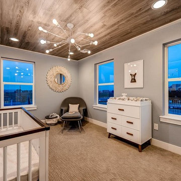
Inspiration for a mid-sized contemporary gender-neutral carpeted kids' room remodel in Denver with gray walls
 ZeroEnergy Design
ZeroEnergy Design (ZED) created this modern home for a progressive family in the desirable community of Lexington.
Thoughtful Land Connection. The residence is carefully sited on the infill lot so as to create privacy from the road and neighbors, while cultivating a side yard that captures the southern sun. The terraced grade rises to meet the house, allowing for it to maintain a structured connection with the ground while also sitting above the high water table. The elevated outdoor living space maintains a strong connection with the indoor living space, while the stepped edge ties it back to the true ground plane. Siting and outdoor connections were completed by ZED in collaboration with landscape designer Soren Deniord Design Studio.
Exterior Finishes and Solar. The exterior finish materials include a palette of shiplapped wood siding, through-colored fiber cement panels and stucco. A rooftop parapet hides the solar panels above, while a gutter and site drainage system directs rainwater into an irrigation cistern and dry wells that recharge the groundwater.
Cooking, Dining, Living. Inside, the kitchen, fabricated by Henrybuilt, is located between the indoor and outdoor dining areas. The expansive south-facing sliding door opens to seamlessly connect the spaces, using a retractable awning to provide shade during the summer while still admitting the warming winter sun. The indoor living space continues from the dining areas across to the sunken living area, with a view that returns again to the outside through the corner wall of glass.
Accessible Guest Suite. The design of the first level guest suite provides for both aging in place and guests who regularly visit for extended stays. The patio off the north side of the house affords guests their own private outdoor space, and privacy from the neighbor. Similarly, the second level master suite opens to an outdoor private roof deck.
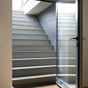
Light and Access. The wide open interior stair with a glass panel rail leads from the top level down to the well insulated basement. The design of the basement, used as an away/play space, addresses the need for both natural light and easy access. In addition to the open stairwell, light is admitted to the north side of the area with a high performance, Passive House (PHI) certified skylight, covering a six by sixteen foot area. On the south side, a unique roof hatch set flush with the deck opens to reveal a glass door at the base of the stairwell which provides additional light and access from the deck above down to the play space.
Energy. Energy consumption is reduced by the high performance building envelope, high efficiency mechanical systems, and then offset with renewable energy. All windows and doors are made of high performance triple paned glass with thermally broken aluminum frames. The exterior wall assembly employs dense pack cellulose in the stud cavity, a continuous air barrier, and four inches exterior rigid foam insulation. The 10kW rooftop solar electric system provides clean energy production. The final air leakage testing yielded 0.6 ACH 50 - an extremely air tight house, a testament to the well-designed details, progress testing and quality construction. When compared to a new house built to code requirements, this home consumes only 19% of the energy.
Architecture & Energy Consulting: ZeroEnergy Design
Landscape Design: Soren Deniord Design
Paintings: Bernd Haussmann Studio
Photos: Eric Roth Photography
32