
Search results for "Meet require" in Home Design Ideas
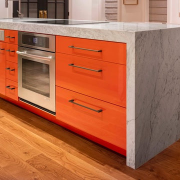
Mid-sized minimalist galley medium tone wood floor open concept kitchen photo in Denver with two islands, an undermount sink, flat-panel cabinets, orange cabinets, marble countertops and stainless steel appliances
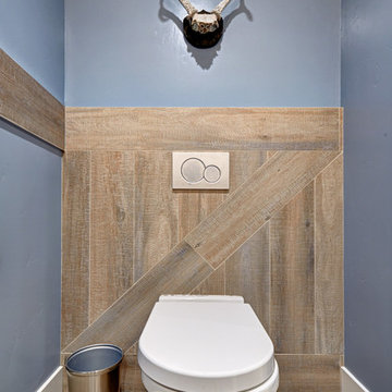
 Nar Design Group
Our carpenters labored every detail from chainsaws to the finest of chisels and brad nails to achieve this eclectic industrial design. This project was not about just putting two things together, it was about coming up with the best solutions to accomplish the overall vision. A true meeting of the minds was required around every turn to achieve "rough" in its most luxurious state.
Featuring: Floating vanity, rough cut wood top, beautiful accent mirror and Porcelanosa wood grain tile as flooring and backsplashes.
PhotographerLink
 Advance Design Studio, Ltd.
This 1930's Barrington Hills farmhouse was in need of some TLC when it was purchased by this southern family of five who planned to make it their new home. The renovation taken on by Advance Design Studio's designer Scott Christensen and master carpenter Justin Davis included a custom porch, custom built in cabinetry in the living room and children's bedrooms, 2 children's on-suite baths, a guest powder room, a fabulous new master bath with custom closet and makeup area, a new upstairs laundry room, a workout basement, a mud room, new flooring and custom wainscot stairs with planked walls and ceilings throughout the home.
The home's original mechanicals were in dire need of updating, so HVAC, plumbing and electrical were all replaced with newer materials and equipment. A dramatic change to the exterior took place with the addition of a quaint standing seam metal roofed farmhouse porch perfect for sipping lemonade on a lazy hot summer day.
In addition to the changes to the home, a guest house on the property underwent a major transformation as well. Newly outfitted with updated gas and electric, a new stacking washer/dryer space was created along with an updated bath complete with a glass enclosed shower, something the bath did not previously have. A beautiful kitchenette with ample cabinetry space, refrigeration and a sink was transformed as well to provide all the comforts of home for guests visiting at the classic cottage retreat.
The biggest design challenge was to keep in line with the charm the old home possessed, all the while giving the family all the convenience and efficiency of modern functioning amenities. One of the most interesting uses of material was the porcelain "wood-looking" tile used in all the baths and most of the home's common areas. All the efficiency of porcelain tile, with the nostalgic look and feel of worn and weathered hardwood floors. The home’s casual entry has an 8" rustic antique barn wood look porcelain tile in a rich brown to create a warm and welcoming first impression.
Painted distressed cabinetry in muted shades of gray/green was used in the powder room to bring out the rustic feel of the space which was accentuated with wood planked walls and ceilings. Fresh white painted shaker cabinetry was used throughout the rest of the rooms, accentuated by bright chrome fixtures and muted pastel tones to create a calm and relaxing feeling throughout the home.
Custom cabinetry was designed and built by Advance Design specifically for a large 70” TV in the living room, for each of the children’s bedroom’s built in storage, custom closets, and book shelves, and for a mudroom fit with custom niches for each family member by name.
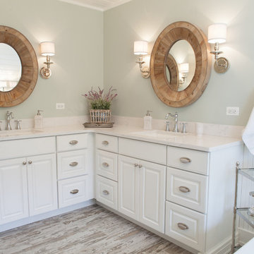
The ample master bath was fitted with double vanity areas in white. A generous shower with a bench features classic white subway tiles and light blue/green glass accents, as well as a large free standing soaking tub nestled under a window with double sconces to dim while relaxing in a luxurious bath. A custom classic white bookcase for plush towels greets you as you enter the sanctuary bath.
Find the right local pro for your project
 Alair Homes Chilliwack
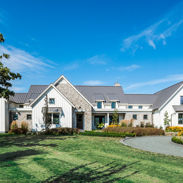
This contemporary farmhouse is located on a scenic acreage in Greendale, BC. It features an open floor plan with room for hosting a large crowd, a large kitchen with double wall ovens, tons of counter space, a custom range hood and was designed to maximize natural light. Shed dormers with windows up high flood the living areas with daylight. The stairwells feature more windows to give them an open, airy feel, and custom black iron railings designed and crafted by a talented local blacksmith. The home is very energy efficient, featuring R32 ICF construction throughout, R60 spray foam in the roof, window coatings that minimize solar heat gain, an HRV system to ensure good air quality, and LED lighting throughout. A large covered patio with a wood burning fireplace provides warmth and shelter in the shoulder seasons.
Carsten Arnold Photography
 Advance Design Studio, Ltd.
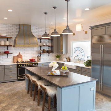
Jennifer and Dan have lived in their Deer Park Illinois home for 15 years, slowly making minor fixes like painting and decorating; but they had a new plan for their kitchen the entire time. An awkwardly placed garage door, and an island cooktop with a terrible downdraft made a full-scale kitchen remodel an absolute must. Jennifer had many ideas in mind and wanted to work with a company that could provide high-end work, while partnering with a designer that would tailor the kitchen to her ideas.
She was intrigued by the phrase “Common Sense Remodeling” in Advance Design’s feature she discovered while perusing an issue of the community’s Quintessential Barrington Magazine. Doing further research on the company’s website, as she looked through project profiles and read about Advance Design’s “Common Sense Remodeling” philosophy, she promptly scheduled an appointment to see if the people and ideas she read about were truly who they said they were. The more she read, the more she knew that the “Common Sense” approach to remodeling they described was exactly the type of company she was looking for.
The partnership was sealed after an initial consultation with Owner Todd Jurs and Project Designer Michelle Lecinski. They displayed a combination of friendliness, professionalism and respect that was unmatched by any of the other companies Jennifer talked to. She knew that with Advance Design, she would be able to retain the vision that she had in mind with high-quality craftsmanship.
“I reached out to Advance Design because of the ‘Common Sense Remodeling’ tagline,” Jennifer said. “That’s what lingered for me”. “Advance Design was the most respectful- of the house and of my design ideas, and the most professional of the handful of companies that looked at my project”.
Soon after the meeting Jennifer began working with Michelle on the project design. They quickly developed chemistry. Jennifer loved how Michelle researched and located every detail that Jennifer wanted for the kitchen. Between the two of them, every concept and idea was worked through and perfected. “Jennifer had definite ideas about what she wanted the new kitchen to look like, she just didn’t know how to bring it all together. We worked together really well to make her ideas into the practical reality necessary for a well-functioning kitchen, with the look and feel that she had envisioned”, says Michelle.
“Michelle was wonderful in using the CAD system she would show me new drawings every time we changed the layout while working through the design,” Jennifer said. “She was a really wonderful partner in execution, she made sure everything happened quickly and easily.”
The finished design drew out elements of Jennifer’s style and personality. The pair call the look “sophisticated farmhouse” to describe the kitchen renovation to family and friends. The result was a beautifully crafted, authentic-feeling space that satisfied Jennifer’s dreams 15 years in the making. The whole project consisted of a kitchen remodel, mudroom upgrade with powder room, and garage entry relocation. “The projects I personally like the best, are the ones that put the client’s dreams on display,” Project Designer Michelle said. “And this is one of those projects.”
The main focal point of the kitchen is custom zinc and brass ventilation hood with a vintage sheen, which was hand made to order by a small company in Indiana named Vogler Metalworking. “It’s like sculpture, a true work of art”, says Jennifer. Your eye is immediately drawn towards this elegant yet practical hood that eliminated the home’s downdraft problem and added a striking conversation piece at the same time. The carpenters had to use special gloves when transporting and installing it, so they didn’t smudge it with fingerprints. The beautiful hood centers proudly over the stunning black enamel and brass LaCornue Range. “I had a friend who had a LaCornue range and after learning how easy it was to cook perfect meals, I was convinced I wanted to have one”, says Jennifer. This unique, breathtaking combination anchors the entire kitchen and is apparent immediately as you walk into the great room the surrounds the space.
DuraSupreme Crestwood cabinets with a Kendall Panel add function and sophistication. A custom gray paint color paired with a storm blue was developed so that the new kitchen looked like it belonged to the existing space. Unlacquered brass faucets and hardware were important to Jennifer because she wanted the living finishes to age over time. Remarkable brass diamond mesh cabinet door inserts imported from the UK continue to add this one-of-a-kind kitchen renovation; giving it a “you won’t see this everywhere” quality. The use of old railcar flooring for the coffee bar countertop and reclaimed oak for the open shelving gives an authenticity to the space uncommon in kitchens today.
Jennifer and Michelle fell in love with the Limestone Grey Stone while they were investigating unique island countertop ideas. They liked the fact that the limestone as a living finish will age and change over time. Calcutta Miel Quartz countertops made for an excellent pairing around the perimeter, as it’s durable and perfect for cooking preparations. A textured white subway tile backsplash that runs to the ceiling keeps your eye moving towards the open shelving, and to the main focal point of the stunning range hood combination.
“The kitchen functions beautifully, and it’s gorgeous,” beams Jennifer as she gestures with both hands while smiling ear to ear. “The most important thing was I wanted a kitchen that had a wonderful flow, cooked beautiful meals and was a great gathering place for family and friends, and this space does that perfectly! Beauty wise, it turned out exactly how I had envisioned. I felt the function part was the hardest part, and that was nailed”!
Relocating the garage entry to the new mudroom was a huge priority and has finally separated the family’s arriving home functions from their kitchen. Now coats and shoes and bags have their own area for dropping once members arrive home. Matching gray DuraSupreme cabinetry helped create gorgeous, purposeful lockers for the family. A reclaimed vintage sink and custom wall paper were added to the tiny powder room to beautify the once previously only functional space. Advance Design was even able to create a custom space for their dog to sleep while the family is away.
“It was unbelievable that a project of this size was completed in such a short time, and I think that’s because of the large amount of planning and preparation that went into it,” Jennifer marveled, “When we started, we were ready, and everything was prepared”.
When it came to execution, Project Manager Justin Davis and his crew were quick, accessible, and organized. Projects like this kitchen are typically completed in as little as 8-10 weeks. Jennifer’s kitchen however despite the relocation of some challenging HVAC in a soffit and moving of an exterior door was completed remarkably fast in part because the team was working with an existing tile floor that ran throughout the first floor that the client really loved.
“You get to know these people really well because they’re living in your house while you’re living in your house. They were so fast and really good, it didn’t take as long as even planned” reported Jennifer. “I would text Justin and he always responded almost immediately. I got to know all the guys who were working in our house and they were all wonderful people”.
Details in a customized kitchen like this one require skill and care from the people who install it. “All the guys on the job were skilled at what the did. I wanted small details like little feet to look like furniture, that is where their carpentry skill came in to make these all perfect”, said Jennifer. “The tile guys were wonderful. They even let me determine how I wanted the texture with the grout to appear for a salt and pepper look; now that is a very skilled trade person making it custom”.
In Jennifer’s interview, she continued to reference Advance Design’s “Common Sense Remodeling”, so I took a minute to ask her exactly what that phrase meant to her and how it played out in her experience with her project and the Advance Design team. Here is what she said: “I was intrigued about Common Sense Remodeling and in my head that there would be clear costs and prices, great communication between the design team, the execution team and me”, said Jennifer. They did deliver on that, it was so clear about the cost breakdown, what I could expect from everyone who came to my house, and everything that we had ordered. That to me is the Common Sense”!
It’s great to see a client take literally our assertion that a well-planned remodeling project is simply “Common Sense”! She anticipated each step of the way would be clear, concise, and predictable, all the while protecting the outcome due to the careful upfront planning. “Advance Design delivered on their ‘Common Sense Remodeling’ promise,” Jennifer said. “From the design team, to the execution team - everything was straight forward like I imagined. The project turned out exactly how I envisioned, I enjoyed this process and absolutely would recommend Advance Design Studio to anyone.”
 Designs by BSB
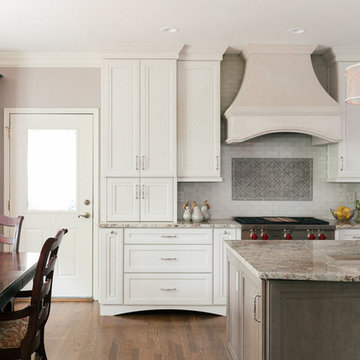
The clients believed the peninsula footprint was required due to the unique entry points from the hallway leading to the dining room and the foyer. The new island increases storage, counters and a more pleasant flow of traffic from all directions.
The biggest challenge was trying to make the structural beam that ran perpendicular to the space work in a new design; it was off center and difficult to balance the cabinetry and functional spaces to work with it. In the end it was decided to increase the budget and invest in moving the header in the ceiling to achieve the best design, esthetically and funcationlly.
Specific storage designed to meet the clients requests include:
- pocket doors at counter tops for everyday appliances
- deep drawers for pots, pans and Tupperware
- island includes designated zone for baking supplies
- tall and shallow pantry/food storage for easy access near island
- pull out spice near cooking
- tray dividers for assorted baking pans/sheets, cutting boards and numerous other serving trays
- cutlery and knife inserts and built in trash/recycle bins to keep things organized and convenient to use, out of sight
- custom design hutch to hold various, yet special dishes and silverware
Elements of design chosen to meet the clients wishes include:
- painted cabinetry to lighten up the room that lacks windows and give relief/contrast to the expansive wood floors
- monochromatic colors throughout give peaceful yet elegant atmosphere
o stained island provides interest and warmth with wood, but still unique in having a different stain than the wood floors – this is repeated in the tile mosaic backsplash behind the rangetop
- punch of fun color used on hutch for a unique, furniture feel
- carefully chosen detailed embellishments like the tile mosaic, valance toe boards, furniture base board around island, and island pendants are traditional details to not only the architecture of the home, but also the client’s furniture and décor.
- Paneled refrigerator minimizes the large appliance, help keeping an elegant feel
Superior cooking equipment includes a combi-steam oven, convection wall ovens paired with a built-in refrigerator with interior air filtration to better preserve fresh foods.
Photography by Gregg Willett
 Thyme & Place Design LLC
When my client had to move from her company office to work at home, she set up in the dining room. Despite her best efforts, this was not the long-term solution she was looking for. My client realized she needed a dedicated space not on the main floor of the home. On one hand, having your office space right next to the kitchen is handy. On the other hand, it made separating work and home life was not that easy.
The house was a ranch. In essence, the basement would run entire length of the home. As we came down the steps, we entered a time capsule. The house was built in the 1950’s. The walls were covered with original knotty pine paneling. There was a wood burning fireplace and considering this was a basement, high ceilings. In addition, there was everything her family could not store at their own homes. As we wound though the space, I though “wow this has potential”, Eventually, after walking through the laundry room we came to a small nicely lit room. This would be the office.
My client looked at me and asked what I thought. Undoubtedly, I said, this can be a great workspace, but do you really want to walk through this basement and laundry to get here? Without reservation, my client said where do we start?
Once the design was in place, we started the renovation. The knotty pine paneling had to go. Specifically, to add some insulation and control the dampness and humidity. The laundry room wall was relocated to create a hallway to the office.
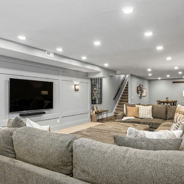
At the far end of the room, we designated a workout zone. Weights, mats, exercise bike and television are at the ready for morning or afternoon workouts. The space can be concealed by a folding screen for party time. Doors to an old closet under the stairs were relocated to the workout area for hidden storage. Now we had nice wall for a beautiful console and mirror for storage and serving during parties.
In order to add architectural details, we covered the old ugly support columns with simple recessed millwork panels. This detail created a visual division between the bar area and the seating area in front of the fireplace. The old red brick on the fireplace surround was replaced with stack stone. A mantle was made from reclaimed wood. Additional reclaimed wood floating shelves left and right of the fireplace provides decorative display while maintaining a rustic element balancing the copper end table and leather swivel rocker.
We found an amazing rug which tied all of the colors together further defining the gathering space. Russet and burnt orange became the accent color unifying each space. With a bit of whimsy, a rather unusual light fixture which looks like roots from a tree growing through the ceiling is a conversation piece.
The office space is quite and removed from the main part of the basement. There is a desk large enough for multiple screens, a small bookcase holding office supplies and a comfortable chair for conference calls. Because working from home requires many online meetings, we added a shiplap wall painted in Hale Navy to contrast with the orange fabric on the chair. We finished the décor with a painting from my client’s father. This is the background online visitors will see.
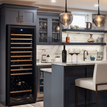
The last and best part of the renovation is the beautiful bar. My client is an avid collector of wine. She already had the EuroCave refrigerator, so I incorporated it into the design. The cabinets are painted Temptation Grey from Benjamin Moore. The counter tops are my favorite hard working quartzite Brown Fantasy. The backsplash is a combination of rustic wood and old tin ceiling like porcelain tiles. Together with the textures of the reclaimed wood and hide poofs balanced against the smooth finish of the cabinets, we created a comfortable luxury for relaxing.
There is ample storage for bottles, cans, glasses, and anything else you can think of for a great party. In addition to the wine storage, we incorporated a beverage refrigerator, an ice maker, and a sink. Floating shelves with integrated lighting illuminate the back bar. The raised height of the front bar provides the perfect wine tasting and paring spot. I especially love the pendant lights which look like wine glasses.
Finally, I selected carpet for the stairs and office. It is perfect for noise reduction. Meanwhile for the overall flooring, I specifically selected a high-performance vinyl plank floor. We often use this product as it is perfect to install on a concrete floor. It is soft to walk on, easy to clean and does not reduce the overall height of the space.
Sponsored
Sunbury, OH

J.Holderby - Renovations
Franklin County's Leading General Contractors - 2X Best of Houzz!
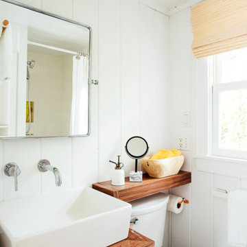
 Tyler Karu Design + Interiors
A tiny waterfront house in Kennebunkport, Maine.
Photos by James R. Salomon
Inspiration for a small coastal bathroom remodel in Portland Maine with flat-panel cabinets, medium tone wood cabinets and white walls
Inspiration for a small coastal bathroom remodel in Portland Maine with flat-panel cabinets, medium tone wood cabinets and white walls
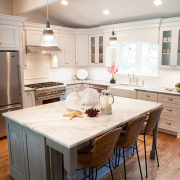 Advance Design Studio, Ltd.
Quinn and Paige, residents of this tired 1960’s tri-level home hated their kitchen. As a matter of fact, prior to making plans to renovate the first floor - they considered selling the home, but were reluctant because of its enviable location near the heart of downtown Barrington which was within walking distance to local stores and all their favorite places. So instead they contacted Advance Design Studio after hearing about them from a neighbor, to rescue their tired home and give it new life.
The very first plan was to remove the constricting walls surrounding the original kitchen, and open the expansive first floor living room and dining area to the new heart of the space; a stunning state of the art coastal designed kitchen. Exposing attractive beams in the vaulted ceiling created an interesting structural detail that suits the open plan and salutes the original architecture of the home, further emphasizing the height of the new space enjoyed now by the family as a great room.
The stage was set for the seaside feel of this kitchen by pairing crisp white painted maple cabinets with Dura Supreme’s one of kind hand weathered finish on the island in soft blue-green finish. But the authentic feeling of being on your favorite beach was supremely achieved by the matching of unique Mt. Claire marble on the island and the specialty Wareham acid washed stone on the perimeter counter tops. Pictures don’t do justice to the feel of this stone under your hand; its water-washed texture reminds instantly of summer vacations collecting rocks softly etched by hundreds of waves.
Stainless steel appliances and satin nickel hardware shine brightly against the backdrop of bright white subway tiles accentuated by subtle grey grout lines contributing to the nautical feel of this comfortable kitchen. Seeded glass door cabinetry reminiscent of beach grasses dress up the space just enough, and a proud 6” stacked crown molding extends above 36” wall cabinets into the expanse of the now taller space; balancing this kitchen nicely within its newly integrated home.
Features in this kitchen include a built in standard depth refrigerator, pull out spice racks, tall tray dividers and wood super Susan with double pull out trash and recycling. A cutlery divider holds sharp knives, and an angled cabinet was customized to hold a secret USB charging station. The bright white Kohler farm sink is graced by an elegant bridge faucet in brushed nickel. This now airy and spacious kitchen has room for guest and family to congregate around the large island, complete with stools and attractive hidden storage for seldom used entertainment pieces.
“I was sold when I saw the drawings. My designer nailed it, down to every last storage idea and coastal detail I envisioned, it was all in there. It was unbelievable how accurate her interpretation was of what was in my head; working with her made my kitchen renovation so easy, it’s as if she literally read my mind”, said Paige enthusiastically.
The woman of the house expressed upon completion not only her love for her fantastic new cooking space, but how renovating her kitchen has given new life to the entire home. Talk of moving has been relegated to the recycling bin, and instead the family is discussing plans to renovate the master bath now that they’ve decided to stay for the long term. Friends who visit the home do a double-take as they recognize the new space’s dramatic transformation from original cramped and closed spaces - to the now amazingly fresh open kitchen that has become the center of every gathering and family meal.
Designer: Nicole Ryan
Photographer: Joe Nowak
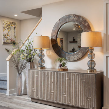 Thyme & Place Design LLC
When my client had to move from her company office to work at home, she set up in the dining room. Despite her best efforts, this was not the long-term solution she was looking for. My client realized she needed a dedicated space not on the main floor of the home. On one hand, having your office space right next to the kitchen is handy. On the other hand, it made separating work and home life was not that easy.
The house was a ranch. In essence, the basement would run entire length of the home. As we came down the steps, we entered a time capsule. The house was built in the 1950’s. The walls were covered with original knotty pine paneling. There was a wood burning fireplace and considering this was a basement, high ceilings. In addition, there was everything her family could not store at their own homes. As we wound though the space, I though “wow this has potential”, Eventually, after walking through the laundry room we came to a small nicely lit room. This would be the office.
My client looked at me and asked what I thought. Undoubtedly, I said, this can be a great workspace, but do you really want to walk through this basement and laundry to get here? Without reservation, my client said where do we start?
Once the design was in place, we started the renovation. The knotty pine paneling had to go. Specifically, to add some insulation and control the dampness and humidity. The laundry room wall was relocated to create a hallway to the office.
At the far end of the room, we designated a workout zone. Weights, mats, exercise bike and television are at the ready for morning or afternoon workouts. The space can be concealed by a folding screen for party time. Doors to an old closet under the stairs were relocated to the workout area for hidden storage. Now we had nice wall for a beautiful console and mirror for storage and serving during parties.
In order to add architectural details, we covered the old ugly support columns with simple recessed millwork panels. This detail created a visual division between the bar area and the seating area in front of the fireplace. The old red brick on the fireplace surround was replaced with stack stone. A mantle was made from reclaimed wood. Additional reclaimed wood floating shelves left and right of the fireplace provides decorative display while maintaining a rustic element balancing the copper end table and leather swivel rocker.
We found an amazing rug which tied all of the colors together further defining the gathering space. Russet and burnt orange became the accent color unifying each space. With a bit of whimsy, a rather unusual light fixture which looks like roots from a tree growing through the ceiling is a conversation piece.
The office space is quite and removed from the main part of the basement. There is a desk large enough for multiple screens, a small bookcase holding office supplies and a comfortable chair for conference calls. Because working from home requires many online meetings, we added a shiplap wall painted in Hale Navy to contrast with the orange fabric on the chair. We finished the décor with a painting from my client’s father. This is the background online visitors will see.
The last and best part of the renovation is the beautiful bar. My client is an avid collector of wine. She already had the EuroCave refrigerator, so I incorporated it into the design. The cabinets are painted Temptation Grey from Benjamin Moore. The counter tops are my favorite hard working quartzite Brown Fantasy. The backsplash is a combination of rustic wood and old tin ceiling like porcelain tiles. Together with the textures of the reclaimed wood and hide poofs balanced against the smooth finish of the cabinets, we created a comfortable luxury for relaxing.
There is ample storage for bottles, cans, glasses, and anything else you can think of for a great party. In addition to the wine storage, we incorporated a beverage refrigerator, an ice maker, and a sink. Floating shelves with integrated lighting illuminate the back bar. The raised height of the front bar provides the perfect wine tasting and paring spot. I especially love the pendant lights which look like wine glasses.
Finally, I selected carpet for the stairs and office. It is perfect for noise reduction. Meanwhile for the overall flooring, I specifically selected a high-performance vinyl plank floor. We often use this product as it is perfect to install on a concrete floor. It is soft to walk on, easy to clean and does not reduce the overall height of the space.
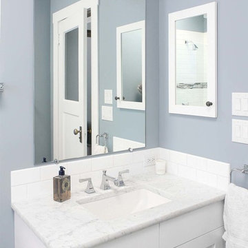
 Custom Kitchens by John Wilkins, Inc.
Bathroom - mid-sized traditional master white tile and cement tile porcelain tile and gray floor bathroom idea in San Francisco with shaker cabinets, white cabinets, a one-piece toilet, blue walls, an undermount sink, marble countertops, a hinged shower door and white countertops
 Klopf Architecture
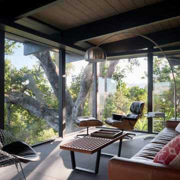
Set in a quiet neighborhood and framed by mature trees, this residence presented a unique opportunity: to thoughtfully evolve a custom mid-century modern home into a space that supports the everyday rhythms of a growing family. With a deep respect for the home’s original architecture, Klopf Architecture reimagined the house to better meet the needs of its owners—introducing functional improvements while preserving the spirit and character of its mid-century roots.
The clients approached Klopf Architecture with a clear vision: refresh their home while seamlessly integrating new programmatic elements. Key goals included clarifying and enhancing the entry sequence; connecting the detached garage to the main house with a practical yet architecturally intentional intervention; adding functional spaces such as a mudroom and laundry room; expanding and remodeling the primary suite’s bathroom and closet; and creating a more engaging outdoor space that capitalized on the site’s impressive views, featuring a fire pit and outdoor kitchen.
As a couple with distinct yet complementary perspectives—one focused on modern functionality and technology, and the other dedicated to preserving the home’s architectural integrity—their collaboration with Klopf Architecture resulted in a solution that harmonized both ideals. Their shared commitment to improving the livability of their home led to a design dialogue rooted in balance. This dynamic partnership shaped the direction of the renovation, ensuring that every decision honored the spirit of the original home while aligning with the practical needs of their growing family.
Designing within the constraints of the sloped site posed one of the project’s central challenges. The detached garage sat at a higher elevation than the main house, requiring a solution that ensured architectural and geometric compatibility between the two structures. Rather than create a purely utilitarian link, Klopf Architecture introduced an intentional connection that contributes to the overall architectural language. A notable pinch point in the plan—where differing geometries converged—was treated as a hinge point, turning a potentially awkward juncture into an architectural feature. This area now functions as both a transition and a moment of design interest that unifies the overall plan.
The design also addressed the underutilized outdoor area, which was located in a shadowed portion of the site with geometrical limitations. A new connection to the rear deck was created in this same area, making the outdoor space more useful and inviting. Klopf Architecture introduced carefully positioned openings and spatial improvements that forged a strong visual and functional connection between indoor and outdoor spaces. The outdoor area now reads as a deliberate extension of the home, embracing natural light and emphasizing the dramatic views.
Working through multiple design iterations, Klopf Architecture crafted a solution that preserved the architectural language of the original home while supporting the functional needs of modern life. The garage-to-house connection became more than a passage—it evolved into an architectural moment of transition. A new mudroom and laundry space enhanced convenience without compromising the clean lines of the design. The primary suite was expanded to create a private, serene retreat. The reimagined backyard, complete with fire pit and kitchen, now plays a vital role in the family’s daily routine and social life.
Outcomes and Lasting Impact
The result is a home that balances heritage with contemporary design, technical precision with design sensibility. The redesign not only met the clients’ initial goals but also exceeded expectations in its ability to seamlessly blend past and present, function and beauty, making the outdoor kitchen a favorite gathering place.
Beyond aesthetics, the renovation has significantly improved daily life for the family. The newly integrated garage connection has streamlined routines, providing a seamless transition between arriving home, storing belongings, and entering the main living spaces. The expanded primary suite offers a retreat-like atmosphere, creating a private space to unwind at the end of the day. The redesigned outdoor areas have also become an extension of their lifestyle—whether it's casual family dinners around the fire pit, entertaining friends in the outdoor kitchen, or simply enjoying the view from the reimagined backyard.
Through a thoughtful and strategic approach, the house has been successfully evolved into a home that remains true to its mid-century modern roots while enhancing livability, functionality, and the overall quality of life for the modern-day owners.
Klopf Architecture Team: Geoffrey Campen, Fernanda Bernardes
Architectural Interior Design: Klopf Architecture
Structural Engineer: Base Design Inc.
Contractor: Golden Snail Builders
Photography: Mariko Reed
Year Completed:2022
 Thyme & Place Design LLC
When my client had to move from her company office to work at home, she set up in the dining room. Despite her best efforts, this was not the long-term solution she was looking for. My client realized she needed a dedicated space not on the main floor of the home. On one hand, having your office space right next to the kitchen is handy. On the other hand, it made separating work and home life was not that easy.
The house was a ranch. In essence, the basement would run entire length of the home. As we came down the steps, we entered a time capsule. The house was built in the 1950’s. The walls were covered with original knotty pine paneling. There was a wood burning fireplace and considering this was a basement, high ceilings. In addition, there was everything her family could not store at their own homes. As we wound though the space, I though “wow this has potential”, Eventually, after walking through the laundry room we came to a small nicely lit room. This would be the office.
My client looked at me and asked what I thought. Undoubtedly, I said, this can be a great workspace, but do you really want to walk through this basement and laundry to get here? Without reservation, my client said where do we start?
Once the design was in place, we started the renovation. The knotty pine paneling had to go. Specifically, to add some insulation and control the dampness and humidity. The laundry room wall was relocated to create a hallway to the office.
At the far end of the room, we designated a workout zone. Weights, mats, exercise bike and television are at the ready for morning or afternoon workouts. The space can be concealed by a folding screen for party time. Doors to an old closet under the stairs were relocated to the workout area for hidden storage. Now we had nice wall for a beautiful console and mirror for storage and serving during parties.
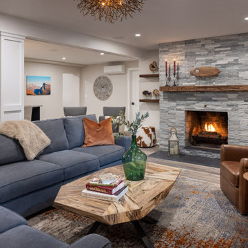
In order to add architectural details, we covered the old ugly support columns with simple recessed millwork panels. This detail created a visual division between the bar area and the seating area in front of the fireplace. The old red brick on the fireplace surround was replaced with stack stone. A mantle was made from reclaimed wood. Additional reclaimed wood floating shelves left and right of the fireplace provides decorative display while maintaining a rustic element balancing the copper end table and leather swivel rocker.
We found an amazing rug which tied all of the colors together further defining the gathering space. Russet and burnt orange became the accent color unifying each space. With a bit of whimsy, a rather unusual light fixture which looks like roots from a tree growing through the ceiling is a conversation piece.
The office space is quite and removed from the main part of the basement. There is a desk large enough for multiple screens, a small bookcase holding office supplies and a comfortable chair for conference calls. Because working from home requires many online meetings, we added a shiplap wall painted in Hale Navy to contrast with the orange fabric on the chair. We finished the décor with a painting from my client’s father. This is the background online visitors will see.
The last and best part of the renovation is the beautiful bar. My client is an avid collector of wine. She already had the EuroCave refrigerator, so I incorporated it into the design. The cabinets are painted Temptation Grey from Benjamin Moore. The counter tops are my favorite hard working quartzite Brown Fantasy. The backsplash is a combination of rustic wood and old tin ceiling like porcelain tiles. Together with the textures of the reclaimed wood and hide poofs balanced against the smooth finish of the cabinets, we created a comfortable luxury for relaxing.
There is ample storage for bottles, cans, glasses, and anything else you can think of for a great party. In addition to the wine storage, we incorporated a beverage refrigerator, an ice maker, and a sink. Floating shelves with integrated lighting illuminate the back bar. The raised height of the front bar provides the perfect wine tasting and paring spot. I especially love the pendant lights which look like wine glasses.
Finally, I selected carpet for the stairs and office. It is perfect for noise reduction. Meanwhile for the overall flooring, I specifically selected a high-performance vinyl plank floor. We often use this product as it is perfect to install on a concrete floor. It is soft to walk on, easy to clean and does not reduce the overall height of the space.
Sponsored
Sunbury, OH
J.Holderby - Renovations
Franklin County's Leading General Contractors - 2X Best of Houzz!
 Advance Design Studio, Ltd.
Jennifer and Dan have lived in their Deer Park Illinois home for 15 years, slowly making minor fixes like painting and decorating; but they had a new plan for their kitchen the entire time. An awkwardly placed garage door, and an island cooktop with a terrible downdraft made a full-scale kitchen remodel an absolute must. Jennifer had many ideas in mind and wanted to work with a company that could provide high-end work, while partnering with a designer that would tailor the kitchen to her ideas.
She was intrigued by the phrase “Common Sense Remodeling” in Advance Design’s feature she discovered while perusing an issue of the community’s Quintessential Barrington Magazine. Doing further research on the company’s website, as she looked through project profiles and read about Advance Design’s “Common Sense Remodeling” philosophy, she promptly scheduled an appointment to see if the people and ideas she read about were truly who they said they were. The more she read, the more she knew that the “Common Sense” approach to remodeling they described was exactly the type of company she was looking for.
The partnership was sealed after an initial consultation with Owner Todd Jurs and Project Designer Michelle Lecinski. They displayed a combination of friendliness, professionalism and respect that was unmatched by any of the other companies Jennifer talked to. She knew that with Advance Design, she would be able to retain the vision that she had in mind with high-quality craftsmanship.
“I reached out to Advance Design because of the ‘Common Sense Remodeling’ tagline,” Jennifer said. “That’s what lingered for me”. “Advance Design was the most respectful- of the house and of my design ideas, and the most professional of the handful of companies that looked at my project”.
Soon after the meeting Jennifer began working with Michelle on the project design. They quickly developed chemistry. Jennifer loved how Michelle researched and located every detail that Jennifer wanted for the kitchen. Between the two of them, every concept and idea was worked through and perfected. “Jennifer had definite ideas about what she wanted the new kitchen to look like, she just didn’t know how to bring it all together. We worked together really well to make her ideas into the practical reality necessary for a well-functioning kitchen, with the look and feel that she had envisioned”, says Michelle.
“Michelle was wonderful in using the CAD system she would show me new drawings every time we changed the layout while working through the design,” Jennifer said. “She was a really wonderful partner in execution, she made sure everything happened quickly and easily.”
The finished design drew out elements of Jennifer’s style and personality. The pair call the look “sophisticated farmhouse” to describe the kitchen renovation to family and friends. The result was a beautifully crafted, authentic-feeling space that satisfied Jennifer’s dreams 15 years in the making. The whole project consisted of a kitchen remodel, mudroom upgrade with powder room, and garage entry relocation. “The projects I personally like the best, are the ones that put the client’s dreams on display,” Project Designer Michelle said. “And this is one of those projects.”
The main focal point of the kitchen is custom zinc and brass ventilation hood with a vintage sheen, which was hand made to order by a small company in Indiana named Vogler Metalworking. “It’s like sculpture, a true work of art”, says Jennifer. Your eye is immediately drawn towards this elegant yet practical hood that eliminated the home’s downdraft problem and added a striking conversation piece at the same time. The carpenters had to use special gloves when transporting and installing it, so they didn’t smudge it with fingerprints. The beautiful hood centers proudly over the stunning black enamel and brass LaCornue Range. “I had a friend who had a LaCornue range and after learning how easy it was to cook perfect meals, I was convinced I wanted to have one”, says Jennifer. This unique, breathtaking combination anchors the entire kitchen and is apparent immediately as you walk into the great room the surrounds the space.
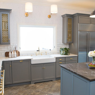
DuraSupreme Crestwood cabinets with a Kendall Panel add function and sophistication. A custom gray paint color paired with a storm blue was developed so that the new kitchen looked like it belonged to the existing space. Unlacquered brass faucets and hardware were important to Jennifer because she wanted the living finishes to age over time. Remarkable brass diamond mesh cabinet door inserts imported from the UK continue to add this one-of-a-kind kitchen renovation; giving it a “you won’t see this everywhere” quality. The use of old railcar flooring for the coffee bar countertop and reclaimed oak for the open shelving gives an authenticity to the space uncommon in kitchens today.
Jennifer and Michelle fell in love with the Limestone Grey Stone while they were investigating unique island countertop ideas. They liked the fact that the limestone as a living finish will age and change over time. Calcutta Miel Quartz countertops made for an excellent pairing around the perimeter, as it’s durable and perfect for cooking preparations. A textured white subway tile backsplash that runs to the ceiling keeps your eye moving towards the open shelving, and to the main focal point of the stunning range hood combination.
“The kitchen functions beautifully, and it’s gorgeous,” beams Jennifer as she gestures with both hands while smiling ear to ear. “The most important thing was I wanted a kitchen that had a wonderful flow, cooked beautiful meals and was a great gathering place for family and friends, and this space does that perfectly! Beauty wise, it turned out exactly how I had envisioned. I felt the function part was the hardest part, and that was nailed”!
Relocating the garage entry to the new mudroom was a huge priority and has finally separated the family’s arriving home functions from their kitchen. Now coats and shoes and bags have their own area for dropping once members arrive home. Matching gray DuraSupreme cabinetry helped create gorgeous, purposeful lockers for the family. A reclaimed vintage sink and custom wall paper were added to the tiny powder room to beautify the once previously only functional space. Advance Design was even able to create a custom space for their dog to sleep while the family is away.
“It was unbelievable that a project of this size was completed in such a short time, and I think that’s because of the large amount of planning and preparation that went into it,” Jennifer marveled, “When we started, we were ready, and everything was prepared”.
When it came to execution, Project Manager Justin Davis and his crew were quick, accessible, and organized. Projects like this kitchen are typically completed in as little as 8-10 weeks. Jennifer’s kitchen however despite the relocation of some challenging HVAC in a soffit and moving of an exterior door was completed remarkably fast in part because the team was working with an existing tile floor that ran throughout the first floor that the client really loved.
“You get to know these people really well because they’re living in your house while you’re living in your house. They were so fast and really good, it didn’t take as long as even planned” reported Jennifer. “I would text Justin and he always responded almost immediately. I got to know all the guys who were working in our house and they were all wonderful people”.
Details in a customized kitchen like this one require skill and care from the people who install it. “All the guys on the job were skilled at what the did. I wanted small details like little feet to look like furniture, that is where their carpentry skill came in to make these all perfect”, said Jennifer. “The tile guys were wonderful. They even let me determine how I wanted the texture with the grout to appear for a salt and pepper look; now that is a very skilled trade person making it custom”.
In Jennifer’s interview, she continued to reference Advance Design’s “Common Sense Remodeling”, so I took a minute to ask her exactly what that phrase meant to her and how it played out in her experience with her project and the Advance Design team. Here is what she said: “I was intrigued about Common Sense Remodeling and in my head that there would be clear costs and prices, great communication between the design team, the execution team and me”, said Jennifer. They did deliver on that, it was so clear about the cost breakdown, what I could expect from everyone who came to my house, and everything that we had ordered. That to me is the Common Sense”!
It’s great to see a client take literally our assertion that a well-planned remodeling project is simply “Common Sense”! She anticipated each step of the way would be clear, concise, and predictable, all the while protecting the outcome due to the careful upfront planning. “Advance Design delivered on their ‘Common Sense Remodeling’ promise,” Jennifer said. “From the design team, to the execution team - everything was straight forward like I imagined. The project turned out exactly how I envisioned, I enjoyed this process and absolutely would recommend Advance Design Studio to anyone.”

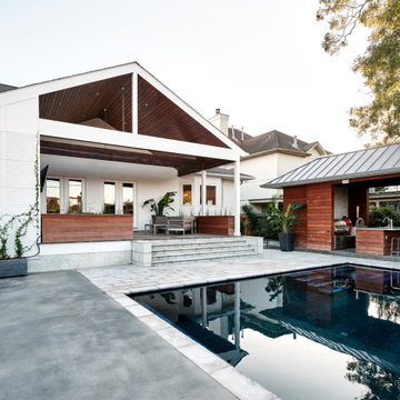
 Nathan Fell Architecture
Porch Addition, Pool and Pool Cabana
Modern exterior home idea in New Orleans
Modern exterior home idea in New Orleans
 Just the Thing
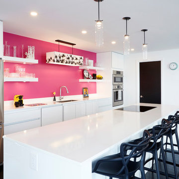
The kitchen in this rental apartment was renovated to meet the client's requirements: all-white, with no visible hardware. In lieu of a backsplash, we opted for a blinding fuchsia wall that was the jumping off point for the main floor colour scheme. New black repro Phillipe Starck stools repeat the black doors to the adjoining pantry and laundry room. An unexpected hand-painted shade adds whimsy to the sink area.
Ingrid Punwani Photography
Sponsored
Columbus, OH

Trish Takacs Design
Award Winning & Highly Skilled Kitchen & Bath Designer in Columbus
 Think Chic Interiors LLC
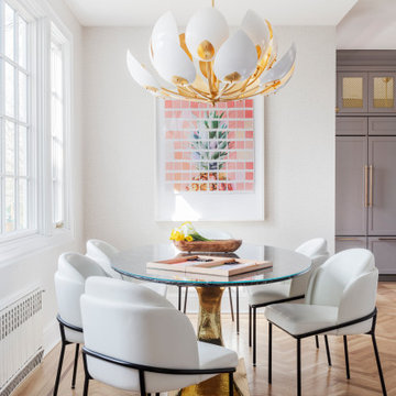
This kitchen belongs to a lively young family of five (soon to be six) in New Rochelle New York. When meeting the family to discuss the kitchen renovation, the request was simple, yet required careful planning. They wanted a beautiful high end kitchen that would be not only child friendly but one that would give their children the feeling that this is a space for them to use freely. And so the kitchen was designed.
All countertops and backsplash, including the sink apron and the kitchen hood, are made out of a Dekton porcelain, a material that is both heat, scratch and stain resistant. Thanks to ever evolving technologies, it not only looks like stone, but feels like it as well. A secret compartment with a pouch magnet on the panel wall contains a three tier step-stool for reaching the upper cabinets while those are equipped with pulldown shelves to utilize all spaces with easy access.
The breakfast room table has a custom glass top created to prevent wear and tear of the table while the chairs are made of leather and can easily be wiped off.
Custom glass top created to prevent wear and tear of the table while the chairs are made of leather and can easily be wiped off.
 Better Builders
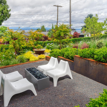
Completed in 2015, the Othello House was designed by PRDG Architecture + Design and built by Better Builders as a striking example of modern living in West Seattle. Though the homeowners chose not to pursue formal certification, the project was built to meet the rigorous standards of a Five-Star Built Green™ home.
From the ground up, sustainability and style were equally prioritized. The build preserved native vegetation, retained mature trees on-site, exceeded Washington State Energy Code requirements, and recycled over 70% of construction waste by weight. Recycled-content materials were thoughtfully incorporated throughout, reinforcing the home’s eco-conscious foundation.
Large windows on all sides flood the interiors with natural light, while the surrounding landscaping is designed to highlight lush greenery and native plantings. The result is a home that combines premium modern design with environmental responsibility—proving that sustainable construction can also deliver the ultimate in comfort and function.
 JAMES DIXON ARCHITECT PC
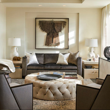
We were hired to transform this small apartment into a tranquil pied-a-terre. Perched atop an historic landmark, the unit features unparalleled views of Manhattan. However, the layout was awkward and the finishes dated. One of the many challenges was staying within the confines of the numerous structural columns and plumbing risers.
A larger foyer was created by removing a cumbersome millwork unit. Folding glass panels open the new kitchen to the view. Two, discrete bathrooms were created from one large one. All mechanical and electrical systems were updated, and each of the windows replaced to meet stringent preservation requirements. A neutral palette for the interiors was chosen to bring a sense of calm to the urban surroundings.
The project was a collaboration between James Dixon Architect PC and Powell & Bonnell Decorators
Photos by John Bessler
64