
Search results for "Neglected" in Home Design Ideas
 Klopf Architecture
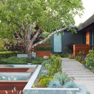
A family of passionate athletes and sports aficionados embarked on a remarkable endeavor alongside our team and Studio M Merge. Their vision? To breathe new life into their outdated mid-century modern home and neglected pool, resulting in the dramatic “Sports Enthusiasts’ Hideaway.” The transformative journey focused on opening the interior spaces out toward the beautiful gardens and amenities. The renewed house features expanded open-plan living areas, a new bedroom, and a reimagined primary bath. An attached ADU added a sports bar and a flexible office space that can double as a private guest bedroom. The outdoor spaces were brought to life with the addition of expansive decks, inviting patios, a horseshoe pit, a basketball half-court, refreshing plunge pools, and a lush sports lawn. A pool house artfully frames the view from the pool to the neighboring golf course. This family of five finds themselves immersed in their expanded home and experiential outdoor hideaway. Every element has been thoughtfully designed to cater to their favorite activities, providing a peaceful haven where they can fully indulge their shared passion for sports.
Klopf Architecture Project Team: John Klopf, AIA, Angela Todorova, Geoff Campen
Interior Architectural Design: Klopf Architecture
Landscape Architect: Studio M Merge
Contractor: Flegels Construction
Landscape Contractor: Frank & Grossman (phase 1), Garden Group (phase 2)
Photography: ©2013-2023 Mariko Reed
Year Completed: 2012 through 2020
Location: Los Gatos, CA
 Well-Designed Home by Slater Interiors
Opportunity:
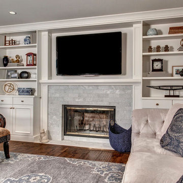
The unusual shape of this space, low ceilings, and poorly located appliances combined to make guests feel cramped and unsure of where to sit in this kitchen. The access doors to the exterior deck begged for more space to make for a more natural flow from the inside out. And the adjacent TV area off of the kitchen felt neglected and disjointed. With some holistic thinking and beautiful details, we were able to turn this awkward space into a focal point of a warm and cozy home.
RESULT:
The range backsplash became our piece de resistance and our focus on creating a cohesive design of the spaces. A blue/gray and white theme with gold accents evolved and combined to bring it all together.
 Fisher Heck Architects
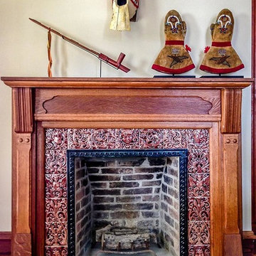
Originally designed by Victoria architect, James Hull in 1892, this two-story Shingle-Style house had long been abandoned and neglected, until the current owner purchased the home in 2007. The house is an important resource in the history of Cuero, Texas. It is a distinctive, late Victorian residence that complements the various architectural styles found in the Terrell-Reuss National Register District in Cuero, Texas. The style of the house is based upon a Queen Anne floor plan, but has strong Shingle style elements and several Colonial Revival details that make it unique to Cuero and South Texas. The design for the house skillfully merged the complex geometries and numerous diverse materials into a consummate Victorian composition. Fisher Heck was commissioned to restore the house in 2009. Almost everything inside and outside the house, down to the studs, had to be rebuilt or refinished. All work was done in conjunction with the Secretary of Interior's Standards for Historic Restoration.
Find the right local pro for your project
 Klopf Architecture
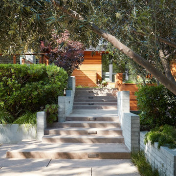
A family of passionate athletes and sports aficionados embarked on a remarkable endeavor alongside our team and Studio M Merge. Their vision? To breathe new life into their outdated mid-century modern home and neglected pool, resulting in the dramatic “Sports Enthusiasts’ Hideaway.” The transformative journey focused on opening the interior spaces out toward the beautiful gardens and amenities. The renewed house features expanded open-plan living areas, a new bedroom, and a reimagined primary bath. An attached ADU added a sports bar and a flexible office space that can double as a private guest bedroom. The outdoor spaces were brought to life with the addition of expansive decks, inviting patios, a horseshoe pit, a basketball half-court, refreshing plunge pools, and a lush sports lawn. A pool house artfully frames the view from the pool to the neighboring golf course. This family of five finds themselves immersed in their expanded home and experiential outdoor hideaway. Every element has been thoughtfully designed to cater to their favorite activities, providing a peaceful haven where they can fully indulge their shared passion for sports.
Klopf Architecture Project Team: John Klopf, AIA, Angela Todorova, Geoff Campen
Interior Architectural Design: Klopf Architecture
Landscape Architect: Studio M Merge
Contractor: Flegels Construction
Landscape Contractor: Frank & Grossman (phase 1), Garden Group (phase 2)
Photography: ©2013-2023 Mariko Reed
Year Completed: 2012 through 2020
Location: Los Gatos, CA
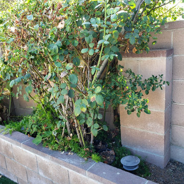
 Goodman's Painting Service
Neglected Garden bed and pool area resurfaced, cleaned and painted.
This is an example of a mid-sized traditional full sun backyard raised garden bed in Los Angeles for summer.
This is an example of a mid-sized traditional full sun backyard raised garden bed in Los Angeles for summer.
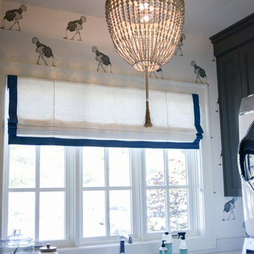
 Brandalyn Designs
Laundry Room |
A space we often neglect, but spend much time in. Why not make it fun? This quirky space is speckled with unique elements from the ostrich wallpaper to the gold and wood accents.
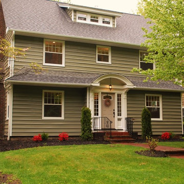
 Imaginet, LLC
Long neglected colonial undergoes top to bottom renovation
Large elegant green three-story gable roof photo in Cleveland
Large elegant green three-story gable roof photo in Cleveland
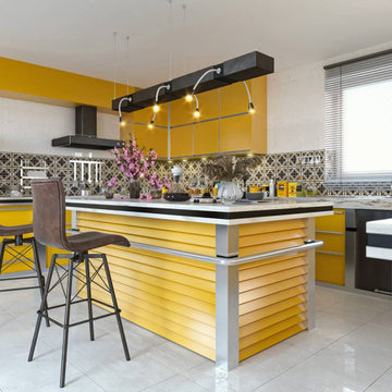
 Rook3d
Extensive or compact, no details will be neglected
Enclosed kitchen - modern l-shaped marble floor and white floor enclosed kitchen idea in Los Angeles with a drop-in sink, open cabinets, yellow cabinets, solid surface countertops, multicolored backsplash, marble backsplash, stainless steel appliances, an island and yellow countertops
Enclosed kitchen - modern l-shaped marble floor and white floor enclosed kitchen idea in Los Angeles with a drop-in sink, open cabinets, yellow cabinets, solid surface countertops, multicolored backsplash, marble backsplash, stainless steel appliances, an island and yellow countertops
 Bilotta Kitchen & Home
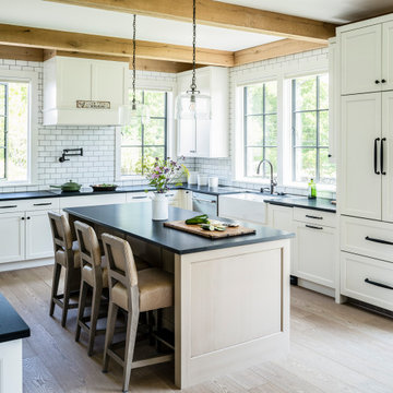
If you search “Modern Farmhouse”, this kitchen should appear as the defining image of this beloved esthetic. But very few of this style’s renditions can claim to be actual working farms. Though badly neglected, the owners of this eastern Connecticut property wanted the renovations to retain their original character. Reclaimed wood beams add antique authenticity, while black framed windows lend an industrial air. Gorgeous ash hardwood floors contribute to the airy ambiance. Cabinetry is full-overlay with a modified beveled Shaker door; white for the perimeter, and soft cream with a strie’ glaze for the island. Gray grout on the period-correct subway tiles creates a modern graphic effect. For this space, an apron front sink was practically mandatory. Reinforcing the simplicity of the design is the deliberate omission of crown and other decorative trim. For contrast, countertops are honed and leathered Absolute Black granite; more black touches appear in the cabinet hardware and pot filler faucet.
Adjoining the kitchen is the mud room and walk-in pantry. Shiplap siding and a sliding barn door pay tribute to the home’s origin. Drawers below an upholstered bench provide much-needed storage. But the star is the etched frosted glass pantry door with charming homespun labeling.
 Torrey Pines Landscape Co., Inc
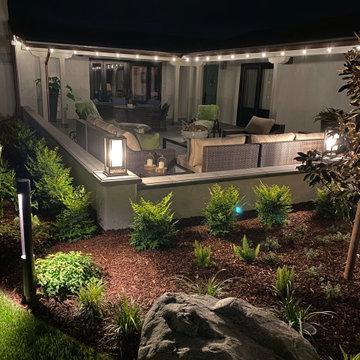
 After decades of neglect left its yard overgrown with weeds and wild flora, we have painstakingly restored the landscapes back to a simple and beautiful state where old growth is enhanced by new additions.
 Rebecca Mitchell Interiors
VICTORIAN LAKEFRONT BEFORE & AFTER
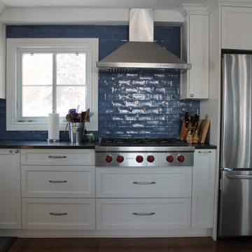
This neglected Victorian on the waterfront in Hudson was a perfect example of a diamond in the rough. But its new owners recognized its potential and (lucky for us) we were hired to redesign the main floor. Everything was replaced, from the uneven and mismatched floor boards, to the dilapidated, rickety old staircase. Not to mention, new windows, sexy new hot water heaters imported from England., a new kitchen and main floor bathroom. The entire house was painted Moonshine by Benjamin Moore - a watery blue-grey colour which works perfectly with all the wood and white trim. The kitchen was gutted and reconfigured to optimize the fantastic water views allowing the owners to relax at their new island (with soapstone counters). The beautiful blue backsplash tiles make this traditional white kitchen anything but boring. And we painted the adjacent dining room ceiling the same deep blue colour to add impact.
Our clients had travelled all over the world for work before returning to Montreal, and their art collection, geological artifacts, wool rugs and assortment of wood furniture (collected in Chile, Mexico and Arizona to name a few places) give this updated Victorian a lived-in, eclectic look. We added some unexpected lighting with a nod to the Victorian age throughout and the back room, once the exterior porch, is now a the perfect retreat to relax, hold book club meetings or just enjoy the views from the elegant new furniture or the newly reupholstered family heirloom bench.
 AMI Design & Associates
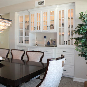
This was an amazing project from start to finish. The house was neglected for years.
Annette Rogers with her team at AMI Design & Associates stepped in to remodel the entire home. We supplied all the furnishings down to the accessories. All surfaces were refinished. Loved the way the light glazing turned out on the kitchen cabinets.
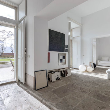
 Ancient Surfaces
•Architects: Aires Mateus
•Location: Lisbon, Portugal
•Architect: Manuel Aires Mateus
•Years: 2006-20011
•Photos by: Ricardo Oliveira Alves
•Stone floor: Ancient Surface
A succession of everyday spaces occupied the lower floor of this restored 18th century castle on the hillside.
The existing estate illustrating a period clouded by historic neglect.
The restoration plan for this castle house focused on increasing its spatial value, its open space architecture and re-positioning of its windows. The garden made it possible to enhance the depth of the view over the rooftops and the Baixa river. An existing addition was rebuilt to house to conduct more private and entertainment functions.
The unexpected discovery of an old and buried wellhead and cistern in the center of the house was a pleasant surprise to the architect and owners.
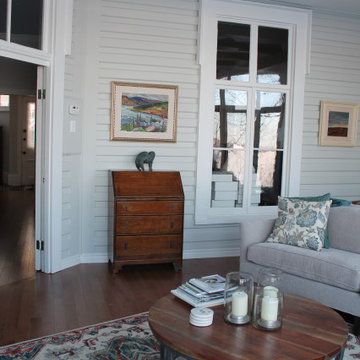 Rebecca Mitchell Interiors
VICTORIAN LAKEFRONT BEFORE & AFTER
This neglected Victorian on the waterfront in Hudson was a perfect example of a diamond in the rough. But its new owners recognized its potential and (lucky for us) we were hired to redesign the main floor. Everything was replaced, from the uneven and mismatched floor boards, to the dilapidated, rickety old staircase. Not to mention, new windows, sexy new hot water heaters imported from England., a new kitchen and main floor bathroom. The entire house was painted Moonshine by Benjamin Moore - a watery blue-grey colour which works perfectly with all the wood and white trim. The kitchen was gutted and reconfigured to optimize the fantastic water views allowing the owners to relax at their new island (with soapstone counters). The beautiful blue backsplash tiles make this traditional white kitchen anything but boring. And we painted the adjacent dining room ceiling the same deep blue colour to add impact.
Our clients had travelled all over the world for work before returning to Montreal, and their art collection, geological artifacts, wool rugs and assortment of wood furniture (collected in Chile, Mexico and Arizona to name a few places) give this updated Victorian a lived-in, eclectic look. We added some unexpected lighting with a nod to the Victorian age throughout and the back room, once the exterior porch, is now a the perfect retreat to relax, hold book club meetings or just enjoy the views from the elegant new furniture or the newly reupholstered family heirloom bench.
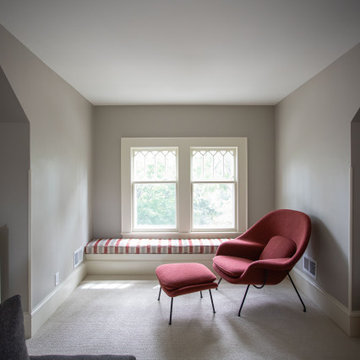
 TreHus Architects+Interior Designers+Builders
This Minneapolis attic was transformed from a long-neglected space into a refined bonus room and full bath. TreHus reinforced the structure, leveled floors and ceilings, and preserved original details such as the antique clawfoot tub. The result is a warm, functional retreat that connects seamlessly with the restored 1901 historical home below.
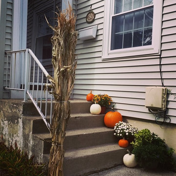
 CM Interiors
If you can look past the chippy scraped sides of my concrete stairs (to be painted)...you can see how much fun I had picking pumpkins and mums to spruce up what is normally a very boring entryway (we never use this door, it's often neglected!).
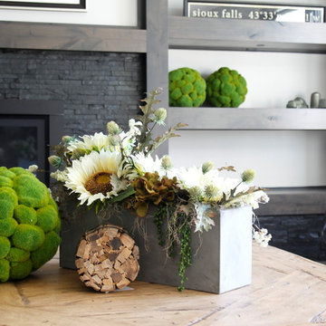
 Simply Perfect
It’s been said that when you dream about a house, the basement represents your subconscious level. Perhaps that was true in the past, when basements were often neglected. But in most of today’s new builds and remodels, lower levels are becoming valuable living spaces. If you’re looking at building or renovating, opening up that lower level with sufficient light can add square footage and value to your home.
In addition, having access to bright indoor areas can help combat cabin fever, which peaks in late winter. Looking at the photos here, you’d never know what you’re seeing is a lower level. That’s because a smart builder knew that bringing natural light into the space was key.
Our job, in furnishing the space, was to make the most of that light. The off-white walls and light grey carpet provide a good base.
A grey sectional sofa with clean, modern lines easily fits into the spacious room. It’s an ideal piece to encourage people to spend time together. The strong, forgiving linen resists staining, and like a blank canvas this true neutral allows for accessorizing with various throws and pillows depending on the season.
The cream-colored throw echoes the light colors in the space, while the nubby pillow adds a textured contrast.
 Taylor & Taylor, Inc.
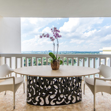
A balcony dining area offers a beautiful view of Miami Beach. Beige tones and organic shape cut outs on the base of the table make the balcony feel light and airy, and doesn't distract from the view.
 Imaginet, LLC
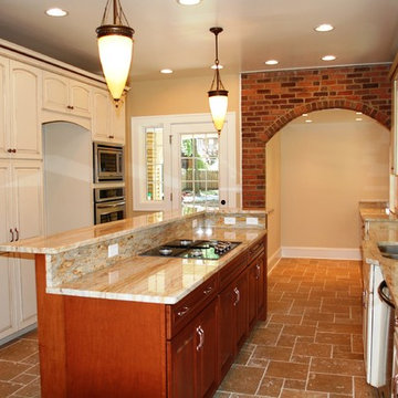
Brick archway created to carry through arch design and create breakfast nook.Kitchen with Kraftmaid cabinetry, perimeter has cream cabinets, warm chestnut island cabinets, arches connect spans between cabinets to mimic the leaded glass in hutch. Decorative piece on backsplash carries the curves and arches in the limestone piece just above counters. Top to bottom renovation on long neglected and vacated house...
 Custom Design & Construction
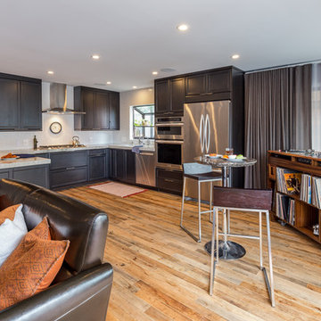
Our client approached us while he was in the process of purchasing his ½ lot detached unit in Hermosa Beach. He was drawn to a design / build approach because although he has great design taste, as a busy professional he didn’t have the time or energy to manage every detail involved in a home remodel. The property had been used as a rental unit and was in need of TLC. By bringing us onto the project during the purchase we were able to help assess the true condition of the home. Built in 1976, the 894 sq. ft. home had extensive termite and dry rot damage from years of neglect. The project required us to reframe the home from the inside out.
To design a space that your client will love you really need to spend time getting to know them. Our client enjoys entertaining small groups. He has a custom turntable and considers himself a mixologist. We opened up the space, space-planning for his custom turntable, to make it ideal for entertaining. The wood floor is reclaimed wood from manufacturing facilities. The reframing work also allowed us to make the roof a deck with an ocean view. The home is now a blend of the latest design trends and vintage elements and our client couldn’t be happier!
View the 'before' and 'after' images of this project at:
http://www.houzz.com/discussions/4189186/bachelors-whole-house-remodel-in-hermosa-beach-ca-part-1
http://www.houzz.com/discussions/4203075/m=23/bachelors-whole-house-remodel-in-hermosa-beach-ca-part-2
http://www.houzz.com/discussions/4216693/m=23/bachelors-whole-house-remodel-in-hermosa-beach-ca-part-3
Features: subway tile, reclaimed wood floors, quartz countertops, bamboo wood cabinetry, Ebony finish cabinets in kitchen
46