
Search results for "One dimensional program" in Home Design Ideas
 J Design Group - Interior Designers Miami - Modern
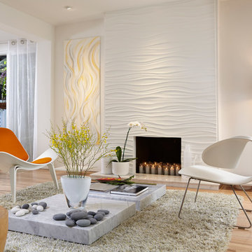
Panels – Wall Paneling - Modern – Contemporary.
Interior paneling is a great way to show off your personality while creating a warm and inviting feeling within your home. Your guests will be talking about your home for months to come.
At J. Design Group, we offer turn-key projects where we incorporate the most modern materials for all types of paneling - from wood to high gloss, and everything in between. We can even create custom interior paneling to make sure the right mood is captured within your home.
Whether you want to add the paneling to enhance your kitchen, bedroom, family room, or dining room, our team of experts will help you choose the right design and color. One of the best ways to bring an entire design together in your home is through the use of panels and with contrasting elements and textures, you can turn your home into the luxurious place you have always wanted it to be.
We welcome you to take a look at some of our past paneling jobs. As you can see, paneling is a great way to decorate the interior of your home or office space. We invite you to give our office a call today to schedule your appointment with one of our design experts. We will work one-on-one with you to ensure that we create the right look in every room throughout your home.
Give J. Design Group a call today to discuss all different options and to receive a free consultation.
Your friendly Interior design firm in Miami at your service.
Contemporary - Modern Interior designs.
Top Interior Design Firm in Miami – Coral Gables.
Panel,
Panels,
Paneling,
Wall Panels,
Wall Paneling,
Wood Panels,
Glass Panels,
Bedroom,
Bedrooms,
Bed,
Queen bed,
King Bed,
Single bed,
House Interior Designer,
House Interior Designers,
Home Interior Designer,
Home Interior Designers,
Residential Interior Designer,
Residential Interior Designers,
Modern Interior Designers,
Miami Beach Designers,
Best Miami Interior Designers,
Miami Beach Interiors,
Luxurious Design in Miami,
Top designers,
Deco Miami,
Luxury interiors,
Miami modern,
Interior Designer Miami,
Contemporary Interior Designers,
Coco Plum Interior Designers,
Miami Interior Designer,
Sunny Isles Interior Designers,
Pinecrest Interior Designers,
Interior Designers Miami,
J Design Group interiors,
South Florida designers,
Best Miami Designers,
Miami interiors,
Miami décor,
Miami Beach Luxury Interiors,
Miami Interior Design,
Miami Interior Design Firms,
Beach front,
Top Interior Designers,
top décor,
Top Miami Decorators,
Miami luxury condos,
Top Miami Interior Decorators,
Top Miami Interior Designers,
Modern Designers in Miami,
modern interiors,
Modern,
Pent house design,
white interiors,
Miami, South Miami, Miami Beach, South Beach, Williams Island, Sunny Isles, Surfside, Fisher Island, Aventura, Brickell, Brickell Key, Key Biscayne, Coral Gables, CocoPlum, Coconut Grove, Pinecrest, Miami Design District, Golden Beach, Downtown Miami, Miami Interior Designers, Miami Interior Designer, Interior Designers Miami, Modern Interior Designers, Modern Interior Designer, Modern interior decorators, Contemporary Interior Designers, Interior decorators, Interior decorator, Interior designer, Interior designers, Luxury, modern, best, unique, real estate, decor
J Design Group – Miami Interior Design Firm – Modern – Contemporary
Contact us: (305) 444-4611
www.JDesignGroup.com
 Haven Design and Construction
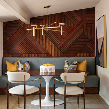
One functional challenge was that the home did not have a pantry. MCM closets were historically smaller than the walk-in closets and pantries of today. So, we printed out the home’s floorplan and began sketching ideas. The breakfast area was quite large, and it backed up to the primary bath on one side and it also adjoined the main hallway. We decided to reconfigure the large breakfast area by making part of it into a new walk-in pantry. This gave us the extra space we needed to create a new main hallway, enough space for a spacious walk-in pantry, and finally, we had enough space remaining in the breakfast area to add a cozy built-in walnut dining bench. Above the new dining bench, we designed and incorporated a geometric walnut accent wall to add warmth and texture.
 Lorraine G Vale, ASID Allied
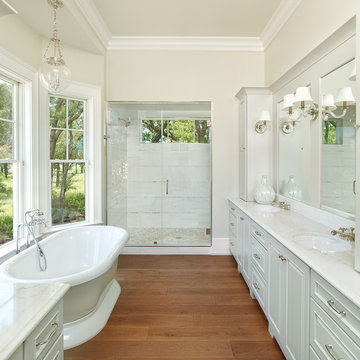
One of the main features of the space is the natural lighting. The windows allow someone to feel they are in their own private oasis. The wide plank European oak floors, with a brushed finish, contribute to the warmth felt in this bathroom, along with warm neutrals, whites and grays. The counter tops are a stunning Calcatta Latte marble as is the basket weaved shower floor, 1x1 square mosaics separating each row of the large format, rectangular tiles, also marble. Lighting is key in any bathroom and there is more than sufficient lighting provided by Ralph Lauren, by Circa Lighting. Classic, custom designed cabinetry optimizes the space by providing plenty of storage for toiletries, linens and more. Holger Obenaus Photography did an amazing job capturing this light filled and luxurious master bathroom. Built by Novella Homes and designed by Lorraine G Vale
Holger Obenaus Photography
Find the right local pro for your project
 41 West
41 West Coastal Retreat Series reveals creative, fresh ideas, for a new look to define the casual beach lifestyle of Naples.
More than a dozen custom variations and sizes are available to be built on your lot. From this spacious 3,000 square foot, 3 bedroom model, to larger 4 and 5 bedroom versions ranging from 3,500 - 10,000 square feet, including guest house options.

 Liz Schupanitz Designs
Cooking for Two
Location: Plymouth, MN, United States
When this couple’s last child graduated from college they began the process of looking for a new home. After a lengthy search they decided to stay with the neighborhood they loved, saving money by remodeling rather than starting over.
The top priorities on their wish list were adding character to their 1990’s era home with a classic white kitchen and a larger island while keeping within the existing footprint. With the intention of honing their cooking skills, they were also considering better appliances and two ovens.
Challenges and Solutions
Design a larger island with seating for at least two. The existing island was small and the area behind the seating was less than recommended clearances.
To solve this challenge, the seating area of the island was extended out into the open area of the kitchen. This created a larger island with seating for three, extra storage and a bookshelf across from the range.
The original kitchen had a range with microwave above, so adding another oven was a challenge with limited wall space.
Because the adjoining dining room is used infrequently, the homeowner was open to placing the second oven and microwave in the walkway. This made room for the small buffet between the built in refrigerator and ovens, creating one of her favorite areas.
The client requested a white painted kitchen but wanted to make sure it had warmth and character. To achieve this the following elements were chosen:
1) Cabinets painted with Benjamin Moore Capitol White, a luminous and warm shade of white.
2) The Range hood was painted with warm metallic shades to reflect the bronze of the Ashley Norton hardware.
3) Black Aqua Grantique granite was chosen for countertops because it looks like soapstone and adds contrast.
4) Walker Zanger Café tile in Latte was chosen for it’s handmade look with uneven edges.
5) The to-the-counter-cabinet with glass door shows off serving dishes and lends sophisticated charm.
The result is a welcoming classic kitchen, where this couple enjoys cooking more often and sharpening their skills with gourmet appliances.
Liz Schupanitz Designs
Photographed by: Andrea Rugg Photography
 Liz Schupanitz Designs
A PLACE TO GATHER
Location: Eagan, MN, USA
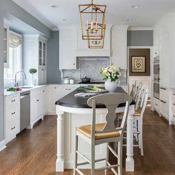
This family of five wanted an inviting space to gather with family and friends. Mom, the primary cook, wanted a large island with more organized storage – everything in its place – and a crisp white kitchen with the character of an older home.
Challenges:
Design an island that could accommodate this family of five for casual weeknight dinners.
Create more usable storage within the existing kitchen footprint.
Design a better transition between the upper cabinets on the 8-foot sink wall and the adjoining 9-foot cooktop wall.
Make room for more counter space around the cooktop. It was poorly lit, cluttered with small appliances and confined by the tall oven cabinet.
Solutions:
A large island, that seats 5 comfortably, replaced the small island and kitchen table. This allowed for more storage including cookbook shelves, a heavy-duty roll out shelf for the mixer, a 2-bin recycling center and a bread drawer.
Tall pantries with decorative grilles were placed between the kitchen and family room. These created ample storage and helped define each room, making each one feel larger, yet more intimate.
A space intentionally separates the upper cabinets on the sink wall from those on the cooktop wall. This created symmetry on the sink wall and made room for an appliance garage, which keeps the countertops uncluttered.
Moving the double ovens to the former pantry location made way for more usable counter space around the cooktop and a dramatic focal point with the hood, cabinets and marble backsplash.
Special Features:
Custom designed corbels and island legs lend character.
Gilt open lanterns, antiqued nickel grilles on the pantries, and the soft linen shade at the kitchen sink add personality and charm.
The unique bronze hardware with a living finish creates the patina of an older home.
A walnut island countertop adds the warmth and feel of a kitchen table.
This homeowner truly understood the idea of living with the patina of marble. Her grandmother’s marble-topped antique table inspired the Carrara countertops.
The result is a highly organized kitchen with a light, open feel that invites you to stay a while.
Liz Schupanitz Designs
Photographed by: Andrea Rugg
 Klopf Architecture
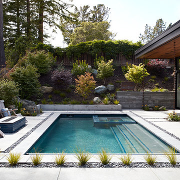
Klopf Architecture, Arterra Landscape Architects and Henry Calvert of Calvert Ventures Designed and built a new warm, modern, Eichler-inspired, open, indoor-outdoor home on a deeper-than-usual San Mateo Highlands property where an original Eichler house had burned to the ground.
The owners wanted multi-generational living and larger spaces than the original home offered, but all parties agreed that the house should respect the neighborhood and blend in stylistically with the other Eichlers. At first the Klopf team considered re-using what little was left of the original home and expanding on it. But after discussions with the owner and builder, all parties agreed that the last few remaining elements of the house were not practical to re-use, so Klopf Architecture designed a new home that pushes the Eichler approach in new directions.
One disadvantage of Eichler production homes is that the house designs were not optimized for each specific lot. A new custom home offered the team a chance to start over. In this case, a longer house that opens up sideways to the south fit the lot better than the original square-ish house that used to open to the rear (west). Accordingly, the Klopf team designed an L-shaped “bar” house with a large glass wall with large sliding glass doors that faces sideways instead of to the rear like a typical Eichler. This glass wall opens to a pool and landscaped yard designed by Arterra Landscape Architects.
Driving by the house, one might assume at first glance it is an Eichler because of the horizontality, the overhanging flat roof eaves, the dark gray vertical siding, and orange solid panel front door, but the house is designed for the 21st Century and is not meant to be a “Likeler.” You won't see any posts and beams in this home. Instead, the ceiling decking is a western red cedar that covers over all the beams. Like Eichlers, this cedar runs continuously from inside to out, enhancing the indoor / outdoor feeling of the house, but unlike Eichlers it conceals a cavity for lighting, wiring, and insulation. Ceilings are higher, rooms are larger and more open, the master bathroom is light-filled and more generous, with a separate tub and shower and a separate toilet compartment, and there is plenty of storage. The garage even easily fits two of today's vehicles with room to spare.
A massive 49-foot by 12-foot wall of glass and the continuity of materials from inside to outside enhance the inside-outside living concept, so the owners and their guests can flow freely from house to pool deck to BBQ to pool and back.
During construction in the rough framing stage, Klopf thought the front of the house appeared too tall even though the house had looked right in the design renderings (probably because the house is uphill from the street). So Klopf Architecture paid the framer to change the roofline from how we had designed it to be lower along the front, allowing the home to blend in better with the neighborhood. One project goal was for people driving up the street to pass the home without immediately noticing there is an "imposter" on this lot, and making that change was essential to achieve that goal.
This 2,606 square foot, 3 bedroom, 3 bathroom Eichler-inspired new house is located in San Mateo in the heart of the Silicon Valley.
Klopf Architecture Project Team: John Klopf, AIA, Klara Kevane
Landscape Architect: Arterra Landscape Architects
Contractor: Henry Calvert of Calvert Ventures
Photography ©2016 Mariko Reed
Location: San Mateo, CA
Year completed: 2016


 Xstyles Bath + More, Inc.
bethsingerphotographer.com
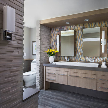
Example of a trendy master multicolored tile and glass tile porcelain tile bathroom design in Detroit with a trough sink, flat-panel cabinets, beige cabinets, quartz countertops, a two-piece toilet, gray walls and gray countertops
Example of a trendy master multicolored tile and glass tile porcelain tile bathroom design in Detroit with a trough sink, flat-panel cabinets, beige cabinets, quartz countertops, a two-piece toilet, gray walls and gray countertops

 Change Your Bathroom©
The goal of this project was to upgrade the builder grade finishes and create an ergonomic space that had a contemporary feel. This bathroom transformed from a standard, builder grade bathroom to a contemporary urban oasis. This was one of my favorite projects, I know I say that about most of my projects but this one really took an amazing transformation. By removing the walls surrounding the shower and relocating the toilet it visually opened up the space. Creating a deeper shower allowed for the tub to be incorporated into the wet area. Adding a LED panel in the back of the shower gave the illusion of a depth and created a unique storage ledge. A custom vanity keeps a clean front with different storage options and linear limestone draws the eye towards the stacked stone accent wall.
Houzz Write Up: https://www.houzz.com/magazine/inside-houzz-a-chopped-up-bathroom-goes-streamlined-and-swank-stsetivw-vs~27263720
The layout of this bathroom was opened up to get rid of the hallway effect, being only 7 foot wide, this bathroom needed all the width it could muster. Using light flooring in the form of natural lime stone 12x24 tiles with a linear pattern, it really draws the eye down the length of the room which is what we needed. Then, breaking up the space a little with the stone pebble flooring in the shower, this client enjoyed his time living in Japan and wanted to incorporate some of the elements that he appreciated while living there. The dark stacked stone feature wall behind the tub is the perfect backdrop for the LED panel, giving the illusion of a window and also creates a cool storage shelf for the tub. A narrow, but tasteful, oval freestanding tub fit effortlessly in the back of the shower. With a sloped floor, ensuring no standing water either in the shower floor or behind the tub, every thought went into engineering this Atlanta bathroom to last the test of time. With now adequate space in the shower, there was space for adjacent shower heads controlled by Kohler digital valves. A hand wand was added for use and convenience of cleaning as well. On the vanity are semi-vessel sinks which give the appearance of vessel sinks, but with the added benefit of a deeper, rounded basin to avoid splashing. Wall mounted faucets add sophistication as well as less cleaning maintenance over time. The custom vanity is streamlined with drawers, doors and a pull out for a can or hamper.
A wonderful project and equally wonderful client. I really enjoyed working with this client and the creative direction of this project.
Brushed nickel shower head with digital shower valve, freestanding bathtub, curbless shower with hidden shower drain, flat pebble shower floor, shelf over tub with LED lighting, gray vanity with drawer fronts, white square ceramic sinks, wall mount faucets and lighting under vanity. Hidden Drain shower system. Atlanta Bathroom.
 Décor Aid
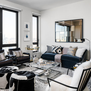
Million Dollar Listing’s celebrity broker Ryan Serhant reached out to Decor Aid to stage a luxurious Brooklyn condo development. The only caveat was that our interior designers had 48 hours to come up with the design, concept, and source all the furniture. Always up for a challenge, we partnered with Mitchell Gold & Bob Williams to create this contemporary gem.
Staying true to their contemporary vision, our interior decorators sourced all pieces through MGBW. Starting in the living room, we placed the Gunner Sofa, a piece that offers clean-lined living. The thin arms and slanted profile emphasize the modern elegance of the home. Through the use of various contemporary patterns and textures we were able to avoid the one-dimensional ambiance, and instead, the apartment’s living room feels detailed and thought out, without making anyone who enters overcrowded with home decor.
The Melrose cocktail table was sourced for its sleek, stainless steel and glass design that contrasts with more substantial pieces in the space, while also complementing the contemporary style. The glass design gives the illusion that this table takes up less space, giving the living room design a light and airy feel all around. The living space transformed into something out of a decor catalog with just the right amount of personality, creating a room that follows through with our starting design, yet functional for everyday use.
After the living room area, we set our eyes on designing the master bedroom. Our interior decorators were immediately drawn to the Celina Floating Rail Bed, it’s opulent nailhead trim, and dramatic design brings fresh sophistication to the bedroom design, while also standing out as a timeless piece that can complement various trends or styles that might be added later on to the bedroom decoration. We sourced the Roland Table Lamp to add texture, with its elaborate ribbed design, that compliments the air of masculinity the Carmen Leather Ottoman add while contrasting with the light, sleeker pieces. This difference in weight left us with a bedroom decoration that lives up to the trending modern standards, yet a space that is timeless and stylish no matter the decor trends.
Once we finished and the project was completed, our senior designers took a step back and took in all of their hard labor. Decor Aid was able to make this newly built blank space and design it into a modern wonder small brooklyn apartment. The MGBW furnishings were all hand-picked to keep an even balance of complementing and contrasting contemporary pieces, which was one of our more critical apartment decorating ideas. The apartment home decor brings to life this modern concept in a way that isn’t overbearing and shows off their style making the space in every sense an accurate reflection of a chic contemporary style.
 Architessa
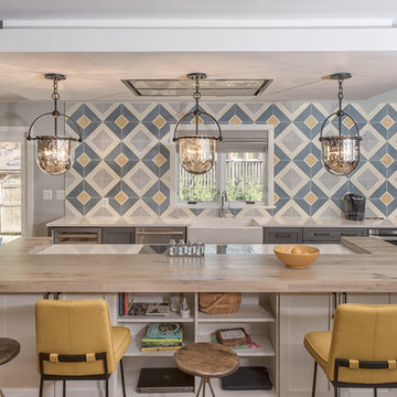
From drab and outdated, to a fantastic modern farmhouse feel, Architectural Ceramics designers were able to give these residents the kitchen of their dreams with the help of the latest trend in tile- cement! Cement tiles are made one at a time by hand, with blends of cement, marble powder, fine sand, and natural mineral color pigments to create the patterns the world has fallen in love with. After helping the client narrow down their favorite selections from Architectural Ceramic’s thousands of high quality tile options, a custom concrete design in shades of blue and grey for their backsplash turned out to be the perfect match to the rest of the kitchen. Architectural Ceramics designers eagerly work to make your project their top priority with a one of a kind design you can brag about for years to come. Visit our website to make an appointment at http://www.architecturalceramics.com/.
 Erin E. Kaiser, Kaiser Real Estate Sales, Inc
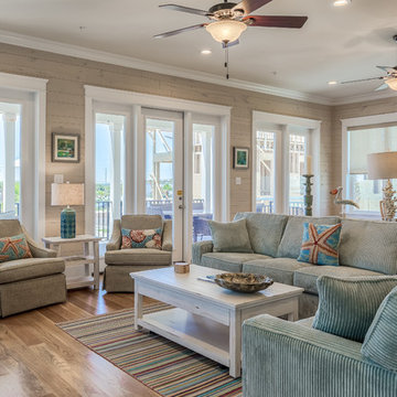
Inspiration for a large coastal open concept medium tone wood floor living room remodel in Miami
 Fluidesign Studio
Building Design, Plans, and Interior Finishes by: Fluidesign Studio I Builder: Anchor Builders I Photographer: sethbennphoto.com
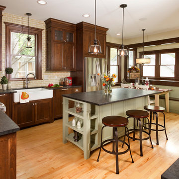
Elegant l-shaped medium tone wood floor eat-in kitchen photo in Minneapolis with a farmhouse sink, shaker cabinets, dark wood cabinets, beige backsplash, subway tile backsplash, stainless steel appliances and an island
Elegant l-shaped medium tone wood floor eat-in kitchen photo in Minneapolis with a farmhouse sink, shaker cabinets, dark wood cabinets, beige backsplash, subway tile backsplash, stainless steel appliances and an island

Sponsored
Sunbury, OH

J.Holderby - Renovations
Franklin County's Leading General Contractors - 2X Best of Houzz!
 Matt Fajkus Architecture
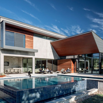
The Control/Shift House is perched on the high side of the site which takes advantage of the view to the southeast. A gradual descending path navigates the change in terrain from the street to the entry of the house. A series of low retaining walls/planter beds gather and release the earth upon the descent resulting in a fairly flat level for the house to sit on the top one third of the site. The entry axis is aligned with the celebrated stair volume and then re-centers on the actual entry axis once you approach the forecourt of the house.
The initial desire was for an “H” scheme house with common entertaining spaces bridging the gap between the more private spaces. After an investigation considering the site, program, and view, a key move was made: unfold the east wing of the “H” scheme to open all rooms to the southeast view resulting in a “T” scheme. The new derivation allows for both a swim pool which is on axis with the entry and main gathering space and a lap pool which occurs on the cross axis extending along the lengthy edge of the master suite, providing direct access for morning exercise and a view of the water throughout the day.
The Control/Shift House was derived from a clever way of following the “rules.” Strict HOA guidelines required very specific exterior massing restrictions which limits the lengths of unbroken elevations and promotes varying sizes of masses. The solution most often used in this neighborhood is one of addition - an aggregation of masses and program randomly attached to the inner core of the house which often results in a parasitic plan. The approach taken with the Control/Shift House was to push and pull program/massing to delineate and define the layout of the house. Massing is intentional and reiterated by the careful selection of materiality that tracks through the house. Voids and relief in the plan are a natural result of this method and allow for light and air to circulate throughout every space of the house, even into the most inner core.
Photography: Charles Davis Smith
 TVL Creative Ltd.
[Our Clients]
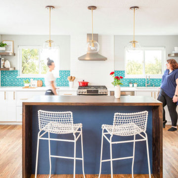
We were so excited to help these new homeowners re-envision their split-level diamond in the rough. There was so much potential in those walls, and we couldn’t wait to delve in and start transforming spaces. Our primary goal was to re-imagine the main level of the home and create an open flow between the space. So, we started by converting the existing single car garage into their living room (complete with a new fireplace) and opening up the kitchen to the rest of the level.
[Kitchen]
The original kitchen had been on the small side and cut-off from the rest of the home, but after we removed the coat closet, this kitchen opened up beautifully. Our plan was to create an open and light filled kitchen with a design that translated well to the other spaces in this home, and a layout that offered plenty of space for multiple cooks. We utilized clean white cabinets around the perimeter of the kitchen and popped the island with a spunky shade of blue. To add a real element of fun, we jazzed it up with the colorful escher tile at the backsplash and brought in accents of brass in the hardware and light fixtures to tie it all together. Through out this home we brought in warm wood accents and the kitchen was no exception, with its custom floating shelves and graceful waterfall butcher block counter at the island.
[Dining Room]
The dining room had once been the home’s living room, but we had other plans in mind. With its dramatic vaulted ceiling and new custom steel railing, this room was just screaming for a dramatic light fixture and a large table to welcome one-and-all.
[Living Room]
We converted the original garage into a lovely little living room with a cozy fireplace. There is plenty of new storage in this space (that ties in with the kitchen finishes), but the real gem is the reading nook with two of the most comfortable armchairs you’ve ever sat in.
[Master Suite]
This home didn’t originally have a master suite, so we decided to convert one of the bedrooms and create a charming suite that you’d never want to leave. The master bathroom aesthetic quickly became all about the textures. With a sultry black hex on the floor and a dimensional geometric tile on the walls we set the stage for a calm space. The warm walnut vanity and touches of brass cozy up the space and relate with the feel of the rest of the home. We continued the warm wood touches into the master bedroom, but went for a rich accent wall that elevated the sophistication level and sets this space apart.
[Hall Bathroom]
The floor tile in this bathroom still makes our hearts skip a beat. We designed the rest of the space to be a clean and bright white, and really let the lovely blue of the floor tile pop. The walnut vanity cabinet (complete with hairpin legs) adds a lovely level of warmth to this bathroom, and the black and brass accents add the sophisticated touch we were looking for.
[Office]
We loved the original built-ins in this space, and knew they needed to always be a part of this house, but these 60-year-old beauties definitely needed a little help. We cleaned up the cabinets and brass hardware, switched out the formica counter for a new quartz top, and painted wall a cheery accent color to liven it up a bit. And voila! We have an office that is the envy of the neighborhood.
 Matt Fajkus Architecture
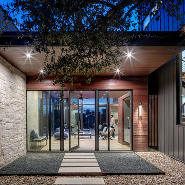
The Control/Shift House is perched on the high side of the site which takes advantage of the view to the southeast. A gradual descending path navigates the change in terrain from the street to the entry of the house. A series of low retaining walls/planter beds gather and release the earth upon the descent resulting in a fairly flat level for the house to sit on the top one third of the site. The entry axis is aligned with the celebrated stair volume and then re-centers on the actual entry axis once you approach the forecourt of the house.
The initial desire was for an “H” scheme house with common entertaining spaces bridging the gap between the more private spaces. After an investigation considering the site, program, and view, a key move was made: unfold the east wing of the “H” scheme to open all rooms to the southeast view resulting in a “T” scheme. The new derivation allows for both a swim pool which is on axis with the entry and main gathering space and a lap pool which occurs on the cross axis extending along the lengthy edge of the master suite, providing direct access for morning exercise and a view of the water throughout the day.
The Control/Shift House was derived from a clever way of following the “rules.” Strict HOA guidelines required very specific exterior massing restrictions which limits the lengths of unbroken elevations and promotes varying sizes of masses. The solution most often used in this neighborhood is one of addition - an aggregation of masses and program randomly attached to the inner core of the house which often results in a parasitic plan. The approach taken with the Control/Shift House was to push and pull program/massing to delineate and define the layout of the house. Massing is intentional and reiterated by the careful selection of materiality that tracks through the house. Voids and relief in the plan are a natural result of this method and allow for light and air to circulate throughout every space of the house, even into the most inner core.
Photography: Charles Davis Smith
 Star Furniture
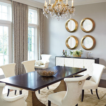
This "high energy" collection is part of a new category: glamorous transitional. Occasional tables are elegantly styled and feature brass plated metal frames. Added details such as embossed leather, antiqued mirror, and quilted bonded fabric/leather add unique elements to this high style, elegant furniture line.
BUFFET:
Ribbon stripe sapele veneers. Four wrapped doors quilted in white bonded leather with nailhead. Behind each pair of doors is one adjustable/removable shelf, one fully extendable drawer with hand cut-out and one fixed shelf. Left drawer has silverware insert. Right drawer has wrapped pad. Adjustable glides. Anti-tip kit. Caviar finish with gold finish base.
See if it’s ON SALE: https://www.starfurniture.com/current-promotion
Sponsored
Sunbury, OH
J.Holderby - Renovations
Franklin County's Leading General Contractors - 2X Best of Houzz!
 CB Architecture + Design
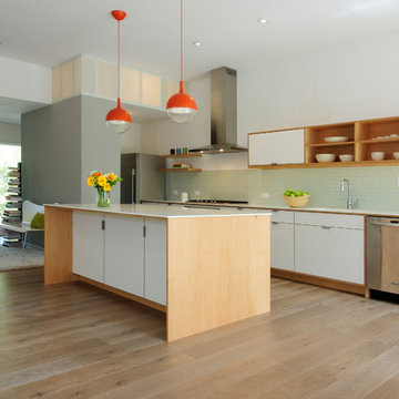
This light open kitchen has made cooking a fun-filled, family event. The large island is a gathering space and the center of the great room that encompasses the kitchen, living area and dining area. The generous counter space allows one to spread out while prepping a meal, doing homework, and entertaining.
Photograph by William Borsari
 Thomas Roszak Architecture, LLC
Photo credit: Scott McDonald @ Hedrich Blessing
7RR-Ecohome:
The design objective was to build a house for a couple recently married who both had kids from previous marriages. How to bridge two families together?
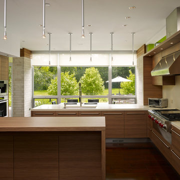
The design looks forward in terms of how people live today. The home is an experiment in transparency and solid form; removing borders and edges from outside to inside the house, and to really depict “flowing and endless space”. The house floor plan is derived by pushing and pulling the house’s form to maximize the backyard and minimize the public front yard while welcoming the sun in key rooms by rotating the house 45-degrees to true north. The angular form of the house is a result of the family’s program, the zoning rules, the lot’s attributes, and the sun’s path. We wanted to construct a house that is smart and efficient in terms of construction and energy, both in terms of the building and the user. We could tell a story of how the house is built in terms of the constructability, structure and enclosure, with a nod to Japanese wood construction in the method in which the siding is installed and the exposed interior beams are placed in the double height space. We engineered the house to be smart which not only looks modern but acts modern; every aspect of user control is simplified to a digital touch button, whether lights, shades, blinds, HVAC, communication, audio, video, or security. We developed a planning module based on a 6-foot square room size and a 6-foot wide connector called an interstitial space for hallways, bathrooms, stairs and mechanical, which keeps the rooms pure and uncluttered. The house is 6,200 SF of livable space, plus garage and basement gallery for a total of 9,200 SF. A large formal foyer celebrates the entry and opens up to the living, dining, kitchen and family rooms all focused on the rear garden. The east side of the second floor is the Master wing and a center bridge connects it to the kid’s wing on the west. Second floor terraces and sunscreens provide views and shade in this suburban setting. The playful mathematical grid of the house in the x, y and z axis also extends into the layout of the trees and hard-scapes, all centered on a suburban one-acre lot.
Many green attributes were designed into the home; Ipe wood sunscreens and window shades block out unwanted solar gain in summer, but allow winter sun in. Patio door and operable windows provide ample opportunity for natural ventilation throughout the open floor plan. Minimal windows on east and west sides to reduce heat loss in winter and unwanted gains in summer. Open floor plan and large window expanse reduces lighting demands and maximizes available daylight. Skylights provide natural light to the basement rooms. Durable, low-maintenance exterior materials include stone, ipe wood siding and decking, and concrete roof pavers. Design is based on a 2' planning grid to minimize construction waste. Basement foundation walls and slab are highly insulated. FSC-certified walnut wood flooring was used. Light colored concrete roof pavers to reduce cooling loads by as much as 15%. 2x6 framing allows for more insulation and energy savings. Super efficient windows have low-E argon gas filled units, and thermally insulated aluminum frames. Permeable brick and stone pavers reduce the site’s storm-water runoff. Countertops use recycled composite materials. Energy-Star rated furnaces and smart thermostats are located throughout the house to minimize duct runs and avoid energy loss. Energy-Star rated boiler that heats up both radiant floors and domestic hot water. Low-flow toilets and plumbing fixtures are used to conserve water usage. No VOC finish options and direct venting fireplaces maintain a high interior air quality. Smart home system controls lighting, HVAC, and shades to better manage energy use. Plumbing runs through interior walls reducing possibilities of heat loss and freezing problems. A large food pantry was placed next to kitchen to reduce trips to the grocery store. Home office reduces need for automobile transit and associated CO2 footprint. Plan allows for aging in place, with guest suite than can become the master suite, with no need to move as family members mature.
 Thomas Roszak Architecture, LLC
Photo credit: Scott McDonald @ Hedrich Blessing
7RR-Ecohome:
The design objective was to build a house for a couple recently married who both had kids from previous marriages. How to bridge two families together?
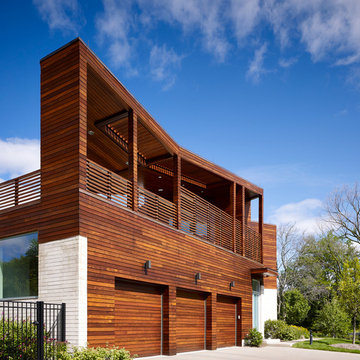
The design looks forward in terms of how people live today. The home is an experiment in transparency and solid form; removing borders and edges from outside to inside the house, and to really depict “flowing and endless space”. The house floor plan is derived by pushing and pulling the house’s form to maximize the backyard and minimize the public front yard while welcoming the sun in key rooms by rotating the house 45-degrees to true north. The angular form of the house is a result of the family’s program, the zoning rules, the lot’s attributes, and the sun’s path. We wanted to construct a house that is smart and efficient in terms of construction and energy, both in terms of the building and the user. We could tell a story of how the house is built in terms of the constructability, structure and enclosure, with a nod to Japanese wood construction in the method in which the siding is installed and the exposed interior beams are placed in the double height space. We engineered the house to be smart which not only looks modern but acts modern; every aspect of user control is simplified to a digital touch button, whether lights, shades, blinds, HVAC, communication, audio, video, or security. We developed a planning module based on a 6-foot square room size and a 6-foot wide connector called an interstitial space for hallways, bathrooms, stairs and mechanical, which keeps the rooms pure and uncluttered. The house is 6,200 SF of livable space, plus garage and basement gallery for a total of 9,200 SF. A large formal foyer celebrates the entry and opens up to the living, dining, kitchen and family rooms all focused on the rear garden. The east side of the second floor is the Master wing and a center bridge connects it to the kid’s wing on the west. Second floor terraces and sunscreens provide views and shade in this suburban setting. The playful mathematical grid of the house in the x, y and z axis also extends into the layout of the trees and hard-scapes, all centered on a suburban one-acre lot.
Many green attributes were designed into the home; Ipe wood sunscreens and window shades block out unwanted solar gain in summer, but allow winter sun in. Patio door and operable windows provide ample opportunity for natural ventilation throughout the open floor plan. Minimal windows on east and west sides to reduce heat loss in winter and unwanted gains in summer. Open floor plan and large window expanse reduces lighting demands and maximizes available daylight. Skylights provide natural light to the basement rooms. Durable, low-maintenance exterior materials include stone, ipe wood siding and decking, and concrete roof pavers. Design is based on a 2' planning grid to minimize construction waste. Basement foundation walls and slab are highly insulated. FSC-certified walnut wood flooring was used. Light colored concrete roof pavers to reduce cooling loads by as much as 15%. 2x6 framing allows for more insulation and energy savings. Super efficient windows have low-E argon gas filled units, and thermally insulated aluminum frames. Permeable brick and stone pavers reduce the site’s storm-water runoff. Countertops use recycled composite materials. Energy-Star rated furnaces and smart thermostats are located throughout the house to minimize duct runs and avoid energy loss. Energy-Star rated boiler that heats up both radiant floors and domestic hot water. Low-flow toilets and plumbing fixtures are used to conserve water usage. No VOC finish options and direct venting fireplaces maintain a high interior air quality. Smart home system controls lighting, HVAC, and shades to better manage energy use. Plumbing runs through interior walls reducing possibilities of heat loss and freezing problems. A large food pantry was placed next to kitchen to reduce trips to the grocery store. Home office reduces need for automobile transit and associated CO2 footprint. Plan allows for aging in place, with guest suite than can become the master suite, with no need to move as family members mature.
4