
Search results for "People additionally" in Home Design Ideas
 Housing & Building Association of Colorado Springs
The Home
Jayden Homes introduces the modern European inspired Arrabelle. Specializing in home placement, Jayden Homes has expertly situated this six-car over/under garage home to maximize panoramic views. An open concept home, the Arrabelle welcomes you home with an enchanting courtyard with barrel ceiling and gas firepit. Main level highlights include a state-of-the-art kitchen with a walk-in pantry, oversized island and gourmet appliances. A floor-to-ceiling stone fireplace is the focal point of the great room and adjoining dining area with an indoor/outdoor bar top. The brick-walled master retreat opens to the covered deck. The 680 square foot covered deck is perfect for outdoor entertaining, with a fireplace and outdoor kitchen including a pizza oven and gas grill. A guest suite with private bath and huge mudroom with pet cubby are also located on the main level.
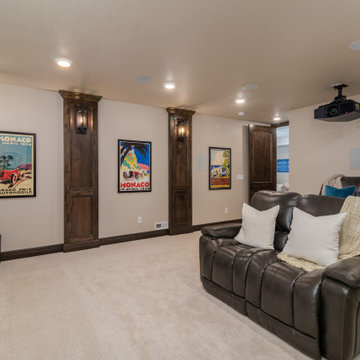
Designed for recreation, the lower level is ideal for fun with friends and family with a large rec room, built-in soda bar, wine room with secret entry, and home theater. Two additional bedrooms and baths are located on the lower level.
The Builder
Celebrating over three decades in Colorado Springs, second-generation Jayden Homes builds award-winning homes in El Paso, Elbert and Douglas Counties. A quality-conscious, custom home builder, Jayden Homes places an emphasis on establishing a partnership with our clients. Recipient of the 2019, 2018 and 2016 Parade of Homes Industry Award of Excellence and the People’s Choice Award, Jayden Homes provides an extraordinary home building experience with a well-thought-out process that allows for less waste and a more efficient method to the construction of your custom home. Accredited by the Better Business Bureau and active members of the Housing and Building Association, Jayden Homes believes communication and education are key to a successful home building relationship. From selection of your homesite to perfect homesite placement to design and construction, Jayden Homes will walk together with you to provide a home worthy of our mantra New Memories Coming Soon.
The Interior Design
Old World charm meets modern inspiration in the casually elegant Arrabelle. The great room and dining room welcome the outdoors in with walls of windows and sliding glass doors accessing a full covered deck with outdoor kitchen and panoramic views. The great room showcases exquisite wood beams and gorgeous hardwood floors.
Decorated with a light and airy decor, creamy neutral accents complement the richness of the home’s extensive tile and brick work. A mix of wood, stone and brick, show stopping light fixtures, and textured design elements are found throughout the Arrabelle. The finished lower level features a cozy theater room in a classic movie themed decor. Designed for entertaining, the rec room walks out to an outdoor living area with hot tub, and showcases a soda bar, game room and enclosed theater room. Be sure to look for memorable touches like the wine rack Murphy door at the entry into the wine room.

 Katie Hutchison Studio
The new owners of this house in Harvard, Massachusetts loved its location and authentic Shaker characteristics, but weren’t fans of its curious layout. A dated first-floor full bathroom could only be accessed by going up a few steps to a landing, opening the bathroom door and then going down the same number of steps to enter the room. The dark kitchen faced the driveway to the north, rather than the bucolic backyard fields to the south. The dining space felt more like an enlarged hall and could only comfortably seat four. Upstairs, a den/office had a woefully low ceiling; the master bedroom had limited storage, and a sad full bathroom featured a cramped shower.
KHS proposed a number of changes to create an updated home where the owners could enjoy cooking, entertaining, and being connected to the outdoors from the first-floor living spaces, while also experiencing more inviting and more functional private spaces upstairs.
On the first floor, the primary change was to capture space that had been part of an upper-level screen porch and convert it to interior space. To make the interior expansion seamless, we raised the floor of the area that had been the upper-level porch, so it aligns with the main living level, and made sure there would be no soffits in the planes of the walls we removed. We also raised the floor of the remaining lower-level porch to reduce the number of steps required to circulate from it to the newly expanded interior. New patio door systems now fill the arched openings that used to be infilled with screen. The exterior interventions (which also included some new casement windows in the dining area) were designed to be subtle, while affording significant improvements on the interior. Additionally, the first-floor bathroom was reconfigured, shifting one of its walls to widen the dining space, and moving the entrance to the bathroom from the stair landing to the kitchen instead.
These changes (which involved significant structural interventions) resulted in a much more open space to accommodate a new kitchen with a view of the lush backyard and a new dining space defined by a new built-in banquette that comfortably seats six, and -- with the addition of a table extension -- up to eight people.
Upstairs in the den/office, replacing the low, board ceiling with a raised, plaster, tray ceiling that springs from above the original board-finish walls – newly painted a light color -- created a much more inviting, bright, and expansive space. Re-configuring the master bath to accommodate a larger shower and adding built-in storage cabinets in the master bedroom improved comfort and function. A new whole-house color palette rounds out the improvements.
Photos by Katie Hutchison
 Blackdog Design Build Remodel
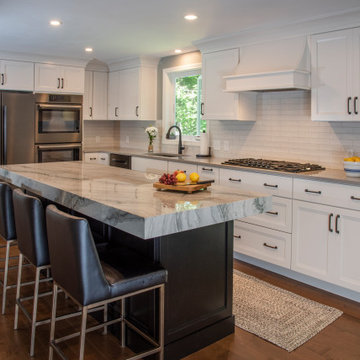
The reason for the project was purely due to the age of the existing space. There were different types of flooring (including carpet that was showing a lot of wear) throughout the first floor, the doors and windows were showing their age, and the kitchen was outdated, dark, and not functioning well for the family. The laundry room didn’t have any storage at all, and was open to the kitchen, which was unsightly to guests. Additionally, the heights of the family members range between 6’ and 6’5” so they were looking to customize the height of all of the cabinetry to make tasks easier and more comfortable. To remedy these challenges, the flooring and baseboards throughout the first floor of the home were updated with a high-quality, refinishable engineered walnut, providing the home with an instant update and creating a more cohesive flow. A wall was added with a sliding barn door between the kitchen and laundry/powder room area, giving that space some separation and privacy from the social space. Beautifulpainted tile was used in the laundry powder room and pantry, which added an artistic pop, and to highlight this we replaced the pantry door with a framed glass door.In the kitchen, an obstructive peninsula was removed, and the cabinetry was extended to make space for a large island that seats up to six people. The range was swapped for a cooktop and double oven, and an exterior-venting fan was added. The microwave was moved into the island, the window above the sink was replaced with a large, single-pane casement, and a gorgeous four-inch mitered edge marble countertop made the island a stunning focal point. A coffee bar and beverage station was added to free up working counter space, and added a functioning feature to an unused corner of the room.
Find the right local pro for your project

 Bassett Furniture
38" Square table. Extends to 50" or 62" with additional leaf. Also in 36" height for an additional charge. Dimensions vary based on base style selected.
Our Custom Dining furniture is made for you and ready for delivery in 30 days. Customize this table with your choice of finishes and top profiles. The top is protected with our Indurance® finish.

 Thompson Remodeling
Our clients had lovingly cared for their home for 16 years. In this small home, space was at a premium and the couple wanted to update this poorly functioning kitchen to match the rest of their Arts & Crafts style home.
Key requirements of this kitchen remodel design included:
- Improved lighting
- Better traffic pattern
- More storage
- Incorporating the Pewabic tile the clients loved
IMPROVED LIGHTING
A new lighting plan for the kitchen included:
- Three pendants over the new island
- Pendant lighting over the sink
- Recessed lights throughout
- Under cabinet lighting
BETTER TRAFFIC PATTERN
The refrigerator was moved from the main walkway to a perimeter wall. Its new location creates one point in the now smaller working triangle.
Prep space was previously scarce and the new island allows two to work in the kitchen without one getting trapped in the corner.
MORE STORAGE
A new island supplies storage that was non-existent before and it creates a place for people to sit and connect.
Although we replaced a slider with a door, we added a pantry cabinet which was also new storage the kitchen did not previously have.
Bulkheads were removed allowing cabinets to extend to the ceiling.
INCORPORATING PEWABIC TILE
Pewabic tile is handcrafted stoneware clay tile that is made in Detroit with a history dating back to 1903. Our clients fell in love with this tile years ago and used it on the landing of their staircase and wanted to incorporate it into the kitchen design.
We decided to let this gorgeous tile take center stage by creating an eye-catching backsplash. The flooring also incorporates details that connect back to the Pewabic tiles used on the walls.
OVERALL RESULTS
The remodeled kitchen has improved the feel of the whole first floor. A clear pathway runs from the living room through the kitchen and from the kitchen into the dining room. A new island supplies much-needed storage and provides a place for people to eat casual meals and hang out. The new lighting plan brightened not only the kitchen, but also the adjacent rooms. Now, with the kitchen completed, the whole house has a cohesive Arts & Crafts aesthetic – Mission Accomplished!
“The kitchen design is everything we hoped it would be. It’s a reflection of our tastes – it’s us. Our designer really understood what we liked and how to make the kitchen fit with the look of the rest of the house.”
“What do we love? Lighting, lighting, lighting! The Pewabic backsplash! The storage additions. The overall look – it’s new, but it looks & feels like it could have been original to the house.”
– Homeowner

 McCabe By Design LLC
Example of a mid-sized trendy l-shaped porcelain tile and beige floor open concept kitchen design in Seattle with a double-bowl sink, flat-panel cabinets, medium tone wood cabinets, granite countertops, beige backsplash, porcelain backsplash, stainless steel appliances, an island and black countertops

 TKS Design Group
Free ebook, Creating the Ideal Kitchen. DOWNLOAD NOW
This was a fun and special project for me to work on – it’s my parent’s new (to them) townhome. Downsizing from their previous home, and I collaborated with my architect father on redesigning their kitchen and master bathroom.
Opening up the layout on the 1st floor was on the top of their list. They hoped to make it possible for whoever was cooking in the kitchen was still able to interact with people in family room and the dining room easily. An existing wall between the family room and the kitchen, made the kitchen feel cut off from the rest of the house.
By removing the wall, we were able to turn the kitchen layout from the standard "U" shape kitchen to a galley which allowed for more storage and countertop space. White Dove frameless cabinetry from Woodharbor was used to give the space a light and fresh feel, while maximizing space within for easy storage. A built in-hutch in the dining room was added for additional storage without encroaching in the room itself.
The master bathroom was completely remodeled as well from head-to-toe. The existing layout was not conducive to my parent’s daily lifestyle. It had one vanity, an awkward corner tub with a just as awkward corner shower which seemed more like a dungeon than a shower. We gutted the existing bathroom, relocated a wall to create a large walk-in closet, omitted the tub, and created a nice spa like shower. The new layout also allowed them to have a double vanity with a small make-up area in between.
Some features we added into the bathroom were heated floors, which are especially nice during the cold Chicago winters, custom marble tile as an accent in the shower, and a custom shower enclosure which really kept the room open.
Designed by: Keri Pryde
Photography by: Mike Kaskal
For more information on kitchen and bath design ideas go to: www.kitchenstudio-ge.com
Sponsored
Columbus, OH

Structural Remodeling
Franklin County's Heavy Timber Specialists | Best of Houzz 2020!
 Housing & Building Association of Colorado Springs
The Home
Jayden Homes introduces the modern European inspired Arrabelle. Specializing in home placement, Jayden Homes has expertly situated this six-car over/under garage home to maximize panoramic views. An open concept home, the Arrabelle welcomes you home with an enchanting courtyard with barrel ceiling and gas firepit. Main level highlights include a state-of-the-art kitchen with a walk-in pantry, oversized island and gourmet appliances. A floor-to-ceiling stone fireplace is the focal point of the great room and adjoining dining area with an indoor/outdoor bar top. The brick-walled master retreat opens to the covered deck. The 680 square foot covered deck is perfect for outdoor entertaining, with a fireplace and outdoor kitchen including a pizza oven and gas grill. A guest suite with private bath and huge mudroom with pet cubby are also located on the main level.
Designed for recreation, the lower level is ideal for fun with friends and family with a large rec room, built-in soda bar, wine room with secret entry, and home theater. Two additional bedrooms and baths are located on the lower level.
The Builder
Celebrating over three decades in Colorado Springs, second-generation Jayden Homes builds award-winning homes in El Paso, Elbert and Douglas Counties. A quality-conscious, custom home builder, Jayden Homes places an emphasis on establishing a partnership with our clients. Recipient of the 2019, 2018 and 2016 Parade of Homes Industry Award of Excellence and the People’s Choice Award, Jayden Homes provides an extraordinary home building experience with a well-thought-out process that allows for less waste and a more efficient method to the construction of your custom home. Accredited by the Better Business Bureau and active members of the Housing and Building Association, Jayden Homes believes communication and education are key to a successful home building relationship. From selection of your homesite to perfect homesite placement to design and construction, Jayden Homes will walk together with you to provide a home worthy of our mantra New Memories Coming Soon.
The Interior Design
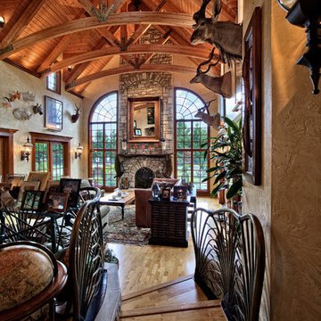
Old World charm meets modern inspiration in the casually elegant Arrabelle. The great room and dining room welcome the outdoors in with walls of windows and sliding glass doors accessing a full covered deck with outdoor kitchen and panoramic views. The great room showcases exquisite wood beams and gorgeous hardwood floors.
Decorated with a light and airy decor, creamy neutral accents complement the richness of the home’s extensive tile and brick work. A mix of wood, stone and brick, show stopping light fixtures, and textured design elements are found throughout the Arrabelle. The finished lower level features a cozy theater room in a classic movie themed decor. Designed for entertaining, the rec room walks out to an outdoor living area with hot tub, and showcases a soda bar, game room and enclosed theater room. Be sure to look for memorable touches like the wine rack Murphy door at the entry into the wine room.
 Thompson Remodeling
Our clients had lovingly cared for their home for 16 years. In this small home, space was at a premium and the couple wanted to update this poorly functioning kitchen to match the rest of their Arts & Crafts style home.
Key requirements of this kitchen remodel design included:
- Improved lighting
- Better traffic pattern
- More storage
- Incorporating the Pewabic tile the clients loved
IMPROVED LIGHTING
A new lighting plan for the kitchen included:
- Three pendants over the new island
- Pendant lighting over the sink
- Recessed lights throughout
- Under cabinet lighting
BETTER TRAFFIC PATTERN
The refrigerator was moved from the main walkway to a perimeter wall. Its new location creates one point in the now smaller working triangle.
Prep space was previously scarce and the new island allows two to work in the kitchen without one getting trapped in the corner.
MORE STORAGE
A new island supplies storage that was non-existent before and it creates a place for people to sit and connect.
Although we replaced a slider with a door, we added a pantry cabinet which was also new storage the kitchen did not previously have.
Bulkheads were removed allowing cabinets to extend to the ceiling.
INCORPORATING PEWABIC TILE
Pewabic tile is handcrafted stoneware clay tile that is made in Detroit with a history dating back to 1903. Our clients fell in love with this tile years ago and used it on the landing of their staircase and wanted to incorporate it into the kitchen design.
We decided to let this gorgeous tile take center stage by creating an eye-catching backsplash. The flooring also incorporates details that connect back to the Pewabic tiles used on the walls.
OVERALL RESULTS
The remodeled kitchen has improved the feel of the whole first floor. A clear pathway runs from the living room through the kitchen and from the kitchen into the dining room. A new island supplies much-needed storage and provides a place for people to eat casual meals and hang out. The new lighting plan brightened not only the kitchen, but also the adjacent rooms. Now, with the kitchen completed, the whole house has a cohesive Arts & Crafts aesthetic – Mission Accomplished!
“The kitchen design is everything we hoped it would be. It’s a reflection of our tastes – it’s us. Our designer really understood what we liked and how to make the kitchen fit with the look of the rest of the house.”
“What do we love? Lighting, lighting, lighting! The Pewabic backsplash! The storage additions. The overall look – it’s new, but it looks & feels like it could have been original to the house.”
– Homeowner

 Michael Nash Design, Build & Homes
Built in the 1950s, this rambler housed a dark, cramped galley kitchen only 6’ x 20’. A later addition added more space, but wasn’t optimally designed. So, when they purchased the property, the new owners did so with the intent of gutting and remodeling the first floor.
The goal of the renovation was to create a functional, dedicated kitchen and dining room space while keeping many of the home’s historic touches. The first step was to remove the bearing wall between kitchen and living room and install a structural beam to create a seamless connection between the two spaces.
A large center island was designed to be the focal point of the space, complete with a new farm sink and room to serve four or more people. A professional range with a stylish wooden hood was installed and custom cabinets wrap around the entire kitchen to provide plenty of storage.
Meanwhile, a custom-built hutch was installed in the dining room area, as was a butler’s pantry, to add more flair to the project. A timeless tile backsplash was installed to spruce up the soft color granite top which was carefully selected to harmonize with cabinet and floor color schemes.
The lighting was revamped and redesigned for entire space, including a couple of hanging pendants over the island. Wide plank distressed hardwood flooring was installed all over the kitchen and dining room to maintain the integrity of historic look.
With all new appliances, linen-stained maple cabinetry and distressed wood Island, old world hickory floor and more, this project moved from its dysfunctional status to fun and funky.
 Home Advertising
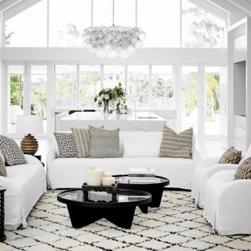
A Hampton style sofa has become a necessity in home decor as people become more familiar with the Hampton interior style. Hampton style sofas are a good choice for timeless design if you are replacing or buying a new one. When you are uncertain of what you want, buying a sofa can seem challenging. If you're trying to select La maison hampton furniture for one of your home's most important rooms, you have a lot to take into account. It maust suit your taste and function.
Couches require thought and consideration. It is important that you choose a style and a color that goes well with your living area, along with a durable material that meets your needs. The front door must also be able to accommodate the rug. So, don't forget to familiarize yourself with the different sizes, fillings, and textures before creating your budget. You don't have to spend a lot of money on a new sofa, but while there are some places where you can save money, there are others where you should invest.
First, Let's Talk about the Vibe of sofa style
First and foremost, you should consider the style of your sofa. Choose a sofa whose style fits the current theme of your home. It may seem very obvious, but many people simply buy whatever suits their fancy, and unfortunately, the style of the room is a lot of the time different from what suits their fancy.
If the rug or the art above the sofa don't go together, it might not work in the room. It's imperative to get the look right before adding the rest of these elements. Make sure you consider how you wish the room to feel when you're in it. If you're looking for something more colorful, or you have a particular style in mind, such as mid-century (then googling 'Hampton style sofas' will prove valuable). A sofa that looks great but is super-comfy might end up looking completely out of place if you skip this step.
Next, We will Discuss Functionality of sofas
It is important to consider what you will be doing with the sofa. Although I am convinced that the answer is "to sit on", we need to dig deeper. Can you, for instance, sit down for drinks in this formal sitting room when company comes over? Do you watch television in this room every day? There is a rumpus room upstairs for the kids to interact with their friends and eat and drink on it? There might be Hampton style sofas in the guest room.
For your convenience, I have compiled a full list of Hampton style sofas here. Depending on the situation, each sofa style needs to be different. Typically, formal couches tend to be less comfortable. They're usually more rigid and upright. Couches for watching TV should be cushier; they should be comfortable. We know that many teens are not concerned about Hampton style sofas maintenance, so kids zones need sofas that are able to withstand more wear and tear. This is something high schools should teach.
This story shows you the importance of not skipping this important ‘how will it be used? At this point, you should have an idea of how you'll use the Hampton style sofas. Consider, for instance, a sofa with a bold color and a formal feel for your living room. If you want a couch with a relaxed feel, choose a neutral shade with a cushy feel.
Dimensions of an ideal hamptons style sofa
Before you buy a Hampton style sofa, you must measure the size of your current living room. You will probably not fit it if you don't do this. A large one will either overwhelm the room and leave no room for a coffee table, or a small one will look dwarfed in comparison. When a pandemic strikes, scale is everything.
You should be able to fit the sofa into the room comfortably without it feeling too large or small. Measure the width of your La maison hampton furniture style sofas first with a tape measure. Consider if you'd like side tables beside your sofa. In that case, you would need to measure the width of either side of your sofa and add around 50cm to either side (most decent side tables have a width of about 50cm).
In addition to measuring Hampton style sofas depth, you should also measure the width. There are some sofas that can be as deep as a metre (from the front of the sofa cushion to its back). Since your sofa will need an allowance of 50cm from the edge of the coffee table to the front of the sofa, and a minimum of 50cm on the other side of the coffee table, you might want to measure your current coffee table to ensure it matches.
Another Important Factor is Height
In an open-plan living room, this element is particularly important if your sofa crosses the space. When you have a sectional sofa, for example, one of the ends will likely cut across the room, so the back should be low so your eye can still pass over the back.
One of the top 10 living room design mistakes I make is to place tall-backed Hampton style sofas across the room, a mistake that really cramps the style of the whole space. It happens way too often.
Although the height won't be a major issue if the sofa is backed up against a wall, it is still worth considering the size of the art you want to hang above it. If you want neck support whilst watching TV, a low-back sofa might not be for you. My neck tends to become less and less flexible as I get older. It's a sad fact, but true nonetheless. If you find yourself in the same situation, you should consider high-back Hampton style sofas.
Sofa Cushions: How Low are They?
Many people don't think about this dimension when purchasing a sofa online, especially if they're doing so for the first time. If you're road-testing the sofa in-store, you'll know if it's too low for you right away, but an online purchase is something else. Low-profile sofas have a seat height of 40 cm or less. The sofa's 60cm seat height will make it much more difficult to get up and out of it. The importance of this factor increases as we age or if we have mobility problems.
The seat you're sitting in should allow you to stand up comfortably, without feeling like you need assistance. Additionally, the height of your coffee table should not be higher than the seat cushions on the sofa, because the table should never be higher than the seat cushions on the sofa. They should never be higher than each other. Make sure you take notes!
What Else is There in the Room?
A good idea when choosing a sofa is to consider what other elements will be in the room. For a well-designed, elegantly-resolved living room, you'll need a sofa, rug, coffee table, side table/s, lamp, TV unit, and wall art. The room will not feel right if you buy a massive sectional sofa that takes up the entire room and leaves no space for a coffee table or side tables.
You should measure out your sofa, keeping in mind that the other pieces La maison hampton furniture and decor will also need to fit into the space. All pieces of furniture need to have enough space to breathe. It's best not to have all the furniture crammed into the point where sitting down means hitting your legs or feet against pieces. You probably now understand that choosing a couch is more about the couch itself than with how to choose it. So think of the big picture whenever you choose something.
Two Two-Seaters, or a Sectional Sofa?
People often have to wrestle with the question of whether they should buy two sofas or one sectional when figuring out how to choose a sofa. Sectionals are usually preferable to two separate two-seater sofas. However, the corner piece is rarely occupied anyway. Often, the corner piece of a sectional is so tiny that it is impossible for a person to sit there comfortably. Therefore, think about whether you actually need this over getting two x two-seater sofas and arranging them into an L-shape.
If you don't have a large living room, you might prefer 2 x two-seater sofas instead. Sectional sofas are best for larger rooms. With the visual break of all that fabric dominating the corner, it will do the room a world of good. Furthermore, you can use the space between your sofas to put a side table so you can place drinks, or a table lamp, there.
You may want to consider getting 1 x two-seater sofa and an armchair instead, if you have a really small living room. Even though you want to seat as many people as possible, you should let the room determine how many people the sofa can accommodate.
A Guide to Picking the Right Material
The material of the sofa is obviously very important when it comes to picking out the right one. The best advice I can offer is to consider who will use the sofa and how that will impact maintenance.
Leather sofas are easier to clean than fabric ones when kids or pets are present. Leather has the disadvantage of retaining heat in the winter and being cold in the summer. Cushions work well with leather sofas, but velvet ones work better with leather sofas. Leather will show up claw marks more easily on some pets (like my cats).
It is true that fabric sofas are softer and cozier, but they can also be more difficult to clean. Having a slipcover sofa is a godsend if you have pets or toddlers, but they're not too easy to maintain.
You should consider how much patience you have to keep the sofa clean and who uses it. That will make it easier to decide what material to use. I work with a sofa supplier who has bomb-proof fabric that is so easy to clean that you can literally serve dinner right onto the cushions without making an utter mess.

 Levi Design Build
Located in Studio City's Wrightwood Estates, Levi Construction’s latest residency is a two-story mid-century modern home that was re-imagined and extensively remodeled with a designer’s eye for detail, beauty and function. Beautifully positioned on a 9,600-square-foot lot with approximately 3,000 square feet of perfectly-lighted interior space. The open floorplan includes a great room with vaulted ceilings, gorgeous chef’s kitchen featuring Viking appliances, a smart WiFi refrigerator, and high-tech, smart home technology throughout. There are a total of 5 bedrooms and 4 bathrooms. On the first floor there are three large bedrooms, three bathrooms and a maid’s room with separate entrance. A custom walk-in closet and amazing bathroom complete the master retreat. The second floor has another large bedroom and bathroom with gorgeous views to the valley. The backyard area is an entertainer’s dream featuring a grassy lawn, covered patio, outdoor kitchen, dining pavilion, seating area with contemporary fire pit and an elevated deck to enjoy the beautiful mountain view.
Project designed and built by
Levi Construction
http://www.leviconstruction.com/
Levi Construction is specialized in designing and building custom homes, room additions, and complete home remodels. Contact us today for a quote.

 Cascade West Development
The Aerius - Modern Craftsman in Ridgefield Washington by Cascade West Development Inc.
Upon opening the 8ft tall door and entering the foyer an immediate display of light, color and energy is presented to us in the form of 13ft coffered ceilings, abundant natural lighting and an ornate glass chandelier. Beckoning across the hall an entrance to the Great Room is beset by the Master Suite, the Den, a central stairway to the Upper Level and a passageway to the 4-bay Garage and Guest Bedroom with attached bath. Advancement to the Great Room reveals massive, built-in vertical storage, a vast area for all manner of social interactions and a bountiful showcase of the forest scenery that allows the natural splendor of the outside in. The sleek corner-kitchen is composed with elevated countertops. These additional 4in create the perfect fit for our larger-than-life homeowner and make stooping and drooping a distant memory. The comfortable kitchen creates no spatial divide and easily transitions to the sun-drenched dining nook, complete with overhead coffered-beam ceiling. This trifecta of function, form and flow accommodates all shapes and sizes and allows any number of events to be hosted here. On the rare occasion more room is needed, the sliding glass doors can be opened allowing an out-pour of activity. Almost doubling the square-footage and extending the Great Room into the arboreous locale is sure to guarantee long nights out under the stars.
Cascade West Facebook: https://goo.gl/MCD2U1
Cascade West Website: https://goo.gl/XHm7Un
These photos, like many of ours, were taken by the good people of ExposioHDR - Portland, Or
Exposio Facebook: https://goo.gl/SpSvyo
Exposio Website: https://goo.gl/Cbm8Ya
Sponsored
Columbus, OH

Hope Restoration & General Contracting
Columbus Design-Build, Kitchen & Bath Remodeling, Historic Renovations
 Katie Hutchison Studio
The new owners of this house in Harvard, Massachusetts loved its location and authentic Shaker characteristics, but weren’t fans of its curious layout. A dated first-floor full bathroom could only be accessed by going up a few steps to a landing, opening the bathroom door and then going down the same number of steps to enter the room. The dark kitchen faced the driveway to the north, rather than the bucolic backyard fields to the south. The dining space felt more like an enlarged hall and could only comfortably seat four. Upstairs, a den/office had a woefully low ceiling; the master bedroom had limited storage, and a sad full bathroom featured a cramped shower.
KHS proposed a number of changes to create an updated home where the owners could enjoy cooking, entertaining, and being connected to the outdoors from the first-floor living spaces, while also experiencing more inviting and more functional private spaces upstairs.
On the first floor, the primary change was to capture space that had been part of an upper-level screen porch and convert it to interior space. To make the interior expansion seamless, we raised the floor of the area that had been the upper-level porch, so it aligns with the main living level, and made sure there would be no soffits in the planes of the walls we removed. We also raised the floor of the remaining lower-level porch to reduce the number of steps required to circulate from it to the newly expanded interior. New patio door systems now fill the arched openings that used to be infilled with screen. The exterior interventions (which also included some new casement windows in the dining area) were designed to be subtle, while affording significant improvements on the interior. Additionally, the first-floor bathroom was reconfigured, shifting one of its walls to widen the dining space, and moving the entrance to the bathroom from the stair landing to the kitchen instead.
These changes (which involved significant structural interventions) resulted in a much more open space to accommodate a new kitchen with a view of the lush backyard and a new dining space defined by a new built-in banquette that comfortably seats six, and -- with the addition of a table extension -- up to eight people.
Upstairs in the den/office, replacing the low, board ceiling with a raised, plaster, tray ceiling that springs from above the original board-finish walls – newly painted a light color -- created a much more inviting, bright, and expansive space. Re-configuring the master bath to accommodate a larger shower and adding built-in storage cabinets in the master bedroom improved comfort and function. A new whole-house color palette rounds out the improvements.
Photos by Katie Hutchison
 Katie Hutchison Studio
The new owners of this house in Harvard, Massachusetts loved its location and authentic Shaker characteristics, but weren’t fans of its curious layout. A dated first-floor full bathroom could only be accessed by going up a few steps to a landing, opening the bathroom door and then going down the same number of steps to enter the room. The dark kitchen faced the driveway to the north, rather than the bucolic backyard fields to the south. The dining space felt more like an enlarged hall and could only comfortably seat four. Upstairs, a den/office had a woefully low ceiling; the master bedroom had limited storage, and a sad full bathroom featured a cramped shower.
KHS proposed a number of changes to create an updated home where the owners could enjoy cooking, entertaining, and being connected to the outdoors from the first-floor living spaces, while also experiencing more inviting and more functional private spaces upstairs.
On the first floor, the primary change was to capture space that had been part of an upper-level screen porch and convert it to interior space. To make the interior expansion seamless, we raised the floor of the area that had been the upper-level porch, so it aligns with the main living level, and made sure there would be no soffits in the planes of the walls we removed. We also raised the floor of the remaining lower-level porch to reduce the number of steps required to circulate from it to the newly expanded interior. New patio door systems now fill the arched openings that used to be infilled with screen. The exterior interventions (which also included some new casement windows in the dining area) were designed to be subtle, while affording significant improvements on the interior. Additionally, the first-floor bathroom was reconfigured, shifting one of its walls to widen the dining space, and moving the entrance to the bathroom from the stair landing to the kitchen instead.
These changes (which involved significant structural interventions) resulted in a much more open space to accommodate a new kitchen with a view of the lush backyard and a new dining space defined by a new built-in banquette that comfortably seats six, and -- with the addition of a table extension -- up to eight people.
Upstairs in the den/office, replacing the low, board ceiling with a raised, plaster, tray ceiling that springs from above the original board-finish walls – newly painted a light color -- created a much more inviting, bright, and expansive space. Re-configuring the master bath to accommodate a larger shower and adding built-in storage cabinets in the master bedroom improved comfort and function. A new whole-house color palette rounds out the improvements.
Photos by Katie Hutchison

 Saikley Architects
This beautiful 1881 Alameda Victorian cottage, wonderfully embodying the Transitional Gothic-Eastlake era, had most of its original features intact. Our clients, one of whom is a painter, wanted to preserve the beauty of the historic home while modernizing its flow and function.
From several small rooms, we created a bright, open artist’s studio. We dug out the basement for a large workshop, extending a new run of stair in keeping with the existing original staircase. While keeping the bones of the house intact, we combined small spaces into large rooms, closed off doorways that were in awkward places, removed unused chimneys, changed the circulation through the house for ease and good sightlines, and made new high doorways that work gracefully with the eleven foot high ceilings. We removed inconsistent picture railings to give wall space for the clients’ art collection and to enhance the height of the rooms. From a poorly laid out kitchen and adjunct utility rooms, we made a large kitchen and family room with nine-foot-high glass doors to a new large deck. A tall wood screen at one end of the deck, fire pit, and seating give the sense of an outdoor room, overlooking the owners’ intensively planted garden. A previous mismatched addition at the side of the house was removed and a cozy outdoor living space made where morning light is received. The original house was segmented into small spaces; the new open design lends itself to the clients’ lifestyle of entertaining groups of people, working from home, and enjoying indoor-outdoor living.
Photography by Kurt Manley.
https://saikleyarchitects.com/portfolio/artists-victorian/
 Katie Hutchison Studio
The new owners of this house in Harvard, Massachusetts loved its location and authentic Shaker characteristics, but weren’t fans of its curious layout. A dated first-floor full bathroom could only be accessed by going up a few steps to a landing, opening the bathroom door and then going down the same number of steps to enter the room. The dark kitchen faced the driveway to the north, rather than the bucolic backyard fields to the south. The dining space felt more like an enlarged hall and could only comfortably seat four. Upstairs, a den/office had a woefully low ceiling; the master bedroom had limited storage, and a sad full bathroom featured a cramped shower.
KHS proposed a number of changes to create an updated home where the owners could enjoy cooking, entertaining, and being connected to the outdoors from the first-floor living spaces, while also experiencing more inviting and more functional private spaces upstairs.
On the first floor, the primary change was to capture space that had been part of an upper-level screen porch and convert it to interior space. To make the interior expansion seamless, we raised the floor of the area that had been the upper-level porch, so it aligns with the main living level, and made sure there would be no soffits in the planes of the walls we removed. We also raised the floor of the remaining lower-level porch to reduce the number of steps required to circulate from it to the newly expanded interior. New patio door systems now fill the arched openings that used to be infilled with screen. The exterior interventions (which also included some new casement windows in the dining area) were designed to be subtle, while affording significant improvements on the interior. Additionally, the first-floor bathroom was reconfigured, shifting one of its walls to widen the dining space, and moving the entrance to the bathroom from the stair landing to the kitchen instead.
These changes (which involved significant structural interventions) resulted in a much more open space to accommodate a new kitchen with a view of the lush backyard and a new dining space defined by a new built-in banquette that comfortably seats six, and -- with the addition of a table extension -- up to eight people.
Upstairs in the den/office, replacing the low, board ceiling with a raised, plaster, tray ceiling that springs from above the original board-finish walls – newly painted a light color -- created a much more inviting, bright, and expansive space. Re-configuring the master bath to accommodate a larger shower and adding built-in storage cabinets in the master bedroom improved comfort and function. A new whole-house color palette rounds out the improvements.
Photos by Katie Hutchison
Sponsored
Columbus, OH
Structural Remodeling
Franklin County's Heavy Timber Specialists | Best of Houzz 2020!
 TKS Design Group
Download our free ebook, Creating the Ideal Kitchen. DOWNLOAD NOW
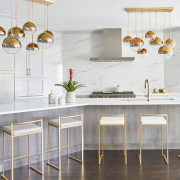
This client was referred to us from a past client. They are a busy 2-career household with young children and enjoy entertaining friends and family in their home. They have a beautiful open concept home but unfortunately the kitchen was not fitting for the rest of the home. They were not quite sure what to do with the space. We talked about trying to refresh it or do more of a minor remodel, but in the end they decided a full gut would get them to where they wanted to be.
One problem was there was no place for guests to hang out other than the large and awkward banquette area. The brick wall and tiled hood area were feeling a bit dated and tired. The space was just not functional for their lifestyle. There was no prep space near the cooktop and no landing area for items coming out of the ovens or refrigerator, plus a big dead zone in the center of the room.
Banquettes, like the one they previously had in the space, are great for small spaces, but when they get really large like this one, it makes getting in and out of the seating area awkward and uncomfortable. Plus, there was room for a large table, so we eliminated the awkward built in.
We started by removing the faux brick wall between the kitchen and back entry. We relocated the entry to the garage over a couple feet in order to get every last inch out of the new kitchen. We also made the decision to close up the primary window that faced the pretty ho hum brick wall of the neighbor’s house. There was plenty of light coming in from the seating area, so we just didn’t feel the window was adding much to the room.
Construction went smoothy. There was a bit of rework with electrical, flooring and HVAC, but in the end, we think it was well worth it.
The clients really wanted a sleek contemporary look, and we originally had planned for a full height slab backsplash, but due to it’s size, it was a budget buster. Instead, we got creative and settled on large format porcelain tiles that have a similar feel but were a fraction of the cost. We made sure the wall was plumb and level so that the fit and finish would mimic that of slab material.
The final space was quite a change. A large prep sink sits directly across from the new pro-style range with plenty additional prep space on the large island. The refrigerator and ovens now have miles of landing space, and a nice tight work triangle makes cooking a breeze.
Since we wanted a more contemporary feel, not many wall cabinets were included. Instead, we outfitted some of the drawers for dish storage with a peg system. Two large pantries flanking the refrigerator hold baking supplies and small appliances. Large drawers by the cooktop hold pots and pans, and an appliance garage tucked away to the left of the range hides away miscellaneous items. The large island also houses a microwave drawer and tons of storage, most of which is drawers offering maximum convenience.
The island now seats 5-6 people comfortably along with the new table in the seating area which can seat up to 8. Entertaining will be a breeze in this space. With such a clean backdrop, we knew we would need some drama with the lighting, so we chose two sets of staggered pendants, which we adjusted for the right visual balance above the island.
We also included a small coffee station to the right of the main kitchen, which helps keep the coffee clutter out of the kitchen proper. Two tones of complimentary gray are featured in this kitchen. The perimeter is a light gray that reads almost white. The island is a gray stain that adds some depth and interest with the visible wood texture. The countertops are clean white quartz, and the hardware, barstools and light fixtures add warm brass tones. I see lots of cooking and entertaining with family and friends in the near future in this bright and airy new space.
Designed by: Susan Klimala, CKD, CBD
Photography by: Michael Kaskel
For more information on kitchen and bath design ideas go to: www.kitchenstudio-ge.com
 KellyBaron
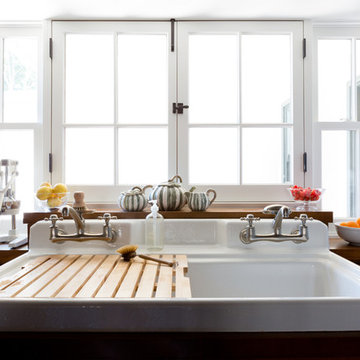
48" kohler farmhouse sink with wood wash board and dual faucets
Transitional dark wood floor kitchen photo in Los Angeles with a farmhouse sink, medium tone wood cabinets, wood countertops and no island
Transitional dark wood floor kitchen photo in Los Angeles with a farmhouse sink, medium tone wood cabinets, wood countertops and no island
 Katie Hutchison Studio
The new owners of this house in Harvard, Massachusetts loved its location and authentic Shaker characteristics, but weren’t fans of its curious layout. A dated first-floor full bathroom could only be accessed by going up a few steps to a landing, opening the bathroom door and then going down the same number of steps to enter the room. The dark kitchen faced the driveway to the north, rather than the bucolic backyard fields to the south. The dining space felt more like an enlarged hall and could only comfortably seat four. Upstairs, a den/office had a woefully low ceiling; the master bedroom had limited storage, and a sad full bathroom featured a cramped shower.
KHS proposed a number of changes to create an updated home where the owners could enjoy cooking, entertaining, and being connected to the outdoors from the first-floor living spaces, while also experiencing more inviting and more functional private spaces upstairs.
On the first floor, the primary change was to capture space that had been part of an upper-level screen porch and convert it to interior space. To make the interior expansion seamless, we raised the floor of the area that had been the upper-level porch, so it aligns with the main living level, and made sure there would be no soffits in the planes of the walls we removed. We also raised the floor of the remaining lower-level porch to reduce the number of steps required to circulate from it to the newly expanded interior. New patio door systems now fill the arched openings that used to be infilled with screen. The exterior interventions (which also included some new casement windows in the dining area) were designed to be subtle, while affording significant improvements on the interior. Additionally, the first-floor bathroom was reconfigured, shifting one of its walls to widen the dining space, and moving the entrance to the bathroom from the stair landing to the kitchen instead.
These changes (which involved significant structural interventions) resulted in a much more open space to accommodate a new kitchen with a view of the lush backyard and a new dining space defined by a new built-in banquette that comfortably seats six, and -- with the addition of a table extension -- up to eight people.
Upstairs in the den/office, replacing the low, board ceiling with a raised, plaster, tray ceiling that springs from above the original board-finish walls – newly painted a light color -- created a much more inviting, bright, and expansive space. Re-configuring the master bath to accommodate a larger shower and adding built-in storage cabinets in the master bedroom improved comfort and function. A new whole-house color palette rounds out the improvements.
Photos by Katie Hutchison
129