
Search results for "People additionally" in Home Design Ideas

 Saikley Architects
This beautiful 1881 Alameda Victorian cottage, wonderfully embodying the Transitional Gothic-Eastlake era, had most of its original features intact. Our clients, one of whom is a painter, wanted to preserve the beauty of the historic home while modernizing its flow and function.
From several small rooms, we created a bright, open artist’s studio. We dug out the basement for a large workshop, extending a new run of stair in keeping with the existing original staircase. While keeping the bones of the house intact, we combined small spaces into large rooms, closed off doorways that were in awkward places, removed unused chimneys, changed the circulation through the house for ease and good sightlines, and made new high doorways that work gracefully with the eleven foot high ceilings. We removed inconsistent picture railings to give wall space for the clients’ art collection and to enhance the height of the rooms. From a poorly laid out kitchen and adjunct utility rooms, we made a large kitchen and family room with nine-foot-high glass doors to a new large deck. A tall wood screen at one end of the deck, fire pit, and seating give the sense of an outdoor room, overlooking the owners’ intensively planted garden. A previous mismatched addition at the side of the house was removed and a cozy outdoor living space made where morning light is received. The original house was segmented into small spaces; the new open design lends itself to the clients’ lifestyle of entertaining groups of people, working from home, and enjoying indoor-outdoor living.
Photography by Kurt Manley.
https://saikleyarchitects.com/portfolio/artists-victorian/

 Katie Hutchison Studio
The new owners of this house in Harvard, Massachusetts loved its location and authentic Shaker characteristics, but weren’t fans of its curious layout. A dated first-floor full bathroom could only be accessed by going up a few steps to a landing, opening the bathroom door and then going down the same number of steps to enter the room. The dark kitchen faced the driveway to the north, rather than the bucolic backyard fields to the south. The dining space felt more like an enlarged hall and could only comfortably seat four. Upstairs, a den/office had a woefully low ceiling; the master bedroom had limited storage, and a sad full bathroom featured a cramped shower.
KHS proposed a number of changes to create an updated home where the owners could enjoy cooking, entertaining, and being connected to the outdoors from the first-floor living spaces, while also experiencing more inviting and more functional private spaces upstairs.
On the first floor, the primary change was to capture space that had been part of an upper-level screen porch and convert it to interior space. To make the interior expansion seamless, we raised the floor of the area that had been the upper-level porch, so it aligns with the main living level, and made sure there would be no soffits in the planes of the walls we removed. We also raised the floor of the remaining lower-level porch to reduce the number of steps required to circulate from it to the newly expanded interior. New patio door systems now fill the arched openings that used to be infilled with screen. The exterior interventions (which also included some new casement windows in the dining area) were designed to be subtle, while affording significant improvements on the interior. Additionally, the first-floor bathroom was reconfigured, shifting one of its walls to widen the dining space, and moving the entrance to the bathroom from the stair landing to the kitchen instead.
These changes (which involved significant structural interventions) resulted in a much more open space to accommodate a new kitchen with a view of the lush backyard and a new dining space defined by a new built-in banquette that comfortably seats six, and -- with the addition of a table extension -- up to eight people.
Upstairs in the den/office, replacing the low, board ceiling with a raised, plaster, tray ceiling that springs from above the original board-finish walls – newly painted a light color -- created a much more inviting, bright, and expansive space. Re-configuring the master bath to accommodate a larger shower and adding built-in storage cabinets in the master bedroom improved comfort and function. A new whole-house color palette rounds out the improvements.
Photos by Katie Hutchison
 Saikley Architects
This beautiful 1881 Alameda Victorian cottage, wonderfully embodying the Transitional Gothic-Eastlake era, had most of its original features intact. Our clients, one of whom is a painter, wanted to preserve the beauty of the historic home while modernizing its flow and function.
From several small rooms, we created a bright, open artist’s studio. We dug out the basement for a large workshop, extending a new run of stair in keeping with the existing original staircase. While keeping the bones of the house intact, we combined small spaces into large rooms, closed off doorways that were in awkward places, removed unused chimneys, changed the circulation through the house for ease and good sightlines, and made new high doorways that work gracefully with the eleven foot high ceilings. We removed inconsistent picture railings to give wall space for the clients’ art collection and to enhance the height of the rooms. From a poorly laid out kitchen and adjunct utility rooms, we made a large kitchen and family room with nine-foot-high glass doors to a new large deck. A tall wood screen at one end of the deck, fire pit, and seating give the sense of an outdoor room, overlooking the owners’ intensively planted garden. A previous mismatched addition at the side of the house was removed and a cozy outdoor living space made where morning light is received. The original house was segmented into small spaces; the new open design lends itself to the clients’ lifestyle of entertaining groups of people, working from home, and enjoying indoor-outdoor living.
Photography by Kurt Manley.
https://saikleyarchitects.com/portfolio/artists-victorian/
Find the right local pro for your project

 Cascade West Development
The Willow - Transitional Family Home on Acreage in Brush Prairie, Washington by Cascade West Development Inc.
Lastly, the style. Shabby Chic (chique) was a trend favorited early on by these clients. We wanted to create a space that used similar elements in materials and construction while allowing their style to play out over interior walls. On the outside this amounted to over 200 square feet of Eldorado Stone’s stacked stone, giving the façade giving the exterior a strong, natural and rustic feel. The stone is additionally used in the rear of the home as well, to frame an outdoor family living area equipped with a full outdoor kitchen. On the interior, their style translated into many accents. Antique wall sconces. Reclaimed wood. Wrought iron fixtures. Ornate woodwork. And old-world stylings of modern furniture. That idea is evidenced in pieces like their mud-bench in the second entryway. The hyperfunctional mud-bench is made of dark, unfinished natural wood stained to match an adjacent tongue and groove ceiling.
All of the ideas featured in this build were challenging. Rising to the challange and building homes that we're proud to put our name on is what we do. We hope you enjoy our work and this homeowner's shabby chic selections!
Cascade West Facebook: https://goo.gl/MCD2U1
Cascade West Website: https://goo.gl/XHm7Un
These photos, like many of ours, were taken by the good people of ExposioHDR - Portland, Or
Exposio Facebook: https://goo.gl/SpSvyo
Exposio Website: https://goo.gl/Cbm8Ya
 Katie Hutchison Studio
The new owners of this house in Harvard, Massachusetts loved its location and authentic Shaker characteristics, but weren’t fans of its curious layout. A dated first-floor full bathroom could only be accessed by going up a few steps to a landing, opening the bathroom door and then going down the same number of steps to enter the room. The dark kitchen faced the driveway to the north, rather than the bucolic backyard fields to the south. The dining space felt more like an enlarged hall and could only comfortably seat four. Upstairs, a den/office had a woefully low ceiling; the master bedroom had limited storage, and a sad full bathroom featured a cramped shower.
KHS proposed a number of changes to create an updated home where the owners could enjoy cooking, entertaining, and being connected to the outdoors from the first-floor living spaces, while also experiencing more inviting and more functional private spaces upstairs.
On the first floor, the primary change was to capture space that had been part of an upper-level screen porch and convert it to interior space. To make the interior expansion seamless, we raised the floor of the area that had been the upper-level porch, so it aligns with the main living level, and made sure there would be no soffits in the planes of the walls we removed. We also raised the floor of the remaining lower-level porch to reduce the number of steps required to circulate from it to the newly expanded interior. New patio door systems now fill the arched openings that used to be infilled with screen. The exterior interventions (which also included some new casement windows in the dining area) were designed to be subtle, while affording significant improvements on the interior. Additionally, the first-floor bathroom was reconfigured, shifting one of its walls to widen the dining space, and moving the entrance to the bathroom from the stair landing to the kitchen instead.
These changes (which involved significant structural interventions) resulted in a much more open space to accommodate a new kitchen with a view of the lush backyard and a new dining space defined by a new built-in banquette that comfortably seats six, and -- with the addition of a table extension -- up to eight people.
Upstairs in the den/office, replacing the low, board ceiling with a raised, plaster, tray ceiling that springs from above the original board-finish walls – newly painted a light color -- created a much more inviting, bright, and expansive space. Re-configuring the master bath to accommodate a larger shower and adding built-in storage cabinets in the master bedroom improved comfort and function. A new whole-house color palette rounds out the improvements.
Photos by Katie Hutchison
 Saikley Architects
This house was a very small mid-century bungalow with previous additions that resulted in a large but chaotic layout. The owners wanted to convert the house to a super-efficient, and charming Craftsman-style, 6 bedroom home for their large family and work at home.
We achieved the space needs by moving a few walls for a more efficient, organized layout, setting up spaces for overlapping uses, and making a small upstairs addition. Every bit of square footage was optimized to meet the goals of the project without making the house huge or adding unnecessary cost.
Much thought was given to the entry sequence near the front door. A large flow-through mudroom with storage for each family member, and adjacent laundry, make it easy for children to be taught to keep their things organized and to contribute to household chores. A mail station and central home admin area at the mudroom help keep clutter down at other areas and minimize home management tasks. A garage door near the kitchen gives quick access to bulk items.
The existing house had too much view to the street from the living room through large corner windows, and too little entry transition, to the extent that the family did not feel comfortable using the living room much without shades drawn. We raised the window sills and brought the new windows in from the corner of the house, allowing plenty of light while protecting privacy and a sense of enclosure in the living room. We enlarged the front porch to create a more graceful transition from the public to private space. We located the front door so that the circulation from entry into the house would allow for furnishing the living room with a sitting circle that is not intruded upon by people walking through the room.
Sight lines through the living spaces were an important consideration in the design. The owners wanted discreet spaces for living room, kitchen, dining and family room, but also wanted the living spaces to feel connected and to be able to easily watch their children. Being able to see the children playing in the yard while getting things done inside the house was also important. While largely working with the existing structure, we opened walls and rearranged the use of spaces to make a series of connected living spaces with long views through them.
The character of the remodeled house is a contemporary Craftsman with classic materials and cool, consistent colors. A few arches echo through the house to frame spaces and soften the feeling of the rooms.
Photography: Kurt Manley
https://saikleyarchitects.com/portfolio/bungalow-expansion/
 Saikley Architects
This beautiful 1881 Alameda Victorian cottage, wonderfully embodying the Transitional Gothic-Eastlake era, had most of its original features intact. Our clients, one of whom is a painter, wanted to preserve the beauty of the historic home while modernizing its flow and function.
From several small rooms, we created a bright, open artist’s studio. We dug out the basement for a large workshop, extending a new run of stair in keeping with the existing original staircase. While keeping the bones of the house intact, we combined small spaces into large rooms, closed off doorways that were in awkward places, removed unused chimneys, changed the circulation through the house for ease and good sightlines, and made new high doorways that work gracefully with the eleven foot high ceilings. We removed inconsistent picture railings to give wall space for the clients’ art collection and to enhance the height of the rooms. From a poorly laid out kitchen and adjunct utility rooms, we made a large kitchen and family room with nine-foot-high glass doors to a new large deck. A tall wood screen at one end of the deck, fire pit, and seating give the sense of an outdoor room, overlooking the owners’ intensively planted garden. A previous mismatched addition at the side of the house was removed and a cozy outdoor living space made where morning light is received. The original house was segmented into small spaces; the new open design lends itself to the clients’ lifestyle of entertaining groups of people, working from home, and enjoying indoor-outdoor living.
Photography by Kurt Manley.
https://saikleyarchitects.com/portfolio/artists-victorian/
Sponsored
Columbus, OH

Hope Restoration & General Contracting
Columbus Design-Build, Kitchen & Bath Remodeling, Historic Renovations
 Saikley Architects
This beautiful 1881 Alameda Victorian cottage, wonderfully embodying the Transitional Gothic-Eastlake era, had most of its original features intact. Our clients, one of whom is a painter, wanted to preserve the beauty of the historic home while modernizing its flow and function.
From several small rooms, we created a bright, open artist’s studio. We dug out the basement for a large workshop, extending a new run of stair in keeping with the existing original staircase. While keeping the bones of the house intact, we combined small spaces into large rooms, closed off doorways that were in awkward places, removed unused chimneys, changed the circulation through the house for ease and good sightlines, and made new high doorways that work gracefully with the eleven foot high ceilings. We removed inconsistent picture railings to give wall space for the clients’ art collection and to enhance the height of the rooms. From a poorly laid out kitchen and adjunct utility rooms, we made a large kitchen and family room with nine-foot-high glass doors to a new large deck. A tall wood screen at one end of the deck, fire pit, and seating give the sense of an outdoor room, overlooking the owners’ intensively planted garden. A previous mismatched addition at the side of the house was removed and a cozy outdoor living space made where morning light is received. The original house was segmented into small spaces; the new open design lends itself to the clients’ lifestyle of entertaining groups of people, working from home, and enjoying indoor-outdoor living.
Photography by Kurt Manley.
https://saikleyarchitects.com/portfolio/artists-victorian/

 Vanco Construction Inc.
Master Bathroom Construction:
Luxury can be incorporated into any master bathroom renovation. Remodeling takes proper planning and construction. A bathroom must stand up to high humidity, unique electrical needs, safe slip-proof floors, and adequate lighting. As bathroom remodel contractors we listen and translate your preferences into a stylish, quiet retreat. Vanco Construction can help you select materials and features that fit within your budget and suggest alternatives to improve the room’s function and style such as hanging an extravagant chandelier; add built-in heated towel bars or install a pass-through fireplace for ambience and warmth. You might also consider increasing the master bathroom's convenience by housing your washer and dryer, adjacent dressing rooms or even massage tables in the space.
Additional finishing touches will add that extra bit of luxury to an already spa-like master bath remodel. Warming floors, sound systems and flat screens are becoming more popular in in-mirror models and the sound emanates from the glass shower door. Universal design in master bathrooms is the approach to accommodate people of all ages and abilities, which includes wider doorways, showers with no raised lip around the bottom, larger shower doors and more room around and under the counters/sinks. Universal elements such as grab bars now blend seamlessly into even the most luxurious master bathrooms. Vanco Construction can guide you and the remodeling of your master bathroom quickly, cleanly and within budget. Give us a call (973) 994-0616

 Bilotta Kitchen & Home
Kitchens with fabulous water views require a design that is central to the view. In this case, Bilotta designer, Randy O’Kane, working with Rachel Laxer of Rachel Laxer Interiors, Robert Keller of Keller Eaton Architects, and the homeowner, quickly established that the focal point would be the outside, thus there are really no wall cabinets. The cooktop and main sink are situated on the island so that they face the water with wall ovens and refrigerator/freezer behind. The lines of the Bilotta Collection cabinetry are sleek and there is little to no hardware; drawers have a channel system in place of hardware. A tall pantry area hugs the wall and disappears with only glass pulls giving it away. The natural quartzite countertops have the undulating feel of moving water. The bar area is tucked away with the same clean lined cabinetry, but with an added touch of antique mercury mirrors to help reflect the lovely views. Soft seating by way of a custom banquette and sectional makes this kitchen not just a place to eat, but a relaxing area to watch the boats go by. Contemporary painted casing trims an extra-large pocket door into a formal dining room beautifully detailed by Rachel Laxer and continues the soft color scheme with added pops of color. This is definitely a great space to entertain in or just enjoy! Additional people involved include Staci Ruiz of Staci Ruiz Lighting Consultant and Bobby Noonan of Noonan Construction. Appliances are a mix of Miele, Sub-Zero and Gaggenau; sinks are Franke and faucets by Dornbracht. Bilotta Designer Randy O’Kane with Rachel Laxer for Rachel Laxer Interiors and Robert Keller of Keller Eaton Architects. Photo Credit: Peter Krupenye
 Bilotta Kitchen & Home
Kitchens with fabulous water views require a design that is central to the view. In this case, Bilotta designer, Randy O’Kane, working with Rachel Laxer of Rachel Laxer Interiors, Robert Keller of Keller Eaton Architects, and the homeowner, quickly established that the focal point would be the outside, thus there are really no wall cabinets. The cooktop and main sink are situated on the island so that they face the water with wall ovens and refrigerator/freezer behind. The lines of the Bilotta Collection cabinetry are sleek and there is little to no hardware; drawers have a channel system in place of hardware. A tall pantry area hugs the wall and disappears with only glass pulls giving it away. The natural quartzite countertops have the undulating feel of moving water. The bar area is tucked away with the same clean lined cabinetry, but with an added touch of antique mercury mirrors to help reflect the lovely views. Soft seating by way of a custom banquette and sectional makes this kitchen not just a place to eat, but a relaxing area to watch the boats go by. Contemporary painted casing trims an extra-large pocket door into a formal dining room beautifully detailed by Rachel Laxer and continues the soft color scheme with added pops of color. This is definitely a great space to entertain in or just enjoy! Additional people involved include Staci Ruiz of Staci Ruiz Lighting Consultant and Bobby Noonan of Noonan Construction. Appliances are a mix of Miele, Sub-Zero and Gaggenau; sinks are Franke and faucets by Dornbracht. Bilotta Designer Randy O’Kane with Rachel Laxer for Rachel Laxer Interiors and Robert Keller of Keller Eaton Architects. Photo Credit: Peter Krupenye
 Bilotta Kitchen & Home
Kitchens with fabulous water views require a design that is central to the view. In this case, Bilotta designer, Randy O’Kane, working with Rachel Laxer of Rachel Laxer Interiors, Robert Keller of Keller Eaton Architects, and the homeowner, quickly established that the focal point would be the outside, thus there are really no wall cabinets. The cooktop and main sink are situated on the island so that they face the water with wall ovens and refrigerator/freezer behind. The lines of the Bilotta Collection cabinetry are sleek and there is little to no hardware; drawers have a channel system in place of hardware. A tall pantry area hugs the wall and disappears with only glass pulls giving it away. The natural quartzite countertops have the undulating feel of moving water. The bar area is tucked away with the same clean lined cabinetry, but with an added touch of antique mercury mirrors to help reflect the lovely views. Soft seating by way of a custom banquette and sectional makes this kitchen not just a place to eat, but a relaxing area to watch the boats go by. Contemporary painted casing trims an extra-large pocket door into a formal dining room beautifully detailed by Rachel Laxer and continues the soft color scheme with added pops of color. This is definitely a great space to entertain in or just enjoy! Additional people involved include Staci Ruiz of Staci Ruiz Lighting Consultant and Bobby Noonan of Noonan Construction. Appliances are a mix of Miele, Sub-Zero and Gaggenau; sinks are Franke and faucets by Dornbracht. Bilotta Designer Randy O’Kane with Rachel Laxer for Rachel Laxer Interiors and Robert Keller of Keller Eaton Architects. Photo Credit: Peter Krupenye
 Bilotta Kitchen & Home
Kitchens with fabulous water views require a design that is central to the view. In this case, Bilotta designer, Randy O’Kane, working with Rachel Laxer of Rachel Laxer Interiors, Robert Keller of Keller Eaton Architects, and the homeowner, quickly established that the focal point would be the outside, thus there are really no wall cabinets. The cooktop and main sink are situated on the island so that they face the water with wall ovens and refrigerator/freezer behind. The lines of the Bilotta Collection cabinetry are sleek and there is little to no hardware; drawers have a channel system in place of hardware. A tall pantry area hugs the wall and disappears with only glass pulls giving it away. The natural quartzite countertops have the undulating feel of moving water. The bar area is tucked away with the same clean lined cabinetry, but with an added touch of antique mercury mirrors to help reflect the lovely views. Soft seating by way of a custom banquette and sectional makes this kitchen not just a place to eat, but a relaxing area to watch the boats go by. Contemporary painted casing trims an extra-large pocket door into a formal dining room beautifully detailed by Rachel Laxer and continues the soft color scheme with added pops of color. This is definitely a great space to entertain in or just enjoy! Additional people involved include Staci Ruiz of Staci Ruiz Lighting Consultant and Bobby Noonan of Noonan Construction. Appliances are a mix of Miele, Sub-Zero and Gaggenau; sinks are Franke and faucets by Dornbracht. Bilotta Designer Randy O’Kane with Rachel Laxer for Rachel Laxer Interiors and Robert Keller of Keller Eaton Architects. Photo Credit: Peter Krupenye

 Katie Hutchison Studio
The new owners of this house in Harvard, Massachusetts loved its location and authentic Shaker characteristics, but weren’t fans of its curious layout. A dated first-floor full bathroom could only be accessed by going up a few steps to a landing, opening the bathroom door and then going down the same number of steps to enter the room. The dark kitchen faced the driveway to the north, rather than the bucolic backyard fields to the south. The dining space felt more like an enlarged hall and could only comfortably seat four. Upstairs, a den/office had a woefully low ceiling; the master bedroom had limited storage, and a sad full bathroom featured a cramped shower.
KHS proposed a number of changes to create an updated home where the owners could enjoy cooking, entertaining, and being connected to the outdoors from the first-floor living spaces, while also experiencing more inviting and more functional private spaces upstairs.
On the first floor, the primary change was to capture space that had been part of an upper-level screen porch and convert it to interior space. To make the interior expansion seamless, we raised the floor of the area that had been the upper-level porch, so it aligns with the main living level, and made sure there would be no soffits in the planes of the walls we removed. We also raised the floor of the remaining lower-level porch to reduce the number of steps required to circulate from it to the newly expanded interior. New patio door systems now fill the arched openings that used to be infilled with screen. The exterior interventions (which also included some new casement windows in the dining area) were designed to be subtle, while affording significant improvements on the interior. Additionally, the first-floor bathroom was reconfigured, shifting one of its walls to widen the dining space, and moving the entrance to the bathroom from the stair landing to the kitchen instead.
These changes (which involved significant structural interventions) resulted in a much more open space to accommodate a new kitchen with a view of the lush backyard and a new dining space defined by a new built-in banquette that comfortably seats six, and -- with the addition of a table extension -- up to eight people.
Upstairs in the den/office, replacing the low, board ceiling with a raised, plaster, tray ceiling that springs from above the original board-finish walls – newly painted a light color -- created a much more inviting, bright, and expansive space. Re-configuring the master bath to accommodate a larger shower and adding built-in storage cabinets in the master bedroom improved comfort and function. A new whole-house color palette rounds out the improvements.
Photos by Katie Hutchison
 Katie Hutchison Studio
The new owners of this house in Harvard, Massachusetts loved its location and authentic Shaker characteristics, but weren’t fans of its curious layout. A dated first-floor full bathroom could only be accessed by going up a few steps to a landing, opening the bathroom door and then going down the same number of steps to enter the room. The dark kitchen faced the driveway to the north, rather than the bucolic backyard fields to the south. The dining space felt more like an enlarged hall and could only comfortably seat four. Upstairs, a den/office had a woefully low ceiling; the master bedroom had limited storage, and a sad full bathroom featured a cramped shower.
KHS proposed a number of changes to create an updated home where the owners could enjoy cooking, entertaining, and being connected to the outdoors from the first-floor living spaces, while also experiencing more inviting and more functional private spaces upstairs.
On the first floor, the primary change was to capture space that had been part of an upper-level screen porch and convert it to interior space. To make the interior expansion seamless, we raised the floor of the area that had been the upper-level porch, so it aligns with the main living level, and made sure there would be no soffits in the planes of the walls we removed. We also raised the floor of the remaining lower-level porch to reduce the number of steps required to circulate from it to the newly expanded interior. New patio door systems now fill the arched openings that used to be infilled with screen. The exterior interventions (which also included some new casement windows in the dining area) were designed to be subtle, while affording significant improvements on the interior. Additionally, the first-floor bathroom was reconfigured, shifting one of its walls to widen the dining space, and moving the entrance to the bathroom from the stair landing to the kitchen instead.
These changes (which involved significant structural interventions) resulted in a much more open space to accommodate a new kitchen with a view of the lush backyard and a new dining space defined by a new built-in banquette that comfortably seats six, and -- with the addition of a table extension -- up to eight people.
Upstairs in the den/office, replacing the low, board ceiling with a raised, plaster, tray ceiling that springs from above the original board-finish walls – newly painted a light color -- created a much more inviting, bright, and expansive space. Re-configuring the master bath to accommodate a larger shower and adding built-in storage cabinets in the master bedroom improved comfort and function. A new whole-house color palette rounds out the improvements.
Photos by Katie Hutchison

 Hive Modular, LLC
Hive Modular
Trendy open concept light wood floor living room photo in Denver with white walls
Trendy open concept light wood floor living room photo in Denver with white walls
 Katie Hutchison Studio
The new owners of this house in Harvard, Massachusetts loved its location and authentic Shaker characteristics, but weren’t fans of its curious layout. A dated first-floor full bathroom could only be accessed by going up a few steps to a landing, opening the bathroom door and then going down the same number of steps to enter the room. The dark kitchen faced the driveway to the north, rather than the bucolic backyard fields to the south. The dining space felt more like an enlarged hall and could only comfortably seat four. Upstairs, a den/office had a woefully low ceiling; the master bedroom had limited storage, and a sad full bathroom featured a cramped shower.
KHS proposed a number of changes to create an updated home where the owners could enjoy cooking, entertaining, and being connected to the outdoors from the first-floor living spaces, while also experiencing more inviting and more functional private spaces upstairs.
On the first floor, the primary change was to capture space that had been part of an upper-level screen porch and convert it to interior space. To make the interior expansion seamless, we raised the floor of the area that had been the upper-level porch, so it aligns with the main living level, and made sure there would be no soffits in the planes of the walls we removed. We also raised the floor of the remaining lower-level porch to reduce the number of steps required to circulate from it to the newly expanded interior. New patio door systems now fill the arched openings that used to be infilled with screen. The exterior interventions (which also included some new casement windows in the dining area) were designed to be subtle, while affording significant improvements on the interior. Additionally, the first-floor bathroom was reconfigured, shifting one of its walls to widen the dining space, and moving the entrance to the bathroom from the stair landing to the kitchen instead.
These changes (which involved significant structural interventions) resulted in a much more open space to accommodate a new kitchen with a view of the lush backyard and a new dining space defined by a new built-in banquette that comfortably seats six, and -- with the addition of a table extension -- up to eight people.
Upstairs in the den/office, replacing the low, board ceiling with a raised, plaster, tray ceiling that springs from above the original board-finish walls – newly painted a light color -- created a much more inviting, bright, and expansive space. Re-configuring the master bath to accommodate a larger shower and adding built-in storage cabinets in the master bedroom improved comfort and function. A new whole-house color palette rounds out the improvements.
Photos by Katie Hutchison
Sponsored
Columbus, OH

Structural Remodeling
Franklin County's Heavy Timber Specialists | Best of Houzz 2020!
 Blackdog Design Build Remodel
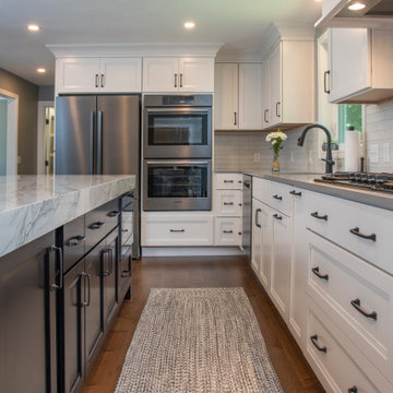
The reason for the project was purely due to the age of the existing space. There were different types of flooring (including carpet that was showing a lot of wear) throughout the first floor, the doors and windows were showing their age, and the kitchen was outdated, dark, and not functioning well for the family. The laundry room didn’t have any storage at all, and was open to the kitchen, which was unsightly to guests. Additionally, the heights of the family members range between 6’ and 6’5” so they were looking to customize the height of all of the cabinetry to make tasks easier and more comfortable. To remedy these challenges, the flooring and baseboards throughout the first floor of the home were updated with a high-quality, refinishable engineered walnut, providing the home with an instant update and creating a more cohesive flow. A wall was added with a sliding barn door between the kitchen and laundry/powder room area, giving that space some separation and privacy from the social space. Beautifulpainted tile was used in the laundry powder room and pantry, which added an artistic pop, and to highlight this we replaced the pantry door with a framed glass door.In the kitchen, an obstructive peninsula was removed, and the cabinetry was extended to make space for a large island that seats up to six people. The range was swapped for a cooktop and double oven, and an exterior-venting fan was added. The microwave was moved into the island, the window above the sink was replaced with a large, single-pane casement, and a gorgeous four-inch mitered edge marble countertop made the island a stunning focal point. A coffee bar and beverage station was added to free up working counter space, and added a functioning feature to an unused corner of the room.
 Bilotta Kitchen & Home
Kitchens with fabulous water views require a design that is central to the view. In this case, Bilotta designer, Randy O’Kane, working with Rachel Laxer of Rachel Laxer Interiors, Robert Keller of Keller Eaton Architects, and the homeowner, quickly established that the focal point would be the outside, thus there are really no wall cabinets. The cooktop and main sink are situated on the island so that they face the water with wall ovens and refrigerator/freezer behind. The lines of the Bilotta Collection cabinetry are sleek and there is little to no hardware; drawers have a channel system in place of hardware. A tall pantry area hugs the wall and disappears with only glass pulls giving it away. The natural quartzite countertops have the undulating feel of moving water. The bar area is tucked away with the same clean lined cabinetry, but with an added touch of antique mercury mirrors to help reflect the lovely views. Soft seating by way of a custom banquette and sectional makes this kitchen not just a place to eat, but a relaxing area to watch the boats go by. Contemporary painted casing trims an extra-large pocket door into a formal dining room beautifully detailed by Rachel Laxer and continues the soft color scheme with added pops of color. This is definitely a great space to entertain in or just enjoy! Additional people involved include Staci Ruiz of Staci Ruiz Lighting Consultant and Bobby Noonan of Noonan Construction. Appliances are a mix of Miele, Sub-Zero and Gaggenau; sinks are Franke and faucets by Dornbracht. Bilotta Designer Randy O’Kane with Rachel Laxer for Rachel Laxer Interiors and Robert Keller of Keller Eaton Architects. Photo Credit: Peter Krupenye

 Zola European Windows
McKeesport Downtown Housing, formerly a YMCA, is an 84-unit SRO for people at risk of homelessness. The old brick and terracotta building was important historically for McKeesport. The decision to design the project to Passive House criteria actually went a long way to making the pro-forma work. This project was the first large scale retrofit to be designed to meet Passive House Standards in the US. Another major concern of the project team was to maintain the historic charm of the building.
Space was at a premium and a reorganization of space allowed for making larger resident rooms. Through a community process with various stakeholders, amenities were identified and added to the project, including a community room, a bike storage area, exterior smoking balconies, single-user rest rooms, a bed bug room for non-toxic treatment of bed bugs, and communal kitchens to provide healthy options for food. The renovation includes new additional lighting, air-conditioning, make-up air and ventilation systems, an elevator, and cooking facilities. A cold-weather shelter, 60-day emergency housing, bridge housing, and section 8 apartment rentals make up the housing programs within the shelter. Thoughtful Balance designed the interiors, and selected the furniture for durability and resistance to bed bugs.
The project team worked closely with Zola Windows to specify a unique uPVC window that not only offers passive house performance levels at an affordable cost, but also harmonizes with the building’s historic aesthetic. Zola’s American Heritage SDH (simulated double hung) from the popular, budget-friendly Thermo uPVC line was specified for the project. The windows implemented in this project feature a lower tilt & turn window and a fixed upper for maximum airtightness and thermal performance. The implementation of these windows helped the project team achieve a very significant energy consumption reduction of at least 75%.
Photographer: Alexander Denmarsh
131