
Search results for "People additionally" in Home Design Ideas

 Renovisions
These Hanover, MA clients came to Renovisions as they wanted a local design-build company to rework and expand their small and outdated 1980’s colonial kitchen.
We collaborated and created an expanded 12’x15’ addition space to accommodate a newly designed kitchen which is now 21’x15’. Before we began with the construction process, proper structural engineering presented a challenge as the property was built on ledge. As expected, we determined that several concrete supports were necessary and needed to be built to support the expanded structure.
Our plan included both creative aesthetic and functional layout modifications to transform this ordinary kitchen into a spacious, well-lit, highly functional, stylish and welcoming space to cook, gather and entertain. The bump-out allowed for more functional cabinetry and a dining table which before was placed in a corner of the previous cramped kitchen. Now, there is a wide open space from the adjacent living room and a clear path to a 5’ French door opening to the pool deck. The homeowners also elected for us to extend a new roof over their existing deck creating a nice shaded space to entertain guests.
The island, which serves as the central gathering spot. is eye catching with contrasting dark cocoa colored cabinets and stunning natural looking Cambria quartz countertops. Large, easily accessible deep drawers provide much needed storage for pots, pans and lids as well as expansive countertop space for everyday prep and family get-togethers.
Overall, the clients were thrilled with their Renovision and cannot wait to throw a party to show off their stunning kitchen.
“There is not a single choice we aren’t happy with; it is so us! I love all of the storage and I have a feeling we are going to do a lot of entertaining this summer.”
“Dear Cathy and Ed, We are abundantly grateful for the entire Renovisions Team that have provided us with a beautiful kitchen and porch to enjoy. We will continue to make family memories for many years to come with this new addition. From the first time we met with you at the showroom, we were confident that high quality workmanship would go into our new construction. Mike, Brad, and Tom were very trustworthy and worked very hard every day they were on the job site. They were very flexible and always put the homeowners safety first. They even offered a bit of comic relief! Every night the site was cleaned meticulously, never leaving tools or sharp edges of any sort in the open space. We were also very pleased with the help offered when designing and choosing cabinets, tile and other finishes. Liz was always very helpful and patient to answer questions when we came by the showroom. We are extremely pleased with all the choices and on a daily basis we enjoy the warmth and amazing space it provides.
We recently hosted a retirement party for 70 people and it never felt crowed! We relax under the covered porch in the morning for coffee, the afternoon for lunch and to watch the grandkids in the pool. And of course in the evening while we read or catch up on emails. It is an amazing space! Thank you all again, for your hard work and passion for your craftsmanship. We will be in touch soon to set up a date for you all to drop by to see the finishing touches and to enjoy refreshments.”
- Paul & Beth H. (Hanover)

 Michael Nash Design, Build & Homes
Built in the early 1950s, this small urban townhouse is located in North Old Town Alexandria in an area currently undergoing major redevelopment. The neighborhood is popular with, and affordable for, young people and families, and very convenient to Washington, DC.
In its heyday, the townhouse touted a stately brick exterior, plaster walls, tongue and groove wood flooring and beautiful wooden staircase. Sixty years later, however, the homeowners were faced with crumbling masonry, sagging floors, a double layer of wallpaper over the plaster walls, a crumbling staircase, a dysfunctional kitchen and small, dark second floor rooms. Additionally, the basement had a low ceiling, moldy and cinder block walls, no plumbing and a large boiler taking up most of the space.
The homeowners’ goal was to restore the exterior’s historic look while creating an interior up-to-date for the 21st Century. To turn their vision into reality, they turned to Michael Nash Design, Build & Homes.
Design Solutions
To maintain the townhome’s historic exterior, the Michael Nash team carefully removed, salvaged, restored and reused existing brick masonry. Matching fascia boards and windows were combined with existing windows to complete the exterior renovation.
All interior walls were gutted and reframed. New electrical work, new insulation and new drywall were installed. Much of the home’s original trim was salvaged and reused, as was a piece of art glass, all to keep a bit of the past in the renovation.
The sagging subfloors were fixed, new hard wood floors were installed and a new staircase and railing were designed in a style similar to the original.
The solid wall between the kitchen and the dining room was removed, plumbing was relocated for a new sink location and the kitchen got expanded with an island into the dining room. Closet and plumbing stacks were relocated to allow a new space for fridge. Stainless steel appliances, granite countertops and custom cabinetry highlight the new modern kitchen.
The plan called for redesigning the three bedrooms on the second floor to allow a larger bathroom, walk-in closet and wider hallways. In addition to new roofing, a large skylight was installed to allow natural light into the bathroom and the upper hallway.
The basement was totally revamped. New plumbing was put in place for a full bathroom, laundry room and a den. New e-grass window was installed in the basement to bring this basement up to current building codes.
This homeowners love the neighborhood and now their home gives them the opportunity to stay in the same location.

 Katie Hutchison Studio
The new owners of this house in Harvard, Massachusetts loved its location and authentic Shaker characteristics, but weren’t fans of its curious layout. A dated first-floor full bathroom could only be accessed by going up a few steps to a landing, opening the bathroom door and then going down the same number of steps to enter the room. The dark kitchen faced the driveway to the north, rather than the bucolic backyard fields to the south. The dining space felt more like an enlarged hall and could only comfortably seat four. Upstairs, a den/office had a woefully low ceiling; the master bedroom had limited storage, and a sad full bathroom featured a cramped shower.
KHS proposed a number of changes to create an updated home where the owners could enjoy cooking, entertaining, and being connected to the outdoors from the first-floor living spaces, while also experiencing more inviting and more functional private spaces upstairs.
On the first floor, the primary change was to capture space that had been part of an upper-level screen porch and convert it to interior space. To make the interior expansion seamless, we raised the floor of the area that had been the upper-level porch, so it aligns with the main living level, and made sure there would be no soffits in the planes of the walls we removed. We also raised the floor of the remaining lower-level porch to reduce the number of steps required to circulate from it to the newly expanded interior. New patio door systems now fill the arched openings that used to be infilled with screen. The exterior interventions (which also included some new casement windows in the dining area) were designed to be subtle, while affording significant improvements on the interior. Additionally, the first-floor bathroom was reconfigured, shifting one of its walls to widen the dining space, and moving the entrance to the bathroom from the stair landing to the kitchen instead.
These changes (which involved significant structural interventions) resulted in a much more open space to accommodate a new kitchen with a view of the lush backyard and a new dining space defined by a new built-in banquette that comfortably seats six, and -- with the addition of a table extension -- up to eight people.
Upstairs in the den/office, replacing the low, board ceiling with a raised, plaster, tray ceiling that springs from above the original board-finish walls – newly painted a light color -- created a much more inviting, bright, and expansive space. Re-configuring the master bath to accommodate a larger shower and adding built-in storage cabinets in the master bedroom improved comfort and function. A new whole-house color palette rounds out the improvements.
Photos by Katie Hutchison
Find the right local pro for your project
 Katie Hutchison Studio
The new owners of this house in Harvard, Massachusetts loved its location and authentic Shaker characteristics, but weren’t fans of its curious layout. A dated first-floor full bathroom could only be accessed by going up a few steps to a landing, opening the bathroom door and then going down the same number of steps to enter the room. The dark kitchen faced the driveway to the north, rather than the bucolic backyard fields to the south. The dining space felt more like an enlarged hall and could only comfortably seat four. Upstairs, a den/office had a woefully low ceiling; the master bedroom had limited storage, and a sad full bathroom featured a cramped shower.
KHS proposed a number of changes to create an updated home where the owners could enjoy cooking, entertaining, and being connected to the outdoors from the first-floor living spaces, while also experiencing more inviting and more functional private spaces upstairs.
On the first floor, the primary change was to capture space that had been part of an upper-level screen porch and convert it to interior space. To make the interior expansion seamless, we raised the floor of the area that had been the upper-level porch, so it aligns with the main living level, and made sure there would be no soffits in the planes of the walls we removed. We also raised the floor of the remaining lower-level porch to reduce the number of steps required to circulate from it to the newly expanded interior. New patio door systems now fill the arched openings that used to be infilled with screen. The exterior interventions (which also included some new casement windows in the dining area) were designed to be subtle, while affording significant improvements on the interior. Additionally, the first-floor bathroom was reconfigured, shifting one of its walls to widen the dining space, and moving the entrance to the bathroom from the stair landing to the kitchen instead.
These changes (which involved significant structural interventions) resulted in a much more open space to accommodate a new kitchen with a view of the lush backyard and a new dining space defined by a new built-in banquette that comfortably seats six, and -- with the addition of a table extension -- up to eight people.
Upstairs in the den/office, replacing the low, board ceiling with a raised, plaster, tray ceiling that springs from above the original board-finish walls – newly painted a light color -- created a much more inviting, bright, and expansive space. Re-configuring the master bath to accommodate a larger shower and adding built-in storage cabinets in the master bedroom improved comfort and function. A new whole-house color palette rounds out the improvements.
Photos by Katie Hutchison

 NanaWall
Coastline to Living Room: Rolling Hills Residenc with NanaWall Folding Doors
House Tour: Rolling Hills Residence Maximizes Views
This particular residence takes indoor and outdoor living to the next level. Influenced by Japanese culture, this two story house contains five bedrooms, 1 spa room, 1 massage room, 2 sauna’s, 1 gym, an office, plus more! Let’s take a closer look.
Located on a private hillside and surrounded by nature, the Rolling Hills Residence overlooks ocean views that can be enjoyed from the residence or nearby hiking trails.
Folding doors bring in natural lighting, fresh air and create a seamless transition to the outdoor patio and BBQ area where homeowners can entertain guests.
The living room opens up to an infinity pool with spectacular views of the horizon!
Window sized folding doors in the kitchen and hallway creates open, unobstructed views.
By creating smaller folding windows, the homeowners used the outside space to create a Japanese garden with a pond.
“Japan is a group of islands surrounded by oceans and seas” writes Dr. Koichi Kawana in “The Garden – Symbols & Esthetics”. Dr. Kawana continues, “From ancient times, the Japanese people had an affinity for the sea […and] one is suppose to be able to enjoy the tranquility of the sea.”
Another private mini garden is connected to the Jacuzzi in the master bathroom. Additional rooms include: a meditation room, mini kitchen, a bamboo room, a club and a gym with two bars.
All of the rooms aim to link homeowners and guests to the outdoors and are all connected with accents of Japanese and Chinese art! What do you love about this house? Write it in the comments section below.
 Blackdog Design Build Remodel
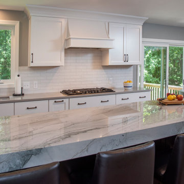
The reason for the project was purely due to the age of the existing space. There were different types of flooring (including carpet that was showing a lot of wear) throughout the first floor, the doors and windows were showing their age, and the kitchen was outdated, dark, and not functioning well for the family. The laundry room didn’t have any storage at all, and was open to the kitchen, which was unsightly to guests. Additionally, the heights of the family members range between 6’ and 6’5” so they were looking to customize the height of all of the cabinetry to make tasks easier and more comfortable. To remedy these challenges, the flooring and baseboards throughout the first floor of the home were updated with a high-quality, refinishable engineered walnut, providing the home with an instant update and creating a more cohesive flow. A wall was added with a sliding barn door between the kitchen and laundry/powder room area, giving that space some separation and privacy from the social space. Beautifulpainted tile was used in the laundry powder room and pantry, which added an artistic pop, and to highlight this we replaced the pantry door with a framed glass door.In the kitchen, an obstructive peninsula was removed, and the cabinetry was extended to make space for a large island that seats up to six people. The range was swapped for a cooktop and double oven, and an exterior-venting fan was added. The microwave was moved into the island, the window above the sink was replaced with a large, single-pane casement, and a gorgeous four-inch mitered edge marble countertop made the island a stunning focal point. A coffee bar and beverage station was added to free up working counter space, and added a functioning feature to an unused corner of the room.

 Zola European Windows
McKeesport Downtown Housing, formerly a YMCA, is an 84-unit SRO for people at risk of homelessness. The old brick and terracotta building was important historically for McKeesport. The decision to design the project to Passive House criteria actually went a long way to making the pro-forma work. This project was the first large scale retrofit to be designed to meet Passive House Standards in the US. Another major concern of the project team was to maintain the historic charm of the building.
Space was at a premium and a reorganization of space allowed for making larger resident rooms. Through a community process with various stakeholders, amenities were identified and added to the project, including a community room, a bike storage area, exterior smoking balconies, single-user rest rooms, a bed bug room for non-toxic treatment of bed bugs, and communal kitchens to provide healthy options for food. The renovation includes new additional lighting, air-conditioning, make-up air and ventilation systems, an elevator, and cooking facilities. A cold-weather shelter, 60-day emergency housing, bridge housing, and section 8 apartment rentals make up the housing programs within the shelter. Thoughtful Balance designed the interiors, and selected the furniture for durability and resistance to bed bugs.
The project team worked closely with Zola Windows to specify a unique uPVC window that not only offers passive house performance levels at an affordable cost, but also harmonizes with the building’s historic aesthetic. Zola’s American Heritage SDH (simulated double hung) from the popular, budget-friendly Thermo uPVC line was specified for the project. The windows implemented in this project feature a lower tilt & turn window and a fixed upper for maximum airtightness and thermal performance. The implementation of these windows helped the project team achieve a very significant energy consumption reduction of at least 75%.
Photographer: Alexander Denmarsh
Sponsored
Columbus, OH

Structural Remodeling
Franklin County's Heavy Timber Specialists | Best of Houzz 2020!

 Bilotta Kitchen & Home
Kitchens with fabulous water views require a design that is central to the view. In this case, Bilotta designer, Randy O’Kane, working with Rachel Laxer of Rachel Laxer Interiors, Robert Keller of Keller Eaton Architects, and the homeowner, quickly established that the focal point would be the outside, thus there are really no wall cabinets. The cooktop and main sink are situated on the island so that they face the water with wall ovens and refrigerator/freezer behind. The lines of the Bilotta Collection cabinetry are sleek and there is little to no hardware; drawers have a channel system in place of hardware. A tall pantry area hugs the wall and disappears with only glass pulls giving it away. The natural quartzite countertops have the undulating feel of moving water. The bar area is tucked away with the same clean lined cabinetry, but with an added touch of antique mercury mirrors to help reflect the lovely views. Soft seating by way of a custom banquette and sectional makes this kitchen not just a place to eat, but a relaxing area to watch the boats go by. Contemporary painted casing trims an extra-large pocket door into a formal dining room beautifully detailed by Rachel Laxer and continues the soft color scheme with added pops of color. This is definitely a great space to entertain in or just enjoy! Additional people involved include Staci Ruiz of Staci Ruiz Lighting Consultant and Bobby Noonan of Noonan Construction. Appliances are a mix of Miele, Sub-Zero and Gaggenau; sinks are Franke and faucets by Dornbracht. Bilotta Designer Randy O’Kane with Rachel Laxer for Rachel Laxer Interiors and Robert Keller of Keller Eaton Architects. Photo Credit: Peter Krupenye
 Bilotta Kitchen & Home
Kitchens with fabulous water views require a design that is central to the view. In this case, Bilotta designer, Randy O’Kane, working with Rachel Laxer of Rachel Laxer Interiors, Robert Keller of Keller Eaton Architects, and the homeowner, quickly established that the focal point would be the outside, thus there are really no wall cabinets. The cooktop and main sink are situated on the island so that they face the water with wall ovens and refrigerator/freezer behind. The lines of the Bilotta Collection cabinetry are sleek and there is little to no hardware; drawers have a channel system in place of hardware. A tall pantry area hugs the wall and disappears with only glass pulls giving it away. The natural quartzite countertops have the undulating feel of moving water. The bar area is tucked away with the same clean lined cabinetry, but with an added touch of antique mercury mirrors to help reflect the lovely views. Soft seating by way of a custom banquette and sectional makes this kitchen not just a place to eat, but a relaxing area to watch the boats go by. Contemporary painted casing trims an extra-large pocket door into a formal dining room beautifully detailed by Rachel Laxer and continues the soft color scheme with added pops of color. This is definitely a great space to entertain in or just enjoy! Additional people involved include Staci Ruiz of Staci Ruiz Lighting Consultant and Bobby Noonan of Noonan Construction. Appliances are a mix of Miele, Sub-Zero and Gaggenau; sinks are Franke and faucets by Dornbracht. Bilotta Designer Randy O’Kane with Rachel Laxer for Rachel Laxer Interiors and Robert Keller of Keller Eaton Architects. Photo Credit: Peter Krupenye
 Zola European Windows
McKeesport Downtown Housing, formerly a YMCA, is an 84-unit SRO for people at risk of homelessness. The old brick and terracotta building was important historically for McKeesport. The decision to design the project to Passive House criteria actually went a long way to making the pro-forma work. This project was the first large scale retrofit to be designed to meet Passive House Standards in the US. Another major concern of the project team was to maintain the historic charm of the building.
Space was at a premium and a reorganization of space allowed for making larger resident rooms. Through a community process with various stakeholders, amenities were identified and added to the project, including a community room, a bike storage area, exterior smoking balconies, single-user rest rooms, a bed bug room for non-toxic treatment of bed bugs, and communal kitchens to provide healthy options for food. The renovation includes new additional lighting, air-conditioning, make-up air and ventilation systems, an elevator, and cooking facilities. A cold-weather shelter, 60-day emergency housing, bridge housing, and section 8 apartment rentals make up the housing programs within the shelter. Thoughtful Balance designed the interiors, and selected the furniture for durability and resistance to bed bugs.
The project team worked closely with Zola Windows to specify a unique uPVC window that not only offers passive house performance levels at an affordable cost, but also harmonizes with the building’s historic aesthetic. Zola’s American Heritage SDH (simulated double hung) from the popular, budget-friendly Thermo uPVC line was specified for the project. The windows implemented in this project feature a lower tilt & turn window and a fixed upper for maximum airtightness and thermal performance. The implementation of these windows helped the project team achieve a very significant energy consumption reduction of at least 75%.
Photographer: Alexander Denmarsh
 Katie Hutchison Studio
The new owners of this house in Harvard, Massachusetts loved its location and authentic Shaker characteristics, but weren’t fans of its curious layout. A dated first-floor full bathroom could only be accessed by going up a few steps to a landing, opening the bathroom door and then going down the same number of steps to enter the room. The dark kitchen faced the driveway to the north, rather than the bucolic backyard fields to the south. The dining space felt more like an enlarged hall and could only comfortably seat four. Upstairs, a den/office had a woefully low ceiling; the master bedroom had limited storage, and a sad full bathroom featured a cramped shower.
KHS proposed a number of changes to create an updated home where the owners could enjoy cooking, entertaining, and being connected to the outdoors from the first-floor living spaces, while also experiencing more inviting and more functional private spaces upstairs.
On the first floor, the primary change was to capture space that had been part of an upper-level screen porch and convert it to interior space. To make the interior expansion seamless, we raised the floor of the area that had been the upper-level porch, so it aligns with the main living level, and made sure there would be no soffits in the planes of the walls we removed. We also raised the floor of the remaining lower-level porch to reduce the number of steps required to circulate from it to the newly expanded interior. New patio door systems now fill the arched openings that used to be infilled with screen. The exterior interventions (which also included some new casement windows in the dining area) were designed to be subtle, while affording significant improvements on the interior. Additionally, the first-floor bathroom was reconfigured, shifting one of its walls to widen the dining space, and moving the entrance to the bathroom from the stair landing to the kitchen instead.
These changes (which involved significant structural interventions) resulted in a much more open space to accommodate a new kitchen with a view of the lush backyard and a new dining space defined by a new built-in banquette that comfortably seats six, and -- with the addition of a table extension -- up to eight people.
Upstairs in the den/office, replacing the low, board ceiling with a raised, plaster, tray ceiling that springs from above the original board-finish walls – newly painted a light color -- created a much more inviting, bright, and expansive space. Re-configuring the master bath to accommodate a larger shower and adding built-in storage cabinets in the master bedroom improved comfort and function. A new whole-house color palette rounds out the improvements.
Photos by Katie Hutchison

 Charlie
Buying term papers from academic writing services and freelance writers is becoming a popular deal. Therefore, former and current professors are entering this industry to write papers for money more and more often. Such services as CourseworkService.com are becoming popular among students all over the world. An interesting fact is that they hire not only former graduates but also out-of-work academics.
When professors find a compromise about cheating
Jennifer Sunseri, a former assistant professor, lost her job in 2009. She has been looking for a job for almost three years. At long last, she had abandoned all hope of finding a new job and started working as an academic writing service creating papers for college students.
Jenifer says, “I realize that it is legal, but highly unethical especially regarding the fact that I am a former professor. For me this is an equivalent of prostitution. But I have been living in a tight situation for years without an opportunity to visit a doctor or pay my bills. I am 53, and I have no kids to help me when I am out-of-work.”
She has been a tutor in Texas Tech since 1998, where she established a Slavic folklore course. Jenifer didn’t have any publications during her working years at Texas Tech, so when the time has come to apply for a venture, she realized that she has no chances and left. She moved to her sister and her mom and now she is living in her studio apartment with her two cats.
Sunseri was worried when she lost her job even though she has master’s degrees in Slavic linguistics and technical communications.
“I thought that my educator’s and writer’s skills will be useful,” she said. “However, I was shocked at the quantity of applications for an instructor at the local college, as well as for the office manager, or an adjunct at the local institution. Even an effort to apply for a substitute teacher failed. I cannot believe that those who have academic background, experience and a degree are in less demand than those have not.”
When Ph.D. and master’s degrees lose their magical power, people with academic background have no choice but to start their term paper writing career. Once professors become unemployed, one may say that they feel themselves like high school graduates looking for a part-time job. However, you will be surprised, but according to statistics sometimes those with high school or college diplomas are more welcome than people with higher education. The reason is that a lot of new job places in America were created at times of economic recovery and, therefore, they are low-paying and require specialists with lower skills. It turns to be that it is much easier to learn a less-educated worker and train him/her in a particular way suitable for a certain company or service than to teach a higher-educated worker all over again. In addition, higher educated job candidates are more selective about their choice.
How to become a ghostwriter if you have been punishing others for paper cheating
Jenifer was not fastidious. She was looking for a job that would correspond her skills and finally decided to try herself as an online editor. While searching for an editing job, she ran against term paper writing service. This company asked her to send examples of her works and complete a test task. She has been accepted as a ghostwriter.
In fact, term paper writing services gladly accept people with higher education and offer them to write papers of all kinds for money. Jenifer says that her first assignments for sale included a 5-page paper on public debt, 10-page paper on linguistics, and an editing work of someone else’s 20-page paper. All these assignments brought her about $150. Jenifer reports that it is possible to turn a useful penny by writing academic papers.
Jenifer realized that ghostwriting is a good source of income after she read an article about an anonymous academic writer who earned almost $70,000 a year writing papers for high school and college students.
“Currently this business becomes more and more popular. During finals and midterms, we have a lot of work to do since there are a lot of students ready to pay for a custom paper and submit it as their own,” he says. “It is no wonder that students use writing services. I have seen a lot of their writings, and I realize why they are so desperate about writing their assignments. Some of them are unable to compose a grocery list without additional help. They really need it. We help them pass a course, that’s all.”
Jenifer says that this work helped her be on form and develop her core skills like writing and researching all the time. She was unemployed for a long time and was afraid that her skills might become lower due to a lack of practice. However, at a writing company she never stops practicing. She claims that this is a hard work mostly because you have to be meet urgent deadlines.
The other challenge was a paper that she couldn’t complete once. The problem was not in a lack of competency, but in ethics. She discovered that it was an order for a student from her former place of work, Tech University. She says that she felt weird about completing this work and refused to write it.
“I became angry when I realized that I am going to serve a kid who is partying in Florida, while being a former faculty member of the university he is attending.”
Currently, Jenifer is working as a Russian translator. However, she is not abandoning academic writing industry even though she feels a little awkward about helping students to cheat. It is not that bad that unemployable professors have an opportunity to earn for living being ghostwriters even though it is not very ethical.
Ironically, a place of work like academic writing company that makes out-of-job educators feel that they are performing a crime assisting students in cheating seems to be the only place in the job market that values their experience in the sphere of education.
 Katie Hutchison Studio
The new owners of this house in Harvard, Massachusetts loved its location and authentic Shaker characteristics, but weren’t fans of its curious layout. A dated first-floor full bathroom could only be accessed by going up a few steps to a landing, opening the bathroom door and then going down the same number of steps to enter the room. The dark kitchen faced the driveway to the north, rather than the bucolic backyard fields to the south. The dining space felt more like an enlarged hall and could only comfortably seat four. Upstairs, a den/office had a woefully low ceiling; the master bedroom had limited storage, and a sad full bathroom featured a cramped shower.
KHS proposed a number of changes to create an updated home where the owners could enjoy cooking, entertaining, and being connected to the outdoors from the first-floor living spaces, while also experiencing more inviting and more functional private spaces upstairs.
On the first floor, the primary change was to capture space that had been part of an upper-level screen porch and convert it to interior space. To make the interior expansion seamless, we raised the floor of the area that had been the upper-level porch, so it aligns with the main living level, and made sure there would be no soffits in the planes of the walls we removed. We also raised the floor of the remaining lower-level porch to reduce the number of steps required to circulate from it to the newly expanded interior. New patio door systems now fill the arched openings that used to be infilled with screen. The exterior interventions (which also included some new casement windows in the dining area) were designed to be subtle, while affording significant improvements on the interior. Additionally, the first-floor bathroom was reconfigured, shifting one of its walls to widen the dining space, and moving the entrance to the bathroom from the stair landing to the kitchen instead.
These changes (which involved significant structural interventions) resulted in a much more open space to accommodate a new kitchen with a view of the lush backyard and a new dining space defined by a new built-in banquette that comfortably seats six, and -- with the addition of a table extension -- up to eight people.
Upstairs in the den/office, replacing the low, board ceiling with a raised, plaster, tray ceiling that springs from above the original board-finish walls – newly painted a light color -- created a much more inviting, bright, and expansive space. Re-configuring the master bath to accommodate a larger shower and adding built-in storage cabinets in the master bedroom improved comfort and function. A new whole-house color palette rounds out the improvements.
Photso by Katie Hutchison
Sponsored
Columbus, OH
Structural Remodeling
Franklin County's Heavy Timber Specialists | Best of Houzz 2020!
 Katie Hutchison Studio
The new owners of this house in Harvard, Massachusetts loved its location and authentic Shaker characteristics, but weren’t fans of its curious layout. A dated first-floor full bathroom could only be accessed by going up a few steps to a landing, opening the bathroom door and then going down the same number of steps to enter the room. The dark kitchen faced the driveway to the north, rather than the bucolic backyard fields to the south. The dining space felt more like an enlarged hall and could only comfortably seat four. Upstairs, a den/office had a woefully low ceiling; the master bedroom had limited storage, and a sad full bathroom featured a cramped shower.
KHS proposed a number of changes to create an updated home where the owners could enjoy cooking, entertaining, and being connected to the outdoors from the first-floor living spaces, while also experiencing more inviting and more functional private spaces upstairs.
On the first floor, the primary change was to capture space that had been part of an upper-level screen porch and convert it to interior space. To make the interior expansion seamless, we raised the floor of the area that had been the upper-level porch, so it aligns with the main living level, and made sure there would be no soffits in the planes of the walls we removed. We also raised the floor of the remaining lower-level porch to reduce the number of steps required to circulate from it to the newly expanded interior. New patio door systems now fill the arched openings that used to be infilled with screen. The exterior interventions (which also included some new casement windows in the dining area) were designed to be subtle, while affording significant improvements on the interior. Additionally, the first-floor bathroom was reconfigured, shifting one of its walls to widen the dining space, and moving the entrance to the bathroom from the stair landing to the kitchen instead.
These changes (which involved significant structural interventions) resulted in a much more open space to accommodate a new kitchen with a view of the lush backyard and a new dining space defined by a new built-in banquette that comfortably seats six, and -- with the addition of a table extension -- up to eight people.
Upstairs in the den/office, replacing the low, board ceiling with a raised, plaster, tray ceiling that springs from above the original board-finish walls – newly painted a light color -- created a much more inviting, bright, and expansive space. Re-configuring the master bath to accommodate a larger shower and adding built-in storage cabinets in the master bedroom improved comfort and function. A new whole-house color palette rounds out the improvements.
Photos by Katie Hutchison
 Morris Black Designs
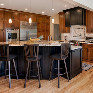
Sometimes the design solutions we come up for a homeowner extend beyond their kitchen — as was the case at the Burfeind residence. Julia Burfeind was unhappy that her home’s nearly 20-year-old kitchen was not well suited to entertain guests, which is something she’s been doing more of recently. She was also not satisfied with how the adjacent sunroom and mud/laundry rooms were laid out and being used (or in the case of the sunroom, not being used) by the family. Julia was recommended to Morris Black Designs whom she was told would be excellent at resolving all three issues.
“Our house was built in ‘98 I believe, so the kitchen was in need of a facelift but more importantly its setup was not particularly helpful for socializing,” explains Julia. “Among other things, there was a small island in the kitchen which was not suitable for accommodating guests.
“In addition, our kitchen was attached to a “sunroom” which was essentially a stepdown separate room that was attached to the kitchen but really wasn’t part of the kitchen — and so it felt like a lot of wasted space for us,” she continues. “We had our kids’ art supplies and the dog bed out there. The space was kinda useless. We didn’t like that setup particularly.”
“And then thirdly, we had a room attached to the kitchen that served as both a mudroom and a laundry room but didn’t do a good job of being either. I’ve got two active young kids that play a lot of sports. There wasn’t enough room in there for all their stuff. And not enough room to do the laundry. The problems we had with all three spaces convinced us to renovate.”
Julia met with one of our designers in her home to discuss and show first-hand the issues that were plaguing the kitchen area of the home. Initial designs were created and approved quickly. The need to address three distinct areas required a bit more planning and time to go from initial ideas to installation than typical kitchen-only projects, but when it was all finally said and done, Julia had three rooms that now meet her needs much better than they did before.
“By itself the kitchen would be fantastic,” she happily expresses. “We have a really large island now where we have four comfortable stools where people can sit and relax while others cook which is exactly what we wanted. You know the kitchen is always the central part of your home and when you entertain, which we do fairly often, people always end up in the kitchen so this big new island works great for us.”
“And now the area that was called a sunroom is incorporated with the kitchen — it was brought physically up to the same level as the kitchen which opened the two rooms up to each other as much as they can be so it’s really all one room now. We now have a dining room table out in that area and a wet bar where we have our bar stuff and our coffee makers and all of that. So those areas now work together great.”
“We completed a small addition to bump the laundry room out behind the kitchen. We then had Morris Black Designs build four big storage lockers in our mudroom for the kids’ gym bags and sports stuff. They’re not like gym lockers; they’re more like nice cabinets with wooden doors which we keep closed to hide the mess inside each — so it looks very nice in that room despite having all of my kids’ gym bags secretly piled up in there. And we have the great big, beautiful, sunny laundry room with a door and a window and a skylight and a big granite countertop where I can fold clothes.”
As much as she loves the distinct improvements made to each individual space, Burfeind will quickly tell you, however, that this project is truly an example of when the whole is greater than the sum of its parts
“The whole house is just much more usable now,” she surmises. “The work done by Morris Black Designs has really increased our daily satisfaction of being in the house which is fun and makes it all worthwhile.”
 Michael Nash Design, Build & Homes
Built in the early 1950s, this small urban townhouse is located in North Old Town Alexandria in an area currently undergoing major redevelopment. The neighborhood is popular with, and affordable for, young people and families, and very convenient to Washington, DC.
In its heyday, the townhouse touted a stately brick exterior, plaster walls, tongue and groove wood flooring and beautiful wooden staircase. Sixty years later, however, the homeowners were faced with crumbling masonry, sagging floors, a double layer of wallpaper over the plaster walls, a crumbling staircase, a dysfunctional kitchen and small, dark second floor rooms. Additionally, the basement had a low ceiling, moldy and cinder block walls, no plumbing and a large boiler taking up most of the space.
The homeowners’ goal was to restore the exterior’s historic look while creating an interior up-to-date for the 21st Century. To turn their vision into reality, they turned to Michael Nash Design, Build & Homes.
Design Solutions
To maintain the townhome’s historic exterior, the Michael Nash team carefully removed, salvaged, restored and reused existing brick masonry. Matching fascia boards and windows were combined with existing windows to complete the exterior renovation.
All interior walls were gutted and reframed. New electrical work, new insulation and new drywall were installed. Much of the home’s original trim was salvaged and reused, as was a piece of art glass, all to keep a bit of the past in the renovation.
The sagging subfloors were fixed, new hard wood floors were installed and a new staircase and railing were designed in a style similar to the original.
The solid wall between the kitchen and the dining room was removed, plumbing was relocated for a new sink location and the kitchen got expanded with an island into the dining room. Closet and plumbing stacks were relocated to allow a new space for fridge. Stainless steel appliances, granite countertops and custom cabinetry highlight the new modern kitchen.
The plan called for redesigning the three bedrooms on the second floor to allow a larger bathroom, walk-in closet and wider hallways. In addition to new roofing, a large skylight was installed to allow natural light into the bathroom and the upper hallway.
The basement was totally revamped. New plumbing was put in place for a full bathroom, laundry room and a den. New e-grass window was installed in the basement to bring this basement up to current building codes.
This homeowners love the neighborhood and now their home gives them the opportunity to stay in the same location.
 Katie Hutchison Studio
The new owners of this house in Harvard, Massachusetts loved its location and authentic Shaker characteristics, but weren’t fans of its curious layout. A dated first-floor full bathroom could only be accessed by going up a few steps to a landing, opening the bathroom door and then going down the same number of steps to enter the room. The dark kitchen faced the driveway to the north, rather than the bucolic backyard fields to the south. The dining space felt more like an enlarged hall and could only comfortably seat four. Upstairs, a den/office had a woefully low ceiling; the master bedroom had limited storage, and a sad full bathroom featured a cramped shower.
KHS proposed a number of changes to create an updated home where the owners could enjoy cooking, entertaining, and being connected to the outdoors from the first-floor living spaces, while also experiencing more inviting and more functional private spaces upstairs.
On the first floor, the primary change was to capture space that had been part of an upper-level screen porch and convert it to interior space. To make the interior expansion seamless, we raised the floor of the area that had been the upper-level porch, so it aligns with the main living level, and made sure there would be no soffits in the planes of the walls we removed. We also raised the floor of the remaining lower-level porch to reduce the number of steps required to circulate from it to the newly expanded interior. New patio door systems now fill the arched openings that used to be infilled with screen. The exterior interventions (which also included some new casement windows in the dining area) were designed to be subtle, while affording significant improvements on the interior. Additionally, the first-floor bathroom was reconfigured, shifting one of its walls to widen the dining space, and moving the entrance to the bathroom from the stair landing to the kitchen instead.
These changes (which involved significant structural interventions) resulted in a much more open space to accommodate a new kitchen with a view of the lush backyard and a new dining space defined by a new built-in banquette that comfortably seats six, and -- with the addition of a table extension -- up to eight people.
Upstairs in the den/office, replacing the low, board ceiling with a raised, plaster, tray ceiling that springs from above the original board-finish walls – newly painted a light color -- created a much more inviting, bright, and expansive space. Re-configuring the master bath to accommodate a larger shower and adding built-in storage cabinets in the master bedroom improved comfort and function. A new whole-house color palette rounds out the improvements.
Photos by Katie Hutchison
Sponsored
Columbus, OH
Structural Remodeling
Franklin County's Heavy Timber Specialists | Best of Houzz 2020!
 Saikley Architects
This house was a very small mid-century bungalow with previous additions that resulted in a large but chaotic layout. The owners wanted to convert the house to a super-efficient, and charming Craftsman-style, 6 bedroom home for their large family and work at home.
We achieved the space needs by moving a few walls for a more efficient, organized layout, setting up spaces for overlapping uses, and making a small upstairs addition. Every bit of square footage was optimized to meet the goals of the project without making the house huge or adding unnecessary cost.
Much thought was given to the entry sequence near the front door. A large flow-through mudroom with storage for each family member, and adjacent laundry, make it easy for children to be taught to keep their things organized and to contribute to household chores. A mail station and central home admin area at the mudroom help keep clutter down at other areas and minimize home management tasks. A garage door near the kitchen gives quick access to bulk items.
The existing house had too much view to the street from the living room through large corner windows, and too little entry transition, to the extent that the family did not feel comfortable using the living room much without shades drawn. We raised the window sills and brought the new windows in from the corner of the house, allowing plenty of light while protecting privacy and a sense of enclosure in the living room. We enlarged the front porch to create a more graceful transition from the public to private space. We located the front door so that the circulation from entry into the house would allow for furnishing the living room with a sitting circle that is not intruded upon by people walking through the room.
Sight lines through the living spaces were an important consideration in the design. The owners wanted discreet spaces for living room, kitchen, dining and family room, but also wanted the living spaces to feel connected and to be able to easily watch their children. Being able to see the children playing in the yard while getting things done inside the house was also important. While largely working with the existing structure, we opened walls and rearranged the use of spaces to make a series of connected living spaces with long views through them.
The character of the remodeled house is a contemporary Craftsman with classic materials and cool, consistent colors. A few arches echo through the house to frame spaces and soften the feeling of the rooms.
Photography: Kurt Manley
https://saikleyarchitects.com/portfolio/bungalow-expansion/
 Katie Hutchison Studio
The new owners of this house in Harvard, Massachusetts loved its location and authentic Shaker characteristics, but weren’t fans of its curious layout. A dated first-floor full bathroom could only be accessed by going up a few steps to a landing, opening the bathroom door and then going down the same number of steps to enter the room. The dark kitchen faced the driveway to the north, rather than the bucolic backyard fields to the south. The dining space felt more like an enlarged hall and could only comfortably seat four. Upstairs, a den/office had a woefully low ceiling; the master bedroom had limited storage, and a sad full bathroom featured a cramped shower.
KHS proposed a number of changes to create an updated home where the owners could enjoy cooking, entertaining, and being connected to the outdoors from the first-floor living spaces, while also experiencing more inviting and more functional private spaces upstairs.
On the first floor, the primary change was to capture space that had been part of an upper-level screen porch and convert it to interior space. To make the interior expansion seamless, we raised the floor of the area that had been the upper-level porch, so it aligns with the main living level, and made sure there would be no soffits in the planes of the walls we removed. We also raised the floor of the remaining lower-level porch to reduce the number of steps required to circulate from it to the newly expanded interior. New patio door systems now fill the arched openings that used to be infilled with screen. The exterior interventions (which also included some new casement windows in the dining area) were designed to be subtle, while affording significant improvements on the interior. Additionally, the first-floor bathroom was reconfigured, shifting one of its walls to widen the dining space, and moving the entrance to the bathroom from the stair landing to the kitchen instead.
These changes (which involved significant structural interventions) resulted in a much more open space to accommodate a new kitchen with a view of the lush backyard and a new dining space defined by a new built-in banquette that comfortably seats six, and -- with the addition of a table extension -- up to eight people.
Upstairs in the den/office, replacing the low, board ceiling with a raised, plaster, tray ceiling that springs from above the original board-finish walls – newly painted a light color -- created a much more inviting, bright, and expansive space. Re-configuring the master bath to accommodate a larger shower and adding built-in storage cabinets in the master bedroom improved comfort and function. A new whole-house color palette rounds out the improvements.
Photos by Katie Hutchison
 Bilotta Kitchen & Home
Kitchens with fabulous water views require a design that is central to the view. In this case, Bilotta designer, Randy O’Kane, working with Rachel Laxer of Rachel Laxer Interiors, Robert Keller of Keller Eaton Architects, and the homeowner, quickly established that the focal point would be the outside, thus there are really no wall cabinets. The cooktop and main sink are situated on the island so that they face the water with wall ovens and refrigerator/freezer behind. The lines of the Bilotta Collection cabinetry are sleek and there is little to no hardware; drawers have a channel system in place of hardware. A tall pantry area hugs the wall and disappears with only glass pulls giving it away. The natural quartzite countertops have the undulating feel of moving water. The bar area is tucked away with the same clean lined cabinetry, but with an added touch of antique mercury mirrors to help reflect the lovely views. Soft seating by way of a custom banquette and sectional makes this kitchen not just a place to eat, but a relaxing area to watch the boats go by. Contemporary painted casing trims an extra-large pocket door into a formal dining room beautifully detailed by Rachel Laxer and continues the soft color scheme with added pops of color. This is definitely a great space to entertain in or just enjoy! Additional people involved include Staci Ruiz of Staci Ruiz Lighting Consultant and Bobby Noonan of Noonan Construction. Appliances are a mix of Miele, Sub-Zero and Gaggenau; sinks are Franke and faucets by Dornbracht. Bilotta Designer Randy O’Kane with Rachel Laxer for Rachel Laxer Interiors and Robert Keller of Keller Eaton Architects. Photo Credit: Peter Krupenye
133