
Search results for "People additionally" in Home Design Ideas

 ADM Bathroom
The SW-105L is the largest of its series for modern curved half egg freestanding bathtubs. Made of durable white stone resin composite and available in a glossy or a matte finish. This tub combines elegance, durability, and convenience with its high quality construction and modern design. This curved freestanding tub will add a very modern feel to your bathroom and its depth from drain to overflow will give you plenty of space to enjoy a relaxing soaking bath. This bathtub is intended for two people.
Item#: SW-105L
Product Size (inches): 72.8 L x 32.8 W x 22 H inches
Material: Solid Surface/Stone Resin
Color / Finish: Matte White (Glossy Optional)
Product Weight: 379.1 lbs
Water Capacity: 90 Gallons
Drain to Overflow: 15.7 Inches
This bathtub comes with: A complimentary pop-up drain (Does NOT include any additional piping). All of our bathtubs come equipped with an overflow. The overflow is built integral to the body of the bathtub and leads down to the drain assembly (provided for free). There is only one rough-in waste pipe necessary to drain both the overflow and drain assembly (no visible piping). Please ensure that all of the seals are tightened properly to prevent leaks before completing installation.
If you require an easier installation for our free standing bathtubs, look into purchasing the Bathtub Rough-In Drain Kit for Free Standing Bathtubs. You can purchase this through our accessories page on our website. There is an option to purchase in Cast Iron or PVC by ADM Bathroom Design.

 Lee Kimball
Bringing a 1980’s kitchen to the 21st century
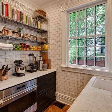
By opening up 3 smaller rooms we created a much larger, more functional and beautiful area for eating, cooking and entertaining. This family hosts large holiday gatherings with lots of aunts in the kitchen cooking and they couldn’t be happier with the function, style and additional space this new design created. Features include Ashbourne style Greenfield cabinets with Cameo paint on the perimeter, a large island 10 feet by 3.5 feet and special baking center. A Natural Cherry Island with Colonial gold granite, Subzero fridge wolf professional range top and hood, stacking convection steam oven /30 inch convection oven and a warming draw hidden behind a draw panel, along with a microwave draw. Finishing touches like a 2 x8 platinum glaze Back splash subway tile – with a herringbone mosaic behind the range and 5 inch white oak stained floor competed their kitchen.
GC: Lee Kimball Photos: Darren Pellegrino

 Katie Hutchison Studio
The new owners of this house in Harvard, Massachusetts loved its location and authentic Shaker characteristics, but weren’t fans of its curious layout. A dated first-floor full bathroom could only be accessed by going up a few steps to a landing, opening the bathroom door and then going down the same number of steps to enter the room. The dark kitchen faced the driveway to the north, rather than the bucolic backyard fields to the south. The dining space felt more like an enlarged hall and could only comfortably seat four. Upstairs, a den/office had a woefully low ceiling; the master bedroom had limited storage, and a sad full bathroom featured a cramped shower.
KHS proposed a number of changes to create an updated home where the owners could enjoy cooking, entertaining, and being connected to the outdoors from the first-floor living spaces, while also experiencing more inviting and more functional private spaces upstairs.
On the first floor, the primary change was to capture space that had been part of an upper-level screen porch and convert it to interior space. To make the interior expansion seamless, we raised the floor of the area that had been the upper-level porch, so it aligns with the main living level, and made sure there would be no soffits in the planes of the walls we removed. We also raised the floor of the remaining lower-level porch to reduce the number of steps required to circulate from it to the newly expanded interior. New patio door systems now fill the arched openings that used to be infilled with screen. The exterior interventions (which also included some new casement windows in the dining area) were designed to be subtle, while affording significant improvements on the interior. Additionally, the first-floor bathroom was reconfigured, shifting one of its walls to widen the dining space, and moving the entrance to the bathroom from the stair landing to the kitchen instead.
These changes (which involved significant structural interventions) resulted in a much more open space to accommodate a new kitchen with a view of the lush backyard and a new dining space defined by a new built-in banquette that comfortably seats six, and -- with the addition of a table extension -- up to eight people.
Upstairs in the den/office, replacing the low, board ceiling with a raised, plaster, tray ceiling that springs from above the original board-finish walls – newly painted a light color -- created a much more inviting, bright, and expansive space. Re-configuring the master bath to accommodate a larger shower and adding built-in storage cabinets in the master bedroom improved comfort and function. A new whole-house color palette rounds out the improvements.
Photos by Katie Hutchison
Find the right local pro for your project


 Cascade West Development
The Aerius - Modern Craftsman in Ridgefield Washington by Cascade West Development Inc.
Upon opening the 8ft tall door and entering the foyer an immediate display of light, color and energy is presented to us in the form of 13ft coffered ceilings, abundant natural lighting and an ornate glass chandelier. Beckoning across the hall an entrance to the Great Room is beset by the Master Suite, the Den, a central stairway to the Upper Level and a passageway to the 4-bay Garage and Guest Bedroom with attached bath. Advancement to the Great Room reveals massive, built-in vertical storage, a vast area for all manner of social interactions and a bountiful showcase of the forest scenery that allows the natural splendor of the outside in. The sleek corner-kitchen is composed with elevated countertops. These additional 4in create the perfect fit for our larger-than-life homeowner and make stooping and drooping a distant memory. The comfortable kitchen creates no spatial divide and easily transitions to the sun-drenched dining nook, complete with overhead coffered-beam ceiling. This trifecta of function, form and flow accommodates all shapes and sizes and allows any number of events to be hosted here. On the rare occasion more room is needed, the sliding glass doors can be opened allowing an out-pour of activity. Almost doubling the square-footage and extending the Great Room into the arboreous locale is sure to guarantee long nights out under the stars.
Cascade West Facebook: https://goo.gl/MCD2U1
Cascade West Website: https://goo.gl/XHm7Un
These photos, like many of ours, were taken by the good people of ExposioHDR - Portland, Or
Exposio Facebook: https://goo.gl/SpSvyo
Exposio Website: https://goo.gl/Cbm8Ya
 Katie Hutchison Studio
The new owners of this house in Harvard, Massachusetts loved its location and authentic Shaker characteristics, but weren’t fans of its curious layout. A dated first-floor full bathroom could only be accessed by going up a few steps to a landing, opening the bathroom door and then going down the same number of steps to enter the room. The dark kitchen faced the driveway to the north, rather than the bucolic backyard fields to the south. The dining space felt more like an enlarged hall and could only comfortably seat four. Upstairs, a den/office had a woefully low ceiling; the master bedroom had limited storage, and a sad full bathroom featured a cramped shower.
KHS proposed a number of changes to create an updated home where the owners could enjoy cooking, entertaining, and being connected to the outdoors from the first-floor living spaces, while also experiencing more inviting and more functional private spaces upstairs.
On the first floor, the primary change was to capture space that had been part of an upper-level screen porch and convert it to interior space. To make the interior expansion seamless, we raised the floor of the area that had been the upper-level porch, so it aligns with the main living level, and made sure there would be no soffits in the planes of the walls we removed. We also raised the floor of the remaining lower-level porch to reduce the number of steps required to circulate from it to the newly expanded interior. New patio door systems now fill the arched openings that used to be infilled with screen. The exterior interventions (which also included some new casement windows in the dining area) were designed to be subtle, while affording significant improvements on the interior. Additionally, the first-floor bathroom was reconfigured, shifting one of its walls to widen the dining space, and moving the entrance to the bathroom from the stair landing to the kitchen instead.
These changes (which involved significant structural interventions) resulted in a much more open space to accommodate a new kitchen with a view of the lush backyard and a new dining space defined by a new built-in banquette that comfortably seats six, and -- with the addition of a table extension -- up to eight people.
Upstairs in the den/office, replacing the low, board ceiling with a raised, plaster, tray ceiling that springs from above the original board-finish walls – newly painted a light color -- created a much more inviting, bright, and expansive space. Re-configuring the master bath to accommodate a larger shower and adding built-in storage cabinets in the master bedroom improved comfort and function. A new whole-house color palette rounds out the improvements.
Photos by Katie Hutchison

 Michael Nash Design, Build & Homes
Built in the early 1950s, this small urban townhouse is located in North Old Town Alexandria in an area currently undergoing major redevelopment. The neighborhood is popular with, and affordable for, young people and families, and very convenient to Washington, DC.
In its heyday, the townhouse touted a stately brick exterior, plaster walls, tongue and groove wood flooring and beautiful wooden staircase. Sixty years later, however, the homeowners were faced with crumbling masonry, sagging floors, a double layer of wallpaper over the plaster walls, a crumbling staircase, a dysfunctional kitchen and small, dark second floor rooms. Additionally, the basement had a low ceiling, moldy and cinder block walls, no plumbing and a large boiler taking up most of the space.
The homeowners’ goal was to restore the exterior’s historic look while creating an interior up-to-date for the 21st Century. To turn their vision into reality, they turned to Michael Nash Design, Build & Homes.
Design Solutions
To maintain the townhome’s historic exterior, the Michael Nash team carefully removed, salvaged, restored and reused existing brick masonry. Matching fascia boards and windows were combined with existing windows to complete the exterior renovation.
All interior walls were gutted and reframed. New electrical work, new insulation and new drywall were installed. Much of the home’s original trim was salvaged and reused, as was a piece of art glass, all to keep a bit of the past in the renovation.
The sagging subfloors were fixed, new hard wood floors were installed and a new staircase and railing were designed in a style similar to the original.
The solid wall between the kitchen and the dining room was removed, plumbing was relocated for a new sink location and the kitchen got expanded with an island into the dining room. Closet and plumbing stacks were relocated to allow a new space for fridge. Stainless steel appliances, granite countertops and custom cabinetry highlight the new modern kitchen.
The plan called for redesigning the three bedrooms on the second floor to allow a larger bathroom, walk-in closet and wider hallways. In addition to new roofing, a large skylight was installed to allow natural light into the bathroom and the upper hallway.
The basement was totally revamped. New plumbing was put in place for a full bathroom, laundry room and a den. New e-grass window was installed in the basement to bring this basement up to current building codes.
This homeowners love the neighborhood and now their home gives them the opportunity to stay in the same location.
Sponsored
Columbus, OH

Structural Remodeling
Franklin County's Heavy Timber Specialists | Best of Houzz 2020!
 Katie Hutchison Studio
The new owners of this house in Harvard, Massachusetts loved its location and authentic Shaker characteristics, but weren’t fans of its curious layout. A dated first-floor full bathroom could only be accessed by going up a few steps to a landing, opening the bathroom door and then going down the same number of steps to enter the room. The dark kitchen faced the driveway to the north, rather than the bucolic backyard fields to the south. The dining space felt more like an enlarged hall and could only comfortably seat four. Upstairs, a den/office had a woefully low ceiling; the master bedroom had limited storage, and a sad full bathroom featured a cramped shower.
KHS proposed a number of changes to create an updated home where the owners could enjoy cooking, entertaining, and being connected to the outdoors from the first-floor living spaces, while also experiencing more inviting and more functional private spaces upstairs.
On the first floor, the primary change was to capture space that had been part of an upper-level screen porch and convert it to interior space. To make the interior expansion seamless, we raised the floor of the area that had been the upper-level porch, so it aligns with the main living level, and made sure there would be no soffits in the planes of the walls we removed. We also raised the floor of the remaining lower-level porch to reduce the number of steps required to circulate from it to the newly expanded interior. New patio door systems now fill the arched openings that used to be infilled with screen. The exterior interventions (which also included some new casement windows in the dining area) were designed to be subtle, while affording significant improvements on the interior. Additionally, the first-floor bathroom was reconfigured, shifting one of its walls to widen the dining space, and moving the entrance to the bathroom from the stair landing to the kitchen instead.
These changes (which involved significant structural interventions) resulted in a much more open space to accommodate a new kitchen with a view of the lush backyard and a new dining space defined by a new built-in banquette that comfortably seats six, and -- with the addition of a table extension -- up to eight people.
Upstairs in the den/office, replacing the low, board ceiling with a raised, plaster, tray ceiling that springs from above the original board-finish walls – newly painted a light color -- created a much more inviting, bright, and expansive space. Re-configuring the master bath to accommodate a larger shower and adding built-in storage cabinets in the master bedroom improved comfort and function. A new whole-house color palette rounds out the improvements.
Photos by Katie Hutchison
 Katie Hutchison Studio
The new owners of this house in Harvard, Massachusetts loved its location and authentic Shaker characteristics, but weren’t fans of its curious layout. A dated first-floor full bathroom could only be accessed by going up a few steps to a landing, opening the bathroom door and then going down the same number of steps to enter the room. The dark kitchen faced the driveway to the north, rather than the bucolic backyard fields to the south. The dining space felt more like an enlarged hall and could only comfortably seat four. Upstairs, a den/office had a woefully low ceiling; the master bedroom had limited storage, and a sad full bathroom featured a cramped shower.
KHS proposed a number of changes to create an updated home where the owners could enjoy cooking, entertaining, and being connected to the outdoors from the first-floor living spaces, while also experiencing more inviting and more functional private spaces upstairs.
On the first floor, the primary change was to capture space that had been part of an upper-level screen porch and convert it to interior space. To make the interior expansion seamless, we raised the floor of the area that had been the upper-level porch, so it aligns with the main living level, and made sure there would be no soffits in the planes of the walls we removed. We also raised the floor of the remaining lower-level porch to reduce the number of steps required to circulate from it to the newly expanded interior. New patio door systems now fill the arched openings that used to be infilled with screen. The exterior interventions (which also included some new casement windows in the dining area) were designed to be subtle, while affording significant improvements on the interior. Additionally, the first-floor bathroom was reconfigured, shifting one of its walls to widen the dining space, and moving the entrance to the bathroom from the stair landing to the kitchen instead.
These changes (which involved significant structural interventions) resulted in a much more open space to accommodate a new kitchen with a view of the lush backyard and a new dining space defined by a new built-in banquette that comfortably seats six, and -- with the addition of a table extension -- up to eight people.
Upstairs in the den/office, replacing the low, board ceiling with a raised, plaster, tray ceiling that springs from above the original board-finish walls – newly painted a light color -- created a much more inviting, bright, and expansive space. Re-configuring the master bath to accommodate a larger shower and adding built-in storage cabinets in the master bedroom improved comfort and function. A new whole-house color palette rounds out the improvements.
Photos by Katie Hutchison
 Kitchen Design Concepts
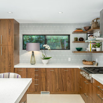
This 1950's kitchen hindered our client's cooking and bi-weekly entertaining and was inconsistent with the home's mid-century architecture. Additional key goals were to improve function for cooking and entertaining 6 to 12 people on a regular basis. Originally with only two entry points to the kitchen (from the entry/foyer and from the dining room) the kitchen wasn’t very open to the remainder of the home, or the living room at all. The door to the carport was never used and created a conflict with seating in the breakfast area. The new plans created larger openings to both rooms, and a third entry point directly into the living room. The “peninsula” manages the sight line between the kitchen and a large, brick fireplace while still creating an “island” effect in the kitchen and allowing seating on both sides. The television was also a “must have” utilizing it to watch cooking shows while prepping food, for news while getting ready for the day, and for background when entertaining.
Meticulously designed cabinets provide ample storage and ergonomically friendly appliance placement. Cabinets were previously laid out into two L-shaped spaces. On the “top” was the cooking area with a narrow pantry (read: scarce storage) and a water heater in the corner. On the “bottom” was a single 36” refrigerator/freezer, and sink. A peninsula separated the kitchen and breakfast room, truncating the entire space. We have now a clearly defined cool storage space spanning 60” width (over 150% more storage) and have separated the ovens and cooking surface to spread out prep/clean zones. True pantry storage was added, and a massive “peninsula” keeps seating for up to 6 comfortably, while still expanding the kitchen and gaining storage. The newly designed, oversized peninsula provides plentiful space for prepping and entertaining. Walnut paneling wraps the room making the kitchen a stunning showpiece.
 Katie Hutchison Studio
The new owners of this house in Harvard, Massachusetts loved its location and authentic Shaker characteristics, but weren’t fans of its curious layout. A dated first-floor full bathroom could only be accessed by going up a few steps to a landing, opening the bathroom door and then going down the same number of steps to enter the room. The dark kitchen faced the driveway to the north, rather than the bucolic backyard fields to the south. The dining space felt more like an enlarged hall and could only comfortably seat four. Upstairs, a den/office had a woefully low ceiling; the master bedroom had limited storage, and a sad full bathroom featured a cramped shower.
KHS proposed a number of changes to create an updated home where the owners could enjoy cooking, entertaining, and being connected to the outdoors from the first-floor living spaces, while also experiencing more inviting and more functional private spaces upstairs.
On the first floor, the primary change was to capture space that had been part of an upper-level screen porch and convert it to interior space. To make the interior expansion seamless, we raised the floor of the area that had been the upper-level porch, so it aligns with the main living level, and made sure there would be no soffits in the planes of the walls we removed. We also raised the floor of the remaining lower-level porch to reduce the number of steps required to circulate from it to the newly expanded interior. New patio door systems now fill the arched openings that used to be infilled with screen. The exterior interventions (which also included some new casement windows in the dining area) were designed to be subtle, while affording significant improvements on the interior. Additionally, the first-floor bathroom was reconfigured, shifting one of its walls to widen the dining space, and moving the entrance to the bathroom from the stair landing to the kitchen instead.
These changes (which involved significant structural interventions) resulted in a much more open space to accommodate a new kitchen with a view of the lush backyard and a new dining space defined by a new built-in banquette that comfortably seats six, and -- with the addition of a table extension -- up to eight people.
Upstairs in the den/office, replacing the low, board ceiling with a raised, plaster, tray ceiling that springs from above the original board-finish walls – newly painted a light color -- created a much more inviting, bright, and expansive space. Re-configuring the master bath to accommodate a larger shower and adding built-in storage cabinets in the master bedroom improved comfort and function. A new whole-house color palette rounds out the improvements.
Photos by Katie Hutchison
 Katie Hutchison Studio
The new owners of this house in Harvard, Massachusetts loved its location and authentic Shaker characteristics, but weren’t fans of its curious layout. A dated first-floor full bathroom could only be accessed by going up a few steps to a landing, opening the bathroom door and then going down the same number of steps to enter the room. The dark kitchen faced the driveway to the north, rather than the bucolic backyard fields to the south. The dining space felt more like an enlarged hall and could only comfortably seat four. Upstairs, a den/office had a woefully low ceiling; the master bedroom had limited storage, and a sad full bathroom featured a cramped shower.
KHS proposed a number of changes to create an updated home where the owners could enjoy cooking, entertaining, and being connected to the outdoors from the first-floor living spaces, while also experiencing more inviting and more functional private spaces upstairs.
On the first floor, the primary change was to capture space that had been part of an upper-level screen porch and convert it to interior space. To make the interior expansion seamless, we raised the floor of the area that had been the upper-level porch, so it aligns with the main living level, and made sure there would be no soffits in the planes of the walls we removed. We also raised the floor of the remaining lower-level porch to reduce the number of steps required to circulate from it to the newly expanded interior. New patio door systems now fill the arched openings that used to be infilled with screen. The exterior interventions (which also included some new casement windows in the dining area) were designed to be subtle, while affording significant improvements on the interior. Additionally, the first-floor bathroom was reconfigured, shifting one of its walls to widen the dining space, and moving the entrance to the bathroom from the stair landing to the kitchen instead.
These changes (which involved significant structural interventions) resulted in a much more open space to accommodate a new kitchen with a view of the lush backyard and a new dining space defined by a new built-in banquette that comfortably seats six, and -- with the addition of a table extension -- up to eight people.
Upstairs in the den/office, replacing the low, board ceiling with a raised, plaster, tray ceiling that springs from above the original board-finish walls – newly painted a light color -- created a much more inviting, bright, and expansive space. Re-configuring the master bath to accommodate a larger shower and adding built-in storage cabinets in the master bedroom improved comfort and function. A new whole-house color palette rounds out the improvements.
Photos by Katie Hutchison
 Katie Hutchison Studio
The new owners of this house in Harvard, Massachusetts loved its location and authentic Shaker characteristics, but weren’t fans of its curious layout. A dated first-floor full bathroom could only be accessed by going up a few steps to a landing, opening the bathroom door and then going down the same number of steps to enter the room. The dark kitchen faced the driveway to the north, rather than the bucolic backyard fields to the south. The dining space felt more like an enlarged hall and could only comfortably seat four. Upstairs, a den/office had a woefully low ceiling; the master bedroom had limited storage, and a sad full bathroom featured a cramped shower.
KHS proposed a number of changes to create an updated home where the owners could enjoy cooking, entertaining, and being connected to the outdoors from the first-floor living spaces, while also experiencing more inviting and more functional private spaces upstairs.
On the first floor, the primary change was to capture space that had been part of an upper-level screen porch and convert it to interior space. To make the interior expansion seamless, we raised the floor of the area that had been the upper-level porch, so it aligns with the main living level, and made sure there would be no soffits in the planes of the walls we removed. We also raised the floor of the remaining lower-level porch to reduce the number of steps required to circulate from it to the newly expanded interior. New patio door systems now fill the arched openings that used to be infilled with screen. The exterior interventions (which also included some new casement windows in the dining area) were designed to be subtle, while affording significant improvements on the interior. Additionally, the first-floor bathroom was reconfigured, shifting one of its walls to widen the dining space, and moving the entrance to the bathroom from the stair landing to the kitchen instead.
These changes (which involved significant structural interventions) resulted in a much more open space to accommodate a new kitchen with a view of the lush backyard and a new dining space defined by a new built-in banquette that comfortably seats six, and -- with the addition of a table extension -- up to eight people.
Upstairs in the den/office, replacing the low, board ceiling with a raised, plaster, tray ceiling that springs from above the original board-finish walls – newly painted a light color -- created a much more inviting, bright, and expansive space. Re-configuring the master bath to accommodate a larger shower and adding built-in storage cabinets in the master bedroom improved comfort and function. A new whole-house color palette rounds out the improvements.
Photos by Katie Hutchison
Sponsored
Columbus, OH

Hope Restoration & General Contracting
Columbus Design-Build, Kitchen & Bath Remodeling, Historic Renovations

 River Valley Landscapes
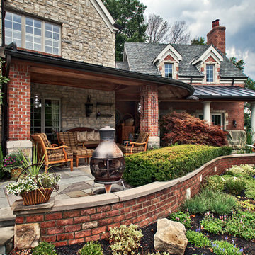
The property is one of the original farm houses located on the main street of a small town. It has been in the family for many years and our client just inherited the property. They were trying to have balance of preserving the old while realizing modern day living has its benefits too. The house had a large addition added using mostly old style materials, but designed with function and modern day luxuries. Our goal was to carry that theme to the outside.
Our first problem we had to address was how to transition between the first floor elevation changes. The lower room was the husband’s office. He stated in the future he may have clients over and it would be nice to have an area to sit outside. The wife’s main concern was to renew the four corner garden. She also felt it was very important to be able to see it from the kitchen area. Finally there was an old wishing well stuck right outside the kitchen. They both felt it would be neat to be able to incorporate this in some how. They wanted a patio area with a built in grill to accommodate there family and friends. They also wanted to keep a large play area for the kids.
We were able to pull this off successfully. We addressed the first issue by having a small lower level flagstone area. This area is large enough for 1 to 2 people to sit comfortably. It also provides a transition from his office to the larger patio area. We installed a simple small gravel sitting area opposite of the main patio. This provides our client a secluded place to relax or do business. Mrs.... told me she is amazed how much her and her husband enjoys this area. It is so peaceful looking at the small creek over a glass of wine.
We built a natural limestone retaining wall to create the patio terrace. The stone was chosen to extend the houses architectural elements into the landscape. Irregular broken flagstone was used to give it a more casual feel. We installed three Serviceberries into the patio terrace to replace some trees that were taken down during the remodeling. She was very concern that they would block the view of the four corner garden. We new they were crucial to nestle in the terrace, so we placed them for a couple days for her to decide. Fortunately she agreed they not only kept the view open, but helped frame the garden.
The four corner garden was designed to be viewed from afar and experienced up close. We wanted the space to have some formal structure while keeping with the casual farm house feel. Another natural limestone retaining wall was created. This leveled the garden terrace and helped associate it with the rest of the property. The four corner garden is nestled into the existing woods edge. This provides three distinct experiences to entering the garden; a more formal from the driveway, an open feel from the lower lawn, and a more natural / casual experience from the wooded area. The Plymouth brown gravel was used for the center of the garden. This helped highlight the stone post that was found during construction. The gravel also brings the sense of sound into the garden space. Lamb’s ear was chosen as a fun way to get kids interest in horticulture.
The balance of using the new to create the old feel is what makes this project a success. The property has already hosted a local historical society event and won an award for its preservation efforts. When Mrs.... can’t find her husband, she knows he is either reading the newspaper by the grill or resting in the hammock along the wood’s path.

 InnovationLand
3D Rendering/Drawing
A two-level pergola, circular firepit area and outdoor kitchen with a charcoal-gas combo grill star in this Houston patio addition designed for entertaining large crowds in style.
"The client was an attorney with a passion for cooking and entertaining," says the project's principal designer, Lisha Maxey of LGH Designs. "Her main objective with this space was to create a large area for 10 to 20 guests, including seating and the prep and cooking of meals."
Located in the backyard of the client's home in Spring, TX, this beautiful outdoor living and entertaining space includes a 28-by-12-foot patio with Fantastico silver travertine tile flooring, arranged in a Versailles pattern. The walkway is Oklahoma wister flagstone.
Providing filtered shade for the patio is a two-level pergola of treated pine stained honey gold. The larger, higher tier is about 18 by 10 feet; the smaller, lower tier is about 10 feet square.
"We covered the entire pergola with Lexan - a high-quality, clear acrylic sheet that provides protection from the sun, heat and rain," says Outdoor Homescapes of Houston owner Wayne Franks.
Beneath the lower tier of the pergola sits an L-shaped, 12-by-9-foot outdoor kitchen island faced with Carmel Country ledgestone. The island houses a Fire Magic® combination charcoal-gas grill and lowered power burner, a Pacific Living countertop pizza oven and a stainless steel RCS trash drawer and sink. The countertops and raised bar are Fantastico silver travertine (18-square-inch tiles) and the backsplash is real quartz.
"The most unique design item of this kitchen area is the hexagon/circular table we added to the end of the long bar," says Lisha. This enabled the client to add seating for her dining guests."
Under the higher, larger tier of the pergola is a seating area, made up of a coffee table and espresso-colored rattan sofa and club chairs with spring-green-and-white cushions.
"Lighting also plays an important role in this space, since the client often entertains in the evening," says Wayne. Enter the chandelier over the patio seating arrangement and - over the outdoor kitchen - pendant lamps and an industrial-modern ceiling fan with a light fixture in the center. "It's important to layer your lighting for ambiance, security and safety - from an all-over ambient light that fills the space to under-the-counter task lighting for food prep and cooking to path and retaining wall lighting."
Off the patio is a transition area of crushed granite and floating flagstone pavers, leading to a circular firepit area of stamped concrete.
At the center of this circle is the standalone firepit, framed at the back by a curved stone bench. The walls of the bench and column bases for the pergola, by the way, are the same ledgestone as the kitchen island. The top slab on the bench is a hearth piece of manmade stone.
"I think the finish materials blend with the home really well," says Wayne. "We met her objectives of being able to entertain with 10 to 12 to 20 people at one time and being able to cook with charcoal and gas separately in one unit. And of course, the project was on time, on budget."
"It is truly a paradise," says the client in her Houzz review of the project. "They listened to my vision and incorporated their expertise to create an outdoor living space just perfect for me and my family!"
 Drury Design
The existing kitchen wasn’t cutting it anymore. The homeowners designed and built this home about 20 years ago, but since then, their taste and needs changed. The outdated finishes felt outdated. There weren’t enough work areas. Some counterspace stations were just awkward due to the layout. Adjoining spaces around the kitchen were also in need of an update, but it was decided that the kitchen would undergo a transformation first.
Design Objectives
-Rework the overall layout (kitchen, laundry and butler’s pantry) to have a better flow and utilize the space better
-Incorporate materials with wow and pizzazz to reflect the homeowner’s style
-Design large work areas for cooking with two or more people at a time
-Provide seating at an island in addition to table seating
-Update surrounding spaces since the kitchen is open to the rest of the home
Design Challenges:
-Include a vast array of cooking appliances while having enough of cabinet storage
-Adjacent rooms need to feel updated and flow with new Kitchen
-Having multiple focal points with different materials but not have the space feel like a hodge podge
-Provide different task, accent and overall lighting to brighten up space
Design Solutions:
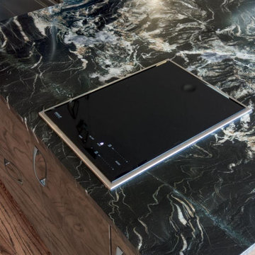
-The homeowner loves to cook and wanted to maximize her abilities. We incorporated a 48” rangetop with a griddle, a single oven, steam oven, microwave drawer and 15” induction cooktop next to a 48” Galley Ideal Workstation with two faucets. In order to have room for all of these appliances, the floor plan needed to accommodate more cabinetry. Both dining room entrances were closed off and the laundry room entrance were moved to the opposite end of the wall to allow two long walls for additional cabinets.
-The existing round columns throughout the first floor were outdated. To keep the architectural element of the columns, we wrapped the new columns to have a square shape with a flat panel on all four sides. Then, we painted them black (to tie in with the kitchen tops and curved hood surround) and added simple crown molding. For the flow of the space, closing up the odd corner that connected the laundry and dining room and relocating both room entrances allowed the space to actually feel larger and more continuous. --Adding the same square columns to the main dining room entrance, by the front door, also tied in the front of the house with the kitchen.
-The homeowner loves unique and bold materials. The main focal point of the kitchen is definitely the custom metal hood that incorporates two finishes and is set on a Lumix quartzite full-high back and side splashes. To make this area even more pronounced, a hearth-like drywall arch encloses the space. Once your eye moves off the hood, you start to notice the mirrored refrigerator panels, high gloss island cabinets, mirrored metal backsplash tile, delicate pendant island lights and the stunning island countertop material! There is a good mix of materials that make every space shine. The blacks, golds and pewter finishes help tie everything together.
-Lighting in a large kitchen is important. This space, besides getting a lot of natural light, needed lots of additional lighting due to the dark finishes. For overall lighting we have plenty of can lights in addition to lighting at the tops of the wall cabinets (that shine on the ceiling), undercabinet task lighting to make the tops sparkle and provide abundant lighting while prepping, pendant accent lighting over the island and a fandolier to add a little sparkle over the pub table. Voila!
 Simply Home Decorating
This beautiful North Vancouver home belongs to a nature-loving and health-conscious couple, Emma and Vince (names changed), their two young children, and their dog, Jasper. When they contacted us about renovating and furnishing their kitchen and family room, we walked in and saw a world of potential waiting to be uncovered.
Before: Larkhall Crescent Home:
Like many original North Vancouver homes, the interior was definitely dated. We encountered late ‘80s finishes in powder pink and teal green, old carpet, and a kitchen that wasn’t maximized to suit this family’s modern-day lifestyle. However, the size of the rooms offered us a ton of space with which to get creative.
Knowing our clients’ love of cooking, need for work spaces (Emma and Vince both work remotely), and growing family, we developed a design concept that would increase usable space, optimize storage, and create intimacy in this large area. As for the style, we were inspired by their European roots, inventing a new and modern take on “Belgian Farmhouse” style. Now, the home is truly one-of-a-kind.
After: Warm & Cozy Family Room:
Fresh, bright, and comfortable, this living area has been transformed! We started with the fireplace as a focal point, selecting aged brick tiles for added texture and a crisp wood mantle. The taupe-coloured sectional infuses the room with visual warmth and serves the added purpose of separating the family room from the kitchen.
Emma and Vince were also keen on using non-toxic materials in their home, and we were happy to oblige. To meet their needs, we sourced natural wood elements and sought out Canadian-made products - that adhere to high health standards - whenever possible.
Look closer at the elements of this space, and you will find this stunning, honeycomb-patterned rug in earthy gold, beige, and charcoal tones. It’s plush to the touch and full of visual texture that brings this room’s colour palette together. We sourced these two-tone chairs with caning, petrified wood side table, black sconces, and botanical prints in greyscale from local artist, Heather Johnston.
We topped off the space with this dark wood and rattan console that offers storage facing the kitchen and presents an opportunity to display cherished items. The result is a cozy lounging space brimming with comfort and functionality. It’s perfect for enjoying quality family time, or Emma can simply slide the coffee table away to make room for her morning yoga practice.
Now, let’s turn around and give some attention to the kitchen. Do you remember what the original kitchen looked like? If not, scroll back up, because the transformation is shocking…
Moody & Welcoming Kitchen for Healthy Living:
This kitchen looks very different from how it started, right? Though we didn’t touch any walls, the kitchen has almost doubled in usable space! We created a long, extended island with storage, an outlet for small appliances, and seating for comfortable prep, after-school snacking, or mingling among friends.
On the other side of the island, the family has even more storage and an integrated dishwasher within easy reach of the sink, perfect for quick clean-up. From this angle, you can also see the expansive custom Shaker cabinetry in white and the integrated double ovens. These facilitate their cooking experience and gave us the opportunity to add an additional surprise…
A coffee garage station and more hidden storage! Keeping these items located along the perimeter allows them to be accessed by the family or their guests without someone getting under the cook’s feet. These are the little details that make everyday life easier and more enjoyable.
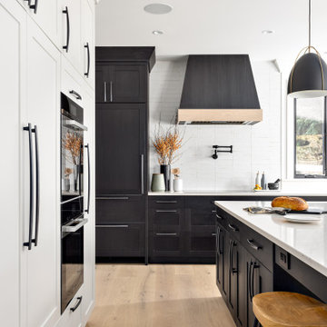
Moving deeper into the kitchen, the seamless induction cooktop topped with a freestanding concealed hood fan commands attention in a soft yet prominent way. The natural wood accent mirrors the fireplace mantle, and the choice of off-black wood-grain cabinets not only continues our black-and-white colour palette but adds a sense of depth and contrast. The corner sink is located to the right and perfectly positioned with a view of their thriving backyard.
To invite more of this family’s character into the space, we mixed metals for interest — matte black, dark pewter, and warm brass — and created open shelves in white oak for their plants and decor. You can also glimpse the tumbled edge of the backsplash tile, which echoes the rustic brick of the fireplace. It adds that farmhouse charm while still feeling timeless and sophisticated.
Last but not least, we designed this dining banquette in the bay window (with integrated bench storage, of course), where the family can share a meal together, the kids can do homework, or Emma and Vince can work and enjoy a change of scenery from their offices. Like the other spaces in the home, it was designed to be beautiful, multi-functional, and long-lasting.
Praise from Our Clients:
It is clear that we love this home, but what did our clients have to say?
“Lori is a visionary and masters execution to the finest detail all at the same time. When she first met us to know more about who we are and how we live, she could right away envision how we could use the space in our kitchen and living room…The results exceeded our expectations.
Lori and her team were also a delight to work with — coordination with all the trades, fast problem-solving, regular updates, professional and friendly attitude of her entire team — made it the dream team. Thank you SHD for making our space so beautiful!”
In turn, we are so grateful for this family’s trust, their open communication, and for being wonderful people with whom to work. (So, thank you!)

 Katie Hutchison Studio
The new owners of this house in Harvard, Massachusetts loved its location and authentic Shaker characteristics, but weren’t fans of its curious layout. A dated first-floor full bathroom could only be accessed by going up a few steps to a landing, opening the bathroom door and then going down the same number of steps to enter the room. The dark kitchen faced the driveway to the north, rather than the bucolic backyard fields to the south. The dining space felt more like an enlarged hall and could only comfortably seat four. Upstairs, a den/office had a woefully low ceiling; the master bedroom had limited storage, and a sad full bathroom featured a cramped shower.
KHS proposed a number of changes to create an updated home where the owners could enjoy cooking, entertaining, and being connected to the outdoors from the first-floor living spaces, while also experiencing more inviting and more functional private spaces upstairs.
On the first floor, the primary change was to capture space that had been part of an upper-level screen porch and convert it to interior space. To make the interior expansion seamless, we raised the floor of the area that had been the upper-level porch, so it aligns with the main living level, and made sure there would be no soffits in the planes of the walls we removed. We also raised the floor of the remaining lower-level porch to reduce the number of steps required to circulate from it to the newly expanded interior. New patio door systems now fill the arched openings that used to be infilled with screen. The exterior interventions (which also included some new casement windows in the dining area) were designed to be subtle, while affording significant improvements on the interior. Additionally, the first-floor bathroom was reconfigured, shifting one of its walls to widen the dining space, and moving the entrance to the bathroom from the stair landing to the kitchen instead.
These changes (which involved significant structural interventions) resulted in a much more open space to accommodate a new kitchen with a view of the lush backyard and a new dining space defined by a new built-in banquette that comfortably seats six, and -- with the addition of a table extension -- up to eight people.
Upstairs in the den/office, replacing the low, board ceiling with a raised, plaster, tray ceiling that springs from above the original board-finish walls – newly painted a light color -- created a much more inviting, bright, and expansive space. Re-configuring the master bath to accommodate a larger shower and adding built-in storage cabinets in the master bedroom improved comfort and function. A new whole-house color palette rounds out the improvements.
Photos by Katie Hutchison

 Saikley Architects
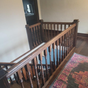
This beautiful 1881 Alameda Victorian cottage, wonderfully embodying the Transitional Gothic-Eastlake era, had most of its original features intact. Our clients, one of whom is a painter, wanted to preserve the beauty of the historic home while modernizing its flow and function.
From several small rooms, we created a bright, open artist’s studio. We dug out the basement for a large workshop, extending a new run of stair in keeping with the existing original staircase. While keeping the bones of the house intact, we combined small spaces into large rooms, closed off doorways that were in awkward places, removed unused chimneys, changed the circulation through the house for ease and good sightlines, and made new high doorways that work gracefully with the eleven foot high ceilings. We removed inconsistent picture railings to give wall space for the clients’ art collection and to enhance the height of the rooms. From a poorly laid out kitchen and adjunct utility rooms, we made a large kitchen and family room with nine-foot-high glass doors to a new large deck. A tall wood screen at one end of the deck, fire pit, and seating give the sense of an outdoor room, overlooking the owners’ intensively planted garden. A previous mismatched addition at the side of the house was removed and a cozy outdoor living space made where morning light is received. The original house was segmented into small spaces; the new open design lends itself to the clients’ lifestyle of entertaining groups of people, working from home, and enjoying indoor-outdoor living.
Photography by Kurt Manley.
https://saikleyarchitects.com/portfolio/artists-victorian/

 Closet Factory
Mudrooms are practical entryway spaces that serve as a buffer between the outdoors and the main living areas of a home. Typically located near the front or back door, mudrooms are designed to keep the mess of the outside world at bay.
These spaces often feature built-in storage for coats, shoes, and accessories, helping to maintain a tidy and organized home. Durable flooring materials, such as tile or easy-to-clean surfaces, are common in mudrooms to withstand dirt and moisture.
Additionally, mudrooms may include benches or cubbies for convenient seating and storage of bags or backpacks. With hooks for hanging outerwear and perhaps a small sink for quick cleanups, mudrooms efficiently balance functionality with the demands of an active household, providing an essential transitional space in the home.
134