
Search results for "People additionally" in Home Design Ideas

 Katie Hutchison Studio
The new owners of this house in Harvard, Massachusetts loved its location and authentic Shaker characteristics, but weren’t fans of its curious layout. A dated first-floor full bathroom could only be accessed by going up a few steps to a landing, opening the bathroom door and then going down the same number of steps to enter the room. The dark kitchen faced the driveway to the north, rather than the bucolic backyard fields to the south. The dining space felt more like an enlarged hall and could only comfortably seat four. Upstairs, a den/office had a woefully low ceiling; the master bedroom had limited storage, and a sad full bathroom featured a cramped shower.
KHS proposed a number of changes to create an updated home where the owners could enjoy cooking, entertaining, and being connected to the outdoors from the first-floor living spaces, while also experiencing more inviting and more functional private spaces upstairs.
On the first floor, the primary change was to capture space that had been part of an upper-level screen porch and convert it to interior space. To make the interior expansion seamless, we raised the floor of the area that had been the upper-level porch, so it aligns with the main living level, and made sure there would be no soffits in the planes of the walls we removed. We also raised the floor of the remaining lower-level porch to reduce the number of steps required to circulate from it to the newly expanded interior. New patio door systems now fill the arched openings that used to be infilled with screen. The exterior interventions (which also included some new casement windows in the dining area) were designed to be subtle, while affording significant improvements on the interior. Additionally, the first-floor bathroom was reconfigured, shifting one of its walls to widen the dining space, and moving the entrance to the bathroom from the stair landing to the kitchen instead.
These changes (which involved significant structural interventions) resulted in a much more open space to accommodate a new kitchen with a view of the lush backyard and a new dining space defined by a new built-in banquette that comfortably seats six, and -- with the addition of a table extension -- up to eight people.
Upstairs in the den/office, replacing the low, board ceiling with a raised, plaster, tray ceiling that springs from above the original board-finish walls – newly painted a light color -- created a much more inviting, bright, and expansive space. Re-configuring the master bath to accommodate a larger shower and adding built-in storage cabinets in the master bedroom improved comfort and function. A new whole-house color palette rounds out the improvements.
Photos by Katie Hutchison
 Drury Design
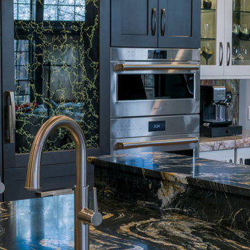
The existing kitchen wasn’t cutting it anymore. The homeowners designed and built this home about 20 years ago, but since then, their taste and needs changed. The outdated finishes felt outdated. There weren’t enough work areas. Some counterspace stations were just awkward due to the layout. Adjoining spaces around the kitchen were also in need of an update, but it was decided that the kitchen would undergo a transformation first.
Design Objectives
-Rework the overall layout (kitchen, laundry and butler’s pantry) to have a better flow and utilize the space better
-Incorporate materials with wow and pizzazz to reflect the homeowner’s style
-Design large work areas for cooking with two or more people at a time
-Provide seating at an island in addition to table seating
-Update surrounding spaces since the kitchen is open to the rest of the home
Design Challenges:
-Include a vast array of cooking appliances while having enough of cabinet storage
-Adjacent rooms need to feel updated and flow with new Kitchen
-Having multiple focal points with different materials but not have the space feel like a hodge podge
-Provide different task, accent and overall lighting to brighten up space
Design Solutions:
-The homeowner loves to cook and wanted to maximize her abilities. We incorporated a 48” rangetop with a griddle, a single oven, steam oven, microwave drawer and 15” induction cooktop next to a 48” Galley Ideal Workstation with two faucets. In order to have room for all of these appliances, the floor plan needed to accommodate more cabinetry. Both dining room entrances were closed off and the laundry room entrance were moved to the opposite end of the wall to allow two long walls for additional cabinets.
-The existing round columns throughout the first floor were outdated. To keep the architectural element of the columns, we wrapped the new columns to have a square shape with a flat panel on all four sides. Then, we painted them black (to tie in with the kitchen tops and curved hood surround) and added simple crown molding. For the flow of the space, closing up the odd corner that connected the laundry and dining room and relocating both room entrances allowed the space to actually feel larger and more continuous. --Adding the same square columns to the main dining room entrance, by the front door, also tied in the front of the house with the kitchen.
-The homeowner loves unique and bold materials. The main focal point of the kitchen is definitely the custom metal hood that incorporates two finishes and is set on a Lumix quartzite full-high back and side splashes. To make this area even more pronounced, a hearth-like drywall arch encloses the space. Once your eye moves off the hood, you start to notice the mirrored refrigerator panels, high gloss island cabinets, mirrored metal backsplash tile, delicate pendant island lights and the stunning island countertop material! There is a good mix of materials that make every space shine. The blacks, golds and pewter finishes help tie everything together.
-Lighting in a large kitchen is important. This space, besides getting a lot of natural light, needed lots of additional lighting due to the dark finishes. For overall lighting we have plenty of can lights in addition to lighting at the tops of the wall cabinets (that shine on the ceiling), undercabinet task lighting to make the tops sparkle and provide abundant lighting while prepping, pendant accent lighting over the island and a fandolier to add a little sparkle over the pub table. Voila!

 PHILLIPJEFFERSONDESIGN LLC
This North Raleigh kitchen renovation was a full redesign of an existing kitchen space. The kitchen needed a more functional layout. It wanted a new look that would capture the lifestyle of the family and provide a more efficient space for cooking, entertaining and as the heart of the house, serve as a space that could be used throughout the day. The exterior shell remained unchanged, however, new windows and full lite glass doors were inserted. The full kitchen space was demolitioned, which allowed for a new kitchen layout to be explored. Cabinets flank the north and south walls. New full height storage cabinets with built-in oven and microwave were placed on the south wall and an appliance nook bookends the north wall. The existing range is relocated on the north wall surrounded by new casement windows and ceramic tile to allow for more uniform natural reflective light to enter the space. A large casement window opens as a pass thru for the existing deck on the south.
A new island became the feature of this space, with a stainless-steel farm sink inserted, this new island is placed along the east/west axis to allow for open efficient movement through the space. The island is designed to accommodate meals and entertaining. It will comfortably seat seven people with additional space to meet the needs of upwards of ten seated. A coffered ceiling connects both the ceiling to the details of the grid tile pattern throughout the space and centralizes the island as a focal point. This space is a design that accommodates friends and family. It brightens the space and allows the kitchen to feel more open and engulfed in natural light.
Photography by Sterling E. Stevens Design Photo
Find the right local pro for your project

 Legendary Escapes Pools
Nautical-themed hybrid swimming pool with raised spa, sunshelf, slide, grotto, and pizza oven
(September 2013) – Ask the Pool Guy and his team at Legendary Escapes recently unveiled the newest Legendary Escape, a stunning nautical-themed hybrid swimming pool. The hand-carved concrete waterfall, rock slide, and grotto are the focal point of this incredible project, and designer and builder Al Curtis has truly outdone himself this time. Behind the waterfall sits a grotto that seats 8-10 people comfortably. The waterfall, slide, and grotto area come complete with intricate details and additions that perfectly play into the project’s theme. An immense amount of creativity, talent, and skill is required to take ordinary materials like vinyl and concrete and turn them into the outstanding backyards that Curtis creates, but these details allow his creativity to shine in a different light. Curtis immerses himself completely in just one or two projects at a time, which allows him the opportunity to add those intricate details that take his extraordinary projects to the next level. Some of the details in the grotto area of this hybrid project include real ship portholes that open and close, as well as carvings and lanterns to add visual interest inside of the grotto.
The project also includes a raised spillover spa and a sunshelf with a bubbling water feature. The sunshelf has steps leading into the main body of the pool, giving swimmers an easy entry point if they don’t feel the urge to jump off the top of the waterfall or take a ride down the hand-carved, hand-tiled slide. The shelf has just enough water to allow shallow wading or lounging, and the pebbled finish provides a perfect place to set a lounge chair without worrying about damaging the vinyl liner. With the spa nearby, this whole end of the pool is perfect for relaxing, talking, or watching the kids while they swim.
This incredible hybrid swimming pool also includes a poolside pizza oven, so fresh, stone-fired pizza is never far away. The brick oven can cook a pizza in about 90 seconds, and produces authentic, outstanding pizzas. The homeowners have spent years perfecting their pizza crust and sauce recipes, as well as growing their own tomatoes and basil. The pizza oven adds another element of their own personality, and makes this project even more perfect for them. With a built-in countertop, it’s easy to get a couple of pies going at one time, or to prep ingredients for personal pizzas.
The homeowners are very family-oriented and love to have friends and family over to their home. During the construction process, the Legendary Escapes crew met several friends and family members who stopped in for some quality time and to check out the progress of the pool. The finished product is a perfect place for entertaining, and it feels very comfortable and welcoming. With the sunshelf, spa, grotto, poolside seating, and the pool itself, there are plenty of different places to sit or soak and have conversations or splash around.
Curtis is incredibly proud of this project, and he has high hopes for it. He was recently named a Master of Design by Pool & Spa News for a hybrid swimming pool he built in Brighton, MI. This new, nautical hybrid pool fits in beautifully with his portfolio, but also stands out as extraordinary. The team at Legendary Escapes anticipates positive feedback and recognition for this project, and looks forward to building more swimming pools that push the envelope and wow clients and fans.
 Drury Design
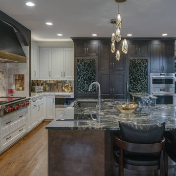
The existing kitchen wasn’t cutting it anymore. The homeowners designed and built this home about 20 years ago, but since then, their taste and needs changed. The outdated finishes felt outdated. There weren’t enough work areas. Some counterspace stations were just awkward due to the layout. Adjoining spaces around the kitchen were also in need of an update, but it was decided that the kitchen would undergo a transformation first.
Design Objectives
-Rework the overall layout (kitchen, laundry and butler’s pantry) to have a better flow and utilize the space better
-Incorporate materials with wow and pizzazz to reflect the homeowner’s style
-Design large work areas for cooking with two or more people at a time
-Provide seating at an island in addition to table seating
-Update surrounding spaces since the kitchen is open to the rest of the home
Design Challenges:
-Include a vast array of cooking appliances while having enough of cabinet storage
-Adjacent rooms need to feel updated and flow with new Kitchen
-Having multiple focal points with different materials but not have the space feel like a hodge podge
-Provide different task, accent and overall lighting to brighten up space
Design Solutions:
-The homeowner loves to cook and wanted to maximize her abilities. We incorporated a 48” rangetop with a griddle, a single oven, steam oven, microwave drawer and 15” induction cooktop next to a 48” Galley Ideal Workstation with two faucets. In order to have room for all of these appliances, the floor plan needed to accommodate more cabinetry. Both dining room entrances were closed off and the laundry room entrance were moved to the opposite end of the wall to allow two long walls for additional cabinets.
-The existing round columns throughout the first floor were outdated. To keep the architectural element of the columns, we wrapped the new columns to have a square shape with a flat panel on all four sides. Then, we painted them black (to tie in with the kitchen tops and curved hood surround) and added simple crown molding. For the flow of the space, closing up the odd corner that connected the laundry and dining room and relocating both room entrances allowed the space to actually feel larger and more continuous. --Adding the same square columns to the main dining room entrance, by the front door, also tied in the front of the house with the kitchen.
-The homeowner loves unique and bold materials. The main focal point of the kitchen is definitely the custom metal hood that incorporates two finishes and is set on a Lumix quartzite full-high back and side splashes. To make this area even more pronounced, a hearth-like drywall arch encloses the space. Once your eye moves off the hood, you start to notice the mirrored refrigerator panels, high gloss island cabinets, mirrored metal backsplash tile, delicate pendant island lights and the stunning island countertop material! There is a good mix of materials that make every space shine. The blacks, golds and pewter finishes help tie everything together.
-Lighting in a large kitchen is important. This space, besides getting a lot of natural light, needed lots of additional lighting due to the dark finishes. For overall lighting we have plenty of can lights in addition to lighting at the tops of the wall cabinets (that shine on the ceiling), undercabinet task lighting to make the tops sparkle and provide abundant lighting while prepping, pendant accent lighting over the island and a fandolier to add a little sparkle over the pub table. Voila!
 Kitchen Design Concepts
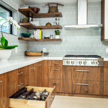
This 1950's kitchen hindered our client's cooking and bi-weekly entertaining and was inconsistent with the home's mid-century architecture. Additional key goals were to improve function for cooking and entertaining 6 to 12 people on a regular basis. Originally with only two entry points to the kitchen (from the entry/foyer and from the dining room) the kitchen wasn’t very open to the remainder of the home, or the living room at all. The door to the carport was never used and created a conflict with seating in the breakfast area. The new plans created larger openings to both rooms, and a third entry point directly into the living room. The “peninsula” manages the sight line between the kitchen and a large, brick fireplace while still creating an “island” effect in the kitchen and allowing seating on both sides. The television was also a “must have” utilizing it to watch cooking shows while prepping food, for news while getting ready for the day, and for background when entertaining.
Meticulously designed cabinets provide ample storage and ergonomically friendly appliance placement. Cabinets were previously laid out into two L-shaped spaces. On the “top” was the cooking area with a narrow pantry (read: scarce storage) and a water heater in the corner. On the “bottom” was a single 36” refrigerator/freezer, and sink. A peninsula separated the kitchen and breakfast room, truncating the entire space. We have now a clearly defined cool storage space spanning 60” width (over 150% more storage) and have separated the ovens and cooking surface to spread out prep/clean zones. True pantry storage was added, and a massive “peninsula” keeps seating for up to 6 comfortably, while still expanding the kitchen and gaining storage. The newly designed, oversized peninsula provides plentiful space for prepping and entertaining. Walnut paneling wraps the room making the kitchen a stunning showpiece.
 Kitchen Design Concepts
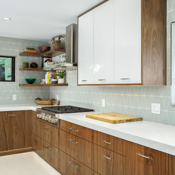
This 1950's kitchen hindered our client's cooking and bi-weekly entertaining and was inconsistent with the home's mid-century architecture. Additional key goals were to improve function for cooking and entertaining 6 to 12 people on a regular basis. Originally with only two entry points to the kitchen (from the entry/foyer and from the dining room) the kitchen wasn’t very open to the remainder of the home, or the living room at all. The door to the carport was never used and created a conflict with seating in the breakfast area. The new plans created larger openings to both rooms, and a third entry point directly into the living room. The “peninsula” manages the sight line between the kitchen and a large, brick fireplace while still creating an “island” effect in the kitchen and allowing seating on both sides. The television was also a “must have” utilizing it to watch cooking shows while prepping food, for news while getting ready for the day, and for background when entertaining.
Meticulously designed cabinets provide ample storage and ergonomically friendly appliance placement. Cabinets were previously laid out into two L-shaped spaces. On the “top” was the cooking area with a narrow pantry (read: scarce storage) and a water heater in the corner. On the “bottom” was a single 36” refrigerator/freezer, and sink. A peninsula separated the kitchen and breakfast room, truncating the entire space. We have now a clearly defined cool storage space spanning 60” width (over 150% more storage) and have separated the ovens and cooking surface to spread out prep/clean zones. True pantry storage was added, and a massive “peninsula” keeps seating for up to 6 comfortably, while still expanding the kitchen and gaining storage. The newly designed, oversized peninsula provides plentiful space for prepping and entertaining. Walnut paneling wraps the room making the kitchen a stunning showpiece.
Sponsored
Columbus, OH

Structural Remodeling
Franklin County's Heavy Timber Specialists | Best of Houzz 2020!

 River Valley Landscapes
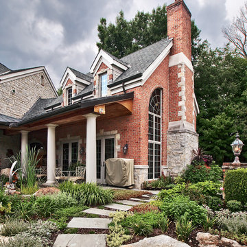
The property is one of the original farm houses located on the main street of a small town. It has been in the family for many years and our client just inherited the property. They were trying to have balance of preserving the old while realizing modern day living has its benefits too. The house had a large addition added using mostly old style materials, but designed with function and modern day luxuries. Our goal was to carry that theme to the outside.
Our first problem we had to address was how to transition between the first floor elevation changes. The lower room was the husband’s office. He stated in the future he may have clients over and it would be nice to have an area to sit outside. The wife’s main concern was to renew the four corner garden. She also felt it was very important to be able to see it from the kitchen area. Finally there was an old wishing well stuck right outside the kitchen. They both felt it would be neat to be able to incorporate this in some how. They wanted a patio area with a built in grill to accommodate there family and friends. They also wanted to keep a large play area for the kids.
We were able to pull this off successfully. We addressed the first issue by having a small lower level flagstone area. This area is large enough for 1 to 2 people to sit comfortably. It also provides a transition from his office to the larger patio area. We installed a simple small gravel sitting area opposite of the main patio. This provides our client a secluded place to relax or do business. Mrs.... told me she is amazed how much her and her husband enjoys this area. It is so peaceful looking at the small creek over a glass of wine.
We built a natural limestone retaining wall to create the patio terrace. The stone was chosen to extend the houses architectural elements into the landscape. Irregular broken flagstone was used to give it a more casual feel. We installed three Serviceberries into the patio terrace to replace some trees that were taken down during the remodeling. She was very concern that they would block the view of the four corner garden. We new they were crucial to nestle in the terrace, so we placed them for a couple days for her to decide. Fortunately she agreed they not only kept the view open, but helped frame the garden.
The four corner garden was designed to be viewed from afar and experienced up close. We wanted the space to have some formal structure while keeping with the casual farm house feel. Another natural limestone retaining wall was created. This leveled the garden terrace and helped associate it with the rest of the property. The four corner garden is nestled into the existing woods edge. This provides three distinct experiences to entering the garden; a more formal from the driveway, an open feel from the lower lawn, and a more natural / casual experience from the wooded area. The Plymouth brown gravel was used for the center of the garden. This helped highlight the stone post that was found during construction. The gravel also brings the sense of sound into the garden space. Lamb’s ear was chosen as a fun way to get kids interest in horticulture.
The balance of using the new to create the old feel is what makes this project a success. The property has already hosted a local historical society event and won an award for its preservation efforts. When Mrs.... can’t find her husband, she knows he is either reading the newspaper by the grill or resting in the hammock along the wood’s path.
 Design Studio West
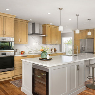
A new island layout encourages gathering with room for four. In addition to an outlet on one side of the island, a pop-up outlet at the other end allows for the utilization of small kitchen appliances and casual usage of laptops and personal devices.
 Drury Design
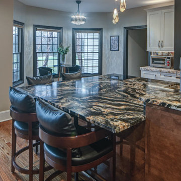
The existing kitchen wasn’t cutting it anymore. The homeowners designed and built this home about 20 years ago, but since then, their taste and needs changed. The outdated finishes felt outdated. There weren’t enough work areas. Some counterspace stations were just awkward due to the layout. Adjoining spaces around the kitchen were also in need of an update, but it was decided that the kitchen would undergo a transformation first.
Design Objectives
-Rework the overall layout (kitchen, laundry and butler’s pantry) to have a better flow and utilize the space better
-Incorporate materials with wow and pizzazz to reflect the homeowner’s style
-Design large work areas for cooking with two or more people at a time
-Provide seating at an island in addition to table seating
-Update surrounding spaces since the kitchen is open to the rest of the home
Design Challenges:
-Include a vast array of cooking appliances while having enough of cabinet storage
-Adjacent rooms need to feel updated and flow with new Kitchen
-Having multiple focal points with different materials but not have the space feel like a hodge podge
-Provide different task, accent and overall lighting to brighten up space
Design Solutions:
-The homeowner loves to cook and wanted to maximize her abilities. We incorporated a 48” rangetop with a griddle, a single oven, steam oven, microwave drawer and 15” induction cooktop next to a 48” Galley Ideal Workstation with two faucets. In order to have room for all of these appliances, the floor plan needed to accommodate more cabinetry. Both dining room entrances were closed off and the laundry room entrance were moved to the opposite end of the wall to allow two long walls for additional cabinets.
-The existing round columns throughout the first floor were outdated. To keep the architectural element of the columns, we wrapped the new columns to have a square shape with a flat panel on all four sides. Then, we painted them black (to tie in with the kitchen tops and curved hood surround) and added simple crown molding. For the flow of the space, closing up the odd corner that connected the laundry and dining room and relocating both room entrances allowed the space to actually feel larger and more continuous. --Adding the same square columns to the main dining room entrance, by the front door, also tied in the front of the house with the kitchen.
-The homeowner loves unique and bold materials. The main focal point of the kitchen is definitely the custom metal hood that incorporates two finishes and is set on a Lumix quartzite full-high back and side splashes. To make this area even more pronounced, a hearth-like drywall arch encloses the space. Once your eye moves off the hood, you start to notice the mirrored refrigerator panels, high gloss island cabinets, mirrored metal backsplash tile, delicate pendant island lights and the stunning island countertop material! There is a good mix of materials that make every space shine. The blacks, golds and pewter finishes help tie everything together.
-Lighting in a large kitchen is important. This space, besides getting a lot of natural light, needed lots of additional lighting due to the dark finishes. For overall lighting we have plenty of can lights in addition to lighting at the tops of the wall cabinets (that shine on the ceiling), undercabinet task lighting to make the tops sparkle and provide abundant lighting while prepping, pendant accent lighting over the island and a fandolier to add a little sparkle over the pub table. Voila!
 Drury Design
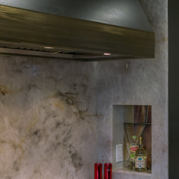
The existing kitchen wasn’t cutting it anymore. The homeowners designed and built this home about 20 years ago, but since then, their taste and needs changed. The outdated finishes felt outdated. There weren’t enough work areas. Some counterspace stations were just awkward due to the layout. Adjoining spaces around the kitchen were also in need of an update, but it was decided that the kitchen would undergo a transformation first.
Design Objectives
-Rework the overall layout (kitchen, laundry and butler’s pantry) to have a better flow and utilize the space better
-Incorporate materials with wow and pizzazz to reflect the homeowner’s style
-Design large work areas for cooking with two or more people at a time
-Provide seating at an island in addition to table seating
-Update surrounding spaces since the kitchen is open to the rest of the home
Design Challenges:
-Include a vast array of cooking appliances while having enough of cabinet storage
-Adjacent rooms need to feel updated and flow with new Kitchen
-Having multiple focal points with different materials but not have the space feel like a hodge podge
-Provide different task, accent and overall lighting to brighten up space
Design Solutions:
-The homeowner loves to cook and wanted to maximize her abilities. We incorporated a 48” rangetop with a griddle, a single oven, steam oven, microwave drawer and 15” induction cooktop next to a 48” Galley Ideal Workstation with two faucets. In order to have room for all of these appliances, the floor plan needed to accommodate more cabinetry. Both dining room entrances were closed off and the laundry room entrance were moved to the opposite end of the wall to allow two long walls for additional cabinets.
-The existing round columns throughout the first floor were outdated. To keep the architectural element of the columns, we wrapped the new columns to have a square shape with a flat panel on all four sides. Then, we painted them black (to tie in with the kitchen tops and curved hood surround) and added simple crown molding. For the flow of the space, closing up the odd corner that connected the laundry and dining room and relocating both room entrances allowed the space to actually feel larger and more continuous. --Adding the same square columns to the main dining room entrance, by the front door, also tied in the front of the house with the kitchen.
-The homeowner loves unique and bold materials. The main focal point of the kitchen is definitely the custom metal hood that incorporates two finishes and is set on a Lumix quartzite full-high back and side splashes. To make this area even more pronounced, a hearth-like drywall arch encloses the space. Once your eye moves off the hood, you start to notice the mirrored refrigerator panels, high gloss island cabinets, mirrored metal backsplash tile, delicate pendant island lights and the stunning island countertop material! There is a good mix of materials that make every space shine. The blacks, golds and pewter finishes help tie everything together.
-Lighting in a large kitchen is important. This space, besides getting a lot of natural light, needed lots of additional lighting due to the dark finishes. For overall lighting we have plenty of can lights in addition to lighting at the tops of the wall cabinets (that shine on the ceiling), undercabinet task lighting to make the tops sparkle and provide abundant lighting while prepping, pendant accent lighting over the island and a fandolier to add a little sparkle over the pub table. Voila!

 Ernest M. Ferizi
German Embassy in Pristina - Kosovo, contracted the architecture office “Ferizi + Ferizi Architects” to plan and implement an Annex Office building for their purposes. As detached part of this building is designed the waiting area, as alone standing structure.
This Office Building is constructed by assembling of Eight used office containers that were delivered on trucks and set up after only a few hours on the basis of the LEGO principle, according to the planning on strip foundations.
By removing the flexible exterior wall panels, a large room of 115 m² was created, with the counter wall as a room partition between two office spaces, each with seven workstations as well as three counters for agents on one side and a room for visitors on the other side.
With this system, room solutions can be easily implemented in all dimensions.
The container, seen as a geometric shape, is a simple, octagonal, solid box.
The standardized perfection of its dimensions is striking: 2.44 meters wide, 2.59 meters high and 6.06 meters or 12.19 meters long.
Since its introduction in 1956 by the American transport entrepreneur Malcom McLean, the container has become a standardized transport module worldwide, whether on ships, trucks or construction sites.
The shipping containers have additionally revolutionized the transport industry, pushed the globalization noticeably, and thus directly or indirectly influenced all our lives.
But after only a few years, when the first overseas containers wore out, many engineers recognized the positive properties of used shipping containers for building houses, especially since they are robust, flexible, multifunctional and second-hand relatively inexpensive to purchase. The time has long passed by to treat containers exclusively as transport objects.
As a "measure of all things", containers can hardly be ignored in construction.
Their use is no longer limited to temporary use since school containers, information containers, office containers or entire residential buildings are now part of our everyday life in the construction industry.
However, current examples of the container architecture prove that even the most demanding solutions for container building are feasible. For their specific aesthetic and spatial qualities, containers also serve as design parameters for the development of new forms of architecture and urbanity.
The office building as an extension of the visa section, characterized by modern materials and contemporary aesthetics has been designed and built mainly as a low-energy building.
Extensive insulation to achieve a comfortable and sustainable constant temperature in the interior, high window quality and low energy consumption make the building energy-efficient.
The sophisticated lighting technology, networks, heating systems and air-conditioning systems are also components of this equipment.
It creates an overall harmonic picture and guarantees the highest standard in sustainable construction, taking into consideration the fact that environmentally friendly recycling and reutilization have become an increasingly important issue in our society.
West and East side of the wooden facade is compact and has few openings, while the southern facade is completely open with lot of glass. Its spatial openness ensures a transparent, friendly work environment, which allows a lot of light into the space.
This openness allows an uninterrupted, pleasant and close-to-nature view from interior spaces into the beautiful garden. During the installation of sophisticated light sources in the garden, emphasis was not only put on functionality and security, but also on the beauty of the garden shown through the illumination in the evening.
Large, horizontal white “brisole” serve as external sun protection systems, mounted on the canopies of the entrance areas of the modular construction and the enclosure, adeptly cast shade on these areas and at the same time shape the entire architectural language.
While on one hand, the two quadratic ledges suspended in the air, are docked with steel stairs and match the wooden façade, lead the staff to their office space, the artful modern interior, on the other hand, perfectly unites the functionality, innovative technology, culture and positive effects on the employees' efficiency and wellbeing.
A lot of white, interjected by warm wooden and colored accents, determines the ambience.
In the case of the lighting solution, the mainly linear ceiling lighting is used as the overlapping design element both for the offices of the visa section as well as for the counters and the waiting area for the visitors.
They underline the puristic design in order to create a pleasant light for a desired general illumination and ensure optimal light conditions without causing disturbing reflections on the computer screens.
In addition, precisely positioned pendant luminaires are installed at the workstations, which ensure pleasant room brightness.
In the entrance area, the harmonic and uniform lighting effect from the ground highlights the integration of photography and architecture.
Photographs of landscapes, people, places, expressing unforgettable, impressive moments and memories have been lovingly engraved on 8 x 8cm square oak blocks.
The idea of an effective, impressive environment that stimulates and inspires the work was the premiss on which the whole design concept was based. Consequently, the modular construction was no longer viewed through its history of utilization and scars, but rather as a structure of work ambiance, art and elegance.
FERIZI + FERIZI Architects
Photo: Arben Llapashtica

 Missouri Botanical Garden
Courtesy Missouri Botanical Garden PlantFinder
Wild type of Hydrangea arborescens. Note the flowers are smaller and essentially all of them are fertile, there may be one a few of the large sterile florets in this image.
Sponsored
Columbus, OH
Structural Remodeling
Franklin County's Heavy Timber Specialists | Best of Houzz 2020!
 Drury Design
The existing kitchen wasn’t cutting it anymore. The homeowners designed and built this home about 20 years ago, but since then, their taste and needs changed. The outdated finishes felt outdated. There weren’t enough work areas. Some counterspace stations were just awkward due to the layout. Adjoining spaces around the kitchen were also in need of an update, but it was decided that the kitchen would undergo a transformation first.
Design Objectives
-Rework the overall layout (kitchen, laundry and butler’s pantry) to have a better flow and utilize the space better
-Incorporate materials with wow and pizzazz to reflect the homeowner’s style
-Design large work areas for cooking with two or more people at a time
-Provide seating at an island in addition to table seating
-Update surrounding spaces since the kitchen is open to the rest of the home
Design Challenges:
-Include a vast array of cooking appliances while having enough of cabinet storage
-Adjacent rooms need to feel updated and flow with new Kitchen
-Having multiple focal points with different materials but not have the space feel like a hodge podge
-Provide different task, accent and overall lighting to brighten up space
Design Solutions:
-The homeowner loves to cook and wanted to maximize her abilities. We incorporated a 48” rangetop with a griddle, a single oven, steam oven, microwave drawer and 15” induction cooktop next to a 48” Galley Ideal Workstation with two faucets. In order to have room for all of these appliances, the floor plan needed to accommodate more cabinetry. Both dining room entrances were closed off and the laundry room entrance were moved to the opposite end of the wall to allow two long walls for additional cabinets.
-The existing round columns throughout the first floor were outdated. To keep the architectural element of the columns, we wrapped the new columns to have a square shape with a flat panel on all four sides. Then, we painted them black (to tie in with the kitchen tops and curved hood surround) and added simple crown molding. For the flow of the space, closing up the odd corner that connected the laundry and dining room and relocating both room entrances allowed the space to actually feel larger and more continuous. --Adding the same square columns to the main dining room entrance, by the front door, also tied in the front of the house with the kitchen.
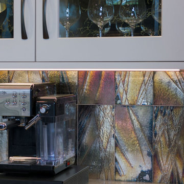
-The homeowner loves unique and bold materials. The main focal point of the kitchen is definitely the custom metal hood that incorporates two finishes and is set on a Lumix quartzite full-high back and side splashes. To make this area even more pronounced, a hearth-like drywall arch encloses the space. Once your eye moves off the hood, you start to notice the mirrored refrigerator panels, high gloss island cabinets, mirrored metal backsplash tile, delicate pendant island lights and the stunning island countertop material! There is a good mix of materials that make every space shine. The blacks, golds and pewter finishes help tie everything together.
-Lighting in a large kitchen is important. This space, besides getting a lot of natural light, needed lots of additional lighting due to the dark finishes. For overall lighting we have plenty of can lights in addition to lighting at the tops of the wall cabinets (that shine on the ceiling), undercabinet task lighting to make the tops sparkle and provide abundant lighting while prepping, pendant accent lighting over the island and a fandolier to add a little sparkle over the pub table. Voila!
 PHILLIPJEFFERSONDESIGN LLC
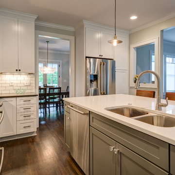
This North Raleigh kitchen renovation was a full redesign of an existing kitchen space. The kitchen needed a more functional layout. It wanted a new look that would capture the lifestyle of the family and provide a more efficient space for cooking, entertaining and as the heart of the house, serve as a space that could be used throughout the day. The exterior shell remained unchanged, however, new windows and full lite glass doors were inserted. The full kitchen space was demolitioned, which allowed for a new kitchen layout to be explored. Cabinets flank the north and south walls. New full height storage cabinets with built-in oven and microwave were placed on the south wall and an appliance nook bookends the north wall. The existing range is relocated on the north wall surrounded by new casement windows and ceramic tile to allow for more uniform natural reflective light to enter the space. A large casement window opens as a pass thru for the existing deck on the south.
A new island became the feature of this space, with a stainless-steel farm sink inserted, this new island is placed along the east/west axis to allow for open efficient movement through the space. The island is designed to accommodate meals and entertaining. It will comfortably seat seven people with additional space to meet the needs of upwards of ten seated. A coffered ceiling connects both the ceiling to the details of the grid tile pattern throughout the space and centralizes the island as a focal point. This space is a design that accommodates friends and family. It brightens the space and allows the kitchen to feel more open and engulfed in natural light.
Photography by Sterling E. Stevens Design Photo

 Michael Lewis Architects PC
The interior staircase opens up a large double height space that is flooded with natural light front he skylight above. The contemporary design is emphasized here through the clean lines of the stairs and railing, reinforced by the minimal artwork.

 Cascade West Development
The Aerius - Modern Craftsman in Ridgefield Washington by Cascade West Development Inc.
Upon opening the 8ft tall door and entering the foyer an immediate display of light, color and energy is presented to us in the form of 13ft coffered ceilings, abundant natural lighting and an ornate glass chandelier. Beckoning across the hall an entrance to the Great Room is beset by the Master Suite, the Den, a central stairway to the Upper Level and a passageway to the 4-bay Garage and Guest Bedroom with attached bath. Advancement to the Great Room reveals massive, built-in vertical storage, a vast area for all manner of social interactions and a bountiful showcase of the forest scenery that allows the natural splendor of the outside in. The sleek corner-kitchen is composed with elevated countertops. These additional 4in create the perfect fit for our larger-than-life homeowner and make stooping and drooping a distant memory. The comfortable kitchen creates no spatial divide and easily transitions to the sun-drenched dining nook, complete with overhead coffered-beam ceiling. This trifecta of function, form and flow accommodates all shapes and sizes and allows any number of events to be hosted here. On the rare occasion more room is needed, the sliding glass doors can be opened allowing an out-pour of activity. Almost doubling the square-footage and extending the Great Room into the arboreous locale is sure to guarantee long nights out under the stars.
Cascade West Facebook: https://goo.gl/MCD2U1
Cascade West Website: https://goo.gl/XHm7Un
These photos, like many of ours, were taken by the good people of ExposioHDR - Portland, Or
Exposio Facebook: https://goo.gl/SpSvyo
Exposio Website: https://goo.gl/Cbm8Ya
Sponsored
Columbus, OH

Hope Restoration & General Contracting
Columbus Design-Build, Kitchen & Bath Remodeling, Historic Renovations

 Renovisions
These Hanover, MA clients came to Renovisions as they wanted a local design-build company to rework and expand their small and outdated 1980’s colonial kitchen.
We collaborated and created an expanded 12’x15’ addition space to accommodate a newly designed kitchen which is now 21’x15’. Before we began with the construction process, proper structural engineering presented a challenge as the property was built on ledge. As expected, we determined that several concrete supports were necessary and needed to be built to support the expanded structure.
Our plan included both creative aesthetic and functional layout modifications to transform this ordinary kitchen into a spacious, well-lit, highly functional, stylish and welcoming space to cook, gather and entertain. The bump-out allowed for more functional cabinetry and a dining table which before was placed in a corner of the previous cramped kitchen. Now, there is a wide open space from the adjacent living room and a clear path to a 5’ French door opening to the pool deck. The homeowners also elected for us to extend a new roof over their existing deck creating a nice shaded space to entertain guests.
The island, which serves as the central gathering spot. is eye catching with contrasting dark cocoa colored cabinets and stunning natural looking Cambria quartz countertops. Large, easily accessible deep drawers provide much needed storage for pots, pans and lids as well as expansive countertop space for everyday prep and family get-togethers.
Overall, the clients were thrilled with their Renovision and cannot wait to throw a party to show off their stunning kitchen.
“There is not a single choice we aren’t happy with; it is so us! I love all of the storage and I have a feeling we are going to do a lot of entertaining this summer.”
“Dear Cathy and Ed, We are abundantly grateful for the entire Renovisions Team that have provided us with a beautiful kitchen and porch to enjoy. We will continue to make family memories for many years to come with this new addition. From the first time we met with you at the showroom, we were confident that high quality workmanship would go into our new construction. Mike, Brad, and Tom were very trustworthy and worked very hard every day they were on the job site. They were very flexible and always put the homeowners safety first. They even offered a bit of comic relief! Every night the site was cleaned meticulously, never leaving tools or sharp edges of any sort in the open space. We were also very pleased with the help offered when designing and choosing cabinets, tile and other finishes. Liz was always very helpful and patient to answer questions when we came by the showroom. We are extremely pleased with all the choices and on a daily basis we enjoy the warmth and amazing space it provides.
We recently hosted a retirement party for 70 people and it never felt crowed! We relax under the covered porch in the morning for coffee, the afternoon for lunch and to watch the grandkids in the pool. And of course in the evening while we read or catch up on emails. It is an amazing space! Thank you all again, for your hard work and passion for your craftsmanship. We will be in touch soon to set up a date for you all to drop by to see the finishing touches and to enjoy refreshments.”
- Paul & Beth H. (Hanover)

 Advance Design Studio, Ltd.
See "5-Year Kitchen in Elgin" for the kitchen featured in this description.
Bud Kane has remodeled nearly every room in his own home over many years. Now reaching his 70’s, he contemplated heading up a major kitchen and laundry room renovation himself, planning on doing the carpentry work with his own hands. “I was not convinced I would ever meet anyone who could do it as well as I could do it myself”, said Bud. Ruth and Bud spent 5 years visiting kitchen firms and interviewing designers. They couldn’t however bring themselves to pull the trigger on the project, until they met Advance Design Studio in 2015.
“No one understood what I wanted”, said Ruth. She was continually frustrated by experiences with designers who weren’t hearing what was important to her. “Everyone kept designing my kitchen with what they thought it should look like; I couldn’t find anyone who would listen to me”!
When they met designer Scott Christensen from Advance Design Studio, they liked him right away. He listened to Ruth and designed a kitchen that she loved, all the while interjecting years of wisdom and design expertise that Ruth appreciated. “The finished product is better than I expected”, says Ruth. “I respected Scott’s opinions and together we created the perfect place for me to bake with my grandkids and truly enjoy the kitchen and laundry room I’ve been dreaming of for many years!”
The kitchen transformation began with removing the home’s soffits, and extending new painted maple cabinetry to the ceiling with the addition of an elegant crown molding. Ruth’s new Vita Mix holds a coveted place on her counter, and adjustments were planned to size the cabinets in conjunction with the under cabinet decorative light molding to fit this appliance just right. “This one small detail was really important to me”, says Ruth smiling. An elegant new island replaced the original island, complete with room for 3 stools where her grandchildren will sit to make home-made pasta every Thanksgiving, and cookies at Christmas time. “Traditions are very important in my family, and making my kitchen work to suit cherished activities with my family was the number one reason this renovation was so desired”, replied Ruth when asked about the island.
A picture perfect new tea station replaced a cluttered unused desk area, creating a wonderful place to prepare hot drinks for sipping any season of the year while overlooking the couple’s wonderfully manicured gardens from the lovely 3 season’s room just off the kitchen. The soft sage island bead panel detail was repeated on the backsplash, replicating the feel of a fine old piece of furniture.
The biggest problem with the laundry room was 3 doors, one from the garage, one from the closet, and one to the hallway. “Scott designed a pocket door, and oh what a dream it is now to bring groceries in from the garage!” exclaims Bud who grew to disdain this task! Doing laundry is now a breeze in this attractive new space that doubles as a wonderful pantry for the kitchen with room to store food items that didn’t have a home in the poorly designed original space.
New Hickory distressed wood flooring was laid both in the kitchen and leading to the hall foyer. Soft gray wood-replicating porcelain was placed in the laundry area, making for an easily cleanable surface for what doubles as a mud room from the garage. Creamy tumbled marble graces an unobtrusive backsplash spilling onto shiny granite counter tops in a rich earthy pattern of fall colors that mimic colors throughout the home. Advance is known details that included custom crafted furniture toe kicks, luxurious crown moldings, and beaded under cabinet moldings. The kitchen is complete with a glass display cabinet showing Ruth’s treasured china tea collection.
Early on, it was initially only their intention of purchasing cabinets for the new design. They were so impressed however with Advance Design’s complete program for budgeting, design, installation and management that it became clear to them both that they wanted Advance to handle the entire project from start to finish. “After seeing the quality work they did, coupled with the in-house team completely dedicated to our satisfaction, it became apparent there was no other choice but to hire them to handle everything. And we’re so glad we did, we have not one regret”, says Bud.
“The attention to detail by the carpentry crew more than satisfied my perfectionist expectations of the finished carpentry,” exclaimed Bud. “Every one of Advance Design’s people we encountered from design through construction was wonderful. We’ve never met a group of people so dedicated to making sure we were happy with every single detail, and every single part of this experience”, said Ruth and Bud.
Designer: Scott Christensen
Photographer: Joe Nowak
 Drury Design
The existing kitchen wasn’t cutting it anymore. The homeowners designed and built this home about 20 years ago, but since then, their taste and needs changed. The outdated finishes felt outdated. There weren’t enough work areas. Some counterspace stations were just awkward due to the layout. Adjoining spaces around the kitchen were also in need of an update, but it was decided that the kitchen would undergo a transformation first.
Design Objectives
-Rework the overall layout (kitchen, laundry and butler’s pantry) to have a better flow and utilize the space better
-Incorporate materials with wow and pizzazz to reflect the homeowner’s style
-Design large work areas for cooking with two or more people at a time
-Provide seating at an island in addition to table seating
-Update surrounding spaces since the kitchen is open to the rest of the home
Design Challenges:
-Include a vast array of cooking appliances while having enough of cabinet storage
-Adjacent rooms need to feel updated and flow with new Kitchen
-Having multiple focal points with different materials but not have the space feel like a hodge podge
-Provide different task, accent and overall lighting to brighten up space
Design Solutions:
-The homeowner loves to cook and wanted to maximize her abilities. We incorporated a 48” rangetop with a griddle, a single oven, steam oven, microwave drawer and 15” induction cooktop next to a 48” Galley Ideal Workstation with two faucets. In order to have room for all of these appliances, the floor plan needed to accommodate more cabinetry. Both dining room entrances were closed off and the laundry room entrance were moved to the opposite end of the wall to allow two long walls for additional cabinets.
-The existing round columns throughout the first floor were outdated. To keep the architectural element of the columns, we wrapped the new columns to have a square shape with a flat panel on all four sides. Then, we painted them black (to tie in with the kitchen tops and curved hood surround) and added simple crown molding. For the flow of the space, closing up the odd corner that connected the laundry and dining room and relocating both room entrances allowed the space to actually feel larger and more continuous. --Adding the same square columns to the main dining room entrance, by the front door, also tied in the front of the house with the kitchen.
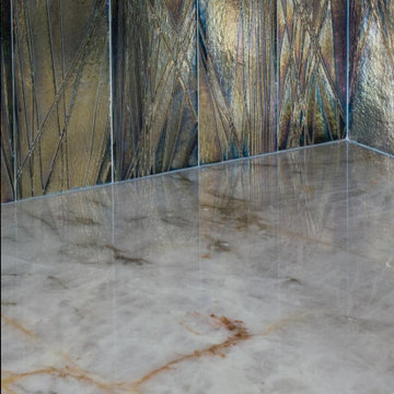
-The homeowner loves unique and bold materials. The main focal point of the kitchen is definitely the custom metal hood that incorporates two finishes and is set on a Lumix quartzite full-high back and side splashes. To make this area even more pronounced, a hearth-like drywall arch encloses the space. Once your eye moves off the hood, you start to notice the mirrored refrigerator panels, high gloss island cabinets, mirrored metal backsplash tile, delicate pendant island lights and the stunning island countertop material! There is a good mix of materials that make every space shine. The blacks, golds and pewter finishes help tie everything together.
-Lighting in a large kitchen is important. This space, besides getting a lot of natural light, needed lots of additional lighting due to the dark finishes. For overall lighting we have plenty of can lights in addition to lighting at the tops of the wall cabinets (that shine on the ceiling), undercabinet task lighting to make the tops sparkle and provide abundant lighting while prepping, pendant accent lighting over the island and a fandolier to add a little sparkle over the pub table. Voila!
136