
Search results for "Perception" in Home Design Ideas
 Etheredge Design Associates, Inc.
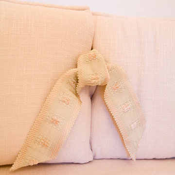
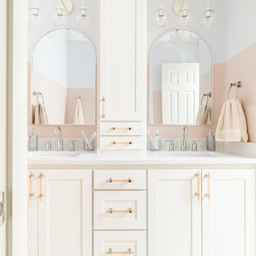
Converting a home office into a nursery for a growing family presented some interesting challenges because of the spatial limitations. Originally, the space housed an enclosed side porch in this small 1940's post war cottage style home. During the planning stage, the decision was made that the design elements of the nursery would be consistent with those previously used in the refurbished home…a soft, sophisticated mix of traditional furnishings accented with contemporary styled pieces and elements set within a monochromatic color scheme. Knowing that the expected child was a girl enabled the exploration of a full range of feminine options. To maximize style, unify the space, and preserve the impression of childlike innocence a decision was reached to use minimalist colors. Winter Morning coats the walls with just a hint of pink as seen in the sky at sunrise. Texture is introduced in a blush linen; its hue was chosen to increase spatial perception within this compact nursery. The same linen covers the crib bumper pads and upholsters the small scale glider. Blush is repeated in the chenille braid on the bumper pads, the pleat closures for the tailored striped silk crib skirt and, again, on the trim of the stripped silk drapery panels which are hung to the ceiling adding visual height and providing yards of gentle softness to the area. Antique botanicals from the owner's childhood provide femininity and a connection to the past. Mounted from the ceiling is a small glazed chandelier with clear crystal and rose quartz pendants perfectly suited for the little charmer who will occupy this room. The space may be small in size, but it is large in style, functionality, and filled with love.
 Etheredge Design Associates, Inc.
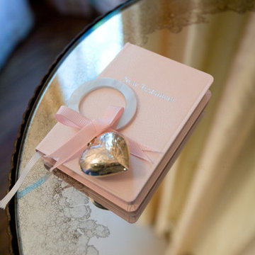
Converting a home office into a nursery for a growing family presented some interesting challenges because of the spatial limitations. Originally, the space housed an enclosed side porch in this small 1940's post war cottage style home. During the planning stage, the decision was made that the design elements of the nursery would be consistent with those previously used in the refurbished home…a soft, sophisticated mix of traditional furnishings accented with contemporary styled pieces and elements set within a monochromatic color scheme. Knowing that the expected child was a girl enabled the exploration of a full range of feminine options. To maximize style, unify the space, and preserve the impression of childlike innocence a decision was reached to use minimalist colors. Winter Morning coats the walls with just a hint of pink as seen in the sky at sunrise. Texture is introduced in a blush linen; its hue was chosen to increase spatial perception within this compact nursery. The same linen covers the crib bumper pads and upholsters the small scale glider. Blush is repeated in the chenille braid on the bumper pads, the pleat closures for the tailored striped silk crib skirt and, again, on the trim of the stripped silk drapery panels which are hung to the ceiling adding visual height and providing yards of gentle softness to the area. Antique botanicals from the owner's childhood provide femininity and a connection to the past. Mounted from the ceiling is a small glazed chandelier with clear crystal and rose quartz pendants perfectly suited for the little charmer who will occupy this room. The space may be small in size, but it is large in style, functionality, and filled with love.
 Etheredge Design Associates, Inc.
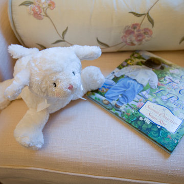
Converting a home office into a nursery for a growing family presented some interesting challenges because of the spatial limitations. Originally, the space housed an enclosed side porch in this small 1940's post war cottage style home. During the planning stage, the decision was made that the design elements of the nursery would be consistent with those previously used in the refurbished home…a soft, sophisticated mix of traditional furnishings accented with contemporary styled pieces and elements set within a monochromatic color scheme. Knowing that the expected child was a girl enabled the exploration of a full range of feminine options. To maximize style, unify the space, and preserve the impression of childlike innocence a decision was reached to use minimalist colors. Winter Morning coats the walls with just a hint of pink as seen in the sky at sunrise. Texture is introduced in a blush linen; its hue was chosen to increase spatial perception within this compact nursery. The same linen covers the crib bumper pads and upholsters the small scale glider. Blush is repeated in the chenille braid on the bumper pads, the pleat closures for the tailored striped silk crib skirt and, again, on the trim of the stripped silk drapery panels which are hung to the ceiling adding visual height and providing yards of gentle softness to the area. Antique botanicals from the owner's childhood provide femininity and a connection to the past. Mounted from the ceiling is a small glazed chandelier with clear crystal and rose quartz pendants perfectly suited for the little charmer who will occupy this room. The space may be small in size, but it is large in style, functionality, and filled with love.
Find the right local pro for your project
 MHM LIVING
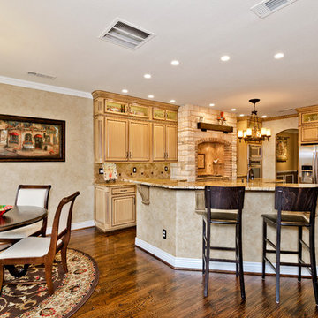
Our client's goal for this project was a more functional kitchen for cooking with the family as well as an open space for entertaining friends and family. They further had a very specific vision for an old world feel while trying to be budget and environmentally conscious.
Upper cabinets with glass fronts add visual interest, provide useful storage and create the perception of a higher ceiling. We crafted the arched stonework around the cook-top that created a focal point and disguises the built in vent hood.
The finishing on the cabinets was customized to match the antique furniture the client had.
Looking across the kitchen, the dated fireplace needed an update to match an Old World feel. We accomplished this by installing stonework similar to that around the cook-top area. We also added crown molding in the living room to flow with the kitchen, all while remaining budget conscious.
This was also a very environmentally conscious project superbly fitting the client's request and matching our company’s values:
• 75% of the cabinets are original or resized from original cabinets.
• The center island remained and had cabinets refinished and a new countertop installed.
• All lighting including task lights, under cabinet lights and recessed lights are LED.
• All Energy Star appliances.
• Brick and stonework around cook-top is from salvaged brick and stone.
• Cedar beam above the arch is salvaged from a past project and stained to fit the kitchen’s decor.
• Existing wood floors were refinished and hand scraped to give a more Old World look.
With this project we were particularly pleased to work within the constraints of budget, environmentally conscious requirements, and building a beautiful Old Word kitchen that perfectly match our client's desires.

 The Cabinet Store + Culina Design
Brian Schultz
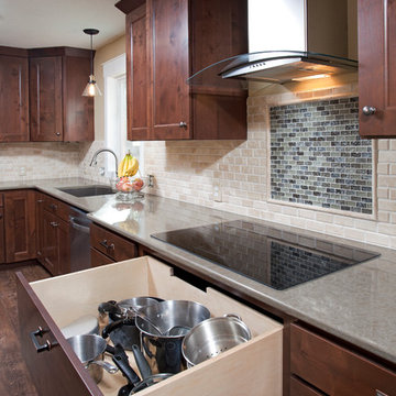
Inspiration for a rustic kitchen remodel in Minneapolis
Inspiration for a rustic kitchen remodel in Minneapolis
 Spark Architecture & Interiors
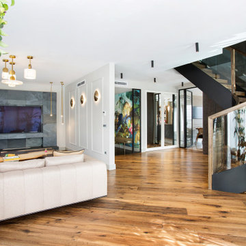
Located in Florya, Istanbul, Ihlamur Apartment House has a total living area of 280 square meters consisting of kitchen, living room, bathroom, bedroom, children’s room and youth room.
The harmony of wood and black is dominant in its kitchen. By applying separate lighting to the food preparation and eating areas, both adequate lighting is provided and the kitchen appears to be separated according to its purpose. In addition, the use of pendant lighting made both the ceiling higher and the environment feel spacious. Instead of a dark color, light marble tiles are used on the floor. Color balance is achieved in the kitchen with tiles that match the marble-patterned matte black color used in the under-counter cabinets.
Thanks to the glass doors, the spaces are made to feel wider and more spacious than they are. In addition, this feeling is supported by the mirror in the hallway. Dark wood and matt black color dominate the staircase, which is desired to form a whole with the design of the house.
As in almost the whole house, pendant lightings are preferred in the living room. The bookcase, consisting of circular shaped matte black shelves in the living room, gave an aesthetic appearance to the environment. In addition, the mirror passing through the middle of the circular form not only supports the aesthetic image, but also appeals to the perception of width, making the room feel wider. The design of the living room was completed with the television unit designed in gray tones and simply.
A richer design has been made in the bathroom. A simple yet elegant bathroom design has been achieved by utilizing the harmony of black and gold.
A surface-mounted rail fixture is used in the youth room. Thus, the need for light is met. An L-shaped desk is placed in the corner and a work area is created. In this way, space was saved and an environment suitable for other activities and activities that could be done in the room was provided.
Blue tones and lighter colors are preferred in the children’s room. The wall was evaluated in two parts and boring was avoided.
In the bedroom, it is more minimalistic compared to other areas. The perfect harmony of white and wood was used.
 Brooks + Scarpa Architects
Description: In early 1994, the architects began work on the project and while in construction (demolition, grading and foundations) the owner, due to circumstances beyond his control, halted all construction of the project. Seven years later the owner returned to the architects and asked them to complete the partially constructed house. Due to code changes, city ordinances and a wide variety of obstacles it was determined that the house was unable to be completed as originally designed.
After much consideration the client asked the architect if it were possible to alter/remodel the partially constructed house, which was a remodel/addition to a 1970’s ranch style house, into a project that fit into current zoning and structural codes. The owner also requested that the house’s footprint and partially constructed foundations remain to avoid the need for further entitlements and delays on an already long overdue and difficult hillside site.
The architects’ main challenge was how to alter the design that reflected an outdated philosophical approach to architecture that was nearly a decade old. How could the house be re-conceived reflecting the architect and client’s maturity on a ten-year-old footprint?
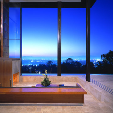
The answer was to remove almost all of the previously proposed existing interior walls and transform the existing footprint into a pavilion-like structure that allows the site to in a sense “pass through the house”. This allowed the client to take better advantage of a limited and restricted building area while capturing extraordinary panoramic views of the San Fernando Valley and Hollywood Hills. Large 22-foot high custom sliding glass doors allow the interior and exterior to become one. Even the studio is separated from the house and connected only by an exterior bridge. Private spaces are treated as loft-like spaces capturing volume and views while maintaining privacy.
Limestone floors extend from inside to outside and into the lap pool that runs the entire length of the house creating a horizon line at the edge of the view. Other natural materials such as board formed concrete, copper, steel and cherry provides softness to the objects that seem to float within the interior volume. By placing objects and materials "outside the frame," a new frame of reference deepens our sense of perception. Art does not reproduce what we see; rather it makes us see.
 WALLAUER'S DESIGN CENTER
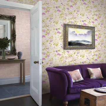
Soft water color floral prints that incorporate unusual color palettes can be seen through the collection. If you’re looking to introduce new color in your home, these designs will change the look and feel of any bathroom, bedroom, dining room, or hall. All Seabrook collections can be seen at any 9 of the Wallauer Design Center locations.
Inquiries email kims@wallauer.com
 Brooks + Scarpa Architects
Description: In early 1994, the architects began work on the project and while in construction (demolition, grading and foundations) the owner, due to circumstances beyond his control, halted all construction of the project. Seven years later the owner returned to the architects and asked them to complete the partially constructed house. Due to code changes, city ordinances and a wide variety of obstacles it was determined that the house was unable to be completed as originally designed.
After much consideration the client asked the architect if it were possible to alter/remodel the partially constructed house, which was a remodel/addition to a 1970’s ranch style house, into a project that fit into current zoning and structural codes. The owner also requested that the house’s footprint and partially constructed foundations remain to avoid the need for further entitlements and delays on an already long overdue and difficult hillside site.
The architects’ main challenge was how to alter the design that reflected an outdated philosophical approach to architecture that was nearly a decade old. How could the house be re-conceived reflecting the architect and client’s maturity on a ten-year-old footprint?
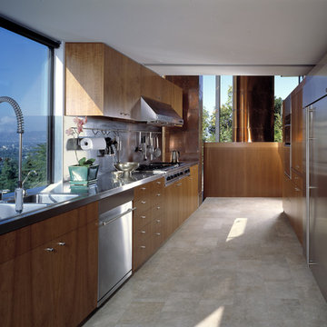
The answer was to remove almost all of the previously proposed existing interior walls and transform the existing footprint into a pavilion-like structure that allows the site to in a sense “pass through the house”. This allowed the client to take better advantage of a limited and restricted building area while capturing extraordinary panoramic views of the San Fernando Valley and Hollywood Hills. Large 22-foot high custom sliding glass doors allow the interior and exterior to become one. Even the studio is separated from the house and connected only by an exterior bridge. Private spaces are treated as loft-like spaces capturing volume and views while maintaining privacy.
Limestone floors extend from inside to outside and into the lap pool that runs the entire length of the house creating a horizon line at the edge of the view. Other natural materials such as board formed concrete, copper, steel and cherry provides softness to the objects that seem to float within the interior volume. By placing objects and materials "outside the frame," a new frame of reference deepens our sense of perception. Art does not reproduce what we see; rather it makes us see.
 Almesedoors
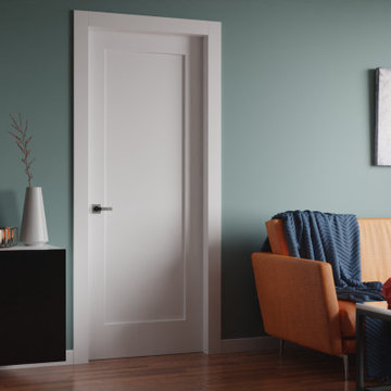
THE DOOR NAME ORIGIN - "SHAKER STYLE 1 PANEL"
How many panels should your interior door have? Well! If you’re looking for a truly no-frills product that is nonetheless elegant, this is an interior door you should consider first. This one-panel model is a truly minimal shaker-style design. While just as reliable as the interior doors in our other collections, these interior doors cost less. A lot less, in fact. Again, if simplicity is your thing, do consider this model. The original Shakers (or Shaking Quackers, as they were styled back in the Nineteenth Century) would be immensely pleased to have this product, as it most certainly adheres to their principle of utter simplicity combined with reliability. In its heyday, the community was highly influential when it came to matters of taste, not just in the United States, but in many other countries. The Baroque period that emphasized and worshipped unapologetic, insolent luxury had come to an end. Austere clas... Show more!
FINISH: WHITE
This is a bit tricky. Isn’t White the default finish that would look great on any interior door? Well, not quite.
W. is the color most often associated with perfection, honesty, cleanliness, newness, neutrality, and exactitude. The pigment has been known and used by humans since prehistoric times. In ancient Egypt, W. symbolized purity. Roman patricians paraded around in W. togas to distinguish themselves from the common folk. It was the color of choice of French monarchs. Architects of all epochs used W., with considerable enthusiasm, in various projects and for various reasons. In the United States, architects favored it when designing churches, capitols, and municipal buildings – which is, in fact, a tradition they inherited from classical and Renaissance architecture. According to some experts, most of the buildings in the celebrated Forum were either made of, or clad in, W. marble. In Taoism, it represents the yang or masculine energy, one of the two complementary natures of the universe. Many authors, both classical and contemporary, have referred to W. as a sign of purity, either physical (like William Shakespeare, whose treacherous usurper monarch wishes a heavenly rain would cleanse his blood-stained hand, washing it “white as snow”) or spiritual (like Tennessee Williams, who named his lead character Blanche (derived, incidentally, from the Germanic word blanc)) as a symbol of her innocent child-like spirit, perceptible from the moment she makes her first entrance (through the interior door stage-left).
Back in the Seventeenth Century, Sir Isaac Newton discovered that sunlight is composed of light with wavelengths across the visible spectrum which the human eye perceives as W. It is the lightest of the spectrum, and achromatic (hue-less) to boot, because it fully reflects and scatters all visible wavelengths of light, absorbing none. W. objects stand out in the dark. Depending on the surroundings, an interior door with W. finish might come off as emphatic or tactful, dominant or complementary. It blends seamlessly into most types of decor and, once the owner’s needs and disposition are taken into account, can symbolize - oh, so many different things, while bringing back a myriad memories: from those glorious snowy Alpine slopes and peaks to the fluffy tops of the wayward herd of cumulus cloud heap over the horizon on a balmy afternoon in the Caribbean. Tropical sand beaches are W. due to the high quantity of calcium carbonate they get from tiny bits of seashells ground to powder by the waves. In a number of cultures W. can also symbolize festivity, and be used lavishly to brighten up weddings, birthdays, and anniversaries. It is beautiful. Make sure it goes well with your interior door model, though.
 Envision Web
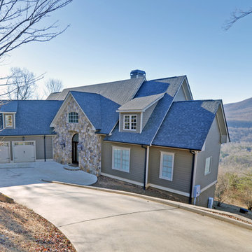
Twin magnificent and historic valleys – named according to lore and legend for two star crossed lovers of warring Native American tribes - make up the unincorporated area of White County that has become a pivot point for the arts, activism, community and preservation. The Sautee and Nacoochee Valleys – both listed on the National Register of Historic Places – are primarily the naturally occurring, lowland landscape punctuated by the sites and assets that give the area its vibrant character. Even the mapping department in White County asserts that Sautee Nacoochee defies definitive boundaries as pride of place has propelled innovative expansion.
Dedicated to Preserving and Protecting
Although Sautee Nacoochee lacks conventional city government, clearly the "mayor" of this hamlet is the Sautee Nacoochee Community Association, a non-profit organization dedicated to preserving and protecting the region and to nurturing the creativity that thrives here. The Association maintains the Sautee Nacoochee Center, a restored red brick schoolhouse, that is home to dual galleries, a history museum showcasing Cherokee heritage, gold strikes, timber and railroads, the Folk Pottery Museum of Northeast Georgia, art and dance studios, a heritage site and nature preserve, an intimate theater, an environmental studies room and a conference and special event facility. The Community Association was instrumental in establishing the official Historic Districts and brought acclaim to Sautee Nacoochee by securing its nomination as one of “The 100 Best Small Arts Towns in America.”
Arts programming, among other endeavors, remains one of the Center’s most valuable community resources. In addition to fostering children’s activities in music, dance, theatre and visual arts, the Center hosts the 50 member Sautee Nacoochee Community Chorale, art studio workshops, speaker luncheons for seniors, gallery exhibits, Contra dances, feature films, sustainable living forums and Open Stage nights. The Center’s six week long SummerFest is highlighted by the home grown folk life play, Headwaters, now in its fourth season, which serves as an unvarnished Valentine to and about the people, places and perceptions that shape the Valleys, and is consistently ranked as a Top 20 Event by the Southeastern Tourism Society.
 Angela Todd Studios | Portland, OR
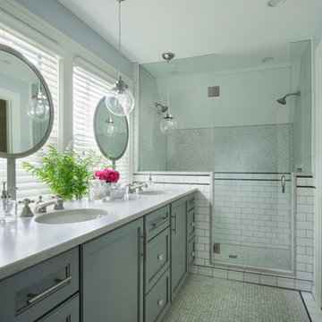
A contemporary gray master bath full of exciting detail and luster. Matte grays and silver finishes are a refreshing change for this space, along with the modern standing vanity mirrors and charming geometric shower tiling.
View the before & afters of this Portland bathroom.
For more about Angela Todd Studios, click here: https://www.angelatoddstudios.com/
To learn more about this project, click here: https://www.angelatoddstudios.com/portfolio/1921-laurelhurst-english-cottage/
 Solomon Colors
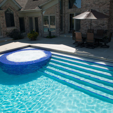
A project by Power Concrete Construction & Deisgn. This award-winning pool and patio made use of Solomon Colors 600 White Integral Color for the pool deck and wall caps. The whole surface was stamped using Brickform Roman Slate texture, paired with decorative saw cuts. A Stampable Overlay was used to add texture to the porches and a Sprayable Overlay was used to coat the planters, retaining walls, and exposed foundation walls.
 Brooks + Scarpa Architects
Description: In early 1994, the architects began work on the project and while in construction (demolition, grading and foundations) the owner, due to circumstances beyond his control, halted all construction of the project. Seven years later the owner returned to the architects and asked them to complete the partially constructed house. Due to code changes, city ordinances and a wide variety of obstacles it was determined that the house was unable to be completed as originally designed.
After much consideration the client asked the architect if it were possible to alter/remodel the partially constructed house, which was a remodel/addition to a 1970’s ranch style house, into a project that fit into current zoning and structural codes. The owner also requested that the house’s footprint and partially constructed foundations remain to avoid the need for further entitlements and delays on an already long overdue and difficult hillside site.
The architects’ main challenge was how to alter the design that reflected an outdated philosophical approach to architecture that was nearly a decade old. How could the house be re-conceived reflecting the architect and client’s maturity on a ten-year-old footprint?
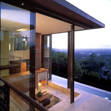
The answer was to remove almost all of the previously proposed existing interior walls and transform the existing footprint into a pavilion-like structure that allows the site to in a sense “pass through the house”. This allowed the client to take better advantage of a limited and restricted building area while capturing extraordinary panoramic views of the San Fernando Valley and Hollywood Hills. Large 22-foot high custom sliding glass doors allow the interior and exterior to become one. Even the studio is separated from the house and connected only by an exterior bridge. Private spaces are treated as loft-like spaces capturing volume and views while maintaining privacy.
Limestone floors extend from inside to outside and into the lap pool that runs the entire length of the house creating a horizon line at the edge of the view. Other natural materials such as board formed concrete, copper, steel and cherry provides softness to the objects that seem to float within the interior volume. By placing objects and materials "outside the frame," a new frame of reference deepens our sense of perception. Art does not reproduce what we see; rather it makes us see.
 LIFESTYLE DESIGN
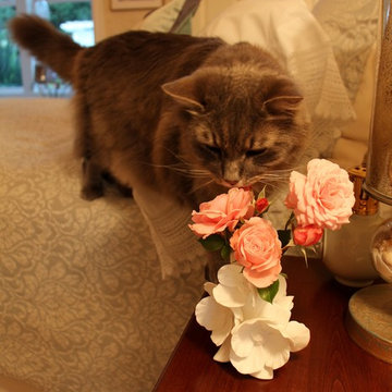
This updated master suite is a blend of European Antiques and transitional furnishings. Designed for relaxation and repose with a gentle color palette and detailed patterns.
 Brooks + Scarpa Architects
Description: In early 1994, the architects began work on the project and while in construction (demolition, grading and foundations) the owner, due to circumstances beyond his control, halted all construction of the project. Seven years later the owner returned to the architects and asked them to complete the partially constructed house. Due to code changes, city ordinances and a wide variety of obstacles it was determined that the house was unable to be completed as originally designed.
After much consideration the client asked the architect if it were possible to alter/remodel the partially constructed house, which was a remodel/addition to a 1970’s ranch style house, into a project that fit into current zoning and structural codes. The owner also requested that the house’s footprint and partially constructed foundations remain to avoid the need for further entitlements and delays on an already long overdue and difficult hillside site.
The architects’ main challenge was how to alter the design that reflected an outdated philosophical approach to architecture that was nearly a decade old. How could the house be re-conceived reflecting the architect and client’s maturity on a ten-year-old footprint?
The answer was to remove almost all of the previously proposed existing interior walls and transform the existing footprint into a pavilion-like structure that allows the site to in a sense “pass through the house”. This allowed the client to take better advantage of a limited and restricted building area while capturing extraordinary panoramic views of the San Fernando Valley and Hollywood Hills. Large 22-foot high custom sliding glass doors allow the interior and exterior to become one. Even the studio is separated from the house and connected only by an exterior bridge. Private spaces are treated as loft-like spaces capturing volume and views while maintaining privacy.
Limestone floors extend from inside to outside and into the lap pool that runs the entire length of the house creating a horizon line at the edge of the view. Other natural materials such as board formed concrete, copper, steel and cherry provides softness to the objects that seem to float within the interior volume. By placing objects and materials "outside the frame," a new frame of reference deepens our sense of perception. Art does not reproduce what we see; rather it makes us see.
 Brooks + Scarpa Architects
Description: In early 1994, the architects began work on the project and while in construction (demolition, grading and foundations) the owner, due to circumstances beyond his control, halted all construction of the project. Seven years later the owner returned to the architects and asked them to complete the partially constructed house. Due to code changes, city ordinances and a wide variety of obstacles it was determined that the house was unable to be completed as originally designed.
After much consideration the client asked the architect if it were possible to alter/remodel the partially constructed house, which was a remodel/addition to a 1970’s ranch style house, into a project that fit into current zoning and structural codes. The owner also requested that the house’s footprint and partially constructed foundations remain to avoid the need for further entitlements and delays on an already long overdue and difficult hillside site.
The architects’ main challenge was how to alter the design that reflected an outdated philosophical approach to architecture that was nearly a decade old. How could the house be re-conceived reflecting the architect and client’s maturity on a ten-year-old footprint?
The answer was to remove almost all of the previously proposed existing interior walls and transform the existing footprint into a pavilion-like structure that allows the site to in a sense “pass through the house”. This allowed the client to take better advantage of a limited and restricted building area while capturing extraordinary panoramic views of the San Fernando Valley and Hollywood Hills. Large 22-foot high custom sliding glass doors allow the interior and exterior to become one. Even the studio is separated from the house and connected only by an exterior bridge. Private spaces are treated as loft-like spaces capturing volume and views while maintaining privacy.
Limestone floors extend from inside to outside and into the lap pool that runs the entire length of the house creating a horizon line at the edge of the view. Other natural materials such as board formed concrete, copper, steel and cherry provides softness to the objects that seem to float within the interior volume. By placing objects and materials "outside the frame," a new frame of reference deepens our sense of perception. Art does not reproduce what we see; rather it makes us see.
 Brooks + Scarpa Architects
Description: In early 1994, the architects began work on the project and while in construction (demolition, grading and foundations) the owner, due to circumstances beyond his control, halted all construction of the project. Seven years later the owner returned to the architects and asked them to complete the partially constructed house. Due to code changes, city ordinances and a wide variety of obstacles it was determined that the house was unable to be completed as originally designed.
After much consideration the client asked the architect if it were possible to alter/remodel the partially constructed house, which was a remodel/addition to a 1970’s ranch style house, into a project that fit into current zoning and structural codes. The owner also requested that the house’s footprint and partially constructed foundations remain to avoid the need for further entitlements and delays on an already long overdue and difficult hillside site.
The architects’ main challenge was how to alter the design that reflected an outdated philosophical approach to architecture that was nearly a decade old. How could the house be re-conceived reflecting the architect and client’s maturity on a ten-year-old footprint?
The answer was to remove almost all of the previously proposed existing interior walls and transform the existing footprint into a pavilion-like structure that allows the site to in a sense “pass through the house”. This allowed the client to take better advantage of a limited and restricted building area while capturing extraordinary panoramic views of the San Fernando Valley and Hollywood Hills. Large 22-foot high custom sliding glass doors allow the interior and exterior to become one. Even the studio is separated from the house and connected only by an exterior bridge. Private spaces are treated as loft-like spaces capturing volume and views while maintaining privacy.
Limestone floors extend from inside to outside and into the lap pool that runs the entire length of the house creating a horizon line at the edge of the view. Other natural materials such as board formed concrete, copper, steel and cherry provides softness to the objects that seem to float within the interior volume. By placing objects and materials "outside the frame," a new frame of reference deepens our sense of perception. Art does not reproduce what we see; rather it makes us see.
 Brooks + Scarpa Architects
Description: In early 1994, the architects began work on the project and while in construction (demolition, grading and foundations) the owner, due to circumstances beyond his control, halted all construction of the project. Seven years later the owner returned to the architects and asked them to complete the partially constructed house. Due to code changes, city ordinances and a wide variety of obstacles it was determined that the house was unable to be completed as originally designed.
After much consideration the client asked the architect if it were possible to alter/remodel the partially constructed house, which was a remodel/addition to a 1970’s ranch style house, into a project that fit into current zoning and structural codes. The owner also requested that the house’s footprint and partially constructed foundations remain to avoid the need for further entitlements and delays on an already long overdue and difficult hillside site.
The architects’ main challenge was how to alter the design that reflected an outdated philosophical approach to architecture that was nearly a decade old. How could the house be re-conceived reflecting the architect and client’s maturity on a ten-year-old footprint?
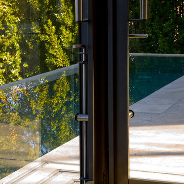
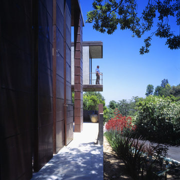
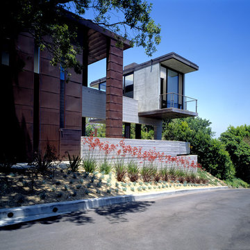
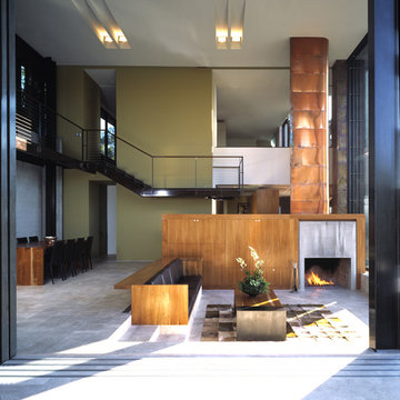
The answer was to remove almost all of the previously proposed existing interior walls and transform the existing footprint into a pavilion-like structure that allows the site to in a sense “pass through the house”. This allowed the client to take better advantage of a limited and restricted building area while capturing extraordinary panoramic views of the San Fernando Valley and Hollywood Hills. Large 22-foot high custom sliding glass doors allow the interior and exterior to become one. Even the studio is separated from the house and connected only by an exterior bridge. Private spaces are treated as loft-like spaces capturing volume and views while maintaining privacy.
Limestone floors extend from inside to outside and into the lap pool that runs the entire length of the house creating a horizon line at the edge of the view. Other natural materials such as board formed concrete, copper, steel and cherry provides softness to the objects that seem to float within the interior volume. By placing objects and materials "outside the frame," a new frame of reference deepens our sense of perception. Art does not reproduce what we see; rather it makes us see.
53