
Search results for "Perception" in Home Design Ideas
 Banker Wire
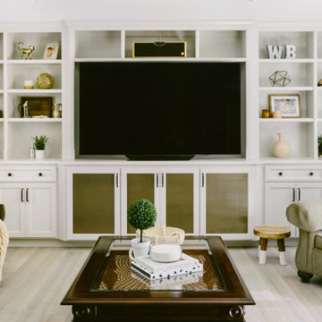
This California residence went from dark and dull to modern and bright with the help of Woodcliff Builders designer Jessica Peters. Remodeled with the thought of entertaining guests in mind, form and functionality played equal roles in the design process. Light cream tones wash over the home, punctuated by the bold statement that Banker Wire’s S-12 makes in it’s Antique Brass plated finish. This woven wire mesh pattern catches the eye throughout the kitchen, living room, and bar as various cabinet door infills.
The unique texture of S-12 brings balance to the stark contrasting color scheme throughout the kitchen. While the open-concept room boasts predominantly pale features, the highlights of the Antique Brass finish draw out the deeper rich tones in the white marble backsplash and counter tops. The shadows created by the weave of the wire mesh help tie in the dark accents in the kitchen, including the black light fixtures and the oil-rubbed bronze cabinet and drawer hardware.
Across from the kitchen, the eye is drawn to the main focal point of the living room, the built-in bookshelves. Banker Wire’s S-12 clads the four central cabinet doors, creating a unique hideaway for television components and other electronics. The Antique Brass finish brings warmth into the otherwise neutral structure, complimented by the displayed curios and the cozy furniture surrounding it. Both the wire mesh and the oil-rubbed bronze hardware are carried over from the kitchen, making for a cohesive home design.
In the home’s custom bar, S-12 adorns the front of the ceiling-high white cabinets. For this area, the former cabinet and drawer pulls have been replaced with brass and ivory colored hardware, underscoring the brass of the cabinet’s panel. Emphasized by the dark stone counter-top, the lowlights of the pattern accentuate the texture of the mesh, while the Antique Brass face coordinates with the wood of the lower cabinets, bringing a consistent appearance to the space.
“I just love that extra level of detail that this wire mesh provides for cabinets,” states Peters. “It really takes the design to the next level.”
The low open area of woven wire mesh pattern S-12 lends itself well to surfacing, cladding, and other applications where partial coverage is key. At 21.6%, only subtle glimpses will be perceptible through the mesh. Embossed and highly faceted, the highs and lows of this distinctive weave are more defined in plated and powder coat finishes, making Antique Brass plating the perfect choice for this residential cabinetry project.

 Almesedoors
THE DOOR NAME ORIGIN - "PALLADIO TRE SOLID"
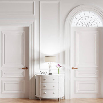
FINISH: WHITE
This is a bit tricky. Isn’t White the default finish that would look great on any interior door? Well, not quite.
W. is the color most often associated with perfection, honesty, cleanliness, newness, neutrality, and exactitude. The pigment has been known and used by humans since prehistoric times. In ancient Egypt, W. symbolized purity. Roman patricians paraded around in W. togas to distinguish themselves from the common folk. It was the color of choice of French monarchs. Architects of all epochs used W., with considerable enthusiasm, in various projects and for various reasons. In the United States, architects favored it when designing churches, capitols, and municipal buildings – which is, in fact, a tradition they inherited from classical and Renaissance architecture. According to some experts, most of the buildings in the celebrated Forum were either made of, or clad in, W. marble. In Taoism, it represents the yang or masculine energy, one of the two complementary natures of the universe. Many authors, both classical and contemporary, have referred to W. as a sign of purity, either physical (like William Shakespeare, whose treacherous usurper monarch wishes a heavenly rain would cleanse his blood-stained hand, washing it “white as snow”) or spiritual (like Tennessee Williams, who named his lead character Blanche (derived, incidentally, from the Germanic word blanc)) as a symbol of her innocent child-like spirit, perceptible from the moment she makes her first entrance (through the interior door stage-left).
Back in the Seventeenth Century, Sir Isaac Newton discovered that sunlight is composed of light with wavelengths across the visible spectrum which the human eye perceives as W. It is the lightest of the spectrum, and achromatic (hue-less) to boot, because it fully reflects and scatters all visible wavelengths of light, absorbing none. W. objects stand out in the dark. Depending on the surroundings, an interior door with W. finish might come off as emphatic or tactful, dominant or complementary. It blends seamlessly into most types of decor and, once the owner’s needs and disposition are taken into account, can symbolize - oh, so many different things, while bringing back a myriad memories: from those glorious snowy Alpine slopes and peaks to the fluffy tops of the wayward herd of cumulus cloud heap over the horizon on a balmy afternoon in the Caribbean. Tropical sand beaches are W. due to the high quantity of calcium carbonate they get from tiny bits of seashells ground to powder by the waves. In a number of cultures W. can also symbolize festivity, and be used lavishly to brighten up weddings, birthdays, and anniversaries. It is beautiful. Make sure it goes well with your interior door model, though.
Find the right local pro for your project

 Ehrlich Yanai Rhee Chaney Architects
The ground floor volumes wrapped in an elongated hand-fired brick, emphasizing the horizontality of the architecture that lays solidly on the land.
(Photography by: Matthew Millman)
 Banker Wire
This California residence went from dark and dull to modern and bright with the help of Woodcliff Builders designer Jessica Peters. Remodeled with the thought of entertaining guests in mind, form and functionality played equal roles in the design process. Light cream tones wash over the home, punctuated by the bold statement that Banker Wire’s S-12 makes in it’s Antique Brass plated finish. This woven wire mesh pattern catches the eye throughout the kitchen, living room, and bar as various cabinet door infills.
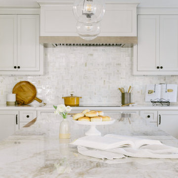
The unique texture of S-12 brings balance to the stark contrasting color scheme throughout the kitchen. While the open-concept room boasts predominantly pale features, the highlights of the Antique Brass finish draw out the deeper rich tones in the white marble backsplash and counter tops. The shadows created by the weave of the wire mesh help tie in the dark accents in the kitchen, including the black light fixtures and the oil-rubbed bronze cabinet and drawer hardware.
Across from the kitchen, the eye is drawn to the main focal point of the living room, the built-in bookshelves. Banker Wire’s S-12 clads the four central cabinet doors, creating a unique hideaway for television components and other electronics. The Antique Brass finish brings warmth into the otherwise neutral structure, complimented by the displayed curios and the cozy furniture surrounding it. Both the wire mesh and the oil-rubbed bronze hardware are carried over from the kitchen, making for a cohesive home design.
In the home’s custom bar, S-12 adorns the front of the ceiling-high white cabinets. For this area, the former cabinet and drawer pulls have been replaced with brass and ivory colored hardware, underscoring the brass of the cabinet’s panel. Emphasized by the dark stone counter-top, the lowlights of the pattern accentuate the texture of the mesh, while the Antique Brass face coordinates with the wood of the lower cabinets, bringing a consistent appearance to the space.
“I just love that extra level of detail that this wire mesh provides for cabinets,” states Peters. “It really takes the design to the next level.”
The low open area of woven wire mesh pattern S-12 lends itself well to surfacing, cladding, and other applications where partial coverage is key. At 21.6%, only subtle glimpses will be perceptible through the mesh. Embossed and highly faceted, the highs and lows of this distinctive weave are more defined in plated and powder coat finishes, making Antique Brass plating the perfect choice for this residential cabinetry project.
 Jordan Iverson Signature Homes
KuDa Photography
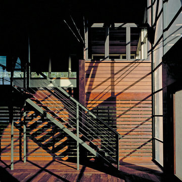
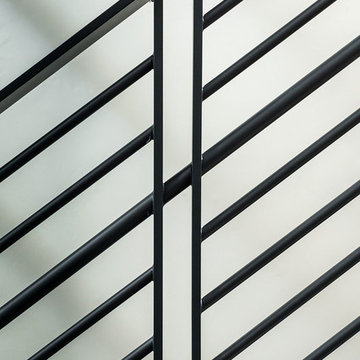
Large minimalist wooden u-shaped staircase photo with metal risers
Large minimalist wooden u-shaped staircase photo with metal risers


 Tague Design Showroom
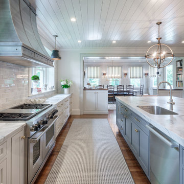
The elegant look of grey is hot in kitchen design; a pop of color to base cabinets or center island adds visual interest to your design. This kitchen also features integrated appliances and hidden storage. The open concept floor plan opens up to a breakfast area and butler's pantry. Ceramic subway tile, quartzite countertops and stainless steel appliances provide a sleek finish while the rich stain to the hardwood floors adds warmth to the space. Butler's pantry with walnut top and khaki sideboard with corbel accent bring a touch of drama to the design.
 AGM Home Store, LLC
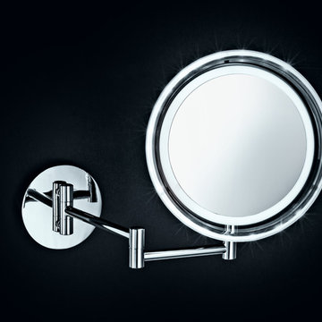
Makeup mirrors are a woman’s or a man’s best friend, they can save you from foundation lines, overgrown eyebrows, and other preventable beauty blunders. Before shopping for a quality makeup mirror, we recommend narrowing down your choices by learning which type of makeup mirror will not only look great in your bathroom, but have you looking your best as well. Magnifying mirrors will give you a new perspective on your skin while cosmetic mirrors are designed to give you red carpet style in the comfort of your own home. Magnifying mirrors can also be found as double face mirrors, with different magnifications on each mirror face. The most popular magnification is 5x as it is ideal for brow tweezing and perfecting eyeliner. Facial mirrors are great for the man of the bathroom and make shaving safer and easier. Lighted Makeup Mirrors are ideal if you want to make the most of each brush, line, and stroke when applying your makeup. Wall Mounted Makeup Mirrors are becoming increasingly popular, we know find them as a standard in hotel rooms. Many of them have extendable arms, which gives you the freedom to adjust it as needed for better lighting or positioning. Additionally, many lighted mirrors today are also wall mounted, which gives you another option to choose from. The best part is several lighted makeup mirrors are now battery powered, which saves you the headaches of hardwired installations. Free Standing Makeup Mirrors, probably the most popular option in this category. Free standing makeup mirrors are fashionable and trendy. They are easy to move from one room to the other or simply closer to a window or better lighting. No matter the type of makeup mirror you choose, you can always rely on one to help you transform into a professional makeup artist and aid you in your quest for flawless skin. Browse our large selection of European makeup mirror collections:
 Concrete-Visions LLC
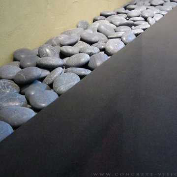
Modern Japanese Room Alcove (Tokonoma) with Black Polished Concrete by Concrete-Visions LLC.
www.concrete-visions.com
〜 Zen Design
Inspiration for an asian home design remodel in Denver
Inspiration for an asian home design remodel in Denver
 Daniel Scerri Periti
We were approached with a request to design the furnishings for an existing ‘finished’ apartment. The intention was to move in relatively fast, and the property already had an existing marble floor, kitchen and bathrooms which had to be kept. The property also boasted a fantastic 270 degree view, seen from most of the apartment. The clients had a very important role in the completion of the project. They were very involved during the design process and through various decoration choices. The final design was kept as a rigid guideline when faced with picking out all the different elements.
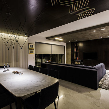
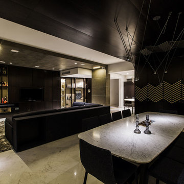
Once clear of all previous furniture, the space felt cold and bare; so we immediately felt the need for warmth, and raw, natural elements and textures to complement the cold marble floor while visually tying in the design of the whole apartment together.
Since the existing kitchen had a touch of dark walnut stain, we felt this material was one we should add to the palette of materials to contest the stark materials. A raw cement finish was another material we felt would add an interesting contrast and could be used in a variety of ways, from cabinets to walls and ceilings, to tie up the design of various areas of the apartment.
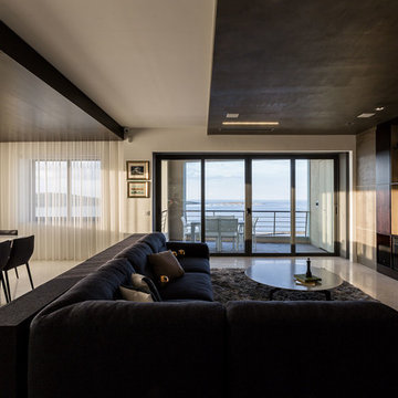
To warm up the living/dining area, keeping the existing marble floor but visually creating zones within the large living/dining area without hindering the flow, a dark timber custom-made soffit, continuous with a floor-to-ceiling drinks cabinet zones the dining area, giving it a degree of much-needed warmth.
The various windows with a stupendous 270 degree view needed to be visually tied together. This was done by introducing a continuous sheer [drape] which also doubled up as a sound-absorbing material along 2 of the 4 walls of the space.
A very large sofa was required to fill up the space correctly, also required for the size of the young family.
Services were integrated within the units and soffits, while a customized design in the corner between the kitchen and the living room took into consideration the viewpoints from the main areas to create a pantry without hindering the flow or views. A strategically placed floor-to-ceiling mirror doubles up the space and extends the view to the inner parts of the apartment.
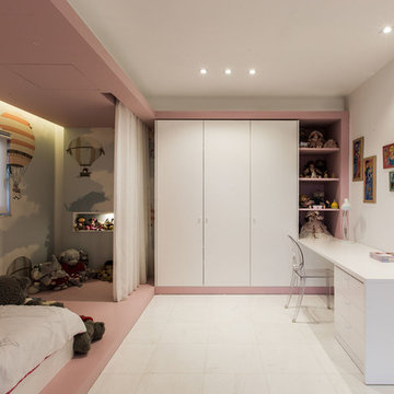
The daughter’s bedroom was a small challenge in itself, and a fun task, where we wanted to achieve the perception of a cozy niche with its own enclosed reading nook [for reading fairy tales], behind see-through curtains and a custom-ordered wall print sporting the girl’s favorite colors.
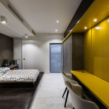
The sons’ bedroom had double the requirements in terms of space needed: more wardrobe, more homework desk space, a tv/play station area… “We combined a raised platform area between the boys’ beds to become an area with cushions where the kids can lay down and play, and face a hidden screen behind the homework desk’s sliding back panel for their play station”. The color of the homework desk was chosen in relation to the boys’ ages. A more masculine material palette was chosen for this room, in contrast to the light pastel palette of the girl’s bedroom. Again, this colour can easily be changed over time for a more mature look.
PROJECT DATA:
St. Paul’s Bay, Malta
DESIGN TEAM:
Perit Rebecca Zammit, Perit Daniel Scerri, Elyse Tonna
OTHER CREDITS:
Photography: Tonio Lombardi
Styling : TKS
 Daniel Scerri Periti
We were approached with a request to design the furnishings for an existing ‘finished’ apartment. The intention was to move in relatively fast, and the property already had an existing marble floor, kitchen and bathrooms which had to be kept. The property also boasted a fantastic 270 degree view, seen from most of the apartment. The clients had a very important role in the completion of the project. They were very involved during the design process and through various decoration choices. The final design was kept as a rigid guideline when faced with picking out all the different elements.
Once clear of all previous furniture, the space felt cold and bare; so we immediately felt the need for warmth, and raw, natural elements and textures to complement the cold marble floor while visually tying in the design of the whole apartment together.
Since the existing kitchen had a touch of dark walnut stain, we felt this material was one we should add to the palette of materials to contest the stark materials. A raw cement finish was another material we felt would add an interesting contrast and could be used in a variety of ways, from cabinets to walls and ceilings, to tie up the design of various areas of the apartment.
To warm up the living/dining area, keeping the existing marble floor but visually creating zones within the large living/dining area without hindering the flow, a dark timber custom-made soffit, continuous with a floor-to-ceiling drinks cabinet zones the dining area, giving it a degree of much-needed warmth.
The various windows with a stupendous 270 degree view needed to be visually tied together. This was done by introducing a continuous sheer [drape] which also doubled up as a sound-absorbing material along 2 of the 4 walls of the space.
A very large sofa was required to fill up the space correctly, also required for the size of the young family.
Services were integrated within the units and soffits, while a customized design in the corner between the kitchen and the living room took into consideration the viewpoints from the main areas to create a pantry without hindering the flow or views. A strategically placed floor-to-ceiling mirror doubles up the space and extends the view to the inner parts of the apartment.
The daughter’s bedroom was a small challenge in itself, and a fun task, where we wanted to achieve the perception of a cozy niche with its own enclosed reading nook [for reading fairy tales], behind see-through curtains and a custom-ordered wall print sporting the girl’s favorite colors.
The sons’ bedroom had double the requirements in terms of space needed: more wardrobe, more homework desk space, a tv/play station area… “We combined a raised platform area between the boys’ beds to become an area with cushions where the kids can lay down and play, and face a hidden screen behind the homework desk’s sliding back panel for their play station”. The color of the homework desk was chosen in relation to the boys’ ages. A more masculine material palette was chosen for this room, in contrast to the light pastel palette of the girl’s bedroom. Again, this colour can easily be changed over time for a more mature look.
PROJECT DATA:
St. Paul’s Bay, Malta
DESIGN TEAM:
Perit Rebecca Zammit, Perit Daniel Scerri, Elyse Tonna
OTHER CREDITS:
Photography: Tonio Lombardi
Styling : TKS
 Daniel Scerri Periti
We were approached with a request to design the furnishings for an existing ‘finished’ apartment. The intention was to move in relatively fast, and the property already had an existing marble floor, kitchen and bathrooms which had to be kept. The property also boasted a fantastic 270 degree view, seen from most of the apartment. The clients had a very important role in the completion of the project. They were very involved during the design process and through various decoration choices. The final design was kept as a rigid guideline when faced with picking out all the different elements.
Once clear of all previous furniture, the space felt cold and bare; so we immediately felt the need for warmth, and raw, natural elements and textures to complement the cold marble floor while visually tying in the design of the whole apartment together.
Since the existing kitchen had a touch of dark walnut stain, we felt this material was one we should add to the palette of materials to contest the stark materials. A raw cement finish was another material we felt would add an interesting contrast and could be used in a variety of ways, from cabinets to walls and ceilings, to tie up the design of various areas of the apartment.
To warm up the living/dining area, keeping the existing marble floor but visually creating zones within the large living/dining area without hindering the flow, a dark timber custom-made soffit, continuous with a floor-to-ceiling drinks cabinet zones the dining area, giving it a degree of much-needed warmth.
The various windows with a stupendous 270 degree view needed to be visually tied together. This was done by introducing a continuous sheer [drape] which also doubled up as a sound-absorbing material along 2 of the 4 walls of the space.
A very large sofa was required to fill up the space correctly, also required for the size of the young family.
Services were integrated within the units and soffits, while a customized design in the corner between the kitchen and the living room took into consideration the viewpoints from the main areas to create a pantry without hindering the flow or views. A strategically placed floor-to-ceiling mirror doubles up the space and extends the view to the inner parts of the apartment.
The daughter’s bedroom was a small challenge in itself, and a fun task, where we wanted to achieve the perception of a cozy niche with its own enclosed reading nook [for reading fairy tales], behind see-through curtains and a custom-ordered wall print sporting the girl’s favorite colors.
The sons’ bedroom had double the requirements in terms of space needed: more wardrobe, more homework desk space, a tv/play station area… “We combined a raised platform area between the boys’ beds to become an area with cushions where the kids can lay down and play, and face a hidden screen behind the homework desk’s sliding back panel for their play station”. The color of the homework desk was chosen in relation to the boys’ ages. A more masculine material palette was chosen for this room, in contrast to the light pastel palette of the girl’s bedroom. Again, this colour can easily be changed over time for a more mature look.
PROJECT DATA:
St. Paul’s Bay, Malta
DESIGN TEAM:
Perit Rebecca Zammit, Perit Daniel Scerri, Elyse Tonna
OTHER CREDITS:
Photography: Tonio Lombardi
Styling : TKS


 User
UserDetail of Iridescent Venetian plaster finish on all walls in Living Room by Christianson Lee Studios
Example of a transitional home design design in New York
Example of a transitional home design design in New York
 Daniel Scerri Periti
We were approached with a request to design the furnishings for an existing ‘finished’ apartment. The intention was to move in relatively fast, and the property already had an existing marble floor, kitchen and bathrooms which had to be kept. The property also boasted a fantastic 270 degree view, seen from most of the apartment. The clients had a very important role in the completion of the project. They were very involved during the design process and through various decoration choices. The final design was kept as a rigid guideline when faced with picking out all the different elements.
Once clear of all previous furniture, the space felt cold and bare; so we immediately felt the need for warmth, and raw, natural elements and textures to complement the cold marble floor while visually tying in the design of the whole apartment together.
Since the existing kitchen had a touch of dark walnut stain, we felt this material was one we should add to the palette of materials to contest the stark materials. A raw cement finish was another material we felt would add an interesting contrast and could be used in a variety of ways, from cabinets to walls and ceilings, to tie up the design of various areas of the apartment.
To warm up the living/dining area, keeping the existing marble floor but visually creating zones within the large living/dining area without hindering the flow, a dark timber custom-made soffit, continuous with a floor-to-ceiling drinks cabinet zones the dining area, giving it a degree of much-needed warmth.
The various windows with a stupendous 270 degree view needed to be visually tied together. This was done by introducing a continuous sheer [drape] which also doubled up as a sound-absorbing material along 2 of the 4 walls of the space.
A very large sofa was required to fill up the space correctly, also required for the size of the young family.
Services were integrated within the units and soffits, while a customized design in the corner between the kitchen and the living room took into consideration the viewpoints from the main areas to create a pantry without hindering the flow or views. A strategically placed floor-to-ceiling mirror doubles up the space and extends the view to the inner parts of the apartment.
The daughter’s bedroom was a small challenge in itself, and a fun task, where we wanted to achieve the perception of a cozy niche with its own enclosed reading nook [for reading fairy tales], behind see-through curtains and a custom-ordered wall print sporting the girl’s favorite colors.
The sons’ bedroom had double the requirements in terms of space needed: more wardrobe, more homework desk space, a tv/play station area… “We combined a raised platform area between the boys’ beds to become an area with cushions where the kids can lay down and play, and face a hidden screen behind the homework desk’s sliding back panel for their play station”. The color of the homework desk was chosen in relation to the boys’ ages. A more masculine material palette was chosen for this room, in contrast to the light pastel palette of the girl’s bedroom. Again, this colour can easily be changed over time for a more mature look.
PROJECT DATA:
St. Paul’s Bay, Malta
DESIGN TEAM:
Perit Rebecca Zammit, Perit Daniel Scerri, Elyse Tonna
OTHER CREDITS:
Photography: Tonio Lombardi
Styling : TKS
 Daniel Scerri Periti
We were approached with a request to design the furnishings for an existing ‘finished’ apartment. The intention was to move in relatively fast, and the property already had an existing marble floor, kitchen and bathrooms which had to be kept. The property also boasted a fantastic 270 degree view, seen from most of the apartment. The clients had a very important role in the completion of the project. They were very involved during the design process and through various decoration choices. The final design was kept as a rigid guideline when faced with picking out all the different elements.
Once clear of all previous furniture, the space felt cold and bare; so we immediately felt the need for warmth, and raw, natural elements and textures to complement the cold marble floor while visually tying in the design of the whole apartment together.
Since the existing kitchen had a touch of dark walnut stain, we felt this material was one we should add to the palette of materials to contest the stark materials. A raw cement finish was another material we felt would add an interesting contrast and could be used in a variety of ways, from cabinets to walls and ceilings, to tie up the design of various areas of the apartment.
To warm up the living/dining area, keeping the existing marble floor but visually creating zones within the large living/dining area without hindering the flow, a dark timber custom-made soffit, continuous with a floor-to-ceiling drinks cabinet zones the dining area, giving it a degree of much-needed warmth.
The various windows with a stupendous 270 degree view needed to be visually tied together. This was done by introducing a continuous sheer [drape] which also doubled up as a sound-absorbing material along 2 of the 4 walls of the space.
A very large sofa was required to fill up the space correctly, also required for the size of the young family.
Services were integrated within the units and soffits, while a customized design in the corner between the kitchen and the living room took into consideration the viewpoints from the main areas to create a pantry without hindering the flow or views. A strategically placed floor-to-ceiling mirror doubles up the space and extends the view to the inner parts of the apartment.
The daughter’s bedroom was a small challenge in itself, and a fun task, where we wanted to achieve the perception of a cozy niche with its own enclosed reading nook [for reading fairy tales], behind see-through curtains and a custom-ordered wall print sporting the girl’s favorite colors.
The sons’ bedroom had double the requirements in terms of space needed: more wardrobe, more homework desk space, a tv/play station area… “We combined a raised platform area between the boys’ beds to become an area with cushions where the kids can lay down and play, and face a hidden screen behind the homework desk’s sliding back panel for their play station”. The color of the homework desk was chosen in relation to the boys’ ages. A more masculine material palette was chosen for this room, in contrast to the light pastel palette of the girl’s bedroom. Again, this colour can easily be changed over time for a more mature look.
PROJECT DATA:
St. Paul’s Bay, Malta
DESIGN TEAM:
Perit Rebecca Zammit, Perit Daniel Scerri, Elyse Tonna
OTHER CREDITS:
Photography: Tonio Lombardi
Styling : TKS
 threshold interiors
Location: New York, NY, United States
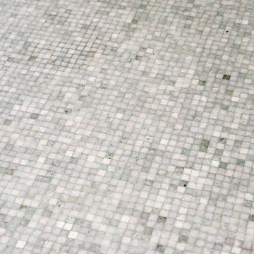
This Loft was tastefully renovated back in the '90s, but was due for an update and an expansion of the kitchen and dining areas to accommodate the client's cooking skills and entertaining needs. EnlargIing the island and adding cabinetry to delineate the office, bar and dining areas was a priority. The bathroom was updated to feel like a tranquil spa with beautiful new tile, plumbing fixtures and cabinets. Our biggest challenge was coordinating the entire renovation while our client was out of town for the Summer!
Photographed by: James Salomon
 Dovetailed Kitchens
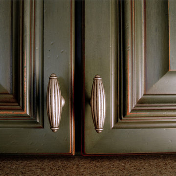
Lovely detail shot of the distressed, painted sage cabinets and handle pull.
Large farmhouse u-shaped ceramic tile kitchen photo in Boston with raised-panel cabinets, green cabinets, an island, an undermount sink, granite countertops and stainless steel appliances
Large farmhouse u-shaped ceramic tile kitchen photo in Boston with raised-panel cabinets, green cabinets, an island, an undermount sink, granite countertops and stainless steel appliances
55