
Search results for "Physics" in Home Design Ideas
 Natural Stone Institute
Tucker Design Awards celebrate the innovation and vision that designers bring to their projects through the specification and use of natural stone materials. For members of the Natural Stone Institute, acknowledgment as a contributor to a Tucker Design Awards winning project is a genuine tribute to their traditional values, physicality of work, and dedication to precise specifications required in the realization of such accomplished architectural design.
Landscape Architect
Design Workshop, Aspen, CO
Landscape Contractor/
Installer
Landscape Workshop, Carbondale, CO
Stone Installer
JD Masonry, Arvada, CO
Stone Suppliers
Coldspring, Cold Spring, MN
Gallegos Corporation, Vail, CO
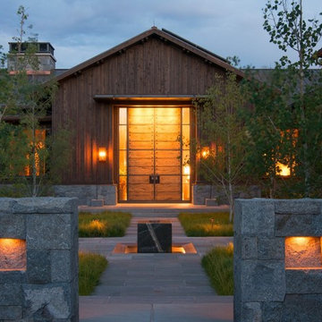
Through a collective dialogue between landscape, architecture and interior design, a new vision reimagines the disturbed site into a livable landscape, emblematic of our American West. The residence – an ensemble of structures designed in a modern ranch vernacular – is effortlessly unified through layered, interconnected outdoor gathering spaces and regional materials that elaborates upon the experience of moving between structures, heightening and renewing one’s sense of place. Upon entering the courtyard, one is immediately aware of seamless and unfolding relationships between architecture and landscape through a sophisticated, regional palette of natural stone, water, and plants. Set upon architectural focal points, two perpendicular sandstone paths descend into the space and converge upon a monolithic, hand-carved granite fountain. The design of the fountain is purposefully quiet, both in its detailing and operation. The feature includes a recessed interior, allowing water to become still before it reaches the surface, with lightly cleft sides, allowing the water to delicately bounce as it descends into the geometric lower granite basin. The landscape architect’s selection of various stone material extends the tones of the home’s granite walls and contextual surroundings into the garden, but also be detailed in a manner that balances rural and modern qualities. The majority of the paving is constructed of rectilinear gray sandstone with a natural finish and snapped edges, laid in a staggered running bond organization. Throughout the garden, thoughtful attention was also given to the configuration and layout of terraces, pathways, and steps. In doing so, this ensured that the edges of the terrace and its interface to other elements were designed so that no “leftover” stone paver pieces would be found. Within the central courtyard, split-faced stone stairs descend into a rectilinear plinth of lawn, punctuated by a carved granite fire pit. Leveraging the property’s existing topographic relief, a shallow infinity-edge dipping pool abstracts the transparent and cavity-like pools found throughout the Rocky Mountains. The design purposefully achieves the illusion of a larger water feature with the distant pond and offers a refreshing recreational element. Containing the infinity edge, a designed granite escarpment emerges from the meadow, juxtaposing the geometric water feature and providing informal seating ledges. The site’s prior use required the landscape architect to incorporate a highly technical and complex sub-surface structural system. The initial geotechnical report identified the building envelopes rested on 12 feet of man-placed fill. Assuming a 1 percent settlement, the team faced concerns that the terraces would settle up to 12 inches. In response, a grid of structural micro-piles provides the necessary foundation for the construction of terraces immediately outside of the architecture, under the water features and site walls. The solution enabled the crisp detailing and design resolution of the architectural structures to seamlessly connect with the horizontal stone terraces.
 Utopia 360 Studio
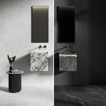
Leader Online, a UK-based company, approached us to support the launch of Nosa, a new sanitary ware brand targeting the British market.
With competition in the sector increasing, they required a cohesive set of visuals for their numerous products to establish a consistent visual language across e-commerce platforms, catalogs, and promotional materials.
It was a complete brand creation from scratch, and we pulled it off.
Key tasks:
- Develop a cohesive visual brand identity for Nosa
- Produce over 2,000 high-quality 3D visualizations
within five months
- Optimize workflows for high efficiency and a unified
visual standard
Our approach:
To efficiently manage high production volumes and accelerate feedback, we implemented an optimized workflow system. This transformed our render production into an assembly line, drastically cutting individual product processing time while upholding top image quality.
Nosa's unique marble, with its distinct veins and inclusions, was central to their brand. Since no existing textures matched, we requested physical samples.
Upon receiving the stone, we set up an improvised photo studio, capturing every detail. Our goal was
not just to replicate the marble in 3D, but to preserve
its raw, organic beauty.
We applied the same meticulous process to metal materials for accurate shade representation. Nosa prioritized authenticity, ensuring buyers saw the true material, not an over-polished version.
Result:
Nosa's market entry surpassed all expectations.
Fueled by its compelling visual identity, the brand achieved strong initial sales and is now rapidly expanding its product range, cementing its presence.
We are proud to continue our partnership with Nosa
to this day.
 Quick Branding & Creative Studio
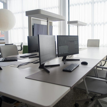
Designing the perfect executive suite is all about clarity and focus. The minimalist white desk and exposed black ceiling create a striking contrast that fuels productivity. But once the physical foundation is laid, how do you establish the brand's verbal identity? For this startup, we matched their sleek aesthetic with a modern name. Using a logical https://quickcountertools.com/word-combiner/ tool, we blended their core architectural terms into a powerful, futuristic brand name that matches their office vibe.
Find the right local pro for your project
 The Shape Of Things To Come
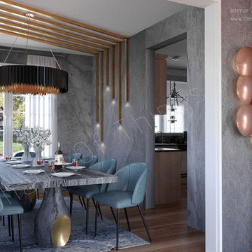
Something Special designed for the dining room. Solid oak wood for the top of the table, the legs are like a rock sculpture, ice grey color, with golden cuts, simulating a physical stone with gold inside it.
 Lamont Bros. Design & Construction
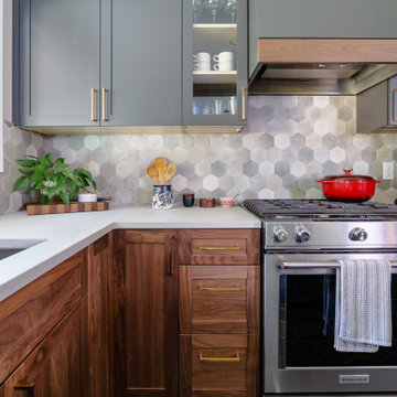
This Portland kitchen transformation focused on reimagining the flow and functionality of the space, while also refreshing its look and feel. The original layout featured a peninsula that created a visual and physical barrier between the cooking and dining areas—and the patio outside—limiting both movement and social interaction.
The homeowners goal was to remove this dividing element and replacing it with a thoughtfully designed custom island that serves as both a functional workspace and a natural gathering point. This strategic change opened up the entire space, creating a seamless flow while maintaining distinct zones for cooking and dining.
Because one of the homeowners is a talented woodworker, we were able to incorporate some really lovely, custom handmade elements throughout the kitchen and dining room.
The result is a kitchen that not only functions better but creates a more inviting environment for both everyday living and entertaining.
 RoomService 360
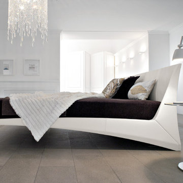
The design concept of Dylan Designer Leather Bed has been driven by extreme engineering, rigorous geometry and basic laws of physics. With extraordinary, innovative structure that gives the illusion of being suspended in air, Dylan Modern Leather Bed is an emblem of originality and a sign of exquisite taste. It is without a doubt by selecting Dylan Leather Platform Bed you are opting to express a distinctive character that echoes modern scale, silhouette and colors. Dylan Designer Platform Bed is made in Italy by Cattelan Italia and is designed by Andrea Lucatello.
 Sabouri Interiors
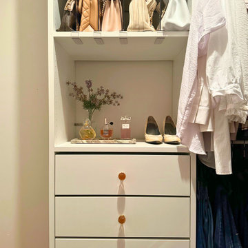
When our client approached us with a budget of $1,000 and a two-month timeline, she was looking to revive her outdated walk-in closet. The old setup was literally falling apart and so cramped that it hardly lived up to the name "walk-in." Our mission was to breathe new life into this space, transforming it into a functional and inviting retreat.
We kicked off the transformation by applying fresh paint and crafting custom storage solutions that precisely matched our client's needs. She had been struggling with locating her shoes, hidden away in old shoe boxes, and her handbags scattered throughout. Our solution was a wallet-friendly, adaptable shoe storage system that keeps everything in sight and easily accessible, evolving right along with her collection.
One of our client's priorities was ensuring comfort for her adorable, cuddly dogs who love spending time in the closet. We chose a washable rug that not only complements the decor but also withstands the occasional mess, maintaining a cozy vibe.
Adding a personal touch, we showcased her cherished wedding shoes and incorporated vintage knobs from her daughter's nursery into the design, making the closet feel uniquely hers.
To streamline her daily routine, we introduced a practical, stylish hamper on wheels, enabling easy transport of laundry from the closet to the laundry room.
The decluttering process was initially overwhelming for our client. With patience and a fresh perspective, we helped her let go of five bags of high-quality clothes and shoes. This not only cleared up physical space but also made room for new beginnings and experiences in her life.
This project was much more than a simple renovation; it was about creating a space that reflects and supports our client's lifestyle, complete with thoughtful touches that make it truly special.
 Baxter Remodeling & Design
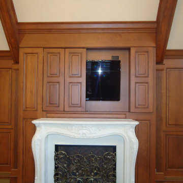
Custom wainscoting and moldings with physical distressing and glazing designed and installed by Baxter Remodeling. All custom panels, doors, solid stock, and moldings provided through Wood-Mode.
 Granit Architects + Interiors
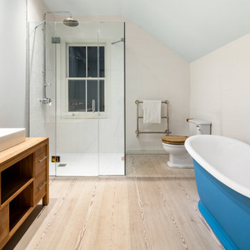
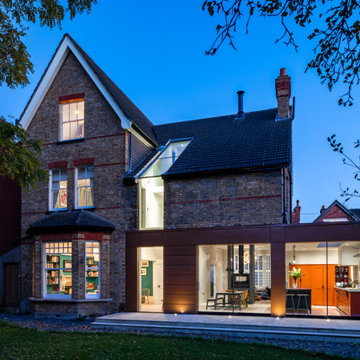
We are delighted to have completed the radical transformation of a tired detached property in South Croydon.
When they appointed Granit, our clients were living in the property which had previously been divided into a number of flats.
The historic sub-division had resulted in an extremely poor use of space with redundant staircases, kitchens and bathrooms throughout.
Our clients sought to reconfigure the property back into a single dwelling for his growing family.
Our client had an eye for design and was keen to balance contemporary design whilst maintaining as much of the character of the original house.
Maximising natural light, space and establishing a visual and physical connection were also key drivers for the design. Owing to the size of the property, it became apparent that reconfiguration rather than extension provided the solution to meet the brief.
A metal clad ‘intervention’ was introduced to the rear facade. This created a strong horizontal element creating a visual balance with the vertical nature of the three storey gable.
The metal cladding specified echoed the colour of the red brick string courses tying old with new. Slender frame sliding doors provide access and views of the large garden.
The central circulation space was transformed by the introduction of a double height glazed slot wrapping up the rear facade and onto the roof. This allows daylight to permeate into the heart of the otherwise dark deep floor plan. The staircase was reconfigured into a series of landings looking down over the main void space below and out towards the tree canopies at the rear of the garden.
The introduction of double pocket doors throughout the ground floor creates a series of interconnected spaces and the whitewashed Larch flooring flows seamlessly from room to room. A bold palette of colours and materials lends character and texture throughout the property.
The end result is a spacious yet cosy environment for the family to inhabit for years to come.
 The Rug Company
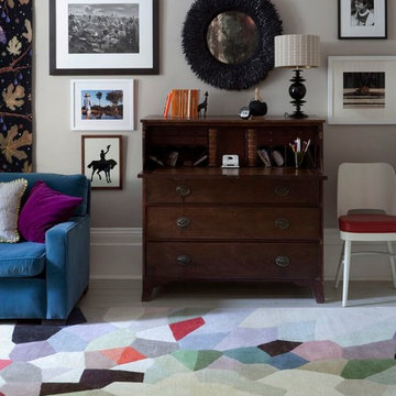
"Palette and Zap depict an explosion of colour that developed out of painted and collaged forms combined with computer manipulation. So much of our visual experience now is rooted in the saturation of images via screen-based technology. My intention therefore, was to transform this visual experience of colour into a physical and tactile one via the beauty of the natural materials and their appeal to the sense of touch." Fiona Curran
 Wood Anchor
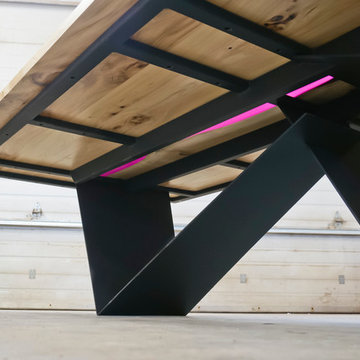
“A deep purple river joins two 14 ft live edge Winnipeg Elm slabs on this one of a kind table.
The angular design of the leg offers visual qualities much like a kite in the sky.
Shifting your perspective to the tables angles you really get a sense of visual and physical mass!
From its side profile you’ll see thin lines of angular connections.”
We were commissioned to build this one of a kind table for a customer residing in another province.
As with all of our custom pieces we worked closely with the customer (much through emails) understanding the emotion they wanted the table to invoke in their space.
Details:
14’ long x 5’ wide x 1.5” thick reclaimed Elm table with central live edge “river” coloured resin, squared outer edges, black powder coated steel leg (“w”leg design) with black powder coated steel table under structure.
First image credit: Customer supplied image.
2016 © Ray Chan Photo, All Rights Reserved
 SHANDRIKA'S REAL ESTATE, STAGING & INTERIOR DESIGN
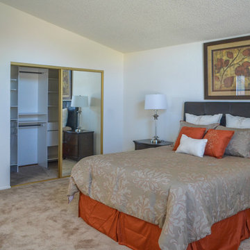
This is a Home Staging Project. Not a full Interior Design Project. The purpose of staging is to showcase a properties physical traits and not detract from them. With staging "less is more". The goal is to add softness and color and a warm environment with out a lot of clutter.
Photo credit: Vanessa Cruz
 Granit Architects + Interiors
We are delighted to have completed the radical transformation of a tired detached property in South Croydon.
When they appointed Granit, our clients were living in the property which had previously been divided into a number of flats.
The historic sub-division had resulted in an extremely poor use of space with redundant staircases, kitchens and bathrooms throughout.
Our clients sought to reconfigure the property back into a single dwelling for his growing family.
Our client had an eye for design and was keen to balance contemporary design whilst maintaining as much of the character of the original house.
Maximising natural light, space and establishing a visual and physical connection were also key drivers for the design. Owing to the size of the property, it became apparent that reconfiguration rather than extension provided the solution to meet the brief.
A metal clad ‘intervention’ was introduced to the rear facade. This created a strong horizontal element creating a visual balance with the vertical nature of the three storey gable.
The metal cladding specified echoed the colour of the red brick string courses tying old with new. Slender frame sliding doors provide access and views of the large garden.
The central circulation space was transformed by the introduction of a double height glazed slot wrapping up the rear facade and onto the roof. This allows daylight to permeate into the heart of the otherwise dark deep floor plan. The staircase was reconfigured into a series of landings looking down over the main void space below and out towards the tree canopies at the rear of the garden.
The introduction of double pocket doors throughout the ground floor creates a series of interconnected spaces and the whitewashed Larch flooring flows seamlessly from room to room. A bold palette of colours and materials lends character and texture throughout the property.
The end result is a spacious yet cosy environment for the family to inhabit for years to come.
 WERK | Building Modern
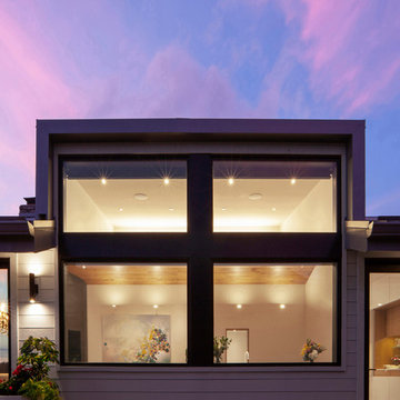
Side garden is reimagined with minimal low maintenance materials and enhanced indoor/outdoor connections (physical and visual), highlighted with new giant shed dormer - Architecture/Interiors/Renderings/Photography: HAUS | Architecture For Modern Lifestyles - Construction Manager: WERK | Building Modern
 Thayer Design Build
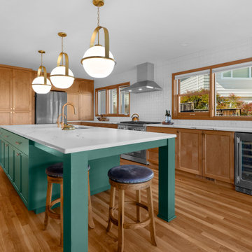
Shannon’s kitchen transformation focused on removing barriers—both physical and functional. By opening up the floor plan, upgrading storage, and modernizing finishes, our team delivered a kitchen and living area that are bright, spacious, and tailored to her style. The result is a cohesive, inviting home that combines beauty and practicality.
 Nistenhaus Design LLC
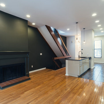
Daring black walls with white trim tie back to the black and white kitchen finishes and bring a modern, dramatic look to the fireplace.
The decision to tear down the wall that was by the refrigerator opened up the space physically as well as visually and makes the space seem much bigger.
 Endless Pools
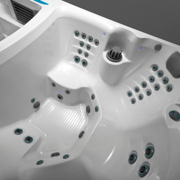
Maximum Features for the Ultimate Experience
It's for those seeking better wellness – fitness, work-life-balance, enriched personal connections. It's a path to find some joy in your physical, mental, and emotional states. That's what we had in mind when we designed the E2000 swim spa.
We combined our exclusive resistance current with luxurious jetted massage seats and wrapped it in one beautiful, low-maintenance package. Swim, run, or exercise in temperate 85-degree water in the front, then unwind at 104 degrees inside the spa area at the back. The E2000 gives you complete control, without sacrifice.
 Irene Designs
Kitchen — Project Description (Bolton, CT)
(Full Renovation • Reconfiguration • Architectural Corrections)
The original kitchen suffered from spatial imbalance and limited functionality: the right side was visually and physically heavy with cabinetry and appliances, the 135-degree angled walls lacked symmetry due to a missing window on the driveway side, and the small island could only seat two. Circulation was obstructed by a desk positioned in the main traffic flow, and the low French door felt disproportionate in scale compared to the large windows and adjacent two-story Great Room.
Major Structural & Functional Improvements
Repositioned window on the front elevation to the right, creating a long-desired view to the driveway while freeing space for a centered cooktop and statement hood — visually aligning with the Great Room’s redesigned fireplace focal wall.
Installed a new custom sliding door, significantly taller and wider than the original French door. This upgrade enhances natural light, visually opens the kitchen to the deck, and provides unobstructed traffic flow thanks to its sliding operation.
New Kitchen Layout & Enhanced Functionality
Designed an entirely new layout centered around a 10' double-slab island, providing expansive workspace and a natural gathering zone.
Added conversational seating for the whole family, allowing comfortable interaction on all sides of the island.
Introduced purpose-designed storage solutions, including pullouts, rollouts, spice towers, tray organizers, and deep drawers to maximize usability.
Reallocated the desk area to a dedicated window spot overlooking the backyard, removing it from traffic paths and improving both functionality and comfort.
Cabinetry & Architectural Detailing
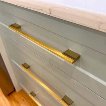
Custom two-tone cabinetry in soft white and a serene blue-green tone reflects the visual language of the adjacent Great Room, creating whole-home cohesion.
Installed lit upper glass cabinets along the entire perimeter, balancing vertical proportions and creating an elegant display band throughout the kitchen.
A custom range hood was designed and painted to match the base cabinetry, becoming a focal point framed by symmetrical windows.
Surfaces, Lighting & Finishes
The island features a double-thickness quartz slab with a soft ogee radius for a timeless, furniture-like feel.
A full-height, handcrafted aqua subway tile backsplash introduces depth, texture, and a gentle reflective quality.
New layered lighting concept, including recessed lights, pendants, task lighting, and integrated cabinet lighting, ensures a warm and functional workspace at any time of day.
 Bryanoji Design Studio
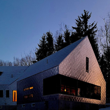
For exterior, factory manufactured aluminium shingles were installed. Wrapped in one material, the architecture’s outline is unpretentiously high-lighted. These aluminium shingles are 90% recycled/recyclable. No scraping, coating, nor painting is required for the lifetime. It can be pin-point replaced should it get damaged. Aluminium’s physical property to reflect light, coupled with super insulation, provides comfortable interior condition without air conditioning. Additionally, this light-weight material has low carbon foot print for shipping.
 Utopia 360 Studio
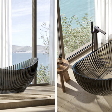
Leader Online, a UK-based company, approached us to support the launch of Nosa, a new sanitary ware brand targeting the British market.
With competition in the sector increasing, they required a cohesive set of visuals for their numerous products to establish a consistent visual language across e-commerce platforms, catalogs, and promotional materials.
It was a complete brand creation from scratch, and we pulled it off.
Key tasks:
- Develop a cohesive visual brand identity for Nosa
- Produce over 2,000 high-quality 3D visualizations
within five months
- Optimize workflows for high efficiency and a unified
visual standard
Our approach:
To efficiently manage high production volumes and accelerate feedback, we implemented an optimized workflow system. This transformed our render production into an assembly line, drastically cutting individual product processing time while upholding top image quality.
Nosa's unique marble, with its distinct veins and inclusions, was central to their brand. Since no existing textures matched, we requested physical samples.
Upon receiving the stone, we set up an improvised photo studio, capturing every detail. Our goal was
not just to replicate the marble in 3D, but to preserve
its raw, organic beauty.
We applied the same meticulous process to metal materials for accurate shade representation. Nosa prioritized authenticity, ensuring buyers saw the true material, not an over-polished version.
Result:
Nosa's market entry surpassed all expectations.
Fueled by its compelling visual identity, the brand achieved strong initial sales and is now rapidly expanding its product range, cementing its presence.
We are proud to continue our partnership with Nosa
to this day.
82