
Search results for "Poor functionality" in Home Design Ideas
 Nip Tuck Remodeling
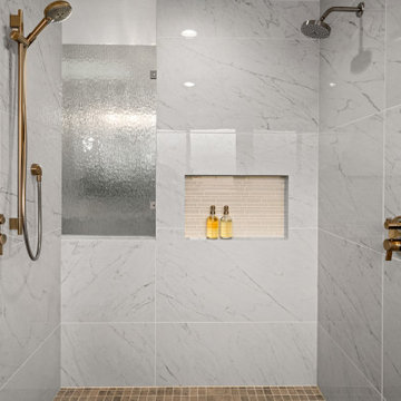
This home had dated and falling apart finishes, an insignificant fireplace in a giant living room, and a poor layout in the family room. Not to mention the primary bath covered in bamboo wallpaper.
The clients wanted a functional, updated and good-looking kitchen, a more adult family room, an updated serene primary bath. The remaining baths to be updated and modern. And, to make it feel like a holistic update, they wanted a welcoming staircase/entry.
As with most clients, stretching their dollar as far as possible was important. They didn't want to enlarge any footprint or move walls - we had to stay within existing bounds. With a whole home remodel costs can add up quickly depending on where we start & stop. For this family it made sense to do all the work at once to avoid repeat remodels. It was either buy new and still have to customize, or remodel to their exact needs and wants. The remodel was more affordable and made just for them.
Many finishes are clean, simple, and modern. A window was removed! in the family room to allow for a symmetrical entertainment center. A dramatic floor to ceiling fireplace surround was created in the Living room. The staircase was totally redone in both shape and style! The primary bath was reworked to get a two-person shower, and soaking tub. Serene /quiet finishes in the primary helped achieve a mellow /calming atmosphere. All new doors and trim throughout.
 Nip Tuck Remodeling
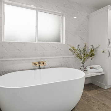
This home had dated and falling apart finishes, an insignificant fireplace in a giant living room, and a poor layout in the family room. Not to mention the primary bath covered in bamboo wallpaper.
The clients wanted a functional, updated and good-looking kitchen, a more adult family room, an updated serene primary bath. The remaining baths to be updated and modern. And, to make it feel like a holistic update, they wanted a welcoming staircase/entry.
As with most clients, stretching their dollar as far as possible was important. They didn't want to enlarge any footprint or move walls - we had to stay within existing bounds. With a whole home remodel costs can add up quickly depending on where we start & stop. For this family it made sense to do all the work at once to avoid repeat remodels. It was either buy new and still have to customize, or remodel to their exact needs and wants. The remodel was more affordable and made just for them.
Many finishes are clean, simple, and modern. A window was removed! in the family room to allow for a symmetrical entertainment center. A dramatic floor to ceiling fireplace surround was created in the Living room. The staircase was totally redone in both shape and style! The primary bath was reworked to get a two-person shower, and soaking tub. Serene /quiet finishes in the primary helped achieve a mellow /calming atmosphere. All new doors and trim throughout.
 San Luis Kitchen Co.
When the homeowners decided to move from San Francisco to the Central Coast, they were looking for a more relaxed lifestyle, a unique place to call their own, and an environment conducive to raising their young children. They found it all in San Luis Obispo. They had owned a house here in SLO for several years that they had used as a rental. As the homeowners own and run a contracting business and relocation was not impossible, they decided to move their business and make this SLO rental into their dream home.
As a rental, the house was in a bare-bones condition. The kitchen had old white cabinets, boring white tile counters, and a horrendous vinyl tile floor. Not only was the kitchen out-of-date and old-fashioned, it was also pretty worn out. The tiles were cracking and the grout was stained, the cabinet doors were sagging, and the appliances were conflicting (ie: you could not open the stove and dishwasher at the same time).
To top it all off, the kitchen was just too small for the custom home the homeowners wanted to create.
Thus enters San Luis Kitchen. At the beginning of their quest to remodel, the homeowners visited San Luis Kitchen’s showroom and fell in love with our Tuscan Grotto display. They sat down with our designers and together we worked out the scope of the project, the budget for cabinetry and how that fit into their overall budget, and then we worked on the new design for the home starting with the kitchen.
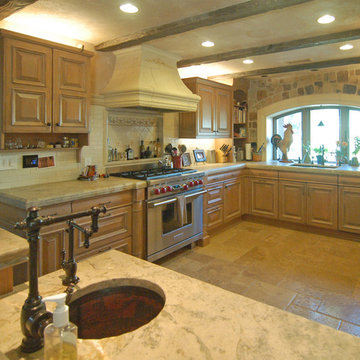
As the homeowners felt the kitchen was cramped, it was decided to expand by moving the window wall out onto the existing porch. Besides the extra space gained, moving the wall brought the kitchen window out from under the porch roof – increasing the natural light available in the space. (It really helps when the homeowner both understands building and can do his own contracting and construction.) A new arched window and stone clad wall now highlights the end of the kitchen. As we gained wall space, we were able to move the range and add a plaster hood, creating a focal nice focal point for the kitchen.
The other long wall now houses a Sub-Zero refrigerator and lots of counter workspace. Then we completed the kitchen by adding a wrap-around wet bar extending into the old dining space. We included a pull-out pantry unit with open shelves above it, wine cubbies, a cabinet for glassware recessed into the wall, under-counter refrigerator drawers, sink base and trash cabinet, along with a decorative bookcase cabinet and bar seating. Lots of function in this corner of the kitchen; a bar for entertaining and a snack station for the kids.
After the kitchen design was finalized and ordered, the homeowners turned their attention to the rest of the house. They asked San Luis Kitchen to help with their master suite, a guest bath, their home control center (essentially a deck tucked under the main staircase) and finally their laundry room. Here are the photos:
I wish I could show you the rest of the house. The homeowners took a poor rental house and turned it into a showpiece! They added custom concrete floors, unique fiber optic lighting, large picture windows, and much more. There is now an outdoor kitchen complete with pizza oven, an outdoor shower and exquisite garden. They added a dedicated dog run to the side yard for their pooches and a rooftop deck at the very peak. Such a fun house.
Wood-Mode Fine Custom Cabinetry, Barcelona
Find the right local pro for your project
 Michael Nash Design, Build & Homes
2010 REGIONAL AWARD WINNER
Built in 2000, this center hall colonial in Fairfax Station, Virginia had a kitchen that was neither functional nor aesthetically pleasing.
First, the floor plan was poorly rationalized. The work triangle was inefficient, a large pantry took up too much floor space, and a series of railings between the kitchen and family room obstructed traffic flow.
Aesthetically, the space was dated. Dutch cabinetry, floral wallpaper and a faux Victorian chandelier all cried for an update. Additionally, the homeowners wanted to incorporate high-end appliances and other amenities like a wine cooler and steam cooker.
Overall, the owners were seeking to replace worn out-of-style kitchen with a substantially upgraded “open” facility that combines traditional and contemporary features configured to support multiple social and culinary needs.
Working with Michael Nash Design, Build & Homes, they decided to implement a series of strategic revisions that would support their new use goals.
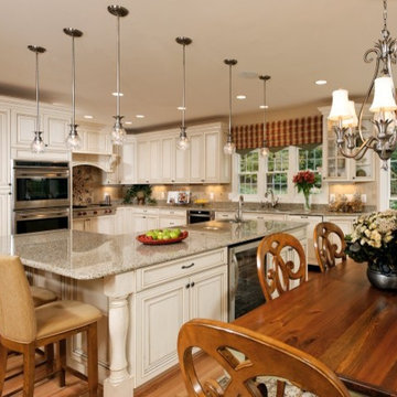
First, they removed an obstructive bearing wall between the existing kitchen and mudroom, creating a recessed niche for a new 48” gas range with custom hood. An unused desk taken out provided a spot for the new 48” two-drawer refrigerator/freezer.
A custom-designed L-shaped granite-surfaced island with bar sink, icemaker and mini-drawer refrigerator takes center stage in the space and offers seating for six. Now the chef can entertain guests while preparing the meal.
From an aesthetic point of view, the interior features are nothing less than stunning. Softly painted walls, decorative ceramic tile backsplashes and granite surfaces combine with custom made cabinets to create an elegant space. Antiqued soft-opaque cabinet facings, wood panel refrigerator door inserts, glass-facing display cabinets and a custom mantle range hood are true works of craftsmanship. Fine detail is expressed with flutes and corbels. Beauty is truly in the details of this award-winning kitchen.
 User
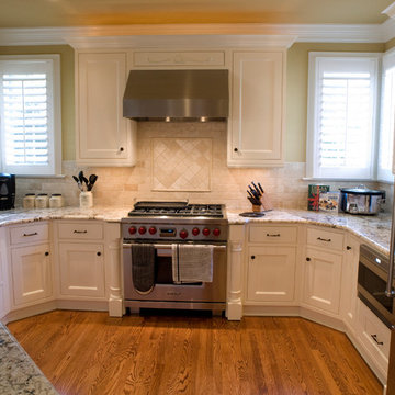
UserThe original kitchen was stuffed into the other end of the kitchen and poorly designed. We moved the kitchen to the old breakfast nook area, kicked out the wall 4' and have a very bright, high end, functional kitchen.
 CBI Design Professionals, Inc.
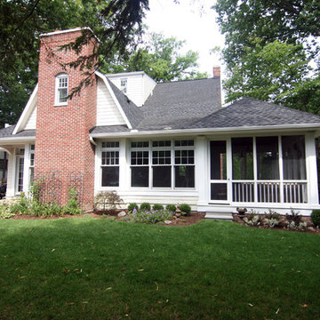
This home addition was intended to expand the home to provide the space needed for the growing new family. The existing kitchen was gutted, expanded and opened up to a family room and nook area. Custom inset cabinets were our preference; however cost was a significant concern. The owner researched multiple companies and standard product lines to save on her budget. After careful analysis, we discovered that it was just as cost effective to use the local custom cabinet maker we preferred. This allowed for more precise detailing and unique features. The goal of a classical farm house kitchen character updated with modern features was able to be obtained much to the home owner's delight.
A family room was added to this home, opening up to a screen porch that takes advantage of a previously unused side yard. The much needed new rear entry provides the family a space for their laundry room and is now the primary entry point from the detached garage. Great care was taken to ensure that the home’s new detailing could have been built this way originally. The space however needed to have a modern function for a modern family. The homes existing exterior had aluminum siding and trim which concealed original millwork and shingles. When the nondescript materials were removed, it was discovered that the original was in poor condition. Careful attention was taken to replace and/or repair original materials wherever possible around the entire home, in order to create a seamless exterior character.
 Kitchen Solvers of Spring Hill
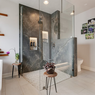
These homeowners were ready to completely transform their master bathroom. The existing space felt cramped and outdated, with an impractical linen closet, a small vanity, poor lighting, a bulky tub, and a shower that had seen better days. Their vision was clear—they wanted a warm, inviting, spa-inspired retreat with natural elements, rich textures, and a unique wood feature wall, rather than the all-white look that has become so common.
The finished design brings that vision to life through a beautiful blend of color, texture, and thoughtful details. A stunning cherry vanity and counter stack, topped with luxurious quartzite countertops, create warmth and elegance. The feature wall, finished in 1" x 3" Articulo tile, adds depth and visual interest, while large-format floor tiles provide a clean, modern foundation.
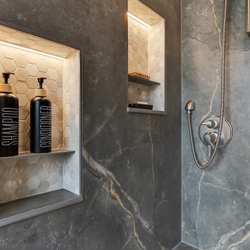
The curbless shower features coordinating hex tile flooring and niches, complemented by porcelain slab walls and glass panels that create an open, airy feel. A spacious freestanding tub offers the perfect place to relax and unwind. To maximize functionality, the doorway was relocated to accommodate a larger vanity, and custom barn and closet doors were added to enhance the room's character.
Programmable lighting tailored to the homeowners' lifestyle, along with a custom wood feature wall designed to showcase decorative plants, transformed a once-empty wall into a stunning focal point. What was once a dreaded space is now a beautiful spa-like retreat and one of the homeowners' favorite rooms in the house.

Sponsored
Columbus, OH

Structural Remodeling
Franklin County's Heavy Timber Specialists | Best of Houzz 2020!
 Kitchen Solvers of Spring Hill
These homeowners were ready to completely transform their master bathroom. The existing space felt cramped and outdated, with an impractical linen closet, a small vanity, poor lighting, a bulky tub, and a shower that had seen better days. Their vision was clear—they wanted a warm, inviting, spa-inspired retreat with natural elements, rich textures, and a unique wood feature wall, rather than the all-white look that has become so common.
The finished design brings that vision to life through a beautiful blend of color, texture, and thoughtful details. A stunning cherry vanity and counter stack, topped with luxurious quartzite countertops, create warmth and elegance. The feature wall, finished in 1" x 3" Articulo tile, adds depth and visual interest, while large-format floor tiles provide a clean, modern foundation.
The curbless shower features coordinating hex tile flooring and niches, complemented by porcelain slab walls and glass panels that create an open, airy feel. A spacious freestanding tub offers the perfect place to relax and unwind. To maximize functionality, the doorway was relocated to accommodate a larger vanity, and custom barn and closet doors were added to enhance the room's character.
Programmable lighting tailored to the homeowners' lifestyle, along with a custom wood feature wall designed to showcase decorative plants, transformed a once-empty wall into a stunning focal point. What was once a dreaded space is now a beautiful spa-like retreat and one of the homeowners' favorite rooms in the house.
 Reico Kitchen & Bath
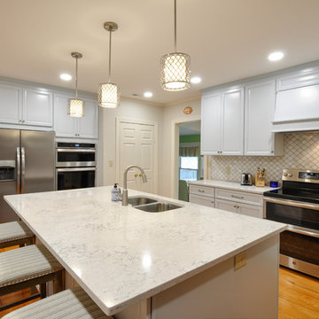
Designed by Jen Gallagher of Reico Kitchen & Bath in Fredericksburg, VA in collaboration with Abby Construction, this transitional style kitchen remodeling project features Merillat Masterpiece cabinets in the Knoxville door style with Surfside finish. Kitchen countertops are Silestone quartz in the color Helix. For the client, what they like best is the new layout. "It was a large space but poorly designed. It's now much more functional with lots of storage space and yet it feels more open. I could not have designed it without Jen's help. Jen told me to make a list of all my kitchen items and decide where they would go. It was the best piece of advice I received. I was able to make sure that I had enough cabinets for everything, it helped me choose accessories for the cabinets and once the remodel was completed it made putting everything away so much quicker." Photos courtesy of Tim Snyder Photography.
 Lean Lens Architects
KITCHEN REDEFINED
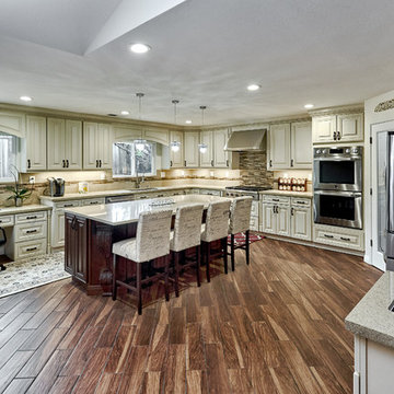
One of the biggest constraints the home owners had was the kitchen's size and layout. By demolishing the poorly designed 'bonus room', Lean Lens Architects was able to create space for a well sized and laid out kitchen.A large island now facilitates entertaining while plentiful storage along the walls creates a perfect background while being functional. The clients picked beautiful finishes to complete the design.
 Bel Air Construction
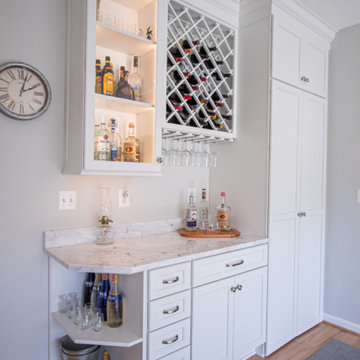
The homeowner’s goal for this kitchen remodel was to improve functionality and increase the home’s value. The existing kitchen was old and needed an update – cabinets were falling apart, the downdraft on the Jenn-Air range made it difficult to cook items correctly, there was little to no storage, lighting was insufficient. A poor layout dominated by a hook-shaped peninsula inhibited the ability to work efficiently
 Sosna Inc
The family's once-loved home had become a source of frustration. Their kitchen, a space meant for gathering and creating, felt cramped and outdated. Limited storage and poor organization made meal prep a tedious task, and entertaining guests a logistical nightmare. The laundry room, often overlooked, was equally problematic. Its cramped layout and lack of storage made laundry day a chore, and the noise of the washing machine echoed through the living room.
To compound the issue, the absence of dedicated office spaces made working from home a constant struggle. One makeshift office was squeezed into the dining room, while another was relegated to the basement.
The family was hesitant to embark on a major renovation, fearing the challenges and uncertainties that come with such a project. Finding a reliable contractor, ensuring timely completion, and worrying about potential shoddy workmanship were all valid concerns.
We understood their anxieties and were committed to providing a smooth and stress-free experience. Our team crafted a design that addressed each of their concerns, transforming their home into a functional and stylish space.
We reimagined the laundry room, creating a custom storage solution and incorporating a stackable washer and dryer. The open hallway to the living room was enclosed, creating a spacious closet with ample storage. The laundry room now seamlessly connected to the kitchen, simplifying the grocery unloading process.
A former juliette balcony was converted into a dedicated office space, providing a peaceful and productive work-from-home environment.
The dated and cluttered ensuite bathroom received a luxurious makeover. A clever pull-out storage system in the shower wall and a spacious niche provided much-needed organization.
While every renovation project has its challenges, this one was remarkably smooth. The only significant hurdle was some additional structural work required in the basement to support the new office space. Our experienced team handled this efficiently, minimizing any disruption.
The final result is a home that truly reflects the family's personality and lifestyle. The laundry room, now a cheerful and organized space with soft green cabinets, patterned floor tiles, and gold accents, showcases our attention to detail.
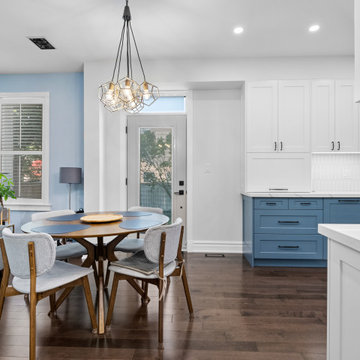
The kitchen is a stunning centerpiece, featuring a striking combination of blue and white cabinets, dark hardwood floors, and a sleek white backsplash. The adjacent beverage bar, with its glass-fronted upper cabinets, provides an elegant space for entertaining.
The ensuite bathroom is a spa-like retreat, with large-format marble tiles, a black vanity, and chrome fixtures creating an atmosphere of understated luxury.
The renovation has had a profound impact on the family's daily life. Ample storage throughout the house has banished clutter, making it easier to maintain a tidy home. The seamless flow from the laundry room to the kitchen has streamlined the grocery unloading process, and the dedicated office spaces have transformed the work-from-home experience.
Beyond the physical transformation, it was the shared moments and laughter that made this project truly special. The family's enthusiasm and good humor were contagious. One of the clients, with his big personality, even starred in a walk-through video of the finished project, showcasing his infectious joy.
From choosing tiles to navigating unexpected challenges, the entire process was filled with warmth and collaboration. Even their four-year-old son, initially shy, warmed up to our site leader, Gus, nicknaming him "Gus the Bus," a moniker that endeared him to the entire team.
 AFFD Design Firm
GAO Zhiqiang: Exploring the infinite possibilities beyond boundaries - Space Emotion Design Series - Vniau Office
The essence of space design is to pay attention to people’s emotional needs, especially in office designs.
Vniau office is designed by GAO Zhiqiang, a space emotion designer. He created an extremely comfortable and inclusive office space by modern design tech-niques, combined with technology, history and humanities.
/ Explore /
Infinite possibilities beyond boundaries
A humanistic caring, warm and emotional design work, under the continuous changes of social forms, evolves into a space in accordance with the develop-ment of the current era, which is the most solid response from the designer to the space.
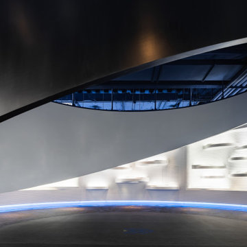
This open space makes you feel like entering into a movie scene. Large areas of black and white contrast, and smooth lines create a powerful aura. However, soft lights bring back a romantic atmosphere. The space is highlighted by vir-tuality and reality.
The development of modern technology diversified people’s cognition and iden-tification of space dimension. The designer tries to break the inherent bound-ary consciousness among technology, humanities and nature by comfortable and efficient spatial perception.
Wandering between virtual and real, light and shadow, the space presents a fu-ture sense through symbols. It shows a bold, free, open, lush, and new office format.
"Compared with technology, we pay more attention to people's emotions and feelings. We have always been advocating using the most common materials to create different spaces, and the key is depended on design." Said designer GAO Zhiqiang.
Therefore, when it came to the selection of materials, pureness presents in-finity, simplicity creates richness. Bright green brings cheerfulness, and the exposed ceiling and cloud-like chandeliers create a natural and agile visual perception. The combination of dynamic and stillness embodies the concentra-tion of the designer.
As the previous office was in Chinese style with redwood furniture, in order to have good effect of the overall space, the designer discussed with the own-er repeatedly, strive to change into a modern style, which matches more with their products, clients, competitors, brand culture and temperament of the of-fice, younger staff, etc., in the end, this design shows up.
This is a ring-shaped office space with same walls and same core tubes, which make people easily disoriented. By the principle of 5 elements - metal, wood, water, fire and earth, the designer placed the reception and exhibition room in the middle, and painted in yellow, corresponding to central earth.
According to this principle, the R & D department on the east side is decorat-ed in green, corresponding to wood, also, the market and finance department on the south side is orange, corresponding to fire. Service department on the west is white color representing metal, CEO and QC office on the north side is given black color, representing water. 5 directions are painted in 5 colors, which make people clearly distinguish departments and directions.
The building wall of the void area has a huge sloped beam, which causes poor visual experience. To solve this problem, the designer creates a magnificent X-shaped style by making use of the original beam structure. Its perforated sides and the luminous aluminum plates are very sci-fi, showing a similar vision of X-Men headquarters.
The interaction, communication and intersection among people are the key points of designing moving lines. Their optimization brings closer collaboration among departments,shorten the distance that people have to walk in the space, such as in conference rooms, negotiation rooms, recreation area, water bar, reception area.
Reasonable moving lines make discussion and communication between people, de-partments, and customers more efficient. At the same time, different spaces create different atmospheres and emotions, relax, or serious, or leisurable, etc., so as to meet needs of different moments.
In addition, the designer GAO Zhiqiang said, "We want to create a feeling of flowing clouds. Lights and curves create moving lines, and give a sense of freedom."
To remove the shackles of traditional office designs, and give a space infi-nite vitality is not just a change in form, it is more about 'people' them-selves. Here, everyone has a very large degree of freedom, and they can feel the infinite possibilities of future. Initiative and creativity are stimulated at the same time. Once people create the environment, areas interact with each other, and the power of design emerges.
Soft curve is a visual expression of tolerance and infinite possibilities. The spatial layout breaks isolation and shortens the distance of human hearts. High efficiency while no boundaries, and everywhere has space for independent thinking and solitude. The space respects each individual and can also unit as a whole.
Gaudi, the most famous Spanish architect, once said that straight lines belong to human, and curves belong to the God. It is probably that the curves give birth to too many wonderful changes. In this space, the curves are formed smoothly, either on the ground or ceiling, or a room, a partition.
"Spatial emotion design" advocates bringing human attributes to spatial func-tions. By designing and shaping the space, people are able to work in the best state of physiological and psychological emotions. Therefore, AFFD is trying their best to create comfortable working environments for employees, to ensure efficient work, as well as physical and mental health of staff.


 Advance Design Studio, Ltd.
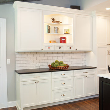
The major kitchen renovation of this old country farmhouse was a task of love, one that had been planned for many years by these Barrington seasoned homeowners. After interviewing no less than five companies, the homeowners chose the design team at Advance Design Studio to make the transformation they had long planned for.
“They had an understanding of the right design for the space almost from the instant they walked in the room”, says Sharon Scott of the design team of Nicole Ryan at Todd Jurs at Advance Design Studio. “They were the only designers who laid out ideas in the first meeting at the house that we really loved”, she says. “It was obvious that they understood the house, and understood us - and from then on the decision to hire them literally made itself”.
The original kitchen had a dividing “wall” of cabinetry…that made the rather large space seem very small, and cut off the kitchen from the eating area that has a beautiful garden view completely hidden from the main kitchen. Circulation was poor, leaving family members on top of one another when entertaining family and friends.
The new kitchen design nearly doubles the kitchen size within the original space; opening it up completely and enjoying an expansive island containing a new Kohler Whitehaven Smart Divide farm sink, a dishwasher, and pull out double trash receptacle. The great new gathering space accommodates four pull out stools beckoning grandchildren and friends alike. Removing the range from the island and relocating it to create a dramatic “feature” wall, completely out of the way of guests; it is now crowned with a beautiful completely customized wood hood designed to ventilate much more efficiently than the original island range containing a limited downdraft system.
The much more efficient use of the space after removing a pantry closet made way for a fully functional “tall wall” housing a double oven and refrigerator, out of the way of guests. Removing the restrictive cabinetry wall now allowed for an expansive floor to ceiling pantry cabinet with full extension pull out shelving, and an elegant display area complete with a beautiful furniture detailed buffet.
Fitting perfectly into the farmhouse charm of the old estate, Medallion Silver Lancaster cabinetry was chosen in a soft white Maple Divinity paint finish lining the perimeter. The stunning island hints to this old home’s past with Medallion Gold’s Maple Devonshire style graced with a Carriage Black Heirloom painted finish. The rubbed off black paint finish reveals the soft wood tones beneath, mimicking furniture you’d see in your grandmother’s home that has lovingly been polished for years to reveal a soft, subtly rubbed-off sheen.
Counter tops reverse contrast with perimeter tops of black “Raven” granite possessing a subtle honed finish, and a shift to Quartz Difinity Viareggio - resembling white Carrera marble on the island. A simple herringbone detail completes the decorative range wall, and subtle porcelain subway tiles grace the backsplash throughout.
The design is finished off with crisp Thermador and Bosch stainless steel appliances, and bright brushed cup pull and handle combination hardware. A pull down Kohler Bellaria faucet makes cleanup a breeze, and soft under-cabinet LED lighting throughout makes every work surface shine softly, and highlights the cabinetry display area with grace.
One special detail was created to make the dramatic ceiling transition to a vaulted area above the breakfast nook extra special. A tongue and groove solid wood ceiling was hung above, and a subtle greenish-grey distressed paint finish was hand developed on site by the talented crew, complementing the new kitchen with a completely unique surface that appears as if it’s been there for many, many years. It’s just one standout feature in the amazing new space that is sure to be in every conversation as newcomers enjoy the newest best hangout in this old home renewed!
After 30 years of renovating homes, this now content homeowner sips a cup of tea enjoying her new garden view, and reminisces projects of past – and lastly reports their experience with Advance Design Studio culminating with their amazing new kitchen to be the most enjoyable and satisfying home experience yet.
Designer: Nicole Ryan
Photographer: Joe Nowak
 Coastal Home Design Studio
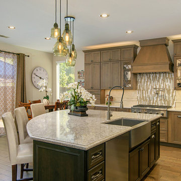
This kitchen started as a builder basic with no personality or charm. The layout didn't have the best function and the island was poorly placed. The homeowners purchased this house with remodeling and upgrading in mind. The layout was changed to accommodate two people cooking together. Zones were created for meal prepping, cooking and baking. The island was expanded to fill the space and utilize bar seating. The walk through butlers pantry was turned in to a wine bar with a fridge, storage and custom glass cabinets. A medium toned hardwood floor was layed throughout the entire lower level
 Reico Kitchen & Bath
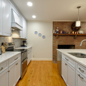
Designed by Jen Gallagher of Reico Kitchen & Bath in Fredericksburg, VA in collaboration with Abby Construction, this transitional style kitchen remodeling project features Merillat Masterpiece cabinets in the Knoxville door style with Surfside finish. Kitchen countertops are Silestone quartz in the color Helix. For the client, what they like best is the new layout. "It was a large space but poorly designed. It's now much more functional with lots of storage space and yet it feels more open. I could not have designed it without Jen's help. Jen told me to make a list of all my kitchen items and decide where they would go. It was the best piece of advice I received. I was able to make sure that I had enough cabinets for everything, it helped me choose accessories for the cabinets and once the remodel was completed it made putting everything away so much quicker." Photos courtesy of Tim Snyder Photography.
 Advance Design Studio, Ltd.
The major kitchen renovation of this old country farmhouse was a task of love, one that had been planned for many years by these Barrington seasoned homeowners. After interviewing no less than five companies, the homeowners chose the design team at Advance Design Studio to make the transformation they had long planned for.
“They had an understanding of the right design for the space almost from the instant they walked in the room”, says Sharon Scott of the design team of Nicole Ryan at Todd Jurs at Advance Design Studio. “They were the only designers who laid out ideas in the first meeting at the house that we really loved”, she says. “It was obvious that they understood the house, and understood us - and from then on the decision to hire them literally made itself”.
The original kitchen had a dividing “wall” of cabinetry…that made the rather large space seem very small, and cut off the kitchen from the eating area that has a beautiful garden view completely hidden from the main kitchen. Circulation was poor, leaving family members on top of one another when entertaining family and friends.
The new kitchen design nearly doubles the kitchen size within the original space; opening it up completely and enjoying an expansive island containing a new Kohler Whitehaven Smart Divide farm sink, a dishwasher, and pull out double trash receptacle. The great new gathering space accommodates four pull out stools beckoning grandchildren and friends alike. Removing the range from the island and relocating it to create a dramatic “feature” wall, completely out of the way of guests; it is now crowned with a beautiful completely customized wood hood designed to ventilate much more efficiently than the original island range containing a limited downdraft system.
The much more efficient use of the space after removing a pantry closet made way for a fully functional “tall wall” housing a double oven and refrigerator, out of the way of guests. Removing the restrictive cabinetry wall now allowed for an expansive floor to ceiling pantry cabinet with full extension pull out shelving, and an elegant display area complete with a beautiful furniture detailed buffet.
Fitting perfectly into the farmhouse charm of the old estate, Medallion Silver Lancaster cabinetry was chosen in a soft white Maple Divinity paint finish lining the perimeter. The stunning island hints to this old home’s past with Medallion Gold’s Maple Devonshire style graced with a Carriage Black Heirloom painted finish. The rubbed off black paint finish reveals the soft wood tones beneath, mimicking furniture you’d see in your grandmother’s home that has lovingly been polished for years to reveal a soft, subtly rubbed-off sheen.
Counter tops reverse contrast with perimeter tops of black “Raven” granite possessing a subtle honed finish, and a shift to Quartz Difinity Viareggio - resembling white Carrera marble on the island. A simple herringbone detail completes the decorative range wall, and subtle porcelain subway tiles grace the backsplash throughout.
The design is finished off with crisp Thermador and Bosch stainless steel appliances, and bright brushed cup pull and handle combination hardware. A pull down Kohler Bellaria faucet makes cleanup a breeze, and soft under-cabinet LED lighting throughout makes every work surface shine softly, and highlights the cabinetry display area with grace.
One special detail was created to make the dramatic ceiling transition to a vaulted area above the breakfast nook extra special. A tongue and groove solid wood ceiling was hung above, and a subtle greenish-grey distressed paint finish was hand developed on site by the talented crew, complementing the new kitchen with a completely unique surface that appears as if it’s been there for many, many years. It’s just one standout feature in the amazing new space that is sure to be in every conversation as newcomers enjoy the newest best hangout in this old home renewed!
After 30 years of renovating homes, this now content homeowner sips a cup of tea enjoying her new garden view, and reminisces projects of past – and lastly reports their experience with Advance Design Studio culminating with their amazing new kitchen to be the most enjoyable and satisfying home experience yet.
Designer: Nicole Ryan
Photographer: Joe Nowak
 Michael Nash Design, Build & Homes
2010 REGIONAL AWARD WINNER
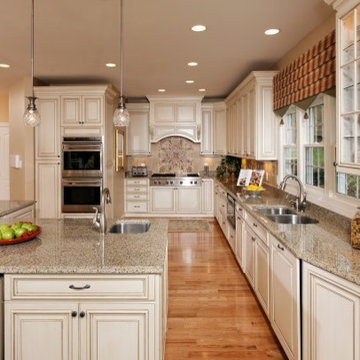
Built in 2000, this center hall colonial in Fairfax Station, Virginia had a kitchen that was neither functional nor aesthetically pleasing.
First, the floor plan was poorly rationalized. The work triangle was inefficient, a large pantry took up too much floor space, and a series of railings between the kitchen and family room obstructed traffic flow.
Aesthetically, the space was dated. Dutch cabinetry, floral wallpaper and a faux Victorian chandelier all cried for an update. Additionally, the homeowners wanted to incorporate high-end appliances and other amenities like a wine cooler and steam cooker.
Overall, the owners were seeking to replace worn out-of-style kitchen with a substantially upgraded “open” facility that combines traditional and contemporary features configured to support multiple social and culinary needs.
Working with Michael Nash Design, Build & Homes, they decided to implement a series of strategic revisions that would support their new use goals.
First, they removed an obstructive bearing wall between the existing kitchen and mudroom, creating a recessed niche for a new 48” gas range with custom hood. An unused desk taken out provided a spot for the new 48” two-drawer refrigerator/freezer.
A custom-designed L-shaped granite-surfaced island with bar sink, icemaker and mini-drawer refrigerator takes center stage in the space and offers seating for six. Now the chef can entertain guests while preparing the meal.
From an aesthetic point of view, the interior features are nothing less than stunning. Softly painted walls, decorative ceramic tile backsplashes and granite surfaces combine with custom made cabinets to create an elegant space. Antiqued soft-opaque cabinet facings, wood panel refrigerator door inserts, glass-facing display cabinets and a custom mantle range hood are true works of craftsmanship. Fine detail is expressed with flutes and corbels. Beauty is truly in the details of this award-winning kitchen.
 Mom's Design Build
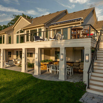
The #LakesideLeisure Project was a comprehensive redesign of a lakefront property that transformed various challenges into stunning solutions. Initially, the property featured a small, high-maintenance cedar deck with minimal lake views, poorly placed stairs, limited flat yard space due to extensive tiered landscaping and excessive plantings, obstructed lake views, and privacy concerns from a neighboring home.
The client’s vision was clear: they wanted a large, flat yard for family activities and hosting, enhanced outdoor living spaces for dining and lounging, increased privacy from neighbors, more shaded hangout areas, improved “curb appeal” from the lake, and reduced maintenance.
 Interiors by Natasha
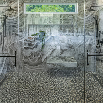
A poorly operating bathroom was creating a negative effect on how it was functioning for Tyrone and Veronica. This 120-square-foot bathroom in Atlanta, GA had problems which needed to be addressed. A leaking, moldy shower stall and a large unused jacuzzi tub were the impetus for this bathroom renovation. The lack of storage in the long narrow double vanity with oversized frameless mirror created yet another problem.
Our immediate attention focused on replacing the large double window above the jacuzzi tub with a long narrow 6-foot window. Because the jacuzzi tub was rarely used my clients wanted to remove it; instead, they wanted a 9-foot his and hers double shower. We decided to modify the vanity with a custom-built double vanity with an attached tall linen closet. The linen closet inside the bathroom was then turned it into a shoe closet. There is a lack of storage space in the owner’s suite closet, so we decided to convert the linen closet into a shoe closet.
38