
Search results for "Poor functionality" in Home Design Ideas
 Sosna Inc
The family's once-loved home had become a source of frustration. Their kitchen, a space meant for gathering and creating, felt cramped and outdated. Limited storage and poor organization made meal prep a tedious task, and entertaining guests a logistical nightmare. The laundry room, often overlooked, was equally problematic. Its cramped layout and lack of storage made laundry day a chore, and the noise of the washing machine echoed through the living room.
To compound the issue, the absence of dedicated office spaces made working from home a constant struggle. One makeshift office was squeezed into the dining room, while another was relegated to the basement.
The family was hesitant to embark on a major renovation, fearing the challenges and uncertainties that come with such a project. Finding a reliable contractor, ensuring timely completion, and worrying about potential shoddy workmanship were all valid concerns.
We understood their anxieties and were committed to providing a smooth and stress-free experience. Our team crafted a design that addressed each of their concerns, transforming their home into a functional and stylish space.
We reimagined the laundry room, creating a custom storage solution and incorporating a stackable washer and dryer. The open hallway to the living room was enclosed, creating a spacious closet with ample storage. The laundry room now seamlessly connected to the kitchen, simplifying the grocery unloading process.
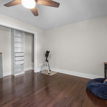
A former juliette balcony was converted into a dedicated office space, providing a peaceful and productive work-from-home environment.
The dated and cluttered ensuite bathroom received a luxurious makeover. A clever pull-out storage system in the shower wall and a spacious niche provided much-needed organization.
While every renovation project has its challenges, this one was remarkably smooth. The only significant hurdle was some additional structural work required in the basement to support the new office space. Our experienced team handled this efficiently, minimizing any disruption.
The final result is a home that truly reflects the family's personality and lifestyle. The laundry room, now a cheerful and organized space with soft green cabinets, patterned floor tiles, and gold accents, showcases our attention to detail.
The kitchen is a stunning centerpiece, featuring a striking combination of blue and white cabinets, dark hardwood floors, and a sleek white backsplash. The adjacent beverage bar, with its glass-fronted upper cabinets, provides an elegant space for entertaining.
The ensuite bathroom is a spa-like retreat, with large-format marble tiles, a black vanity, and chrome fixtures creating an atmosphere of understated luxury.
The renovation has had a profound impact on the family's daily life. Ample storage throughout the house has banished clutter, making it easier to maintain a tidy home. The seamless flow from the laundry room to the kitchen has streamlined the grocery unloading process, and the dedicated office spaces have transformed the work-from-home experience.
Beyond the physical transformation, it was the shared moments and laughter that made this project truly special. The family's enthusiasm and good humor were contagious. One of the clients, with his big personality, even starred in a walk-through video of the finished project, showcasing his infectious joy.
From choosing tiles to navigating unexpected challenges, the entire process was filled with warmth and collaboration. Even their four-year-old son, initially shy, warmed up to our site leader, Gus, nicknaming him "Gus the Bus," a moniker that endeared him to the entire team.
 Designs by BSB
This modest kitchen renovation in Lilburn, GA including removing a short peninsula and transforming the space to allow for an island. This greatly improved not only the flow of traffic but also the function of work zones. There was an awkward deep corner with a hutch display that yielded to unfunctional counter space and poor storage. This area was redesigned to be the wall ovens & refrigerator thus allowing more counter space where it was needed -- by the cooktop.
The shallow island features a Zebrawood Island Top with a mineral oil finish, practical and beautiful for food prep! The backside has a soft elliptical arch to increase the top size and allow for a stool for long prep or quick snacks.
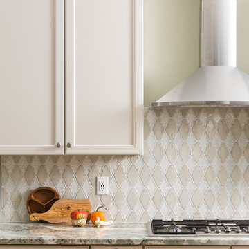
The unique monochromatic mosaic backsplash by SOHO Tile creates a beautiful backdrop that compliments with the leathered Fantasy Brown Quartzite counter tops.
 Advance Design Studio, Ltd.
The major kitchen renovation of this old country farmhouse was a task of love, one that had been planned for many years by these Barrington seasoned homeowners. After interviewing no less than five companies, the homeowners chose the design team at Advance Design Studio to make the transformation they had long planned for.
“They had an understanding of the right design for the space almost from the instant they walked in the room”, says Sharon Scott of the design team of Nicole Ryan at Todd Jurs at Advance Design Studio. “They were the only designers who laid out ideas in the first meeting at the house that we really loved”, she says. “It was obvious that they understood the house, and understood us - and from then on the decision to hire them literally made itself”.
The original kitchen had a dividing “wall” of cabinetry…that made the rather large space seem very small, and cut off the kitchen from the eating area that has a beautiful garden view completely hidden from the main kitchen. Circulation was poor, leaving family members on top of one another when entertaining family and friends.
The new kitchen design nearly doubles the kitchen size within the original space; opening it up completely and enjoying an expansive island containing a new Kohler Whitehaven Smart Divide farm sink, a dishwasher, and pull out double trash receptacle. The great new gathering space accommodates four pull out stools beckoning grandchildren and friends alike. Removing the range from the island and relocating it to create a dramatic “feature” wall, completely out of the way of guests; it is now crowned with a beautiful completely customized wood hood designed to ventilate much more efficiently than the original island range containing a limited downdraft system.
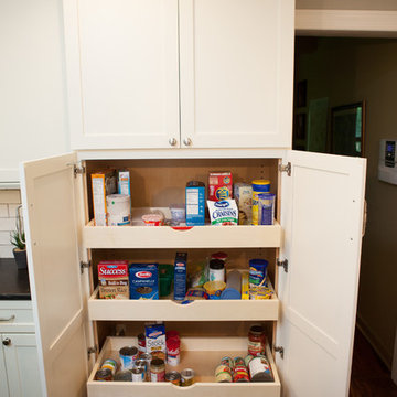
The much more efficient use of the space after removing a pantry closet made way for a fully functional “tall wall” housing a double oven and refrigerator, out of the way of guests. Removing the restrictive cabinetry wall now allowed for an expansive floor to ceiling pantry cabinet with full extension pull out shelving, and an elegant display area complete with a beautiful furniture detailed buffet.
Fitting perfectly into the farmhouse charm of the old estate, Medallion Silver Lancaster cabinetry was chosen in a soft white Maple Divinity paint finish lining the perimeter. The stunning island hints to this old home’s past with Medallion Gold’s Maple Devonshire style graced with a Carriage Black Heirloom painted finish. The rubbed off black paint finish reveals the soft wood tones beneath, mimicking furniture you’d see in your grandmother’s home that has lovingly been polished for years to reveal a soft, subtly rubbed-off sheen.
Counter tops reverse contrast with perimeter tops of black “Raven” granite possessing a subtle honed finish, and a shift to Quartz Difinity Viareggio - resembling white Carrera marble on the island. A simple herringbone detail completes the decorative range wall, and subtle porcelain subway tiles grace the backsplash throughout.
The design is finished off with crisp Thermador and Bosch stainless steel appliances, and bright brushed cup pull and handle combination hardware. A pull down Kohler Bellaria faucet makes cleanup a breeze, and soft under-cabinet LED lighting throughout makes every work surface shine softly, and highlights the cabinetry display area with grace.
One special detail was created to make the dramatic ceiling transition to a vaulted area above the breakfast nook extra special. A tongue and groove solid wood ceiling was hung above, and a subtle greenish-grey distressed paint finish was hand developed on site by the talented crew, complementing the new kitchen with a completely unique surface that appears as if it’s been there for many, many years. It’s just one standout feature in the amazing new space that is sure to be in every conversation as newcomers enjoy the newest best hangout in this old home renewed!
After 30 years of renovating homes, this now content homeowner sips a cup of tea enjoying her new garden view, and reminisces projects of past – and lastly reports their experience with Advance Design Studio culminating with their amazing new kitchen to be the most enjoyable and satisfying home experience yet.
Designer: Nicole Ryan
Photographer: Joe Nowak
Find the right local pro for your project
 Kaufman Construction Design and Build
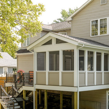
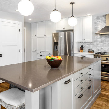
Emily and Steve have remodeled several pieces of their home and because they love Kaufman’s process so much, they keep coming back. In past years, we’ve remodeled most of their main floor including an updated living space and staircase, and a completely remodeled powder room and kitchen with a nice big island that’s perfect for entertaining. Their most recent project was this year when we remodeled their deck. The major pain points Steve and Emily dealt with before the remodel was lack of functionality due to poor design and because the previous owners had built the deck themselves, there were quite a few safety concerns. Throughout the design process, we decided to remove the existing deck completely and start fresh with a screened in porch, Emily’s Porch, and a deck off the porch with stairs going down to the beautiful backyard – one of the factors that motivated them to make this house their home to begin with.
 MMW Architects
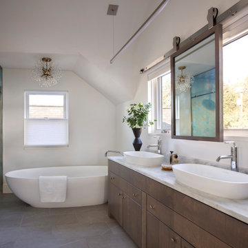
What the owners of the Madeline Ave Residence loved about the home when they bought it was the charm of the original 1920’s structure. However, a dissonance addition from the 1970’s shifted original charm to aesthetic awkwardness and poor flow. While maintaining the feel of the front façade, the rest of the home was reconfigured and choreographed to offer beauty and meet functional needs. Like many homes in historic districts, the homes grow organically to meet needs. Multiple forms and roof lines result.
Due to incorporating these same moves, this renovation fits seamlessly into the neighborhood. It is formal where it needs to be yet comfortable for the daily life. The people, the dog, the cats, the wine: all were carefully tended to throughout the design of the home. The spacious rooms and crisp white palette set the stage for vibrant tile and offers many locations for large scale art. Easy connections to the exterior spaces offer all-season gathering under the shade of the trellis or while making s’mores around the fire pit.
 Reico Kitchen & Bath
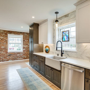
Designed by Marc Jean-Michel of Reico Kitchen & Bath in Bethesda, MD in collaboration with Liz Forgione of MMD Construction, this small transitional kitchen features Green Forest cabinets in the Park Place shaker door style in two finishes. The base cabinets feature a Summit Grey finish and the wall cabinets a White finish. The kitchen countertops are MSI Artic White Quartz.
The kitchen includes a Maravilla/Alvetian Isles Honed Marble 4x16 tile backsplash along with GE and Frigidaire appliances.
“The hardest part was envisioning a new functional space in an old kitchen with a poor layout and use of space,” said the client. “I love most the transformation in the flow of the whole first floor. The kitchen entries are wide, more inviting and create a lot of great light! There is so much great storage in a small kitchen! Marc was great to work with. I loved all of his ideas.”
Photos courtesy of BTW Images LLC.
 Amsted Design-Build
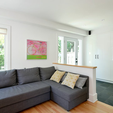
Previously renovated with a two-story addition in the 80’s, the home’s square footage had been increased, but the current homeowners struggled to integrate the old with the new.
An oversized fireplace and awkward jogged walls added to the challenges on the main floor, along with dated finishes. While on the second floor, a poorly configured layout was not functional for this expanding family.
From the front entrance, we can see the fireplace was removed between the living room and dining rooms, creating greater sight lines and allowing for more traditional archways between rooms.
At the back of the home, we created a new mudroom area, and updated the kitchen with custom two-tone millwork, countertops and finishes. These main floor changes work together to create a home more reflective of the homeowners’ tastes.
On the second floor, the master suite was relocated and now features a beautiful custom ensuite, walk-in closet and convenient adjacency to the new laundry room.
Gordon King Photography

Sponsored
Columbus, OH

Structural Remodeling
Franklin County's Heavy Timber Specialists | Best of Houzz 2020!
 Interiors By Melody
Before
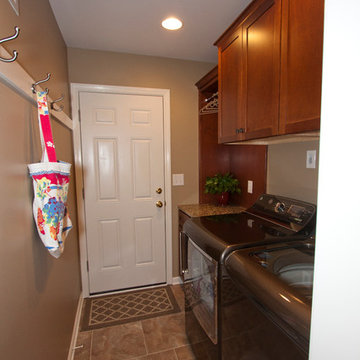
The laundry storage was inadequate Lighting was poor
The hookups pushed the appliances too far into the room
After
Though the new appliances were deeper we were able to recess the hook ups and the venting into the walls to offer a clearer walk-thru. The new cabinets meant clutter could be hidden. Additional lighting and a wall hung coat rack add even more functional space.
 Kaufman Construction Design and Build
Emily and Steve have remodeled several pieces of their home and because they love Kaufman’s process so much, they keep coming back. In past years, we’ve remodeled most of their main floor including an updated living space and staircase, and a completely remodeled powder room and kitchen with a nice big island that’s perfect for entertaining. Their most recent project was this year when we remodeled their deck. The major pain points Steve and Emily dealt with before the remodel was lack of functionality due to poor design and because the previous owners had built the deck themselves, there were quite a few safety concerns. Throughout the design process, we decided to remove the existing deck completely and start fresh with a screened in porch, Emily’s Porch, and a deck off the porch with stairs going down to the beautiful backyard – one of the factors that motivated them to make this house their home to begin with.
 Coastal Home Design Studio
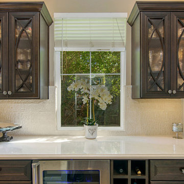
This kitchen started as a builder basic with no personality or charm. The layout didn't have the best function and the island was poorly placed. The homeowners purchased this house with remodeling and upgrading in mind. The layout was changed to accommodate two people cooking together. Zones were created for meal prepping, cooking and baking. The island was expanded to fill the space and utilize bar seating. The walk through butlers pantry was turned in to a wine bar with a fridge, storage and custom glass cabinets. A medium toned hardwood floor was layed throughout the entire lower level.
 MMW Architects
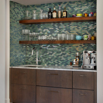
What the owners of the Madeline Ave Residence loved about the home when they bought it was the charm of the original 1920’s structure. However, a dissonance addition from the 1970’s shifted original charm to aesthetic awkwardness and poor flow. While maintaining the feel of the front façade, the rest of the home was reconfigured and choreographed to offer beauty and meet functional needs. Like many homes in historic districts, the homes grow organically to meet needs. Multiple forms and roof lines result.
Due to incorporating these same moves, this renovation fits seamlessly into the neighborhood. It is formal where it needs to be yet comfortable for the daily life. The people, the dog, the cats, the wine: all were carefully tended to throughout the design of the home. The spacious rooms and crisp white palette set the stage for vibrant tile and offers many locations for large scale art. Easy connections to the exterior spaces offer all-season gathering under the shade of the trellis or while making s’mores around the fire pit.
 Arin Carlyle
"Maximize Your Space:
The Upstreman Black BR321 Mini Fridge
I'm a college student living in a tiny dorm room, struggling to keep my snacks, beverages, and leftovers fresh. My regular trips to the communal kitchen fridge are time-consuming and frustrating. I often discover my snacks mysteriously disappearing.
This was the exact situation I found myself in before investing in the Upstreman BR321 Mini Fridge. It was a game-changer for me in more ways than one.
One scorching summer, my friends and I hosted a movie night in my dorm room. We brought our snacks and even ice cream. Given the limited space, I doubted one appliance could handle it all. Still, with a capacity of 3.2 cubic feet, the Upstreman BR321 Mini Fridge exceeded my expectations.
As we stocked the fridge with beverages, the efficient single-door and adjustable thermostat stood out, cooling our drinks to varying preferences seamlessly. It ran quietly during our movie night, its soft 38 dB hum lost amid our enjoyment, unlike the disruptive communal fridge. It operates smoothly on 115 volts.
The freezer impressed us further by keeping the ice cream firm, complementing the ready ice cubes from the included tray. The Upstreman BR321 Mini Fridge proved excellent for storing frozen delights.
Discovering the Upstreman BR321 Mini Fridge's full capabilities was enlightening. Its crisper drawer extended the freshness of my produce, and the removable shelves made for intelligent storage. This fridge became an indispensable time and money saver in my dorm.
The included accessories, like the defrost tool, and responsive customer service added convenience. Outshining other models, it integrated into my college life effortlessly, keeping my food and drinks ideally chilled.
Pros:
1. At 17.4" deep, 33.1" wide, and 18.7" high, this space-saving, single-door design is ideal for snug spaces.
2. Customizable thermostat for personalized cooling.
3. Silent operation that doesn't disrupt your peace.
4. A crisper drawer and removable shelves for organized storage.
5. Comprehensive package with valuable accessories and reliable customer service.
6. Weighing just 39.7 pounds, this item is easily portable.
Cons:
1. None to mention, it exceeded all my expectations.
Conclusion:
The Upstreman BR321 Mini Fridge is a stellar choice for anyone needing a compact, reliable appliance. As a student, it exceeded my expectations, proving itself daily. At around $137.9, it is budget-friendly.
—----------------------------
"Chill in Style:
The Upstreman Black FR-17 Fridge with Freezer
One evening, Dad came home looking troubled. Over dinner, he shared how his office fridge was failing, struggling to keep things cold. He was fed up with its poor performance, which only added to the stresses of his workday. It was clear that a replacement was overdue.
I fondly recall how my trusty Upstreman BR321 became my dorm's cooling hero. I suggested to Dad, "It's time tlack FR-17 model. Confident in the brand's quality, it would be an excellent choice for his office needs.
old replace the old fridge in the office."
Based on my positive experience with the Upstreman BR321, I suggested to my father that he consider the Upstreman B
Sleek and space-efficient, the Upstreman 1.7 Cu.ft Mini Fridge shines in compactness and practicality. At 18.9" x 17.7" x 19.3", it tucks into small spaces easily, an excellent addition to dorms, offices, or bedrooms. The design includes a reversible door, maximizing convenience in snug layouts.
Its cooling prowess is adjustable between 33.8°F and 46.4°F, and it comes with a nifty freezer compartment for keeping edibles ice-cold. Operating at a whisper-quiet 38dB, it ensures a tranquil atmosphere.
Energy consumption is impressively low, about 0.5 kWh per day, using an eco-conscious R600a refrigerant. Upstreman backs this model with a one-year warranty, making the FR17 an intelligent, stress-free choice.
Pros:
1. Compact (18.9" x 17.7" x 19.3") - Fits well in tight spaces.
2. Adjustable thermostat (33.8°F to 46.4°F) - Suits varied storage needs.
3. Quiet (38dB) - Ensures a peaceful environment.
4. Energy-efficient - Only 0.5 kWh daily usage.
5. Eco-friendly - Uses R600a refrigerant, better for the planet.
Cons:
1. Requires manual defrosting, adding to maintenance tasks.
2. It offers minimal freezer space, which is unsuitable for more extensive storage needs.
Conclusion:
Dad's office space is complete with the Upstreman Black FR-17, offering a silent, energy-efficient cooling solution that's both space-saving and perfect for his daily needs, ensuring fresh snacks and drinks are always within reach.
—-----------------------------------------
"Chill in Compact Luxury:
Upstreman's Sleek 3.2 Cu.Ft Double Door Mini Fridge- BD-321"
Nestled amidst our salon's vibrant bustle and the rhythmic snip of scissors, the Upstreman BD321 Mini Double Door Fridge stands as a beacon of excellent efficiency. This sleek, space-conscious appliance, chosen by my mother for its style and functionality, ensures drinks and beauty products are refreshingly cold.
Its well-designed compartments, a 2.2 Cu.Ft cooler alongside a 1 Cu.Ft freezer, maintain our essentials at prime temperatures, from crisp face masks to frosty beverages. The adjustable thermostat and soft LED interior lighting cater to our after-hours operations. At the same time, the versatile shelving accommodates various product sizes.
Costing mere cents to run daily and operating in hushed tones, it's the salon's silent workhorse. With its energy-smart design and customizable options, the Upstreman Mini Double Door Fridge isn't just an appliance—it's a vital part of our daily routine, earning my recommendation for anyone searching for a stylish, reliable mini fridge for personal or professional spaces.
Pros:
1. Compact yet spacious with a 3.2 cubic feet capacity, perfect for small living spaces.
2. Offers five temperature settings and a constant -0.4 F freezer for precise cooling.
3. Features a crisper drawer and removable shelves to keep produce fresh.
4. Quiet (38 dB) operation and energy-efficient, costing roughly $0.1 daily.
5. Customizable with accessories like an ice tray and reversible doors for user convenience.
Cons:
1. Requires manual defrosting, a potential hassle for the time-strapped.
2. The 1 Cu.Ft freezer compartment may be too small for bulk freezing needs.
Conclusion:
My salon's service quality has soared with the Upstreman Mini Double Door Fridge —beverages stay chilled, products remain fresh, and the silent operation keeps the ambiance serene.
 CBI Design Professionals, Inc.
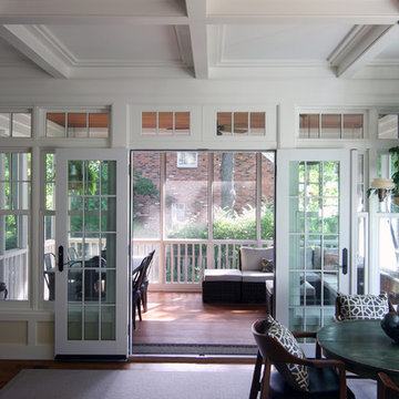
This home addition was intended to expand the home to provide the space needed for the growing new family. The existing kitchen was gutted, expanded and opened up to a family room and nook area. Custom inset cabinets were our preference; however cost was a significant concern. The owner researched multiple companies and standard product lines to save on her budget. After careful analysis, we discovered that it was just as cost effective to use the local custom cabinet maker we preferred. This allowed for more precise detailing and unique features. The goal of a classical farm house kitchen character updated with modern features was able to be obtained much to the home owner's delight.
A family room was added to this home, opening up to a screen porch that takes advantage of a previously unused side yard. The much needed new rear entry provides the family a space for their laundry room and is now the primary entry point from the detached garage. Great care was taken to ensure that the home’s new detailing could have been built this way originally. The space however needed to have a modern function for a modern family. The homes existing exterior had aluminum siding and trim which concealed original millwork and shingles. When the nondescript materials were removed, it was discovered that the original was in poor condition. Careful attention was taken to replace and/or repair original materials wherever possible around the entire home, in order to create a seamless exterior character.


 Michael Nash Design, Build & Homes
2010 REGIONAL AWARD WINNER
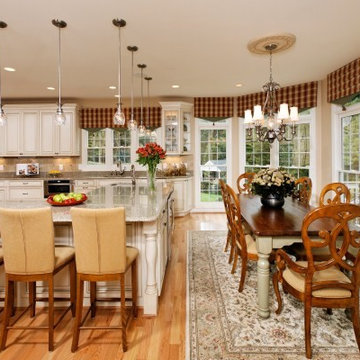
Built in 2000, this center hall colonial in Fairfax Station, Virginia had a kitchen that was neither functional nor aesthetically pleasing.
First, the floor plan was poorly rationalized. The work triangle was inefficient, a large pantry took up too much floor space, and a series of railings between the kitchen and family room obstructed traffic flow.
Aesthetically, the space was dated. Dutch cabinetry, floral wallpaper and a faux Victorian chandelier all cried for an update. Additionally, the homeowners wanted to incorporate high-end appliances and other amenities like a wine cooler and steam cooker.
Overall, the owners were seeking to replace worn out-of-style kitchen with a substantially upgraded “open” facility that combines traditional and contemporary features configured to support multiple social and culinary needs.
Working with Michael Nash Design, Build & Homes, they decided to implement a series of strategic revisions that would support their new use goals.
First, they removed an obstructive bearing wall between the existing kitchen and mudroom, creating a recessed niche for a new 48” gas range with custom hood. An unused desk taken out provided a spot for the new 48” two-drawer refrigerator/freezer.
A custom-designed L-shaped granite-surfaced island with bar sink, icemaker and mini-drawer refrigerator takes center stage in the space and offers seating for six. Now the chef can entertain guests while preparing the meal.
From an aesthetic point of view, the interior features are nothing less than stunning. Softly painted walls, decorative ceramic tile backsplashes and granite surfaces combine with custom made cabinets to create an elegant space. Antiqued soft-opaque cabinet facings, wood panel refrigerator door inserts, glass-facing display cabinets and a custom mantle range hood are true works of craftsmanship. Fine detail is expressed with flutes and corbels. Beauty is truly in the details of this award-winning kitchen.
 Interiors by Natasha
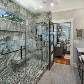
A poorly operating bathroom was creating a negative effect on how it was functioning for Tyrone and Veronica. This 120-square-foot bathroom in Atlanta, GA had problems which needed to be addressed. A leaking, moldy shower stall and a large unused jacuzzi tub were the impetus for this bathroom renovation. The lack of storage in the long narrow double vanity with oversized frameless mirror created yet another problem.
Our immediate attention focused on replacing the large double window above the jacuzzi tub with a long narrow 6-foot window. Because the jacuzzi tub was rarely used my clients wanted to remove it; instead, they wanted a 9-foot his and hers double shower. We decided to modify the vanity with a custom-built double vanity with an attached tall linen closet. The linen closet inside the bathroom was then turned it into a shoe closet. There is a lack of storage space in the owner’s suite closet, so we decided to convert the linen closet into a shoe closet.
 Michael Nash Design, Build & Homes
2010 REGIONAL AWARD WINNER
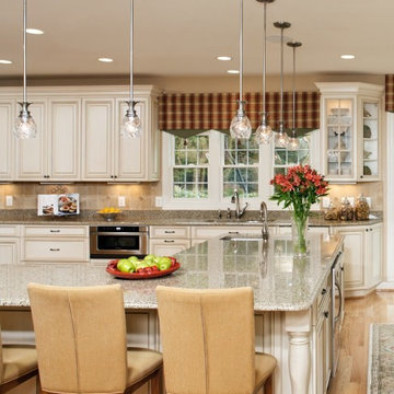
Built in 2000, this center hall colonial in Fairfax Station, Virginia had a kitchen that was neither functional nor aesthetically pleasing.
First, the floor plan was poorly rationalized. The work triangle was inefficient, a large pantry took up too much floor space, and a series of railings between the kitchen and family room obstructed traffic flow.
Aesthetically, the space was dated. Dutch cabinetry, floral wallpaper and a faux Victorian chandelier all cried for an update. Additionally, the homeowners wanted to incorporate high-end appliances and other amenities like a wine cooler and steam cooker.
Overall, the owners were seeking to replace worn out-of-style kitchen with a substantially upgraded “open” facility that combines traditional and contemporary features configured to support multiple social and culinary needs.
Working with Michael Nash Design, Build & Homes, they decided to implement a series of strategic revisions that would support their new use goals.
First, they removed an obstructive bearing wall between the existing kitchen and mudroom, creating a recessed niche for a new 48” gas range with custom hood. An unused desk taken out provided a spot for the new 48” two-drawer refrigerator/freezer.
A custom-designed L-shaped granite-surfaced island with bar sink, icemaker and mini-drawer refrigerator takes center stage in the space and offers seating for six. Now the chef can entertain guests while preparing the meal.
From an aesthetic point of view, the interior features are nothing less than stunning. Softly painted walls, decorative ceramic tile backsplashes and granite surfaces combine with custom made cabinets to create an elegant space. Antiqued soft-opaque cabinet facings, wood panel refrigerator door inserts, glass-facing display cabinets and a custom mantle range hood are true works of craftsmanship. Fine detail is expressed with flutes and corbels. Beauty is truly in the details of this award-winning kitchen.
 MMW Architects
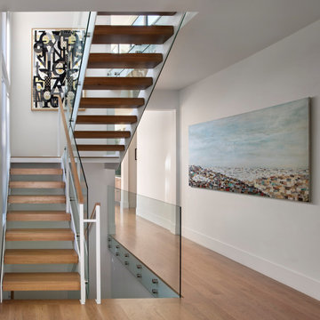
What the owners of the Madeline Ave Residence loved about the home when they bought it was the charm of the original 1920’s structure. However, a dissonance addition from the 1970’s shifted original charm to aesthetic awkwardness and poor flow. While maintaining the feel of the front façade, the rest of the home was reconfigured and choreographed to offer beauty and meet functional needs. Like many homes in historic districts, the homes grow organically to meet needs. Multiple forms and roof lines result.
Due to incorporating these same moves, this renovation fits seamlessly into the neighborhood. It is formal where it needs to be yet comfortable for the daily life. The people, the dog, the cats, the wine: all were carefully tended to throughout the design of the home. The spacious rooms and crisp white palette set the stage for vibrant tile and offers many locations for large scale art. Easy connections to the exterior spaces offer all-season gathering under the shade of the trellis or while making s’mores around the fire pit.
 J & F Specialties, Inc.
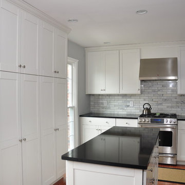
What was once a dark and dated kitchen with a poor layout was transformed into a bright open kitchen that is much more functional. We opened up some walls and removed another, relocated the door leading to the garage and relocated the sink. We added recessed and under cabinet lighting as well as updating outlets and switched. The new cabinets are Bridgewood Advantage Maple Mission door in painted white. The countertops are black quartz. The backsplash is Carrera marble.
 Imagine That Kitchens + Baths
Client desire:
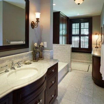
Bring back the original splendor of the master bathroom in her 1905 four-square mansion, including a low profile bathtub for her mother, a separate shower for herself, and plenty of storage.
Design challenges:
The bathroom had been part of a poorly constructed 1960’s addition with a narrow passage and a substandard foundation resulting in a room that was always too cold. The original part of the house had a foot of concrete for the sub-flooring so we were unsure about the ability to move fixtures. The window size and location had to remain fixed due to architectural details on the outside of the home.
Solutions:
We removed the addition subfloor to repair the weak footings and added closed cell insulation. We widened the passage and added a floor to ceiling armoire and shallow base cabinets with a curved end for storage. Inside one of the base cabinets we concealed a new larger radiator and we added in-floor heat. Functionality and flow were improved by switching the placement of the vanity and bathtub. The arched doors throughout the house were the inspiration for the curved glass shower door, arched medicine cabinet, and curved cabinetry. The antique wall sconces were purchased by the homeowner on her quest to find lighting in keeping with the era of the home. But the pièce de résistance is the beautiful Carrera marble and basket weave tile flooring achieved by a master tilesetter who worked meticulously to create the perfect result from my design.
 Coastal Home Design Studio
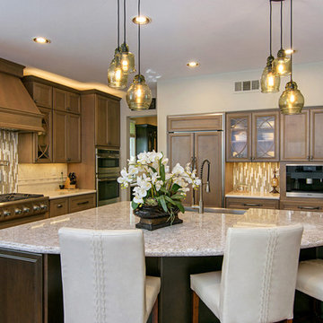
This kitchen started as a builder basic with no personality or charm. The layout didn't have the best function and the island was poorly placed. The homeowners purchased this house with remodeling and upgrading in mind. The layout was changed to accommodate two people cooking together. Zones were created for meal prepping, cooking and baking. The island was expanded to fill the space and utilize bar seating. The walk through butlers pantry was turned in to a wine bar with a fridge, storage and custom glass cabinets. A medium toned hardwood floor was layed throughout the entire lower level
37