
Search results for "Poor functionality" in Home Design Ideas
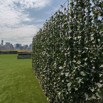
 TechGrass
In areas where real grass is difficult to grow or maintain–due to high traffic or poor conditions–we offer a superb alternative that is functional, durable, remarkably realistic and replicates a natural appearance of pristine landscape in any environment.
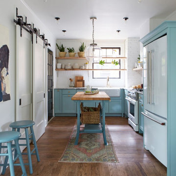
 Next Gen Design Firm
We took this small galley kitchen and turned it into a functional space for a family of 5. Open shelves let the light poor in. White appliances offer a clean look that is more warm than stainless steel. We added barn doors for better traffic management when Mom and Dad are cooking. We also made the center island mobile so it can also be used in the dining room for serving buffet style.
 Designs by KS
When our clients came to us with their renovation project asking for a pink kitchen, we were thrilled at the opportunity to create a unique, bright and colourful kitchen. It’s not something you see everyday, and we live for it! Being that they are a young family, who loves to cook but felt secluded and overwhelmed when in this space, we knew that this was going to be an epic transformation, not just aesthetically but also for their day-to-day life.
This renovation transformed a closed off, cramped, and poorly laid-out kitchen into a colourful, bright, open, and inviting space that combines functionality with vibrant colours and character. The redesign focused on maximizing storage, improving layout efficiency, and infusing the space with unique design elements that make it both practical and fun.
Find the right local pro for your project
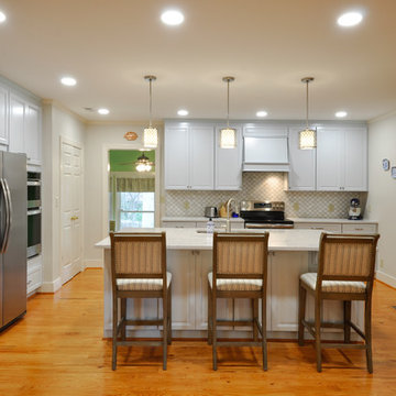
 Reico Kitchen & Bath
Designed by Jen Gallagher of Reico Kitchen & Bath in Fredericksburg, VA in collaboration with Abby Construction, this transitional style kitchen remodeling project features Merillat Masterpiece cabinets in the Knoxville door style with Surfside finish. Kitchen countertops are Silestone quartz in the color Helix. For the client, what they like best is the new layout. "It was a large space but poorly designed. It's now much more functional with lots of storage space and yet it feels more open. I could not have designed it without Jen's help. Jen told me to make a list of all my kitchen items and decide where they would go. It was the best piece of advice I received. I was able to make sure that I had enough cabinets for everything, it helped me choose accessories for the cabinets and once the remodel was completed it made putting everything away so much quicker." Photos courtesy of Tim Snyder Photography.
 Walczak Design And Build
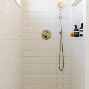
When this family came to us, they loved their home — but their bathrooms were failing them. The kids' bathroom had a non-functioning tub, a serious problem with two young children in the house. The primary bathroom was battling an active shower leak, a poor layout, and finishes well past their prime. Both spaces needed to be gutted. We got to work.
The Primary Bath: Elevated, Effortless, Unmistakably Theirs
Our clients arrived with a clear vision and a beautiful, refined sense of style. The layout was reconfigured from the ground up, and at the heart of the room sits a custom double vanity in a soft, sophisticated sage, topped with a stunning marble countertop and coordinating backsplash. Paired with elegant walnut-framed mirrors, a sculptural black and brass sconce, and wall-mounted polished nickel faucets, the vanity wall is a showpiece. Custom woven shades add warmth without sacrificing light.
The walk-in shower delivers — floor-to-ceiling white subway tile, a mosaic marble floor, transom windows, and frameless glass. Schluter DITRA radiant floor heating adds the kind of quiet luxury you feel every morning. Both marble surfaces were professionally sealed with StoneGuard to protect the investment for the long haul.
The Kids' Bath: Cheerful, Timeless, Built to Last
The girls' bathroom is designed with just as much intention as any room in the house. A warm white oak vanity with marble countertop anchors the space, paired with an antique brass-framed mirror and raspberry custom sconce shades that bring personality without being precious. A botanical-print Roman shade layers in pattern and charm.
The fully rebuilt tub-shower features wall-to-wall white subway tile, polished nickel fixtures, and a beautiful geometric floor tile in cream and warm taupe. A glass-front wall cabinet keeps things tidy, and tile wainscoting wraps the room for durability where it counts. Schluter DITRA radiant heat runs underfoot here too — because warm floors aren't just for adults.
Two bathrooms. Completely distinct. Completely intentional. Built for a family that already loved their home — and loves it even more now.
 ForeverLawn, Inc.
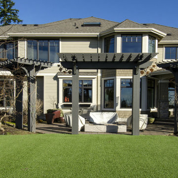
The owners of this incredible home in Lake Sammamish, Washington, had been discouraged by the work done by a previous artificial turf company at their home—a low quality product was installed poorly and therefore didn’t function as it should. Their faith in the artificial turf industry was restored when ForeverLawn Bellevue stepped in to remove and correct the issues that the previous company had created. ForeverLawn transformed a disaster into the homeowners’ dream yard. This wonderfully executed installation included over 4,000 square feet of DuPont™ ForeverLawn® Select HD and a unique backyard putting green surfaced with EZ Putt, a variation of GolfGreens™ ideal for fun, family-focused putting greens that requires little maintenance and will provide endless entertainment.
 Saikley Architects
This beautiful 1881 Alameda Victorian cottage, wonderfully embodying the Transitional Gothic-Eastlake era, had most of its original features intact. Our clients, one of whom is a painter, wanted to preserve the beauty of the historic home while modernizing its flow and function.
From several small rooms, we created a bright, open artist’s studio. We dug out the basement for a large workshop, extending a new run of stair in keeping with the existing original staircase. While keeping the bones of the house intact, we combined small spaces into large rooms, closed off doorways that were in awkward places, removed unused chimneys, changed the circulation through the house for ease and good sightlines, and made new high doorways that work gracefully with the eleven foot high ceilings. We removed inconsistent picture railings to give wall space for the clients’ art collection and to enhance the height of the rooms. From a poorly laid out kitchen and adjunct utility rooms, we made a large kitchen and family room with nine-foot-high glass doors to a new large deck. A tall wood screen at one end of the deck, fire pit, and seating give the sense of an outdoor room, overlooking the owners’ intensively planted garden. A previous mismatched addition at the side of the house was removed and a cozy outdoor living space made where morning light is received. The original house was segmented into small spaces; the new open design lends itself to the clients’ lifestyle of entertaining groups of people, working from home, and enjoying indoor-outdoor living.
Photography by Kurt Manley.
https://saikleyarchitects.com/portfolio/artists-victorian/


 Designs by KS
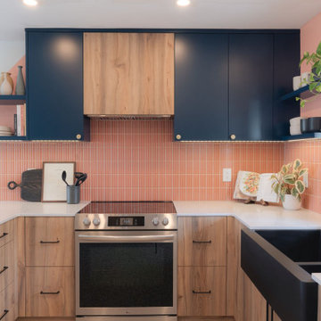
When our clients came to us with their renovation project asking for a pink kitchen, we were thrilled at the opportunity to create a unique, bright and colourful kitchen. It’s not something you see everyday, and we live for it! Being that they are a young family, who loves to cook but felt secluded and overwhelmed when in this space, we knew that this was going to be an epic transformation, not just aesthetically but also for their day-to-day life.
This renovation transformed a closed off, cramped, and poorly laid-out kitchen into a colourful, bright, open, and inviting space that combines functionality with vibrant colours and character. The redesign focused on maximizing storage, improving layout efficiency, and infusing the space with unique design elements that make it both practical and fun.
 Texan Landscape Group LLC
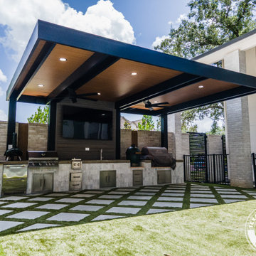
Set in a backyard with a beautiful pool but little shade, this Houston project was designed to solve two key problems. Problem number 1 was sun exposure and the second problem was a poorly laid-out outdoor kitchen. The homeowners reached out to our team looking for a modern, functional solution.
At the heart of this transformation is a 16×32 cantilevered aluminum pergola, one of the longest we can build without front posts. This design creates uninterrupted open space beneath the structure, offering full visibility and maximum flexibility for layout and movement. The pergola features insulated roof panels (IRP) in a striking sandalwood finish that mimics tongue-and-groove wood. The structure’s frame and roof are all aircraft-grade aluminum, making it both stylish and durable—ideal for Houston’s heat and humidity.
Six recessed can lights and dual ceiling fans were installed to ensure the area stays cool and usable day or night. All electrical runs were cleanly concealed within the IRP, keeping the minimalist design intact.
Beneath the pergola, we installed 2×2 pearl white alpine smooth cast pavers in a diamond pattern. These pavers blend seamlessly with the existing turf, bringing brightness and texture to the space while maintaining a soft, luxurious feel underfoot.
The old L-shaped kitchen was removed and replaced with a full-length custom build across the back of the patio. It’s outfitted with everything a backyard chef could want: a built-in grill, burners, sink, Big Green Egg, Traeger smoker, and a slide-out fridge. The kitchen was carefully designed to maximize the available space while meeting city code, with all components permitted and engineered.
To complete the entertainment zone, we built a custom CMU TV wall, finished with Trex paneling for warmth and texture. It includes a wall-mounted flat-screen, Sonos speakers, and a discreetly hidden mini amplifier for seamless AV integration. All wiring is cleanly tucked away, keeping the look sleek and modern.
 Castle Building & Remodeling
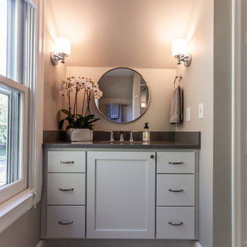
This 1932 South Minneapolis bathroom was OK to look at but did not suit the client’s aesthetics. Not to mention, it was composed of poorly-made and impractical products. Glass mosaic tiles in the shower were hard to clean and were cracking, while the vanity was falling apart.
The clients wanted something fresher that connected with the rest of the feel of their home, and products that were easier to maintain. The layout remained the same, but the space was updated with traditional style cement tiles, subway tiles and a timeless style/finish for the new vanity. Quartz was used for the vanity top, which will be easy to clean and maintain for the homeowner for years to come. A frameless glass enclosure was installed in order to eliminate the problematic stall-style shower curtain that the client despised.
The result was a bathroom that is classic in style but modern in maintenance and function.
 Enchanted Kitchens, LLC
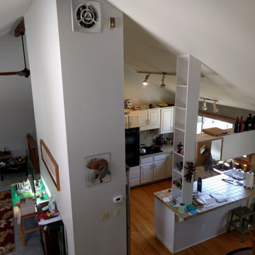
The space was unusable for family and entertaining. It was too small, with poor space planning. This complete remodel required structural wall removal, appliance relocate, floor replace and refinish. The peninsula was replaced with island for better traffic flow. The bridge at hood avoided the need for tile to the ceiling. The client was a fireman and the ladder makes him feel right at home!
 Mom's Design Build
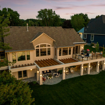
The #LakesideLeisure Project was a comprehensive redesign of a lakefront property that transformed various challenges into stunning solutions. Initially, the property featured a small, high-maintenance cedar deck with minimal lake views, poorly placed stairs, limited flat yard space due to extensive tiered landscaping and excessive plantings, obstructed lake views, and privacy concerns from a neighboring home.
The client’s vision was clear: they wanted a large, flat yard for family activities and hosting, enhanced outdoor living spaces for dining and lounging, increased privacy from neighbors, more shaded hangout areas, improved “curb appeal” from the lake, and reduced maintenance.
 MMW Architects
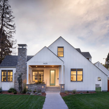
What the owners of the Madeline Ave Residence loved about the home when they bought it was the charm of the original 1920’s structure. However, a dissonance addition from the 1970’s shifted original charm to aesthetic awkwardness and poor flow. While maintaining the feel of the front façade, the rest of the home was reconfigured and choreographed to offer beauty and meet functional needs. Like many homes in historic districts, the homes grow organically to meet needs. Multiple forms and roof lines result.
Due to incorporating these same moves, this renovation fits seamlessly into the neighborhood. It is formal where it needs to be yet comfortable for the daily life. The people, the dog, the cats, the wine: all were carefully tended to throughout the design of the home. The spacious rooms and crisp white palette set the stage for vibrant tile and offers many locations for large scale art. Easy connections to the exterior spaces offer all-season gathering under the shade of the trellis or while making s’mores around the fire pit.

Sponsored
Columbus, OH

Structural Remodeling
Franklin County's Heavy Timber Specialists | Best of Houzz 2020!
 New Era Builders Inc
Here’s a polished paragraph for you:
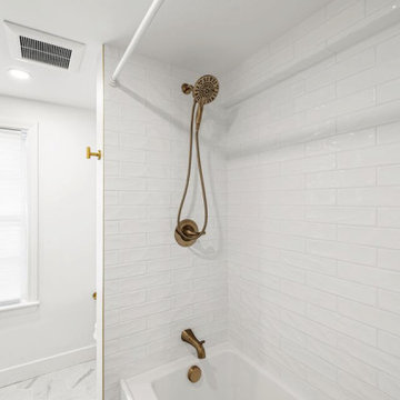
We took what was once a poorly finished flipper’s space and transformed it into a properly built, functional laundry room and bathroom designed with this growing family in mind. With a newborn on the way, every detail mattered — from creating an open, accessible layout for effortless laundry, to building a comfortable, safe area to bathe the baby. Thoughtful design, quality craftsmanship, and smart planning came together to deliver a space that not only works beautifully today, but will make life easier for this family as they continue to grow.
 Cantoni
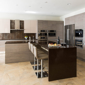
After dealing with a poorly designed kitchen for more than 15 years, the Kumets family brought in Cantoni design consultant George Saba to transform their space into one that was open, contemporary and ergonomically efficient. Read the full story here: http://cantoni.com/interior-design-services/projects/AChef-WorthyRemodel/
Photos by Lauren Reynolds Logan
 Mom's Design Build
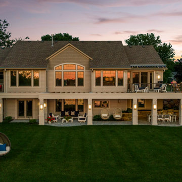
The #LakesideLeisure Project was a comprehensive redesign of a lakefront property that transformed various challenges into stunning solutions. Initially, the property featured a small, high-maintenance cedar deck with minimal lake views, poorly placed stairs, limited flat yard space due to extensive tiered landscaping and excessive plantings, obstructed lake views, and privacy concerns from a neighboring home.
The client’s vision was clear: they wanted a large, flat yard for family activities and hosting, enhanced outdoor living spaces for dining and lounging, increased privacy from neighbors, more shaded hangout areas, improved “curb appeal” from the lake, and reduced maintenance.
 L/L Design - Build - Furnish
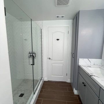
Sometimes the cost of painting an existing vanity vs. a new vanity isn't only the cost of the labor, fixing the old doors, the inside shelves were in poor condition, and the overall space the vanity provided was sub par...so we did replace the vanity and they have so much more functioning space. We did however paint the linen cabinet and the adjoining wall, and it really makes it look built it. I think this transformation is a home run!!!
 Keith Spears Kitchen & Bath Designer/Consultant
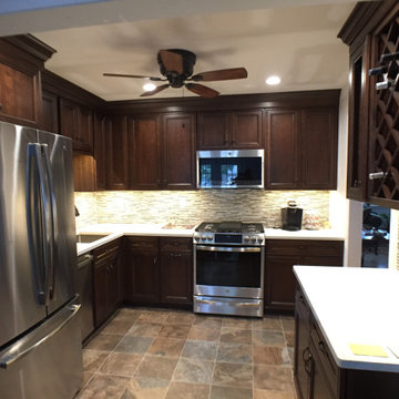
The old, outdated kitchen from the 40's had poor flow and was no longer to code. The remodeled kitchen has better flow and function just by switching the fridge and stove. The new wood cabinets fit better with the colors and style of the updated house, as is the flooring.
 Nancy Finneson | DeMane Design
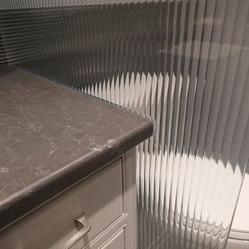
The owners of this remodel desired a refreshing new master bathroom. The original layout was poorly designed with minimal storage, a small shower, a rarely used bathtub and a water closet that was difficult to access. The old vanity flanked a curved wall of glass block (the main challenge with this space) which didn’t allow for mirrors and was always cluttered because of limited storage.
With smart space planning and attention to detail this well-appointed bathroom is now a uniquely personal space that functions brilliantly and balanced for the homeowners.
Photo: DeMane Design
 McCabe By Design LLC
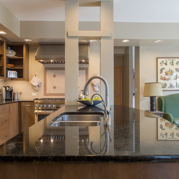
By extending the soffit across the entry to the back hall, the ventilation ducting was brought into code compliance while providing additional lighting. Pull-out base pantries were installed on either side of the range for easy access spice and condiment storage.
The support posts at the end of the island could not be removed. However by removing one of the 'decorative' shelves, the line of sight between the range and the sink was opened up for enhanced communications.
Photo by A Kitchen That Works LLC
42