
Search results for "Poor functionality" in Home Design Ideas
 Nancy Finneson | DeMane Design
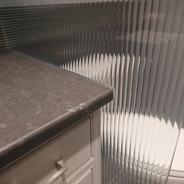
The owners of this remodel desired a refreshing new master bathroom. The original layout was poorly designed with minimal storage, a small shower, a rarely used bathtub and a water closet that was difficult to access. The old vanity flanked a curved wall of glass block (the main challenge with this space) which didn’t allow for mirrors and was always cluttered because of limited storage.
With smart space planning and attention to detail this well-appointed bathroom is now a uniquely personal space that functions brilliantly and balanced for the homeowners.
Photo: DeMane Design
 Voar Construction
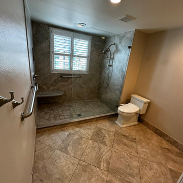
Before – Master Bathroom: Outdated and in Need of Renewal
Before the renovation, the master bathroom featured outdated double sinks, old cabinetry, and poor lighting. The mirrors and finishes were worn and no longer aligned with modern design standards. The shower area had dark tiles and an undersized niche, contributing to an overall dim and dated look. The space not only felt aged but was also in need of repairs and a complete transformation to meet current functionality and style.
 Cantoni
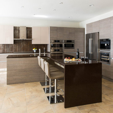
After dealing with a poorly designed kitchen for more than 15 years, the Kumets family brought in Cantoni design consultant George Saba to transform their space into one that was open, contemporary and ergonomically efficient. Read the full story here: http://cantoni.com/interior-design-services/projects/AChef-WorthyRemodel/
Photos by Lauren Reynolds Logan
Find the right local pro for your project
 MMW Architects
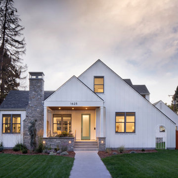
What the owners of the Madeline Ave Residence loved about the home when they bought it was the charm of the original 1920’s structure. However, a dissonance addition from the 1970’s shifted original charm to aesthetic awkwardness and poor flow. While maintaining the feel of the front façade, the rest of the home was reconfigured and choreographed to offer beauty and meet functional needs. Like many homes in historic districts, the homes grow organically to meet needs. Multiple forms and roof lines result.
Due to incorporating these same moves, this renovation fits seamlessly into the neighborhood. It is formal where it needs to be yet comfortable for the daily life. The people, the dog, the cats, the wine: all were carefully tended to throughout the design of the home. The spacious rooms and crisp white palette set the stage for vibrant tile and offers many locations for large scale art. Easy connections to the exterior spaces offer all-season gathering under the shade of the trellis or while making s’mores around the fire pit.
 Reico Kitchen & Bath
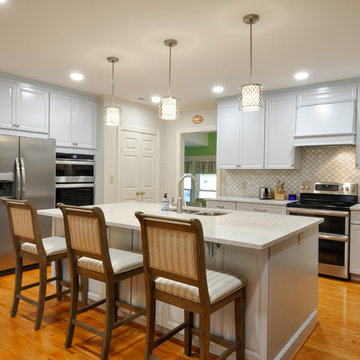
Designed by Jen Gallagher of Reico Kitchen & Bath in Fredericksburg, VA in collaboration with Abby Construction, this transitional style kitchen remodeling project features Merillat Masterpiece cabinets in the Knoxville door style with Surfside finish. Kitchen countertops are Silestone quartz in the color Helix. For the client, what they like best is the new layout. "It was a large space but poorly designed. It's now much more functional with lots of storage space and yet it feels more open. I could not have designed it without Jen's help. Jen told me to make a list of all my kitchen items and decide where they would go. It was the best piece of advice I received. I was able to make sure that I had enough cabinets for everything, it helped me choose accessories for the cabinets and once the remodel was completed it made putting everything away so much quicker." Photos courtesy of Tim Snyder Photography.
 Michael Nash Design, Build & Homes
2010 REGIONAL AWARD WINNER
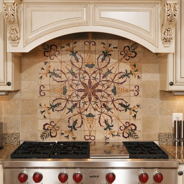
Built in 2000, this center hall colonial in Fairfax Station, Virginia had a kitchen that was neither functional nor aesthetically pleasing.
First, the floor plan was poorly rationalized. The work triangle was inefficient, a large pantry took up too much floor space, and a series of railings between the kitchen and family room obstructed traffic flow.
Aesthetically, the space was dated. Dutch cabinetry, floral wallpaper and a faux Victorian chandelier all cried for an update. Additionally, the homeowners wanted to incorporate high-end appliances and other amenities like a wine cooler and steam cooker.
Overall, the owners were seeking to replace worn out-of-style kitchen with a substantially upgraded “open” facility that combines traditional and contemporary features configured to support multiple social and culinary needs.
Working with Michael Nash Design, Build & Homes, they decided to implement a series of strategic revisions that would support their new use goals.
First, they removed an obstructive bearing wall between the existing kitchen and mudroom, creating a recessed niche for a new 48” gas range with custom hood. An unused desk taken out provided a spot for the new 48” two-drawer refrigerator/freezer.
A custom-designed L-shaped granite-surfaced island with bar sink, icemaker and mini-drawer refrigerator takes center stage in the space and offers seating for six. Now the chef can entertain guests while preparing the meal.
From an aesthetic point of view, the interior features are nothing less than stunning. Softly painted walls, decorative ceramic tile backsplashes and granite surfaces combine with custom made cabinets to create an elegant space. Antiqued soft-opaque cabinet facings, wood panel refrigerator door inserts, glass-facing display cabinets and a custom mantle range hood are true works of craftsmanship. Fine detail is expressed with flutes and corbels. Beauty is truly in the details of this award-winning kitchen.
 Imagine That Kitchens + Baths
Client desire:
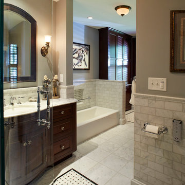
Bring back the original splendor of the master bathroom in her 1905 four-square mansion, including a low profile bathtub for her mother, a separate shower for herself, and plenty of storage.
Design challenges:
The bathroom had been part of a poorly constructed 1960’s addition with a narrow passage and a substandard foundation resulting in a room that was always too cold. The original part of the house had a foot of concrete for the sub-flooring so we were unsure about the ability to move fixtures. The window size and location had to remain fixed due to architectural details on the outside of the home.
Solutions:
We removed the addition subfloor to repair the weak footings and added closed cell insulation. We widened the passage and added a floor to ceiling armoire and shallow base cabinets with a curved end for storage. Inside one of the base cabinets we concealed a new larger radiator and we added in-floor heat. Functionality and flow were improved by switching the placement of the vanity and bathtub. The arched doors throughout the house were the inspiration for the curved glass shower door, arched medicine cabinet, and curved cabinetry. The antique wall sconces were purchased by the homeowner on her quest to find lighting in keeping with the era of the home. But the pièce de résistance is the beautiful Carrera marble and basket weave tile flooring achieved by a master tilesetter who worked meticulously to create the perfect result from my design.

Sponsored
Columbus, OH

Structural Remodeling
Franklin County's Heavy Timber Specialists | Best of Houzz 2020!
 Designs by KS
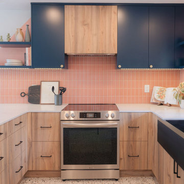
When our clients came to us with their renovation project asking for a pink kitchen, we were thrilled at the opportunity to create a unique, bright and colourful kitchen. It’s not something you see everyday, and we live for it! Being that they are a young family, who loves to cook but felt secluded and overwhelmed when in this space, we knew that this was going to be an epic transformation, not just aesthetically but also for their day-to-day life.
This renovation transformed a closed off, cramped, and poorly laid-out kitchen into a colourful, bright, open, and inviting space that combines functionality with vibrant colours and character. The redesign focused on maximizing storage, improving layout efficiency, and infusing the space with unique design elements that make it both practical and fun.
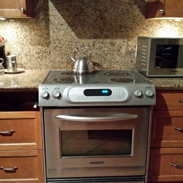
 Image To Interior Inc.
A poorly laid out kitchen whose colours and finishes didn't match the rest of the traditional home was given an incredibly functional and beautiful update.
The floorplan was adjusted without moving any walls or the flooring only the addition of new cabinets, extended breakfast bar island, granite counters, brick backsplash, lighting, appliances, trim, crown and paint. Voila!
 Lotus Gardenscapes & Bloom Garden Center
The Vision
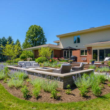
Our clients wanted a beautiful backyard to look out upon from their upper screen room, and to have a water feature to listen to. A functional space to have their grandchildren be able to enjoy and also the installation of lighting for safety and enjoyment in the evenings were high on the priority list. Their final wish list was an extended driveway and several trees nearby for privacy and future shade.
The Challenge
The site itself is in a low area and the lot was heavy clay that was often full of standing water. This was the biggest challenge with choosing plant material that would withstand some poor drainage in most areas.
Project Features
Paver border on driveway
Water feature
Bluestone and paver patio and walkways
Outdoor Lighting
Plantings
Design + Plan
Creating this landscape to be successful started with proper grading of the site to help reduce the amount of standing water. Drainage was installed as well as grading to allow water to be directed to a storm drain at the rear of the property. Plantings that will tolerate standing water, such as Red maple and Dawn Redwood were used in areas that may have flooding.
A paver border was installed along the driveway to give them more space and add a finished look to the home. Natural stone steps and a bluestone patio were added with paver accents through the patio to highlight a path to the backyard from the deck. Boulders are placed throughout for the kids to climb on and to bring in more stones to play off of the water feature.
Plantings include grasses, flowering shrubs, and perennials creating a casual atmosphere in the back landscape. The front entrance has shrub roses, coral bells, and grasses as well in high contrast colors for visual interest.
The lighting throughout the landscape features path lighting for safety as well as uplights on many of the trees and downlighting onto the water feature in the backyard.
Final Result
New Build with the Future in Mind
Many newly built homes in subdivisions leave a lot to be desired in the landscape, and this homeowner had the foresight to know that doing it right the first time is important. By investing in good materials and planning, and planting trees for the future early on, this landscape will last a long time and provide an amazing space for decades.
A beautiful timeless combination of plantings and hardscape materials at this property along with the relaxing sound of the water feature make for a lovely retreat in this neighborhood.
 Chicagoland Home Products
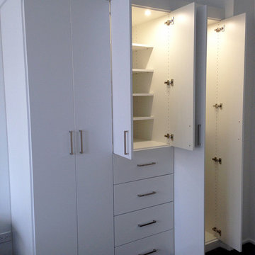
Chicagoland Home Products pops up all over the Chicago area just looking for an awkward niche to transform into a place of custom storage, accessibility and function. Most homes have an area that is hard to get to, poorly designed or with no purpose. The design people and craftsmen at CHP are ready to look at your biggest and smallest problem places and help you fulfill your plans to bring grace to the awkward. Even if you don’t have a plan for transformation, Chicagoland Home Products will help you develop one.
Example #1 adds some usable storage space to a room that came up short when it needed a closet. Using white with flat fronts and polished chrome square pulls, this unit has base molding and in-cabinet lighting. Where there was once awkward emptiness there are now drawers, shelves and a space for hanging storage.
Example #2 takes advantage of an unused wall. This unit is highlighted with the Carnaval color and Aspen fronts. A lighting valance enriches the area and makes it look great and brings alive a space that will be used for general storage and to display whatever you would like to show off.
These are just two examples of the many ways Chicagoland Home Products can take wasted space and provide storage solutions, beauty and usefulness. Remember that CHP has a practical purpose and a storage solution for all those places in your home, office or garage that need to become so much more that they are.
 Coastal Home Design Studio
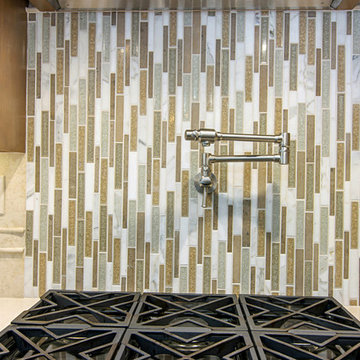
This kitchen started as a builder basic with no personality or charm. The layout didn't have the best function and the island was poorly placed. The homeowners purchased this house with remodeling and upgrading in mind. The layout was changed to accommodate two people cooking together. Zones were created for meal prepping, cooking and baking. The island was expanded to fill the space and utilize bar seating. The walk through butlers pantry was turned in to a wine bar with a fridge, storage and custom glass cabinets. A medium toned hardwood floor was layed throughout the entire lower level
 Mom's Design Build
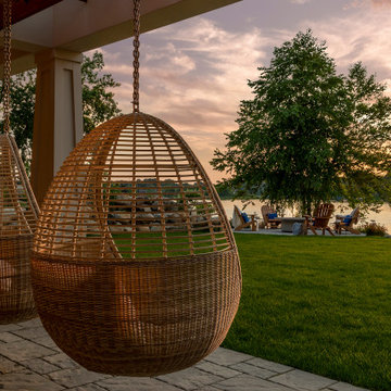
The #LakesideLeisure Project was a comprehensive redesign of a lakefront property that transformed various challenges into stunning solutions. Initially, the property featured a small, high-maintenance cedar deck with minimal lake views, poorly placed stairs, limited flat yard space due to extensive tiered landscaping and excessive plantings, obstructed lake views, and privacy concerns from a neighboring home.
The client’s vision was clear: they wanted a large, flat yard for family activities and hosting, enhanced outdoor living spaces for dining and lounging, increased privacy from neighbors, more shaded hangout areas, improved “curb appeal” from the lake, and reduced maintenance.


 River Woodcraft
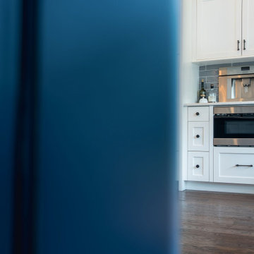
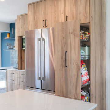
A must see before and after kitchen. What was a drab brown kitchen before with a not-so-functional layout, we have completely opened up the space, by removing a peninsula and a poorly used pantry space and added a large floating island and slide-out pantry storage instead. Now this bright and open space now feels fresh, clean and expansive.
 Sue Oda
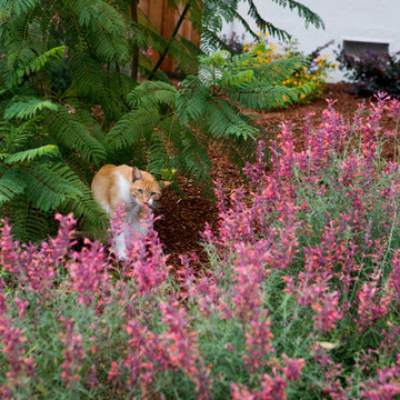
After one of the family took a fall on a slippery, sloped and painted walkway, our clients decided it was time to update their home's entry walkway. A large cedar tree, in poor health, also dripped sap on the sidewalk and parked cars, creating a sticky mess. We replaced the tree and water wasting lawn with drought tolerant alternatives and created a lighted, flagstone pathway, with custom steel railing leading to the front door.
In the backyard, our clients wanted to create a space for entertaining, hanging out with their grandchildren, and growing their own vegetables. The yard was replaced with a flagstone patio including a large raised bed. We also hid the air conditiong unit to create a convivial and functional area.
 Designs by KS
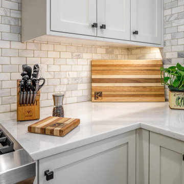
When our clients came to us with their renovation project asking for a pink kitchen, we were thrilled at the opportunity to create a unique, bright and colourful kitchen. It’s not something you see everyday, and we live for it! Being that they are a young family, who loves to cook but felt secluded and overwhelmed when in this space, we knew that this was going to be an epic transformation, not just aesthetically but also for their day-to-day life.
This renovation transformed a closed off, cramped, and poorly laid-out kitchen into a colourful, bright, open, and inviting space that combines functionality with vibrant colours and character. The redesign focused on maximizing storage, improving layout efficiency, and infusing the space with unique design elements that make it both practical and fun.
 Kaufman Construction Design and Build
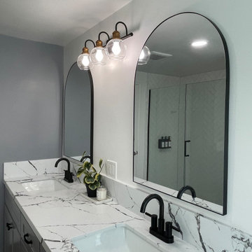
Emily and Steve have remodeled several pieces of their home and because they love Kaufman’s process so much, they keep coming back. In past years, we’ve remodeled most of their main floor including an updated living space and staircase, and a completely remodeled powder room and kitchen with a nice big island that’s perfect for entertaining. Their most recent project was this year when we remodeled their deck. The major pain points Steve and Emily dealt with before the remodel was lack of functionality due to poor design and because the previous owners had built the deck themselves, there were quite a few safety concerns. Throughout the design process, we decided to remove the existing deck completely and start fresh with a screened in porch, Emily’s Porch, and a deck off the porch with stairs going down to the beautiful backyard – one of the factors that motivated them to make this house their home to begin with.
 L/L Design - Build - Furnish
Sometimes the cost of painting an existing vanity vs. a new vanity isn't only the cost of the labor, fixing the old doors, the inside shelves were in poor condition, and the overall space the vanity provided was sub par...so we did replace the vanity and they have so much more functioning space. We did however paint the linen cabinet and the adjoining wall, and it really makes it look built it. I think this transformation is a home run!!!
 Nancy Finneson | DeMane Design
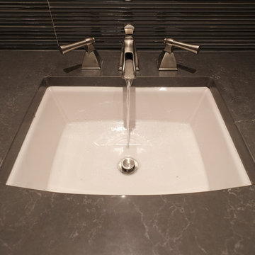
The owners of this remodel desired a refreshing new master bathroom. The original layout was poorly designed with minimal storage, a small shower, a rarely used bathtub and a water closet that was difficult to access. The old vanity flanked a curved wall of glass block (the main challenge with this space) which didn’t allow for mirrors and was always cluttered because of limited storage.
With smart space planning and attention to detail this well-appointed bathroom is now a uniquely personal space that functions brilliantly and balanced for the homeowners.
Photo: DeMane Design
 katherine
Office Workstations and Cubicles: The Unsung Heroes of Efficient Team Environments
In today's fast-paced business world, the hum of productivity is the sweetest sound an office can produce. But what fuels this symphony of efficiency?
While leadership and strategy are crucial, the physical environment in which a team operates plays a role that is just as vital. The debate between open-plan offices and traditional cubicles has raged for years, yet the truth is that a well-designed space incorporating both office workstations cubicles can be the key to unlocking a team's full potential. This isn't just about furniture; it's about creating a habitat for success.
The Evolution of the Workspace: Beyond the Beige Box
Gone are the days of monotonous rows of identical, soul-crushing cubicles. Modern office design has embraced a more nuanced understanding of worker needs. The contemporary workstation is a far cry from its predecessors, offering flexibility, ergonomic support, and a nod to aesthetic appeal. This evolution recognizes that a one-size-fits-all approach stifles creativity and productivity.
Fostering Focus in a Sea of Collaboration
While collaboration is a cornerstone of modern business, the need for individual, focused work remains paramount. This is where the modern cubicle shines. It provides a sanctuary from the constant distractions of a completely open office, allowing employees to delve deep into tasks that require concentration. This dedicated space minimizes interruptions, leading to higher quality work and reduced stress levels.
The Power of Personalization and Ownership
Giving employees a degree of control over their immediate environment can have a profound impact on morale and engagement. Modern workstations and cubicles that allow for personalization be it through adjustable shelving, pinboards for personal items, or even the choice of chair foster a sense of ownership. This small act of empowerment can translate into a greater sense of belonging and commitment to the organization.
Ergonomics: The Foundation of Employee Well-being and Productivity
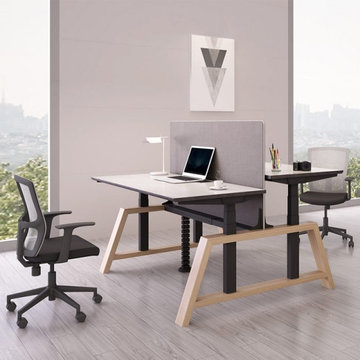
A comfortable employee is a productive employee. Ergonomics is not a luxury; it's a fundamental necessity in any office environment. Poorly designed workstations can lead to a host of musculoskeletal issues, from back pain to carpal tunnel syndrome, resulting in increased absenteeism and decreased efficiency. Investing in ergonomic chairs, adjustable-height desks, and properly positioned monitors is an investment in the long-term health and performance of your team.
Designing for Synergy: The Strategic office layout design
The arrangement of workstations and cubicles is as important as the furniture itself. A strategic office layout design can facilitate seamless communication and collaboration while still providing pockets of privacy for focused work. This involves creating "neighborhoods" for different teams, placing collaborative zones in central, easily accessible areas, and ensuring that high-traffic pathways don't cut through quiet work zones.
Breaking Down Barriers with Hybrid Designs
The most effective office environments often feature a hybrid approach. This might involve clusters of cubicles for focused work, interspersed with open, collaborative "huddle spaces" equipped with whiteboards and comfortable seating. This variety allows employees to choose the environment that best suits the task at hand, offering the best of both worlds.
The Role of Acoustics in a Thriving Workplace
Noise is one of the biggest complaints in open-plan offices. Well-designed cubicles with sound-dampening panels can significantly mitigate this issue. Furthermore, incorporating acoustic solutions throughout the office, such as sound-absorbing materials on walls and ceilings, can create a more pleasant and productive auditory environment for everyone.
Integrating Technology for a Seamless Workflow
In the digital age, technology is the lifeblood of any business. Modern office workstations are designed with this in mind, featuring integrated power and data ports, cable management systems, and ample space for multiple monitors. This seamless integration of technology ensures that employees have the tools they need to work efficiently and without frustration.
Choosing the Right Partner for Your Office Environment
The task of outfitting an office can be daunting. Partnering with a knowledgeable and reputable Meet&Co commercial furniture supplier is crucial to creating an environment that is both functional and inspiring. A good supplier will not only offer a wide range of high-quality products but will also provide expert advice on space planning and ergonomic best practices, ensuring that your investment yields the best possible return.
The Future of the Office: Flexibility and Adaptability
The world of work is constantly evolving, and office design must evolve with it. The future lies in creating flexible and adaptable spaces that can be easily reconfigured to meet the changing needs of a business. Modular furniture and movable partitions are key components of this future-proof approach, allowing organizations to scale and adapt without the need for costly and disruptive renovations.
Conclusion: A Strategic Investment in Your Greatest Asset
Ultimately, the design of your office is a direct reflection of your company's culture and values. By investing in high-quality, ergonomic, and well-designed office workstations and cubicles, you are sending a clear message to your employees: their well-being and productivity matter. This strategic investment in your physical workspace is, in fact, an investment in your most valuable asset your people. The result is a more engaged, efficient, and innovative team, ready to tackle the challenges of tomorrow.
39