
Search results for "Poor functionality" in Home Design Ideas
 Mason Hearn
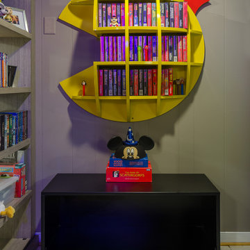
The client's basement was a poorly-finished strange place; was cluttered and not functional as an entertainment space. We updated to a club-like atmosphere to include a state of the art entertainment area, poker/card table, unique curved bar area, karaoke and dance floor area with a disco ball to provide reflecting fractals above to pull the focus to the center of the area to tell everyone; this is where the action is!
 Nancy Finneson | DeMane Design
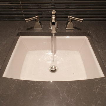
The owners of this remodel desired a refreshing new master bathroom. The original layout was poorly designed with minimal storage, a small shower, a rarely used bathtub and a water closet that was difficult to access. The old vanity flanked a curved wall of glass block (the main challenge with this space) which didn’t allow for mirrors and was always cluttered because of limited storage.
With smart space planning and attention to detail this well-appointed bathroom is now a uniquely personal space that functions brilliantly and balanced for the homeowners.
Photo: DeMane Design
 Kitchen Solvers of Spring Hill
These homeowners were ready to completely transform their master bathroom. The existing space felt cramped and outdated, with an impractical linen closet, a small vanity, poor lighting, a bulky tub, and a shower that had seen better days. Their vision was clear—they wanted a warm, inviting, spa-inspired retreat with natural elements, rich textures, and a unique wood feature wall, rather than the all-white look that has become so common.
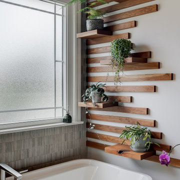
The finished design brings that vision to life through a beautiful blend of color, texture, and thoughtful details. A stunning cherry vanity and counter stack, topped with luxurious quartzite countertops, create warmth and elegance. The feature wall, finished in 1" x 3" Articulo tile, adds depth and visual interest, while large-format floor tiles provide a clean, modern foundation.
The curbless shower features coordinating hex tile flooring and niches, complemented by porcelain slab walls and glass panels that create an open, airy feel. A spacious freestanding tub offers the perfect place to relax and unwind. To maximize functionality, the doorway was relocated to accommodate a larger vanity, and custom barn and closet doors were added to enhance the room's character.
Programmable lighting tailored to the homeowners' lifestyle, along with a custom wood feature wall designed to showcase decorative plants, transformed a once-empty wall into a stunning focal point. What was once a dreaded space is now a beautiful spa-like retreat and one of the homeowners' favorite rooms in the house.
Find the right local pro for your project
 Castle Building & Remodeling
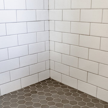
This 1932 South Minneapolis bathroom was OK to look at but did not suit the client’s aesthetics. Not to mention, it was composed of poorly-made and impractical products. Glass mosaic tiles in the shower were hard to clean and were cracking, while the vanity was falling apart.
The clients wanted something fresher that connected with the rest of the feel of their home, and products that were easier to maintain. The layout remained the same, but the space was updated with traditional style cement tiles, subway tiles and a timeless style/finish for the new vanity. Quartz was used for the vanity top, which will be easy to clean and maintain for the homeowner for years to come. A frameless glass enclosure was installed in order to eliminate the problematic stall-style shower curtain that the client despised.
The result was a bathroom that is classic in style but modern in maintenance and function.
 Reico Kitchen & Bath
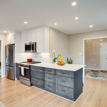
Designed by Marc Jean-Michel of Reico Kitchen & Bath in Bethesda, MD in collaboration with Liz Forgione of MMD Construction, this small transitional kitchen features Green Forest cabinets in the Park Place shaker door style in two finishes. The base cabinets feature a Summit Grey finish and the wall cabinets a White finish. The kitchen countertops are MSI Artic White Quartz.
The kitchen includes a Maravilla/Alvetian Isles Honed Marble 4x16 tile backsplash along with GE and Frigidaire appliances.
“The hardest part was envisioning a new functional space in an old kitchen with a poor layout and use of space,” said the client. “I love most the transformation in the flow of the whole first floor. The kitchen entries are wide, more inviting and create a lot of great light! There is so much great storage in a small kitchen! Marc was great to work with. I loved all of his ideas.”
Photos courtesy of BTW Images LLC.
 ForeverLawn, Inc.
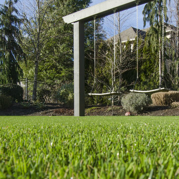
The owners of this incredible home in Lake Sammamish, Washington, had been discouraged by the work done by a previous artificial turf company at their home—a low quality product was installed poorly and therefore didn’t function as it should. Their faith in the artificial turf industry was restored when ForeverLawn Bellevue stepped in to remove and correct the issues that the previous company had created. ForeverLawn transformed a disaster into the homeowners’ dream yard. This wonderfully executed installation included over 4,000 square feet of DuPont™ ForeverLawn® Select HD and a unique backyard putting green surfaced with EZ Putt, a variation of GolfGreens™ ideal for fun, family-focused putting greens that requires little maintenance and will provide endless entertainment.
 Amsted Design-Build
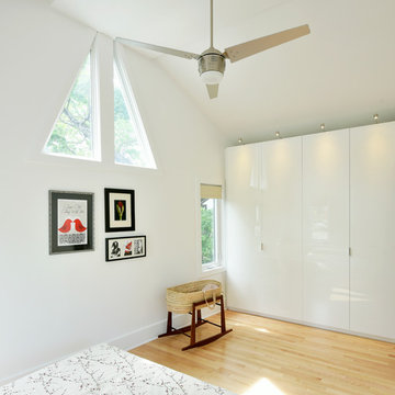
Previously renovated with a two-story addition in the 80’s, the home’s square footage had been increased, but the current homeowners struggled to integrate the old with the new.
An oversized fireplace and awkward jogged walls added to the challenges on the main floor, along with dated finishes. While on the second floor, a poorly configured layout was not functional for this expanding family.
From the front entrance, we can see the fireplace was removed between the living room and dining rooms, creating greater sight lines and allowing for more traditional archways between rooms.
At the back of the home, we created a new mudroom area, and updated the kitchen with custom two-tone millwork, countertops and finishes. These main floor changes work together to create a home more reflective of the homeowners’ tastes.
On the second floor, the master suite was relocated and now features a beautiful custom ensuite, walk-in closet and convenient adjacency to the new laundry room.
Gordon King Photography

Sponsored
Columbus, OH

Structural Remodeling
Franklin County's Heavy Timber Specialists | Best of Houzz 2020!
 Enchanted Kitchens, LLC
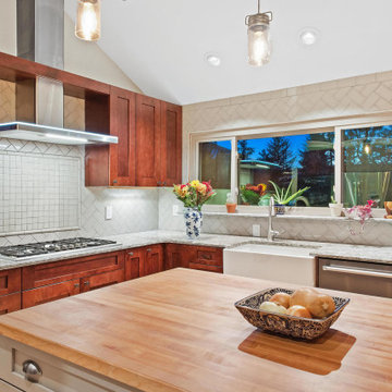
The space was unusable for family and entertaining. It was too small, with poor space planning. This complete remodel required structural wall removal, appliance relocate, floor replace and refinish. The peninsula was replaced with island for better traffic flow. The bridge at hood avoided the need for tile to the ceiling. The client was a fireman and the ladder makes him feel right at home!
 Designs by KS
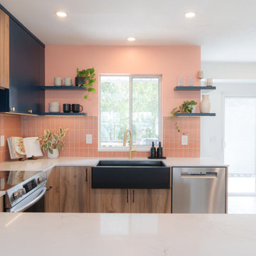
When our clients came to us with their renovation project asking for a pink kitchen, we were thrilled at the opportunity to create a unique, bright and colourful kitchen. It’s not something you see everyday, and we live for it! Being that they are a young family, who loves to cook but felt secluded and overwhelmed when in this space, we knew that this was going to be an epic transformation, not just aesthetically but also for their day-to-day life.
This renovation transformed a closed off, cramped, and poorly laid-out kitchen into a colourful, bright, open, and inviting space that combines functionality with vibrant colours and character. The redesign focused on maximizing storage, improving layout efficiency, and infusing the space with unique design elements that make it both practical and fun.
 New Era Builders Inc
Here’s a polished paragraph for you:
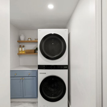
We took what was once a poorly finished flipper’s space and transformed it into a properly built, functional laundry room and bathroom designed with this growing family in mind. With a newborn on the way, every detail mattered — from creating an open, accessible layout for effortless laundry, to building a comfortable, safe area to bathe the baby. Thoughtful design, quality craftsmanship, and smart planning came together to deliver a space that not only works beautifully today, but will make life easier for this family as they continue to grow.
 San Luis Kitchen Co.
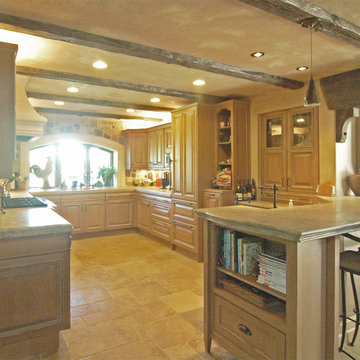
When the homeowners decided to move from San Francisco to the Central Coast, they were looking for a more relaxed lifestyle, a unique place to call their own, and an environment conducive to raising their young children. They found it all in San Luis Obispo. They had owned a house here in SLO for several years that they had used as a rental. As the homeowners own and run a contracting business and relocation was not impossible, they decided to move their business and make this SLO rental into their dream home.
As a rental, the house was in a bare-bones condition. The kitchen had old white cabinets, boring white tile counters, and a horrendous vinyl tile floor. Not only was the kitchen out-of-date and old-fashioned, it was also pretty worn out. The tiles were cracking and the grout was stained, the cabinet doors were sagging, and the appliances were conflicting (ie: you could not open the stove and dishwasher at the same time).
To top it all off, the kitchen was just too small for the custom home the homeowners wanted to create.
Thus enters San Luis Kitchen. At the beginning of their quest to remodel, the homeowners visited San Luis Kitchen’s showroom and fell in love with our Tuscan Grotto display. They sat down with our designers and together we worked out the scope of the project, the budget for cabinetry and how that fit into their overall budget, and then we worked on the new design for the home starting with the kitchen.
As the homeowners felt the kitchen was cramped, it was decided to expand by moving the window wall out onto the existing porch. Besides the extra space gained, moving the wall brought the kitchen window out from under the porch roof – increasing the natural light available in the space. (It really helps when the homeowner both understands building and can do his own contracting and construction.) A new arched window and stone clad wall now highlights the end of the kitchen. As we gained wall space, we were able to move the range and add a plaster hood, creating a focal nice focal point for the kitchen.
The other long wall now houses a Sub-Zero refrigerator and lots of counter workspace. Then we completed the kitchen by adding a wrap-around wet bar extending into the old dining space. We included a pull-out pantry unit with open shelves above it, wine cubbies, a cabinet for glassware recessed into the wall, under-counter refrigerator drawers, sink base and trash cabinet, along with a decorative bookcase cabinet and bar seating. Lots of function in this corner of the kitchen; a bar for entertaining and a snack station for the kids.
After the kitchen design was finalized and ordered, the homeowners turned their attention to the rest of the house. They asked San Luis Kitchen to help with their master suite, a guest bath, their home control center (essentially a deck tucked under the main staircase) and finally their laundry room. Here are the photos:
I wish I could show you the rest of the house. The homeowners took a poor rental house and turned it into a showpiece! They added custom concrete floors, unique fiber optic lighting, large picture windows, and much more. There is now an outdoor kitchen complete with pizza oven, an outdoor shower and exquisite garden. They added a dedicated dog run to the side yard for their pooches and a rooftop deck at the very peak. Such a fun house.
Wood-Mode Fine Custom Cabinetry, Barcelona
 New Era Builders Inc
Here’s a polished paragraph for you:
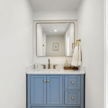
We took what was once a poorly finished flipper’s space and transformed it into a properly built, functional laundry room and bathroom designed with this growing family in mind. With a newborn on the way, every detail mattered — from creating an open, accessible layout for effortless laundry, to building a comfortable, safe area to bathe the baby. Thoughtful design, quality craftsmanship, and smart planning came together to deliver a space that not only works beautifully today, but will make life easier for this family as they continue to grow.
 MMW Architects
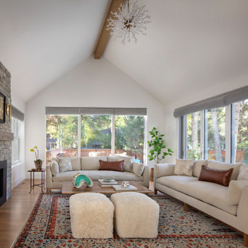
What the owners of the Madeline Ave Residence loved about the home when they bought it was the charm of the original 1920’s structure. However, a dissonance addition from the 1970’s shifted original charm to aesthetic awkwardness and poor flow. While maintaining the feel of the front façade, the rest of the home was reconfigured and choreographed to offer beauty and meet functional needs. Like many homes in historic districts, the homes grow organically to meet needs. Multiple forms and roof lines result.
Due to incorporating these same moves, this renovation fits seamlessly into the neighborhood. It is formal where it needs to be yet comfortable for the daily life. The people, the dog, the cats, the wine: all were carefully tended to throughout the design of the home. The spacious rooms and crisp white palette set the stage for vibrant tile and offers many locations for large scale art. Easy connections to the exterior spaces offer all-season gathering under the shade of the trellis or while making s’mores around the fire pit.


 Saikley Architects
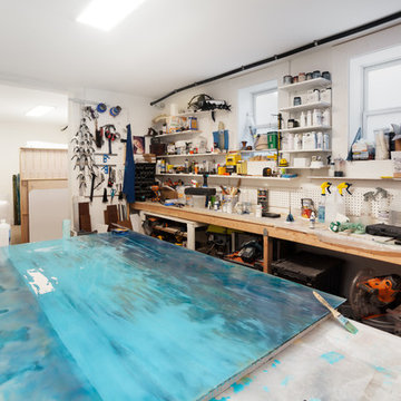
This beautiful 1881 Alameda Victorian cottage, wonderfully embodying the Transitional Gothic-Eastlake era, had most of its original features intact. Our clients, one of whom is a painter, wanted to preserve the beauty of the historic home while modernizing its flow and function.
From several small rooms, we created a bright, open artist’s studio. We dug out the basement for a large workshop, extending a new run of stair in keeping with the existing original staircase. While keeping the bones of the house intact, we combined small spaces into large rooms, closed off doorways that were in awkward places, removed unused chimneys, changed the circulation through the house for ease and good sightlines, and made new high doorways that work gracefully with the eleven foot high ceilings. We removed inconsistent picture railings to give wall space for the clients’ art collection and to enhance the height of the rooms. From a poorly laid out kitchen and adjunct utility rooms, we made a large kitchen and family room with nine-foot-high glass doors to a new large deck. A tall wood screen at one end of the deck, fire pit, and seating give the sense of an outdoor room, overlooking the owners’ intensively planted garden. A previous mismatched addition at the side of the house was removed and a cozy outdoor living space made where morning light is received. The original house was segmented into small spaces; the new open design lends itself to the clients’ lifestyle of entertaining groups of people, working from home, and enjoying indoor-outdoor living.
Photography by Kurt Manley.
https://saikleyarchitects.com/portfolio/artists-victorian/
 Advance Design Studio, Ltd.
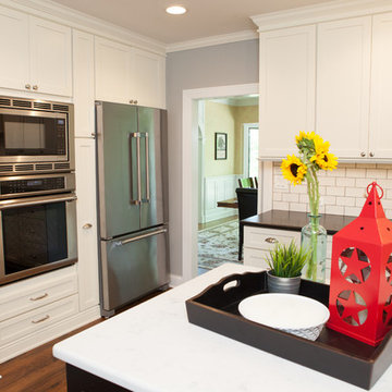
The major kitchen renovation of this old country farmhouse was a task of love, one that had been planned for many years by these Barrington seasoned homeowners. After interviewing no less than five companies, the homeowners chose the design team at Advance Design Studio to make the transformation they had long planned for.
“They had an understanding of the right design for the space almost from the instant they walked in the room”, says Sharon Scott of the design team of Nicole Ryan at Todd Jurs at Advance Design Studio. “They were the only designers who laid out ideas in the first meeting at the house that we really loved”, she says. “It was obvious that they understood the house, and understood us - and from then on the decision to hire them literally made itself”.
The original kitchen had a dividing “wall” of cabinetry…that made the rather large space seem very small, and cut off the kitchen from the eating area that has a beautiful garden view completely hidden from the main kitchen. Circulation was poor, leaving family members on top of one another when entertaining family and friends.
The new kitchen design nearly doubles the kitchen size within the original space; opening it up completely and enjoying an expansive island containing a new Kohler Whitehaven Smart Divide farm sink, a dishwasher, and pull out double trash receptacle. The great new gathering space accommodates four pull out stools beckoning grandchildren and friends alike. Removing the range from the island and relocating it to create a dramatic “feature” wall, completely out of the way of guests; it is now crowned with a beautiful completely customized wood hood designed to ventilate much more efficiently than the original island range containing a limited downdraft system.
The much more efficient use of the space after removing a pantry closet made way for a fully functional “tall wall” housing a double oven and refrigerator, out of the way of guests. Removing the restrictive cabinetry wall now allowed for an expansive floor to ceiling pantry cabinet with full extension pull out shelving, and an elegant display area complete with a beautiful furniture detailed buffet.
Fitting perfectly into the farmhouse charm of the old estate, Medallion Silver Lancaster cabinetry was chosen in a soft white Maple Divinity paint finish lining the perimeter. The stunning island hints to this old home’s past with Medallion Gold’s Maple Devonshire style graced with a Carriage Black Heirloom painted finish. The rubbed off black paint finish reveals the soft wood tones beneath, mimicking furniture you’d see in your grandmother’s home that has lovingly been polished for years to reveal a soft, subtly rubbed-off sheen.
Counter tops reverse contrast with perimeter tops of black “Raven” granite possessing a subtle honed finish, and a shift to Quartz Difinity Viareggio - resembling white Carrera marble on the island. A simple herringbone detail completes the decorative range wall, and subtle porcelain subway tiles grace the backsplash throughout.
The design is finished off with crisp Thermador and Bosch stainless steel appliances, and bright brushed cup pull and handle combination hardware. A pull down Kohler Bellaria faucet makes cleanup a breeze, and soft under-cabinet LED lighting throughout makes every work surface shine softly, and highlights the cabinetry display area with grace.
One special detail was created to make the dramatic ceiling transition to a vaulted area above the breakfast nook extra special. A tongue and groove solid wood ceiling was hung above, and a subtle greenish-grey distressed paint finish was hand developed on site by the talented crew, complementing the new kitchen with a completely unique surface that appears as if it’s been there for many, many years. It’s just one standout feature in the amazing new space that is sure to be in every conversation as newcomers enjoy the newest best hangout in this old home renewed!
After 30 years of renovating homes, this now content homeowner sips a cup of tea enjoying her new garden view, and reminisces projects of past – and lastly reports their experience with Advance Design Studio culminating with their amazing new kitchen to be the most enjoyable and satisfying home experience yet.
Designer: Nicole Ryan
Photographer: Joe Nowak
 Designs by KS
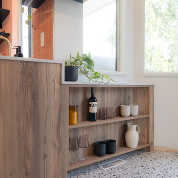
When our clients came to us with their renovation project asking for a pink kitchen, we were thrilled at the opportunity to create a unique, bright and colourful kitchen. It’s not something you see everyday, and we live for it! Being that they are a young family, who loves to cook but felt secluded and overwhelmed when in this space, we knew that this was going to be an epic transformation, not just aesthetically but also for their day-to-day life.
This renovation transformed a closed off, cramped, and poorly laid-out kitchen into a colourful, bright, open, and inviting space that combines functionality with vibrant colours and character. The redesign focused on maximizing storage, improving layout efficiency, and infusing the space with unique design elements that make it both practical and fun.
 Sue Oda
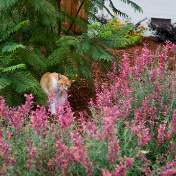
After one of the family took a fall on a slippery, sloped and painted walkway, our clients decided it was time to update their home's entry walkway. A large cedar tree, in poor health, also dripped sap on the sidewalk and parked cars, creating a sticky mess. We replaced the tree and water wasting lawn with drought tolerant alternatives and created a lighted, flagstone pathway, with custom steel railing leading to the front door.
In the backyard, our clients wanted to create a space for entertaining, hanging out with their grandchildren, and growing their own vegetables. The yard was replaced with a flagstone patio including a large raised bed. We also hid the air conditiong unit to create a convivial and functional area.
 Saikley Architects
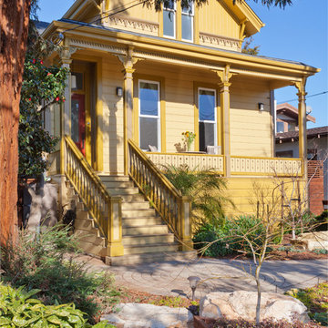
This beautiful 1881 Alameda Victorian cottage, wonderfully embodying the Transitional Gothic-Eastlake era, had most of its original features intact. Our clients, one of whom is a painter, wanted to preserve the beauty of the historic home while modernizing its flow and function.
From several small rooms, we created a bright, open artist’s studio. We dug out the basement for a large workshop, extending a new run of stair in keeping with the existing original staircase. While keeping the bones of the house intact, we combined small spaces into large rooms, closed off doorways that were in awkward places, removed unused chimneys, changed the circulation through the house for ease and good sightlines, and made new high doorways that work gracefully with the eleven foot high ceilings. We removed inconsistent picture railings to give wall space for the clients’ art collection and to enhance the height of the rooms. From a poorly laid out kitchen and adjunct utility rooms, we made a large kitchen and family room with nine-foot-high glass doors to a new large deck. A tall wood screen at one end of the deck, fire pit, and seating give the sense of an outdoor room, overlooking the owners’ intensively planted garden. A previous mismatched addition at the side of the house was removed and a cozy outdoor living space made where morning light is received. The original house was segmented into small spaces; the new open design lends itself to the clients’ lifestyle of entertaining groups of people, working from home, and enjoying indoor-outdoor living.
Photography by Kurt Manley.
https://saikleyarchitects.com/portfolio/artists-victorian/
 Enchanted Kitchens, LLC
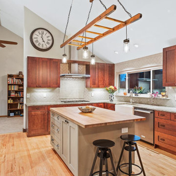
The space was unusable for family and entertaining. It was too small, with poor space planning. This complete remodel required structural wall removal, appliance relocate, floor replace and refinish. The peninsula was replaced with island for better traffic flow. The bridge at hood avoided the need for tile to the ceiling. The client was a fireman and the ladder makes him feel right at home!
 katherine
Office Workstations and Cubicles: The Unsung Heroes of Efficient Team Environments
In today's fast-paced business world, the hum of productivity is the sweetest sound an office can produce. But what fuels this symphony of efficiency?
While leadership and strategy are crucial, the physical environment in which a team operates plays a role that is just as vital. The debate between open-plan offices and traditional cubicles has raged for years, yet the truth is that a well-designed space incorporating both office workstations cubicles can be the key to unlocking a team's full potential. This isn't just about furniture; it's about creating a habitat for success.
The Evolution of the Workspace: Beyond the Beige Box
Gone are the days of monotonous rows of identical, soul-crushing cubicles. Modern office design has embraced a more nuanced understanding of worker needs. The contemporary workstation is a far cry from its predecessors, offering flexibility, ergonomic support, and a nod to aesthetic appeal. This evolution recognizes that a one-size-fits-all approach stifles creativity and productivity.
Fostering Focus in a Sea of Collaboration
While collaboration is a cornerstone of modern business, the need for individual, focused work remains paramount. This is where the modern cubicle shines. It provides a sanctuary from the constant distractions of a completely open office, allowing employees to delve deep into tasks that require concentration. This dedicated space minimizes interruptions, leading to higher quality work and reduced stress levels.
The Power of Personalization and Ownership
Giving employees a degree of control over their immediate environment can have a profound impact on morale and engagement. Modern workstations and cubicles that allow for personalization be it through adjustable shelving, pinboards for personal items, or even the choice of chair foster a sense of ownership. This small act of empowerment can translate into a greater sense of belonging and commitment to the organization.
Ergonomics: The Foundation of Employee Well-being and Productivity
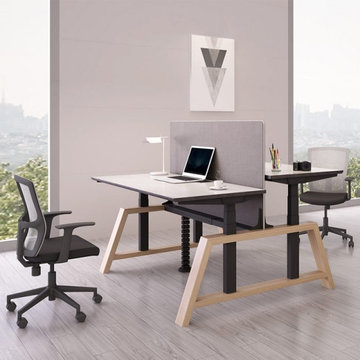
A comfortable employee is a productive employee. Ergonomics is not a luxury; it's a fundamental necessity in any office environment. Poorly designed workstations can lead to a host of musculoskeletal issues, from back pain to carpal tunnel syndrome, resulting in increased absenteeism and decreased efficiency. Investing in ergonomic chairs, adjustable-height desks, and properly positioned monitors is an investment in the long-term health and performance of your team.
Designing for Synergy: The Strategic office layout design
The arrangement of workstations and cubicles is as important as the furniture itself. A strategic office layout design can facilitate seamless communication and collaboration while still providing pockets of privacy for focused work. This involves creating "neighborhoods" for different teams, placing collaborative zones in central, easily accessible areas, and ensuring that high-traffic pathways don't cut through quiet work zones.
Breaking Down Barriers with Hybrid Designs
The most effective office environments often feature a hybrid approach. This might involve clusters of cubicles for focused work, interspersed with open, collaborative "huddle spaces" equipped with whiteboards and comfortable seating. This variety allows employees to choose the environment that best suits the task at hand, offering the best of both worlds.
The Role of Acoustics in a Thriving Workplace
Noise is one of the biggest complaints in open-plan offices. Well-designed cubicles with sound-dampening panels can significantly mitigate this issue. Furthermore, incorporating acoustic solutions throughout the office, such as sound-absorbing materials on walls and ceilings, can create a more pleasant and productive auditory environment for everyone.
Integrating Technology for a Seamless Workflow
In the digital age, technology is the lifeblood of any business. Modern office workstations are designed with this in mind, featuring integrated power and data ports, cable management systems, and ample space for multiple monitors. This seamless integration of technology ensures that employees have the tools they need to work efficiently and without frustration.
Choosing the Right Partner for Your Office Environment
The task of outfitting an office can be daunting. Partnering with a knowledgeable and reputable Meet&Co commercial furniture supplier is crucial to creating an environment that is both functional and inspiring. A good supplier will not only offer a wide range of high-quality products but will also provide expert advice on space planning and ergonomic best practices, ensuring that your investment yields the best possible return.
The Future of the Office: Flexibility and Adaptability
The world of work is constantly evolving, and office design must evolve with it. The future lies in creating flexible and adaptable spaces that can be easily reconfigured to meet the changing needs of a business. Modular furniture and movable partitions are key components of this future-proof approach, allowing organizations to scale and adapt without the need for costly and disruptive renovations.
Conclusion: A Strategic Investment in Your Greatest Asset
Ultimately, the design of your office is a direct reflection of your company's culture and values. By investing in high-quality, ergonomic, and well-designed office workstations and cubicles, you are sending a clear message to your employees: their well-being and productivity matter. This strategic investment in your physical workspace is, in fact, an investment in your most valuable asset your people. The result is a more engaged, efficient, and innovative team, ready to tackle the challenges of tomorrow.
40