
Search results for "Positive credit" in Home Design Ideas
 RAJ Kitchen and Bath, LLC
**Check out the video of this transformation on our website**
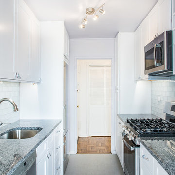
This small kitchen was way too small for this 2 bedrooms, 2 bathrooms apartment. Not only was it a very small kitchen, but the physical location of it made it very difficult to make it any bigger. There wasn't much that could have been done without incurring astronomical cost, which would get little or no return on the investment. The client wanted a kitchen that can be optimized in its current location to add a ton of value for resale.
This was difficult to do, because there was no moving of any mechanical around in the kitchen and even if we wanted to, the management of the building would not allow. For those of you who live in condos, co-ops or apartment building, you know how difficult it is to rework these foot prints. When we showed up, we saw the problems, but we also saw a huge opportunity where we can achieve those goals in the small space. This was accomplished by making some key changes and to incorporate some new things that was not possible when this kitchen was built years ago.
The crucial part of the design that would drive the entire new layout, was selecting the only appliance; that was the Refrigerator. Once we nailed down that refrigerator, we then proceeded to design the kitchen around it. We moved it to the other side of the wall where the sink was so that we can tap into the water line from the sink plumbing. It was crucial that it stays exactly 24" deep, not an inch more because we had to keep the entry as open as possible. Also, it was going to be directly in front of another big storage unit - The pantry. It is not ideal in most cases, but we needed the rest of the space to ramp up the design and open feel towards the side where all of the activities would take place, which happend to be the dining room and the view.
Once all that was figured out, we re-positioned the sink, dishwasher and the range and proceeded to wrap the cabinets around the columns to integrate them into the space. Thirty- six inches cabinets height was used so that they can be installed higher towards the ceiling height to give more room rather than the standard 18" required height between the counter tops. This was done to make the room feel a lot bigger than it really was. Not to mention, we also didn't want the faucet to be buried under the cabinets so that was also a necessary design detail for the space.
We then lowered both knee walls so that the counter top can sit on top of them, by removing that stop point that would have otherwise defined the kitchen area. This allowed us to pick up that extra footprint into the room for added prep space and enabled us to create the illusion of a kitchen that is looking longer than it really is. Every inch mattered when designing this kitchen and we made a conscious decision to use every one of that inch.
White cabinets were selected to do just what white cabinets are design to do; make a small or dark room appear bigger, brighter and more open. In this kitchen, this was amplified the more because of the kitchen location. It was perfect! We knew we did justice to the space because while we were there taking some photos, a few potential buyers walked in and went straight for the kitchen! They said its design just to fit the apartment.
Pantry roll out shelving, Double recycle bin, fancy handles, LED lighting, Quartz counter top, beautiful backslash tiles and grey linen floors finished off the kitchen which looked over a beautiful view of the George Washington Bridge from the top of this lovely 4th floor apartment.
Credit to Masterpiece Tile and Marble (Annmarie on the selection of Tiles and countertop and Val on the Construction to complete this project).
Davor Kokic Photography
 Drapery Street
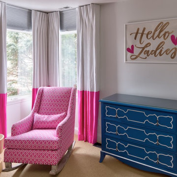
For their daughters’ room, David and Dawn chose blackout Hunter Douglas Duette® honeycomb shades with a LiteRise® operating system. LiteRise® allows them to raise and lower the shades without cords, imperative for child safety. The shades hold securely in any position — there’s no need for constant adjusting. The shades were mounted floor to ceiling to block light when lowered. Blackout drapes were again used to capture any light seeping in from the side of the shades. Now two and half years of age, their daughters are still taking two hours naps! David and Dawn credit the restful atmosphere created by their window treatments for this parenting miracle.
 Aloha Kitchen, Bath & Design
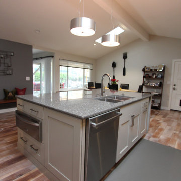
California modern rancher. Blend of warm and cool tones and material balance this space. Outdoor environment is low water use and drought resistant but still has greenery and inviting to hang out.
In the kitchen we removed the walls that made up the tiny closet of a kitchen that was in the corner under the skylight and was able to hide the ceiling height differences at the small desk area and oven cabinets and keep the skylight. The effect is a wide-open concept with the least amount of construction possible.
For the kitchen layout, we created a cozy zone for the chef to work in the corner without any cross traffic, seating area around the outside of the island keeps guest out of the work area but still close and part of the process. The warming drawer in the island positioned for proximity to the "buffet line" at the island when entertaining. On the dining end of the kitchen there is a coffee and wine bar. Coffee bar is hidden behind the metal roll up door, and the wine and liquor bar are to the left and both share the sink in the middle, making it a functional and useful space from the morning until the evening. I like to call this bar "Start and Stop" ha-ha. Even though this space is very open and airy, it has a ton of storage including underneath the seating area at the island and the little workstation, which is open and uncluttered, has lots of storage nestled in the wall and underneath the counter and hides any CPU and wires neatly.
In the master bath, we updated all the colors and finishes in a clean modern European style with large format porcelain tiles and repurposed a small useless closet (with a window in it) to a second vanity for extra counter space and linen storage. Plus, we added storage over the toilet in the water closet and an updated door and casing into the walk-in closet with frosted glass panels so that at night the light in the closet glowing in those panels can act as a night light. (Photo credit; Kitchens of Diablo)
Find the right local pro for your project
 Aloha Kitchen, Bath & Design
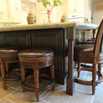
This beautiful estate is positioned with beautiful views and mountain sides around which is why the client loves it so much and never wants to leave. She has lots of pretty decor and treasures she had collected over the years of travelling and wanted to give the home a facelift and better display those items, including a Murano glass chandelier from Italy. The kitchen had a strange peninsula and dining nook that we removed and replaced with a kitchen continent (larger than an island) and built in around the patio door that hide outlets and controls and other supplies. We changed all the flooring, stairway and railing including the gallery area, fireplaces, entryway and many other touches, completely updating the downstairs. Upstairs we remodeled the master bathroom, walk-in closet and after everything was done, she loved it so much that she had us come back a few years later to add another patio door with built in downstairs and an elevator from the master suite to the great room and also opened to a spa outside. (Photo credit; Shawn Lober Construction)
 Naikoon Contracting Ltd
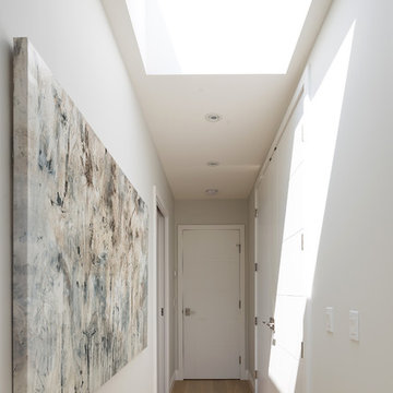
Situated above the Vancouver skyline, overlooking the city below, this custom home is a top performer on top of it all. An open kitchen, dining, and great room with a 99 bottle capacity wine wall, this space is made for entertaining.
The three car garage houses the technical equipment including solar inverters and the Tesla Powerwall 2. A vehicle lift allows for easy maintenance and double parking storage. From BBQ season in the summer to the gorgeous sunsets of fall, the views are simply stunning both from and within the home. A cozy library and home office are well placed to allow for a more intimate atmosphere while still absorbing the beautiful city below.
Luxury custom homes are not always as high on the performance scale but this home boasts a modelled energy rating of 60 GJ/year compared with the 182 GJ/year standard, close to 70% better! With high-efficiency appliances and a well positioned solar array, this home may perform so well that it starts generating income through Net Metering.
Photo Credits: SilentSama Architectural Photography
 RAJ Kitchen and Bath, LLC
**Check out the video of this transformation on our website**
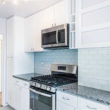
This small kitchen was way too small for this 2 bedrooms, 2 bathrooms apartment. Not only was it a very small kitchen, but the physical location of it made it very difficult to make it any bigger. There wasn't much that could have been done without incurring astronomical cost, which would get little or no return on the investment. The client wanted a kitchen that can be optimized in its current location to add a ton of value for resale.
This was difficult to do, because there was no moving of any mechanical around in the kitchen and even if we wanted to, the management of the building would not allow. For those of you who live in condos, co-ops or apartment building, you know how difficult it is to rework these foot prints. When we showed up, we saw the problems, but we also saw a huge opportunity where we can achieve those goals in the small space. This was accomplished by making some key changes and to incorporate some new things that was not possible when this kitchen was built years ago.
The crucial part of the design that would drive the entire new layout, was selecting the only appliance; that was the Refrigerator. Once we nailed down that refrigerator, we then proceeded to design the kitchen around it. We moved it to the other side of the wall where the sink was so that we can tap into the water line from the sink plumbing. It was crucial that it stays exactly 24" deep, not an inch more because we had to keep the entry as open as possible. Also, it was going to be directly in front of another big storage unit - The pantry. It is not ideal in most cases, but we needed the rest of the space to ramp up the design and open feel towards the side where all of the activities would take place, which happend to be the dining room and the view.
Once all that was figured out, we re-positioned the sink, dishwasher and the range and proceeded to wrap the cabinets around the columns to integrate them into the space. Thirty- six inches cabinets height was used so that they can be installed higher towards the ceiling height to give more room rather than the standard 18" required height between the counter tops. This was done to make the room feel a lot bigger than it really was. Not to mention, we also didn't want the faucet to be buried under the cabinets so that was also a necessary design detail for the space.
We then lowered both knee walls so that the counter top can sit on top of them, by removing that stop point that would have otherwise defined the kitchen area. This allowed us to pick up that extra footprint into the room for added prep space and enabled us to create the illusion of a kitchen that is looking longer than it really is. Every inch mattered when designing this kitchen and we made a conscious decision to use every one of that inch.
White cabinets were selected to do just what white cabinets are design to do; make a small or dark room appear bigger, brighter and more open. In this kitchen, this was amplified the more because of the kitchen location. It was perfect! We knew we did justice to the space because while we were there taking some photos, a few potential buyers walked in and went straight for the kitchen! They said its design just to fit the apartment.
Pantry roll out shelving, Double recycle bin, fancy handles, LED lighting, Quartz counter top, beautiful backslash tiles and grey linen floors finished off the kitchen which looked over a beautiful view of the George Washington Bridge from the top of this lovely 4th floor apartment.
Credit to Masterpiece Tile and Marble (Annmarie on the selection of Tiles and countertop and Val on the Construction to complete this project).
Davor Kokic Photography
 CraftedWild Cabinetry
Photo credit: PDET Photography, Pawel Dmytrow
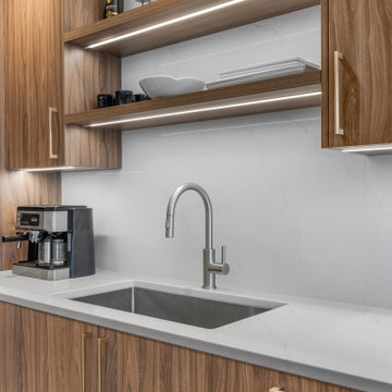
Designed for a home in the Chicago suburbs, this kitchen was created around the client’s desire for clean, minimal lines, visual balance, and highly functional storage.
A warm, high-end European textured TFL brings depth and natural character to the cabinetry, with careful grain matching from panel to panel reinforcing the seamless, tailored appearance. Floating shelves were introduced to break up the cabinetry and create a lighter composition, while integrated dimmable lighting adds warmth and ambiance—especially important given the kitchen’s connection to the surrounding great room.
Function was considered at every level. A custom utensil storage solution was stained to coordinate with the cabinetry finish, while a concealed integrated outlet in the island keeps everyday power readily available without interrupting the clean exterior. Generous drawer and pantry storage maximize usability, including a reduced-depth pantry positioned near the window to provide additional capacity without unnecessarily projecting into the room or compromising natural light.
Every element—from proportions and lighting to storage, material transitions, and grain direction—was considered to create a kitchen that feels calm, cohesive, and deliberately understated.

Sponsored
Columbus, OH

Snider & Metcalf Interior Design, LTD
Leading Interior Designers in Columbus, Ohio & Ponte Vedra, Florida
 Aloha Kitchen, Bath & Design
California modern rancher. Blend of warm and cool tones and material balance this space. Outdoor environment is low water use and drought resistant but still has greenery and inviting to hang out.
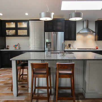
In the kitchen we removed the walls that made up the tiny closet of a kitchen that was in the corner under the skylight and was able to hide the ceiling height differences at the small desk area and oven cabinets and keep the skylight. The effect is a wide-open concept with the least amount of construction possible.
For the kitchen layout, we created a cozy zone for the chef to work in the corner without any cross traffic, seating area around the outside of the island keeps guest out of the work area but still close and part of the process. The warming drawer in the island positioned for proximity to the "buffet line" at the island when entertaining. On the dining end of the kitchen there is a coffee and wine bar. Coffee bar is hidden behind the metal roll up door, and the wine and liquor bar are to the left and both share the sink in the middle, making it a functional and useful space from the morning until the evening. I like to call this bar "Start and Stop" ha-ha. Even though this space is very open and airy, it has a ton of storage including underneath the seating area at the island and the little workstation, which is open and uncluttered, has lots of storage nestled in the wall and underneath the counter and hides any CPU and wires neatly.
In the master bath, we updated all the colors and finishes in a clean modern European style with large format porcelain tiles and repurposed a small useless closet (with a window in it) to a second vanity for extra counter space and linen storage. Plus, we added storage over the toilet in the water closet and an updated door and casing into the walk-in closet with frosted glass panels so that at night the light in the closet glowing in those panels can act as a night light. (Photo credit; Kitchens of Diablo)
 Brandi Renee Designs
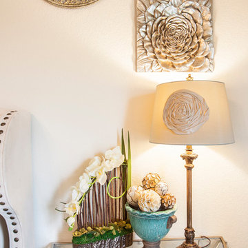
Floral elements create a softness that bring about positive emotional feelings in those who enter the room. Different forms of floral patterns create dimension without being redundant and overpowering. The lampshade compliments the metal wall hanging above it with its similar structure and plays beautifully off of the flowing orchids on the opposite side of the night stand. Photo Credit: Samantha Day
 Catherine Arensberg
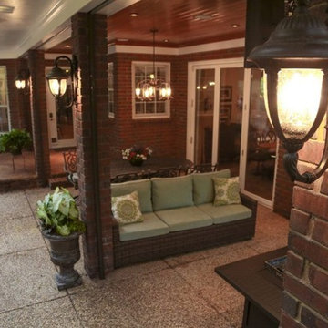
Overlooking new roof expansion over retractable screen porch and outdoor kitchen/dining area (screens in retracted position for this photo)
Photo Credit: Today's Homeowner Media
 Gilmans Kitchens and Baths
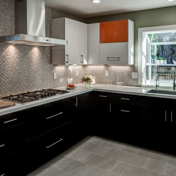
Colors played an integral part in the design of the kitchen. The color orange was strategically and artistically incorporated into the design by using it as a pop of color in only two wall cabinets. It was also extended into the breakfast bar countertop by creating a waterfall edge.
The breakfast bar was also a way to separate the kitchen from the dining room while maintaining an open layout. The raised countertop also created a unique feature looking from within the kitchen and into the dining room. The raised countertop was positioned above the main countertop and cabinets, creating a pocket of space for cell phones and smaller items.
Schedule an appointment with one of our Designers:
http://www.gkandb.com/contact-us/
Designer: Michelle O'Connor
Photography Credit: Treve Johnson
Wall Cabinets: Dura Supreme Cabinetry
Base Cabinets: Dewils Cabinetry
 CraftedWild Cabinetry
Photo credit: PDET Photography, Pawel Dmytrow
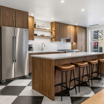
Designed for a home in the Chicago suburbs, this kitchen was created around the client’s desire for clean, minimal lines, visual balance, and highly functional storage.
A warm, high-end European textured TFL brings depth and natural character to the cabinetry, with careful grain matching from panel to panel reinforcing the seamless, tailored appearance. Floating shelves were introduced to break up the cabinetry and create a lighter composition, while integrated dimmable lighting adds warmth and ambiance—especially important given the kitchen’s connection to the surrounding great room.
Function was considered at every level. A custom utensil storage solution was stained to coordinate with the cabinetry finish, while a concealed integrated outlet in the island keeps everyday power readily available without interrupting the clean exterior. Generous drawer and pantry storage maximize usability, including a reduced-depth pantry positioned near the window to provide additional capacity without unnecessarily projecting into the room or compromising natural light.
Every element—from proportions and lighting to storage, material transitions, and grain direction—was considered to create a kitchen that feels calm, cohesive, and deliberately understated.
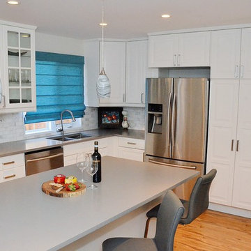
 Get It Together Inc.
Styled by: Sheri Bruneau
Photo Credit: Karen Rice
Example of a mid-sized transitional l-shaped vinyl floor kitchen pantry design in Calgary with a double-bowl sink, shaker cabinets, white cabinets, quartz countertops, gray backsplash, porcelain backsplash, stainless steel appliances and an island
Example of a mid-sized transitional l-shaped vinyl floor kitchen pantry design in Calgary with a double-bowl sink, shaker cabinets, white cabinets, quartz countertops, gray backsplash, porcelain backsplash, stainless steel appliances and an island
Sponsored
Columbus, OH

Hope Restoration & General Contracting
Columbus Design-Build, Kitchen & Bath Remodeling, Historic Renovations
 Aloha Kitchen, Bath & Design
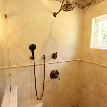
This beautiful estate is positioned with beautiful views and mountain sides around which is why the client loves it so much and never wants to leave. She has lots of pretty decor and treasures she had collected over the years of travelling and wanted to give the home a facelift and better display those items, including a Murano glass chandelier from Italy. The kitchen had a strange peninsula and dining nook that we removed and replaced with a kitchen continent (larger than an island) and built in around the patio door that hide outlets and controls and other supplies. We changed all the flooring, stairway and railing including the gallery area, fireplaces, entryway and many other touches, completely updating the downstairs. Upstairs we remodeled the master bathroom, walk-in closet and after everything was done, she loved it so much that she had us come back a few years later to add another patio door with built in downstairs and an elevator from the master suite to the great room and also opened to a spa outside. (Photo credit; Shawn Lober Construction)
 R. B. Schwarz, Inc.
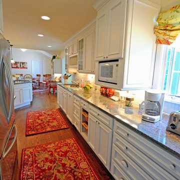
This view from the dining room, showcases the work horses of the kitchen - the refrigerator and ovens. As you can image, a lot of the cooking prep happens under these windows, where the sink was located before the remodel. The refrigerator was also relocated to its new position on the left.
Photo Credit: Marc Golub
 Xavieras Inc.
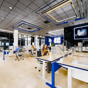
IQ Business Media Inc. wishes to expand the programming of their business brand by connecting with their audience in more dynamic ways and further enhance their position as a viable partner to national and international design markets. Bringing diverse stakeholders together to facilitate ongoing dialogue in the areas of design and architecture is a key goal of the organization.
Design Solutions:
Quality of space and brand delivery provide state-of-the-art technology in all the spaces.
Spaces can adapt to support the project and business needs. Onsite staff act as a conduit for culture, community, connecting people, companies, and industries by sharing expertise and developing meaningful relationships. Therefore, the spaces are flexible, easy to reconfigure, and adapt to diverse uses.
Software: Revit with Enscape plugin, Photoshop.
Designer Credit: www.linkedin.com/in/mahsa-taskini
 Interiors By Janlee
Photo Credits- Josh Cuchiara
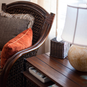
Example of an island style family room design in Other
Example of an island style family room design in Other
Sponsored
Columbus, OH
Hope Restoration & General Contracting
Columbus Design-Build, Kitchen & Bath Remodeling, Historic Renovations
 Picture Perfect Kitchen Designs
Photo Credit: Brandi Image Photography
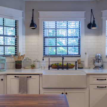
Our Modern Farmhouse Style reflects in our own personal kitchen and working showroom. The warmth of the Walnut Butcher Block sets the scene for gathering and also for long baking sessions. The Silestone Quartz countertop around the perimeter makes it for easy clean up - especially around the range area. That heavy cooking zone features a custom PPKD built wood hood with all the detailing in the crown molding. The glass hutch serves as a perfect every day dish cabinet, while glass on the range wall also helps to lighten up the heavy load. The Farmhouse sink provides a beautiful clean-up station with the bridge faucet to add beauty and tradition. The purifier is strategically set up near the coffee station for early morning risers. The refrigerator is built into an old walkway that was under-used and it provides the perfect spot to house a hard working appliance. The dishwasher is paneled and tucked away beside the sink while the double pull-out trash is also camoflauged adjacent to the sink.
We welcome you to make your Design Consult Appointment today so you can come and see the beauty, quality, and special touches we will put in your home, as we did with ours.
 Naikoon Contracting Ltd
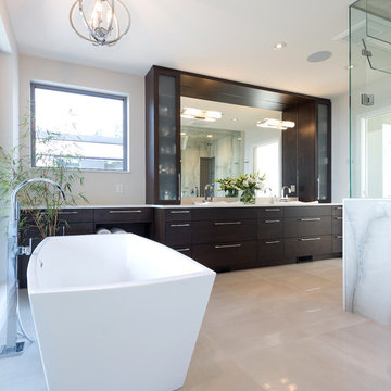
Situated above the Vancouver skyline, overlooking the city below, this custom home is a top performer on top of it all. An open kitchen, dining, and great room with a 99 bottle capacity wine wall, this space is made for entertaining.
The three car garage houses the technical equipment including solar inverters and the Tesla Powerwall 2. A vehicle lift allows for easy maintenance and double parking storage. From BBQ season in the summer to the gorgeous sunsets of fall, the views are simply stunning both from and within the home. A cozy library and home office are well placed to allow for a more intimate atmosphere while still absorbing the beautiful city below.
Luxury custom homes are not always as high on the performance scale but this home boasts a modelled energy rating of 60 GJ/year compared with the 182 GJ/year standard, close to 70% better! With high-efficiency appliances and a well positioned solar array, this home may perform so well that it starts generating income through Net Metering.
Photo Credits: SilentSama Architectural Photography
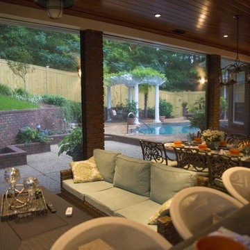 Catherine Arensberg
Overlooking landscape, pool, wall fountain, and new roof expansion over retractable screen porch and outdoor kitchen/dining area (screens in down position for this photo)
Photo Credit: Today's Homeowner Media
11