
Search results for "Potential clients" in Home Design Ideas
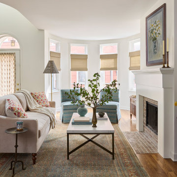

 Interiors by Steven G
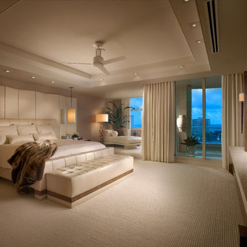
Barry Grossman Photography
Trendy master carpeted bedroom photo in Miami with no fireplace and gray walls
Trendy master carpeted bedroom photo in Miami with no fireplace and gray walls

 Barbara Grushow Designs Inc.
Jim Bartsch Photography
Bathroom - mid-sized transitional master white tile and subway tile mosaic tile floor and gray floor bathroom idea in Los Angeles with a wall-mount sink, gray walls, a hinged shower door and a niche
Bathroom - mid-sized transitional master white tile and subway tile mosaic tile floor and gray floor bathroom idea in Los Angeles with a wall-mount sink, gray walls, a hinged shower door and a niche
Find the right local pro for your project
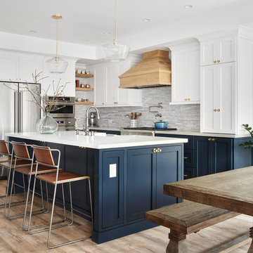
 KBG Design
Open concept kitchen - large coastal l-shaped light wood floor and brown floor open concept kitchen idea in San Francisco with shaker cabinets, gray backsplash, stainless steel appliances, an island, a farmhouse sink, white cabinets, solid surface countertops and white countertops
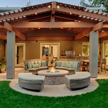
 Kankel Conroy Rose & Hill Landscape Architecture
The homeowners desired an outdoor space that felt more rustic than their refined interior spaces, but still related architecturally to their house. Cement plaster support arbor columns provide enough of visual tie to the existing house exterior. Oversized wood beams and rafter members provide a unique outdoor atmosphere. Structural bolts and hardware were minimized for a cleaner appearance. Structural connections and supports were engineered to meet California's stringent earthquake standards.
Ali Atri Photography
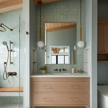
 Agnieszka Jakubowicz PHOTOGRAPHY
Design: kbg Design / Build: John Fuchs Properties / Cabinetry: Schmitz Woodworks / Photography: Agnieszka Jakubowicz
Bathroom - coastal mosaic tile floor, beige floor, single-sink, exposed beam, vaulted ceiling and wood ceiling bathroom idea in San Francisco with flat-panel cabinets, light wood cabinets, blue walls, an undermount sink, white countertops and a floating vanity
Bathroom - coastal mosaic tile floor, beige floor, single-sink, exposed beam, vaulted ceiling and wood ceiling bathroom idea in San Francisco with flat-panel cabinets, light wood cabinets, blue walls, an undermount sink, white countertops and a floating vanity

 Thyme & Place Design LLC
When my client had to move from her company office to work at home, she set up in the dining room. Despite her best efforts, this was not the long-term solution she was looking for. My client realized she needed a dedicated space not on the main floor of the home. On one hand, having your office space right next to the kitchen is handy. On the other hand, it made separating work and home life was not that easy.
The house was a ranch. In essence, the basement would run entire length of the home. As we came down the steps, we entered a time capsule. The house was built in the 1950’s. The walls were covered with original knotty pine paneling. There was a wood burning fireplace and considering this was a basement, high ceilings. In addition, there was everything her family could not store at their own homes. As we wound though the space, I though “wow this has potential”, Eventually, after walking through the laundry room we came to a small nicely lit room. This would be the office.
My client looked at me and asked what I thought. Undoubtedly, I said, this can be a great workspace, but do you really want to walk through this basement and laundry to get here? Without reservation, my client said where do we start?
Once the design was in place, we started the renovation. The knotty pine paneling had to go. Specifically, to add some insulation and control the dampness and humidity. The laundry room wall was relocated to create a hallway to the office.
At the far end of the room, we designated a workout zone. Weights, mats, exercise bike and television are at the ready for morning or afternoon workouts. The space can be concealed by a folding screen for party time. Doors to an old closet under the stairs were relocated to the workout area for hidden storage. Now we had nice wall for a beautiful console and mirror for storage and serving during parties.
In order to add architectural details, we covered the old ugly support columns with simple recessed millwork panels. This detail created a visual division between the bar area and the seating area in front of the fireplace. The old red brick on the fireplace surround was replaced with stack stone. A mantle was made from reclaimed wood. Additional reclaimed wood floating shelves left and right of the fireplace provides decorative display while maintaining a rustic element balancing the copper end table and leather swivel rocker.
We found an amazing rug which tied all of the colors together further defining the gathering space. Russet and burnt orange became the accent color unifying each space. With a bit of whimsy, a rather unusual light fixture which looks like roots from a tree growing through the ceiling is a conversation piece.
The office space is quite and removed from the main part of the basement. There is a desk large enough for multiple screens, a small bookcase holding office supplies and a comfortable chair for conference calls. Because working from home requires many online meetings, we added a shiplap wall painted in Hale Navy to contrast with the orange fabric on the chair. We finished the décor with a painting from my client’s father. This is the background online visitors will see.
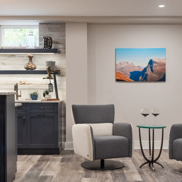
The last and best part of the renovation is the beautiful bar. My client is an avid collector of wine. She already had the EuroCave refrigerator, so I incorporated it into the design. The cabinets are painted Temptation Grey from Benjamin Moore. The counter tops are my favorite hard working quartzite Brown Fantasy. The backsplash is a combination of rustic wood and old tin ceiling like porcelain tiles. Together with the textures of the reclaimed wood and hide poofs balanced against the smooth finish of the cabinets, we created a comfortable luxury for relaxing.
There is ample storage for bottles, cans, glasses, and anything else you can think of for a great party. In addition to the wine storage, we incorporated a beverage refrigerator, an ice maker, and a sink. Floating shelves with integrated lighting illuminate the back bar. The raised height of the front bar provides the perfect wine tasting and paring spot. I especially love the pendant lights which look like wine glasses.
Finally, I selected carpet for the stairs and office. It is perfect for noise reduction. Meanwhile for the overall flooring, I specifically selected a high-performance vinyl plank floor. We often use this product as it is perfect to install on a concrete floor. It is soft to walk on, easy to clean and does not reduce the overall height of the space.

Sponsored
Columbus, OH

Snider & Metcalf Interior Design, LTD
Leading Interior Designers in Columbus, Ohio & Ponte Vedra, Florida
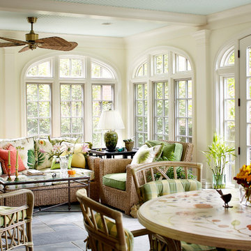
 R. Scott Javore & Associates, LTD.
Inspiration for a timeless gray floor sunroom remodel in Chicago with a standard ceiling
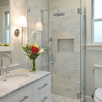
 Studio G+S Architects
5'6" × 7'-0" room with Restoration Hardware "Hutton" vanity (36"w x 24"d) and "Hutton" mirror, sconces by Waterworks "Newel", shower size 36" x 36" with 22" door, HansGrohe "Axor Montreux" shower set. Wall paint is "pearl white" by Pratt & Lambert and wood trim is "white dove" eggshell from Benjamin Moore. Wall tiles are 3"x6" honed, carrara marble with inset hexagonals for the niche. Coved ceiling - walls are curved into a flat ceiling.
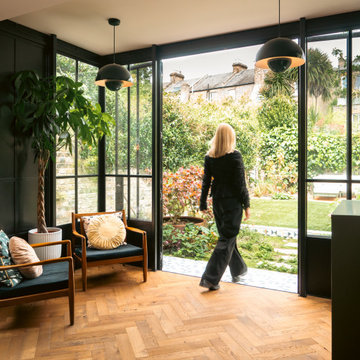
 Fabco Sanctuary
The architect and designer Guy Derwent was approached by his client with a clear and compelling brief: to completely transform a grand Victorian terrace house they were planning to renovate. The client envisioned something far beyond a standard renovation – this was to be a bold and dramatic reimagining of a family home that could grow with them over time.
With the property having remained largely untouched for more than fifty years, the architects saw an opportunity to unlock its potential and deliver a contemporary design that would contrast beautifully with its Victorian heritage.
The existing layout consisted of a series of small, disconnected rooms to the rear of the house. To respond to the client’s need for openness and flexibility, the architect proposed a radical restructuring of the ground floor:
The rear rooms were completely removed
Suspended timber floors were lowered by up to two metres to align with the garden
Two bold extensions were added
The first extension filled in the side return with a London stock brick facade and a glazed roof, while the second – a striking black steel and glass pavilion was glazed on three sides and placed along the garden elevation.
This new pavilion redefined the building’s relationship with the garden. Its steel-framed glazing created a seamless dialogue between interior and exterior, offering a sense of immersion in the surrounding landscape.
At the heart of the plan sits a dramatic, five-metre-tall dining space that acts as a transition from the original entrance hall into the new addition. A large, circular cast-glass window, framed in steel, provides a visual and spatial link between old and new, allowing light and movement to travel through the depth of the home.
Throughout the project, a series of black metal elements were introduced as sculptural interventions – each marking moments of transformation within the house. These included the bespoke steel framed circular window, a custom metal staircase, a cylindrical support column, and the striking steel and glass garden pavilion. Together, they formed a coherent architectural language that underscored the project’s bold intent.
Our steel windows and doors played a vital role in delivering the project’s vision. The architects chose steel for its refined sight lines and distinctive material character, which helped bridge the gap between the historical context of the building and the bold new additions.
The black steel frames provided a crisp contrast to the pale London stock brick and added definition to the glazed pavilion, reinforcing the sense of architectural precision. In particular, the fine steel profiles of the garden room allowed the extension to feel both lightweight and immersive, blurring the boundary between the house and its garden.
The architect drew inspiration from the Bauhaus Movement, particularly the work of Walter Gropius, whose approach to functional beauty and industrial materials informed the design of the garden pavilion.
Here, our glazing system was used not just for transparency, but as an expressive architectural element. The carefully proportioned panels help to conceal the roof thickness and reinforce the pavilion’s industrial yet abstract character – a deliberate nod to product design and modernist detailing.
Sustainability was an important factor in the selection of materials. Our steel systems, made from 99% recycled content and 100% recyclable, aligned with the project’s broader environmental goals.
The architects noted that this commitment to material longevity and circularity was central to their decision to use steel. The durability and recyclability of the windows and doors ensured the project met both aesthetic and ethical criteria.
This London terrace house now stands as a celebration of contrast – between heritage and innovation, solidity and transparency, tradition and transformation. Our steel windows and doors were not simply components; they were essential tools in crafting a home that is as bold and expressive as it is functional.
The result is a home designed for modern family life, where light, space, and materiality come together in perfect harmony.

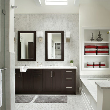
 Ulrich Inc
Ulrich Designer: Tom Santarsiero
Photography by Peter Rymwid
This is a master bath with subtle sophistication and understated elegance. The cabinets were custom designed by Tom, with straight, simple lines, and custom built by Draper DBS of walnut, with a deep, rich brown finish. The richness of the dark cabinetry juxtaposed with the elegance of the white carrara marble on the countertop, wall and floors contributes to the room's sophistication. Ample storage is found in the large vanity and an armoire style cabinet, designed to mimic a free-standing furniture piece, that is positioned behind the door. Architectural beams placed across the vaulted ceiling bring a sense of scale to the room and invite natural light in through the skylight.
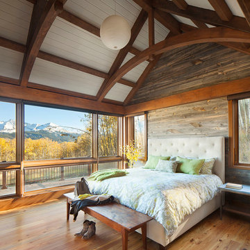
 SV Design
When full-time Massachusetts residents contemplate building a second home in Telluride, Colorado the question immediately arises; does it make most sense to hire a regionally based Rocky Mountain architect or a sea level architect conveniently located for all of the rigorous collaboration required for successful bespoke home design. Determined to prove the latter true, Siemasko + Verbridge accompanied the potential client as they scoured the undulating Telluride landscape in search of the perfect house site.
The selected site’s harmonious balance of untouched meadow rising up to meet the edge of an aspen grove and the opposing 180 degree view of Wilson’s Range spoke to everyone. A plateau just beyond a fork in the meadow provided a natural flatland, requiring little excavation and yet the right amount of upland slope to capture the views. The intrinsic character of the site was only enriched by an elk trail and snake-rail fence.
Establishing the expanse of Wilson’s range would be best served by rejecting the notion of selected views, the central sweeping curve of the roof inverts a small saddle in the range with which it is perfectly aligned. The soaring wave of custom windows and the open floor plan make the relatively modest house feel sizable despite its footprint of just under 2,000 square feet. Officially a two bedroom home, the bunk room and loft allow the home to comfortably sleep ten, encouraging large gatherings of family and friends. The home is completely off the grid in response to the unique and fragile qualities of the landscape. Great care was taken to respect the regions vernacular through the use of mostly native materials and a palette derived from the terrain found at 9,820 feet above sea level.
Photographer: Gibeon Photography
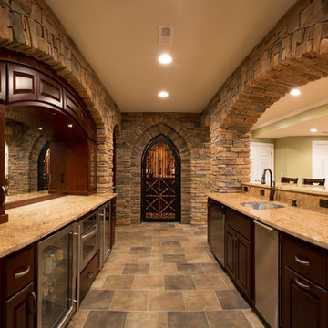
Sponsored
Delaware, OH

Buckeye Basements, Inc.
Central Ohio's Basement Finishing ExpertsBest Of Houzz '13-'21

 Pink Door Designs
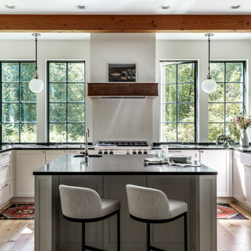
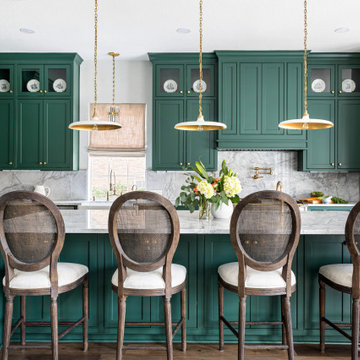
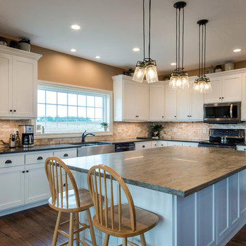
Rich, warm yet strikingly beautiful! This kitchen got a major overhaul with its oversized island housing a pre-sing, wine fridge, and tons of storage. Relocation of the refractor to make way for the gourmet range alongside the existing window framed sink. This kitchen is "L" shaped and has a hidden pantry built-in behind the fridge.
 Hansen Architects, P.C.
Atlantic Archives
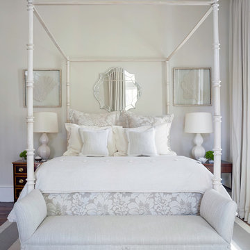
Elegant dark wood floor bedroom photo in Atlanta with white walls
Elegant dark wood floor bedroom photo in Atlanta with white walls
 L. Lumpkins Architect, Inc.
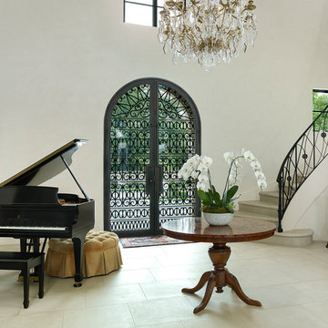
The front entry of the home with custom iron doors and staircase railing. Photograph by Holger Obenaus Photography LLC
Inspiration for a large mediterranean beige floor and limestone floor entryway remodel in Dallas with white walls and a glass front door
Inspiration for a large mediterranean beige floor and limestone floor entryway remodel in Dallas with white walls and a glass front door

 Bearded Builders, Baltimore
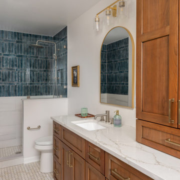
This master suite exudes a tranquil, spa-like atmosphere, featuring a luxurious soaking tub as the centerpiece. A natural wood vanity adds warmth and texture, while the basket-weave tile floor creates subtle pattern and interest. The glass-enclosed shower is highlighted by blue tile arranged in a unique pattern, offering a striking visual contrast. Mixed metal finishes throughout—on fixtures and accents—bring an eclectic yet cohesive touch to the space, balancing modern elegance with natural elements.
 LMB Interiors
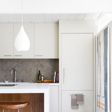
In the kitchen, tractor seat barstools were sourced (retail) by the client. Another money-saving tactic: The backsplash tile is Heath, but rather than selecting the expensive shapes from the Series 5 collection that our client was drawn to at first, we chose a stock size and shape and created visual interest by installing the tiles in a herringbone pattern. Pendant lights (splurge) from Design Within Reach.
Photo credit: Suzanna Scott
 Thyme & Place Design LLC
When my client had to move from her company office to work at home, she set up in the dining room. Despite her best efforts, this was not the long-term solution she was looking for. My client realized she needed a dedicated space not on the main floor of the home. On one hand, having your office space right next to the kitchen is handy. On the other hand, it made separating work and home life was not that easy.
The house was a ranch. In essence, the basement would run entire length of the home. As we came down the steps, we entered a time capsule. The house was built in the 1950’s. The walls were covered with original knotty pine paneling. There was a wood burning fireplace and considering this was a basement, high ceilings. In addition, there was everything her family could not store at their own homes. As we wound though the space, I though “wow this has potential”, Eventually, after walking through the laundry room we came to a small nicely lit room. This would be the office.
My client looked at me and asked what I thought. Undoubtedly, I said, this can be a great workspace, but do you really want to walk through this basement and laundry to get here? Without reservation, my client said where do we start?
Once the design was in place, we started the renovation. The knotty pine paneling had to go. Specifically, to add some insulation and control the dampness and humidity. The laundry room wall was relocated to create a hallway to the office.
At the far end of the room, we designated a workout zone. Weights, mats, exercise bike and television are at the ready for morning or afternoon workouts. The space can be concealed by a folding screen for party time. Doors to an old closet under the stairs were relocated to the workout area for hidden storage. Now we had nice wall for a beautiful console and mirror for storage and serving during parties.
In order to add architectural details, we covered the old ugly support columns with simple recessed millwork panels. This detail created a visual division between the bar area and the seating area in front of the fireplace. The old red brick on the fireplace surround was replaced with stack stone. A mantle was made from reclaimed wood. Additional reclaimed wood floating shelves left and right of the fireplace provides decorative display while maintaining a rustic element balancing the copper end table and leather swivel rocker.
We found an amazing rug which tied all of the colors together further defining the gathering space. Russet and burnt orange became the accent color unifying each space. With a bit of whimsy, a rather unusual light fixture which looks like roots from a tree growing through the ceiling is a conversation piece.
The office space is quite and removed from the main part of the basement. There is a desk large enough for multiple screens, a small bookcase holding office supplies and a comfortable chair for conference calls. Because working from home requires many online meetings, we added a shiplap wall painted in Hale Navy to contrast with the orange fabric on the chair. We finished the décor with a painting from my client’s father. This is the background online visitors will see.
The last and best part of the renovation is the beautiful bar. My client is an avid collector of wine. She already had the EuroCave refrigerator, so I incorporated it into the design. The cabinets are painted Temptation Grey from Benjamin Moore. The counter tops are my favorite hard working quartzite Brown Fantasy. The backsplash is a combination of rustic wood and old tin ceiling like porcelain tiles. Together with the textures of the reclaimed wood and hide poofs balanced against the smooth finish of the cabinets, we created a comfortable luxury for relaxing.
There is ample storage for bottles, cans, glasses, and anything else you can think of for a great party. In addition to the wine storage, we incorporated a beverage refrigerator, an ice maker, and a sink. Floating shelves with integrated lighting illuminate the back bar. The raised height of the front bar provides the perfect wine tasting and paring spot. I especially love the pendant lights which look like wine glasses.
Finally, I selected carpet for the stairs and office. It is perfect for noise reduction. Meanwhile for the overall flooring, I specifically selected a high-performance vinyl plank floor. We often use this product as it is perfect to install on a concrete floor. It is soft to walk on, easy to clean and does not reduce the overall height of the space.
3