
Search results for "Precisely" in Home Design Ideas
 Mae Reedy Build + Design
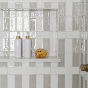
Precisely aligned shower tile creates a visual axis that connects the tub, shower, and vanities. The glossy Marin ceramic tile reflects light and reinforces the room’s clean, calming aesthetic.
 kitchen & bath CRATE
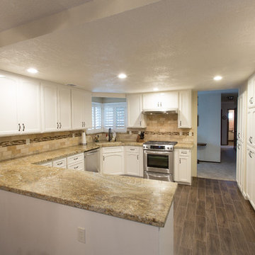
kitchenCRATE Oak Avenue | Ripon, CA | Granite: Arizona Tile Golden Ridge | Backsplash: Emser Vino Gold 3X6 Tiles | Accent: Emser Lucente Tromba Stone Blend Tiles | Cabinets: Kelly-Moore Canvas Cloth | Sink: Blanco Precis sink in Bisccotti | Faucet: Kohler Ballera in Oil Rubbed Bronze | Kohler Traditional Soap Dispenser
 Luxaforma LLC
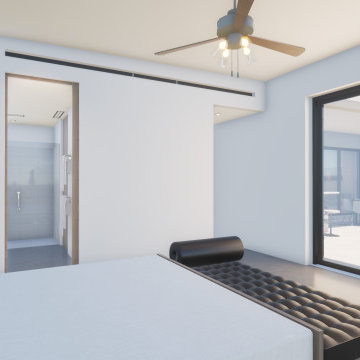
Luxaforma has been engaged by Corsair Property Solutions to lead the design of a sustainable, hurricane-resilient home built with Insulated Concrete Forms (ICF) for the South Florida market. The project is fully modeled in Archicad BIM, and is now advancing through Design Development, where all building systems are being precisely coordinated with the innovative structural strategy.
Find the right local pro for your project
 Design Matters
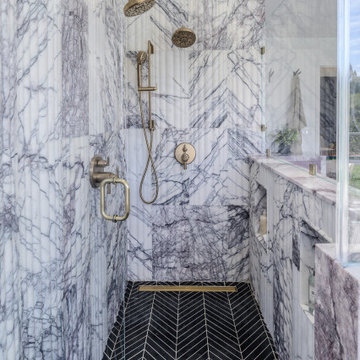
The primary suite and bath is an engagement of both opulent natural stone materials, textures with the chevron flooring, fluted lilac shower walls and full slab vanity wall precisely accented with a perfectly paired painted lilac cabinetry. This is a full surround of beauty and sophistication for a spa like retreat like no other!
Product Sourcing:
Signature Custom Cabinetry: Frameless Luca Door
Shower Tile - All Natural Stone / Flute Lilac Marble Field Dimensional 12"X24" / Fluted Natural Stone Tile
Countertop & Backsplash Natural Lilac Stone / Lilac Slab All Natural Stone
Floor: Superior Stone / Chevron Mosaic Nero Marquina 10.5x14.2
Hammerton Lighting, Aalto Pendant
 Rhodes Architecture + Light
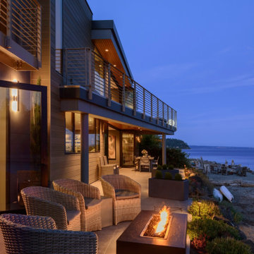
A transformation inspired by the owner’s love of modern architecture, art and color (and the adjacent sand, rock, water, and the northwest landscape), the Indianola House sought to bring the soul of a home to a colorless muted box. The original house was a drab 1990’s-era box with no personality or presence sited on a beautiful secluded bay, facing water and island views, northwest of the City of Seattle. The existing mono-colored stucco-clad exterior and pyramidal glass-block openings had led the neighborhood to dub the structure, unflatteringly, “The Miami Vice House”.
Rhodes Architecture’s Residential Architects careful use of natural light, rich, collaged finishes and ability to open the house to gardens, beach, and outdoor gathering was critical to the design. The house soon became “The Gallery”.
The original home’s grey stucco exterior made the house seem both large and featureless; the introduction of no-maintenance exterior materials that collage and complement each other was a goal of the homeowner and the Seattle Architects who teamed up for this residential design. The bloated scale of the house cried out for the establishment and definition of the parts of the structure, a breaking down of the home’s form and its apparent bland size.
Living, sleeping, and bathing areas that started as staid spaces were in need of opening to the natural environment with additions of large doors, folding glass walls and useable balconies were crucial to each space having a dialogue with the outdoors.
The owner’s extensive art collection was highlighted and became the focus of interior places, well-lit naturally and through a new lighting system. Energy use and sustainable systems were a key component of the design which used high-efficacy lighting, better cladding on a rain-screen system, high-efficiency doors and windows, new insulation and weather barriers, and which added a photovoltaic-generated electrical system. The contemporary design sought to integrate all of these systems, materials, and finishes into a seamless whole that lent interest and drama to a residence which was previously lusterless.
How radically this house was transformed is evident in the exteriors, gardens and the natural spaces the house now opens to, as well as the gallery-like interiors. This home is a stunning testament to what is possible “before-and-after” when remade by Rhodes Architecture + Light.
The clients are an older couple with long professional and political careers, a love of art and a clear desire to connect with the Northwest environment and enliven their daily lives with spaces full of color and natural light.
Rhodes Architecture + Light was hired in 2019 to add new exteriors and interiors, natural light, larger openings to beach and bay, seismic and foundation upgrades to the home, and to infuse life into the house through the re-use of existing space and varied materials, color, textures, and lighting. The only actual change to the exterior “shell” of the house was the introduction of a low “gull-wing” roof with wood soffits above the central atrium space, to add drama and bring natural light into the entry gallery space. Interior spaces, including bedrooms and bathrooms, were re-planned and opened to each other, to greater natural light, to roof decks, and to the incredible views and sea-side environment.
The Builder, Fairbank Construction Company of Bainbridge Island, Washington, met the challenge of the design, first completely deconstructing the finishes inside and out, then precisely interlocking new claddings, windows and doors, cabinetry, finishes and a new gull-wing central roof in a beautiful transformation. The construction was total, thorough, and very detailed, resulting a house that, far from seeming a “remodeling”, is far more present and fitting to the owner’s lives and the natural environment than the house we started with.
 Lang's Kitchen & Bath
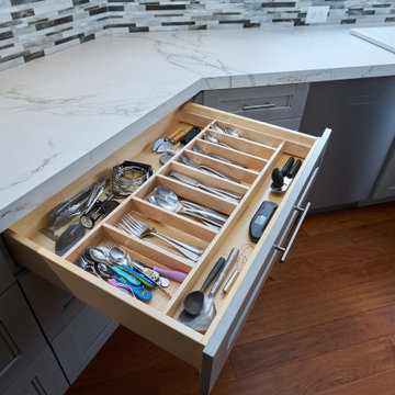
Every detail of this cool gray transitional kitchen design in Yardley, PA combines to create a stunning space, packed with stylish and practical features. The Dura Supreme stacked Avery style kitchen cabinets are painted zinc with a shadow glaze to add depth to the finish. The upper cabinets have a mullion style door, and the island is in a contrasting dark finish with glass front cabinets on one side. This is beautifully accented by Top Knobs bar pulls and a Dekton by Cosentino Entzo countertop with 2" mitered edge and a double waterfall countertop on the island. The cabinetry includes ample storage accessories, such as a tray divider, spice drawer, roll outs, and pull out base cabinet. The backsplash is random size mosaic Alabastro tile with Schluter strips to cap the edges. A Blanco Precis Siligranit sink combines with a Brizo Smart Touch on the perimeter of the kitchen. The appliances include Wolf ovens and a Sub Zero refrigerator, as well as a Wolf range in the island, perfect for cooking while talking to guests or keeping an eye on the kids. Power outlets in the island and angled power strips under the wall cabinets are ideal for plugging in small appliances or charging electronics. This open plan kitchen design is a functional, efficient space, as well as a style icon in the center of this home.
 Klopf Architecture
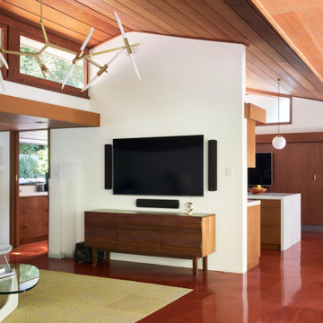
Nestled in the hills of Orinda, California, this 1951 residence is one of only seven extant homes, now known as “The Magnificent Seven”, designed by architect Olof Dahlstrand, a protégé of Frank Lloyd Wright. With its low-slung rooflines, natural materials, and deep integration with the sloping landscape, the home is a pristine example of mid-century modern design inspired by Wright’s organic principles. Over the years, prior homeowners have emphasized preservation, ensuring that the house remained relatively untouched. Each owner has respected the original architecture and stayed true to Dahlstrand’s intent. When a family of five—two college-aged sons and a middle school-aged daughter—acquired the property, they were captivated by its history, legacy of care, and architectural significance. While they appreciated Dahlstrand’s original vision, they also recognized the need to adapt the home for contemporary living while preserving its design integrity.
The remodel was conceived as a thoughtful response to the past—an effort to bring the house into the 21st century without compromising its soul. The primary mandate was to maintain architectural continuity while improving the functionality, comfort, and livability for a modern family. The design team—architects and contractor alike—worked with a shared reverence for the original architecture, allowing that mindset to guide even the most technical or pragmatic decisions.
A key objective was to increase natural light in the kitchen—a departure from Wrightian principles of enclosed, intimate cooking spaces—while maintaining the home’s architectural language. The kitchen was reconfigured to foster a stronger connection to adjacent living spaces while retaining the underlying concept of spatial separation. One of the most transformative architectural changes was the removal of a ridge beam that was originally planned to remain visible through the kitchen. During construction, the team collaborated on a better solution: a wide-flanged steel beam concealed within the roof envelope. This subtle move preserved the clean lines and ceiling continuity, a modern update carried out with utmost respect for the existing framework.
The home’s original powder room, previously accessible only through the kitchen, was relocated for better flow and privacy. A new powder room was carved out of former kitchen cabinetry—a narrow, interior space that could have felt dark and enclosed. To avoid this, the design extended the line of original transom windows into the new powder room and added a skylight above the vanity. The result is a bright and airy space that feels consistent with the rest of the home. Other updates included the installation of new solid-core interior doors with veneers carefully matched to the original mahogany, enhancing the continuity of the interiors. Even smaller decisions, such as placing the door knobs at 42 inches high, mirrored the original proportions. Every choice reflected a shared belief between the architect, contractor, and client: that new work should serve the integrity of the old.
The home’s extensive interior redwood millwork and paneling was meticulously restored. Where new materials were introduced—such as the replacement redwood soffit paneling—the contractor took pains to find finish nails that matched the original, rather than using modern equivalents. This level of craftsmanship and collaboration defined the project. It extended even to the detailing of a blind door to the new powder room, which had to disappear into the existing redwood board-and-batten wall. It was a team effort: the owner found a suitable handle, the architects devised the custom in-swing mechanism, and the contractor executed it so the door aligned precisely with the battens. Throughout, the homeowners were deeply engaged in the design process. One, a meticulous design enthusiast, focused on aesthetic integrity and historic detail. The other brought a practical and function-driven perspective, ensuring that new fixtures and materials would be durable and require minimal maintenance.
While the home’s location posed no major site challenges, sustainability was a key concern. The team upgraded the roof insulation, installed solar panels with battery storage, and added ductless mini-split cooling systems. Lighting was another area where modern technology was woven into a historic framework: new square LED fixtures echo the original custom perimeter soffit lights, maintaining the design language while offering advanced performance.
A planned expansion of a bedroom into suite with a bathroom had to be shelved due to budget constraints and the high cost of below-grade foundation work. Still, the team focused their efforts on making the most of the existing footprint, resolving constraints through design ingenuity rather than adding square footage. This renovation represents a collaborative achievement in preserving and evolving a historically significant home. Every decision was shaped by a shared ethos among clients, architects, and contractor: to maintain the home’s architectural soul while updating it for contemporary life. The result is a timeless modernist residence that continues Olof Dahlstrand’s legacy, remaining grounded in nature, craftsmanship, and human-scale design.
Klopf Architecture Team: John Klopf, AIA, Klara Kevane, Fernanda Bernardes
Interior Architectural Design: Klopf Architecture
Structural Engineer: Daniel Bastiao
Contractor: Don Larwood, Larwood Construction
Photography: Mariko Reed
Year Completed: 2022
 TKB DESIGN
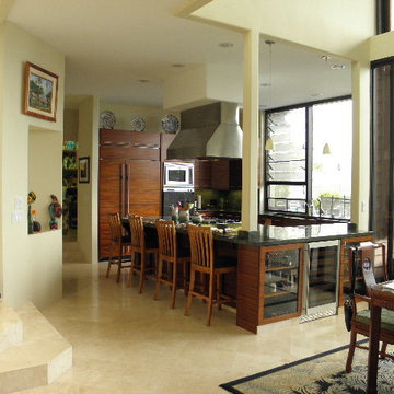
Single height counter top w/ dining room side SubZero Wine Cooler and liquor cabinets combined with buffet space and eating bar. Counter top height chairs. Post had to remain, requiring design around the post. Hood roof/ducting utilizing existing system required the new Range Top to be precisely located to align with hood and gas pipe coming up through the concrete floor. The location of the gas supply pipe had to be used to design the size and shape of all of the cabinets for this part of the island. Photo By; Randy Trager
 ALVAREZ-DIAZ & VILLALON
Photography by Carlos Esteva.
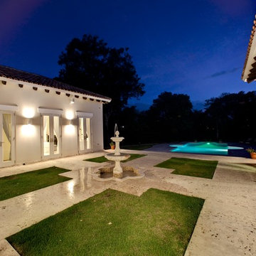
When this private client, a married couple, first approached Álvarez-Díaz & Villalón to build ‘the house of their dreams’ on the grounds of their sprawling family estate, the first challenge was to identify the exact location that would maximize the positive aspects of the topography while affording the most gracious views. Propped up on scaffolding, juggling digital cameras and folding ladders, the design team photographed the property from hundreds of angles before the ideal site was selected.
Once the site was selected, construction could begin.
The building’s foundation was raised slightly off the ground to disperse geothermal heat. In addition, the designers studied daily sunlight patterns and positioned the structure accordingly in order to warm the swimming pool during the cooler morning hours and illuminate the principal living quarters during the late afternoon. Finally, the main house was designed with functional balconies on all sides: each balcony meticulously planned ~ and precisely positioned ~ to
both optimize wind flow and frame the property’s most breath-taking views.
Stylistically, the goal was to create an authentic Spanish hacienda. Following Old World tradition, the house was anchored around a centralized interior patio
in the Moorish style: enclosed on three sides ~ yet
open on the fourth (similar to the Alcázar of Seville) ~ to reveal a reflecting pool ~ and mirror the water motif of the home’s magnificent marble fountain. A bell tower, horseshoe arches, a colonnaded,vineyard-style patio, and
ornamental Moorish mosaic tilework (“azulejos”) completed this picturesque portrait of a faraway fantasy world of castles, chivalry, and swordsplay, reminiscent of Medieval Spain.
Shortly after completion, this showcase home was showcased on the TVE Spanish television series Spaniards Around The World (Españoles Alrededor
Del Mundo) as a prime example of authentic Spanish architecture designed outside the peninsula. Not surprising. After all, the story of a fairy-tale retreat as
magical as this one deserves a happy ending.
 Homeowner Services of Michigan LLC
Our clients were expecting their first child and needed to make room. They decided to convert their existing master bedroom into a nursery and create a peaceful retreat for themselves by building an addition off the back of their home. Our journey together began with detailed planning, working closely with the architect to design a master bedroom suite that would offer comfort and functionality. Every aspect, from the room's layout to the bathroom's design, was carefully considered.
Budgeting was the next crucial step. We worked closely with our expectant clients to select high-quality materials while keeping costs within reach, ensuring the project stayed on track financially.
Construction started by preparing the site and laying a solid foundation. The team then moved on to framing the walls and installing plenty of windows to create a private wooded bedroom retreat. We added skylights to the beautiful vaulted ceiling so the couple could lie in bed and view the night sky. Attention to detail was paramount throughout the process.
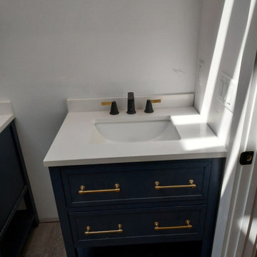
Finally, the finishing touches brought the vision to life. An en suite, curbless shower, custom interior doors, paint, and luxury vinyl plank flooring were installed precisely as planned.
The new master bedroom suite provided the perfect sanctuary for the growing family.
 Castle Building & Remodeling
Tired of doing laundry in an unfinished rugged basement? The owners of this 1922 Seward Minneapolis home were as well! They contacted Castle to help them with their basement planning and build for a finished laundry space and new bathroom with shower.
Changes were first made to improve the health of the home. Asbestos tile flooring/glue was abated and the following items were added: a sump pump and drain tile, spray foam insulation, a glass block window, and a Panasonic bathroom fan.
After the designer and client walked through ideas to improve flow of the space, we decided to eliminate the existing 1/2 bath in the family room and build the new 3/4 bathroom within the existing laundry room. This allowed the family room to be enlarged.
Plumbing fixtures in the bathroom include a Kohler, Memoirs® Stately 24″ pedestal bathroom sink, Kohler, Archer® sink faucet and showerhead in polished chrome, and a Kohler, Highline® Comfort Height® toilet with Class Five® flush technology.
American Olean 1″ hex tile was installed in the shower’s floor, and subway tile on shower walls all the way up to the ceiling. A custom frameless glass shower enclosure finishes the sleek, open design.
Highly wear-resistant Adura luxury vinyl tile flooring runs throughout the entire bathroom and laundry room areas.
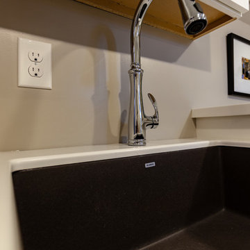
The full laundry room was finished to include new walls and ceilings. Beautiful shaker-style cabinetry with beadboard panels in white linen was chosen, along with glossy white cultured marble countertops from Central Marble, a Blanco, Precis 27″ single bowl granite composite sink in cafe brown, and a Kohler, Bellera® sink faucet.
We also decided to save and restore some original pieces in the home, like their existing 5-panel doors; one of which was repurposed into a pocket door for the new bathroom.
The homeowners completed the basement finish with new carpeting in the family room. The whole basement feels fresh, new, and has a great flow. They will enjoy their healthy, happy home for years to come.
Designed by: Emily Blonigen
See full details, including before photos at https://www.castlebri.com/basements/project-3378-1/
 Century Stair Company
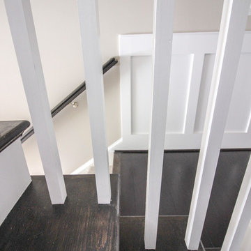
Refined simplicity defines this clean, contemporary staircase. Dark solid oak treads contrast beautifully with crisp white risers, square balusters, and newels, creating a striking visual rhythm. The design includes a thoughtful landing that doubles as a reading nook, transforming a transitional space into a destination.
White railing runs the full length of the stairwell, maintaining the home's bright, minimalist aesthetic while providing safety and structure. Every element was precisely crafted to meet the architect and builder's exacting vision, demonstrating how attention to detail and modern machining capabilities can bring refined designs to life.
1976-2026 © Century Stair Company
 HU-884212062
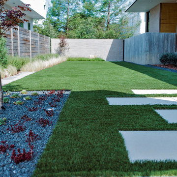
Our client recently purchased a newly-constructed home in order to downsize and have a low- maintenance home and yard. The existing side yard/back yard was undeveloped by the builder, leaving the homeowner with the huge challenge of creating a great outdoor entertaining space for family and friends, while creating privacy and overcoming the over 8-foot steep drop from the existing back porch down to the alley.
The grade was the largest challenge because the space was so narrow with such a large fall from existing porch to the property line. The second largest challenge is that this residence is located in a semi-private community where HOA approval of plans and materials is difficult, as all the residences here share a similar look and feel with a very clean and contemporary aesthetic.
We had to precisely shoot grades to know what kinds of retaining walls would need to be constructed along with how much backfill soil and dirt movement would need to be done. After that the design had to carefully consider the space with maximum functionality for outdoor entertainment with newly constructed walls to ensure it would last for many years to come. All of this was done with multiple meetings with the homeowners who are a retired engineer and active architect themselves. Once a design was settled upon, then submission to the HOA board of approval had to be completed and signed off on with all questions and concerns answered for the community by-laws.
The two biggest difficulties within the construction phase were that the neighbor next to the back yard had a large retaining wall not properly backfilled up to the property line. That neighbor wouldn’t allow us proper access and control to help alleviate the issues, so we had to skillfully work around this to ensure what we constructed would last, despite their property not being properly addressed. We also had to go through multiple shipments from the manufacturer due to large variances in the material’s appearance on the steps and another shipment that was broken during shipping. These two things delayed the project we were working to complete before the spring so the homeowner could have the maximum use of the space this year.
Topping off this challenging construction was a beautiful palette of native grasses, rosemary, groundcover, granite walkways, and synthetic grass to ensure year-round, practically effortless beauty.
 sonnemanlighting
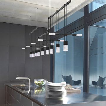
Suspenders™ LED system is a delicately scaled, modular system of interconnected elements and suspended LED components. It can be configured as individual lighting sculptures or as a tiered web of infinite scope and variety. Using today’s leadingedge technology, Robert Sonneman has reimagined and greatly expanded his original Suspenders concept from the late 1980s with a lighter scale, increased capability, and wider range of precisely scaled luminaires.
Because of the extensive range of possibilities offered by Suspenders, we have preconfigured a collection of arrangements that you can select as shown. You can also modify these arrangements using our configuration tables, or use them as inspiration to create your own completely custom configurations.
We will continue to build upon and expand Suspenders as an openframed illumination system of innovative possibilities as we move forward.
Three 36” Power Bars arranged in a straight line. Two upper Power Bars are ceiling mounted with two 18” field-cuttable rod Ceiling Hangers, with a 36” Power Bar hanging between them from two 6” Power Bar Hangers. Luminaires hang, three to a bar, in an alternating pattern from 6” and 12” Luminaire Hangers to set the Luminaires at an even height. Includes ceiling mounted Power Feed with outlet box mounted transformer.
 kitchen & bath CRATE
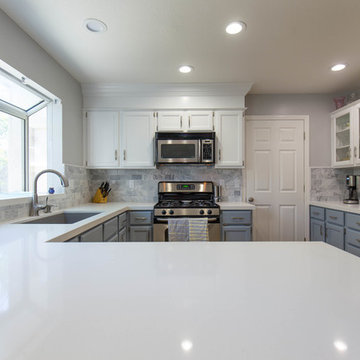
kitchenCRATE Cobblestone Manor | Modesto, CA | Quartz: MSI Stellar White | Backsplash: MSI Arabescato Carrara 3 x 6 Marble Tiles | Cabinets: Kelly-Moore Pearly White and Cave Painting | Sink: Blanco Precis in Metallic Gray | Cabinet Pulls: Liberty 3” & 5” Arched Pulls in Satin Nickel
 EAG Studio
On a quiet street just steps from San Francisco’s beloved Dolores Park, a formerly modest urban structure has been transformed into a luminous vertical residence that quietly redefines contemporary city living. Through a comprehensive remodel and both vertical and horizontal expansion, the project turns a constrained urban footprint into a sequence of serene, art-forward living spaces that unfold upward toward expansive city views.
The architecture balances restraint and warmth: crisp contemporary geometry softened by natural materials, artful lighting, and carefully curated interiors. The result is a home that feels simultaneously grounded and elevated—deeply connected to its neighborhood yet remarkably private.
Reimagining the Urban Envelope
The original building has been almost entirely reconceived. The facade now reads as a disciplined composition of plaster volumes and precisely detailed window openings framed by subtle projecting bands. The geometry references San Francisco’s classic rhythm of bayed facades while stripping the language down to a refined modern expression.
Behind this quiet exterior lies a dramatically expanded interior volume. The redesign adds both additional floor area and new vertical circulation, transforming what was once a conventional city house into a multi-level architectural sequence organized around light, art, and views.
At the roofline, planted terraces soften the building’s silhouette and create a green crown visible from surrounding hillsides.
Interiors as a Sequence of Galleries
Inside, the home unfolds as a series of spatial moments connected by a sculptural stair and gallery-like corridors.
Wide plank oak floors run throughout, providing continuity and warmth against a palette of plaster walls, dark steel detailing, and natural stone. The hallways function almost as curated galleries, with layered artworks suspended in front of mesh panels that create depth and subtle shadow.
Light filters through carefully placed windows and stair openings, transforming circulation spaces into contemplative transitions rather than mere passageways.
A Living Room Anchored by Stone and Light
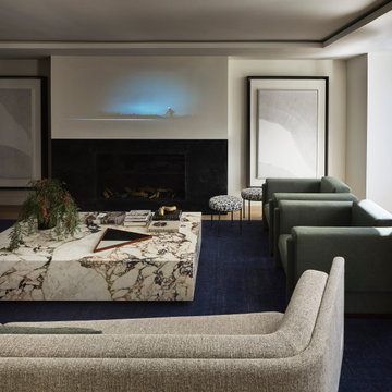
The primary living room occupies one of the home’s central floors, where a quiet interplay of texture and geometry defines the space.
A monumental fireplace wrapped in dark stone forms the room’s anchor, its mass contrasting with a recessed ceiling plane that seems to float above the seating area. Integrated perimeter lighting creates a soft architectural glow that washes the ceiling and walls.
Furniture is sculptural yet understated—rounded lounge chairs in warm ochre velvet, tailored sofas, and a striking marble cocktail table whose expressive veining becomes a focal artwork in itself. Deep blue carpeting grounds the seating arrangement and subtly absorbs light, enhancing the calm atmosphere.
Above the fireplace, a delicate projection artwork introduces a moment of visual poetry—an unexpected cinematic gesture that transforms the wall into a quietly animated canvas.
Kitchen as Architectural Furniture
The kitchen expresses a different register: crisp, tactile, and materially rich.
Custom walnut cabinetry spans the wall in a continuous plane, punctuated only by the sculpted hood and integrated appliances. The wood’s depth and warmth are balanced by expanses of pale marble that flow seamlessly from countertop to backsplash.
Three dome pendants hover above the island like industrial sculptures, casting pools of warm light onto the stone surface.
A row of vivid red stools introduces a controlled burst of color, a small but confident departure from the otherwise restrained palette.
Dining With a Living Backdrop
Adjacent to the kitchen, the dining room opens toward a glass wall overlooking a vertical garden of climbing ivy. The greenery becomes a constantly changing backdrop—lush and shadowy during the day, atmospheric and cinematic after sunset.
A dark wood table anchors the room, surrounded by pale oak chairs whose understated forms echo Scandinavian design traditions. The simplicity of the furniture allows the view and natural light to become the dominant experience.
Intimate Spaces and Material Contrast
Throughout the home, smaller rooms offer moments of intimacy and material experimentation.
The powder room pairs textured wall coverings with a dramatic black marble vanity whose bold veining feels almost geological. A suspended mirror and slender pendant create a sculptural composition against the tactile backdrop.
The primary bedroom, by contrast, feels serene and expansive. Floor-to-ceiling glazing frames sweeping views of the city, while soft textiles and warm wood paneling create a cocooning effect. Slender black columns subtly define a sitting area without interrupting the openness of the space.
Bathing Above the City
In the primary bathroom, a sculptural freestanding tub sits beside a panoramic window overlooking San Francisco’s hills and rooftops.
The room’s palette—light oak, grey stone, and matte metals—reinforces the spa-like atmosphere. Floating cabinetry and integrated lighting maintain a sense of visual lightness despite the richness of the materials.
Entertaining Above the Park
Higher in the house, a lounge and bar area becomes the social heart of the home. Here, dark stone slabs with dramatic veining wrap the bar wall like a piece of monumental art.
Open shelving displays glassware and spirits, while integrated wine storage hints at the home’s entertaining ambitions. A soft leather sectional and low glass table create a relaxed setting for conversation, framed by expansive views of the city skyline.
Cinema and Retreat
The lower level introduces yet another atmosphere: a dedicated media room designed for immersive viewing.
Dark walls, plush seating, and soft lighting create a cinematic environment that contrasts intentionally with the airy upper floors. It’s a retreat within the home—intimate, quiet, and removed from the brightness above.
Architecture That Balances Discipline and Warmth
What makes the project particularly compelling is its balance between architectural discipline and lived warmth.
Every element—from the carefully framed views to the restrained material palette—contributes to a cohesive spatial narrative. Yet the home never feels austere. Natural materials, curated art, and layered lighting create a sense of comfort and depth.
The result is a house that feels both architecturally rigorous and deeply human.
A Contemporary Interpretation of San Francisco Living
In a neighborhood defined by historic homes and iconic park views, this transformation offers a contemporary interpretation of San Francisco living.
It respects the city’s urban density while embracing openness, light, and vertical living. The home rises quietly above its surroundings, culminating in panoramic vistas that stretch across rooftops, hills, and sky.
What began as a conventional structure has become something far more nuanced: a modern urban sanctuary—part gallery, part retreat, and wholly connected to the vibrant city just beyond its walls.
 Jim Sharples Furniture
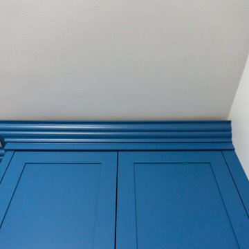
Bespoke Blue Library for a lovely cottage near Bristol.
The problem:
The room was going to be their office, it didn’t have much storage and it wasn’t very big. It had a difficult wall nib sticking out behind the door running the length of the wall and the room and had very high ceilings 3.2 metres high. This is precisely why they decided to go bespoke.
The brief:
The clients wanted lots of cabinets and shelves to make a library / bookcase for an awkward wall in a small room. The clients initially wanted ‘L’ shaped cabinets.
Lots of bookshelves, and I mean lots, like a bookcase wall and somewhere to hide office equipment like the printer and phone chargers.
Book shelves needed to be strong so they wouldn’t sag under the weight of the books – this was of utmost importance to the brief, these clients love books and reading.
Adjustable book shelves so they could fit their books exactly and change it up when needed.
The bespoke library was to go right up to the very high ceiling and finish in a cornice.
The cornice needed a particular profile to match their existing furniture.
“It’s better than we imagined it could be” was the first thing they said when they saw it complete!
When we first visited and discussed the design for this bespoke library in Bristol with them, it became obvious that an ‘L’ shape wouldn’t work in the room, so the first draft was to have the shelves and cabinets along one wall.
There were around 5 revisions in the end, until the design was approved. The design was intricate and had to be spot on taking the wall nib and the opening door and latch into account.
The whole bookcase cabinetry was made from solid tulip wood, this is a strong and stable material to take the weight of the books. The cornice was specially commissioned to match the profile of their existing furniture. For the adjustable shelves we used brass bookcase strips.
The bookshelves are all solid English oak from our favourite local supplier a family run business called Interesting Timbers these were all finished in our rollered Osmo oil finish.
Jo hand painted the whole piece, inside and out, it in their choice of colour (Woad’ by Little Greene). Jim installed it to our meticulous standards and the clients were very happy with the results.
We are also delighted with the finished result! Do let us know what you think or get in touch if you would like to discuss your own project.
 The Decorating Therapist
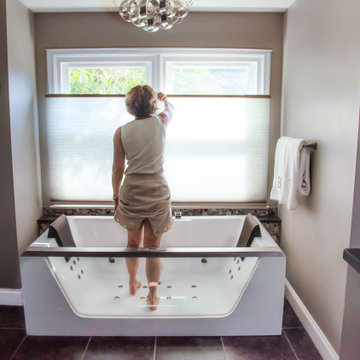
The cordless top-down, bottom-up honeycomb shade offers exceptional flexibility, allowing homeowners to precisely control natural light and privacy throughout the day. This premium window treatment can be adjusted from either the top or bottom, preserving outdoor views while shielding the bathing area when desired. Its clean, streamlined design complements the contemporary aesthetic of the luxury primary bathroom, while the energy-efficient cellular construction helps improve insulation and indoor comfort. Blending sophisticated style with everyday functionality, the shade enhances the spa-like atmosphere by maximizing daylight without compromising privacy.
 Atlanta Curb Appeal
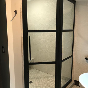
The client is a commercial designer by trade, so she was able to grasp and, in some cases, directly purchase precisely what she wanted style-wise. She chose the fantastic lighting fixture above the freestanding tub, and the beautiful wood and granite mixed vanity with black farmhouse-style faucets. The barn door entry was quite a find! She discovered it at an antique store. Admittedly, it was quite beaten up and dirty. We pulled the glass off, cleaned it up, stained it, and then we put it all back together. She talentedly selected most everything; we merely followed her drawings and wishes. Since she is a designer, she has a keen attention to detail. Many things had to be custom made, which takes more time and effort. The results, though, are breathtaking and worth it!
 CORE Remodeling Services, Inc.
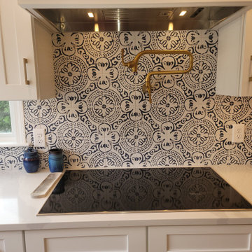
Kitchen Remodel - Southborough MA
Kitchen Remodel/Renovation - Southborough MA
Complete demo of the old kitchen. We installed Waypoint 650F painted Linen cabinets and a painted Navy Island cabinet. We also installed a 5” wide 32" tall soft close spice pull-out and a soft close appliance lift for island cabinet. The hardware we installed was center-to-center in Satin Bronze Square Sutton cabinet bar pull hardware.
The counter tops are Silestone Quartz in Eternal Calacatta Classic Pencil Edge with Kitchen sink and bar sink cut outs. Backsplash tile in the kitchen is from MSI: Kenzzi Indigo 8X8 matte with silver shadow grout.
For the prep sink we installed a Blanco Precis 20-7/8" undermount single basin SILGRANIT sink in white, and the kitchen sink was Blanco Diamond 33-1/2" undermount single basin SILGRANIT. For the faucet we installed a Kohler Graze K-22060 Vibrant Brushed Moderne Brass, and the bar faucet was a Kohler Graze 1.5 GPM Single Hole Bar Faucet. We also installed a pot filler from Kohler Graze 3.2 GPM Wall
55