
Search results for "Pretty sever" in Home Design Ideas
 Neuhoff Custom Builders
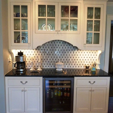
Kitchen remodel with custom cabinets with glass doors, Custom tiled backsplash, Black granite countertop. Mini several refrigerator.
Mid-sized elegant single-wall medium tone wood floor eat-in kitchen photo in Raleigh with recessed-panel cabinets, white cabinets, marble countertops, gray backsplash, mosaic tile backsplash, no island and stainless steel appliances
Mid-sized elegant single-wall medium tone wood floor eat-in kitchen photo in Raleigh with recessed-panel cabinets, white cabinets, marble countertops, gray backsplash, mosaic tile backsplash, no island and stainless steel appliances
 Advance Design Studio, Ltd.
After six years of living in their Huntley IL home, Chris and Meghan were tired of their dark, dingy, outdated kitchen and it was finally time for a long-anticipated change. “The kitchen is the place where we live, it’s where we do everything,” Meghan said. “It was important that it be a space where we wanted to be.” Meghan loves cooking and enjoys including their girls in healthy meal prepping, this led them to want a brighter, more enjoyable kitchen with increased functionality and improved storage.
For Chris especially, the laundry room was an entirely dysfunctional eyesore. “We had a washer and a dryer, but it was all kind-of cobbled together!” Chris said. “There were always laundry piles everywhere, we weren’t really sure what we wanted to do in there, but it was time for us to make a change.” The mess of the space was stressful every time they walked in the door from the garage each day. Kids’ backpacks and shoes piled up haphazardly in the makeshift boot-bench closet left the family feeling disorganized and stressed. They needed space for folding clothes and locker cubbies to help keep the family organized.
Having known Christine and Todd in the Huntley community for years, Chris and Meghan were familiar with their work. “We already trusted them personally and having seen their projects for years we knew they did top notch work. After we reviewed the initial round of designs, we knew that hiring them was definitely the right choice,” Meghan and Chris said. Although Chris had done a lot of work in their home himself, the kitchen and laundry room renovation was such a large undertaking that he didn’t want to steal time away from his family to spend what would surely be many long weekends doing the job himself. “That would not have been a wise choice for us,” Chris laughed.
“Our designer, Michelle was very, very, easy to work with; anything we wanted to see or weren’t sure about, she went above and beyond to make this easy for us. She was easy to get hold of and always quick to respond,” the couple said. Michelle pulled ideas that mirrored the couple’s taste and style and was adept at directing the couple to limited choices that didn’t overwhelm them and kept the process moving. “I have a hard time making decisions. Michelle made the decision-making process so easy. I loved how she listened to what I liked and then presented three great options for me to choose from,” Meghan said.
The main objectives for the kitchen were better storage solutions, they wanted the space to reflect their lifestyle and taste, and they wanted it to last for years with low maintenance. One of the first steps in creating a more functional kitchen was relocating the refrigerator, creating an improved workflow for the busy family.
“We didn’t know that we could even move the refrigerator to a new location where it is now, that was something that we never would have thought of,” Chris said. “The new refrigerator location makes the kitchen feel so much bigger. We didn’t add any space, but our whole kitchen with the new design just seems like it’s so much larger than before!” Meghan said.
The perimeter mist colored cabinets helped warm and brighten the entire room, while the graphite colored cabinets on the island added contrast. Using this fresh, clean color palette satisfied the couple’s desire for a bright space that was the exact opposite of what they had before. Organization accessories were also added to the cabinets such as a spice drawer tray and roll outs to create hidden convenience.
“I absolutely love the hidden spices – it makes cooking so much more enjoyable!” Chris said. “And all the pull outs, and the double trash bin, who would think you could get so excited about organization!” the couple said in unison.
One thing they hated in their original kitchen was how dark the space felt. Added lighting on the ceiling with the new light fixtures combined with the lighter cabinetry colors throughout solved this problem. “Our new kitchen has this warm, almost cozy feeling that our old kitchen never had, it’s just a space that I love spending my time in now,” Meghan said. The light airy feeling was accentuated with the use of floating white shelves on either side of the decorative range hood. “We have so much cabinetry space, the new design is amazing we actually have more storage space than we will ever need,” Meghan said.
The island was extended to create more work surface and added space for stool seating. “The new island changes how we live. Now the kids can be in the kitchen with us, doing homework, eating breakfast, and the three of us have special dinners there when Chris is working late,” Meghan said.
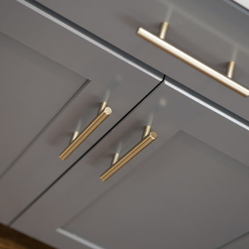
The Carrara Marmi Quartz countertops were chosen because they are, not only beautiful, but are made from hard-working material that doesn’t require maintenance. The white subway tile backsplash that wraps to the ceiling behind the focal point cooktop range/hood compliments the crisp white countertops perfectly, while brushed brass hardware and light fixtures keep the design fresh and new.
The couple had a few fears at the beginning of the project, as most homeowners do. Their biggest fear was being out of their kitchen and laundry room for an extended time. The crew made it very easy for the family to work in a limited space keeping the washer and dryer hooked up the majority of the time, and also getting appliances working with minimal downtime.
“They above and beyond accommodated us to get us through the process,” Meghan said. “They did a great job making sure we were as comfortable as possible throughout the process,” Chris added.
“Our project manager DJ did a great job. He was very good at updating us on schedule changes, getting guys in as quickly as possible. Everyone that stepped in the house was nice and did great work,” said Chris. They thought Advance’s carpenter was phenomenal and were impressed when he took a conceptual idea from a photograph and worked with designer Michelle to create a one of a kind range/hood that has become the topic of conversation with friends and family who visit the new kitchen. “He was in our house literally every day for several weeks. He was easy to work with and good at what he did,” Meghan and Chris said.
The focal point of the kitchen; a hand-crafted, custom-built ventilation hood was clad with handpicked reclaimed barnwood. Advance Design’s carpenter built the framework and the cladding to create a one-of-a-kind design element that the couple loves.
“I think it was especially fun for him to create something unique from scratch, showcasing his talent in this area,” Meghan said. “I love that my kitchen is not like everyone else’s. I got to pick out the wood on my hood and watch it being built and was able to choose what pieces of wood went where on it. It’s totally unique.”
Red Oak flooring was toothed-in throughout the kitchen and the rest of the first floor anywhere changes were made. Then the whole floor was refinished to tone down the orange undertones in the existing floor stain, ultimately changing the color complexion of the entire first floor. The result is a completely new feeling to the entire home.
Renovating the laundry room was extremely important to Meghan and Chris, but they had trouble visualizing what the possibilities were for the seemingly small space. Michelle produced beautiful 3D illustrations that helped them envision the space in a whole new way.
“I must have told Michelle 100 times that I am a visual person, seeing the designs in 3D made it so easy to make decisions and see what we could really do with our space,” Meghan said.
A dividing wall and doorway were removed between the existing laundry room and hallway formerly containing a coat closet, providing space to design specialized graphite colored cabinetry matching the kitchen island to house custom storage cubbies for each family member. Adding the tall utility cabinetry in the new laundry area helped solve the storage issue, tucking away cleaning supplies, household items, and even the cat got its own cubby.
“I love how everything is now hidden in its own space. I can’t tell you how much I hated coming home and seeing everything sitting around on counters,” Chris said.
Electrical outlets were planned for the inside of utility cabinets, so devices could charge in hidden locations. Stacking the washer and dryer allowed for wider countertop space to provide a folding area and a special space for clothes to hang. “The way I do laundry has been completely transformed! I can actually fold clothes and hang them now right out of the washer and dryer,” Meghan said.
“The end result in the kitchen and the laundry/mud room was an updated light and bright space, with a smarter work flow that better meets the needs of this family,” Michelle said.
“I would totally recommend Advance Design,” Meghan said. “Sometimes I sit and just look at my kitchen and laundry room and think ‘Wow, I can’t believe I get to live here!’ It’s an understatement to say we love our new space.”
 Mackey Builders, Inc.
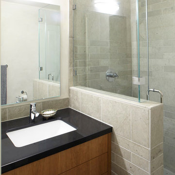
Inspiration for a mid-sized contemporary master porcelain tile and gray floor alcove shower remodel in San Francisco with flat-panel cabinets, dark wood cabinets, a one-piece toilet, beige walls, an undermount sink and a hinged shower door
Find the right local pro for your project
 Wilson Kelsey Design
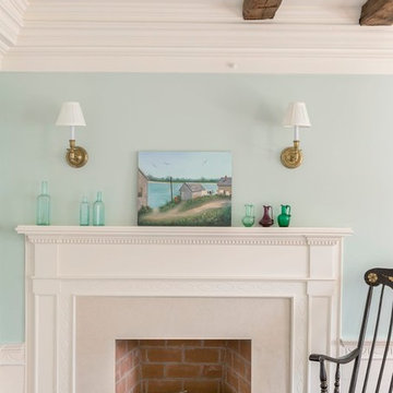
WKD’s design specialty in quality historic preservation ensured that the integrity of this home’s interior and exterior architecture was kept intact. The design mission was to preserve, restore and renovate the home in a manner that celebrated its heritage, while recognizing and accommodating today’s lifestyle and technology. Drawing from the home’s original details, WKD re-designed a friendly entry (including the exterior landscape approach) and kitchen area, integrating it into the existing hearth room. We also created a new stair to the second floor, eliminating the small, steep winding stair. New colors, wallpaper, furnishings and lighting make for a family friendly, welcoming home.
The project has been published several times. Click below to read:
October 2014 Northshore Magazine
Spring 2013 Kitchen Trends Magazine
Spring 2013 Bathroom Trends Magazine
Photographer: MIchael Lee
 Swedish Blue Designs / LMF Design LLC
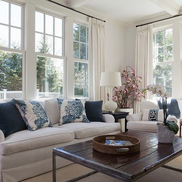
My client Kyra asked me to help her update their family room which was done in peach and green several years ago. She gave me carte blanche initially at the first meeting to come up with fabric selections and a new color scheme. Then once I showed her the indigo, white and grey colors and fabrics, I had nailed it on the head and it was a reflection of the client's personality and design aesthetic. She was probably the most decisive person I know in making quick fabric and design decisions throughout the rest of this project!
We kept to the idea of a white background because the client was afraid she would get tired quickly with colors and patterns. We used a gorgeous Holland & Sherry white linen for the window treatments with a white decorative tape along the lead edge. The white window treatments along with the white furniture and white/pale gray painted walls became her blank canvas. With a few shots of indigo and a blue-grey mohair chair, she shouldn't outgrow this room for a long time. Even if she did want to change out the color scheme, it would involve only a small investment to change out a few pillows and one club chair.
The client already had a coffee table made of reclaimed wood. It looked pretty beat up so I suggested a refinish in a lacquered dark walnut. A totally different look and "instant update". The client had a refinisher she wanted to use herself so that was one way to bring the total project cost down and at the same time recreate an almost brand new piece for such a reasonable price (workroom labor alone transformed this piece into a gorgeous table and focal point in the room).
For the side tables, the client wanted to do "linen wrapped" tables in a ming style. She requested a navy blue rather than another shade of blue or even another accent color; this way she should be able to use a neutral color like navy to go with almost any other color scheme.
The best part of this project is that this is the home of a very active family with 4 children and one large dog, and we were able to do everything with indoor/outdoor performance fabrics and one sturdy mohair fabric.
Cherry blossoms, flowers and foliage can introduce new colors depending on the season so the client won't get sick of seeing the same thing, and it makes the whole room cozier and even more beautiful at different times of the year. Kyra is so very talented with designing and arranging flowers and foliage which makes her entire home look and feel warm and inviting.
Overall, with this one redo, the family room has been transformed into a peaceful haven with a beautiful design aesthetic that the client and their family will be able to enjoy for years.
Sam Gray Photography
 Kathryn Long
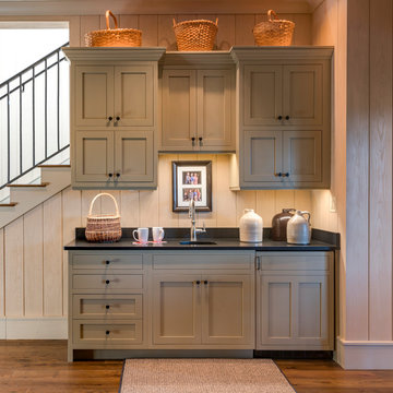
Basement/Lower Level: Painted kitchenette cabinets contrast with the dark countertop. A microwave is hidden behind doors in the upper cabinet.
Example of a large mountain style open concept medium tone wood floor game room design in Other with beige walls, no fireplace and a tv stand
Example of a large mountain style open concept medium tone wood floor game room design in Other with beige walls, no fireplace and a tv stand
 Judy Cook Interiors, LLC
Photo Credits: Alex Donovan, asquaredstudio.com
Beach style galley enclosed kitchen photo in Boston with an undermount sink, raised-panel cabinets, white cabinets, quartz countertops, blue backsplash, glass tile backsplash and stainless steel appliances
Beach style galley enclosed kitchen photo in Boston with an undermount sink, raised-panel cabinets, white cabinets, quartz countertops, blue backsplash, glass tile backsplash and stainless steel appliances


 Guggenheim Architecture + Design Studio
Josh Partee Photography
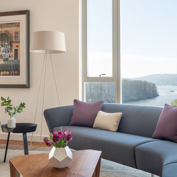
With sweeping views of the Willamette river and Mt. Hood, this Atwater Place condo was designed with a balance of minimalism and livability in mind. A complete kitchen remodel brought a dark interior kitchen to the light and a full furnishings package welcomed Los Angeles transplants home to their new modern and bright residence. Our clients, a retired camera operator for both feature films and television and a producer/production manager on numerous television series including Weeds and The Middle, relocated from their traditionally-styled LA bungalow to Portland in the Summer of 2014. The couple sought a design departure from their long-term California residence and a fresh start for their new life in the South Waterfront.
With only two pieces of sentimental furniture and a handful of artwork included in the plan, we set out to create a comfortable and clean-lined furnishings package complimenting the broad southeast views. Organically shaped upholstery pieces juxtaposed with angular steel and wood tables create a soft balance in the open floor plan. Several custom pieces, including a dining table designed by our studio and a custom hand-blown glass chandelier crafted by Scott Schiesel with Lightlite compliment timeless pieces from Knoll, Herman Miller, and B&B Italia.
The kitchen is designed to reflect light and create brilliance in a space that is otherwise naturally dark. A material balance of stainless steel, back painted glass, quartz composite, lacquer, and mirror all play their part in creating a vibrant cooking environment. We collectively decided to forgo the traditional island pendant for a linear commercial fixture that provides tremendous light to the prep surface and creates an unexpected architectural element. The mirrored prep island creates the illusion of open space while concealing casework and wine storage on the working side of the kitchen.
It is worth noting that this project was designed and installed almost entirely while our clients were still living in LA and wrapping up professional obligations and selling their home. This afforded us the tremendous opportunity to send our clients to showrooms not available in Portland to view key pieces before final specification. Textiles and finish samples were approved via mail and communication took place over e-mail, telephone, and an occasional office visit. This unique process lead to a successful result and a beautifully balanced living environment.
 Owen Homes LLC
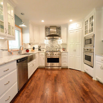
This renovated farmhouse kitchen features beautiful hardwood floors that contrast perfectly with the white cabinetry and light gray counter tops. The tile wall and back splash as well as the colorful accents really bring this kitchen to life. This kitchen also includes several unique built-in storage features to optimize counter space and functionality.
 Judy Dinkle - JD Designs
L.Herrada-Rios
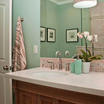
Example of a small beach style 3/4 white tile, beige tile and glass tile travertine floor and beige floor tub/shower combo design in San Francisco with shaker cabinets, medium tone wood cabinets, a one-piece toilet, blue walls, an undermount sink and quartz countertops
Example of a small beach style 3/4 white tile, beige tile and glass tile travertine floor and beige floor tub/shower combo design in San Francisco with shaker cabinets, medium tone wood cabinets, a one-piece toilet, blue walls, an undermount sink and quartz countertops

Tiny pink blossoms that will eventually become pretty purple berries, at Juno Dunes Natural Area.
American beautyberry (Callicarpa americana). Photo: Flickr user Bob Peterson, licensed under Creative Commons Attribution-ShareAlike 2.0 Generic
 Design Connection, Inc.
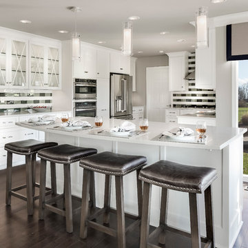
Overland Park Interior Designer, Arlene Ladegaard of Design Connection, Inc., was brought into this remodeling project by the client who wanted to update his 1980’s home which sits on a beautiful property, but which had an interior that was severely dated.
Prior to the remodel, this kitchen had dated oak cabinets, old counters, antiquated appliances, and inadequate storage. Ladegaard considered the client’s desire to lighten the kitchen, and transformed the space with the aid of Brackman Construction. A load bearing wall was removed to open the space to the great room, and a new large island was added… perfect for entertaining.
Aside from the beautiful aesthetics of gray glass staggered tile on the back splash, new quartz counters, gorgeous new appliances, and updated modern lighting, one of Ladegaard’s main considerations in planning this kitchen, was the client’s need for more storage. Cabinets were designed in both the kitchen, and the adjoining laundry/pantry area, where storage was highly customized and made to suit the specific needs of the client. Upon completion of the project, the client is thrilled with the major updates to this functional space.
Design Connection Inc. of Overland Park provided: Kitchen plans and elevations, material selections, appliances selections, detailed materials key for the contractor and project management.
 Iron Point Construction
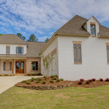
Front elevation of house with large front porch, cypress columns, double front door and old chicago pavers.
Large farmhouse gray two-story brick house exterior idea in Jackson with a hip roof and a shingle roof
Large farmhouse gray two-story brick house exterior idea in Jackson with a hip roof and a shingle roof

 Home Pro
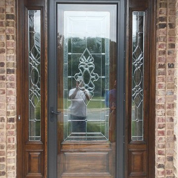
UV severely damaged the finish on this oak entry system. My client wanted to restore the finish and install a eight foot storm/screen door. The entry system was stripped and stained with an architectural dye and sealed with a marine quality spar varnish. We had to custom order a 8' storm door and fabricate a jamb system and threshold to accommodate the storm door.
 Main Line Kitchen Design
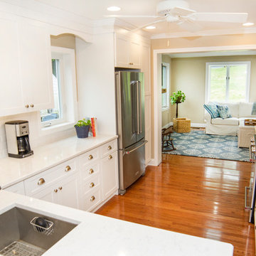
Main Line Kitchen Design is a brand new business model! We are a group of skilled Kitchen Designers each with many years of experience planning kitchens around the Delaware Valley. And we are cabinet dealers for 6 nationally distributed cabinet lines like traditional showrooms. At Main Line Kitchen Design instead of a full showroom we use a small office and selection center, and 100’s of sample doorstyles, finish and sample kitchen cabinets, as well as photo design books and CAD on laptops to display your kitchen. This way we eliminate the need and the cost associated with a showroom business model. This makes the design process more convenient for our customers, and we pass the significant savings on to them as well.
We believe that since a web site like Houzz.com has over half a million kitchen photos any advantage to going to a full kitchen showroom with full kitchen displays has been lost. Almost no customer today will ever get to see a display kitchen in their door style and finish there are just too many possibilities. And of course the design of each kitchen is unique anyway.

 Clara Godbey Home Staging and Organizing, Inc.
VM STUDIOS Photography
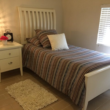
Nice and cozy bedroom decorated with cream color furniture and with a feminine look for a girls bedroom.
Example of a small classic guest ceramic tile and beige floor bedroom design in Miami with beige walls and no fireplace
Example of a small classic guest ceramic tile and beige floor bedroom design in Miami with beige walls and no fireplace

 Cantoni Irvine
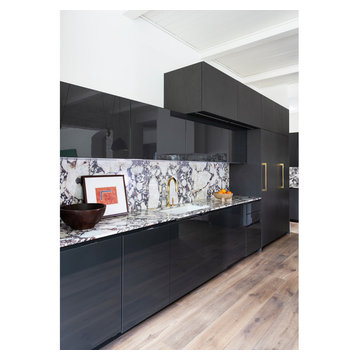
From the street, it’s an impeccably designed English manor. Once inside, the best of that same storied architecture seamlessly meshes with modernism. This blend of styles was exactly the vibe three-decades-running Houston homebuilder Chris Sims, founder and CEO of Sims Luxury Builders, wanted to convey with the $5.2 million show-home in Houston’s coveted Tanglewood neighborhood. “Our goal was to uniquely combine classic and Old World with clean and modern in both the architectural design as well as the interior finishes,” Chris says.
Their aesthetic inspiration is clearly evident in the 8,000-square-foot showcase home’s luxurious gourmet kitchen. It is an exercise in grey and white—and texture. To achieve their vision, the Sims turned to Cantoni. “We had a wonderful experience working with Cantoni several years ago on a client’s home, and were pleased to repeat that success on this project,” Chris says.
Cantoni designer Amy McFall, who was tasked with designing the kitchen, promptly took to the home’s beauty. Situated on a half-acre corner lot with majestic oak trees, it boasts simplistic and elegant interiors that allow the detailed architecture to shine. The kitchen opens directly to the family room, which holds a brick wall, beamed ceilings, and a light-and-bright stone fireplace. The generous space overlooks the outdoor pool. With such a large area to work with, “we needed to give the kitchen its own, intimate feel,” Amy says.
To that end, Amy integrated dark grey, high-gloss lacquer cabinetry from our Atelier Collection. by Aster Cucine with dark grey oak cabinetry, mixing finishes throughout to add depth and texture. Edginess came by way of custom, heavily veined Calacatta Viola marble on both the countertops and backsplash.
The Sims team, meanwhile, insured the layout lent itself to minimalism. “With the inclusion of the scullery and butler’s pantry in the design, we were able to minimize the storage needed in the kitchen itself,” Chris says. “This allowed for the clean, minimalist cabinetry, giving us the creative freedom to go darker with the cabinet color and really make a bold statement in the home.”
It was exactly the look they wanted—textural and interesting. “The juxtaposition of ultra-modern kitchen cabinetry and steel windows set against the textures of the wood floors, interior brick, and trim detailing throughout the downstairs provided a fresh take on blending classic and modern,” Chris says. “We’re thrilled with the result—it is showstopping.”
They were equally thrilled with the design process. “Amy was incredibly responsive, helpful and knowledgeable,” Chris says. “It was a pleasure working with her and the entire Cantoni team.”
Check out the kitchen featured in Modern Luxury Interiors Texas’ annual “Ode to Texas Real Estate” here.
 Renovisions
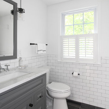
After several years on the remodeling to-do list, the homeowners decided to update to add a sense of style to their half-bath/laundry and called the Renovisions team in to help create their vision for this space. The main goal was to provide a clean, open and inviting feel, while adding a nice balance of texture and interest.
Upon a few visits to the Renovisions showroom, to discuss a suitable style, the final CAD design was approved and de-construction began. A new double-hung window replaced the old window, and measurements were taken for the new painted wood shutters. Out with the existing tile flooring, vanity, drop-in sink, toilet and outdated wall cabinets over laundry pair and window. In with the stylish, now taller shaker style vanity in stunning blue-green paint color. Pretty quartz countertop with under mount sink, and energy efficient comfort height toilet. The white subway wall tiles provide a classic look with timeless appeal fabulous with black porcelain floor tiles and contrasting light grey grout. Black and white provides a more dramatic look without compromising the rooms longevity.
Overall. The client is thrilled with the simple and fresh look of her now more interesting and stylish bath/laundry room. The vintage industrial design with stylish mini pendant light fixtures with clear seedy glass shades in old bronze finish is a perfect addition to this newly remodeled space and ties in nicely with the oil rubbed bronze hardware and accessories.
“The bathroom is SIMPLY BEAUTIFUL…….floor, tile, vanity, countertop, cabinets, lighting, and the faucet….I could not be more pleased!!!!!!” - Susan M. (Hanover)

26