
Search results for "Proper rest" in Home Design Ideas

 Millpond Kitchens and Cabinetry
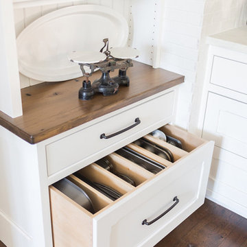
A contemporary farmhouse kitchen renovation, made custom and built by Amish craftsmen. Cabinets are flat inset panel shaker style cabinetry, a custom distressed antique black glazed oak island countertop, marble countertops and a plethora of drawers, custom pull out trays, hidden book shelf, custom muffin drawer and more.
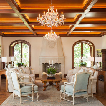
Example of a large classic formal dark wood floor living room design in Salt Lake City with a standard fireplace and no tv
Find the right local pro for your project
 Peter Dolkas
Joyce Lee
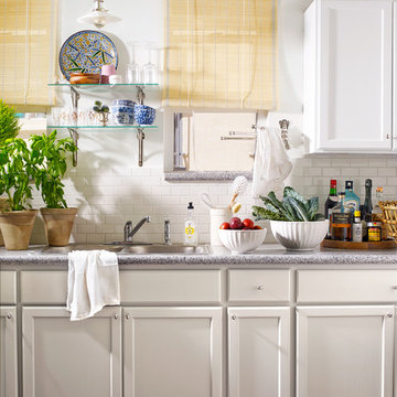
Enclosed kitchen - small eclectic u-shaped enclosed kitchen idea in Los Angeles with a double-bowl sink, recessed-panel cabinets, gray cabinets, quartz countertops, white backsplash, ceramic backsplash, white appliances and no island
Enclosed kitchen - small eclectic u-shaped enclosed kitchen idea in Los Angeles with a double-bowl sink, recessed-panel cabinets, gray cabinets, quartz countertops, white backsplash, ceramic backsplash, white appliances and no island
 CM Fresh Perspectives
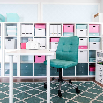
These Ikea shelves are perfect for adding storage for craft supplies and toys.
Inspiration for a transitional home office remodel in Seattle
Inspiration for a transitional home office remodel in Seattle
 Medallion Cabinetry
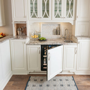
"The homeowners wanted a kitchen that reflected their personalities and cooking styles. Sophisticated but still elegant." designer Rodney Lee of York, PA.
After designing a successful home office space remodel, our same client came back to us to discuss plans and possibilities for their kitchen renovation. After a few discussions with the client, we decided the overall design concept for their kitchen would be “Sophisticated Elegance.” The homeowners wanted a kitchen that reflected their personalities and their cooking styles. Sophisticated but still elegant. The space had to be extremely functional and the color scheme had to have a certain warmth that matched the rest of their home.
The Medallion line has a wide range of architectural elements that helped us achieve that “Sophisticated Elegance”; curved/arched range hood, openings, valances, and corbels and trim. The “Sophistication” lies purely in the detail, the fixtures, the angles in the peninsula, and the changes in height and depth.
We wanted the color scheme to be as warm as possible as it would be in a bright, elegant space. We considered two colors and ended up choosing Divinity over the White Icing. The grey tones in the marble backsplash tile kept the colors modern but warm. We used natural stone versus the more aggregated quartz to maintain the use of natural product and unpredictable patterns and natural elements. We also used a dark rich stain on walnut wood as a good break from all the bright painted finishes. Oak and walnut reflect the “heart” of Pennsylvania and was a great way to maintain the use of natural elements.
The kitchen was divided into individual areas, each one focused on a particular need and/or function. My biggest challenge was transitioning the peninsula into the wet bar/hutch area while maintaining proper separation from the kitchen cabinetry and still tying it into the rest of the space.
A wealth of storage solutions.
•Desk Area. The client wanted a functional work area so we created a furniture look with ogee edging in the walnut, provincial toe space detail in solid walnut, and open display storage at top. The desk has plenty of storage.
•Main Kitchen. We were able to open up this space by creating smart transitions and separations using custom Medallion products that cater to the clients’ lifestyle. Each piece is functional while staying true to the sophisticated elegance design throughout the home.
◦Main Cabinetry: Medallion Gold Wellington Maple Divinity Classic Paint
◦48" uppers around range area; glass eclipse mullion-arched hood design
◦Mixer lift base left of range; drawer warmer with custom panel
•The main work station, or power spot, can hold up to five work stations comfortably. The cook can work within the confines of the peninsula design and access everything needed to prepare complete meals in 1-2 steps. Every cabinet has deluxe roll-out trays and/or drawers, making this kitchen fully accessible. The client wanted to be able to display and stage different pieces and concepts during holidays and gatherings. We chose to go with the more modern Mission arch above the wall oven and fridge, which complimented many of the hard angles and distinct lines used in the kitchen space.
My favorite part of this kitchen remodel came about just by listening to our client talk about how much they adored their daughter’s artwork. After numerous conversations, we landed on installing an artwork wall that was designed as a conversation piece and provides the ability to install different works of art.


Sponsored
Fredericksburg, OH

High Point Cabinets
Columbus' Experienced Custom Cabinet Builder | 4x Best of Houzz Winner
 Lord & Lady Construction LLC
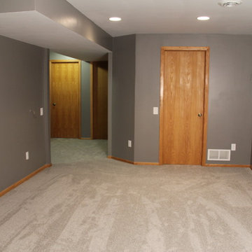
This is part of a whole home remodel we completed and featured in the Home Builder's Association Showcase of Remodeled Homes. This room is probably the biggest transformation in the whole home. What was previously an unused garage in the home, will now become a mudroom and entertainment area for the home.
We removed non-structural walls at the entry to the rest of the home to allow for more flow from the home into the room. The utility room previously was not actually large enough for the utilities, and there was a hole cut into the wall to allow the unit to fit. To resolve this issue the wall of the utility room was brought out into the space. Additionally, the plumbing and drainage for the water softner was not properly drained from the room and just went through small pvc pipes (that you can see in the photo) that went over the floor to a hole in the center of the room. The plumbing and drainage was completely rebuilt and re-plumbed through the ceilings to drain properly into the house lines.
The room also used to be a step down into the garage, so once the plumbing was adjusted a new slab was poured to bring it up to the same level.
Heating and electrical were brought into the room to make it a livable space. Can lighting was installed to bring in light without affecting the ceiling height. Team Player (color talented) carpet was installed that ties to the rest of the home.
Photo by Laura Cavendish
 Outdoor Creations Unlimited
There are an infinite number of possible designs, and outdoor fire pits no longer need to be just a round pile of rocks. I work with several basic styles of gas fed fire pits when I design outdoor gardens to enchant my clients.
The popularity of fire pits and the fire effects they produce in the garden is one of fastest growing trends in outdoor design. The allure of sitting around a fire ring has been around since the beginning of mankind. Fire provides warmth, light, a cooking source and, of course relaxation. A dancing flame has a mesmerizing affect that encourages you to unwind and settle in. The popularity of fire pits, or conversation pits as they are commonly called, has grown rapidly in recent years. Proper design and construction will ensure a safe and enjoyable feature that will last several decades
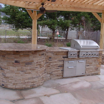
This fully equipped outdoor kitchen is separate from the rest of the living space, allowing the two areas to be utilized entirely on their own. outdoor kitchens are most efficient when it's zoned into logical uses. your cook space should have plenty of prep space, room to set down utensils and stage ingredients, and a comfortable buffer from the seating island to keep guests protected from the heat.

 First Alert / BRK Brands
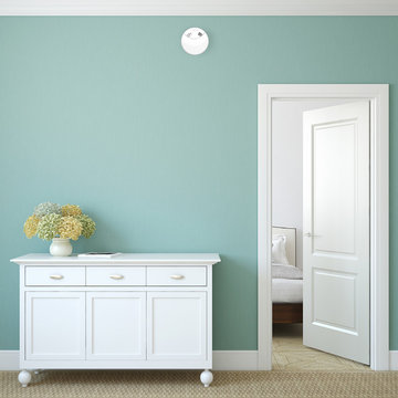
These First Alert Smoke Alarms and Combination Smoke and Carbon Monoxide Alarms offer slick alternatives to traditional alarms, providing modern, streamlined options for style-centric homes.
 TKS Design Group
Download our free ebook, Creating the Ideal Kitchen. DOWNLOAD NOW
Lakefront property in the northwest suburbs of Chicago is hard to come by, so when we were hired by this young family with exactly that, we were immediately inspired by not just the unusually large footprint of this 1950’s colonial revival but also the lovely views of the manmade lake it was sited on. The large 5-bedroom home was solidly stuck in the 1980’s, but we saw tons of potential. We started out by updating the existing staircase with a fresh coat of paint and adding new herringbone slate to the entry hall.
The powder room off the entryway also got a refresh - new flooring, new cabinets and fixtures. We ran the new slate right through into this space for some consistency. A fun wallpaper and shiplap trim add a welcoming feel and set the tone for the home.
Next, we tackled the kitchen. Located away from the rest of the first floor, the kitchen felt a little isolated, so we immediately began planning for how to better connect it to the rest of the first floor. We landed on removing the wall between the kitchen and dining room and designed a modified galley style space with separate cooking and clean up zones. The cooking zone consists of the refrigerator, prep sink and cooktop, along with a nice long run of prep space at the island. The cleanup side of the kitchen consists of the main sink and dishwasher. Both areas are situated so that the user can view the lake during prep work and cleanup!
One of the home’s main puzzles was how to incorporate the mudroom and area in front of the patio doors at the back of the house. We already had a breakfast table area, so the space by the patio doors was a bit of a no man’s land. We decided to separate the kitchen proper from what became the new mudroom with a large set of barn doors. That way you can quickly hide any mudroom messes but have easy access to the light coming in through the patio doors as well as the outdoor grilling station. We also love the impact the barn doors add to the overall space.
The homeowners’ first words to us were “it’s time to ditch the brown,” so we did! We chose a lovely blue pallet that reflects the home’s location on the lake which is also vibrant yet easy on the eye. Countertops are white quartz, and the natural oak floor works well with the other honey accents. The breakfast table was given a refresh with new chairs, chandelier and window treatments that frame the gorgeous views of the lake out the back.
We coordinated the slate mudroom flooring with that used in the home’s main entrance for a consistent feel. The storage area consists of open and closed storage to allow for some clutter control as needed.
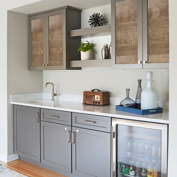
Next on our “to do” list was revamping the dated brown bar area in the neighboring dining room. We eliminated the clutter by adding some closed cabinets and did some easy updates to help the space feel more current. One snag we ran into here was the discovery of a beam above the existing open shelving that had to be modified with a smaller structural beam to allow for our new design to work. This was an unexpected surprise, but in the end we think it was well worth it!
We kept the colors here a bit more muted to blend with the homeowner’s existing furnishings. Open shelving and polished nickel hardware add some simple detail to the new entertainment zone which also looks out onto the lake!
Next we tackled the upstairs starting with the homeowner’s son’s bath. The bath originally had both a tub shower and a separate shower, so we decided to swap out the shower for a new laundry area. This freed up some space downstairs in what used to be the mudroom/laundry room and is much more convenient for daily laundry needs.
We continued the blue palette here with navy cabinetry and the navy tile in the shower. Porcelain floor tile and chrome fixtures keep maintenance to a minimum while matte black mirrors and lighting add some depth the design. A low maintenance runner adds some warmth underfoot and ties the whole space together.
We added a pocket door to the bathroom to minimize interference with the door swings. The left door of the laundry closet is on a 180 degree hinge to allow for easy full access to the machines. Next we tackled the master bath which is an en suite arrangement. The original was typical of the 1980’s with the vanity outside of the bathroom, situated near the master closet. And the brown theme continued here with multiple shades of brown.
Our first move was to segment off the bath and the closet from the master bedroom. We created a short hall from the bedroom to the bathroom with his and hers walk-in closets on the left and right as well as a separate toilet closet outside of the main bathroom for privacy and flexibility.
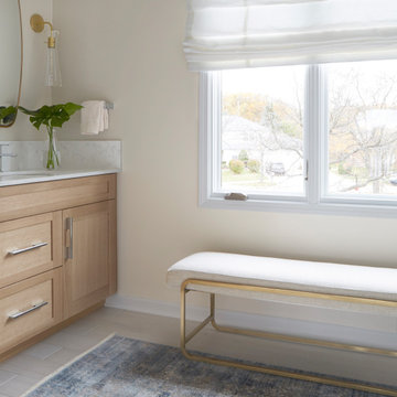
The original bathroom had a giant soaking tub with steps (dangerous!) as well as a small shower that did not work well for our homeowner who is 6’3”. With other bathtubs in the home, they decided to eliminate the tub and create an oversized shower which takes up the space where the old tub was located. The double vanity is on the opposite wall and a bench is located under the window for morning conversations and a place to set a couple of towels.
The pallet in here is light and airy with a mix of blond wood, creamy porcelain and marble tile, and brass accents. A simple roman shade adds some texture and it’s top-down mechanism allows for light and privacy.
This large whole house remodel gave our homeowners not only the ability to maximize the potential of their home but also created a lovely new frame from which to view their fabulous lake views.
Designed by: Susan Klimala, CKD, CBD
Photography by: Michael Kaskel
For more information on kitchen and bath design ideas go to: www.kitchenstudio-ge.com
 TKS Design Group
Download our free ebook, Creating the Ideal Kitchen. DOWNLOAD NOW
Lakefront property in the northwest suburbs of Chicago is hard to come by, so when we were hired by this young family with exactly that, we were immediately inspired by not just the unusually large footprint of this 1950’s colonial revival but also the lovely views of the manmade lake it was sited on. The large 5-bedroom home was solidly stuck in the 1980’s, but we saw tons of potential. We started out by updating the existing staircase with a fresh coat of paint and adding new herringbone slate to the entry hall.
The powder room off the entryway also got a refresh - new flooring, new cabinets and fixtures. We ran the new slate right through into this space for some consistency. A fun wallpaper and shiplap trim add a welcoming feel and set the tone for the home.
Next, we tackled the kitchen. Located away from the rest of the first floor, the kitchen felt a little isolated, so we immediately began planning for how to better connect it to the rest of the first floor. We landed on removing the wall between the kitchen and dining room and designed a modified galley style space with separate cooking and clean up zones. The cooking zone consists of the refrigerator, prep sink and cooktop, along with a nice long run of prep space at the island. The cleanup side of the kitchen consists of the main sink and dishwasher. Both areas are situated so that the user can view the lake during prep work and cleanup!
One of the home’s main puzzles was how to incorporate the mudroom and area in front of the patio doors at the back of the house. We already had a breakfast table area, so the space by the patio doors was a bit of a no man’s land. We decided to separate the kitchen proper from what became the new mudroom with a large set of barn doors. That way you can quickly hide any mudroom messes but have easy access to the light coming in through the patio doors as well as the outdoor grilling station. We also love the impact the barn doors add to the overall space.
The homeowners’ first words to us were “it’s time to ditch the brown,” so we did! We chose a lovely blue pallet that reflects the home’s location on the lake which is also vibrant yet easy on the eye. Countertops are white quartz, and the natural oak floor works well with the other honey accents. The breakfast table was given a refresh with new chairs, chandelier and window treatments that frame the gorgeous views of the lake out the back.
We coordinated the slate mudroom flooring with that used in the home’s main entrance for a consistent feel. The storage area consists of open and closed storage to allow for some clutter control as needed.
Next on our “to do” list was revamping the dated brown bar area in the neighboring dining room. We eliminated the clutter by adding some closed cabinets and did some easy updates to help the space feel more current. One snag we ran into here was the discovery of a beam above the existing open shelving that had to be modified with a smaller structural beam to allow for our new design to work. This was an unexpected surprise, but in the end we think it was well worth it!
We kept the colors here a bit more muted to blend with the homeowner’s existing furnishings. Open shelving and polished nickel hardware add some simple detail to the new entertainment zone which also looks out onto the lake!
Next we tackled the upstairs starting with the homeowner’s son’s bath. The bath originally had both a tub shower and a separate shower, so we decided to swap out the shower for a new laundry area. This freed up some space downstairs in what used to be the mudroom/laundry room and is much more convenient for daily laundry needs.
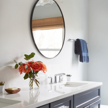
We continued the blue palette here with navy cabinetry and the navy tile in the shower. Porcelain floor tile and chrome fixtures keep maintenance to a minimum while matte black mirrors and lighting add some depth the design. A low maintenance runner adds some warmth underfoot and ties the whole space together.
We added a pocket door to the bathroom to minimize interference with the door swings. The left door of the laundry closet is on a 180 degree hinge to allow for easy full access to the machines. Next we tackled the master bath which is an en suite arrangement. The original was typical of the 1980’s with the vanity outside of the bathroom, situated near the master closet. And the brown theme continued here with multiple shades of brown.
Our first move was to segment off the bath and the closet from the master bedroom. We created a short hall from the bedroom to the bathroom with his and hers walk-in closets on the left and right as well as a separate toilet closet outside of the main bathroom for privacy and flexibility.
The original bathroom had a giant soaking tub with steps (dangerous!) as well as a small shower that did not work well for our homeowner who is 6’3”. With other bathtubs in the home, they decided to eliminate the tub and create an oversized shower which takes up the space where the old tub was located. The double vanity is on the opposite wall and a bench is located under the window for morning conversations and a place to set a couple of towels.
The pallet in here is light and airy with a mix of blond wood, creamy porcelain and marble tile, and brass accents. A simple roman shade adds some texture and it’s top-down mechanism allows for light and privacy.
This large whole house remodel gave our homeowners not only the ability to maximize the potential of their home but also created a lovely new frame from which to view their fabulous lake views.
Designed by: Susan Klimala, CKD, CBD
Photography by: Michael Kaskel
For more information on kitchen and bath design ideas go to: www.kitchenstudio-ge.com
 Medallion Cabinetry
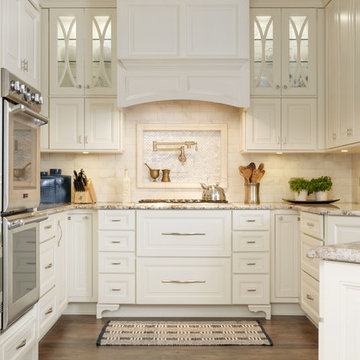
"The homeowners wanted a kitchen that reflected their personalities and cooking styles. Sophisticated but still elegant." designer Rodney Lee of York, PA.
After designing a successful home office space remodel, our same client came back to us to discuss plans and possibilities for their kitchen renovation. After a few discussions with the client, we decided the overall design concept for their kitchen would be “Sophisticated Elegance.” The homeowners wanted a kitchen that reflected their personalities and their cooking styles. Sophisticated but still elegant. The space had to be extremely functional and the color scheme had to have a certain warmth that matched the rest of their home.
The Medallion line has a wide range of architectural elements that helped us achieve that “Sophisticated Elegance”; curved/arched range hood, openings, valances, and corbels and trim. The “Sophistication” lies purely in the detail, the fixtures, the angles in the peninsula, and the changes in height and depth.
We wanted the color scheme to be as warm as possible as it would be in a bright, elegant space. We considered two colors and ended up choosing Divinity over the White Icing. The grey tones in the marble backsplash tile kept the colors modern but warm. We used natural stone versus the more aggregated quartz to maintain the use of natural product and unpredictable patterns and natural elements. We also used a dark rich stain on walnut wood as a good break from all the bright painted finishes. Oak and walnut reflect the “heart” of Pennsylvania and was a great way to maintain the use of natural elements.
The kitchen was divided into individual areas, each one focused on a particular need and/or function. My biggest challenge was transitioning the peninsula into the wet bar/hutch area while maintaining proper separation from the kitchen cabinetry and still tying it into the rest of the space.
A wealth of storage solutions.
•Desk Area. The client wanted a functional work area so we created a furniture look with ogee edging in the walnut, provincial toe space detail in solid walnut, and open display storage at top. The desk has plenty of storage.
•Main Kitchen. We were able to open up this space by creating smart transitions and separations using custom Medallion products that cater to the clients’ lifestyle. Each piece is functional while staying true to the sophisticated elegance design throughout the home.
◦Main Cabinetry: Medallion Gold Wellington Maple Divinity Classic Paint
◦48" uppers around range area; glass eclipse mullion-arched hood design
◦Mixer lift base left of range; drawer warmer with custom panel
•The main work station, or power spot, can hold up to five work stations comfortably. The cook can work within the confines of the peninsula design and access everything needed to prepare complete meals in 1-2 steps. Every cabinet has deluxe roll-out trays and/or drawers, making this kitchen fully accessible. The client wanted to be able to display and stage different pieces and concepts during holidays and gatherings. We chose to go with the more modern Mission arch above the wall oven and fridge, which complimented many of the hard angles and distinct lines used in the kitchen space.
My favorite part of this kitchen remodel came about just by listening to our client talk about how much they adored their daughter’s artwork. After numerous conversations, we landed on installing an artwork wall that was designed as a conversation piece and provides the ability to install different works of art.
 My Kitchen And Bath
A complete kitchen and powder room remodel in Herndon, Virginia, designed around two clear priorities: open up the kitchen to the rest of the main level, and create an experience that felt warm and timeless rather than trendy.
The original layout had a wall separating the kitchen from the dining room and an awkward fridge wall that limited both storage and traffic flow. Our solution involved removing the dividing wall (confirmed non-load-bearing), tightening the new dining room opening to 66 inches, and extending the fridge wall 25 inches into the kitchen to create a proper full-height pantry run. The result is a kitchen that breathes — open to the dining and living areas, with clear sight lines from the island to the bay windows at the far end.
Design Approach
The clients came in knowing they didn't want white. They didn't want navy. They wanted something with real wood character — the kind of finish that ages well and looks more like furniture than stock kitchen cabinetry. Cherry was the answer to that question.
We anchored the room around contrast: warm cherry cabinetry against clean white walls and white quartz, black hardware grounding the cherry's warmth, and a single waterfall island acting as the architectural focal point. Stainless appliances, brushed gold pendant accents, and the herringbone hardwood floor pull the room together without any one element shouting for attention.
The Cabinetry
Medallion Gold Line Sonoma Cappuccino — a stained cherry finish that catches light differently throughout the day. All-plywood box construction, solid wood doors and drawer fronts, soft close everywhere, US-made with a lifetime warranty. Four pull-out drawers built into the pantry bottoms keep the deep storage actually usable rather than a black hole.
Cabinet hardware is Top Knobs Riverside Pulls in flat black — 40 pulls across drawers and doors, plus three longer pulls on the 36-inch base drawers. The black was a deliberate decision: with cherry and stainless already providing warm and cool tones, brass or gold would have been one warm tone too many. Black grounds the cabinetry and gives the kitchen its architectural definition.
The Island and Countertops
MSI Calacatta Miraggio Gold quartz throughout — perimeter counters, island, waterfall ends, and the powder room. The Gold variant has subtle warm veining that pairs with cherry where cooler whites would have fought the wood tone.
The island gets a full waterfall edge — slabs book-matched, miters precise, the finished edge essentially seamless. Treating the island as architectural sculpture rather than just functional storage. The black undermount farmhouse-style sink ties back to the hardware throughout the rest of the kitchen.
The Backsplash
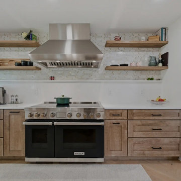
MSI Metro Gold tile — small format white and gold tiles in a herringbone-adjacent pattern with intermittent gold accents. Full height, continuous behind the floating shelves and behind the hood.
Four custom floating shelves are spaced above a 3-inch countertop ledge: first shelf 18 inches above the ledge, second shelf 9 inches above that, third 18 inches above the second. The shelves are stained to match the cabinetry. The backsplash continues behind the shelves and behind the hood, so the wall reads as a continuous textured surface that the shelves and hood float in front of.
The Appliances
This is a serious cooking kitchen. The clients chose a 48-inch Wolf gas range, a Sub-Zero built-in refrigerator integrated into the cherry cabinet wall, a Wolf microwave drawer in the island base, and a Bosch dishwasher. For ventilation, we installed a 1200 CFM hood paired with a make-up air system to balance the negative pressure that hood pulls. New ducting was routed through the exterior siding on the side of the house.
The Flooring
MSI engineered hardwood throughout the entire main level — approximately 800 square feet — installed in a Bramlett herringbone pattern. Herringbone adds roughly 15-20 percent to material and labor costs because of the angled cuts and waste factor, but the result is a floor that reads as more considered and luxurious than standard plank flooring. Finished with 4.5-inch white wood baseboards throughout.
The Powder Room
A small room with a big personality. The clients chose a deep blue and teal scallop pattern wallpaper (client-supplied, we installed) and paired it with the same Sonoma Cappuccino cherry vanity used in the kitchen — material continuity between the spaces.
Powder room countertop is the same MSI Calacatta Miraggio Gold quartz from the kitchen with a rectangular white undermount sink. Hardware on the powder room vanity is Top Knobs Riverside in honey bronze rather than the kitchen's flat black — the warm bronze pulls the brass tones from the faucet into the millwork and complements the wallpaper. New sconce, kept the existing toilet (refinishing or replacing a working toilet is wasted money in a powder room remodel), and a Panasonic Whisper Green exhaust fan.
Project Specs
Location: Herndon, Virginia
Project type: Combined kitchen and powder room remodel
Project duration: Approximately 4 to 6 weeks
Style: Transitional, Modern Farmhouse, Warm Wood Contemporary
Color palette: Cherry, white, black, brushed gold, deep blue (powder room)
Materials
Cabinetry (kitchen and powder room): Medallion Gold Line Sonoma Cappuccino cherry, Shaker-style, all-plywood box construction, lifetime warranty
Kitchen hardware: Top Knobs Riverside Pulls in flat black (TK1014BLK and TK1017BLK)
Powder room hardware: Top Knobs Riverside Pulls in honey bronze (TK1012HB)
Counter tops: MSI Calacatta Miraggio Gold Quartz, pencil edge, waterfall island
Backsplash: MSI Metro Gold tile, full height
Floating shelves: 4 custom shelves at 48" by 9", stained to match cabinets
Range: 48-inch Wolf gas range
Refrigerator: Sub-Zero built-in
Microwave: Wolf microwave drawer (island base)
Hood: 1200 CFM with make-up air system
Kitchen sink: Kohler farmhouse-style, 36-inch base, black
Kitchen faucet: Brizo (homeowner-supplied)
Flooring: MSI engineered hardwood in Bramlett herringbone pattern, approximately 800 sq ft
Baseboards: 4.5-inch white wood throughout
Powder room wallpaper: Client-supplied scallop pattern in blues and teals
Powder room exhaust fan: Panasonic Whisper Green
Paint: Benjamin Moore
Designed and built by My Kitchen and Bath out of our Herndon showroom at 285 Sunset Park Drive. We've been designing and building kitchens, bathrooms, and full home renovations across Northern Virginia and the DMV since 1994.
 User
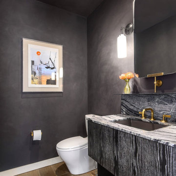
UserDark and smoky, this powder bathroom served as a moody touch to the rest of this modern condo.
Example of a mid-sized minimalist blue tile medium tone wood floor powder room design in Austin with medium tone wood cabinets, black walls and white countertops
Example of a mid-sized minimalist blue tile medium tone wood floor powder room design in Austin with medium tone wood cabinets, black walls and white countertops

 TKS Design Group
Free ebook, CREATING THE IDEAL KITCHEN
Download now → http://bit.ly/idealkitchen
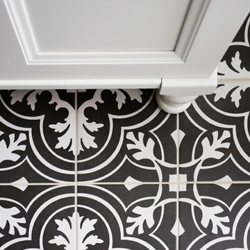
The hall bath for this client started out a little dated with its 1970’s color scheme and general wear and tear, but check out the transformation!
The floor is really the focal point here, it kind of works the same way wallpaper would, but -- it’s on the floor. I love this graphic tile, patterned after Moroccan encaustic, or cement tile, but this one is actually porcelain at a very affordable price point and much easier to install than cement tile.
Once we had homeowner buy-in on the floor choice, the rest of the space came together pretty easily – we are calling it “transitional, Moroccan, industrial.” Key elements are the traditional vanity, Moroccan shaped mirrors and flooring, and plumbing fixtures, coupled with industrial choices -- glass block window, a counter top that looks like cement but that is actually very functional Corian, sliding glass shower door, and simple glass light fixtures.
The final space is bright, functional and stylish. Quite a transformation, don’t you think?
Designed by: Susan Klimala, CKD, CBD
Photography by: Mike Kaskel
For more information on kitchen and bath design ideas go to: www.kitchenstudio-ge.com
 ValEquity Construction
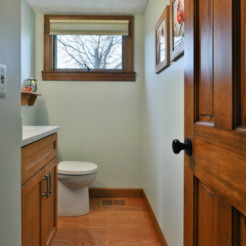
Keeping with the design style with the rest of the home, the owner's elected to update with a transitional style with rustic undertones.
Example of a small transitional medium tone wood floor and brown floor powder room design in Columbus with shaker cabinets, brown cabinets, a one-piece toilet, green walls, an undermount sink, quartz countertops, gray countertops and a built-in vanity
Example of a small transitional medium tone wood floor and brown floor powder room design in Columbus with shaker cabinets, brown cabinets, a one-piece toilet, green walls, an undermount sink, quartz countertops, gray countertops and a built-in vanity
 TKS Design Group
Download our free ebook, Creating the Ideal Kitchen. DOWNLOAD NOW
Lakefront property in the northwest suburbs of Chicago is hard to come by, so when we were hired by this young family with exactly that, we were immediately inspired by not just the unusually large footprint of this 1950’s colonial revival but also the lovely views of the manmade lake it was sited on. The large 5-bedroom home was solidly stuck in the 1980’s, but we saw tons of potential. We started out by updating the existing staircase with a fresh coat of paint and adding new herringbone slate to the entry hall.
The powder room off the entryway also got a refresh - new flooring, new cabinets and fixtures. We ran the new slate right through into this space for some consistency. A fun wallpaper and shiplap trim add a welcoming feel and set the tone for the home.
Next, we tackled the kitchen. Located away from the rest of the first floor, the kitchen felt a little isolated, so we immediately began planning for how to better connect it to the rest of the first floor. We landed on removing the wall between the kitchen and dining room and designed a modified galley style space with separate cooking and clean up zones. The cooking zone consists of the refrigerator, prep sink and cooktop, along with a nice long run of prep space at the island. The cleanup side of the kitchen consists of the main sink and dishwasher. Both areas are situated so that the user can view the lake during prep work and cleanup!
One of the home’s main puzzles was how to incorporate the mudroom and area in front of the patio doors at the back of the house. We already had a breakfast table area, so the space by the patio doors was a bit of a no man’s land. We decided to separate the kitchen proper from what became the new mudroom with a large set of barn doors. That way you can quickly hide any mudroom messes but have easy access to the light coming in through the patio doors as well as the outdoor grilling station. We also love the impact the barn doors add to the overall space.
The homeowners’ first words to us were “it’s time to ditch the brown,” so we did! We chose a lovely blue pallet that reflects the home’s location on the lake which is also vibrant yet easy on the eye. Countertops are white quartz, and the natural oak floor works well with the other honey accents. The breakfast table was given a refresh with new chairs, chandelier and window treatments that frame the gorgeous views of the lake out the back.
We coordinated the slate mudroom flooring with that used in the home’s main entrance for a consistent feel. The storage area consists of open and closed storage to allow for some clutter control as needed.
Next on our “to do” list was revamping the dated brown bar area in the neighboring dining room. We eliminated the clutter by adding some closed cabinets and did some easy updates to help the space feel more current. One snag we ran into here was the discovery of a beam above the existing open shelving that had to be modified with a smaller structural beam to allow for our new design to work. This was an unexpected surprise, but in the end we think it was well worth it!
We kept the colors here a bit more muted to blend with the homeowner’s existing furnishings. Open shelving and polished nickel hardware add some simple detail to the new entertainment zone which also looks out onto the lake!
Next we tackled the upstairs starting with the homeowner’s son’s bath. The bath originally had both a tub shower and a separate shower, so we decided to swap out the shower for a new laundry area. This freed up some space downstairs in what used to be the mudroom/laundry room and is much more convenient for daily laundry needs.
We continued the blue palette here with navy cabinetry and the navy tile in the shower. Porcelain floor tile and chrome fixtures keep maintenance to a minimum while matte black mirrors and lighting add some depth the design. A low maintenance runner adds some warmth underfoot and ties the whole space together.
We added a pocket door to the bathroom to minimize interference with the door swings. The left door of the laundry closet is on a 180 degree hinge to allow for easy full access to the machines. Next we tackled the master bath which is an en suite arrangement. The original was typical of the 1980’s with the vanity outside of the bathroom, situated near the master closet. And the brown theme continued here with multiple shades of brown.
Our first move was to segment off the bath and the closet from the master bedroom. We created a short hall from the bedroom to the bathroom with his and hers walk-in closets on the left and right as well as a separate toilet closet outside of the main bathroom for privacy and flexibility.
The original bathroom had a giant soaking tub with steps (dangerous!) as well as a small shower that did not work well for our homeowner who is 6’3”. With other bathtubs in the home, they decided to eliminate the tub and create an oversized shower which takes up the space where the old tub was located. The double vanity is on the opposite wall and a bench is located under the window for morning conversations and a place to set a couple of towels.
The pallet in here is light and airy with a mix of blond wood, creamy porcelain and marble tile, and brass accents. A simple roman shade adds some texture and it’s top-down mechanism allows for light and privacy.
This large whole house remodel gave our homeowners not only the ability to maximize the potential of their home but also created a lovely new frame from which to view their fabulous lake views.
Designed by: Susan Klimala, CKD, CBD
Photography by: Michael Kaskel
For more information on kitchen and bath design ideas go to: www.kitchenstudio-ge.com
6