
Search results for "Referenced" in Home Design Ideas
 Powell Construction
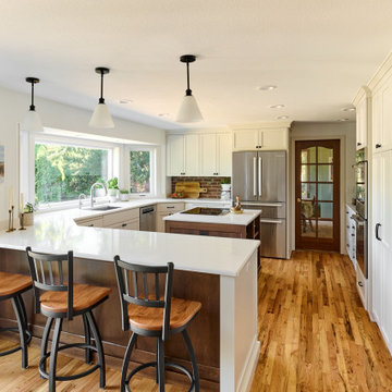
It doesn’t always require a major reconfiguration to accomplish a major transformation. That was certainly the case with this gorgeous kitchen remodel! Although these homeowners were eager for some significant improvements, there were a few things that were still working for them. Collaborating with their designer, they elected to stick with the original footprint of the kitchen, keep their red oak flooring, and integrate the original quaint brick backsplash. So how did we create such a dramatically different space while preserving such foundational elements? There were a few key revisions that made all the difference…
Most notably, we brought the light! What a major impact this made…from floor to ceiling! To start, refinishing the dark hardwood floors restored their brilliance and lightened them considerably. The warm white custom cabinetry and light-toned quartz countertops gave this kitchen an updated look that is transformational. Raising the dropped ceiling, we replaced the florescent lighting with recessed lights and added modern pendant lights over the peninsula. We painted the wood trim and window casings and exchanged the aging wood windows for white vinyl windows. Collectively, these design choices give the impression of a more spacious kitchen, but it remains within the existing footprint.
As always, careful consideration was given to the cabinet design to maximize the space and functionality of this kitchen.
Raising the ceiling allowed for taller upper cabinets. The full-height pantry now provides generous storage for food and small appliances, and even houses their microwave oven. The island’s built-in bookcase is the ideal spot to keep cookbooks accessible for quick referencing. Although their former cabinetry did have a fixed wine rack, the new design makes this corner a lovely focal feature—a proper wine bar in our opinion. The matte black cabinet hardware is simple and current, contrasting beautifully with the white cabinetry, giving it that updated farmhouse appeal.
 John Lum Architecture, Inc. AIA
Architecture: John Lum Architecture
Interior Design: NicoleHollis
Contractor: Jetton Construction
Landscape: Arterra Landscape Architects
Photography: Adam Rouse Photography
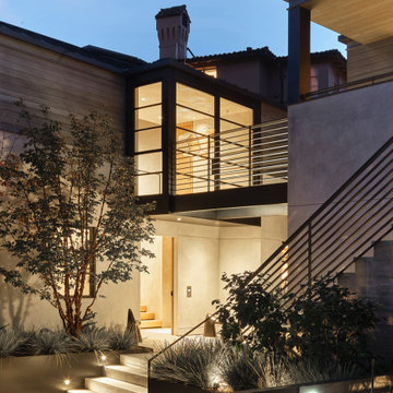
We reworked a spec-level Mediterranean into a design that quietly fits its spectacular bay-side setting. Referencing Sausalito’s fishing village roots, the stucco and styrofoam detailing were replaced with environmentally-conscious materials designed to weather, utilizing a palette of Kebony, cement plaster, and copper standing seam roof.

 Andra Martens Design Studio
We were hired to finish the basement of our clients cottage in Haliburton. The house is a woodsy craftsman style. Basements can be dark so we used pickled pine to brighten up this 3000 sf space which allowed us to remain consistent with the vibe of the overall cottage. We delineated the large open space in to four functions - a Family Room (with projector screen TV viewing above the fireplace and a reading niche); a Game Room with access to large doors open to the lake; a Guest Bedroom with sitting nook; and an Exercise Room. Glass was used in the french and barn doors to allow light to penetrate each space. Shelving units were used to provide some visual separation between the Family Room and Game Room. The fireplace referenced the upstairs fireplace with added inspiration from a photo our clients saw and loved. We provided all construction docs and furnishings will installed soon.
Find the right local pro for your project
 John Lum Architecture, Inc. AIA
Architecture: John Lum Architecture
Interior Design: NicoleHollis
Contractor: Jetton Construction
Landscape: Arterra Landscape Architects
Photography: Douglas Friedman
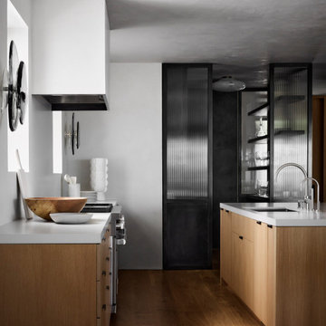
We reworked a spec-level Mediterranean into a design that quietly fits its spectacular bay-side setting. Referencing Sausalito’s fishing village roots, the stucco and styrofoam detailing were replaced with environmentally-conscious materials designed to weather, utilizing a palette of Kebony, cement plaster, and copper standing seam roof.
 HAVEN design+building llc
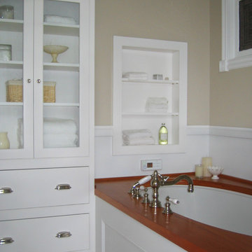
For this 1890s historic home in Burlington’s hill section, homeowners needed to update a master bath last renovated in the 1950s. The goal was in incorporate modern, state-of-the-art amenities while restoring the style of the original architecture. Working within the confines of the room’s modest size, we were able to carve out space for a double walk-in shower, an air jetted chromatherapy tub with a custom mahogany deck and a charming vintage style console sink. The custom cabinetry, paneled wainscoting, doors and trim we designer for this project replicated the period millwork of the home, while the polished nickel fittings provided state-of-the-art function with vintage style. Above the tub we added an interior stained glass window that referenced other such period windows in the home.
 Patrician Design
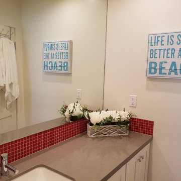
When designing for a vacation rental property, the first order of business is to select things that are durable and easy to maintain. This means finishes to furnishings. I know this from practical life experiences and also working with commercial/hospitality interiors. Here, an owner in Maine with property in San Diego wanted to bring her beloved Lobster to Pacific Beach. Read more and see more photographs at the above referenced website.
 Blondie's Treehouse Inc
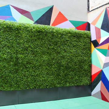
Referencing this square footage as an internal courtyard might be a stretch. A more accurate description would perhaps be the awesome things that New Yorkers can do with the tiny spaces we have.
The parameters of the project lend to its description. This Tribeca residential building’s shared amenity space and gym on the lower level opens up onto a 350 square foot space of brick walls and concrete pavers. The south wall of this space is made up by the terraces belonging to the residential units above and while the setting allows for minimal ambient light, each balcony looks down onto the shared space below.
In order to provide visual interest from the gym and the overhead views, Blondie’s designers Sara Baerwald and Eva Vessio utilized Jay Scott’s rectangle containers lining the north wall as well as surrounding the utilities in the southwest corner. They then created 8 foot faux boxwood hedge on the north wall and the appropriate height to conceal the utilities. From below the hedge creates the feeling of a courtyard and from above it softens the view of the once barren space. Adding color and functionality, the concrete pavers were replaced with rubber tiles in a bright aqua. To play off of this color and add a unique level of visual impact, artist Chris Pearson designed and painted a multi-color prism mural. Primarily on the east wall and then stretching over the hedges to the south, the depth and dimension that this mural provides for the space is incredible. It is a testament to the successful solutions we conjure when thinking outside the box and allowing for unique site specific resolutions.
 User
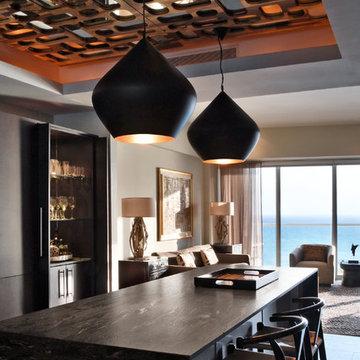
UserEvery design decision for this Caribbean beach residence was guided by the desire to maximize the views of the property’s breathtaking natural surroundings.
To connect the spaces and reveal the views from every vantage point, the team reconfigured the layout to create vistas, and installed window film to reduce solar heat gain. These modifications increased efficiencies, reused 90% of the interior envelope and did not impact the exterior structure of the building. In addition to providing incredible views, opening up the plan allows cross ventilation, maximizing the use of ocean breezes to cool the interior. The result is an effortless flow and maximization of space.
Throughout the interior, dark materials express the concept of respite in the shade, and emphasize the sweeping views of the Caribbean Sea. Millwork crafted by local artisans from local materials establishes hierarchy – providing a clear understanding of the layout – and filters light to create privacy and drama. Screens help define the spaces and create suspense.
Varying screen opacities serve specific functions: nearly opaque screens build suspense, translucent screens provide privacy, and reflective screens – as seen in the kitchen ceiling – create mystery in the core where light and views
are challenged. Referencing the seaside location, the baseboards create a sense of being in a deep shallow. The 16” tall baseboards create a pool effect, engaging the walls with Cradle to Cradle certified Mosa tile flooring. The irregular height also conceals power and data cabling. The resulting space is a contemporary oasis that offers a high-level of comfort and functionality.
Anne Rausch Photography
 Childress & Cunningham, Inc
Copyright © Childress & Cunningham, Inc.
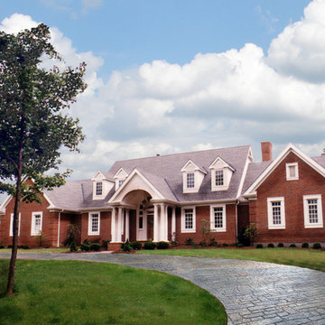
Inspiration for a timeless red two-story brick exterior home remodel in Cincinnati
Inspiration for a timeless red two-story brick exterior home remodel in Cincinnati
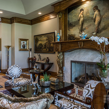
 Frankel Design Build
This estate on Rivercrest incorporates more than 27,000. The house is 26,369, the Pool House is 2,181, the stables are 3,597 (total covered area) square feet of covered structure, including poolside entertaining space, and stables.
This home is very much a traditional meets modern layout. It’s formalized. Referencing heavily upon Andrea Palladio, the home uses symmetry as a major design element.
Connie Anderson Photography
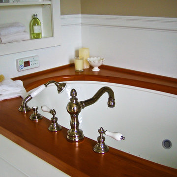 HAVEN design+building llc
For this 1890s historic home in Burlington’s hill section, homeowners needed to update a master bath last renovated in the 1950s. The goal was in incorporate modern, state-of-the-art amenities while restoring the style of the original architecture. Working within the confines of the room’s modest size, we were able to carve out space for a double walk-in shower, an air jetted chromatherapy tub with a custom mahogany deck and a charming vintage style console sink. The custom cabinetry, paneled wainscoting, doors and trim we designer for this project replicated the period millwork of the home, while the polished nickel fittings provided state-of-the-art function with vintage style. Above the tub we added an interior stained glass window that referenced other such period windows in the home.
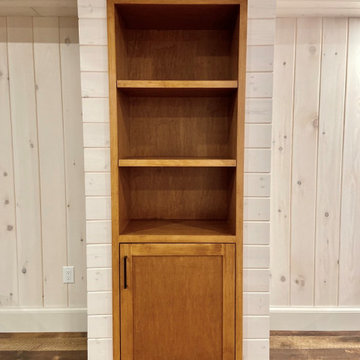 Andra Martens Design Studio
We were hired to finish the basement of our clients cottage in Haliburton. The house is a woodsy craftsman style. Basements can be dark so we used pickled pine to brighten up this 3000 sf space which allowed us to remain consistent with the vibe of the overall cottage. We delineated the large open space in to four functions - a Family Room (with projector screen TV viewing above the fireplace and a reading niche); a Game Room with access to large doors open to the lake; a Guest Bedroom with sitting nook; and an Exercise Room. Glass was used in the french and barn doors to allow light to penetrate each space. Shelving units were used to provide some visual separation between the Family Room and Game Room. The fireplace referenced the upstairs fireplace with added inspiration from a photo our clients saw and loved. We provided all construction docs and furnishings will installed soon.
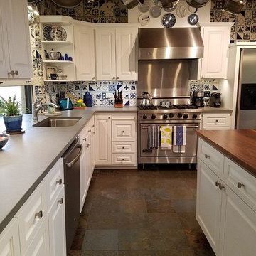 Patrician Design
This charming little bungalow had already experienced its share of remodeling. Well, not so much structural. Although, many interior design transformations occurred over the decades. In the mix, the well-used and enjoyed kitchen was feeling a quite tired and dated. Read more and see before and after pictures at the above referenced website.
 Naikoon Contracting Ltd
Architect: M3 Architecture Inc.
Interior Design: Mocoro Studio
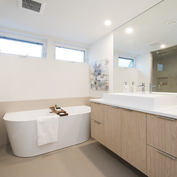
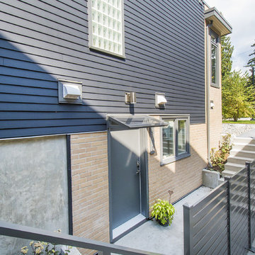
We recently completed a development project in the Pemberton Heights area of North Vancouver. These 2 houses were built to benefit the long-term durability through the selection of efficient materials and process which will give a longer lifespan with lower maintenance and energy costs. This project was a perfect fit for us to assist in the design and execute the construction while working with some outstanding clients and consultants. A win for all of us!
The original home was recycled hitting our target goals of 90%, leading way to a couple of stealth looking homes with performance levels right there with the best of them. Our mechanical engineer designed the mechanical systems to achieve maximum efficiency and hit our internal target goals that we have set for ourselves in accordance with our Vision here at Naikoon. These homes came in at EnerGuide score of 85% which can also be referenced in GJ with a score of 54GJ. To give you an idea of how this rating relates to an average home of this size, these 2 beauties on Mackay are about 80% more efficient. The main components in the design and equipment selection that leads to this are:
1) Space heating and Cooling
2) Water Heating
3) Lights and Appliances
4) Wall assemblies and insulation
Like all of our projects, we take pride in looking at the small details of the house. Things like, insulated water lines, domestic hot water heat recovery units, electric car plug-ins, solar power ready, extensive use of environmentally friendly materials, hot water heat pumps and stringent testing and inspection point along the way, led to a successful completion of 2 certified high-performance homes with Built Green Platinum and EnergyStar certifications.
Photo credits: vopenhouse.ca
 Blondie's Treehouse Inc
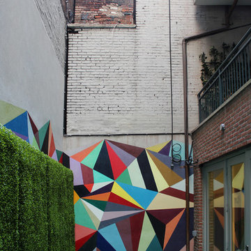
Referencing this square footage as an internal courtyard might be a stretch. A more accurate description would perhaps be the awesome things that New Yorkers can do with the tiny spaces we have.
The parameters of the project lend to its description. This Tribeca residential building’s shared amenity space and gym on the lower level opens up onto a 350 square foot space of brick walls and concrete pavers. The south wall of this space is made up by the terraces belonging to the residential units above and while the setting allows for minimal ambient light, each balcony looks down onto the shared space below.
In order to provide visual interest from the gym and the overhead views, Blondie’s designers Sara Baerwald and Eva Vessio utilized Jay Scott’s rectangle containers lining the north wall as well as surrounding the utilities in the southwest corner. They then created 8 foot faux boxwood hedge on the north wall and the appropriate height to conceal the utilities. From below the hedge creates the feeling of a courtyard and from above it softens the view of the once barren space. Adding color and functionality, the concrete pavers were replaced with rubber tiles in a bright aqua. To play off of this color and add a unique level of visual impact, artist Chris Pearson designed and painted a multi-color prism mural. Primarily on the east wall and then stretching over the hedges to the south, the depth and dimension that this mural provides for the space is incredible. It is a testament to the successful solutions we conjure when thinking outside the box and allowing for unique site specific resolutions.
 MATHISON | MATHISON ARCHITECTS
Watermark Residence was conceived as a “downsizing” project for Owners looking to transition from the home where they raised their family to a simpler lifestyle. The footprint and exterior massing of the single family condo was prescribed, but MMA wove new details into these constraints and was urged by the Owner to completely reinvent the interior experience.
From the exterior, the home sits subtly on a corner lot, referencing the neighborhood in its style, but with a warmth and crispness that speaks also to the interiors.
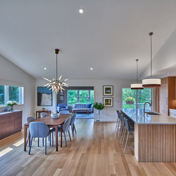
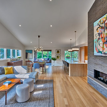
The primary goal of the project was to provide an open, inviting atmosphere of connected spaces that allowed natural light into all areas of the home. Upon entry, there is an immediate involvement in the daily activities with the living and dining rooms being the focal point, and a more intimate kitchen slightly out of view.
Throughout the home, the idea of privacy and transparency plays an important role in the organization of spaces and materials chosen. More private corridors lead to intimate bedroom spaces and functional laundry and mudrooms. A two-floor, semi-transparent slat wall shields direct visibility from the street, while also providing connection between the entertaining spaces of the home. Combined with the white oak, open staircase, the movement between levels feels intuitive and inviting.
A simple palette of materials, understated in their appearance but detailed in their execution, are threaded throughout the home. Gathering spaces are represented with open slats, grounding brick, white oak, and bright walls. Movement deeper into the house brings refined slat panels with integrated hardware at kitchen millwork, softly painted cabinetry, and warm tones of walnut in furniture elements. The most private spaces of the home further extrude the slat element into fluted panels, painted in deeper colors.
 MATHISON | MATHISON ARCHITECTS
Watermark Residence was conceived as a “downsizing” project for Owners looking to transition from the home where they raised their family to a simpler lifestyle. The footprint and exterior massing of the single family condo was prescribed, but MMA wove new details into these constraints and was urged by the Owner to completely reinvent the interior experience.
From the exterior, the home sits subtly on a corner lot, referencing the neighborhood in its style, but with a warmth and crispness that speaks also to the interiors.
The primary goal of the project was to provide an open, inviting atmosphere of connected spaces that allowed natural light into all areas of the home. Upon entry, there is an immediate involvement in the daily activities with the living and dining rooms being the focal point, and a more intimate kitchen slightly out of view.
Throughout the home, the idea of privacy and transparency plays an important role in the organization of spaces and materials chosen. More private corridors lead to intimate bedroom spaces and functional laundry and mudrooms. A two-floor, semi-transparent slat wall shields direct visibility from the street, while also providing connection between the entertaining spaces of the home. Combined with the white oak, open staircase, the movement between levels feels intuitive and inviting.
A simple palette of materials, understated in their appearance but detailed in their execution, are threaded throughout the home. Gathering spaces are represented with open slats, grounding brick, white oak, and bright walls. Movement deeper into the house brings refined slat panels with integrated hardware at kitchen millwork, softly painted cabinetry, and warm tones of walnut in furniture elements. The most private spaces of the home further extrude the slat element into fluted panels, painted in deeper colors.
 Naikoon Contracting Ltd
Architect: M3 Architecture Inc.
Interior Design: Mocoro Studio
We recently completed a development project in the Pemberton Heights area of North Vancouver. These 2 houses were built to benefit the long-term durability through the selection of efficient materials and process which will give a longer lifespan with lower maintenance and energy costs. This project was a perfect fit for us to assist in the design and execute the construction while working with some outstanding clients and consultants. A win for all of us!
The original home was recycled hitting our target goals of 90%, leading way to a couple of stealth looking homes with performance levels right there with the best of them. Our mechanical engineer designed the mechanical systems to achieve maximum efficiency and hit our internal target goals that we have set for ourselves in accordance with our Vision here at Naikoon. These homes came in at EnerGuide score of 85% which can also be referenced in GJ with a score of 54GJ. To give you an idea of how this rating relates to an average home of this size, these 2 beauties on Mackay are about 80% more efficient. The main components in the design and equipment selection that leads to this are:
1) Space heating and Cooling
2) Water Heating
3) Lights and Appliances
4) Wall assemblies and insulation
Like all of our projects, we take pride in looking at the small details of the house. Things like, insulated water lines, domestic hot water heat recovery units, electric car plug-ins, solar power ready, extensive use of environmentally friendly materials, hot water heat pumps and stringent testing and inspection point along the way, led to a successful completion of 2 certified high-performance homes with Built Green Platinum and EnergyStar certifications.
Photo credits: vopenhouse.ca
 Brooks + Scarpa Architects
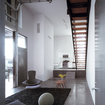
Located in a neighborhood characterized by traditional bungalow style single-family residences, Orange Grove is a new landmark for the City of West Hollywood. The building is sensitively designed and compatible with the neighborhood, but differs in material palette and scale from its neighbors. Referencing architectural conventions of modernism rather than the pitched roof forms of traditional domesticity, the project presents a characteristic that is consistent with the eclectic and often unconventional demographic of West Hollywood. Distinct from neighboring structures, the building creates a strong relationship to the street by virtue of its large amount of highly usable balcony area in the front façade.
While there are dramatic and larger scale elements that define the building, it is also broken down into comprehensible human scale parts, and is itself broken down into two different buildings. Orange Grove displays a similar kind of iconoclasm as the Schindler House, an icon of California modernism, located a short distance away. Like the Schindler House, the conventional architectural elements of windows and porches become part of an abstract sculptural ensemble. At the Schindler House, windows are found in the gaps between structural concrete wall panels. At Orange Grove, windows are inserted in gaps between different sections of the building.
The design of Orange Grove is generated by a subtle balance of tensions. Building volumes and the placement of windows, doors and balconies are not static but rather constitute an active three-dimensional composition in motion. Each piece of the building is a strong and clearly defined shape, such as the corrugated metal surround that encloses the second story balcony in the east and north facades. Another example of this clear delineation is the use of two square profile balcony surrounds in the front façade that set up a dialogue between them—one is small, the other large, one is open at the front, the other is veiled with stainless steel slats. At the same time each balcony is balanced and related to other elements in the building, the smaller one to the driveway gate below and the other to the roll-up door and first floor balcony. Each building element is intended to read as an abstract form in itself—such as a window becoming a slit or windows becoming a framed box, while also becoming part of a larger whole. Although this building may not mirror the status quo it answers to the desires of consumers in a burgeoning niche market who want large, simple interior volumes of space, and a paradigm based on space, light and industrial materials of the loft rather than the bungalow.
 Deik
DeikProject: Residential interior refurbishment
Site: Kensington, London
Designer: Deik (www.deik.co.uk)
Photographer: Anna Stathaki
Floral/prop stylish: Simone Bell
We have also recently completed a commercial design project for Café Kitsuné in Pantechnicon (a Nordic-Japanese inspired shop, restaurant and café).
Simplicity and understated luxury
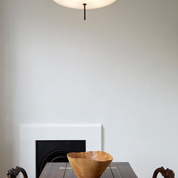
The property is a Grade II listed building in the Queen’s Gate Conservation area. It has been carefully refurbished to make the most out of its existing period features, with all structural elements and mechanical works untouched and preserved.
The client asked for modest, understated modern luxury, and wanted to keep some of the family antique furniture.
The flat has been transformed with the use of neutral, clean and simple elements that blend subtly with the architecture of the shell. Classic furniture and modern details complement and enhance one another.
The focus in this project is on craftsmanship, handiwork and the use of traditional, natural, timeless materials. A mix of solid oak, stucco plaster, marble and bronze emphasize the building’s heritage.
The raw stucco walls provide a simple, earthy warmth, referencing artisanal plasterwork. With its muted tones and rough-hewn simplicity, stucco is the perfect backdrop for the timeless furniture and interiors.
Feature wall lights have been carefully placed to bring out the surface of the stucco, creating a dramatic feel throughout the living room and corridor.
The bathroom and shower room employ subtle, minimal details, with elegant grey marble tiles and pale oak joinery creating warm, calming tones and a relaxed atmosphere.
22